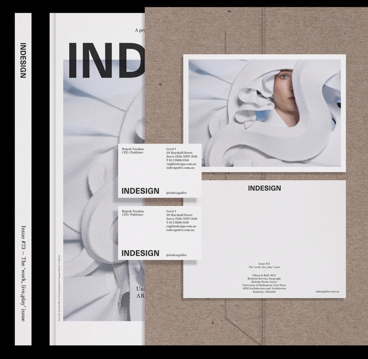
This week we welcome the wonderful Certain Magazine for a guest piece. Dedicated to showcasing visionary, accomplished graphic design and typography, Certain share with us their top 15 type-focused artists and agencies.
Semiotik Design Agency | @semiotik_design
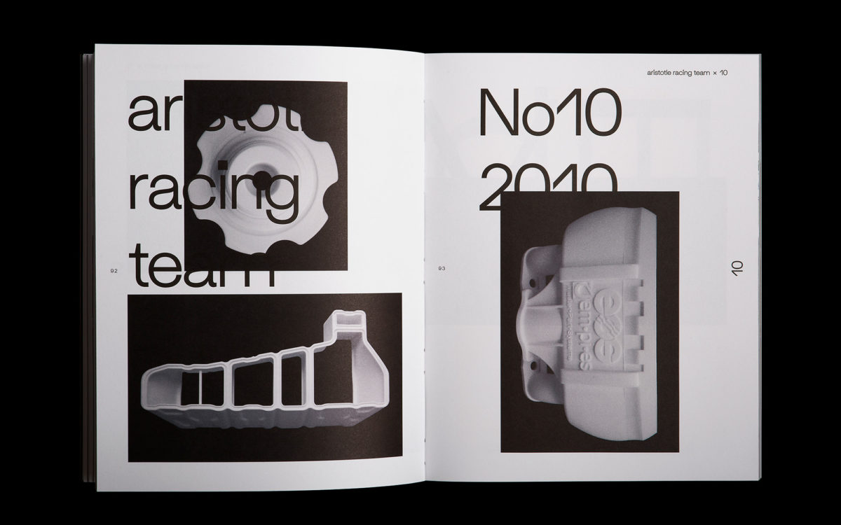
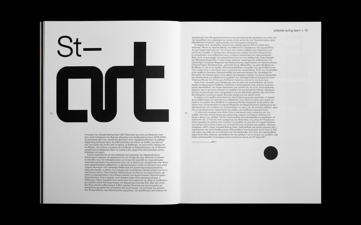
Award-winning creative consultancy and design studio, Semiotik, boast work for a wide-ranging span of clients and projects including identity development for Fabrika, Perrakis Papers at Benaki Museum, The Architect Show and the Volvo XC40-XC60 launch, as well as numerous editorial and packaging design projects with AkzoNobel Coatings, The Aristotle Racing Team and The Domes Resort Hotels. Meeting commercially-focussed needs with cutting-edge creativity, Semiotik’s designs are lead with a rich and thoughtful type sensibility, enforced by the research-focused, bespoke methodologies they bring to each, individual project.
Kris Andrew Small | @krisandrewsmall
Sydney based artist and designer, Kris Andrew Small, is a fantastically talented artist whose work is imbued with a radical and distinctive utilisation of type. His psychedelic, kaleidoscopic designs are infused with a vibrant – almost hyperactively buoyant – and utterly addictive energy. Centred by stunning uses of bold, attention-demanding typography, Kris’ work is injected with the vivacity of ‘long-standing traditions of radical protest art from the fringes of the club world.’ His heavy, angular and dynamic typographic works take up maximum space and play with warping dimensions and perspective; granting deep artistic integrity to the compositional aspects of type.
Working in Cologne, designer Ira Arturawna creates gorgeously sleek, refined and elegant type-led work, with a focus on poster design, editorial, branding and packaging. Her stunning and eloquent approach to type means her designs are somehow masterfully minimal and understated, and yet appearing incredibly rich, engaging and characterful. We particularly lover her incredible poster designs, showcased on @iraarturawna, which take an imaginative, dimensional approach to type-led compositions.
Sebastian Pren | @sebastianpren
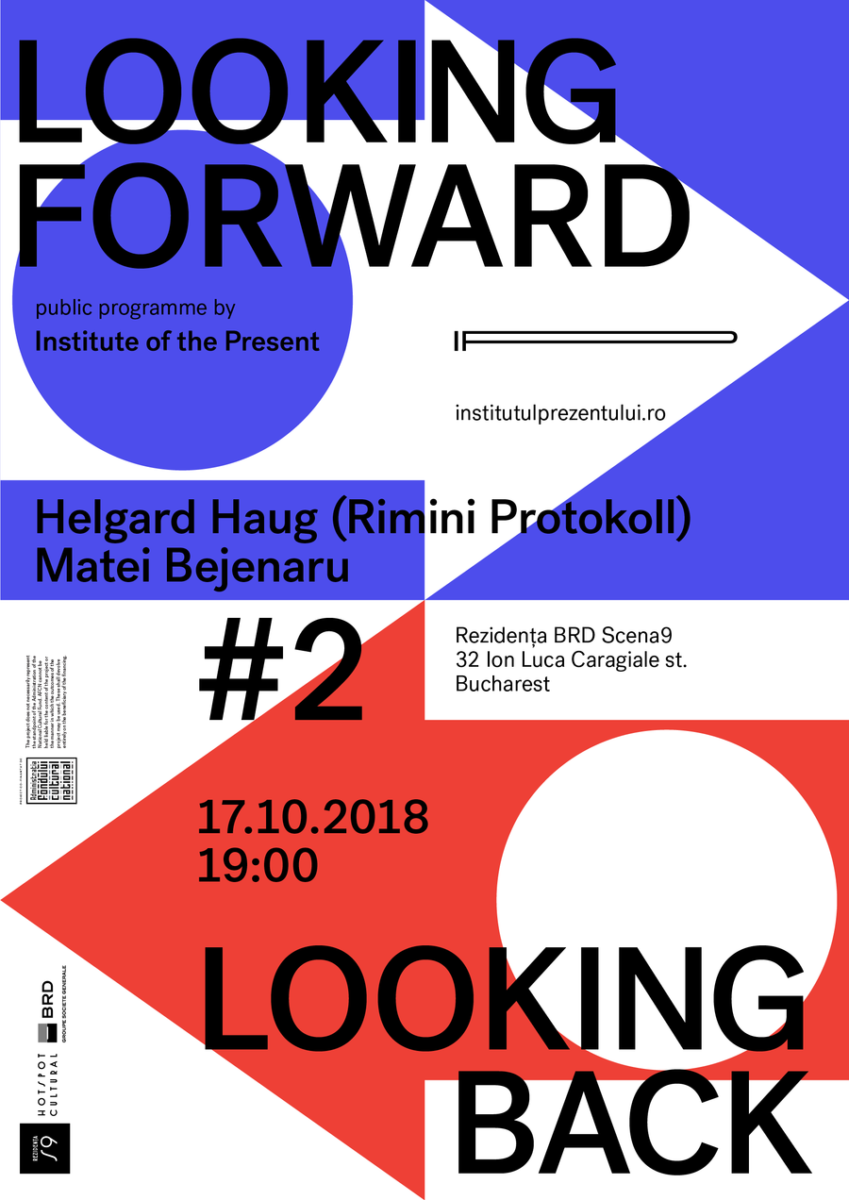
Graphic designer and Illustrator, Sebastian Pren, is currently based in Bucharest and has worked with an impressive bunch of clients, including &Walsh, Google and Levi’s. His work is extremely versatile, ranging from strong, playful and energetic compositions with graphic, street-art undertones to highly sophisticated, minimal and intelligent pieces. Usually directed with limited, sometimes dusty, contrast-filled and vibrant colour schemes – with a tendency for a pop on neon – Pren’s super fun, direct and distinctive.
G Design Studio | @gdesignstudio.gr
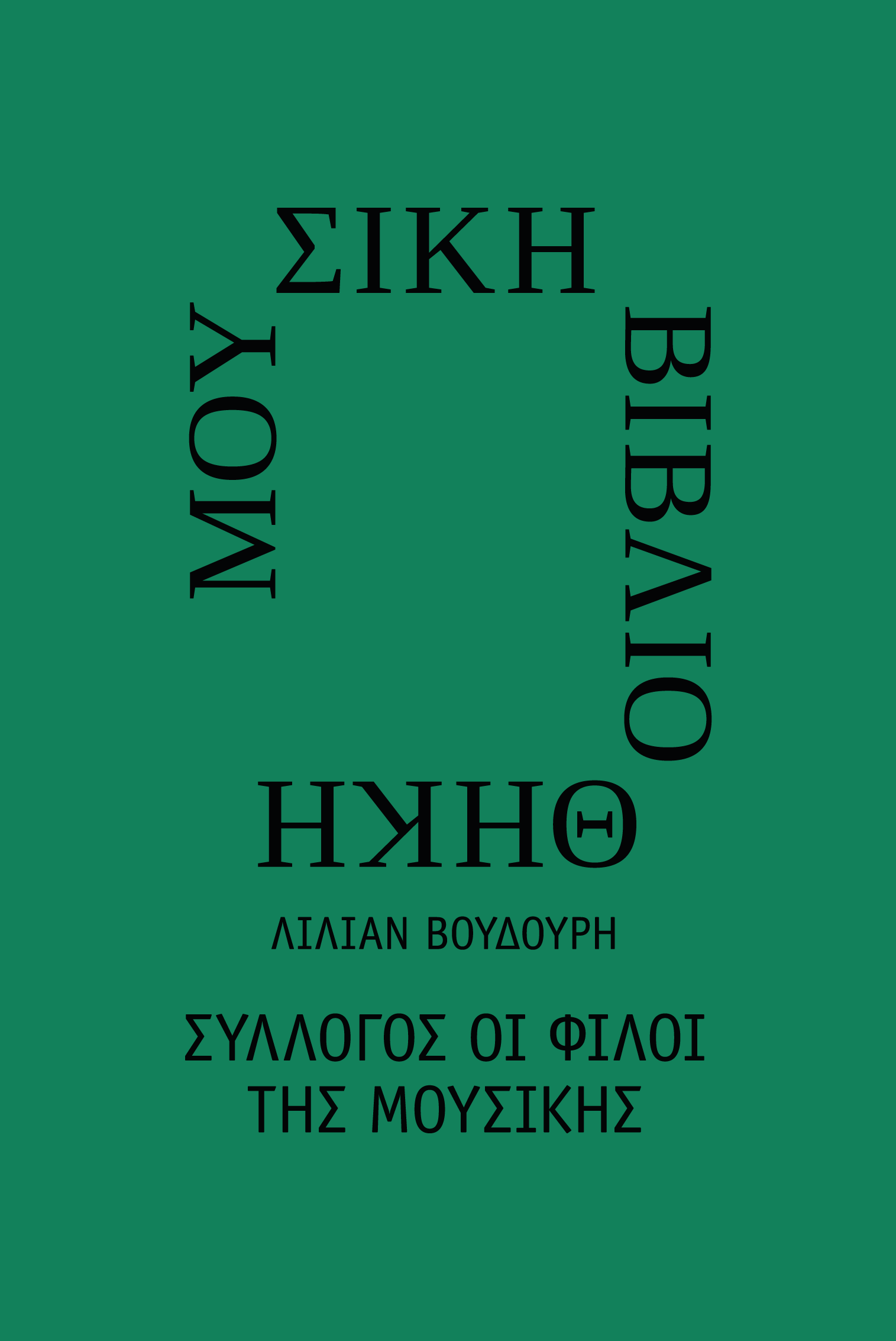
G Design Studio, based in Athens, is notable for its stunning approach to design, which positions ‘clarity, authenticity and emotional resonance’ at its core. Working across brand identity, packaging, strategic design, multimedia campaigns and digital experiences, their ability to the bottom of deep-rooted meaning in each project makes sets them apart from the crowd. We particularly love their brand identity for The Lilian Voudouri Music Library by the Friends of Music Society. For the largest music library in Greece, the starting point for their design was to look at the equilibrium between mathematics and music – the way ‘in music, only precise mathematic relationships can emit harmonious sounds’ – and to translate this into a stunning brand identity.
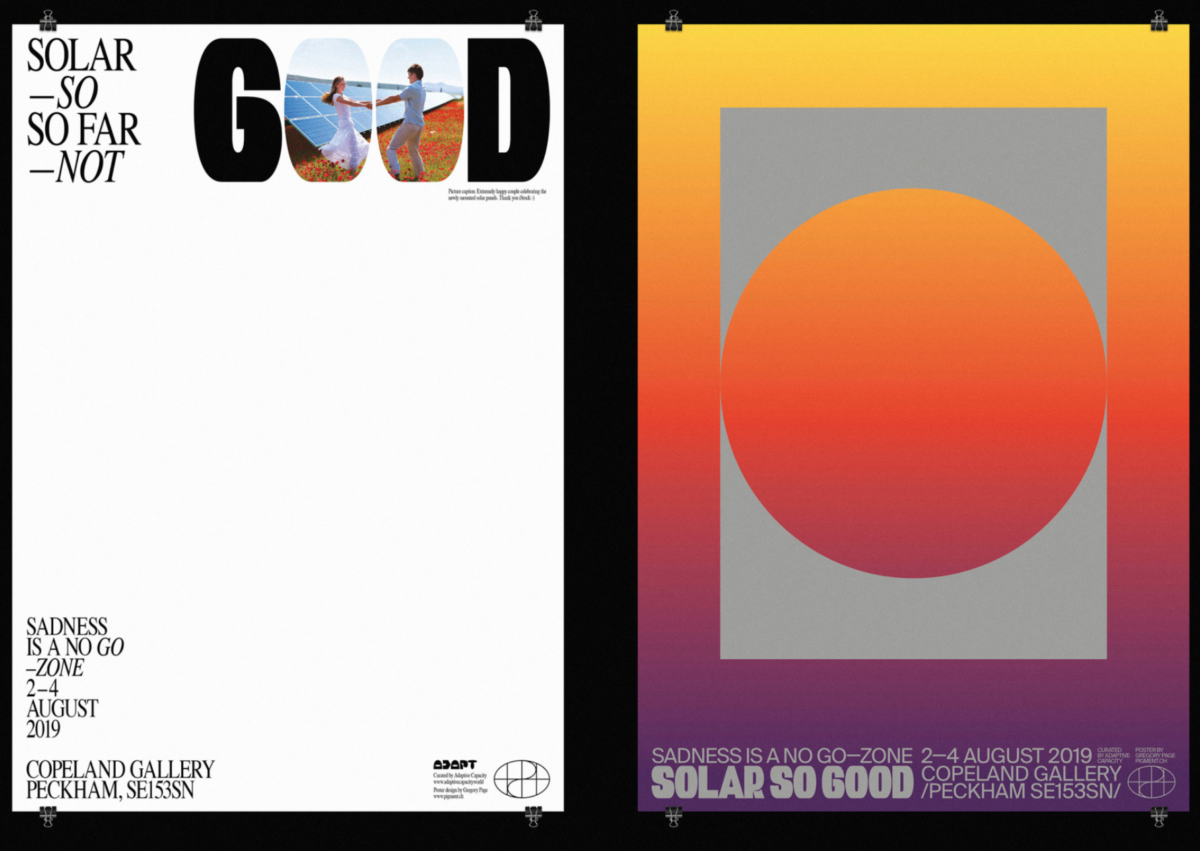
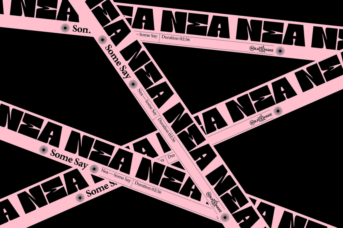
Leader of Geneva-based graphic design and art direction studio, Pigment, Gregory Page centralises type across the board in his eclectic collection of work. Amongst our favourite projects include his visual response to the tagline ‘Solar So Good,’ put out by the collective, Adapt, for the 2019 climate exhibition held in Copeland Gallery, Peckham, ‘Sadness Is A No Go-Zone.’ Page’s recent visual identity work for music artist, NEA (commissioned by Milkshake Label / Sony Music) is super-impressive and features stunning and unusual display type.
Multidisciplinary artist and graphic designer, Ryan Carl, is based in New York and describes his practice, succinctly and extremely fittingly, as ‘rooted in radical simplicity.’ We adore his personal projects, which explore themes of ‘identity and being, hope and togetherness,’ by finding a compelling balance between negative space and the interrelations of letterforms. Another favourite is ‘Modular-Repetition Type System,’ which explores compositions comprised of square quadrants made of repeated letters. This stunning typographic exploration was recognised for Typographic Excellence by Type Directors Club in 2019.
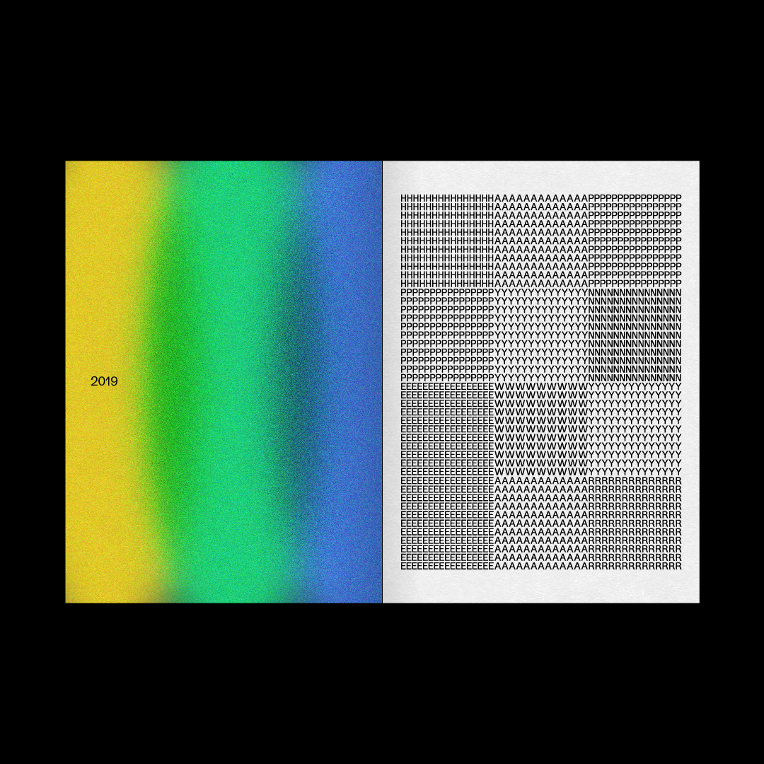
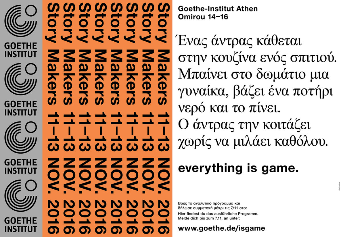
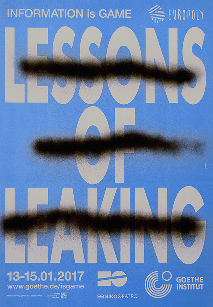
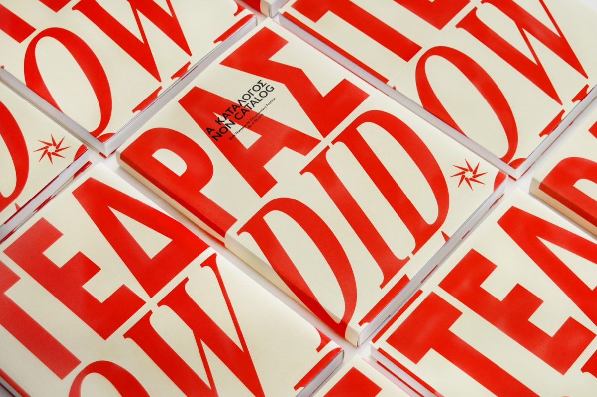
Visual design studio and independent publisher, MNP, was founded in 2003 in Athens by Katerina Papanagiotou, and specialises in communication design, packaging, website design and publishing. Their work for the Thessaloniki Film Festival features numerous posters and a beautiful catalogue design which showcases multilingual type-design and elegant, sensitive typesetting. They have also produced huge and varied bodies of work for the Goethe Institut Athen, which showcase a distinctive and unique application of typographic work.
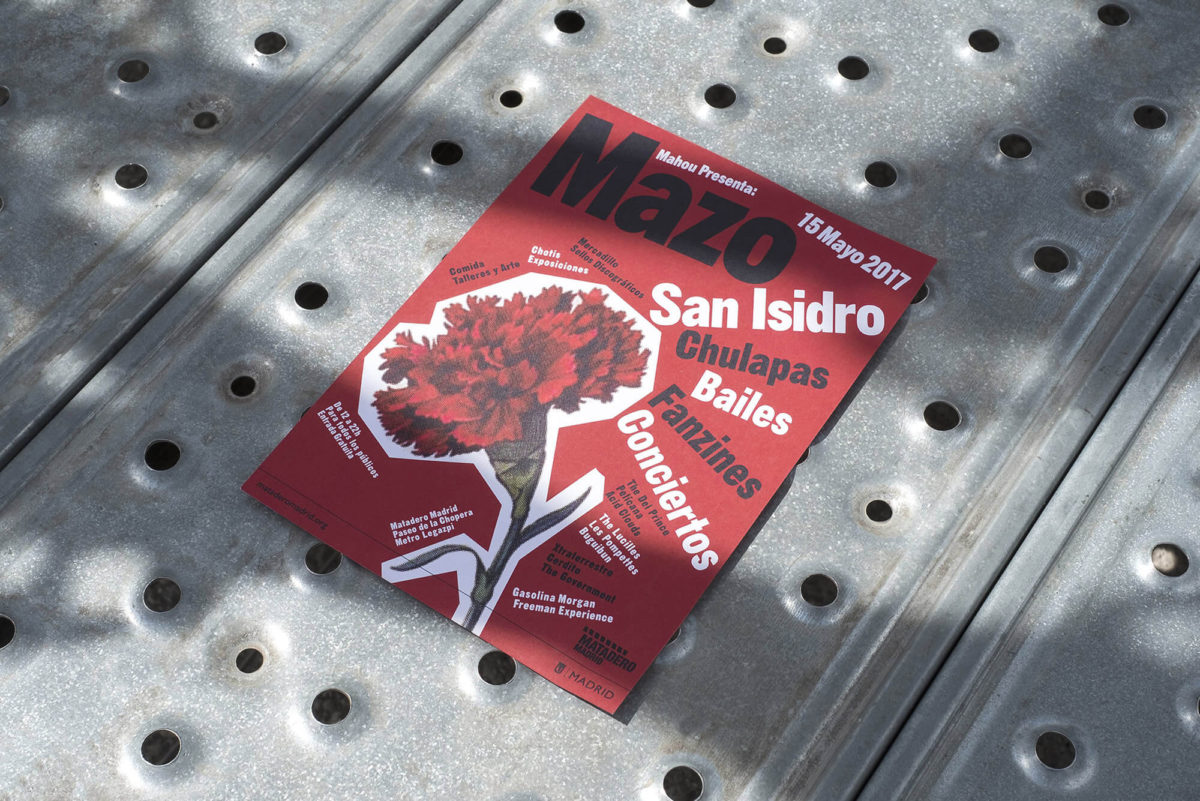
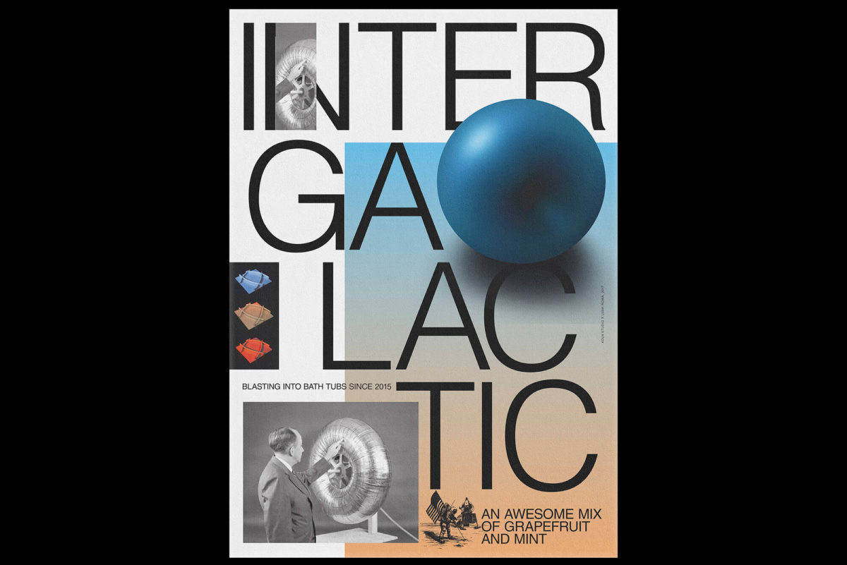
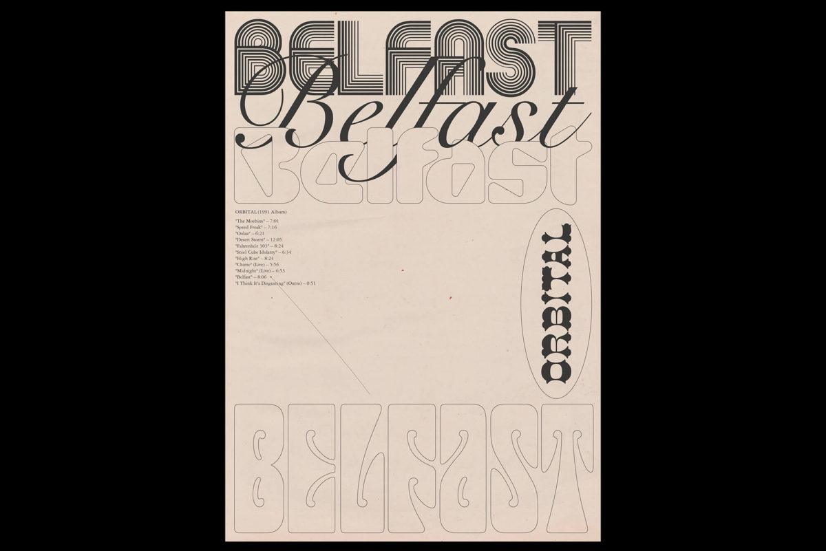
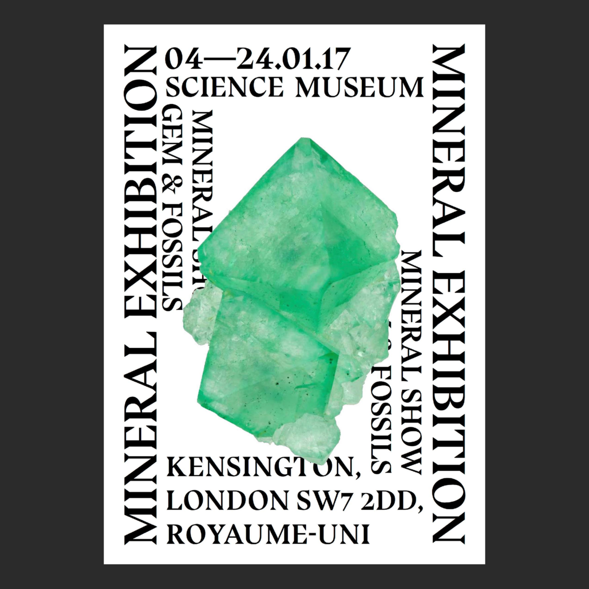
At the core of Madrid based Koln Studio is an ethos of experimentation, playful, thoughtful typography and a strong conceptual bass line. The definitive qualities of their visual language grows from an original take on classic and avant-garde design; adorned with the deep aesthetic insight to marry the two beautifully – and with striking effect. Their work for electronic music and contemporary arts festival, Absolut Manifesto 2019, features work inspired by song lyrics dealing with freedom; centralising the geometry, contrast and visual clarity crucial masterful typographic design. Their amazing collection of 2016-2019 posters is 100% worth checking out, and available here.
Emilie Vizcano | @emilievizcano
Artistic director and graphic and type designer, Emilie Vizcano, is also a co-founder of the Paris based Studio Push (@studio.push). She is of course the designer of the incredible Lapicide, but her broad and eclectic portfolio spans across multiple disciplines; drawing influence largely from print, fashion and photography. Her overarching visual language conjures up an alternative, avant-garde modern zine-culture feel, with a deep awareness of digital visual culture. Emilie’s work in authentically grounded in a strong and unique aesthetic sensibility, making her design instantly recognisable and visually addictive.
International graphic design, photography and publishing practice, HOLT, holds the value of beautifully rendered typographic design close to heart throughout all of its projects. HOLT’s rebrand for the Australian government initiative, Artbank, drew conceptually from the initiative’s purpose: to collect, curate and lease Australian Art. As the initiative was dedicated a gallery space in Sydney, HOLT developed a typographic system for the space and, with a focus on collecting, developed a series of postcards and posters to be collected fro each show.
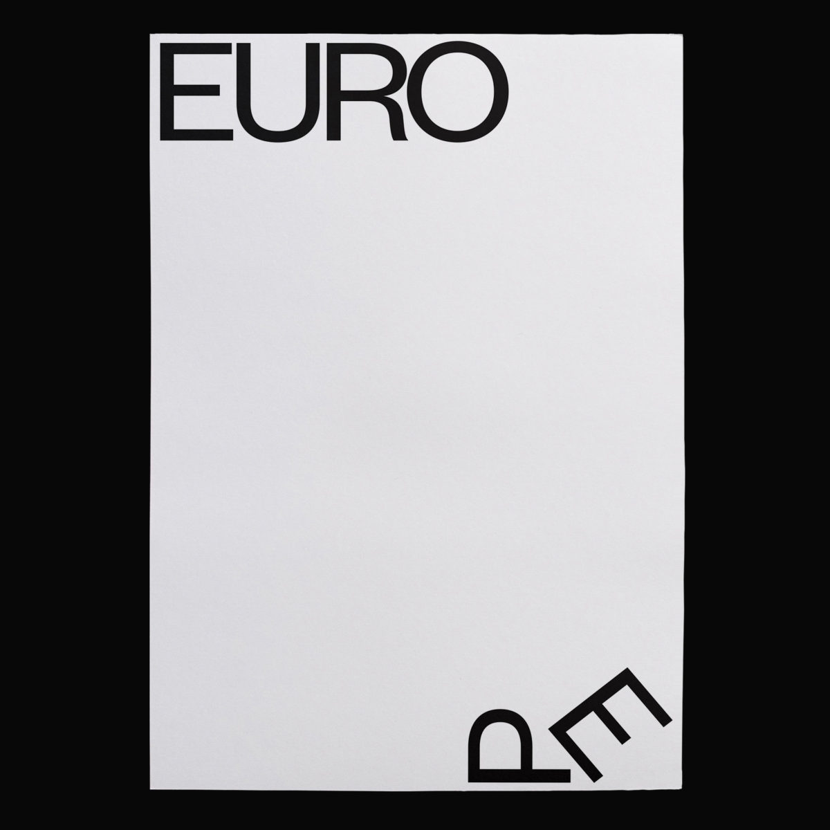
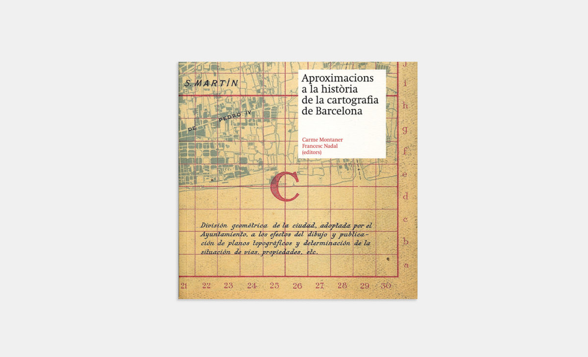
Barcelona based graphic design studio, pfp, disseny, showcase a truly distinctive and compelling portfolio of work. Their poster design for Slanted Europe 34, a publication made in response to ever-emerging divisions, the growth of right-wing populism and prevalence of ‘selfish-politics’ in Europe, features a minimal yet imaginative typographic response; reflecting the unique and concise approach of the studio. Similarly, their editorial project for the Cartographic Institute of Catalonia explores the history of cartography in Barcelona; delving into historical archives of the city and bringing them sensitively together with contemporary design.
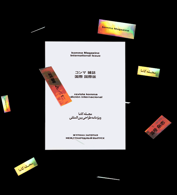
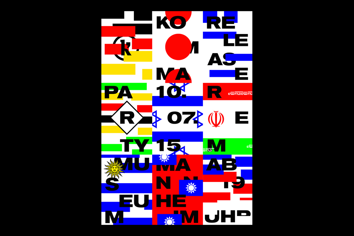
Graphic designer, Tim Lindacher, studied at Hochschule Mannheim and is a co-founder of the publication A Mag A Month, where he stretches his editorial graphic design works to encompass an eclectic take on typographic design. Tim has also worked as editor-in-cheif at komma magazine, and, between work and his similarly creative friends, fully immerses himself in the design word.
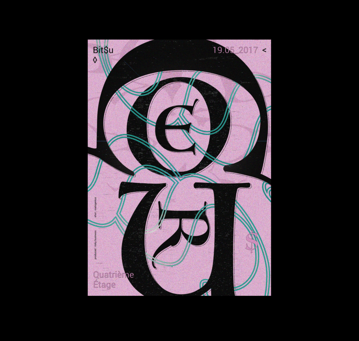
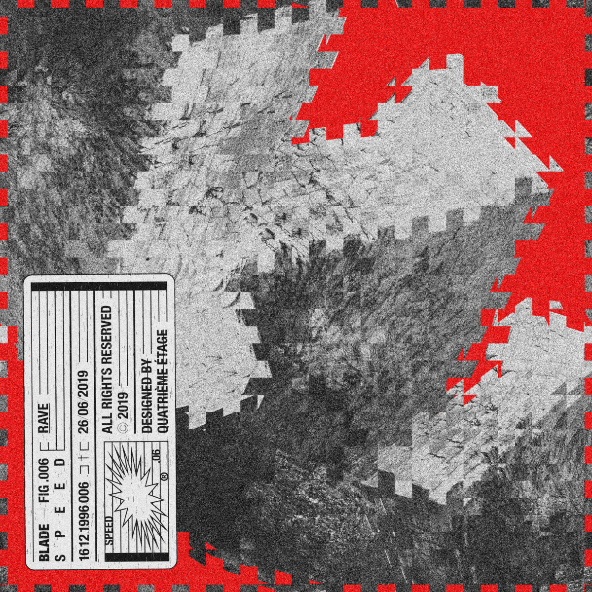
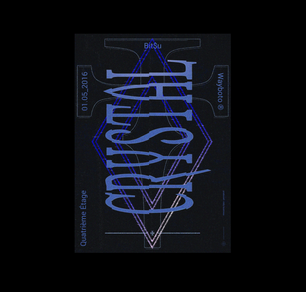
Quatrième Étage | @studioquatriemeetage
Based in Toulouse, graphic design studio Quatrième Étage focus on art direction and visual identity. We particularly love their logotype work for French Techno Producer, Blade. Full of character and contrast, the project reflects the overall feel of the studio; one which marries fresh and energetic compositions with an imaginative take on typographic design.
Tres Tipos Gráficos | @3tgraficos
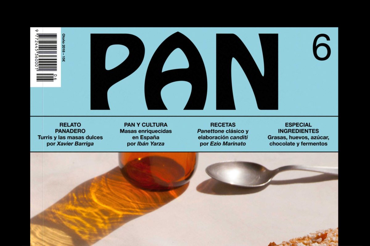
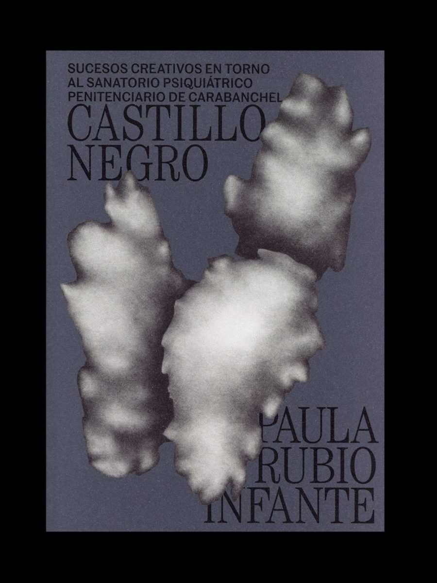
And, last but not least, Madrid based design studio, Tres Tipos Gráficos. Specialising across both print and online solutions, Tres Tipos Gráficos focus on Art Direction, Identities, Editorial Design, Web Design and Packaging. Their work is strikingly unique and broad reaching. In one fascinating project entitled Castillo Negro, they present an editorial design piece based on a series of drawings by a notorious Spanish serial killer, whilst their logotype work for baking magazine, Pan, features a minimal display font constructed through rounded, tactile shapes.