
In underground music culture, where sonic landscapes are sculpted through deep, hypnotic rhythms, typography assumes a parallel role—visualising the movement, tension, and immersion that define the experience. Solfeggio Obscuro is a design and media series capturing the essence of underground music culture and its new visual identity, created by Croatia-based agency Studio Size, deconstructs conventional legibility, embraces kinetic movement, and leverages the contrast between clarity and distortion to translate auditory depth into a visual form successfully.

Visual Identity: Typography as Soundscapes
At the core of Solfeggio Obscuro is a typographic approach that mirrors the layered complexity of the music it represents. Drawing from the textural qualities of cosmic disco, deep house, and leftfield techno, the type treatment reflects rhythmic variations and sonic depth through distortion, layering, and calculated repetition. Just as the event’s curators push musical boundaries, the typography challenges conventional legibility, embracing fluidity and abstraction to create a visual rhythm that pulsates alongside the beat.
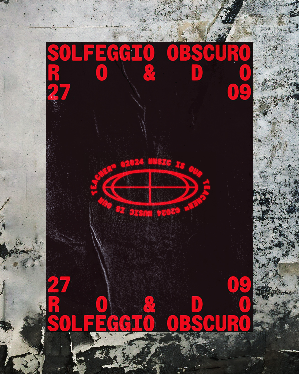
A carefully selected type palette is anchored by Hot Type’s Stroy Mono, a typeface that enhances the project’s experimental and immersive aesthetic. Its monospaced structure and mechanical precision create a sense of rhythmic stability, while subtle distortions and spacing variations echo the sonic fluctuations of underground music. This choice reinforces the project’s interplay between control and chaos, much like the genre-blurring sounds that define the scene.
This balance of clarity and distortion reinforces the hypnotic energy of the music, encouraging deeper engagement through typographic play.
Visual Identity: Dynamic Motion & Kinetic Type
In a setting where light and sound continuously interact, static typography alone simply could not encapsulate the essence of an underground sonic experience. Motion design extends the typographic treatment, applying oscillations, blurring effects, and rhythmic pulsations that respond to audio frequencies. Words shift, stretch, and morph—much like sound waves reverberating through a dimly lit venue. These kinetic typographic gestures serve to heighten immersion, transforming words into a tangible echo of the event’s sonic identity.
The use of animated typography is particularly effective in digital applications, where titles, event information, and artist lineups materialize and dissipate in a ghostly fashion, reminiscent of fading echoes. Subtle flickering, reminiscent of LED displays in dark rooms, enhances the overall mood, reinforcing the club environment’s transient nature.
Contrast & Minimalist Composition
While the visual language of Solfeggio Obscuro is rooted in movement and energy, it is equally defined by restraint. High-contrast Black-and-Red treatments dominate, punctuated by sharp flashes of neon-inspired hues—perhaps a nod to the interplay of light in club spaces. Minimalist layouts ensure that the focus remains on the interaction of form and space, much like the stripped-back, spacious quality of deep electronic sound.
Text placement follows an asymmetrical grid, disrupting traditional alignment in favour of unpredictability, echoing the organic structure of live-mixed DJ sets. Letter spacing fluctuates between compressed and expanded states, imitating the push and pull of rhythmic tension. This approach enhances the notion of depth and layering, allowing the typography to breathe within its own negative space while still maintaining an underlying structural coherence.
The punchy, typographic approach to this design solution doesn’t just communicate—it resonates, reverberates, and pulses in sync with the music, offering a glimpse into the visceral, all-encompassing world of underground sound. A testament to how type can visually translate the ephemeral, euphoric quality of after-hours club culture.
You can keep tabs on what Studio Size are up to by following them on Instagram (@studiosize) or by visiting their website to check out some of their other incredible projects.
Did you enjoy reading this article? You can read additional editorials centred around kinetic typography and visual identity design, and graphic design and typography.


