For Type-01, Production Type’s Jean-Baptiste Levée digs out the best gems of his foundry’s work library…Spoiler: it’s not your usual collection of grimoires.
The hypercenter of Paris hosts Production Type, one of France’s most prolific type foundries. In this article, they offered to navigate us through a selection of their best, out-of-the-ordinary, rarely seen type specimens, delving into the role and purpose of documentation in their creative process.
“I started collecting them from around age 22”, remembers Levée. “At that time, I was interning in Atelier de la Cerisaie, a letterpress workshop. The owner was quite a compulsive collector. He had a beautiful collection ranging from a 1506 book printed by Paul Manuce, to late 1960s metal type specimen, via XXth century Art Nouveau catalogues. It was mesmerising.”
From then on, the book collecting virus grew, and acquiring type documentation became a regular practice. Beyond a mere accumulation frenzy, it quickly became clear that documentation proved an integral facet of the foundry’s practice. “Of course, we use it for inspiration”, says Levée. “But it’s also informing the discovery and ideation phase of many custom font projects: it provides insight, commentary, and context on the many briefs we receive. Sometimes, these briefs are ill-informed or naïve.” deplores Levée. “Good references enable us to inject depth, to explicate what we design and how we design it.”
Although the collecting process is focused on specimens first and foremost, the archive doesn’t subjectively qualify what is historical and what is not. Beyond collectable type books, there are also type specimens from the 1990s, and contemporary type specimens— a holistic take on a narrow subject.
Illustrated: 4 picks from the library
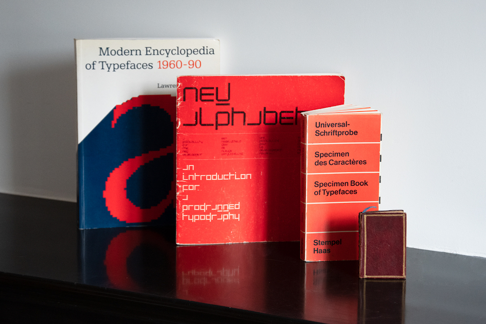
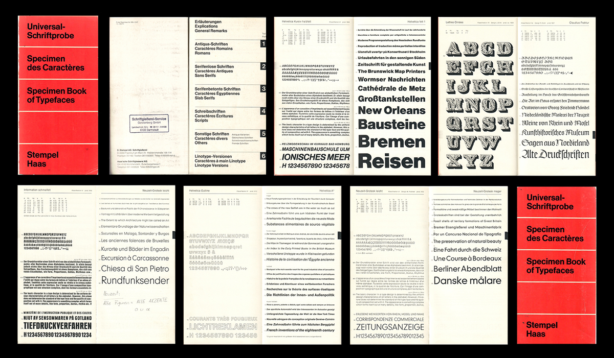
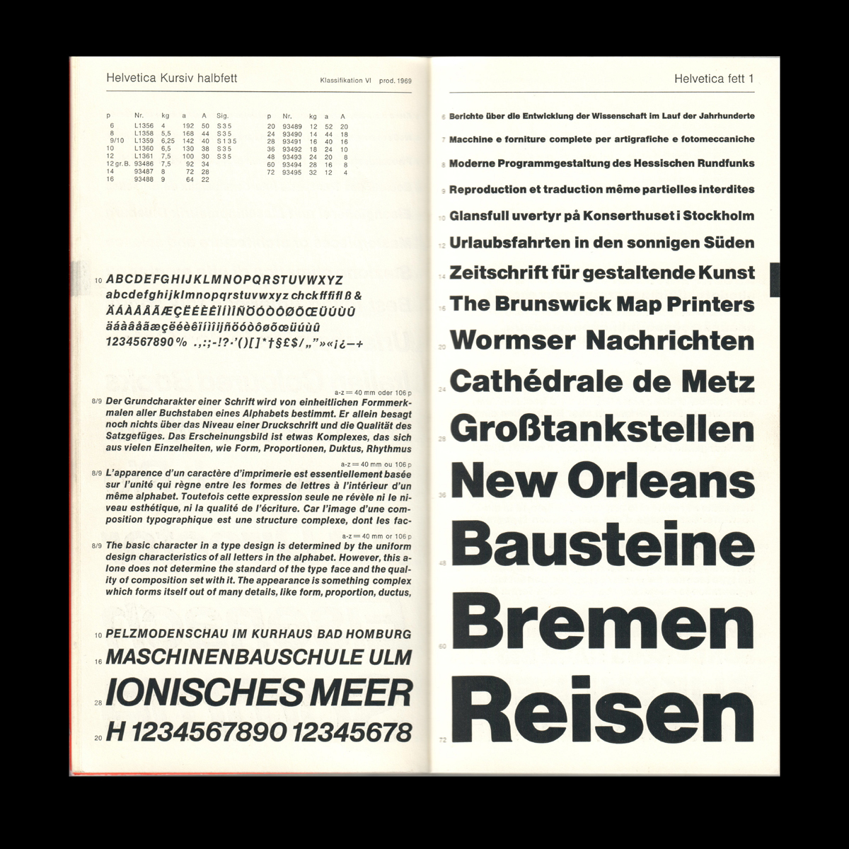
Stempel & Haas type specimen, 1975
This typeface specimen, published in 1975 by Stempel & Haas, is an example of how the alliance of content and form can result in a beautiful demonstration of ergonomics. Even though the specimen is not an example of originality, as most of its typefaces are the usual suspects of the time, the book’s design is worth a second glance.
This specimen was designed with specific attention given to its use. The book is legible, of a medium size, OTA bound, and is therefore easy to manipulate without crunching the binding. In the mid-70s, we are halfway between lead type and photocomposition, which means that if anyone needs a letter, they will need to take a picture of it—a much easier task when a book can open completely. In this sense, this specimen ensures optimal comfort to the user.
Another aspect of the ergonomics of the book is the choice of the letters shown: we notice that there are very few descenders in the typefaces displayed. This brings uniformity to the composition and balance to the lines, making this book a concrete object as much in 3D as in 2D.
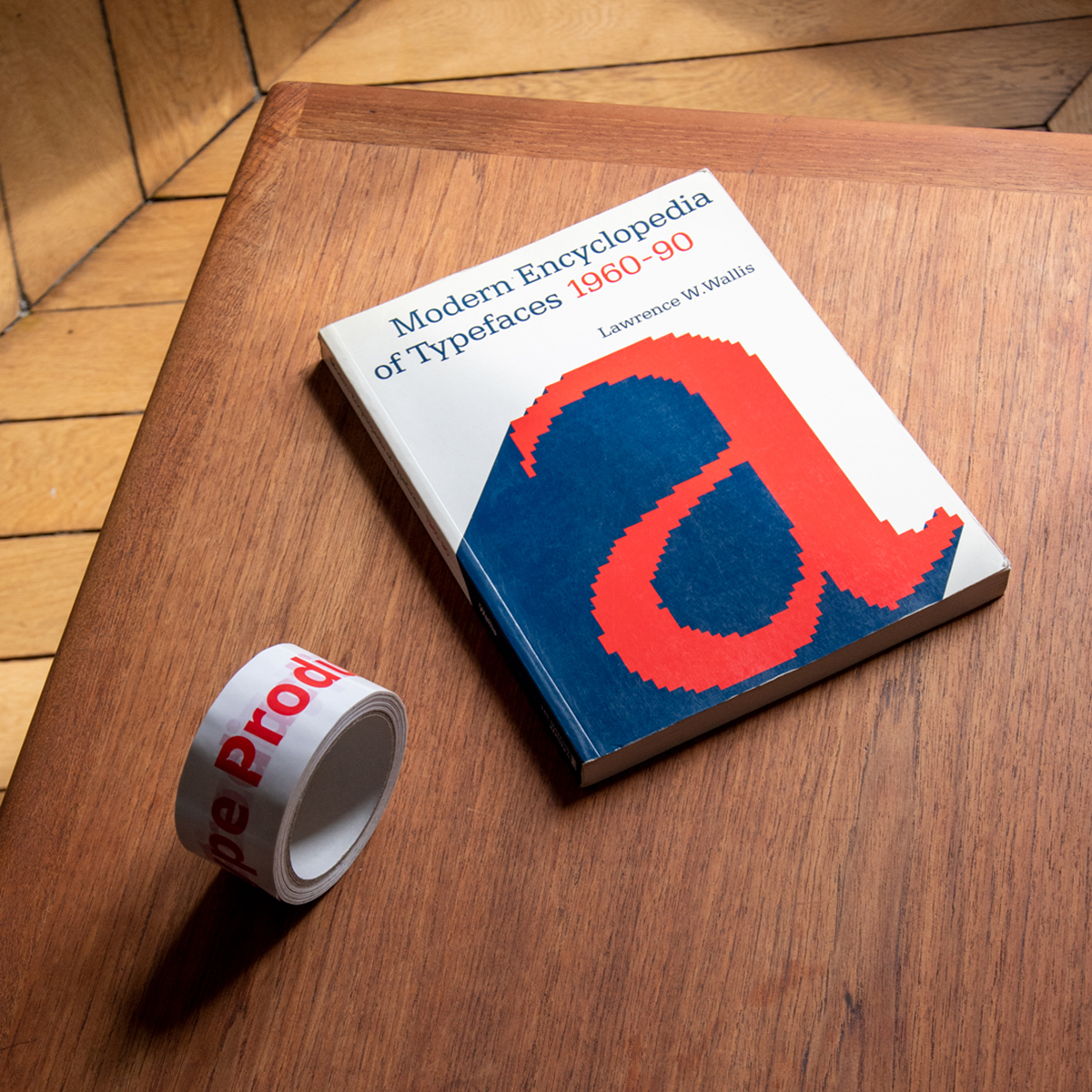
Modern Encyclopedia of Typefaces, 1960-90, by Lawrence W. Wallis
This is one of the rare testimonies of the 1960s-1980s in type design. Indeed, the period saw the end of analogue type and the beginning of digital type design. This passing between technologies caused a significant loss of the typefaces created at this time, as all of them didn’t make it through the change. For this reason, this book is, by default, non-exhaustive in its research. It gives a faithful glimpse into the forgotten designs of the second half of the XXth century nevertheless.
The interesting thing with the selection presented in Modern Encyclopedia of Typefaces 1960-90, is that we find early typefaces of type design superstars, such as Gerhard Unger — or more confidential designs by Aldo Novarese. Whereas renowned figures of lead type saw their creations survive all techniques due to their best-seller quality, these designs often made for photocomposition and depending on specific machines died with their period. As a matter of fact, this book is in a way a graveyard of digital type design.
One of the few survivors of this period featured in the book is Proforma by Petr van Blokland. First produced by Purup Electronics for the setting of forms, the typeface was renewed by the designer in digital format at Font Bureau — van Blokland’s foundry that is replaced today by Type Network. As a part of a type design library, Modern Encyclopedia of Typefaces 1960-90 helps restore genealogies of type and enlighten this historical context of creation.
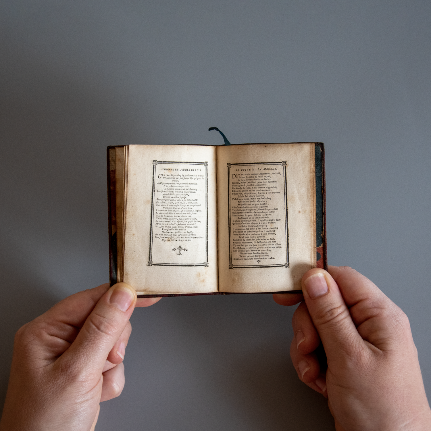
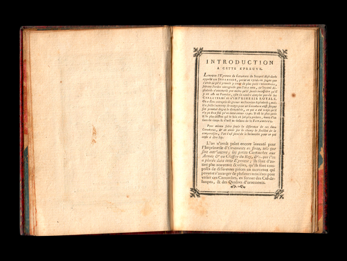
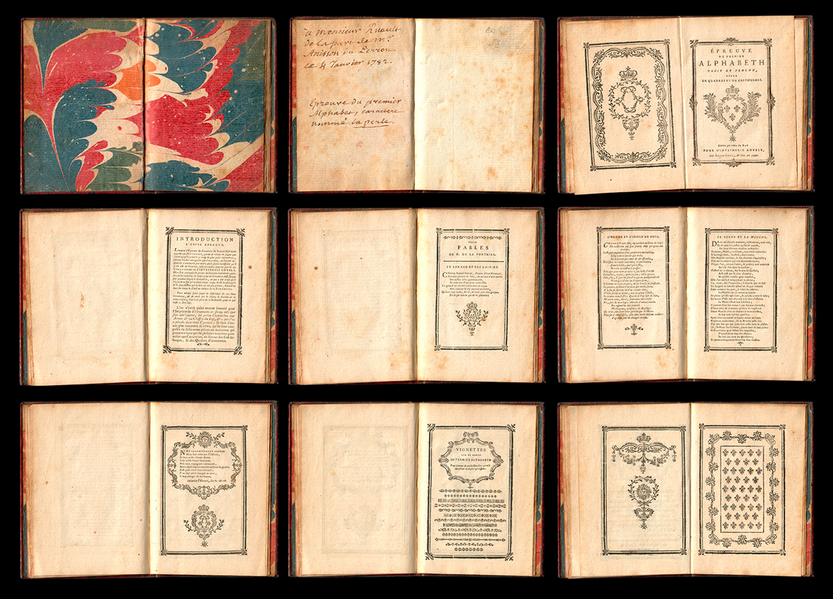
La Perle
The 1740 specimen of La Perle is a publication whose small size is stunning: at a time when typefaces were not given specific measures but names, the Perle refers to what could nowadays be 4pt. The dimensions of the book, a bare 6x7cm, are just right to contain the printing proofs of the tiniest typeface by Louis-René Luce, the XVIIIth century master of meticulous lead type engraving.
La Perle has to be replaced in context: this technical achievement was made at a time when typography as a craft was challenged everyday, and whose two main figures in France were Louis-René Luce and Pierre-Simon Fournier. The first was a master with small sizes; the latter was known for its typefaces for musical notation. More than just a specimen, La Perle is a masterpiece of a craftsman at the top of his art.
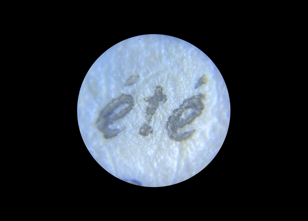
This copy of La Perle touches the heart for a specific detail. We can see on the first page a handwritten note from Étienne-Alexandre-Jacques Anisson-Dupéron, who was the director of the French royal printworks. The note is addressed to Nicolas Ruault, editor and humanist of this period. This three hundred years old testimony is a dive into the depth of history and a moving proof of the passing of time.
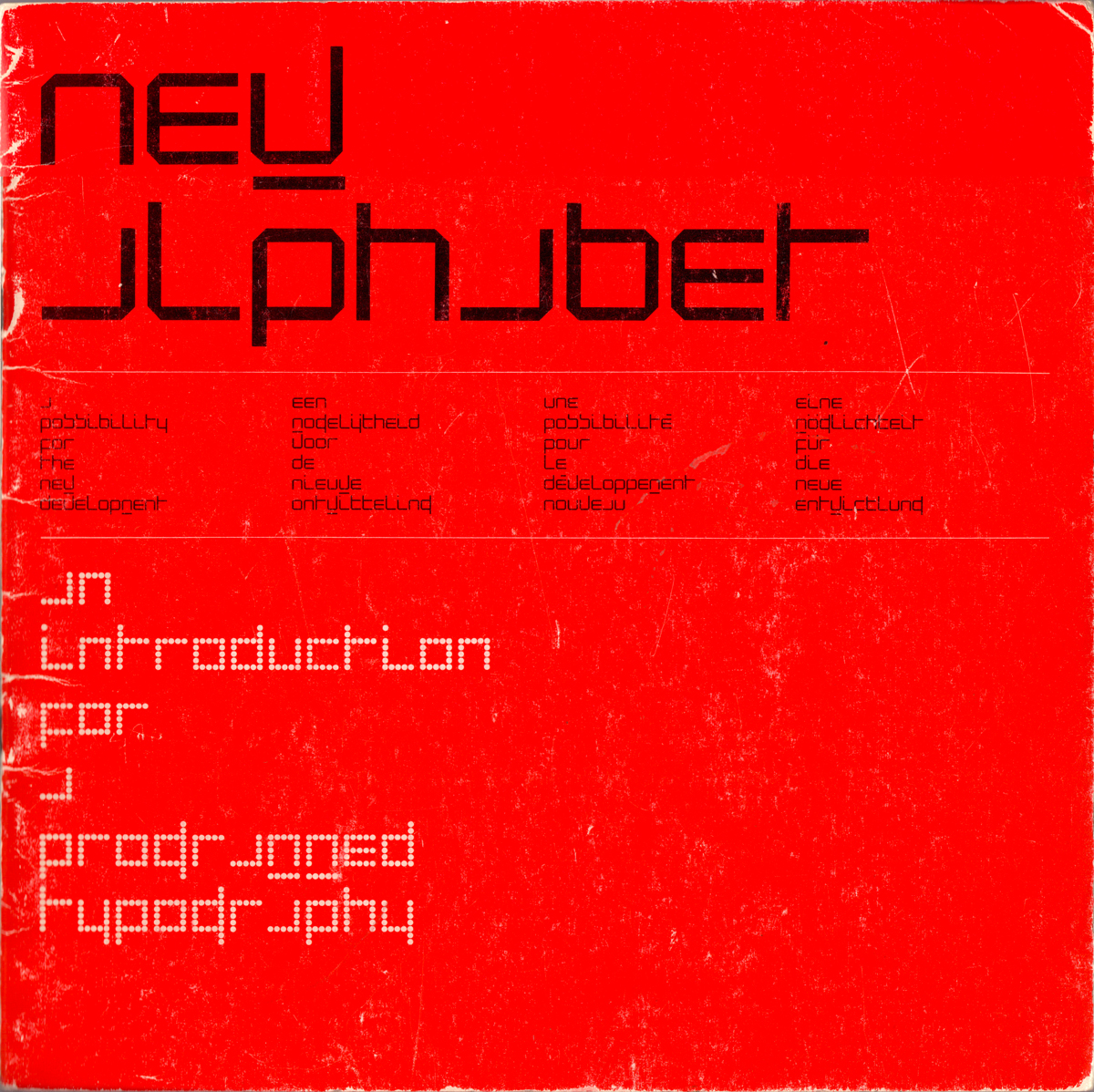
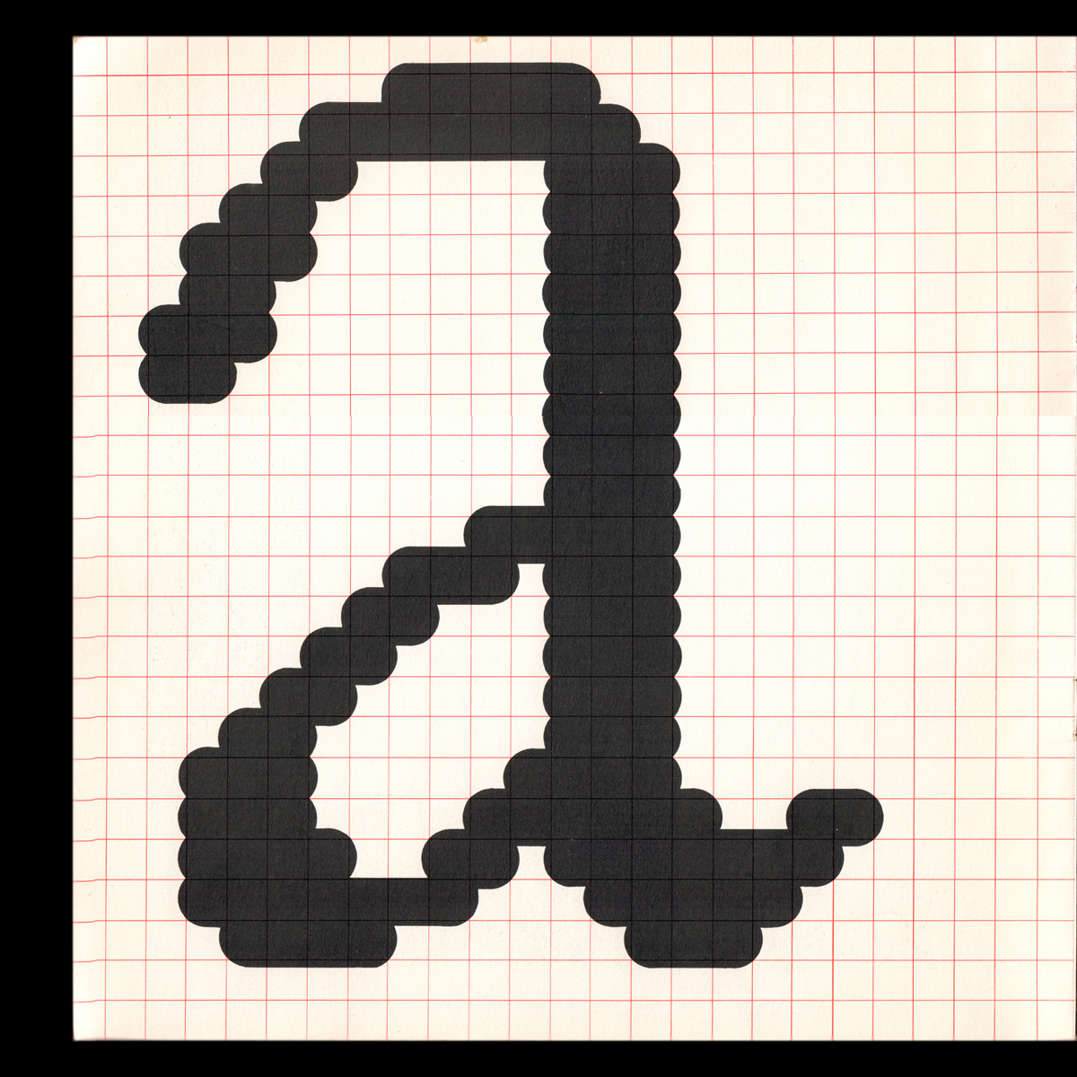
Wim Crouwel’s New Alphabet
The specimen of New Alphabet (1967) by Wim Crouwel is a monument of graphic design and type design history. A surprising fact is that even though this typeface is now world-famous, it was only used (scarcely) by Total Design and Wim Crouwel himself. What gives this font so much historical impact is its manifesto quality, as it was one of the last modern fonts created to accommodate a technical change.
New Alphabet was designed in the 1960s, a time when computers were beginning to be a core concern. In this context, Wim Crouwel created a typeface suited for cathode-ray screens: because of their low resolution, CRT screens could not manage to successfully display the curves of traditional typefaces without altering them. Crouwel’s reflection led to the production of a radical typeface design based on straight lines and 0°, 45°, and 90° angles, in which the letters were barely readable and seemed to come from outer space. Indeed, the first man on the moon was to land two years later.
New Alphabet’s specimen is one of the rare publications where we can see the typeface in use: it was also a rather peculiar object. Funded by the printer itself, the specimen was not for sale and aimed at demonstrating the qualities of paper, inks, and typeface all at once. Except for the specimen, one of the most famous uses of New Alphabet is the cover artwork for Joy Division’s 1988 album Substance, designed by Peter Saville, who brought the typeface up to date.
Sharing is caring: advice for type book lovers
In the book Les Collectionneurs, author Maurice Rheims dissect the practice of collecting. There, he argues that two kinds of collections exist: “closet collections”, where items are withdrawn from public circulation and stored away, locked out from unwanted eyes, and “display window collections”, which are thought to be shown extensively, and in the case of Production Type, used: “for us, the value of books lies in the use we are making of it, and the usage that others, like visiting students, make from it as well” observes Levée.
Then, what to do if one doesn’t have enough books? “First: no one ever has enough books”, says Levée, tongue-in-cheek. “Second: don’t sweat it. It’s often said that research and documentation should occupy an integral part of design work. While this is often useful, it shouldn’t dramatically inform your practice. It’s all too easy to indulge in revivalism, merely transferring a letterform from one technology to another, without adding any new discourse.” Last, Levée points at online possibilities for remote typophiles, or anyone who doesn’t have the means to access such resources. “The Typographica Library recently put up a list of digitised specimens. Although it will only let you sort chronologically, it’s a starting point. I also spent a LOT of time on David M. MacMillan’s Historical Outline of Typefoundries. Of course, you can still dig the Internet Archive, too, but my personal favourites are the French resources offered by Gallica, the city of Paris’ specialised libraries index, and Éric Nunez’s Flickr page.”
Going the extra mile
And what happened to the Cerisaie collection? In 2013, it was transferred to a type design school library, EsadType. Items are now stored in a public venue for everyone to browse and enjoy. “It’s possible that our work library will follow a similar path, a bit like ATF (American Type Founders) did with their own massive collection, back in the 1960s.” Production Type recently went the extra mile and started to post about their gem collection with commentaries and context on each item. The Instagram account, named Type.board, has a weekly highlight on one library item. Display window collection or closet collection, at Production Type, it seems that a philosophy of sharing and openness is at work.