Eko Setiawan delivers not one, not two, but four delightful new fonts to sink our teeth into. Here’s the roundup…

Designing under the name Emyself Design, Eko is an Indonesia-based graphic designer who’s been creating fonts since 2018. Following a phase of experimentation with text fonts, Eko now focuses on display faces with a unique, distinct look.
The creative’s latest offerings, ED Daffodil, ED Sonar, ED Vacaville and ED Begonia, are no exception. Pulling on fascinating threads of inspiration and research, Eko says ideas can pique quickly and spontaneously whilst scrolling through Instagram, or they can arrive more slowly, as integral parts of the creative process.


Eko’s modern take on a blackletter, ED Daffodil, a groovy style font with a fractured look, germinated in the same environment as ED Begonia. The two fonts are essentially parallel meditations on the same concept, showing off Eko’s prowess and skill, and sparking a ton of cool ideas for branding, visual identities and editorial layouts.

ED Daffodil is equipped with stylistic alternates, standard ligatures and multi-lingual support, whilst ED Begonia, although similar to Daffodil, comes with more alternates and a cool outline style.


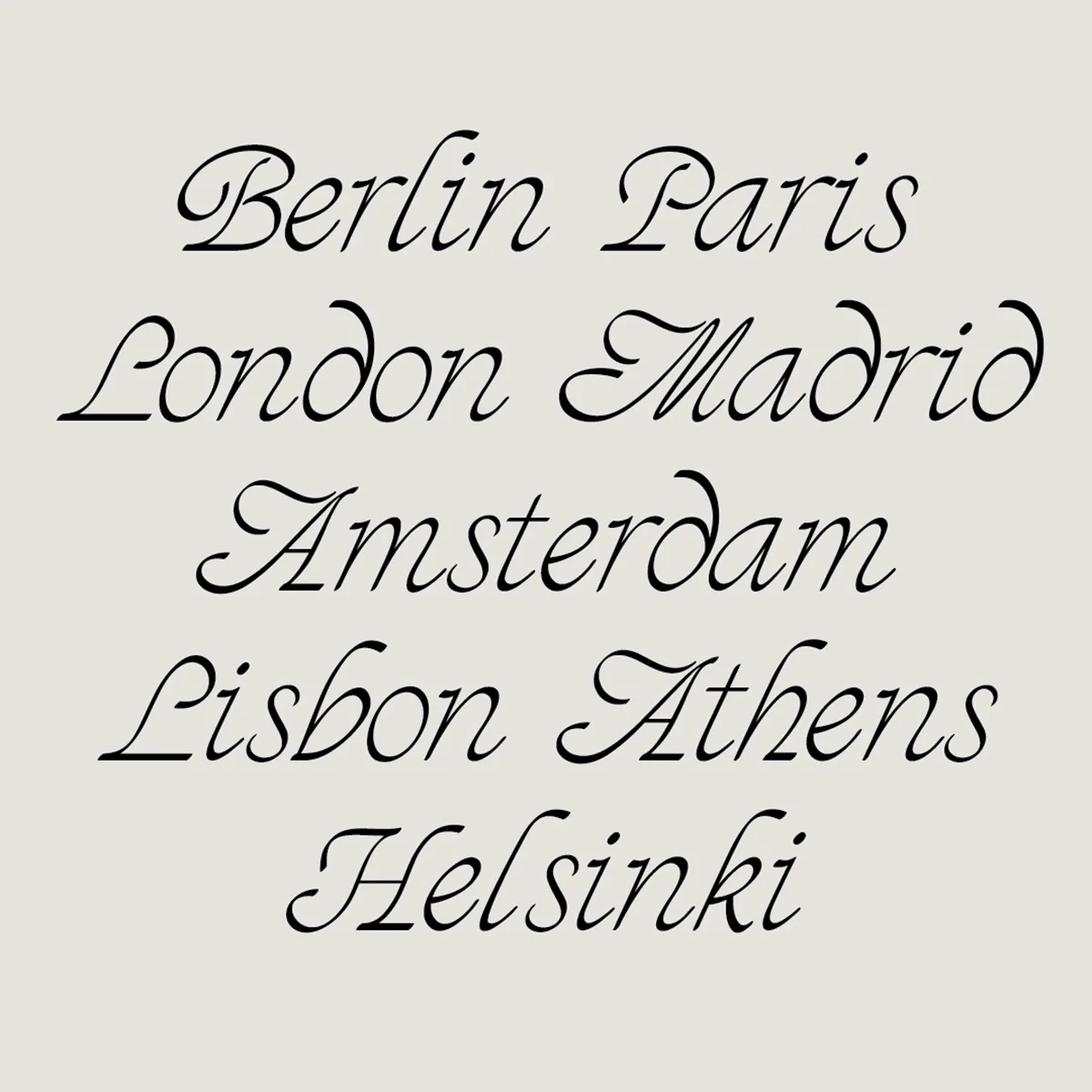
ED Sonar, the third new release from Eko, is an elegant, flowing font inspired by italic roman serif features and classic script fonts. Equipped with stylistic alternates and multi-lingual support, ED Sonar is complete with a set of 30 stunning ligatures, allowing users to craft tons of different combinations.


Lastly, we have ED Vacaville, a lettering-inspired handwriting font. Along with the same features of the ED Daffodil, ED Sonar and ED Begonia, ED Vacaville offers contextual alternates, automatically activated in software such as Adobe Photoshop and Illustrator, and two stylistic sets.
You can head over to Type Department if you’re interested in learning more about Eko’s fonts.


