Typeface design is the industry that knows how to challenge, question, and play with the infinite possibilities of a seemingly finite number of global glyphs. Rosetta Type — a Czechia-based typeface design studio and font distributor — knows exactly what questions to ask in their typographic research, and how to approach answering them. With their reputation built primarily around multilingual text typefaces, their classic typefaces comprise the backbone of their library — for which they provide ongoing maintenance and wider language support.
Their latest selection of typeface releases — an array of expressive, playful, and powerful fonts that remind us that we’re only really scratching the surface of how letters can look and feel. “As designers,” Anna Štepanovská tells us, “we thrive on exploration, seeking challenges outside our comfort zones and occasionally indulging in designs simply for the joy of it.” This can no doubt be felt among the vastly different typefaces — each with its unique design principles and characteristics — which are unified by a natural curiosity for creative inquiry.
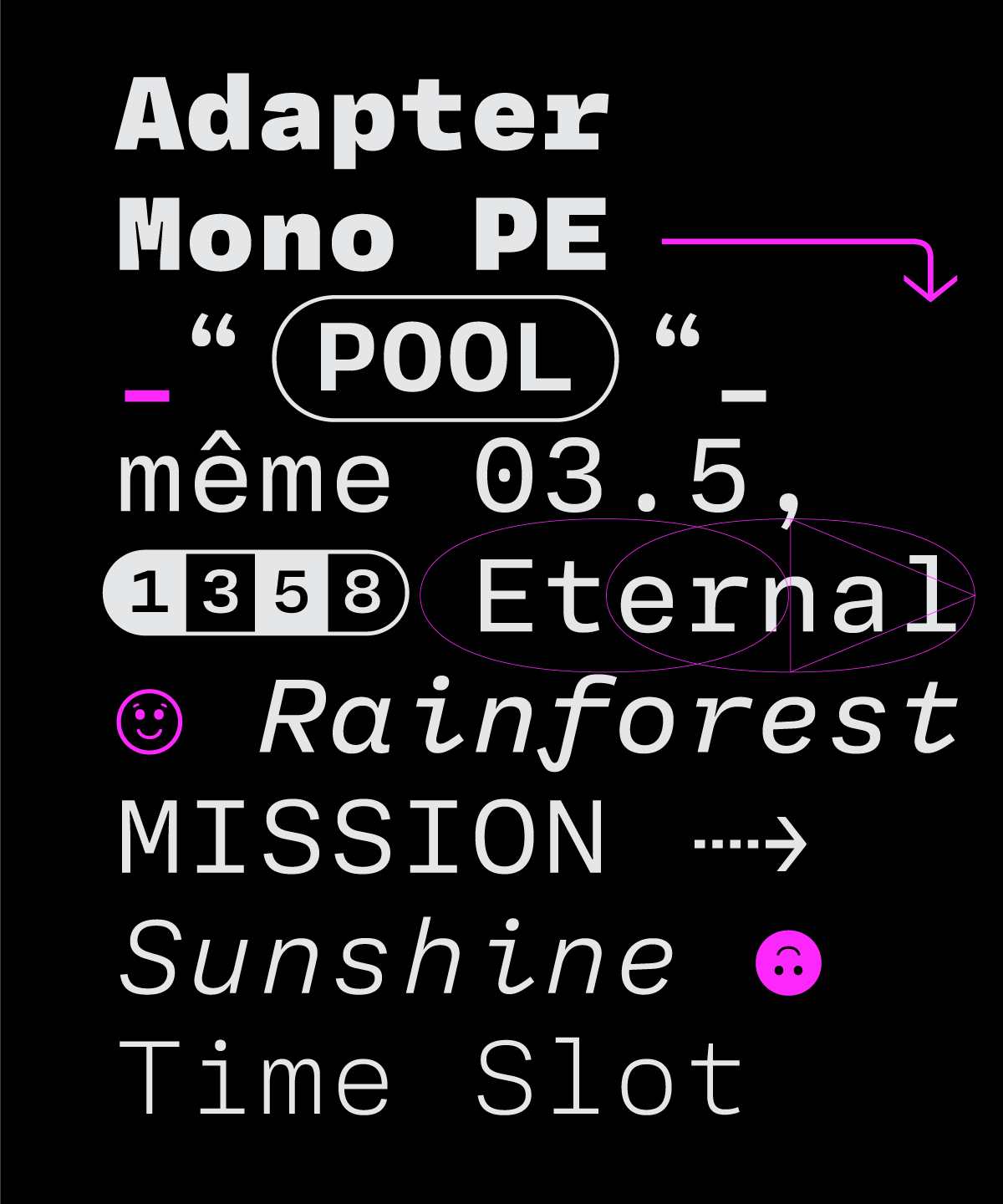
“We were curious to explore the Mono-world,” designer Tania Chacana tells us of Rosetta Type’s newest mono typeface: Adapter Mono. A collaboration between David Březina and Tania Chacana, it is a monospaced type family designed with an editorial state of mind, featuring a wider look than most monospaced fonts. “We think the generous spacing makes it quite suitable for continuous texts,” notes Chacana, where it creates “a more consistent rhythm” on the page. As part of the Adapter family, it maintains consistency with the slightly squarish proportions of Adapter Text.
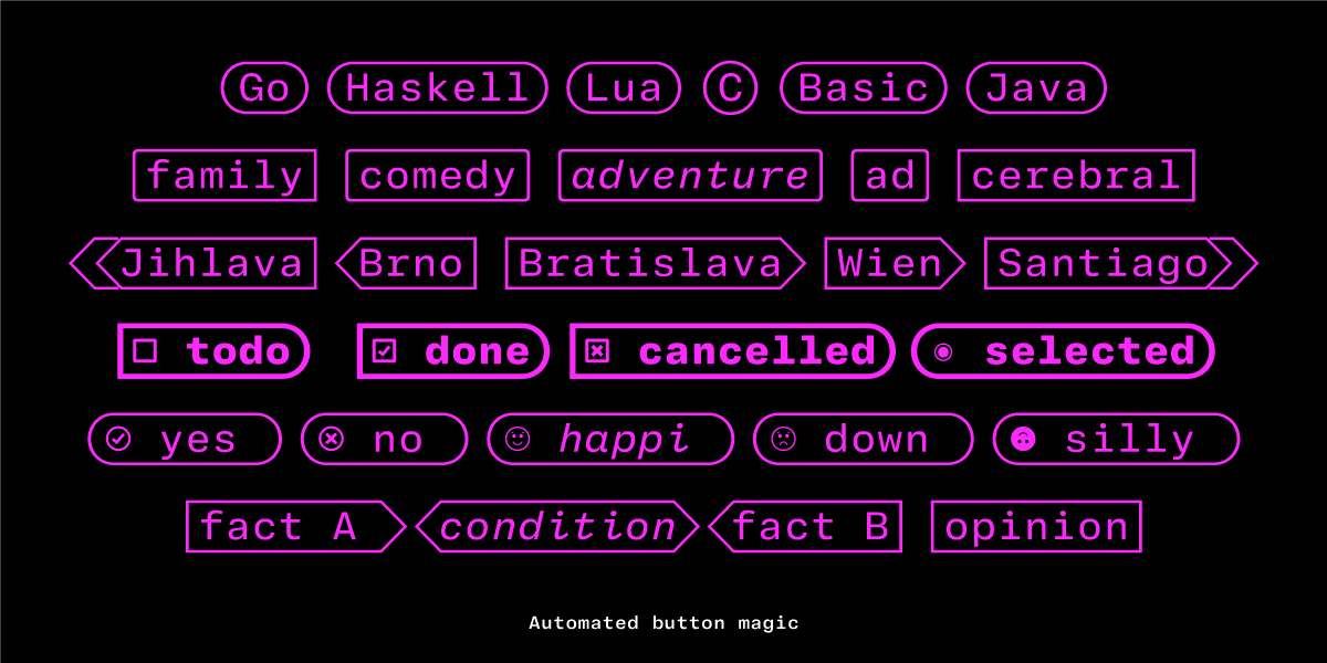
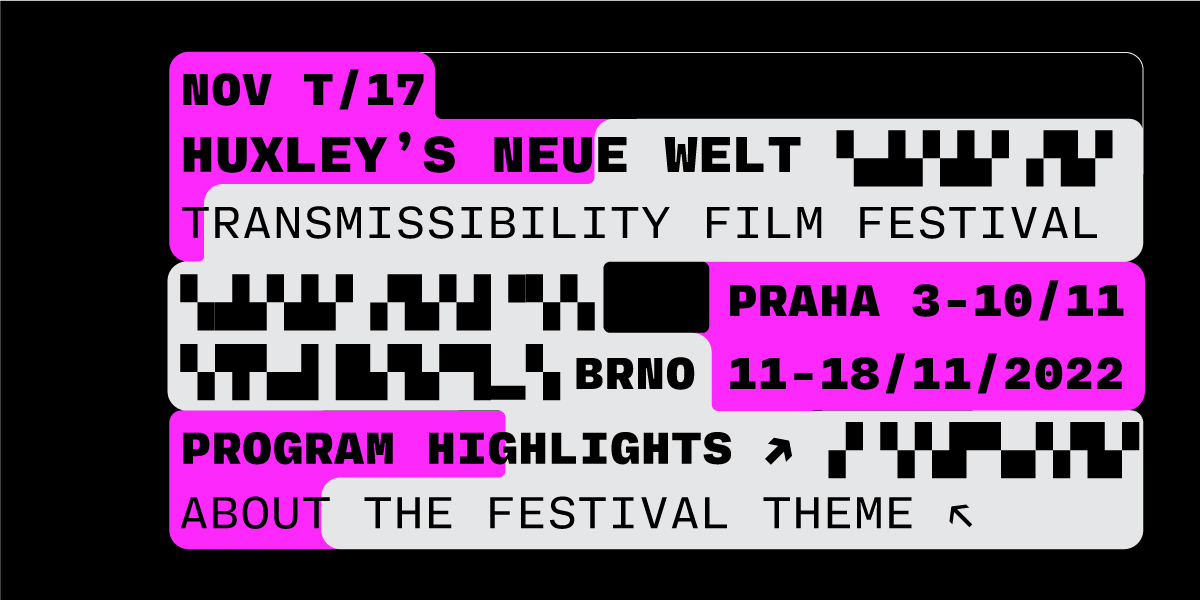
“Additionally, we embraced the ink traps that were already there. We just made them a bit more visible,” Chacana adds. With a range of weights and an italic with cursive alternates, it is optimised for coding but can also be used for a variety of other applications, from ASCII art to text games. “We hope that the next step could be Adapter Mono Arabic,” says Chacana, following their current availability in Cyrillic and Greek.
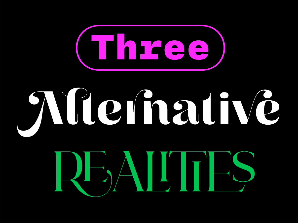
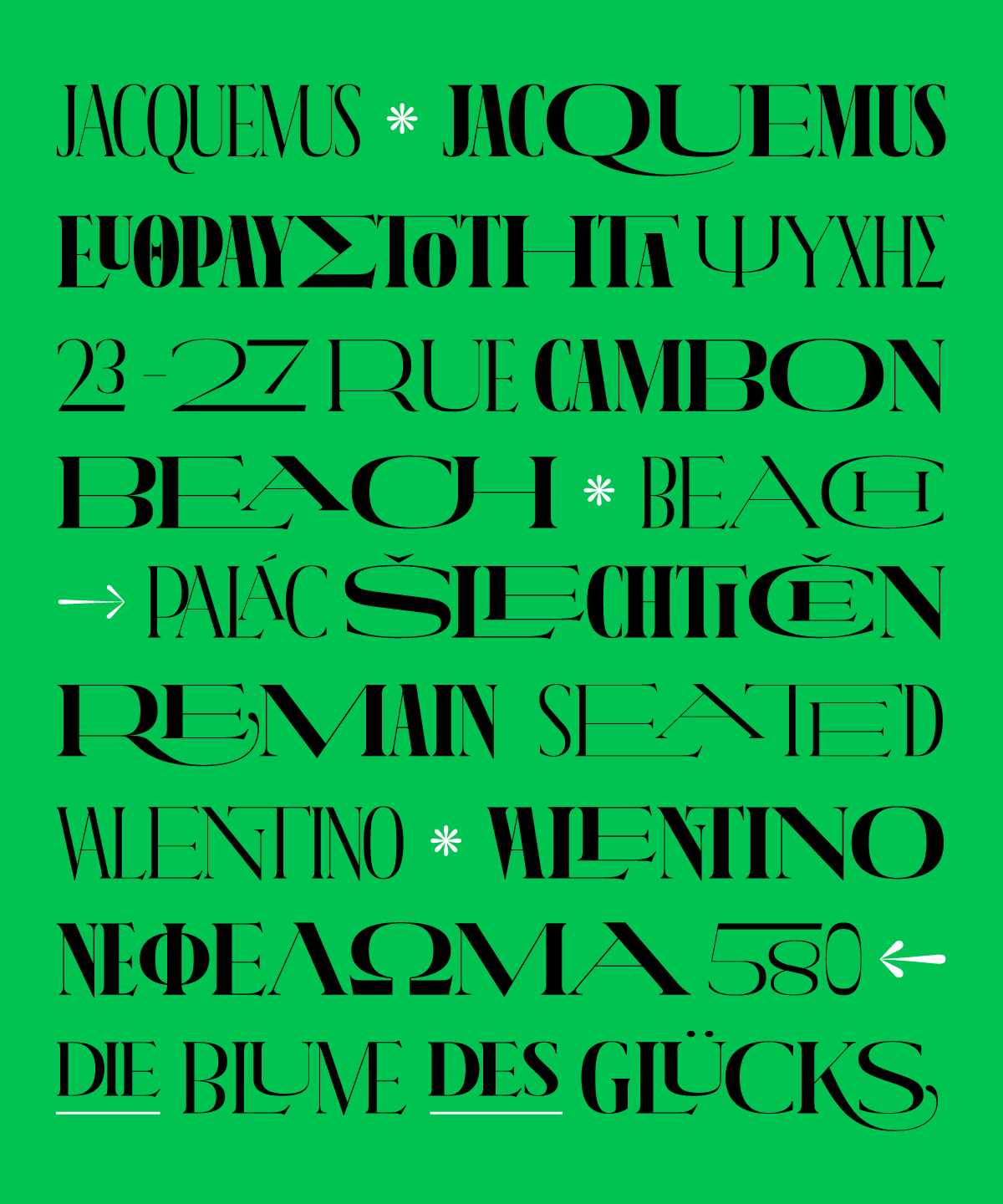
On the other hand, Nova Caps, created by Chacana, is a globe-trotting editorial typeface designed for impact. Inspired by architectural observations and Roman inscriptions, the letterforms are all in uppercase, with petite caps and small caps acting as substitutes for lowercase in various settings. Additionally, it boasts a variety of widths that can be seamlessly combined, offering both versatility and dynamism.
However, the design process was far from straightforward, requiring an intricate balance of creativity and precision. Chacana recalls that it was a journey of trial and error, with a significant amount of time spent on printing, redrawing, and curation of the glyph set. “Another challenge was the organisation and planning of the technical sources. This may sound a bit obvious, but I did not expect this,” she adds. “It started with a completely different file structure. In order to make it all work and in a relatively short time, the file had to be reorganised in a way that would streamline the process, but I would still be in control of the design.”
Created for eye-catching headlines and prominent magazine titles, the designer carefully considered the typeface’s compatibility with other fonts during its design process. “Nova Caps would have to cohabit the magazine pages with text typefaces that need to be simpler and utilitarian in order to work well in smaller sizes,” she explains. “I had to keep that in mind not to make it too decorative in order for it to easily blend with the rest. I had to work with restraint, not to introduce too many idiosyncrasies and mannerisms which can be very tempting in this kind of project.”
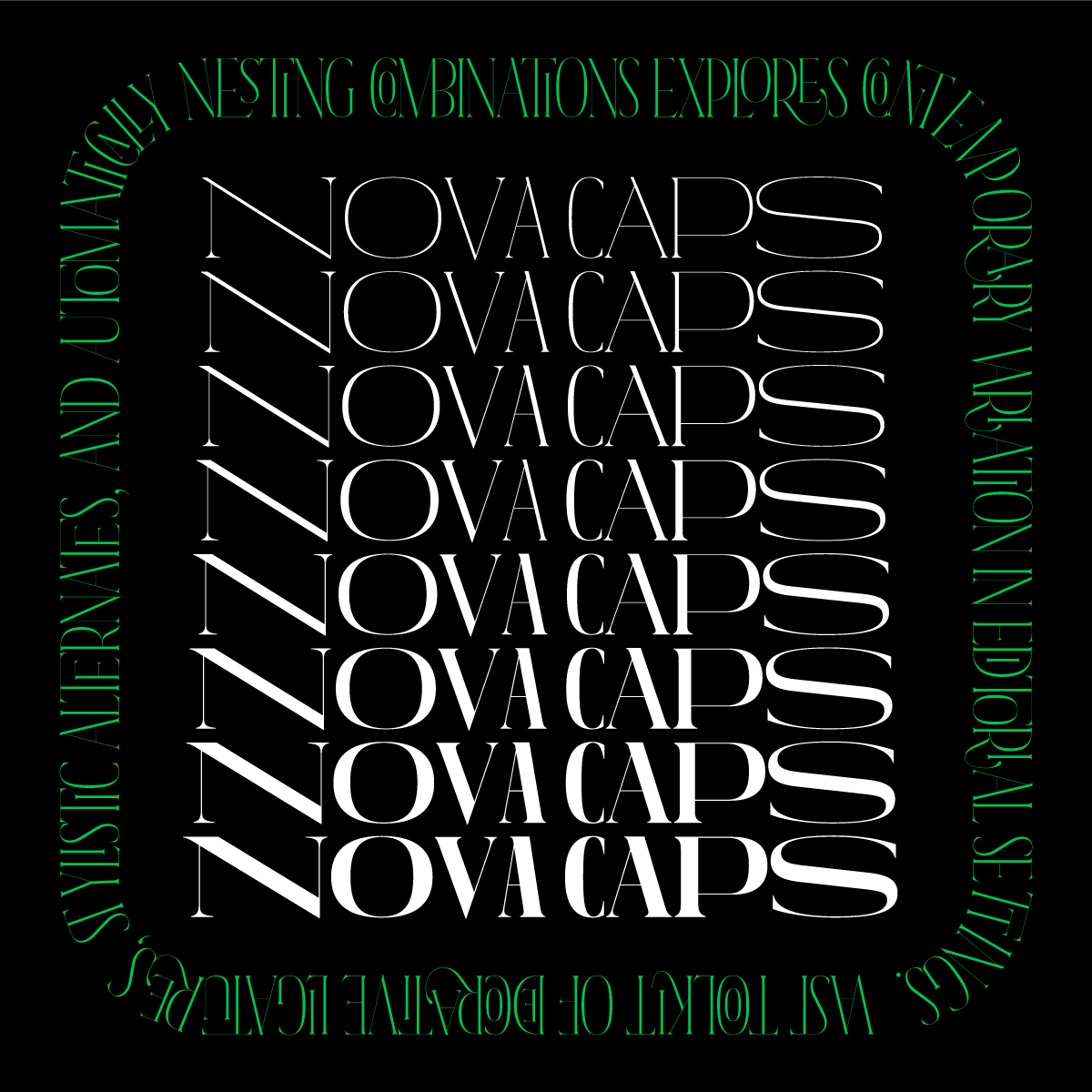
A standout feature is its system of ligatures, contractions, and nestings, which are informed by historical solutions for space limitations in Roman stone carving. “There was no way to correct a mistake without starting all over again,” Chacana notes. “If there was a character missing in an inscription or the stone carver ran out of space, they would use one of these solutions to fit everything in.” Chacana wanted to infuse this historical spontaneity into the digital form – a feat that presented its own set of challenges.
This feature was intricately designed to work across all weights and, with the help of font engineer Johannes Neumeier, even for diacritical characters. Likewise, with its range of styles and weights, it covers Cyrillic, Greek, and Latin scripts.
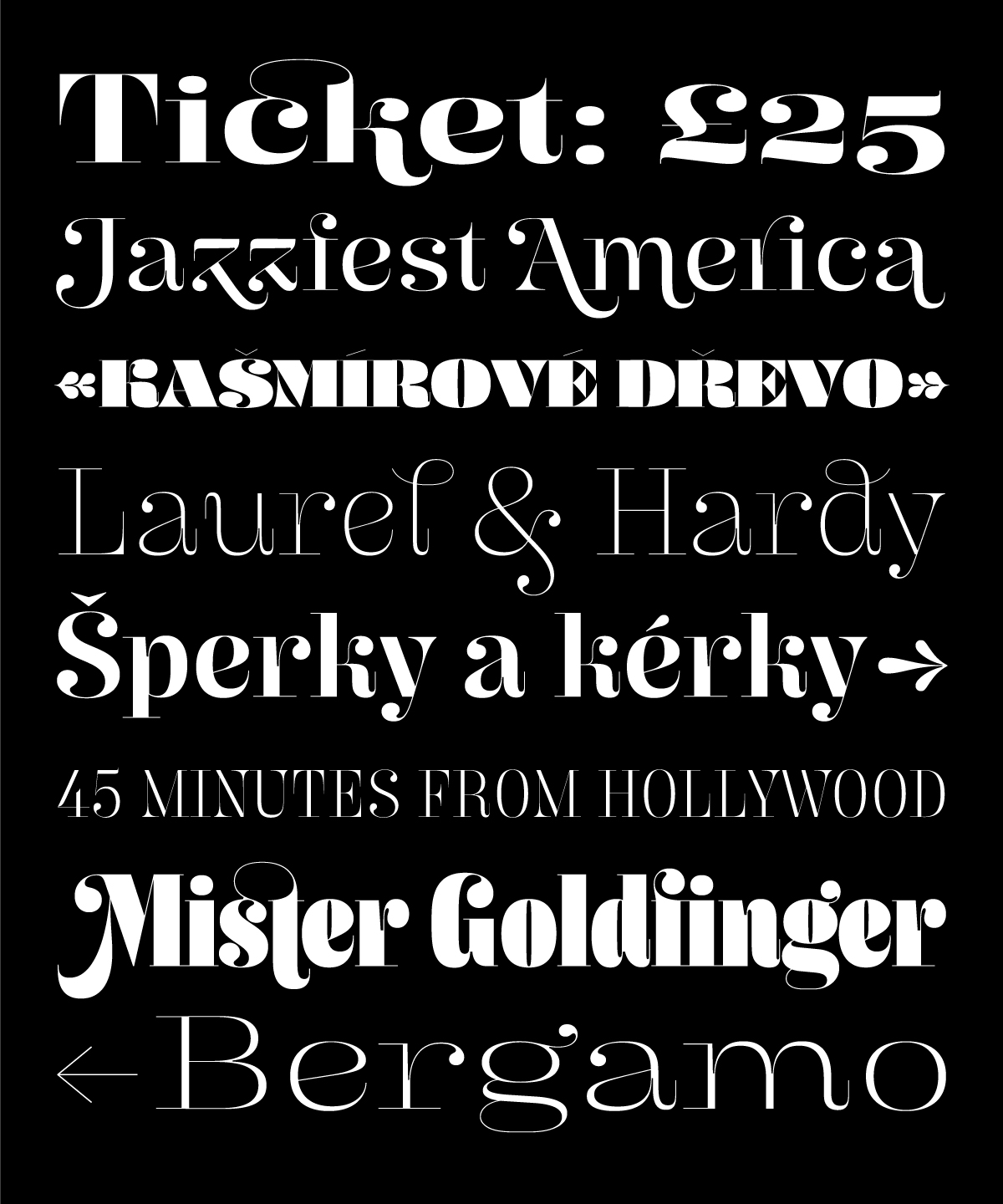
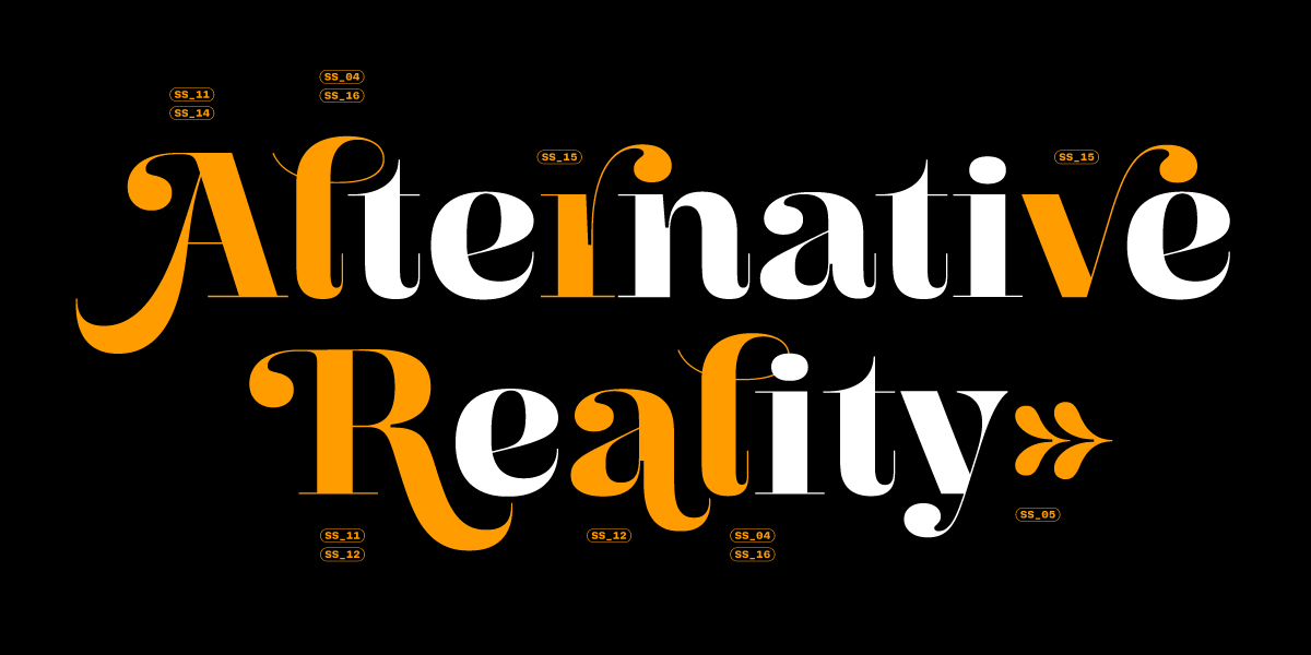
Lastly, Butik, crafted by Anna Štepanovská, is a buoyant Didonesque display typeface that balances fragility and strength in one mighty package. “From the onset,” Štepanovská explains, “I was curious to see if one could combine delicate and spiky thin strokes with bold, chunky blacks within a single stylistic space, and how the role of the thin hairline, thick wedge serifs, and ball terminals would change.” As a high-contrast typeface available in extreme weights and widths, this presented the biggest technical hurdle: “the smooth interpolation between distinct extremes.”
For example, ball terminals that are small droplet-like dots in thin weights transform into much larger ones in heavier weights, sometimes occupying up to a fifth of the entire letter. Moreover, the junctions of diagonals posed a significant challenge, especially when the width and weight changed simultaneously, or in the thin weights where even a single-pixel difference becomes quite noticeable.
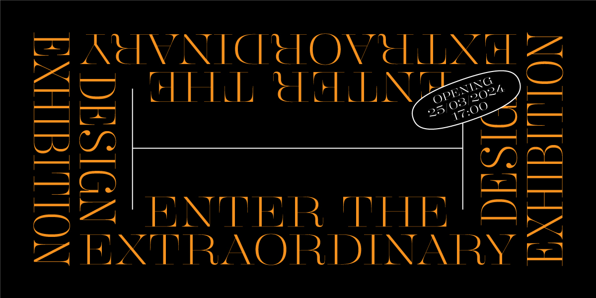
The creation and refinement of the typeface was an ambitious journey that unfolded over nearly three years, involving intermittent work phases that cumulatively equated to about a year and a half of full-time effort. As a distinctive Didone, the typeface was aptly named to mirror its unique persona – it’s not only decorative and elegant, but also carries a hint of delightful quirkiness. “‘Butik‘ is the local (Polish and Czech) spelling of the word ’boutique’,” Štepanovská explains, “which is more direct than the classy French version.”
Rosetta Type continues to innovate in the typeface design field, creating a diverse array of dynamic typefaces, each with its own rich backstory and process. In a nod to their history, the foundry has rediscovered a forgotten collection of specimens in their studio and decided to give them away. For those eager to snag one, the first two specimens per person are available for free, including shipping. For three or more, shipping will be charged.
Don’t miss out!
Read more of our type foundry features here.

