
The new variable font blends fresh with familiar, drawing on inspiration from mid-century industrial designers and injecting flexibility into an aesthetic of ‘deliberate conformism.’
Before putting pen to paper, Loew was a typeface that Jonathan Hill, a self-taught graphic artist and Founder of The Northern Block (@northernblock), would never have dreamt of making. When he was approached by a Newcastle-based studio seeking corporate regularity, the goal of neutrality was a far cry from Jonathan’s usual approach—which had, until now, mostly consisted of experimenting with outlandish music-related typographies while freelancing in Sheffield.
Despite his initial unease, Hill was drawn in—completing the first version of Loew in 2014 and naming it after the father of industrial design, Raymond Loewy. Strangely enough, as a typeface boasting definitive regularity amidst eccentric geometric forms—such as Borda, Hefring Slab and Luminare—Loew holds its own with ease and finesse. ‘It’s funny’, Jonathan says, ‘but you can’t actually explain why you like it.’ Users on Behance apparently agree: their appreciation is extensive but nonspecific. One comment simply reads ‘yeah, just yeah.’
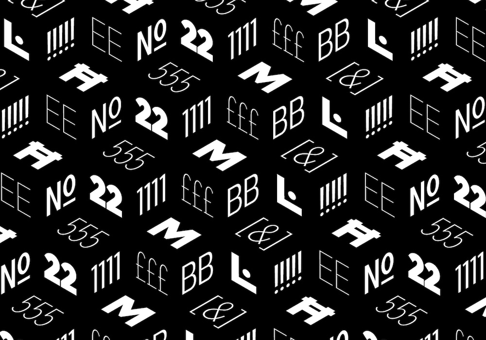
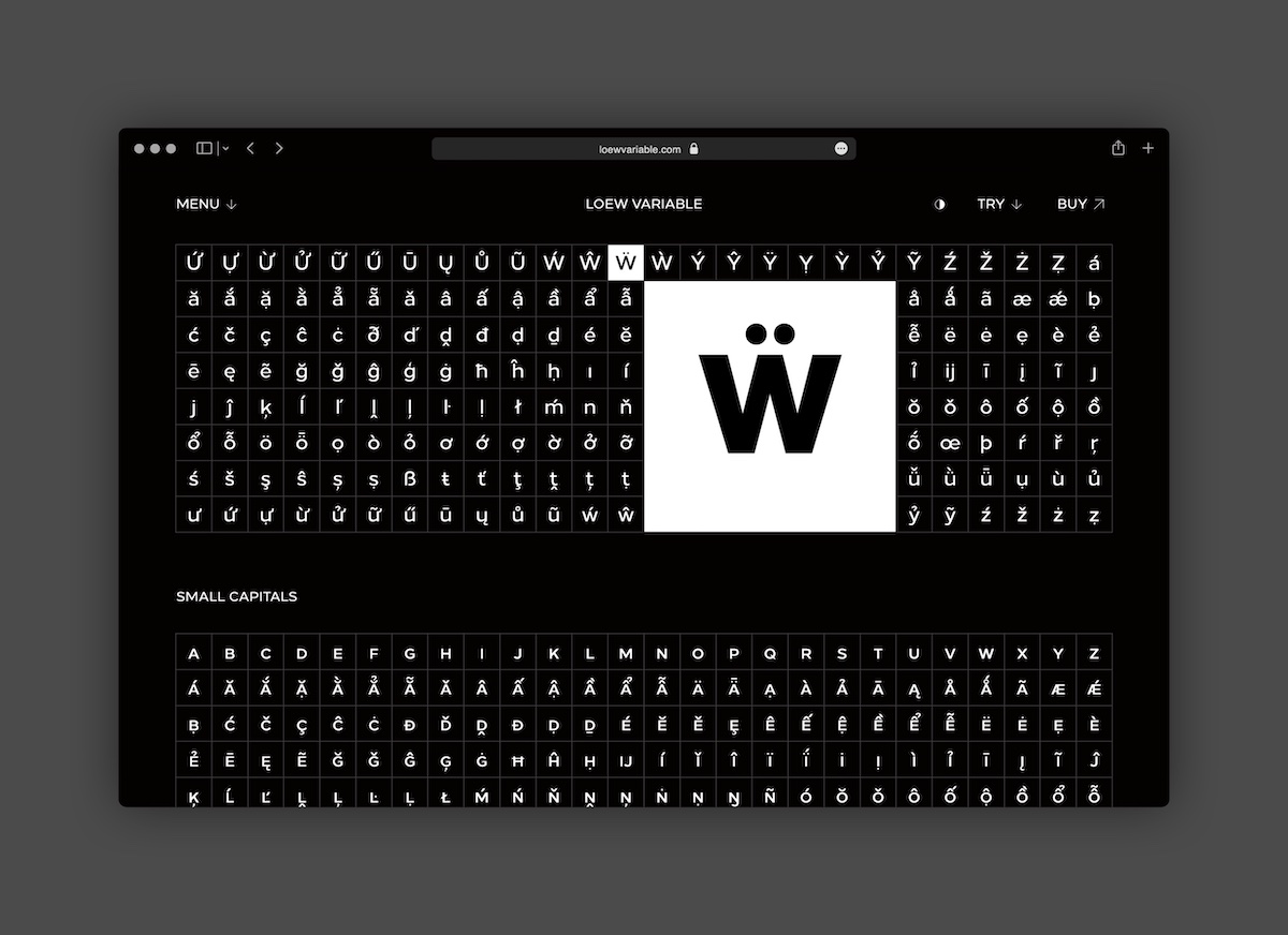
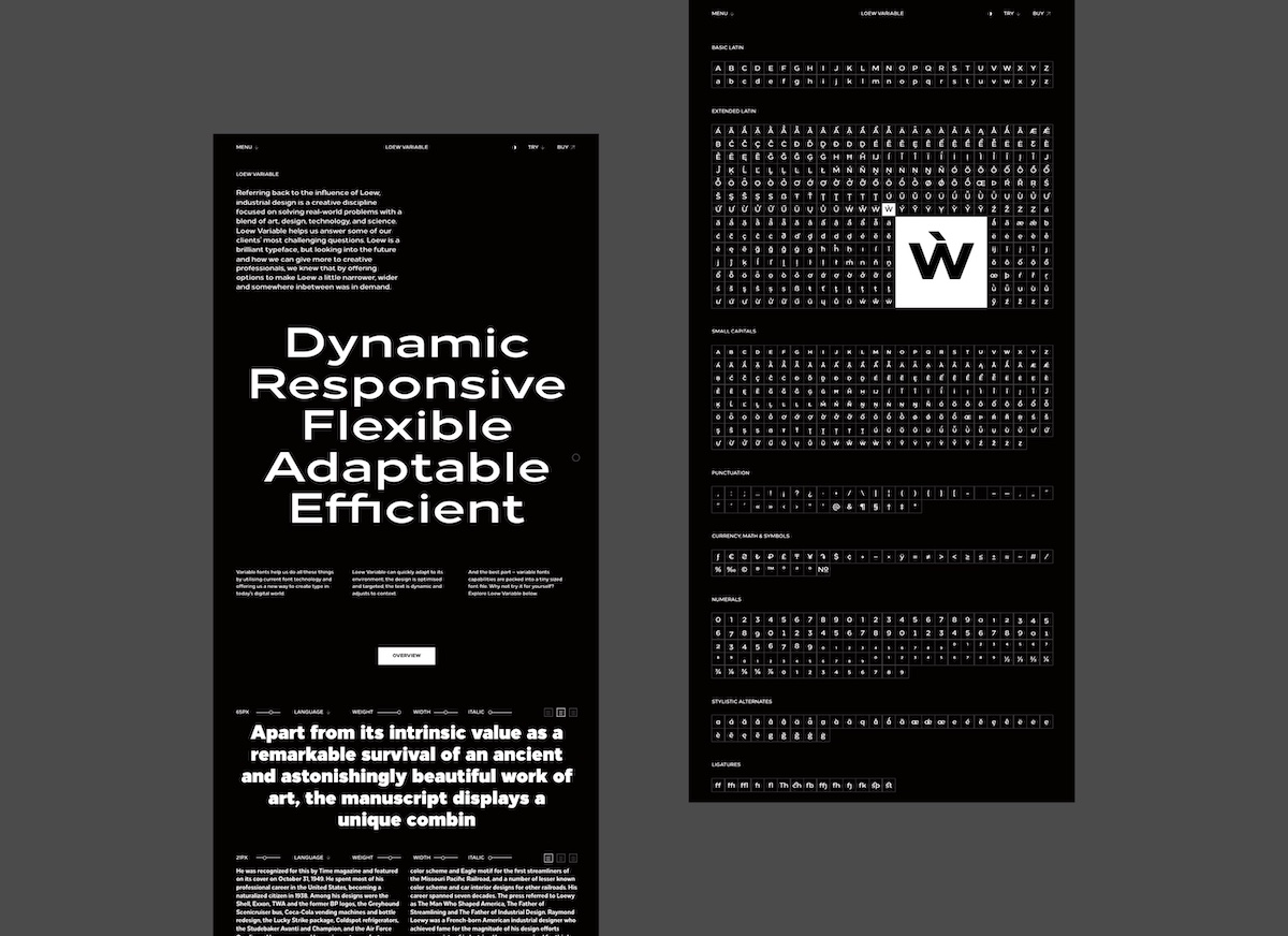
So how is this spark achieved? Expressed through pure mechanical shapes, carefully adjusted to give the characters the right form, function and usability, Loew was both an alien brief and an opportunity to expand; to come up with a typeface that is universally liked and universally applicable. The versatile sans serif font is built on simple and honest geometry, aimed at a wide range of modern applications. Details include over 800 characters with alternative lowercase a, e and g; seven variations of numerals; true small caps with accents; manually edited kerning and Opentype features. But Loew’s appeal has to be more than the sum of its parts.
The font’s conception, Jonathan admits, did not come to him immediately; in fact, Loew’s clean, modernist aesthetic was the product of heavy research. Deciding to take inspiration from the industrial designers of the mid-20th century, Loew’s name honours Raymond Loewy, also known as the ‘Godfather of Streamlining’ or ‘The Man who Shaped America’. Preceded by the Art Deco movement and its popularisation of sleek aerodynamics, Loewy’s design portfolio is expansive—steam locomotives, railroad systems, cars, liveries, commercial household products, jukeboxes and Coca-Cola vending machines. His works, though brilliant, weren’t renowned for their grandeur, iconoclasm, and non-conformity. Instead, they indulged in standard applications of good industrial conventions. His work was efficient and unadorned: his architecture purposeful and inoffensive. His style captured the character of a society in mourning following the Second World War—now desperate for a new kind of understated modernity in its shattering aftermath.
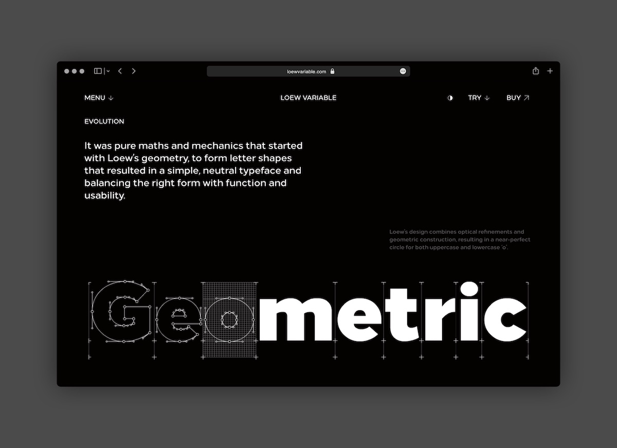
Loew’s geometry began with pure maths and mechanics to form letter shapes that resulted in a simple, neutral typeface that balanced form with function and usability. First came Loew Neue, a custom typeface created for Vauxhall Motors, then came Hilton Worldwide. These relationships opened up a whole new level of inquiry that went beyond design and into the realms of science and engineering, by questioning whether the shapes could be sturdier, less mechanical and match complex writing systems such as Arabic, Chinese, Japanese and Korean. Loew had the potential to offer all these things and more.
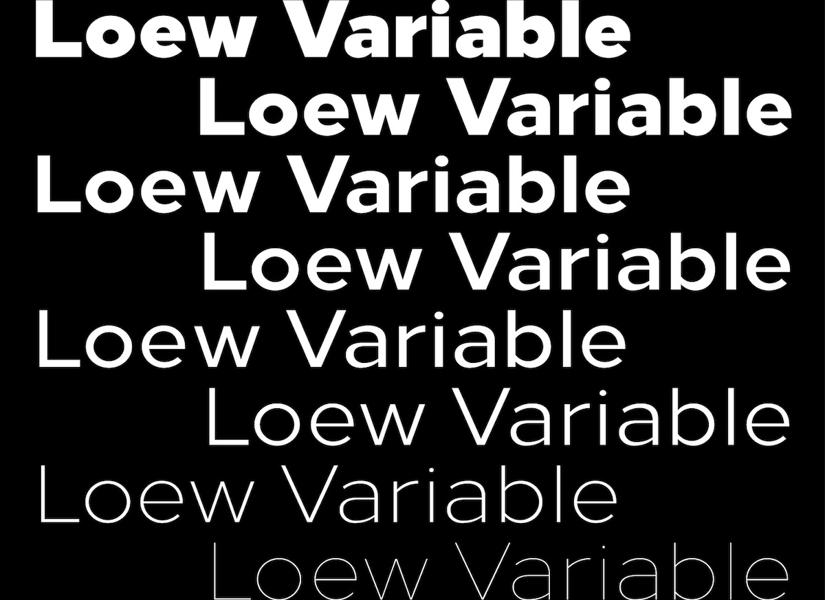
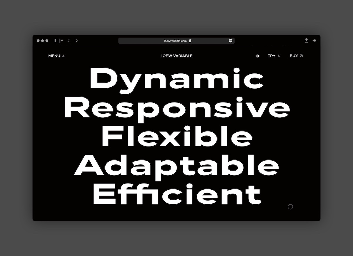
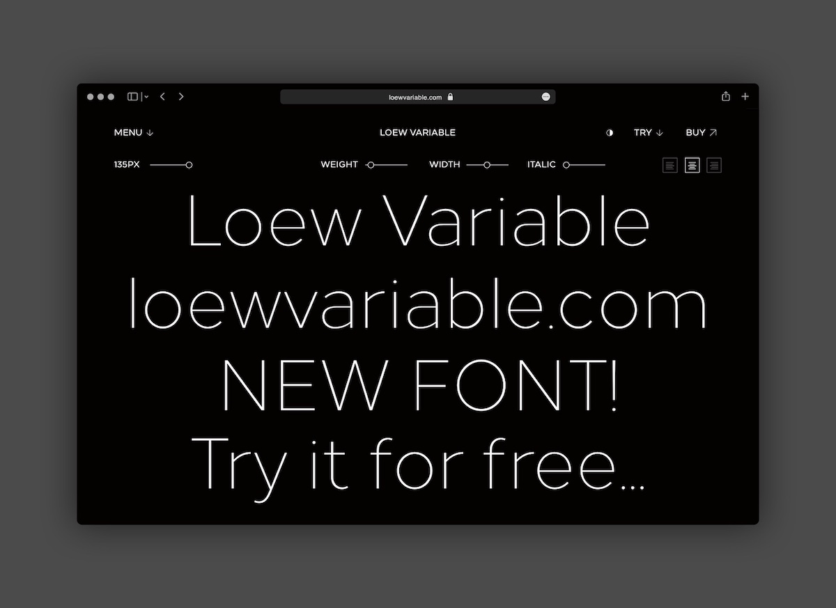
As the latest installation of Loew, Loew Variable blends fresh with familiar, giving creatives the option of making Loew a little narrower, wider, or somewhere in-between. It can quickly adapt to its environment: the design is optimised and targeted; the text is dynamic and adjusts to context. Formed in response to truly understanding how creatives currently use Loew, The Northern Block—in collaboration with world-leading brands—has come to understand its place within the market: offering a brilliant variable option that gives flexibility to creative professionals.
With humility at their core, both Loew as a font and The Northern Block as a practice strive to respond to the ever-changing environments in which they exist. Loew’s omitted ‘y’ is just one symbol of the font’s resistance to being restricted by the past. As Hill explains, ‘It also embraces that all-important dimension of contemporaneity which innovation always demands…I was trying to make something new and fresh, not just paying homage to a single chapter in time.’
Thank you, Jonathan, and the team at The Northern Block, for sharing more about Loew. Loew Variable, alongside Loew, Loew Next, and Loew Next Arabic, is available now via The Northern Block’s font shop.


