
Right now there’s tonnes of newly released, gorgeous fonts landing over at our sister marketplace, Type Department. From experimental displays to classical, confident serifs, Type Department have all sorts of exciting stuff to check out. So, we decided to give you a round up of our top 10 new releases and the creators behind them…
Tegamitype — 50% off with discount code TEGAMITYPE50
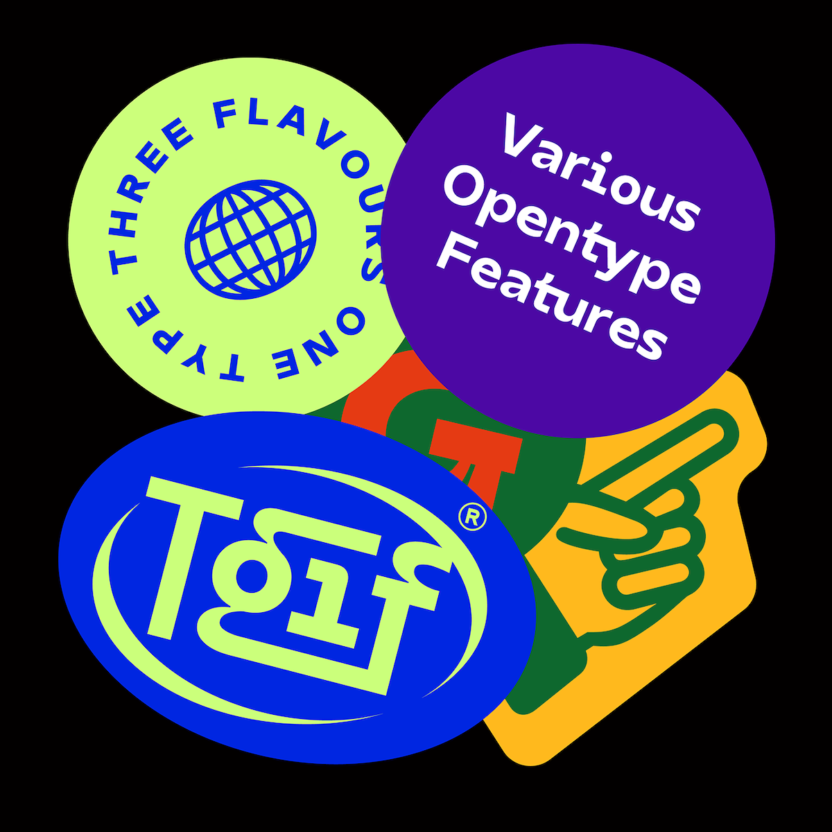
Based in Jakarta, Indonesia, Tegmitype is an independent type foundry and one of the latest sellers to join Type Department. ‘Our goal is produce high quality typeface systems with a large range of possibilities and extensive support language’, say the foundry, and their latest release, TG Praktikal, certainly does the trick. An extensive modern geometric sans with 8 styles to choose from, TG Praktikal draws inspiration from ‘geometrics and gothic typefaces like Bell Centinel, Whitney, and Metric with a touch of monospace characters‘, meaning its unique form is perfectly suited to body text settings. With 3 flavours to provide different impressions, including approximately 90 multilingual features and various OpenType features, this is one to get your hands on… And, be sure to check out TG Haido Grotesk and TG Frekuent Mono while you’re there, too.
Ellen Luff Type Foundry
Another exciting new seller on the scene is Ellen Luff Type Foundry with their confident new serif, Larken. Boasting tonnes of versatility, Larken melds organic curves with gentle repetitions into a harmonious, usable typeface. ‘Designed to reflect nature,’ the foundry explain, ‘it creates a sense of natural softness and expressiveness. The designers pushed the concept into usability focused direction, to work as a bold tool and beautiful communicator’. Whilst at larger scales the type invites you to appreciate its stunning shapes and curvatures, its refined structure renders it a stunning option for longer body text settings. To find out more, check it out here.
Peter Roeleveld
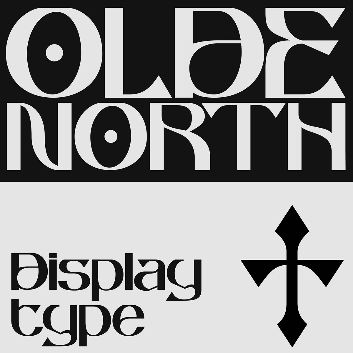
Peter Roeleveld’s Oldenorth has got be another favourite. A display typeface focussing on legibility form a mid-distance, Oldenorth also has a uniquely decorative character. As the designer expands, Oldenorth‘s personality comes with ‘Low Caps-Height, flat surfaces on each glyph, a few unique glyph designs (m,k) and a combination of soft curves and sharp strokes/endings, making it both dangerous and elegant overall’. These stunning features also make it possible to kern the glyphs tight together, which is an excellent feature for users.
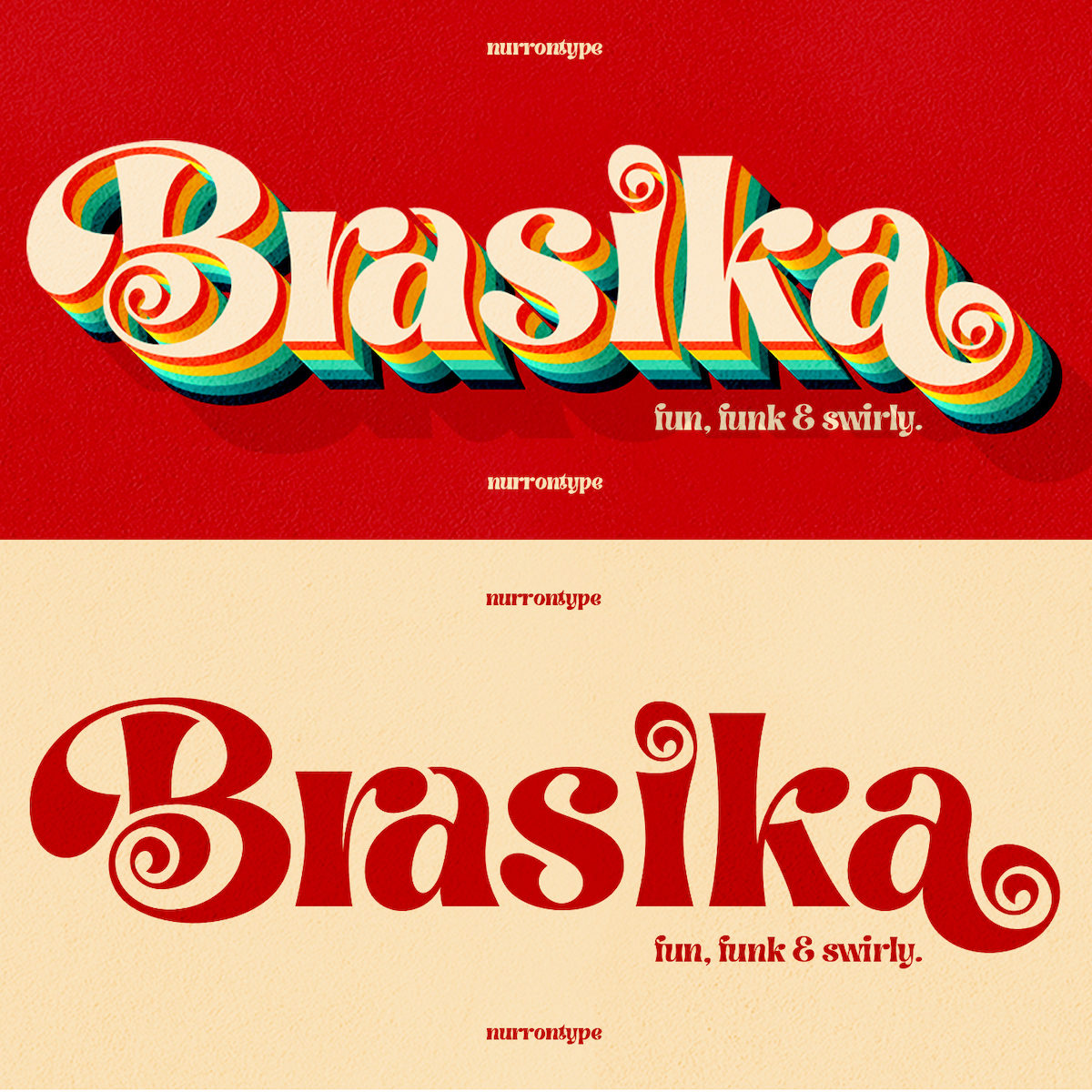
Nurron Type
Former tech magazine editor turned type fanatic, Nurrontype is the creator of the fun, swirly font, Brasika Display. Created with tonnes of versatility, Brasika Display knows just how to adapt to your needs and will make a nostalgic yet fresh addition in a whole range of settings. Its playful, upbeat tone alongside its highly stylised anatomy brings joy wherever it goes. Well suited to a range in scenarios including logos, magazine titles, Christmas greetings cards, wedding invitations, Instagram feeds and much more, Brasika Display‘s 476 glyphs and various features will make a stunning impact in your next project.
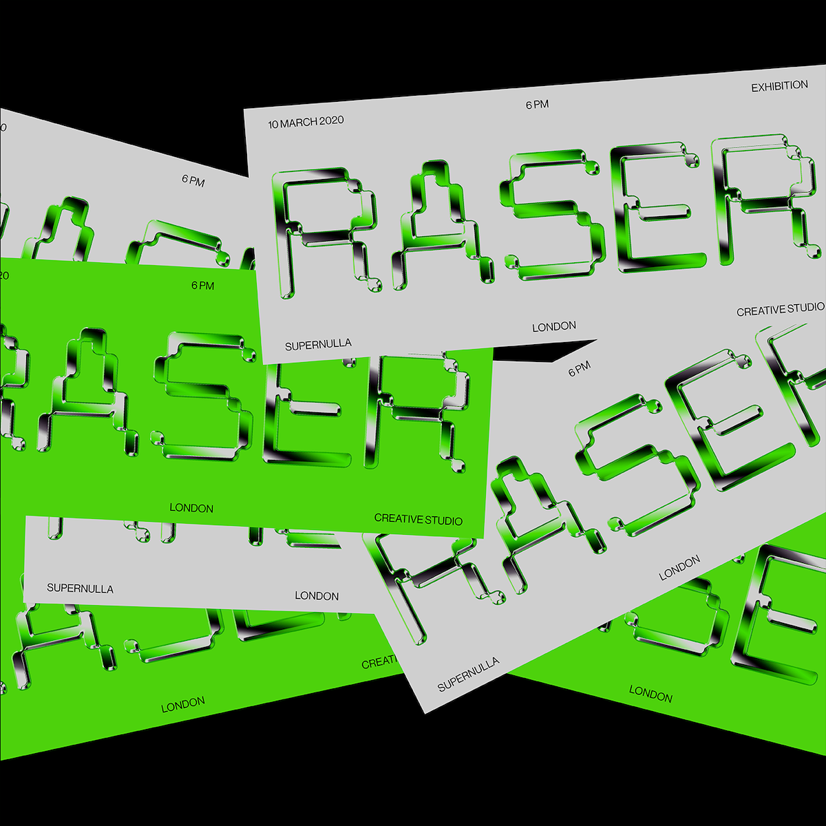
Supernulla Creative Studio
‘Pexel Grotesk was born, like most other fonts, playing around with shapes and letters’, say creative studio, Supernulla. Driven by a desire to fill the gap for pixel fonts with the right proportions and a distinguished sense of character, Pexel Grotesk aims to ‘imitate the letter dimension and proportion of a grotesque type while remaining inside its strict grid’. With individual quirks such as the rounded edges, Pexel Grotesk is unusual for a pixel font and thus endlessly engaging… With a total glyphset of 236 and various features, it’s super refreshing to see such a well constructed pixel font on the market. See more here!
Fer Cozzi
Buenos Aries-based graphic and type designer, For Cozzi is the creator of the stunning new addition to Type Department, Tomasa; a contemporary typeface inspired by urban visual and musical subcultures. ‘The formal explorations of the characters are an interpretation of the letterforms used on the street scene, in an attempt to praise and evoke the peculiarities of graffiti and urban tags’, the designer says. With four structural variants for each letter, Tomasa‘s construction represents the ‘diversity, dynamism and rhythm of musical genres such as rap, hip hop and trap’. With a total glyphset of 473 and a range of OpenType features, Tomasa‘s definitely one to get your hands on.
Ognjen Gligorijevic
The new release from Serbian graphic and type designer Ognjen Gligorijevic, Aremia is a stunning, refined serif typeface inspired by late Renaissance-era type with a modern, unique twist. The delicate kerning and wide counterspace creates a comfortable, gentle effect which is both classical and subtly unexpected. Currently offered in Regular style, the typeface includes 262 glyphs, multilingual support as well as specialised kerning… And, Aremia‘s careful construction means it works well for both big and small point sizes, making it a valuable and versatile addition to the your collection. Check out Aremia on Type Department to find out more.
Nicolas Desle
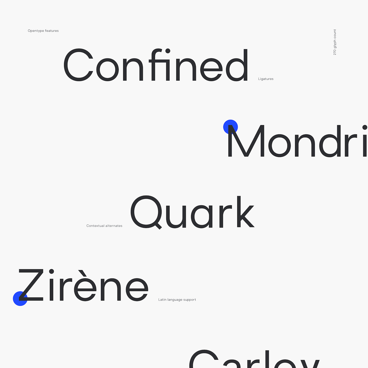
Nicholas Desle is a freelance digital designer based in Antwerp and the creator of the brand new geometric sans typeface, Brasley. Spaced and mastered for optimal readability, Brasley’s usability is extremely diverse. Available in 6 weights (bold, semibold, medium, regular, light and thin) each weight has its own corresponding italics. Equipped with contextual alternates, ligatures, fractions, arrows and shapes and with a glyph set of 270, Brasley is excellent value making it a stunningly well-rounded addition to anyone’s type collection.
Kenan Nasibov
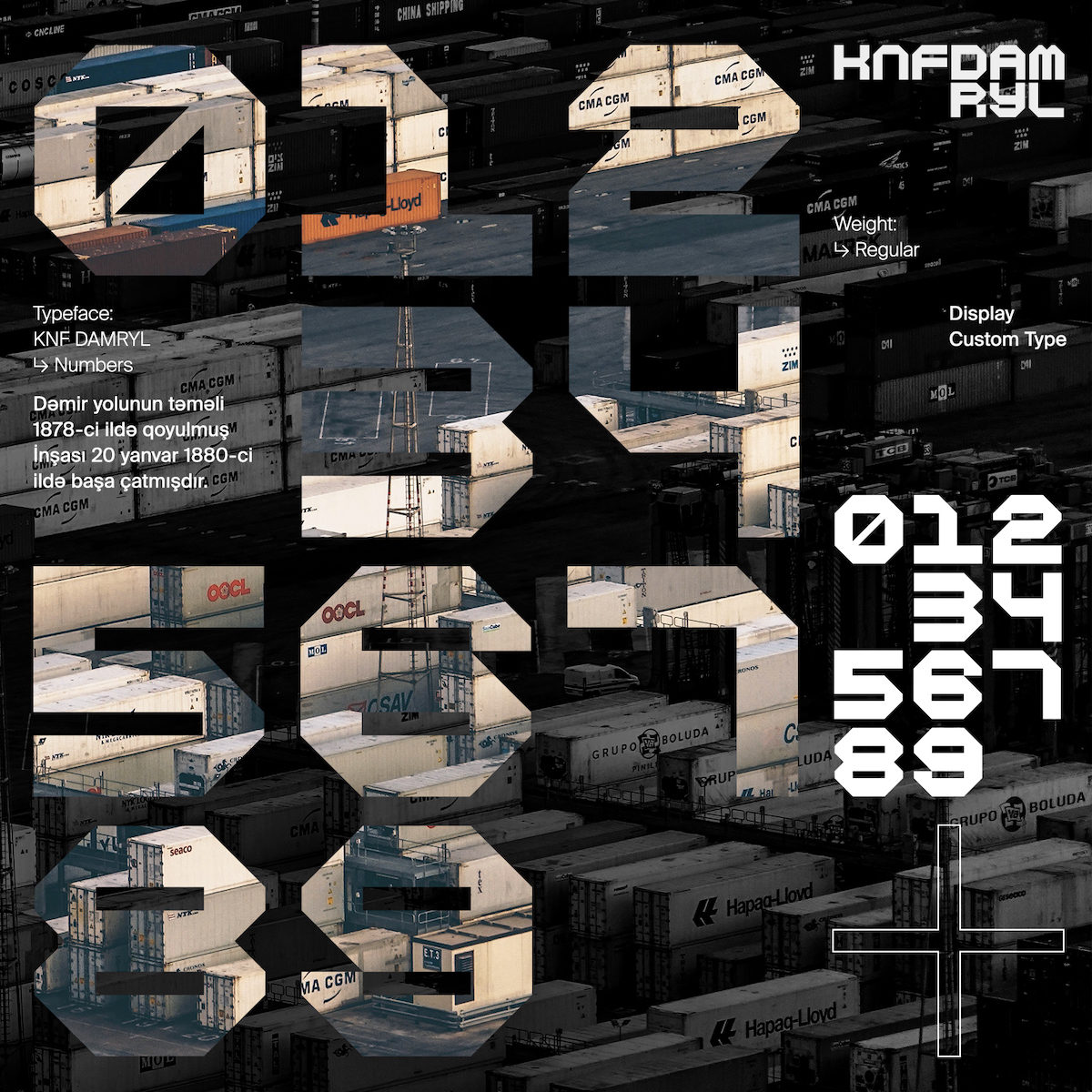
KNF Damryl is a new, monospaced display font with modern geometric sans features. Created with inspiration from geometric and postmodernist typefaces such as Gridnik and FRAC, KNF Damryl packs maximum impact and would be well suited to adding dimension and power to headlines, posters, magazines, logos in large and medium point sizes. You can check it out here.
Blanco Letters
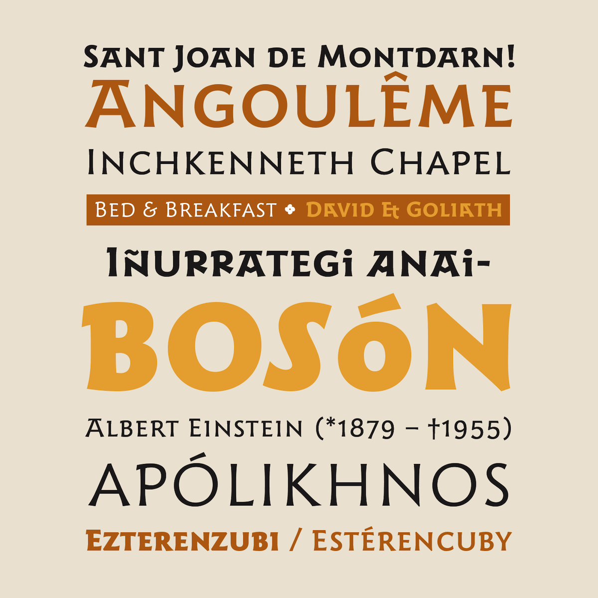
Creators of Karela, Harri Text and Harri Display, Blanco Letters are based in Spain and specialise in type design, graphic design and calligraphy. Harri means ‘stone’ in Basque language and Blanco’s newest release on Type Department, Harri Display, is based on ‘the peculiar letterforms used in signs and fascias all over the Basque Country’. Entrenched in local history, Harri Display draws on these letterforms which ‘evolved from ancient inscriptions carved on gravestones which can still be found in the French part of the Basque Country ‘. With a total glyphset of 872, support for upwards of 200 languages and an accompanying text style – Harri Text – the Harri family is a vast, versatile and meaningful new addition.
We hope you love these new additions as much as we do! Check out Type Department to see more.


