
While Daan Rietbergen believes leaning into variable fonts for their dynamism and flexibility is going to be of great importance in the type world to come, he’s hasty to add that what seems more important—despite a fast-paced design culture that leaves many creatives scrambling to become as ‘multi-skilled’ as possible—is that people dig deep into their specific area; that they become highly skilled in their niche, without trying to do it all. For him, it seems creatives should be prioritising ‘Working together with people who excel at what they do, and who can offer something that will make the project you are working on better… You can’t be good at everything,’ he adds.
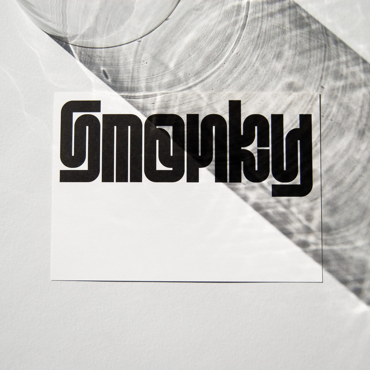
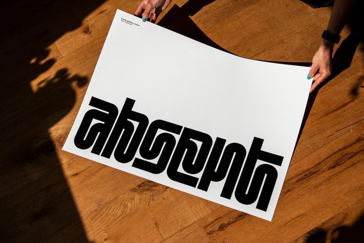
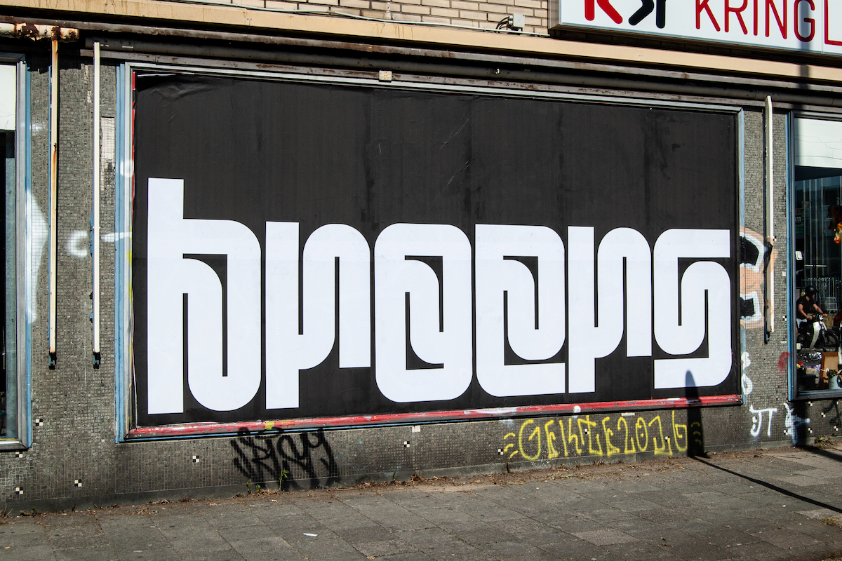
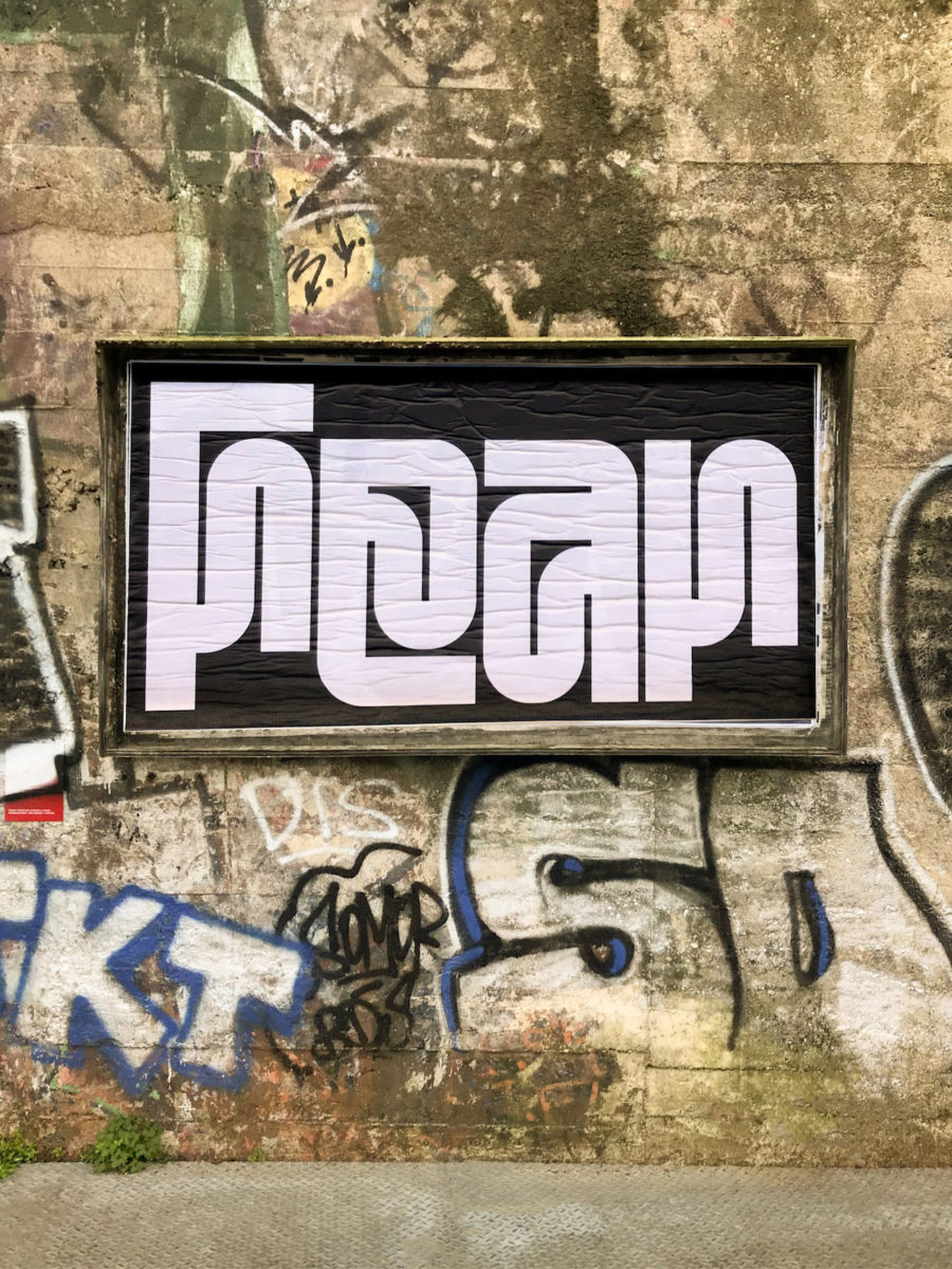
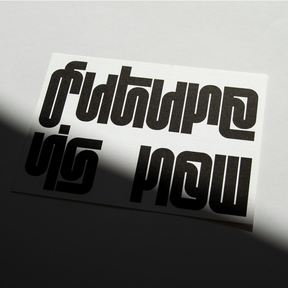
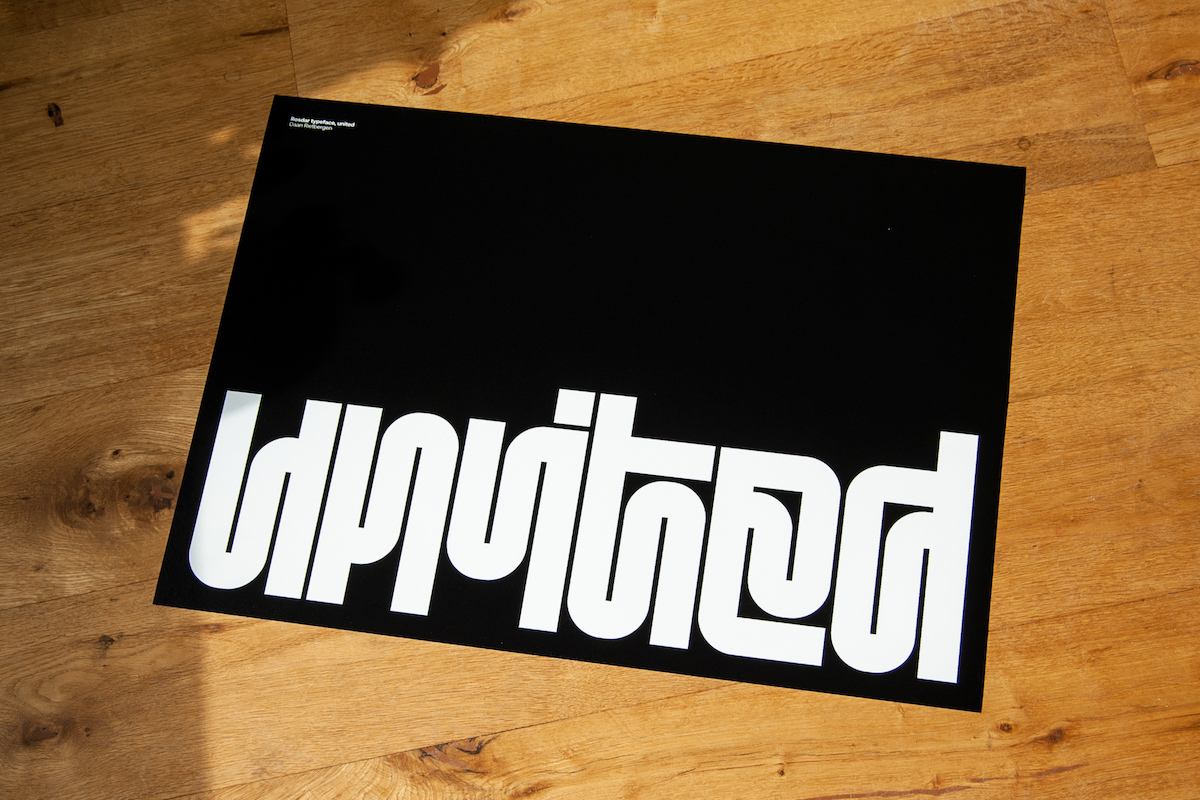
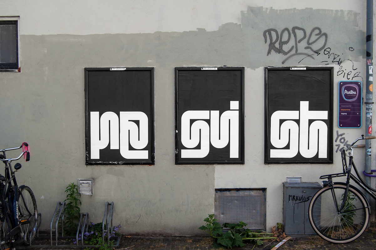
Daan’s latest typeface, Rosdar, which he is choosing to sell exclusively in printed form, is threaded together with an undulating movement in all the characters to create solid, dynamic shapes throughout words. The typeface is designed with ‘Black on white or white on black’ in mind, and the designer says he envisions it ‘placed at maximum width and preferably as one word at the bottom of a print, depending on which letters are being used… Or even better,’ he adds, ‘as a large wall painting or a poster in public space.’
‘With the Rosdar typeface,’ Daan continues, ‘the idea started with the lowercase “r”, where I wanted to exaggeratedly enlarge the ear/terminal of the “r” to see what would happen. After that, I tried to do the same with the belly/bowl of the lowercase “a”…The typeface [which has a Latin glyph set] is not consciously inspired by other languages or scripts, but many people see similarities with languages that I did not know, such as Armenian, Cambodian and South Indian scripts such as Malayalam and Telugu.’
Despite the times, Daan is choosing to sell Rodsar exclusively as printed matter. It seems an interesting choice at present, when so much current and future typographic work seemed steeped in demands for motion, UX/UI, or AR and VR. ‘As most type designers sell their typefaces digitally, I prefer to sell them as printed matter,’ he says. ‘It means Rosdar prints will be unique and if someone wants a custom Rosdar print, they will have to come to me.’
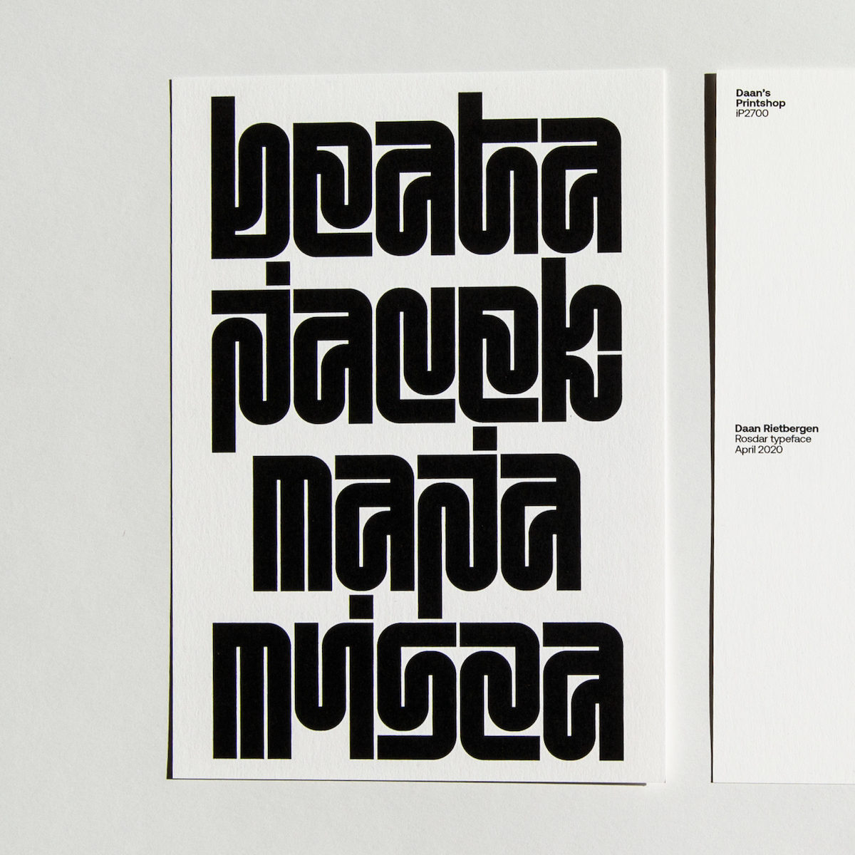
‘Next to that,’ he adds, ‘I find it difficult to sell it digitally and to see it being used in a way that in my opinion is not the way it should be used, and I don’t like the fact I’m no longer the full owner.’ The creation of Rosdar began when quite a few of Daan’s projects were cancelled due to the pandemic, and the decision to distribute is as printed matter coincided with his project “Daan’s Printshop iP2700”. ‘I fine-tuned a cheap crappy inkjet printer and started printing the Rosdar characters,’ he explains. ‘People could choose any character, word or sentence and I would make a custom print for them on a nice A5 size paper for 9 euros.’ On reflection, Daan explains that the process of printing all these different words during the design process was ‘the perfect way to see which characters needed to be improved.’
Designing around 240 characters in one month, Rosdar was one of Daan’s fastest moving typefaces in terms of design and development. ‘The only thing that bothers me is that the lowercase “L” does not fit within the system,’ he notes, ‘It’s the only character that is just a vertical stroke and doesn’t have undulating movement in it, because visually I just couldn’t get it right…For some reason there’s always a character that wants to be the bad boy.’
About the designer: Daan Rietbergen (@daan_rietbergen) is an independent graphic designer and artist specialised in visual identity, poster design and typography, based in Utrecht, The Netherlands. From 2014 to 2019 he worked at Studio Dumbar, Rotterdam, as a visual designer. His typographic work is about grids and systems and he sees his letters almost as living characters that form one family, but also have the power to stand on their own. His typographic characters often appear in public spaces, where they come to life even more.


