
Recycling found materials and trash into energetic, explorative typographic collages, Milan Doctor is a 21 year old designer originally from Hamburg, now based in Kiel. He studies Communication Design at the Muthesius University of Fine Arts and Design (MKH), and in his collages, he breaths new life into disposed materials to create iterative, tactile artworks. The first time around, his application to university was rejected, which the artist tells us came as quite a reality check. ‘At the time I couldn’t get across what I was passionate about, and I realised that was because I actually didn’t know myself either’, he explains. ‘In order to find out, I went on a little journey in search for answers. What do I really enjoy doing?’
‘I first looked around and checked what was out there and resonated with me…I then started imitating the aesthetics that pleased me and started experimenting by making small collages. Around that time I decided to upload them onto Instagram as a way of setting a structure and keeping myself accountable. Slowly but surely, my own visual language started to emerge. I feel that I am still on this journey, of course—I guess that one never really arrives.’ We chatted with Milan to discuss why typographic collages remain such a timeless, engaging art form; look at what the addition of motion brings to collages, and whether people find movement more engaging; and explore the ins and outs of his creative processes as he works with found and recycled materials.
Hi, Milan! Firstly, can you give us an overview of your visual language and your go-tos for inspiration?
For me, inspiration is everywhere. When you are in the right headspace, thinking about your work, the ripped billboard around the corner or a conversation you had just yesterday gives you something to work with. Looking up older and current legends of graphic and type design, like Wolfgang Weingart, El Lissitzky, David Carson and of course Chris Ashworth, always gives me something to think about. Scrolling through Instagram and checking out what other people are currently doing is also a source of inspiration for me.
My visual language, as of right now, is a mixture of classical Swiss graphic design and the complete opposite—where I totally break the rules and just play with contrast, composition, colour and type. Type can be readable, just texture, or an abstract form which is part of the whole composition.
We love your typographic collages. Can you run us through your creative process and why you choose to create in this way?
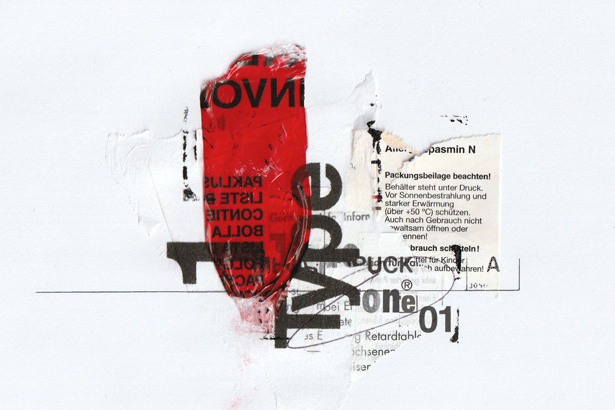
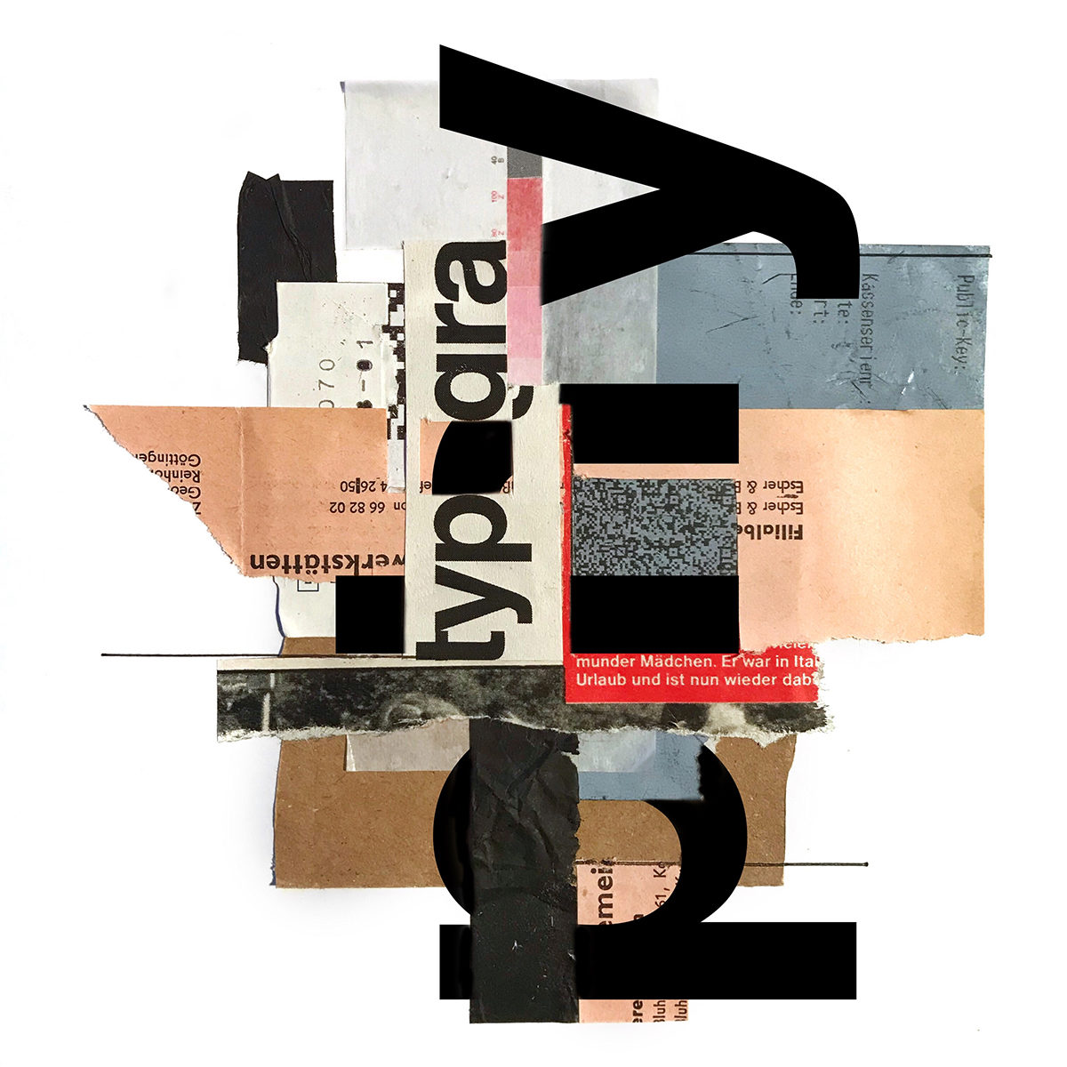
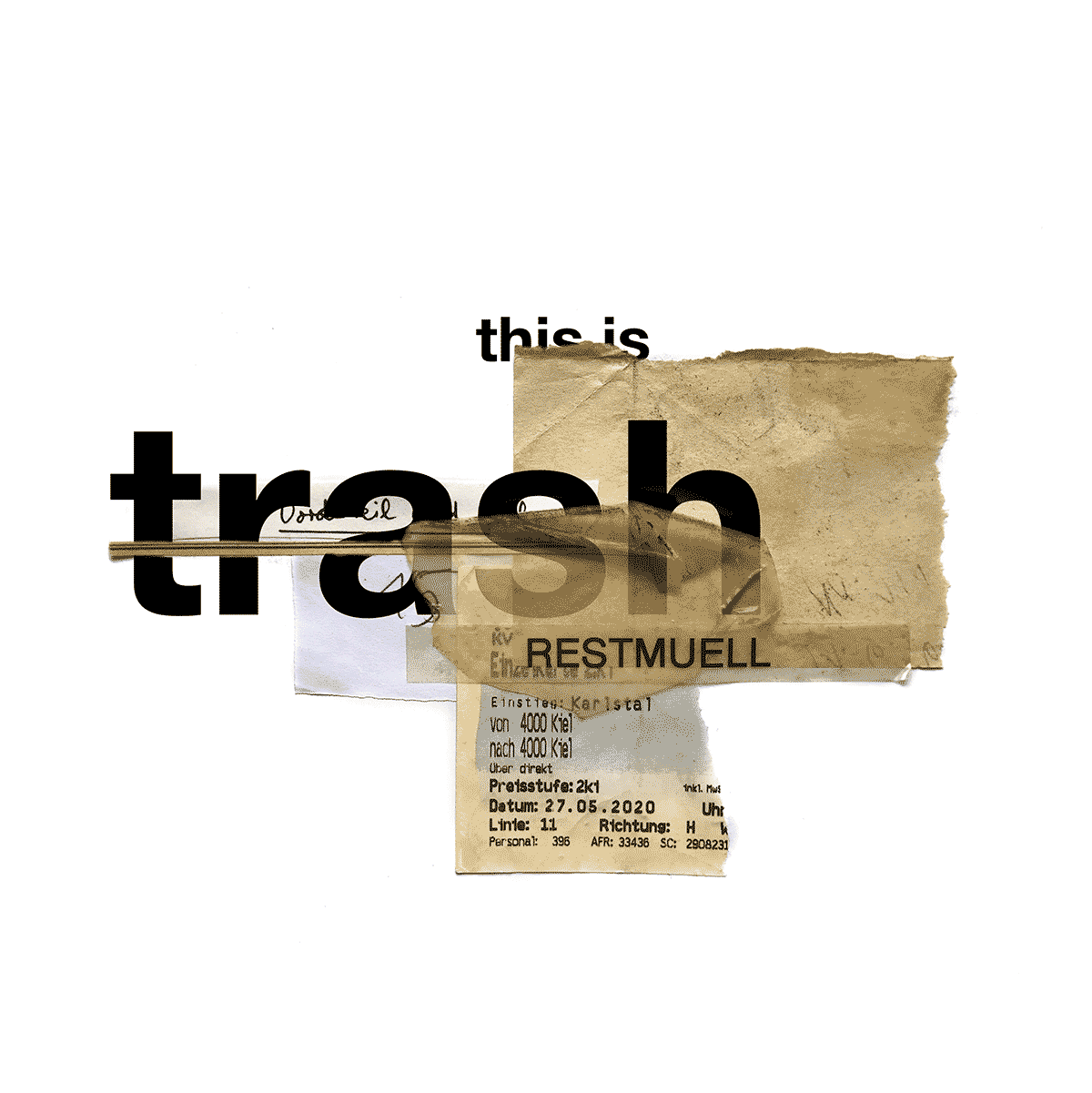
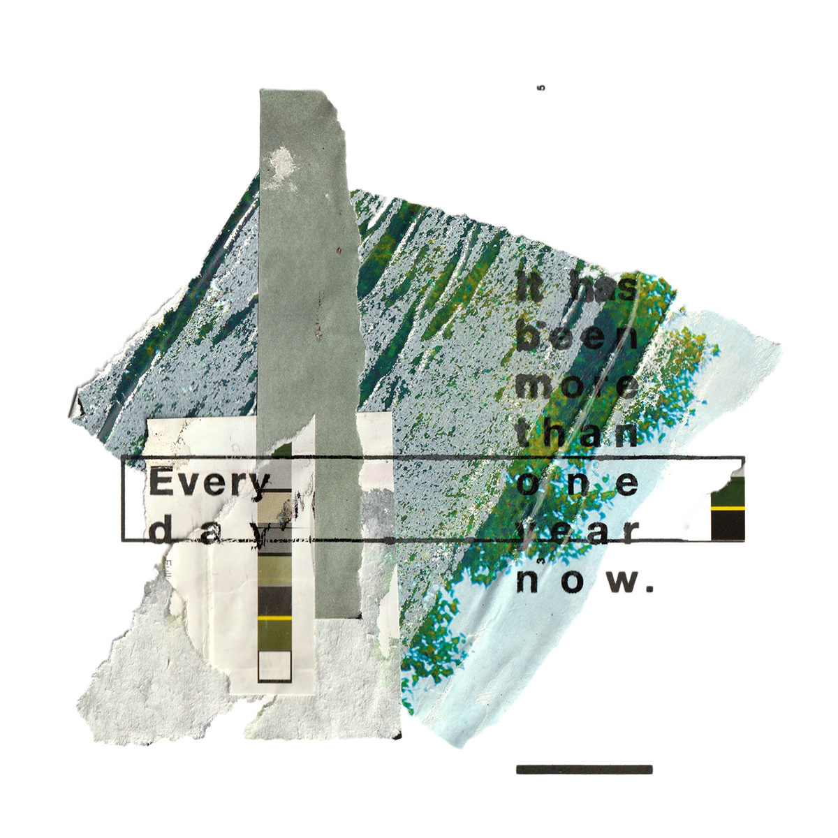
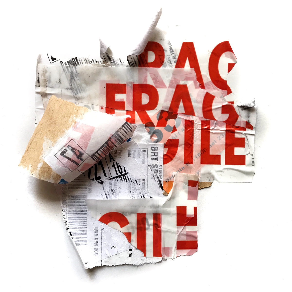
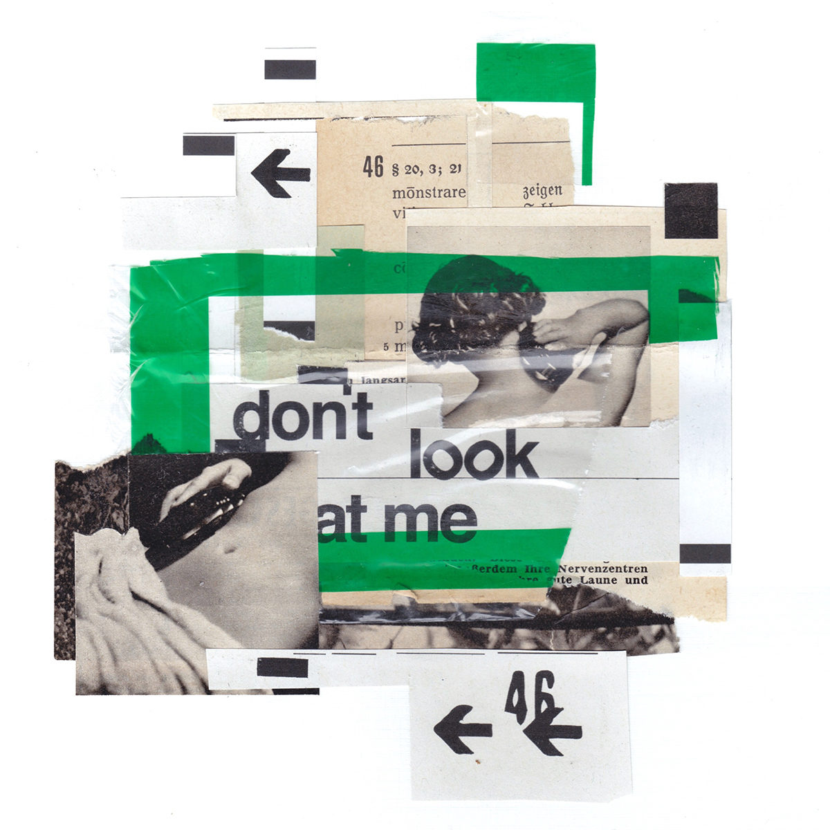
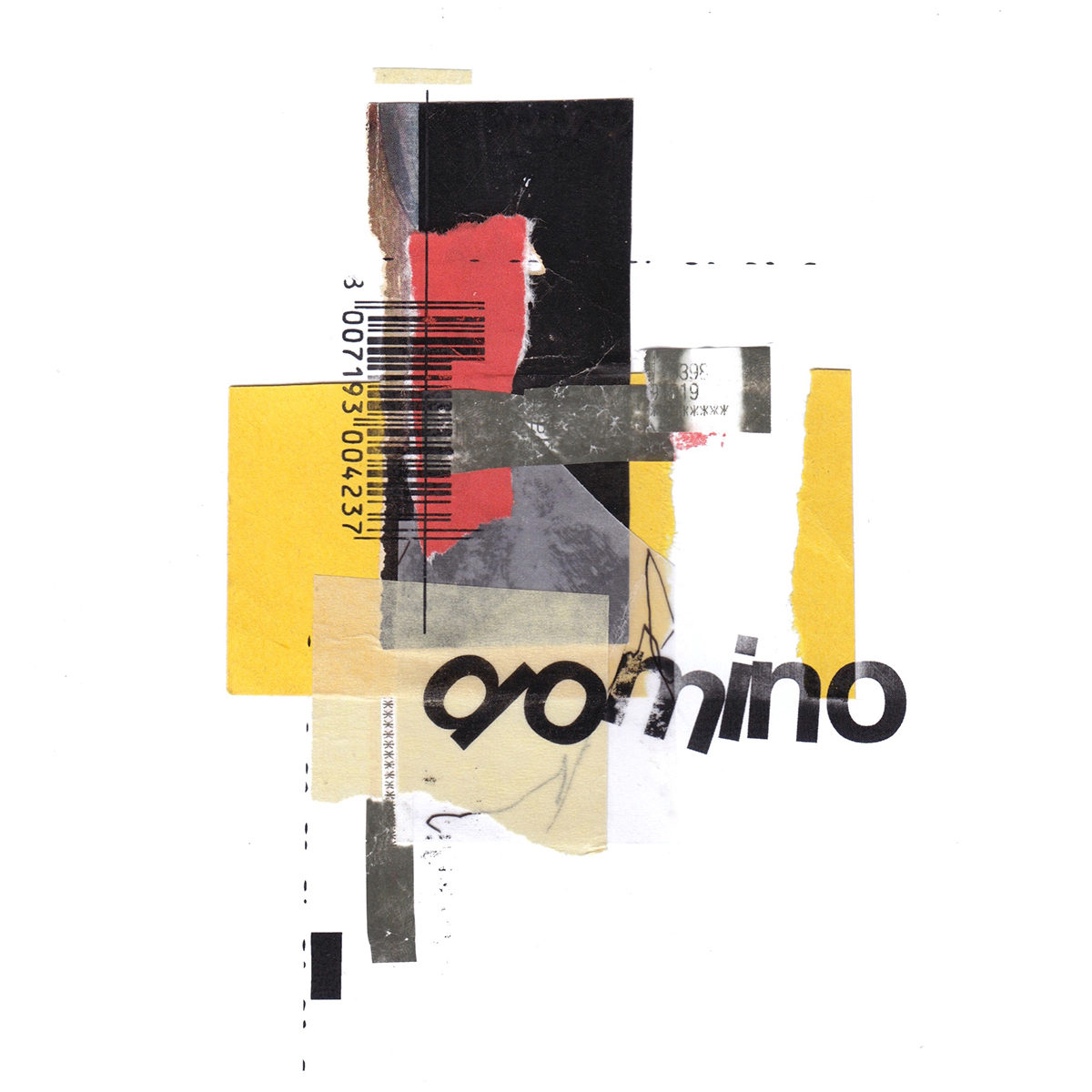
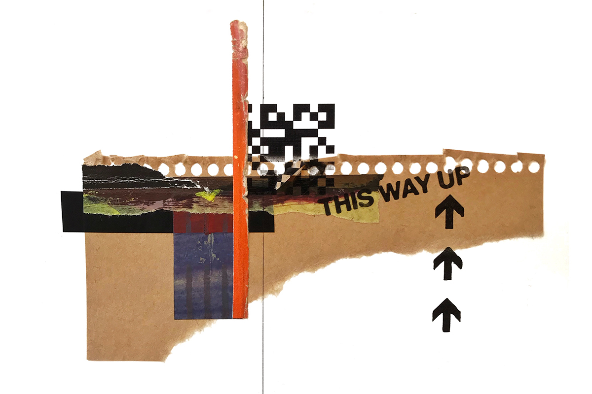
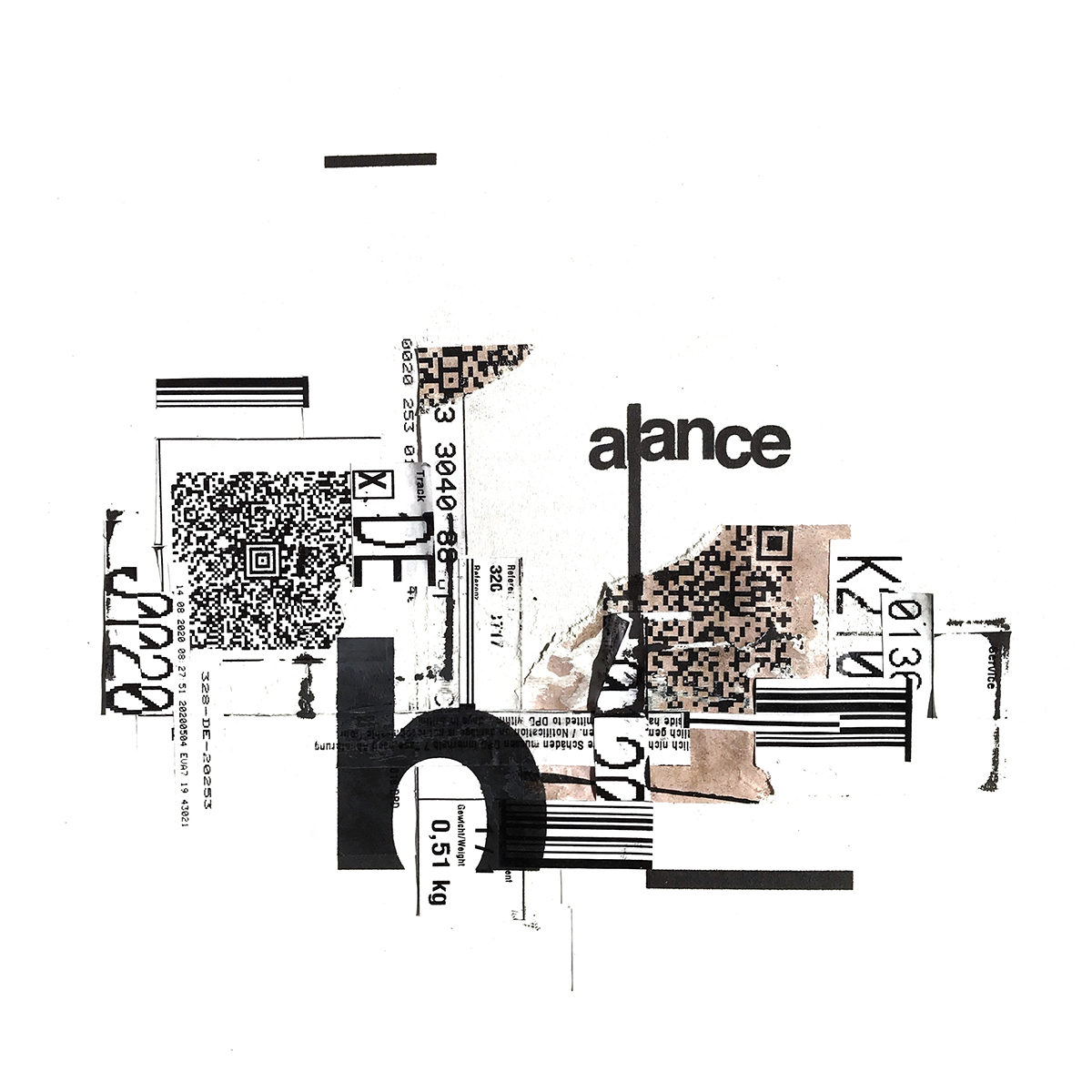
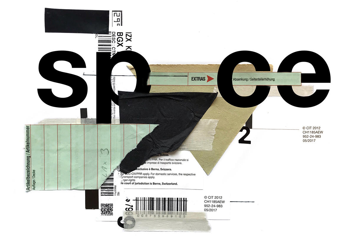
I always start the same way: by assembling pieces of printed material that I regularly collect and recycle onto a white DIN A4 sheet of paper. This allows me to start thinking of the composition right away without the fear of the white canvas…although, as I just said, I do start with a white sheet of paper. I enjoy the challenge of working with whatever is at hand. Not relying on any specific materials, equipment or software allows me to make a piece every day, regardless of where I am. Also, the fact that the materials I use are basically free and readily available gives me a sense of creative freedom. The focus does not lay on special effects or trendy design, but on the challenge of working with one’s surrounding.
Regarding the role of typography, it goes one of two ways. Sometimes the composition suggests a concept or a word, other times I start assembling the piece from a set idea. I have different methods of getting type on the page. As you can see it is mostly Helvetica. I do sometimes use Letraset, which adds a nice layer of texture, or I’ll print out type and cut and paste. Sometimes I design a small composition in Adobe Illustrator and print it on the actual collage, or I add type digitally afterwards.
What materials do you use and how do you go about creating a composition?
The materials I use are mainly functional printed matter that is not supposed to be aesthetically pleasing, like expiration dates, barcodes, ripped invoices, labels, proofs, tapes, etc. I sometimes also use imagery taken from old magazines, posters or packaging. Composition wise, the process of taking one piece of paper at a time and just looking where it wants to sit on the page, for me, is just learning to see. These daily collage experiments in the end are just a form of exercise. It is always a balance between the making and taking a step back, where you try to look at the piece more as an observer than a creator, and try to evaluate and think about what you just did. This balance between thinking and feeling is important, I think, to design and compose.
We really like the pieces which work in a motion element. What do you think motion brings to this way of working? Do you think people find motion more engaging?
Traditionally collages don’t move right..? But what if they do?! I think this is why people enjoy it. Maybe you see or feel if the process of making a piece was especially fun or time consuming. In case of the more complex animations, that was the case. I sometimes play with the meaning of a word and depict what it communicates in the design of the word itself. If this depiction works in motion, even better.
This way of working seems to remain timeless in a lot of ways. It never fails to capture the imagination despite being quite a well trodden path…Why do you think this is?
I think people just read if there is something to read, whether they like it or not. It can be just a fragment of a letter, a letter or a whole sentence. As the images I create are mostly of abstract nature, I guess the viewer enjoys to see—or at least suspect—a familiar shape or form. If you start playing with the perception and the meaning of what is written down, one creates tension. And if word and image together create something new in the viewer’s head, you have a little element of surprise.
Thank you, Milan!


