
When The One Club for Creativity approached Khyati Trehan to design the visual identity for ADC Young Guns 23, it marked a full-circle moment. Founded in 1996 by the Art Directors Club, ADC Young Guns is a portfolio-based competition recognising creative professionals aged 30 and under. Over the years, it has grown into one of the most respected accolades in the global creative community, counting past winners such as The Daniels and Stefan Sagmeister among its alumni.
As a Young Guns 19 winner herself, Trehan was invited to shape the identity for the 23rd edition — an opportunity traditionally extended to a previous honoree. Collaborating with Bridgid Moore, Brett McKenzie, and the internal One Club team, she developed a system that channels the defining trait she sees in every Young Gun: a restless, hands-on momentum that pushes creatives beyond the obvious.
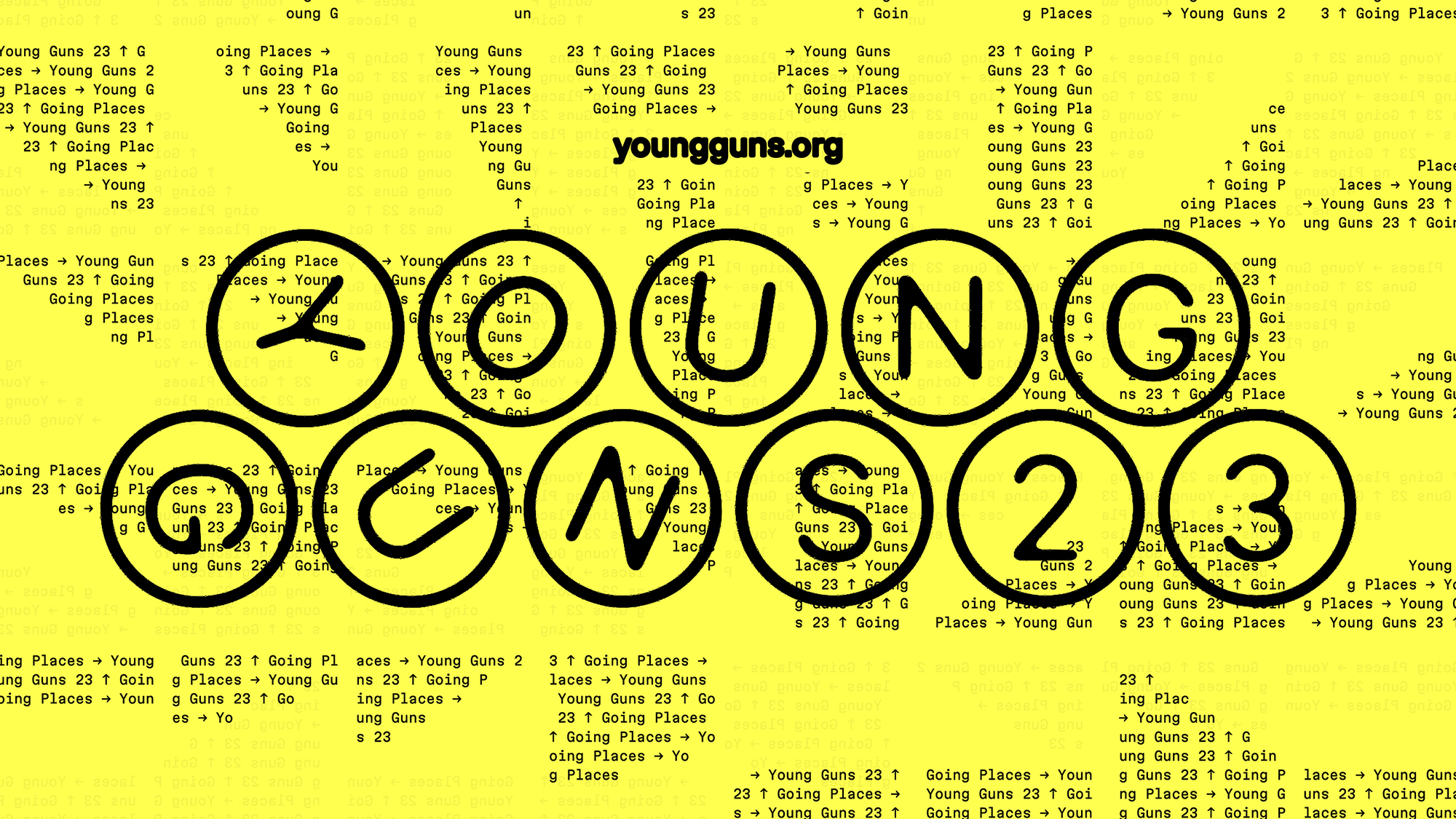
That spirit of forward motion became the conceptual core of the identity. The wordmark transforms letterforms into wheels, perpetually rotating in cyclical motion. Modular by design, the mark can compress into a compact square of four or extend into a linear configuration, adapting fluidly across formats. Typography becomes both message and mechanism — kinetic in behaviour and symbolic in meaning.
The key visual draws from a formative design school exercise Trehan once loved: slicing animation keyframe strips into squares and rearranging them into an 8×8 grid to create rhythmic compositions. This logic of fragmentation and recomposition informs the broader visual language, reinforcing ideas of movement, iteration, and collective energy.
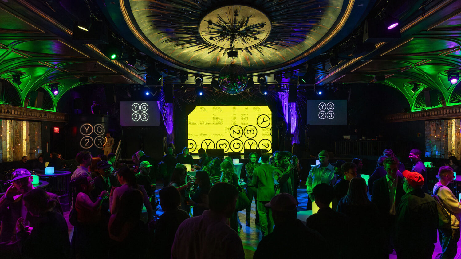
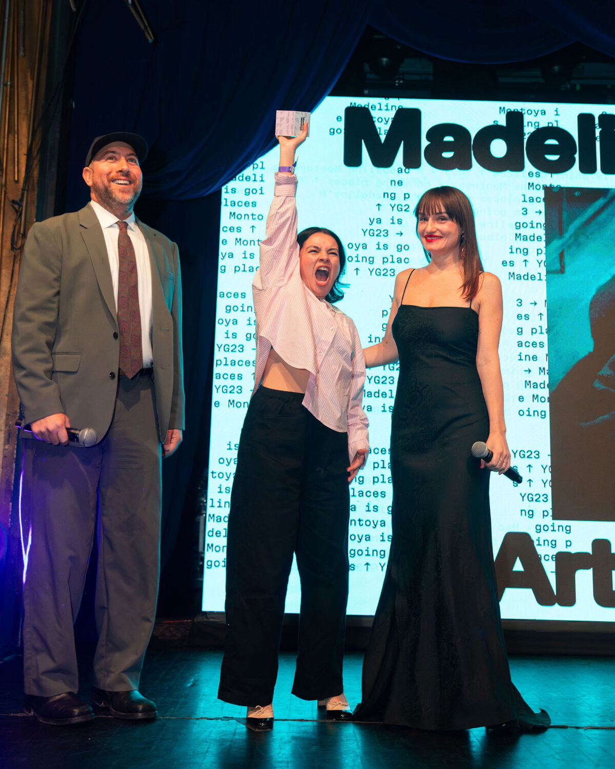
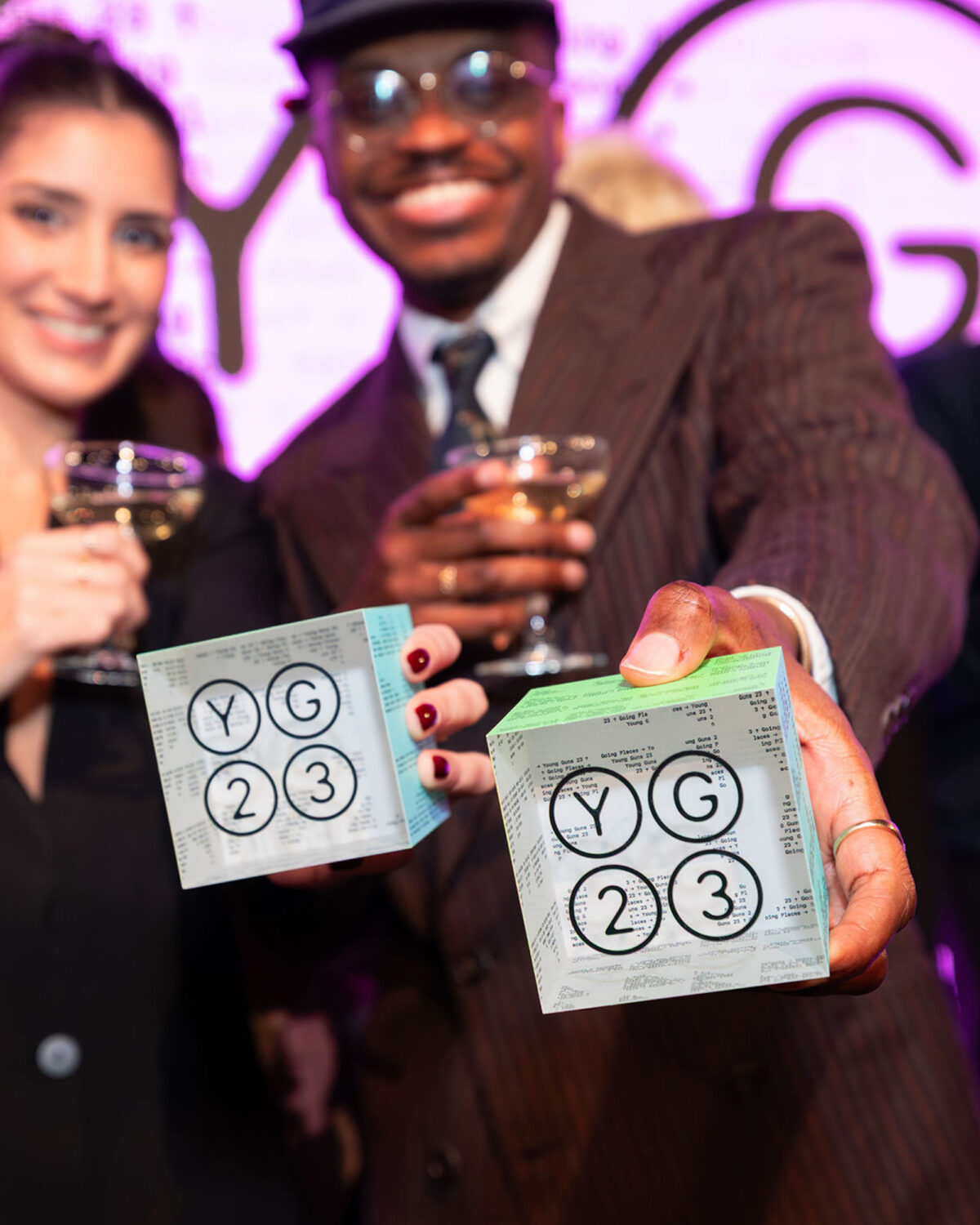
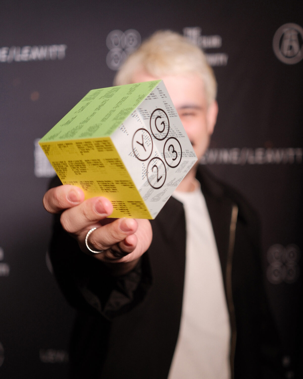
That sense of collectivity extends to the award itself. While ADC Young Guns celebrates individual achievement, the YG23 cube emphasises shared accomplishment. One face features the recipient’s name, while the remaining sides carry fragments of text representing every winner in the cohort. The object becomes a reminder that no one wins alone — that recognition is embedded within a wider creative community.
The identity’s typographic palette further reinforces its layered character. Titles are set in Milling by 205TF, ASCII animations employ Martian Mono by Roman Shamin and Evil Martians, and the dynamic wordmark builds from a modified version of Inter by Rasmus Andersson — specifically adapting its circled characters. Together, these elements create an identity that feels mechanical yet playful, systematic yet alive.
In Trehan’s hands, YG23 becomes more than a competition branding exercise. It is a typographic system in motion — a celebration of momentum, modularity, and the shared drive that defines the next generation of creative talent.
Enjoyed this editorial? Browse more of our graphic design and typography pieces here.


