The way brands access type is changing.
Previously, the choice has been binary: off-the-shelf fonts designed for mass use, or fully bespoke commissions built from the ground up. One offers speed and accessibility; the other, distinctiveness, control and ownership. But increasingly, studios and brands are finding that neither option fully reflects the realities of modern design—where timelines are tight, budgets are considered, and the demand for originality can be non-negotiable.
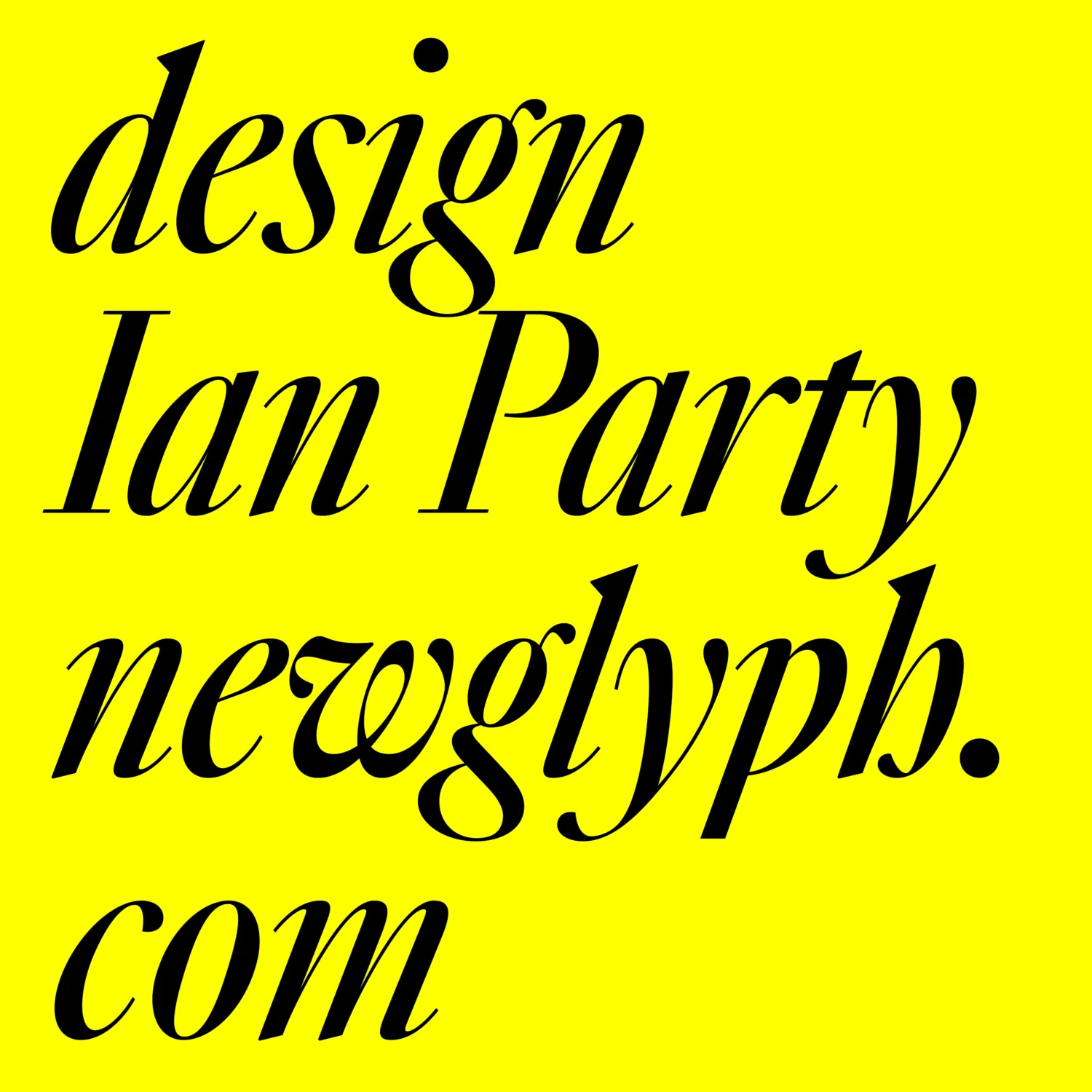
Customising pre-existing fonts, using the original design as a base, has become increasingly popular, so when we came into contact with Swiss type studio Newglyph through our font marketplace Type Department, we jumped at the chance of rethinking how we could provide more uniquely driven, independently made typographic voices for brands.
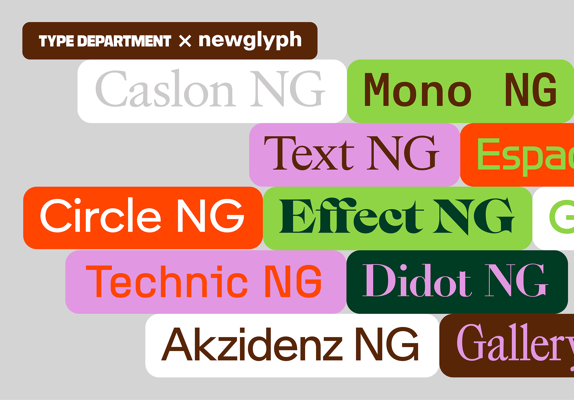
Announcing an official partnership between Type Department x Newglyph
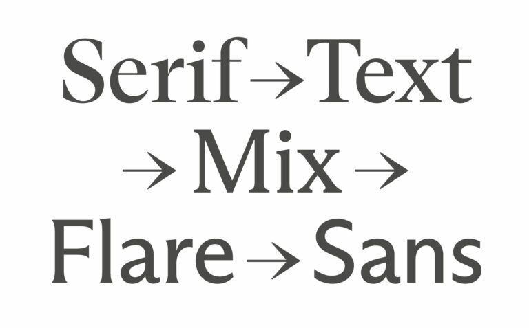
Rather than starting from scratch or settling for the standard, the collaboration centres on a third approach: carefully customised, production-ready typefaces that retain the voice of an independent foundry while being adapted for specific, real-world use. We respect how important it is that foundries retain ownership over their intellectual property (their fonts), so this approach felt right in the sense that it didn’t compromise the character of the typefaces, nor the independence of the foundry.
Launching with 14 extensive font families, all developed exclusively for Type Department, this is more than a release—it’s the foundation of an ongoing model. One that rethinks not just how type is distributed, but how it is authored, adapted, and ultimately experienced by the brands that use it.
Below are a few typographic beauties that form part of the collection:
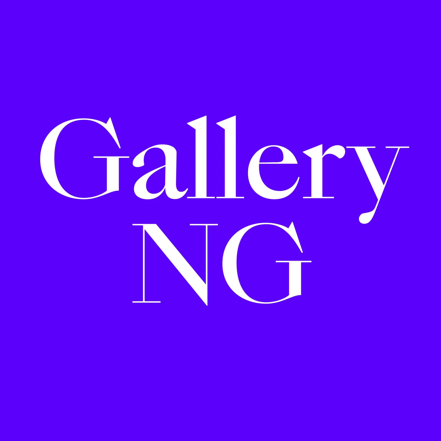
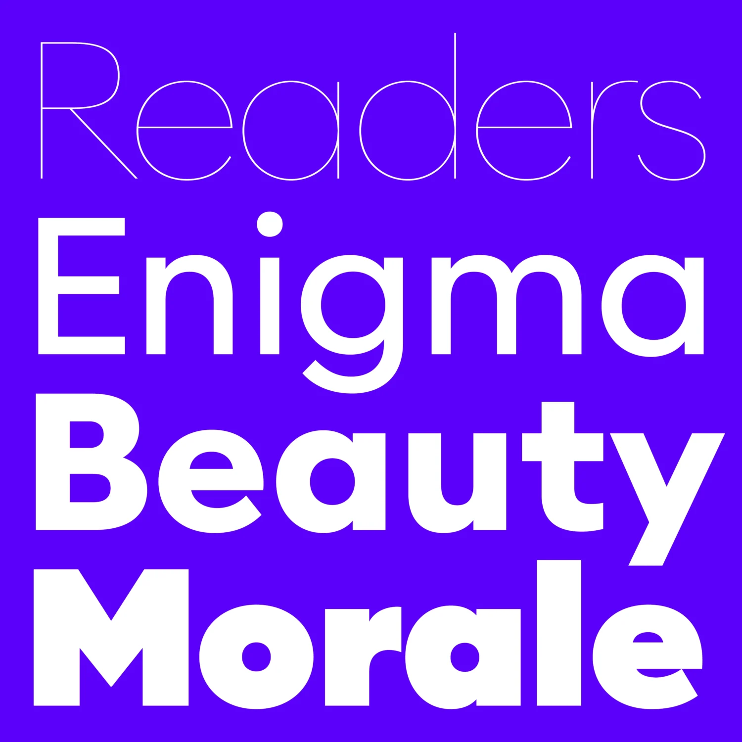
Gallery NG, designed by Ian Party, is a 17th-century-inspired variable typeface that blends historical elegance with contemporary expression. Rather than a revival, it’s a reimagining—combining bold proportions and high contrast to feel equally at home in fashion editorials, modern branding, and digital environments. Spanning 72 styles, the family invites designers to explore a wide range of tones, while its variable capabilities allow precise control over weight and contrast.
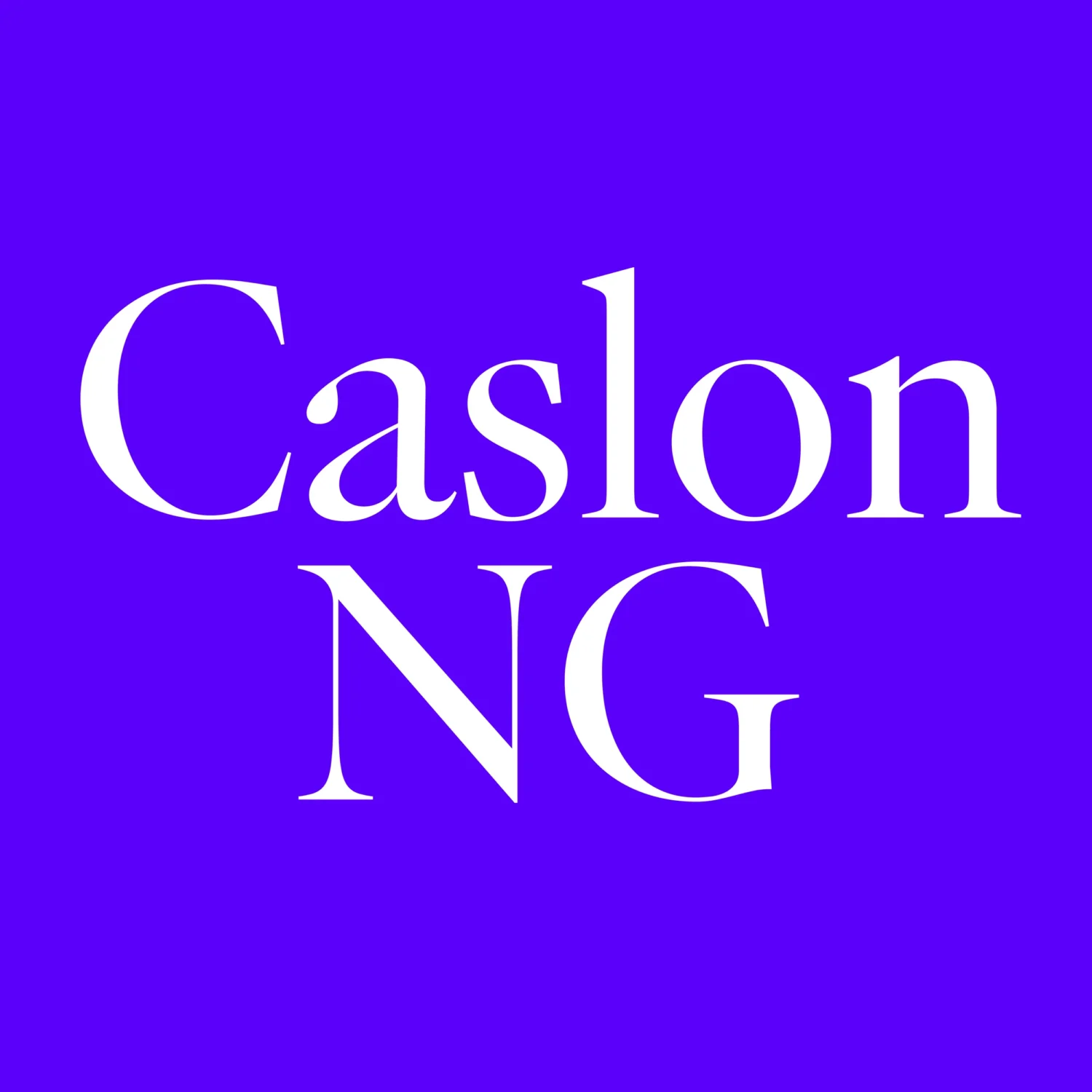
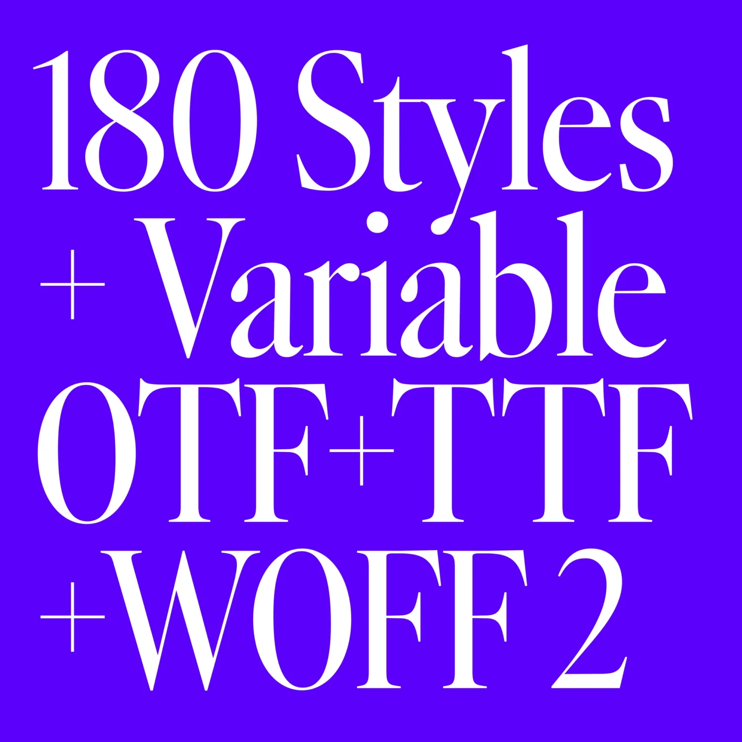
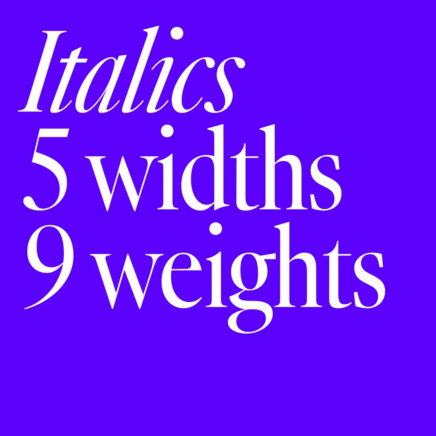
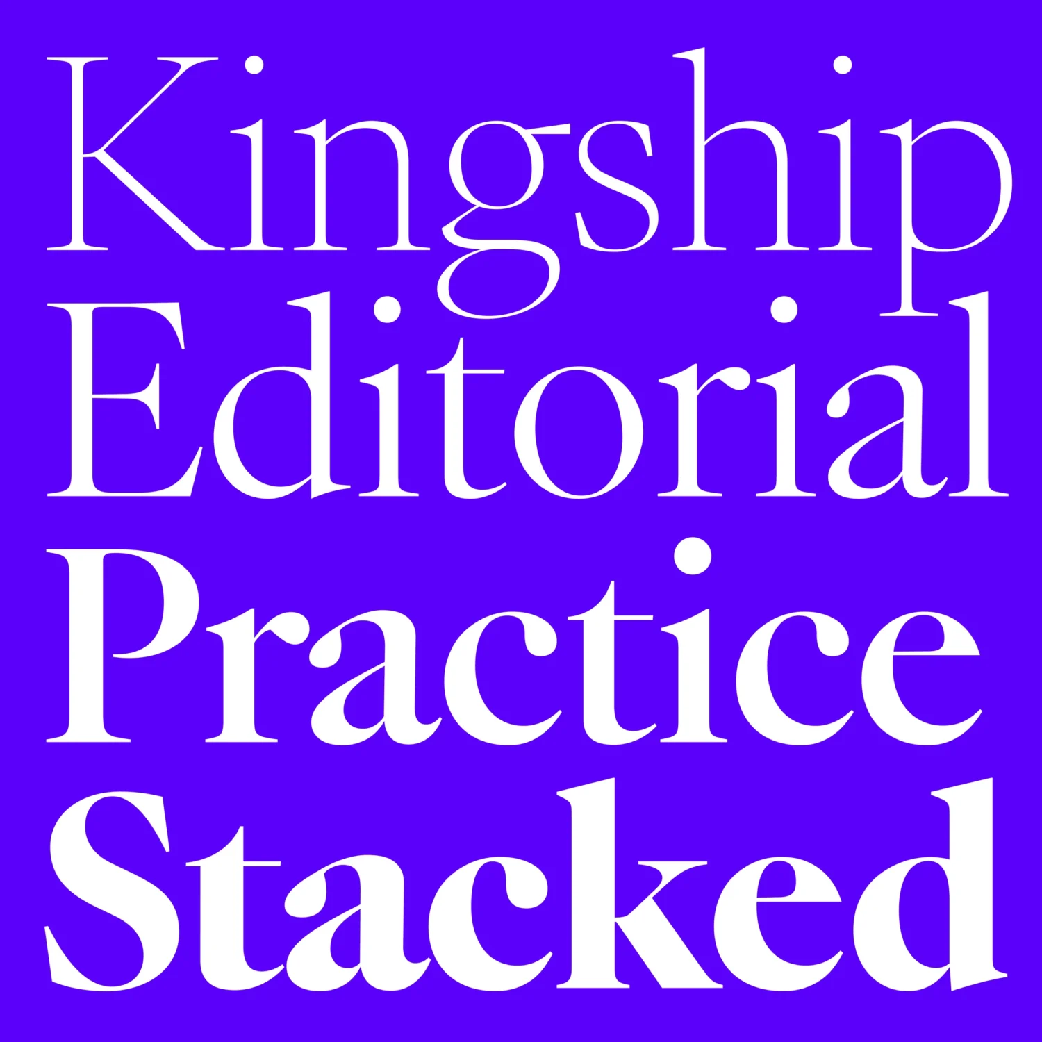
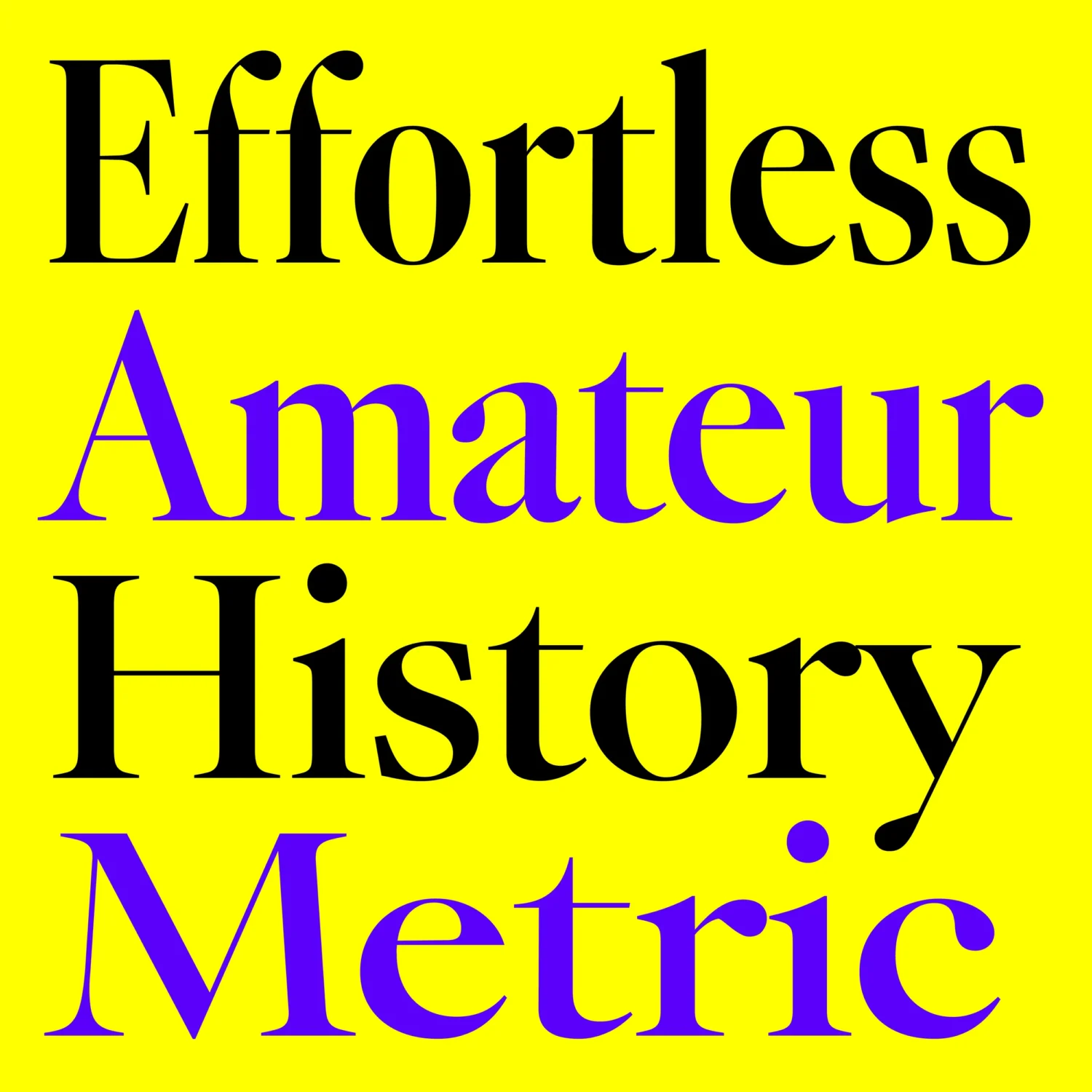
Caslon NG, a 180-style monster of a font family, is a variable typeface that reinterprets the classic Garalde tradition for contemporary use, drawing inspiration from the work of Claude Garamond and later masters. Blending soft, organic curves with precise structure, it balances warmth and sophistication through bracketed serifs, refined contrast, and open, readable forms—making it well suited to editorial, branding, and immersive reading contexts.
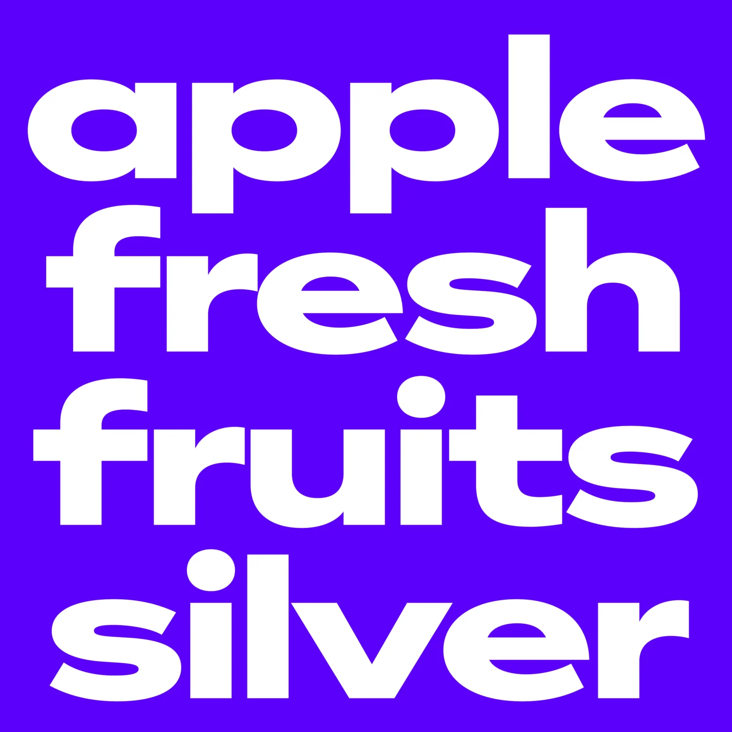
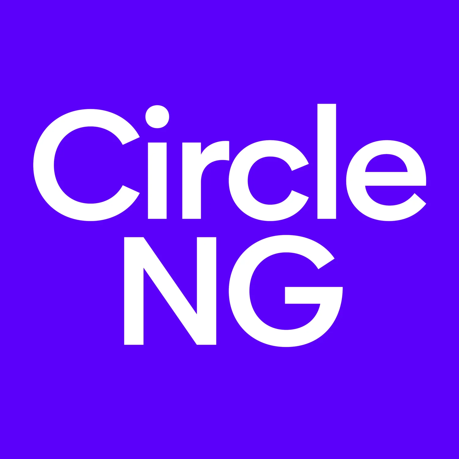
Circle NG, is a contemporary interpretation of the geometric sans tradition, drawing on the bold visual language of early 20th-century design. As a variable typeface, it offers full control over weight and width, allowing it to shift effortlessly from light, refined applications to bold, graphic statements, while its minimal contrast and even proportions ensure readability and versatility across contexts.
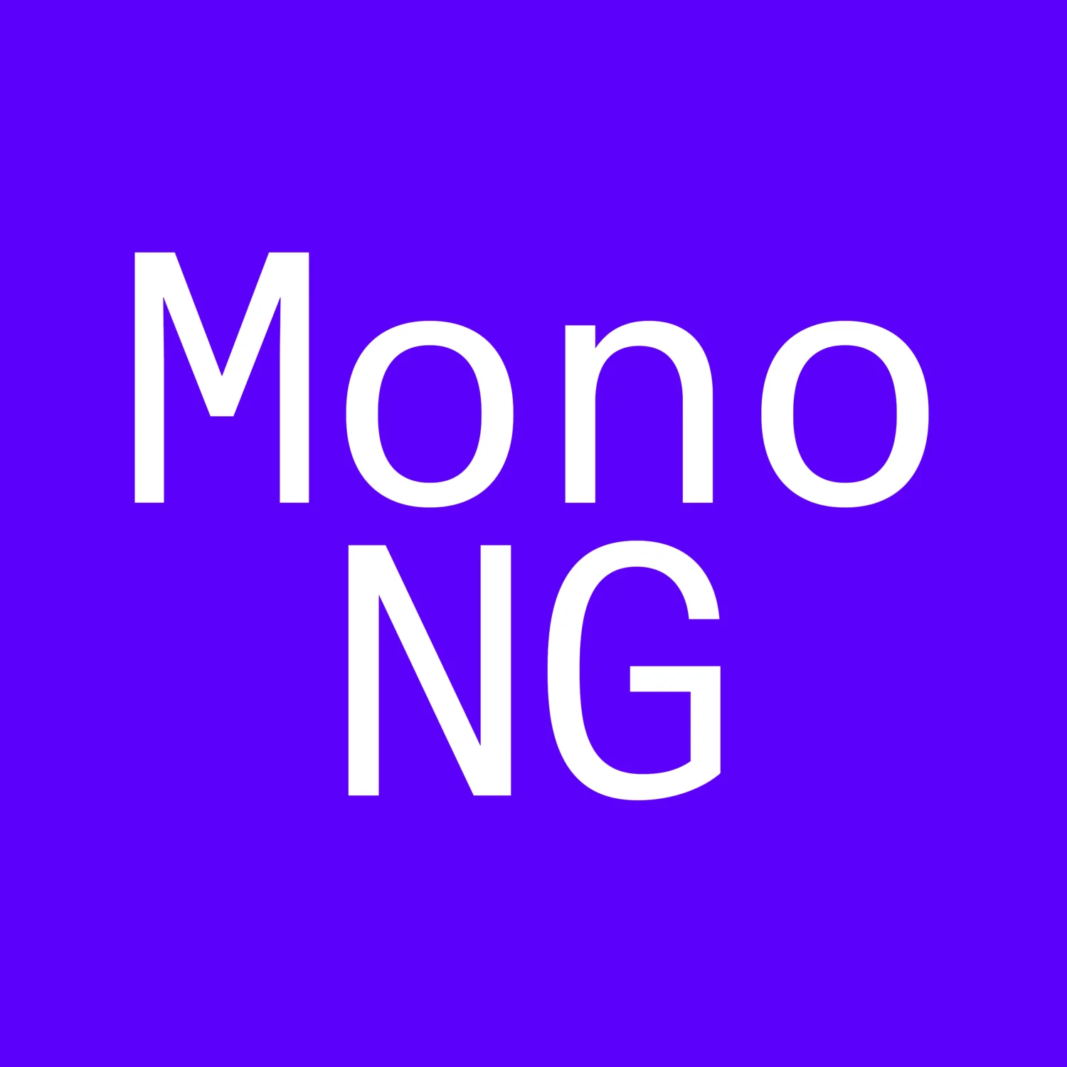
Mono NG, designed by Ian Party, is a variable monospace typeface that reimagines the conventions of fixed-width monospace with greater flexibility and expression. Rooted in the legacy of typewriter and coding fonts, it retains the structured rhythm of monospacing while introducing more refined proportions and a fluid, contemporary feel.
With 44 styles and full control over weight and width, Mono NG moves effortlessly between minimal, functional applications and bold, high-impact design, making it a versatile tool for branding, editorial, and digital environments.
Trial out the full font collection.
Enjoyed this piece? Browse more of our editorials centred around fonts released through our font marketplace here.