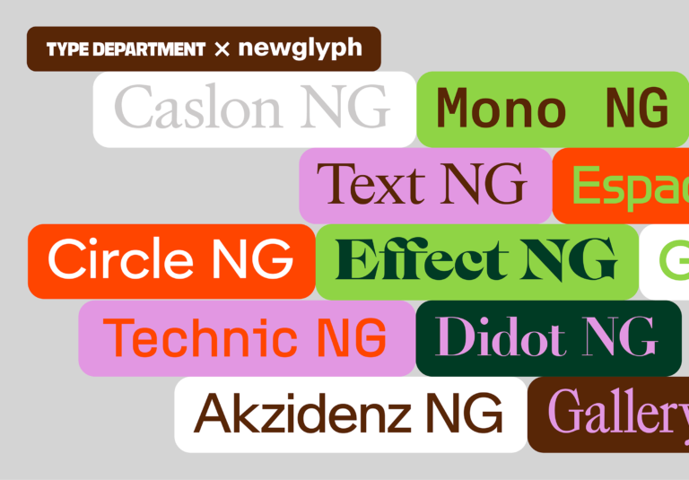
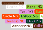
Along with a stunning redesign, Type Department’s new store offers a streamlined font shopping experience and a ton of exciting new typefaces to browse. Whether its bold serif displays, experimental sans serifs or versatile variable fonts, here’s a roundup of the latest releases you can get your hands on now.
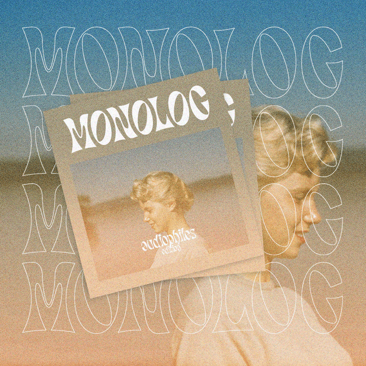
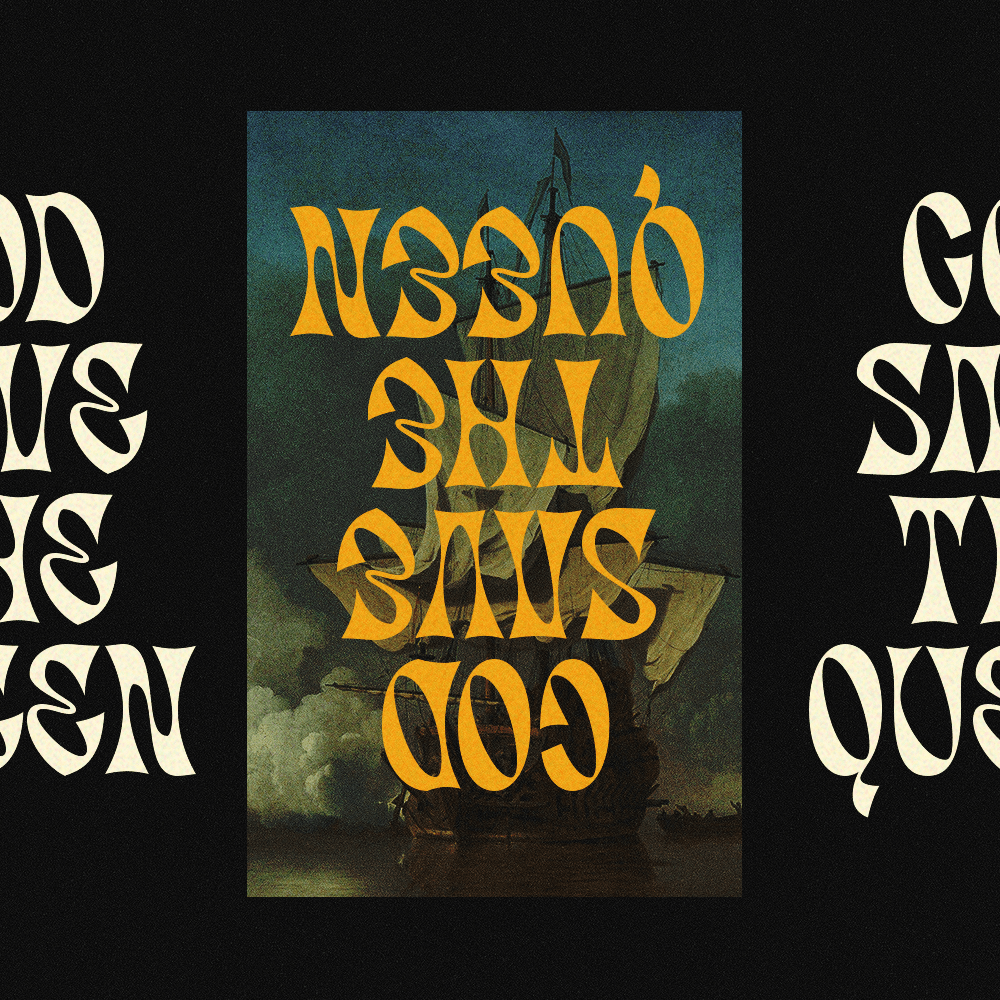
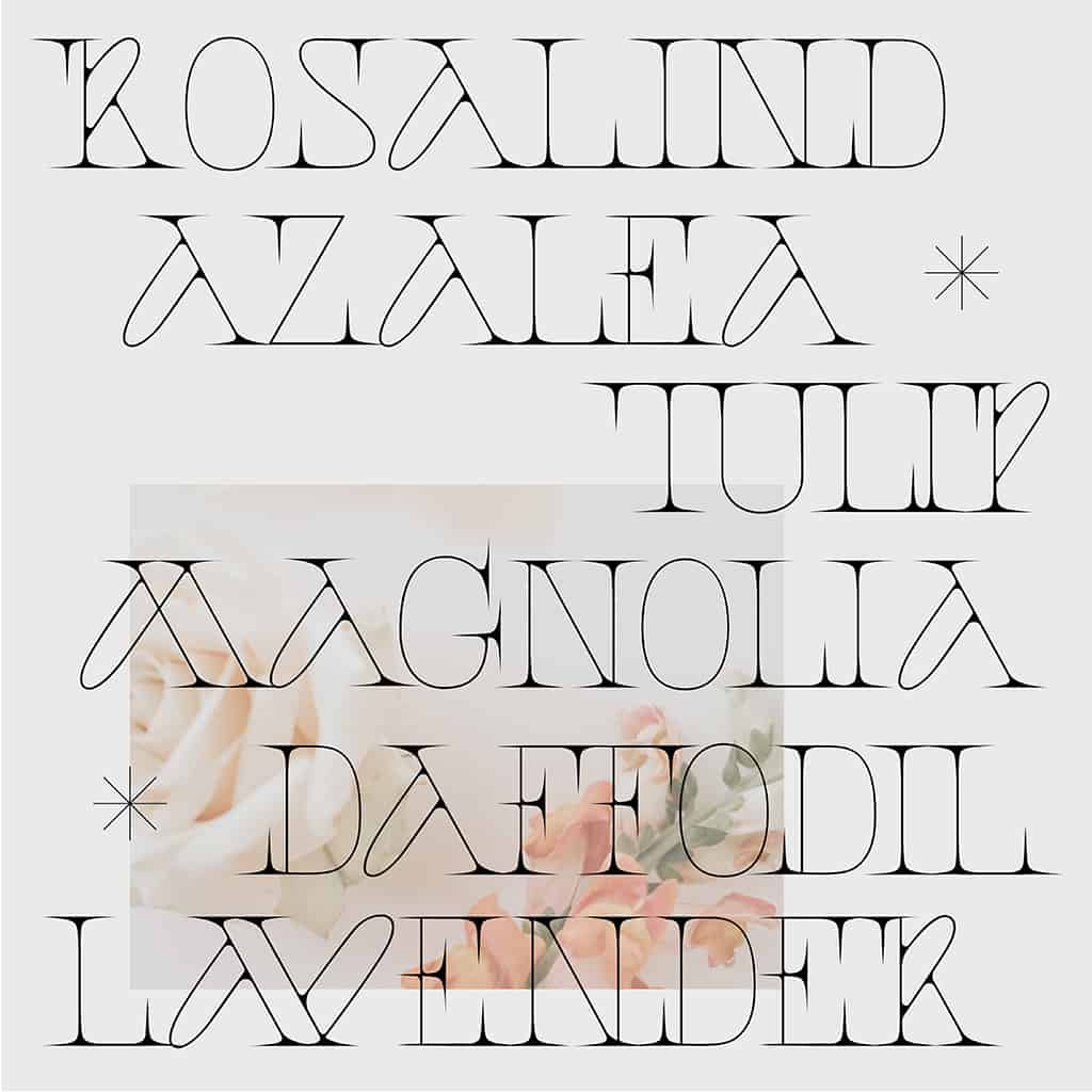
New from Indonesia-based type foundry Nurrontype, Molen is a bold display typeface with a distinctively curvaceous structure and an unusual use of contrast. Joining Nurrontype’s two existing typefaces available on Type Department, Migaela and Brasika Display, Molen comes with a total glyphset of 248, as well as uppercase, lowercase, numbers, diacritics, punctuation, alternates and ligatures, and is perfect for bold titles and logotypes.
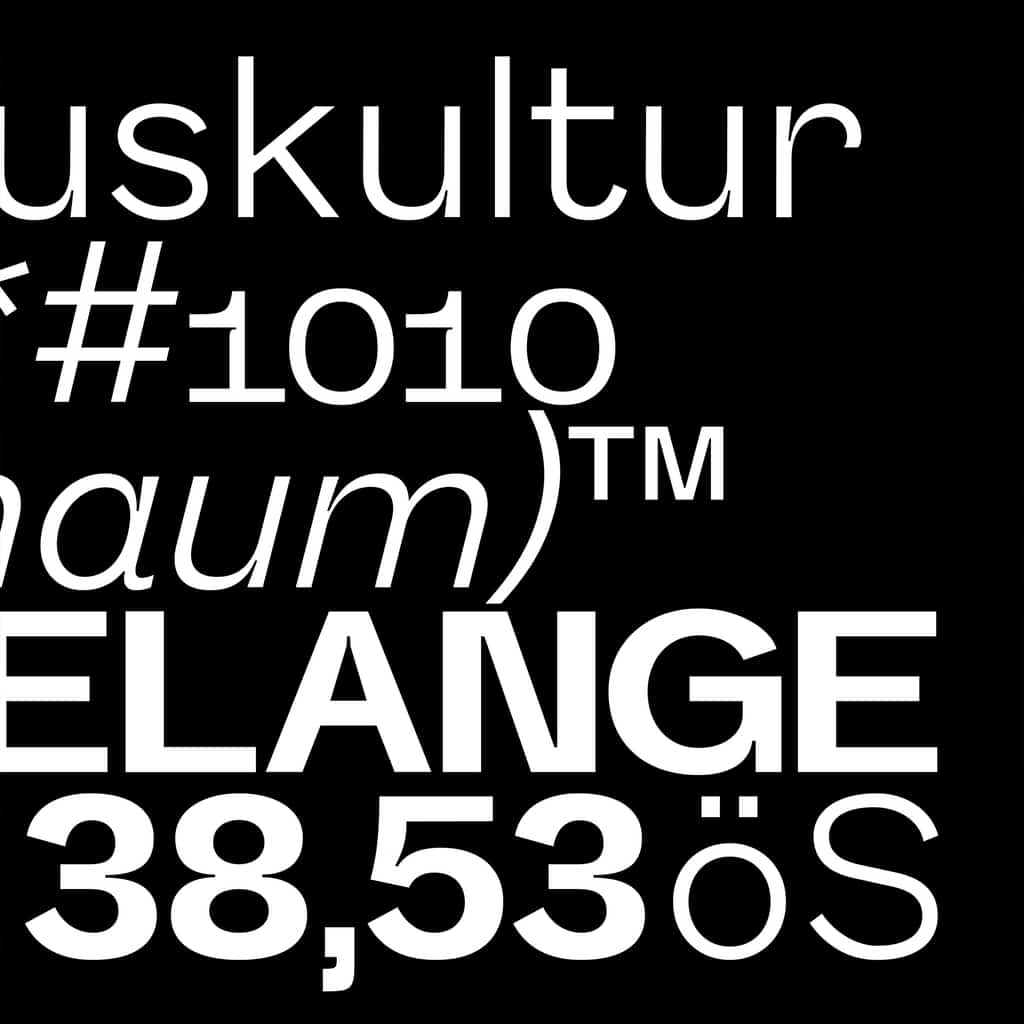
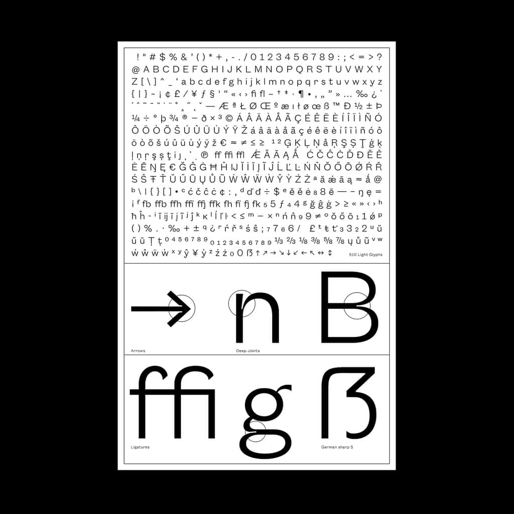
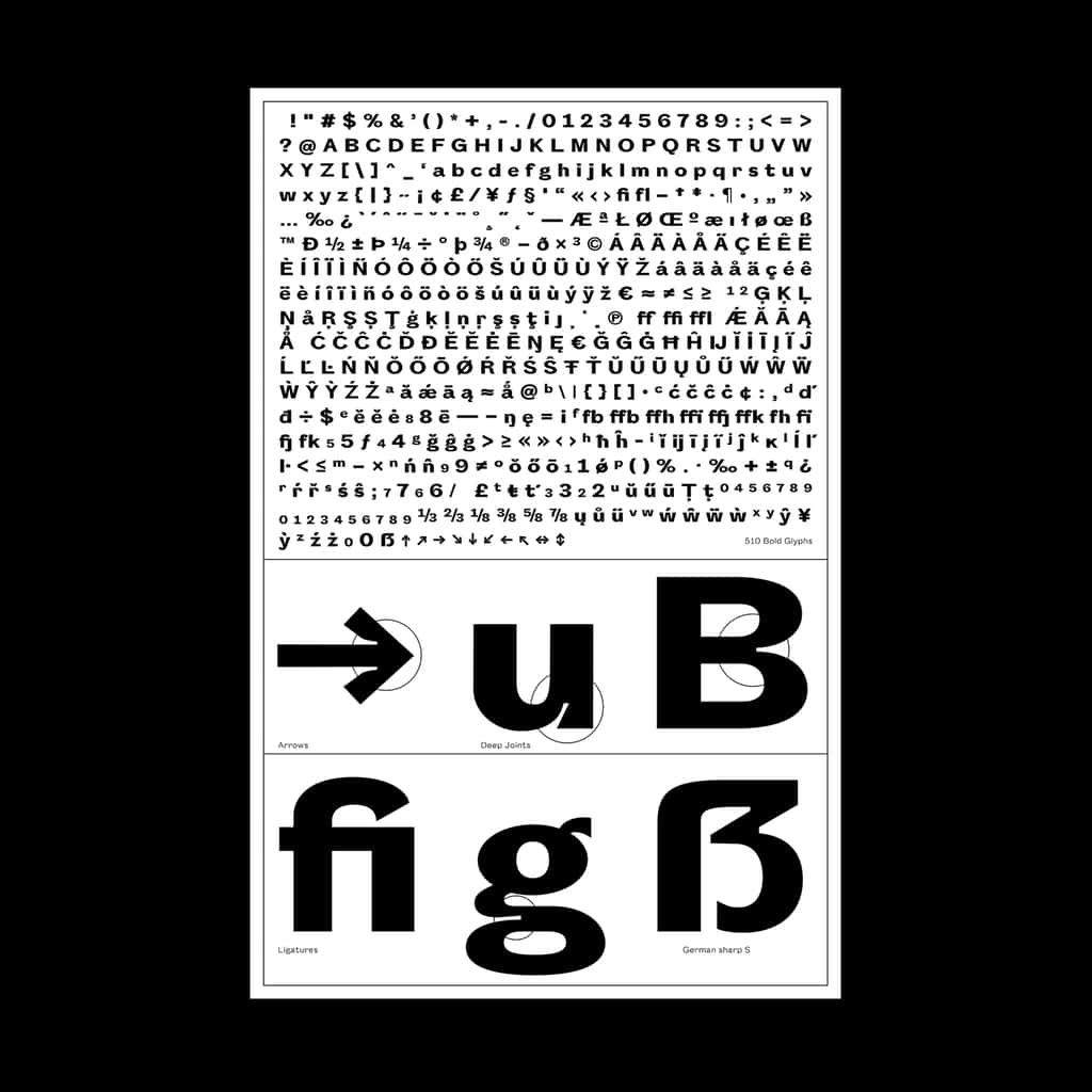
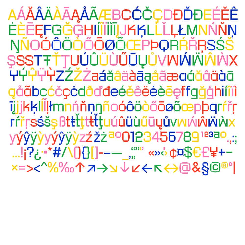
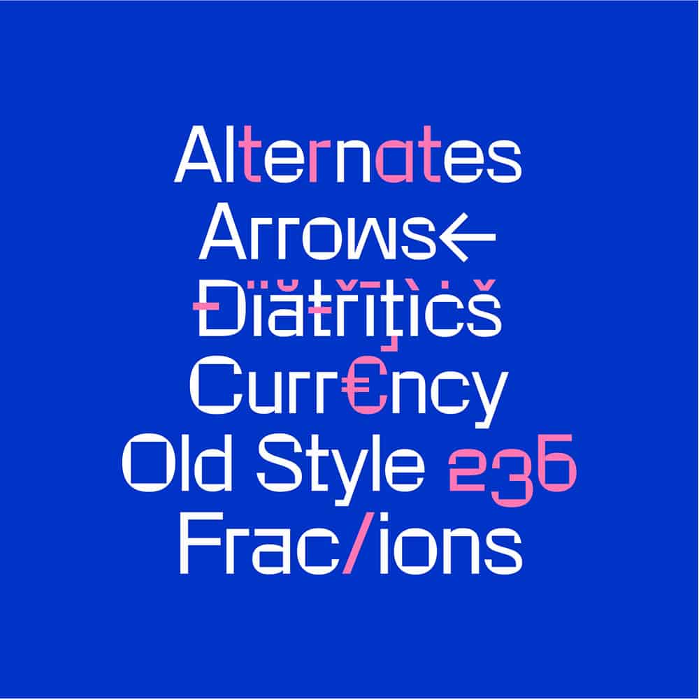
Melange is an extensive sans serif typeface that focusses on readability in small sizes, coming from Berlin-based Graphic and Type Designer Daniel Stuhlpfarrer. Although dedicated to legibility, Melange’s unusual proportions and delicate ink traps give it an artful edge – allowing it to stand out from more generic sans serif typefaces and make an impact in display settings. Equipped with 440 glyphs and an extensive set of features, Melange is a versatile and powerful choice suited to creating a sharp, contemporary aesthetic.
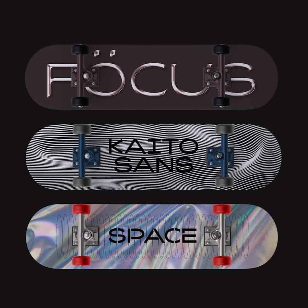
Kaito® Sans is a display typeface inspired by the elliptical movement of comets mixed with the grotesque style of early 20th century typefaces. This offering from KOBU Foundry – the foundry of KOBU Agency – balances subtle quirks with strong baseline shapes. Supporting over 80 Latin languages, Kaito® Sans is a bold typeface with an edgy energy; perfect for uplifting the voice of contemporary brands.
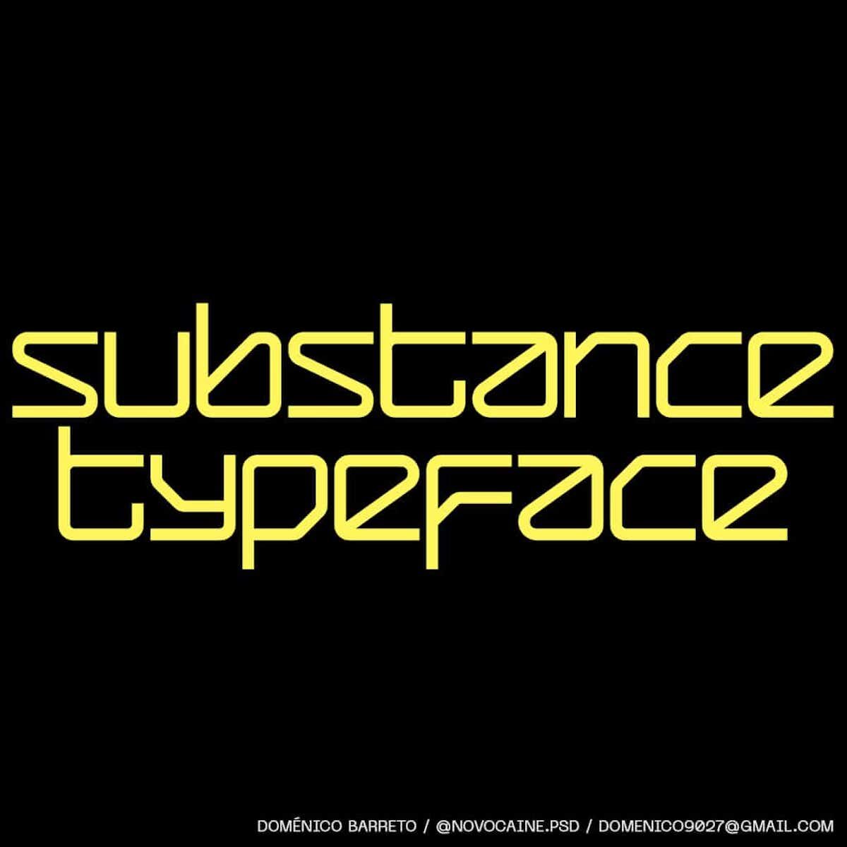
Inspired by the Y2K aesthetic, Substance is a new display typeface from Domenico Barreto, the creator of Evangelion and Tenebras. A sans serif with angular counters, Substance brings a modern aesthetic with a hint of nostalgia. Coming with a total glyphset of 343, the typeface is multilingual and equipped with a range of useful features.
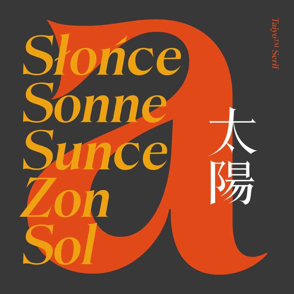
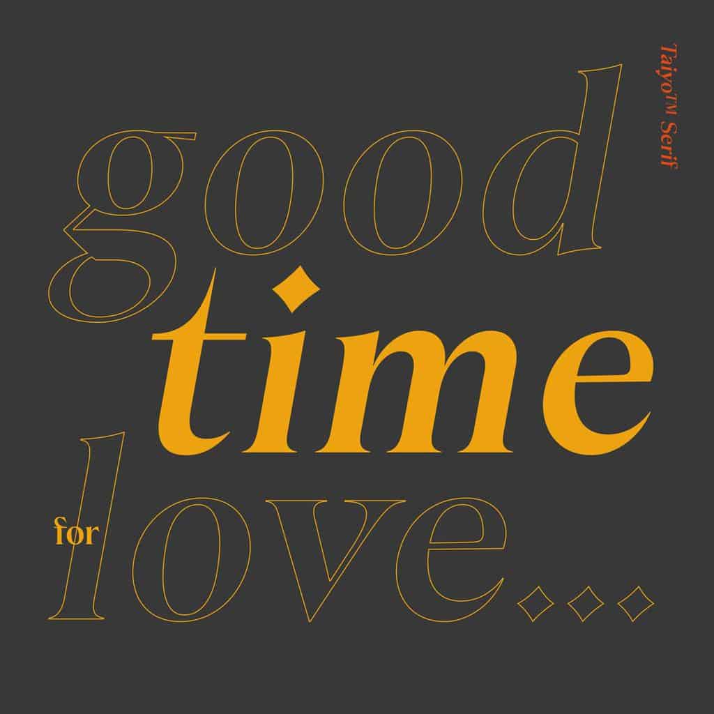
Taiyo™ Serif, another new release from Kobu Foundry, is a digital typeface with one weight (medium) and two styles (normal and italic). Due to the high contrast, Taiyo’s typographic forms are easily recognisable, making it an excellent choice for titles and headlines. Being inspired by the editorials of the 70s and 80s, this font is can also be applied to both small or long texts, and is a suitable choice for both print pieces or digital media.
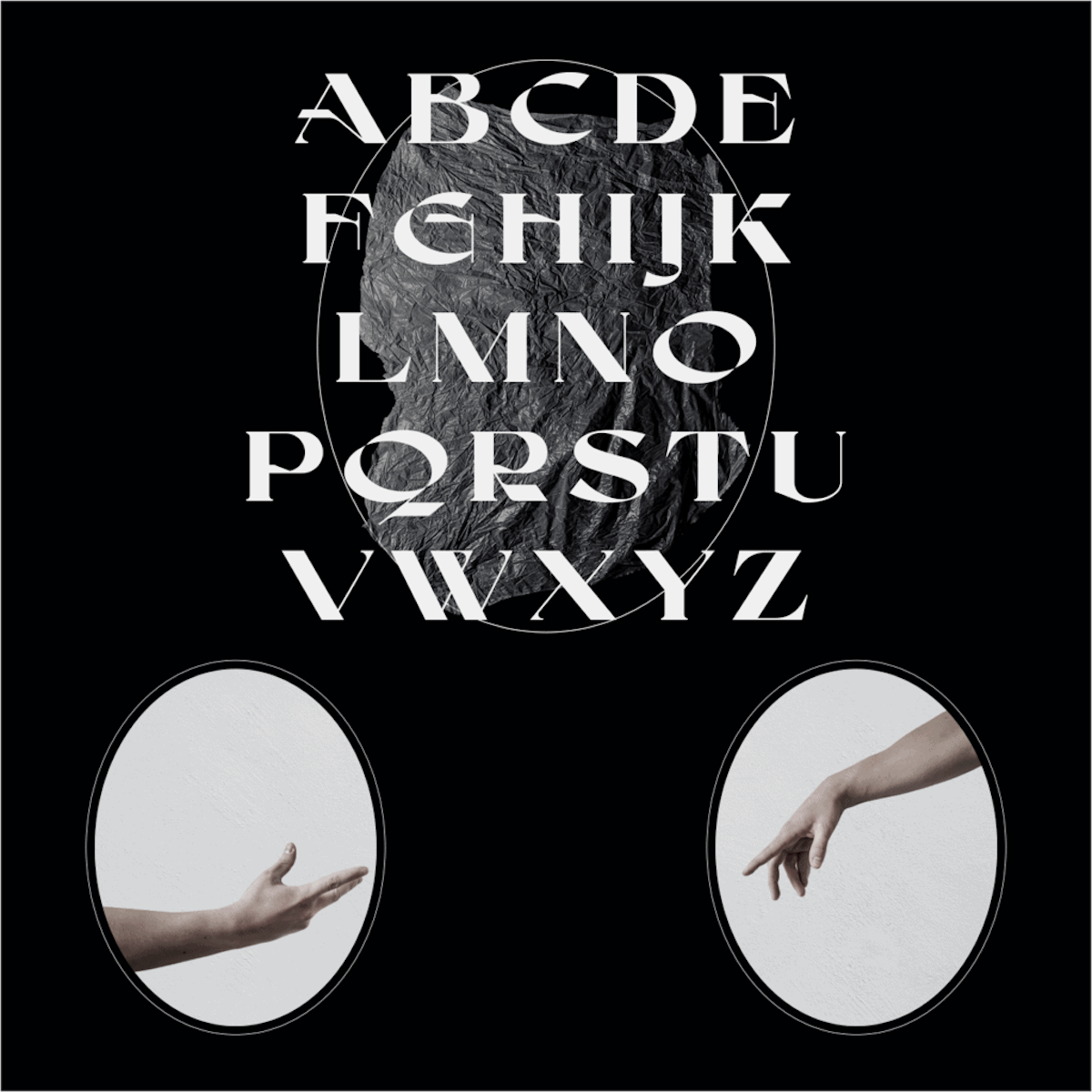
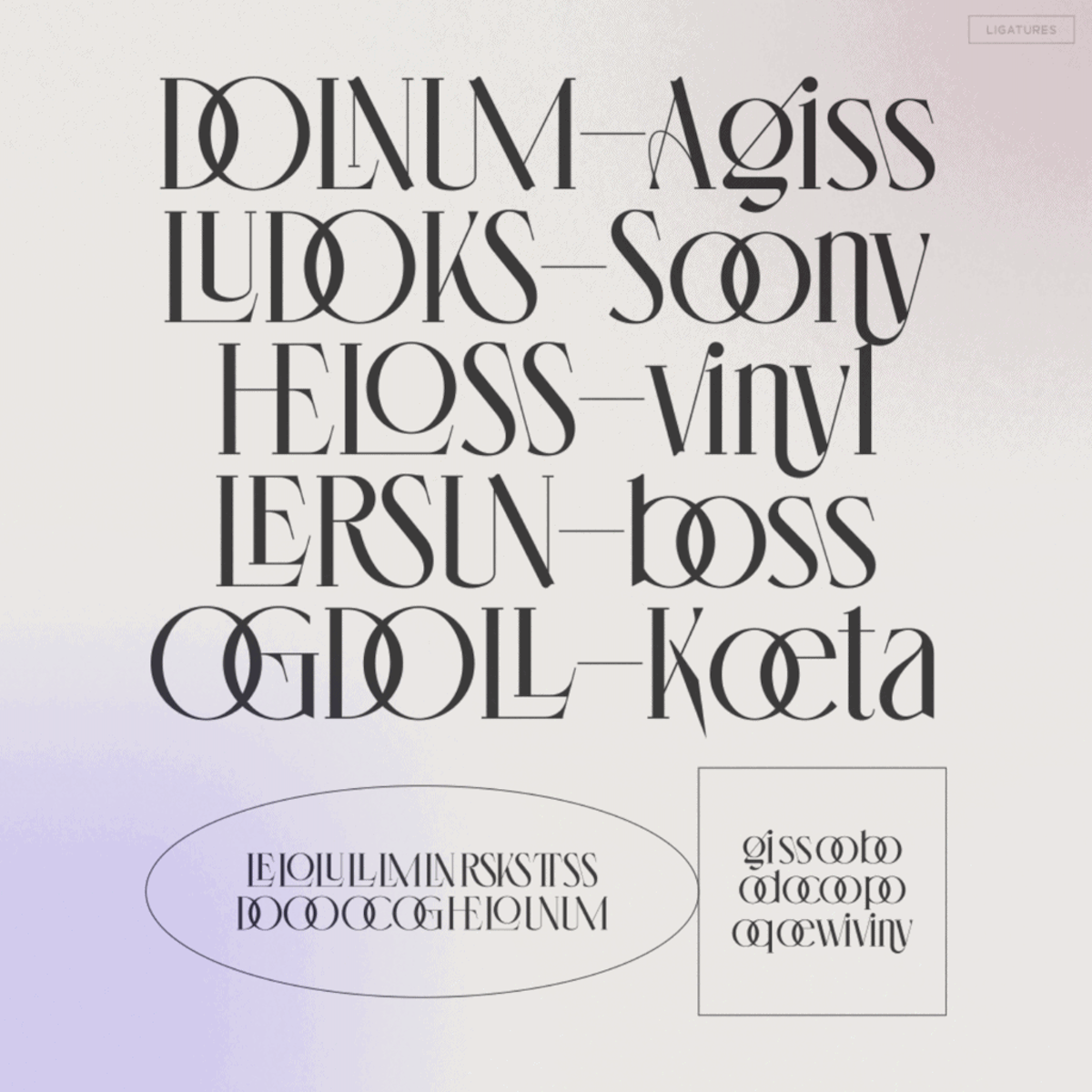
Characterised by super high contrast and angular, extended serifs, Voca Display is both delicate and high-impact. This typeface, which is the latest addition to Zealab’s extensive collection, is easy to imagine in strong editorial settings, or paired with more minimal sans typefaces in unique typographic hierarchies for webpages and visual identities. With alternates and a stunning set of ligatures, this typeface is full of opportunities for experimentation and sets the tone for a vibrant, elegant typographic look.
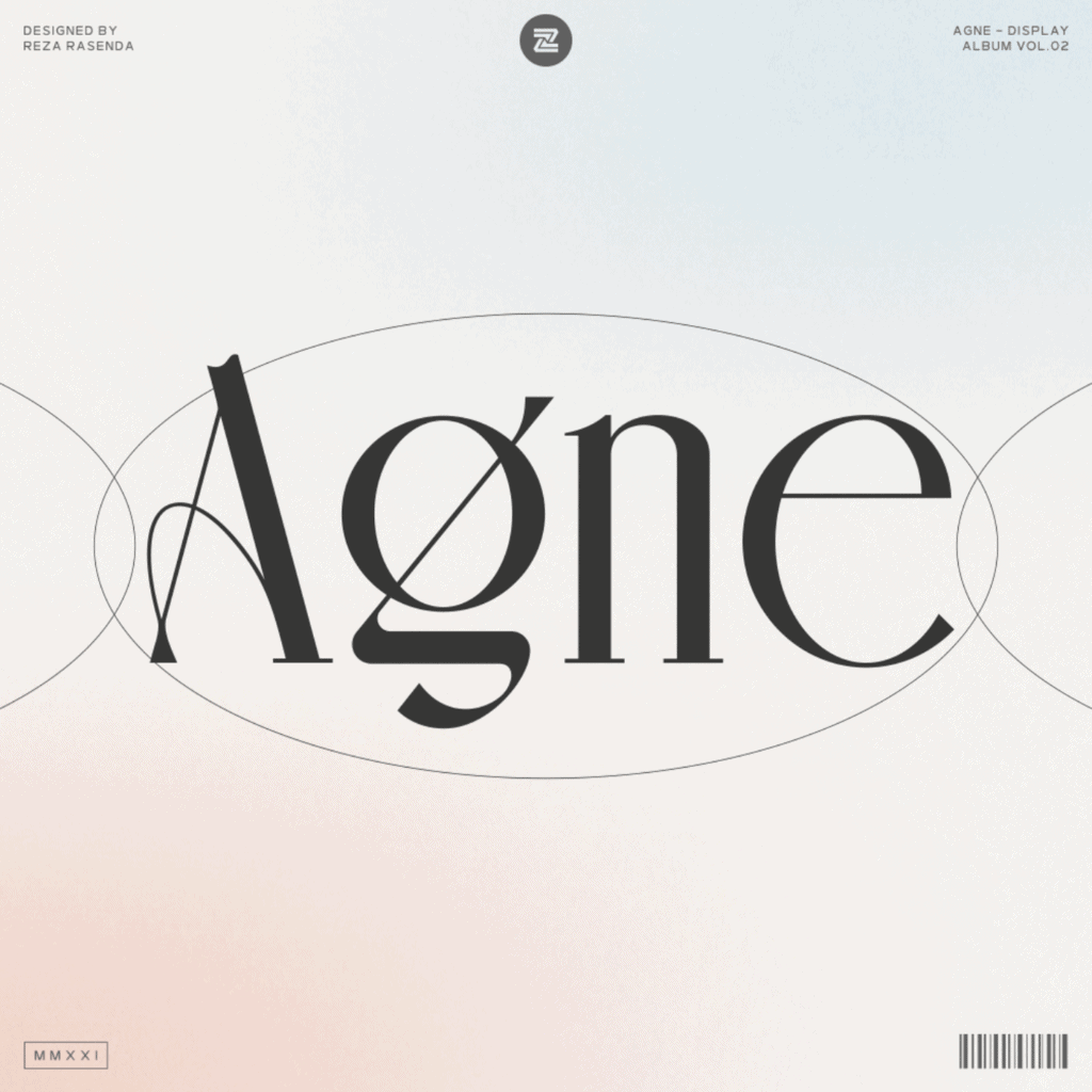
Another stunning new release from Zealab, Agne is designed by Reza Rasenda and inspired by a combination of art nouveau styles and modern touches. With its elegant presence, Agne brings a sleek aesthetic to magazine layouts and various graphic design projects; creating a refined, structured look through its high x-height, fine hairlines and unique flourishes. This typeface is multilingual and equipped with a range of features which offer the flexibility to tailor your own typographic voice.
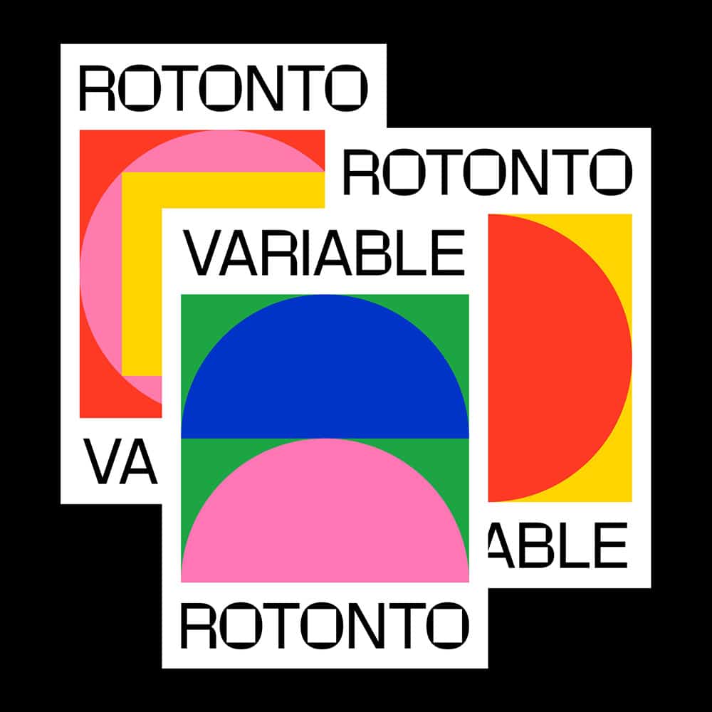
Rotonto – Supernulla Creative Studio
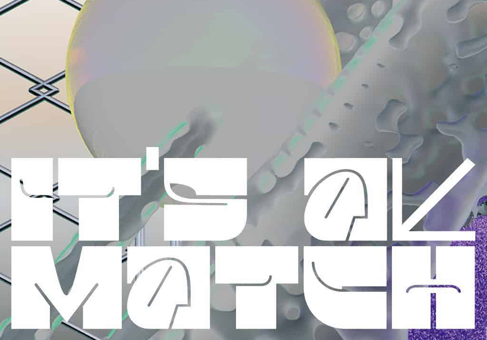
New from the Italy-based Supernulla Creative Studio, Rotonto is a variable typeface that contrasts its curves with angular, squared off counters. The proportions and general construction follow the conventions of a grotesque typeface, giving it an unusual aesthetic and a strong presence well suited a range of settings. Equipped with a tons of useful of features, the variable font file allows maximum flexibility.
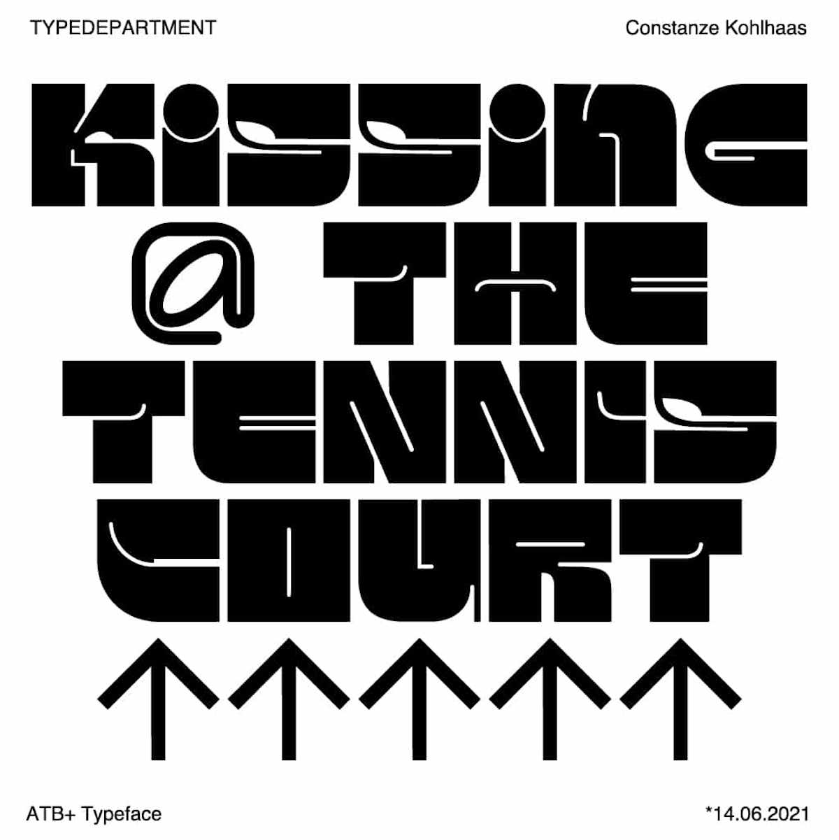
Short for Around The Block, ATB+ is a powerful single case font based on a square-grid system. The first font added to Type Department from Leipzig based Digital Designer Constanze Kohlhaas, ATB+ has minimal counter space and bold, juicy forms, perfect for designing headlines, titling, and logos.
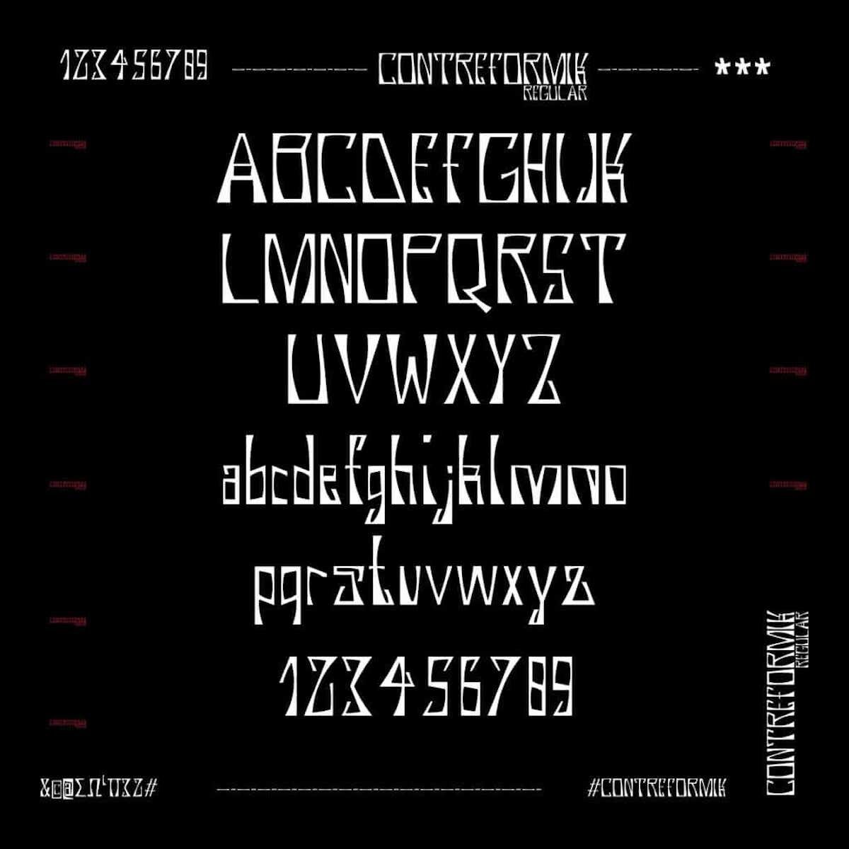
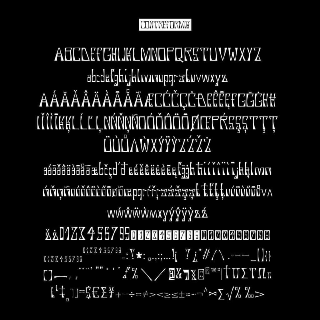
Contreformik – Thibaud Chanoine
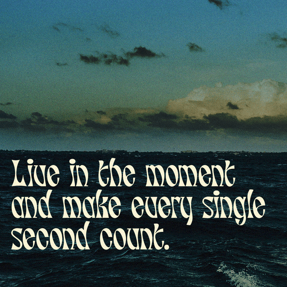
Contreformik is a stunningly unique new addition to Type Department. Named after its unusually shaped counter forms, the typeface has a whimsical old-style feel and a mysterious personality. With features including subscript & superscript, old-style figures, diacritics, ligatures and more, it offers tons of flexibility and potential for experimentation.
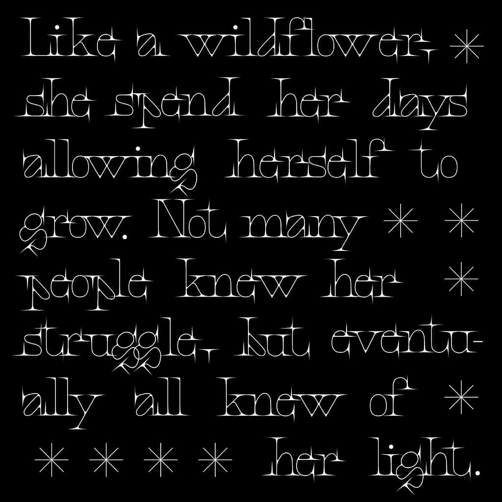
Faglia is a modern, futuristic display serif typeface by Natalia Timea, a brand new seller on Type Department. The expressive serifs are exaggerated and pointed, adding a sense of sparkle to every letter. Despite the unique and unusual shapes of the typeface, the letters are extremely legible, meaning it’s full of character while remaining clean and clear. With a total glyph set of 107, Faglia comes with features including uppercase, lowercase, numbers, punctuation, symbols and mathematical symbols.
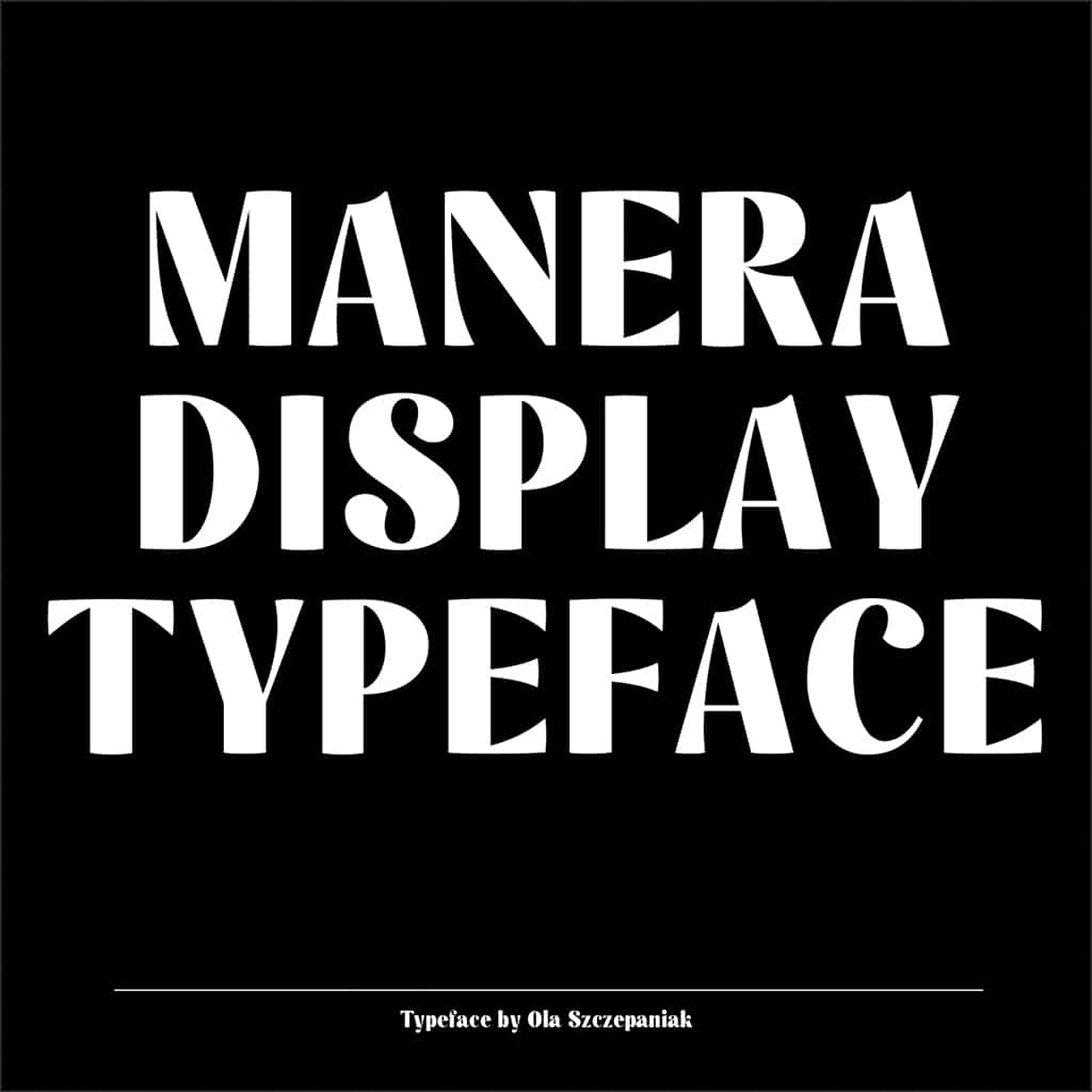
Featuring high contrast letterforms and a bold yet understated sense of elegance, Manera is a display typeface that’s suited to both headlines and some longer text settings. Designed by Warsaw-based graphic design student Ola Szczepaniak, this typeface is both modern and filled with inspiration from the past – a versatile and bold choice for a range of settings.
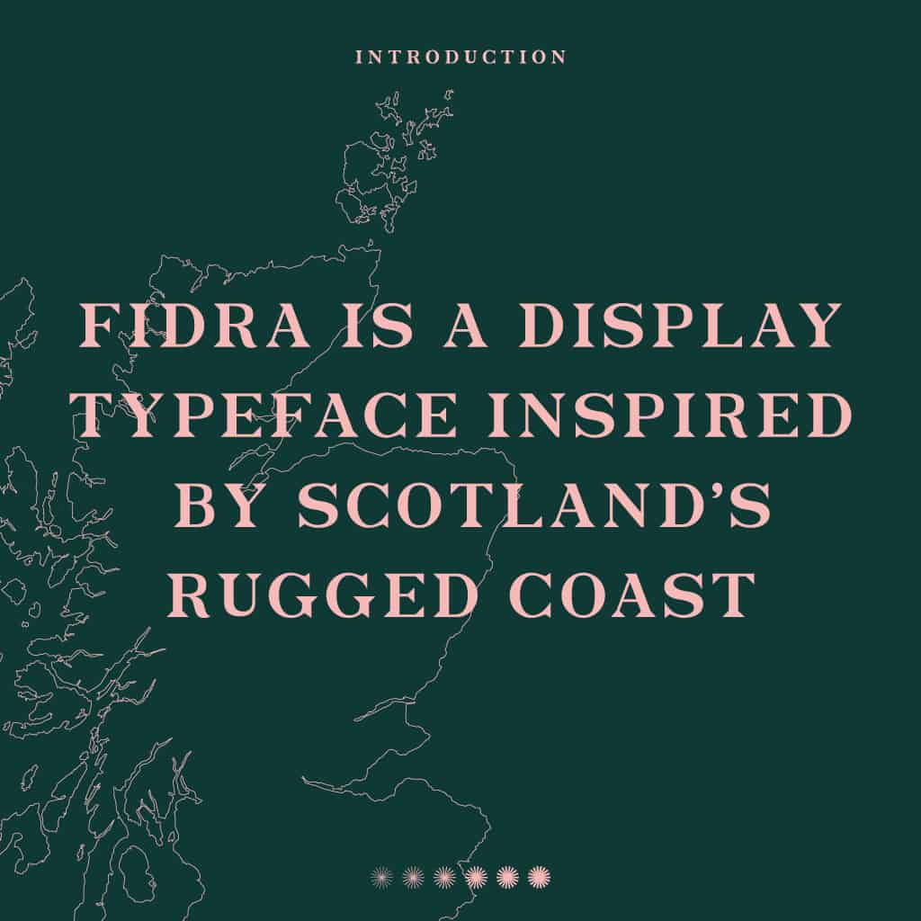
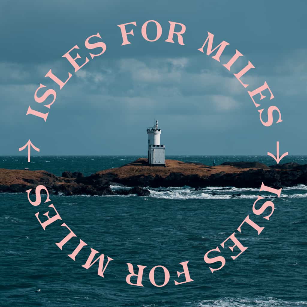
A display typeface inspired by Scotland’s rugged coast, Fidra is a new offering from Scottish Graphic and Type Designer Cameron Gibson. Its elegant Latin detailing includes curvaceous hooked terminals and sharp triangular serifs, which combine with a vertical stress axis for a contemporary aesthetic. This stunning typeface would be particularly powerful in contemporary branding projects and visual identities.
Evangelina – New Tropical Design
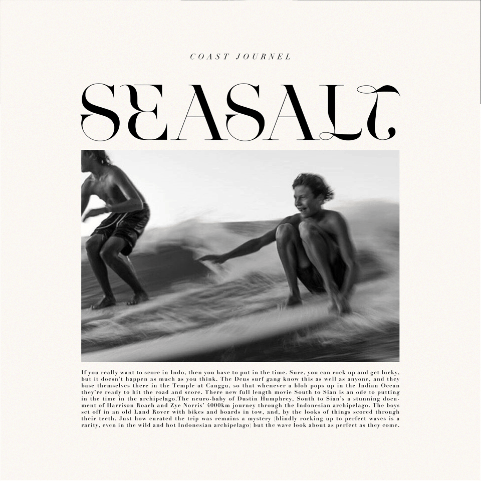
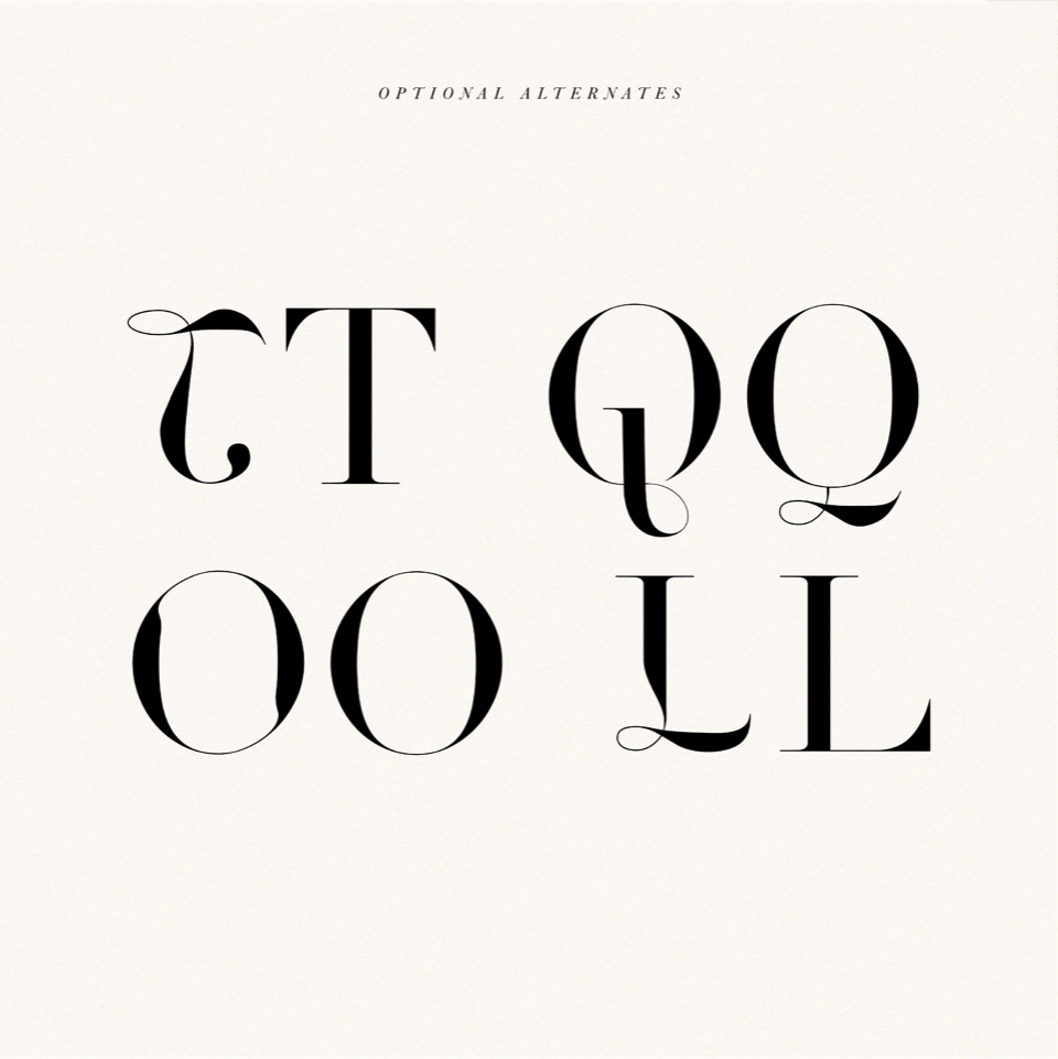
Newly released by Byron Bay, Australia-based boutique font foundry New Tropical Design, Evangelina is a charismatic display font. Created as an ode to fashion typography from the 1970s to the present day, its elaborate curves and unique shapes suit it perfectly to headlines, logos, sophisticated wedding invitations and elegant editorial layouts. If you’re looking for something classic with and edge, this is a perfect choice.
Keep an eye out on Type Department for more stunning new additions coming soon!

