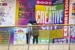
As projects, brands and events evolve over time, their representative graphic or word marks and communication systems can become disconnected and outdated. For festivals like Dutch Design Week, continuous evolution is a key element of the festival’s identity and Thonik Design Studio, based in Amsterdam, has embraced this quality of change by giving the nearly 20-year-old Dutch Design Week tulip a refresh.

Founded in 1993 by designers Thomas Widdershoven and Nikki Gonnisse, Thonik emphasises the importance of collaboration by working on projects that intersect art, design, and social issues. Their new visuals are described as open and fluid, featuring a lack of explicit branding that facilitates the festival’s forward growth and identity. In addition to this, the project saw an exciting revival of Wim Crouwel’s original bespoke typeface, bridging the gap between past and modern fonts for a richer visual and contextual experience.

DDW is an annual event held in Eindhoven and serves as a platform for designers to share their ideas and creations with a broader audience, including industry professionals, enthusiasts and the general public. The week becomes a hub of innovation and idea exchange, intending to showcase and promote a host of not just Dutch but global design talent too. Attracting thousands of visitors each year and featuring contributions from both emerging designers and established names, DDW reinforces the Netherlands’ reputation as a hub for creative thinking and design excellence.

“Having been invited to this year’s press tour, the thematic framework focused on ‘REAL UNREAL.’This theme explored the intersections between reality and imagination, encouraging visitors to question their perceptions and consider how design can redefine our understanding of what is “real” versus “unreal.” With exhibits and experiences that played with both digital and physical elements, it was truly inspiring to see how designers are thinking outside the box to create new, exciting futures by combining creativity, technology, and collaboration.
Through immersive installations, futuristic technologies, and innovative approaches to sustainability, designers at DDW 2024 pushed the boundaries of traditional perceptions. The event’s focus on collaborative change emphasised the important role design plays in helping to build a more sustainable and dynamic future for our planet.” – Amber Weaver, Director of TYPE01.
Through their thoughtful and sophisticated quality of work Thonik quickly became an ideal design studio to tackle this project. The interrelated nature between design and the wider context surrounding graphics resonates with the studio’s ethos. Their project objectives centre around creating designs that are not only visually striking but also contextually relevant, reflecting the narratives and values of the clients they work with, and positioning them as the optimum collaborator for the DDW festival.

Delving into the DDWs tulip, a configuration of quarter circles and rectangles, also seen in typography experiments as early as the 1920s, can be observed in the logo. For a retrospective at the Van Abbemuseum honouring Dutch painter Edgar Fernhout in the 1960s, graphic designer Wim Crouwel created a refined version of this typeface by adding subtle indentations to the letters E, A, R, and T. This intricate detail introduced a sense of rhythm to the logotype, increasing its character, with this particular detail allowing the font to progress beyond geometric form.
Since the typeface was originally designed for a museum in Eindhoven, the Thonik design studio felt that Crouwel’s Fernhout typeface would be an ideal choice for the new bespoke house style. With the endorsement of Judith Cahen, Crouwel’s partner, Thonik set out to design the remaining letters of the alphabet, along with numbers and punctuation, to ensure they could fully represent Dutch Design Week and other related text. The project was initiated in collaboration with Stuart de Rozario and David Quay from The Foundry Types, with a strong acknowledgement of the unique qualities of Crouwel’s original lettering.

The colour scheme of the project also takes its queue from Crouwel, who was frequently described as a colourist himself. The colour scheme is more sensitive than the clashing nature of previous pairings that have been explored for DDW, with the studio explaining their heightened awareness of the subtleties of colour spurred from their curation of Broken White at the Van Abbemuseum.
Roy Terhorst, a partner at Thonik, explains that it felt natural to animate the newly evolved font. He notes, “When the letters started moving, the underlying grid became visually present. A bridge was forged between the aesthetics of the past and the design language of the future: motion design.” The animations have provided a way for the typeface to evolve alongside the vision of Dutch Design Week and the social contexts it engages with, while still maintaining strong ties to its rich origins—an ode to its development.
Stay updated on Thonik’s future projects by following the link here.
Browse more custom typeface projects here.


