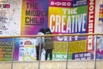
In collaboration with Ragged Edge, Wise released a custom-built, large-scale font for its refreshed visual identity and new brand positioning. Formerly known as TransferWise, Wise is a global financial technology company that offers a range of services designed to make international money transfers more efficient. This update to its brand identity aimed to enhance the user’s experience with increasingly expressive characters and presence on its trajectory of growth. The font production, led by type designer Luke Prowse of NaN Typefaces was simultaneously driven by the need for greater consistency with Wise’s marketing materials.

Following the significant change in Wise’s visual identity in March 2023, the new, energetic, and direct qualities of the font became fully realised. The essence of Wise Sans captures the innovative and lively character of the Wise brand, reflecting its forward-thinking nature. The font’s expressive design embodies the vibrant, modern spirit of the company, further aligning with its mission to make financial services simpler, faster, and more accessible across the globe.

The inspiration behind the project was drawn from letterforms and alphabets from around the world. The beauty lies in the details, with the “B” inspired by a sign in Davao City, Philippines, and the “G” influenced by Thai script. It’s a font influenced by the essence of Wise— international character and energy. Most importantly, it supports an impressive 342 languages.
After establishing the design of the custom typeface, the design team quickly began experimenting with integrating the new fonts into their existing design system; they soon realised how complex and outdated the system had become. They outlined how there were too many styles and overly generic names within the framework. As a result, this proved to be an issue for designers when understanding which style to use or where, without relying on lengthy and detailed guidelines.

To tackle this problem, the team began from scratch, completely redesigning the experience and experimenting with various sizes, weights, letter spacings, and line heights, all in pursuit of the perfect balance between style and boldness that would scale effectively. As a result, they narrowed their options down to four display styles, four title styles, and six body styles, reducing their total set from 22 to 14. Wise Sans naturally support many languages, but not all of them. As a result, it became crucial for the design team to find a way to communicate with customers in all languages without compromising their Wise experience.

Starting with the basics and introducing system defaults, they ensured that no matter what language a user spoke, they could still navigate Wise in the same way. While system defaults helped get the team halfway there, their sometimes unpredictable and clumsy functionality detracted from the overall Wise experience. To address this, fallback fonts were introduced for core languages that Inter and Wise Sans don’t support. They began with Simplified Chinese, Japanese, and Thai, which you can already see in their previous marketing materials.
The NaN team recognised that when designing for an international audience, it’s imperative to consider line heights and how they function in different languages. A tight line height may work well in English, but in languages like Spanish, diacritics (accents) can cause text to bleed between lines. A simple solution was to adjust the line height dynamically for different languages, allowing for more breathing space and improving legibility for all users. If you already have separate language stacks, this is relatively easy to implement.
Through learning from these lessons and continuously evolving their design system, the team has been able to craft a multilingual Wise experience that feels seamless, intuitive, and inclusive for users worldwide. Reinforcing Wise’s commitment to accessibility and user-centred design.
You can stay up to date with the latest design identities from both Ragged Edge and Wise through their websites.


