‘If BlackJack was a character, a real person, he would be a talented card player with a strong temperament and a great righteousness’ say design studio, My Name Is Wendy (@mynameiswendystudio). BlackJack is their stunning new monospaced sans typeface, and their first typeface to go on sale. Formed of a collaboration between graphic designers Eugénie Favre and Carole Gautier, My Name Is Wendy specialise in art direction, graphic design, typography and illustration. We’ve been chatting with them to find out more about BlackJack.
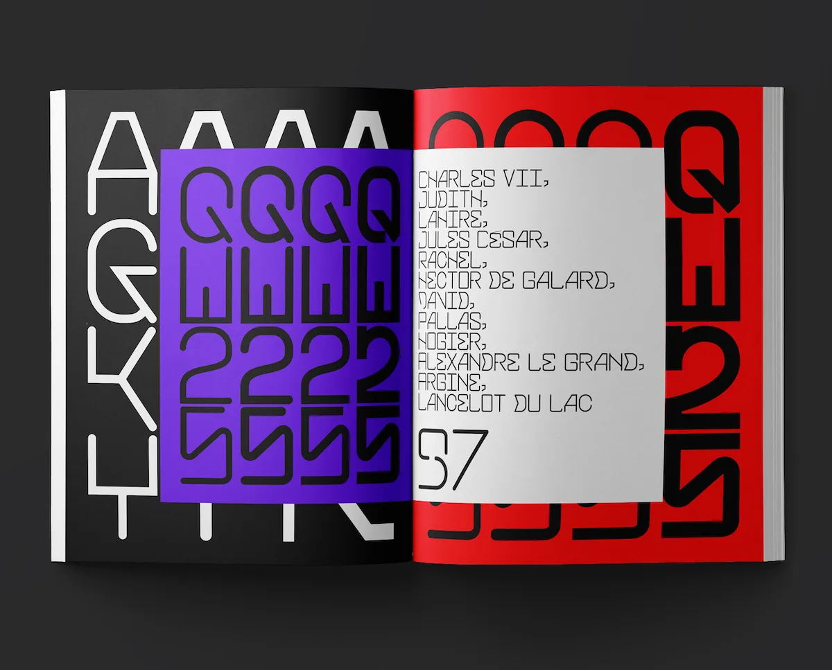
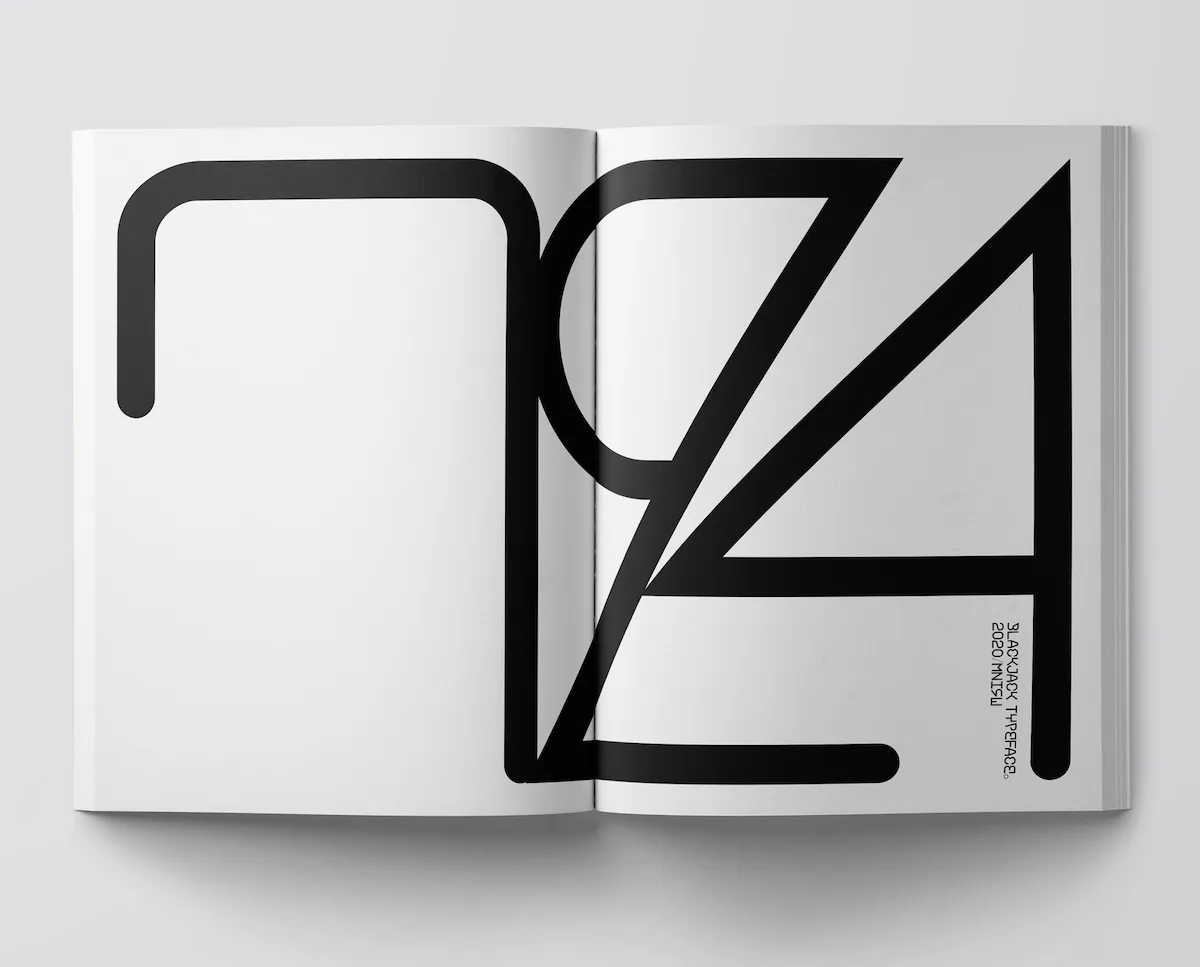
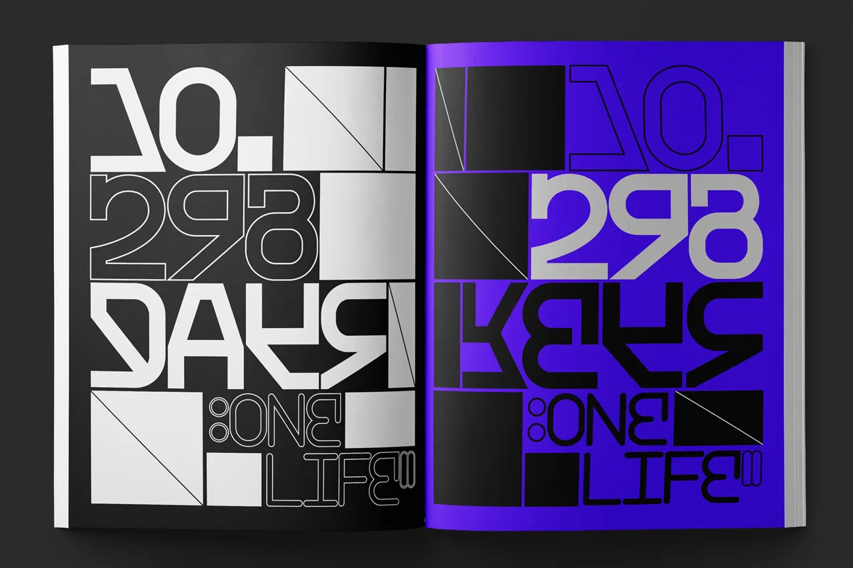
BlackJack was born from particular shapes found in the studio’s sketches and archives which they played with and manipulated, until it grew into an entire alphabet; created with no particular form of application in mind. ‘We think it can work for different projects (cultural or commercial)’, the studio explain. ‘The three weights have a specific glyphs. For example, the BlackJack Light has multiple A, B, E, M, Q, etc. whilst the BlackJack Black has a specific double L’. This undeniably adds a rich sense of personality to BlackJack and means that its continuity between weights and styles is smooth, whilst giving space to highlight individual quirks.
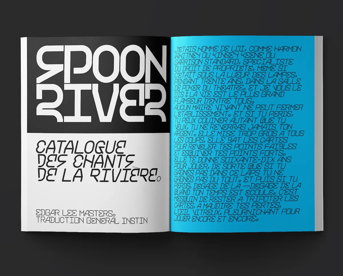
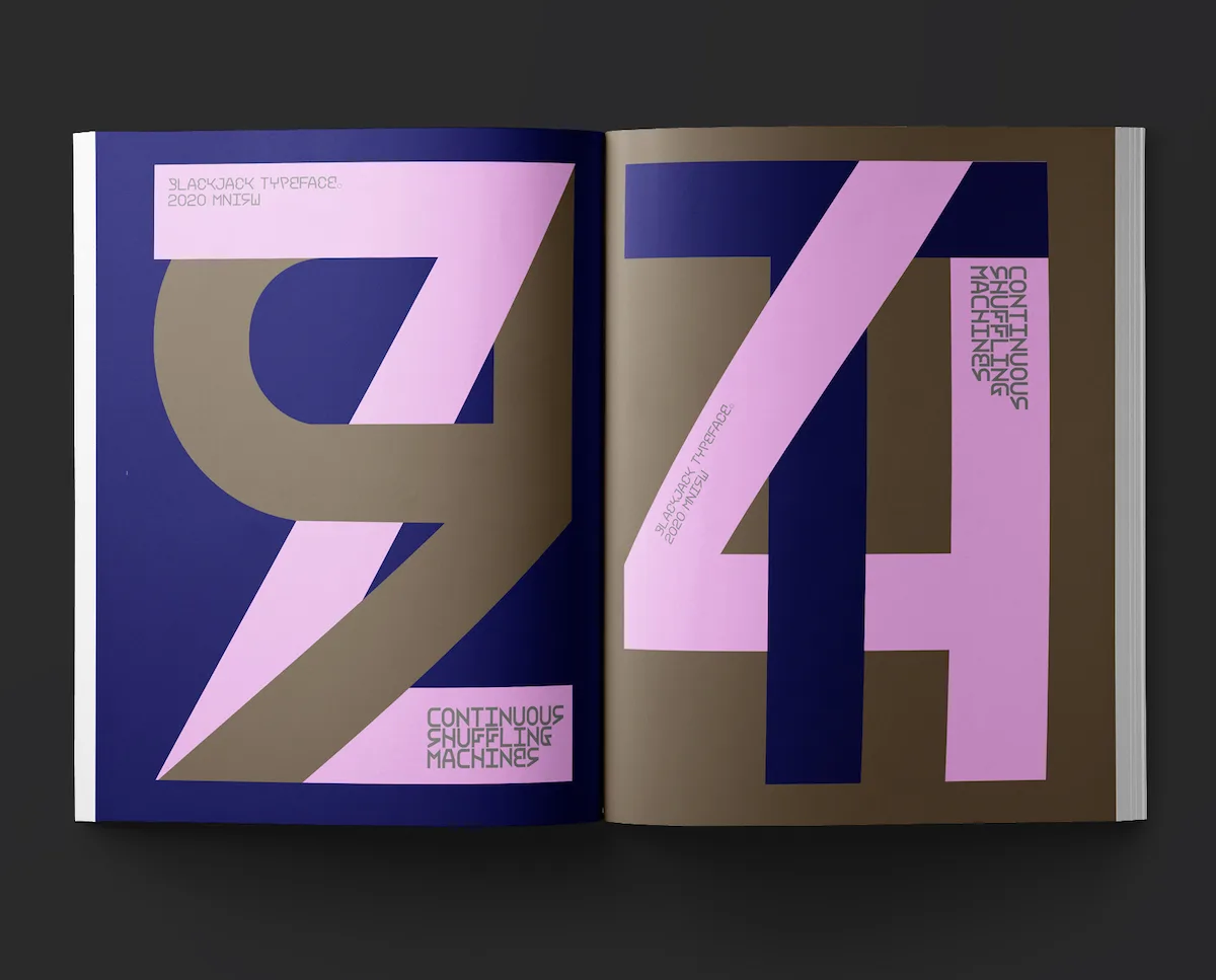
This highly structured sans typeface has a changing tone throughout its three styles (3 weights, 2 versions): BlackJack Black & Black Slanted, BlackJack Regular & Regular Slanted, and BlackJack Light & Light Slanted. ‘For us, a monospaced typeface is more straight’, the studio note. ‘It gives the impression of being more geometric or constructed […] It creates strength in the sense of presence’. Amidst the influx of experimental serifs in recent months, we were interested in MNIW’s approach to creating an experimental monospaced sans; moving away from the prominent and characteristic neutrality of modern sans typefaces led by Swiss typographic styles.
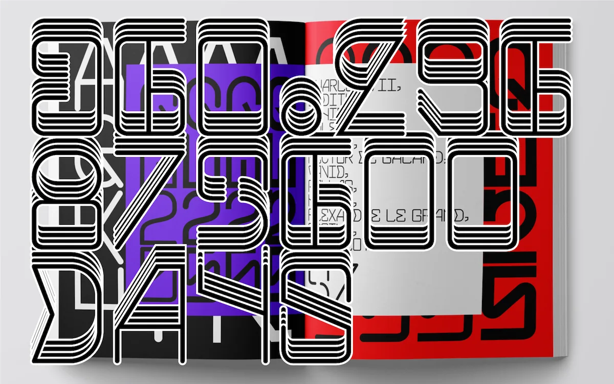
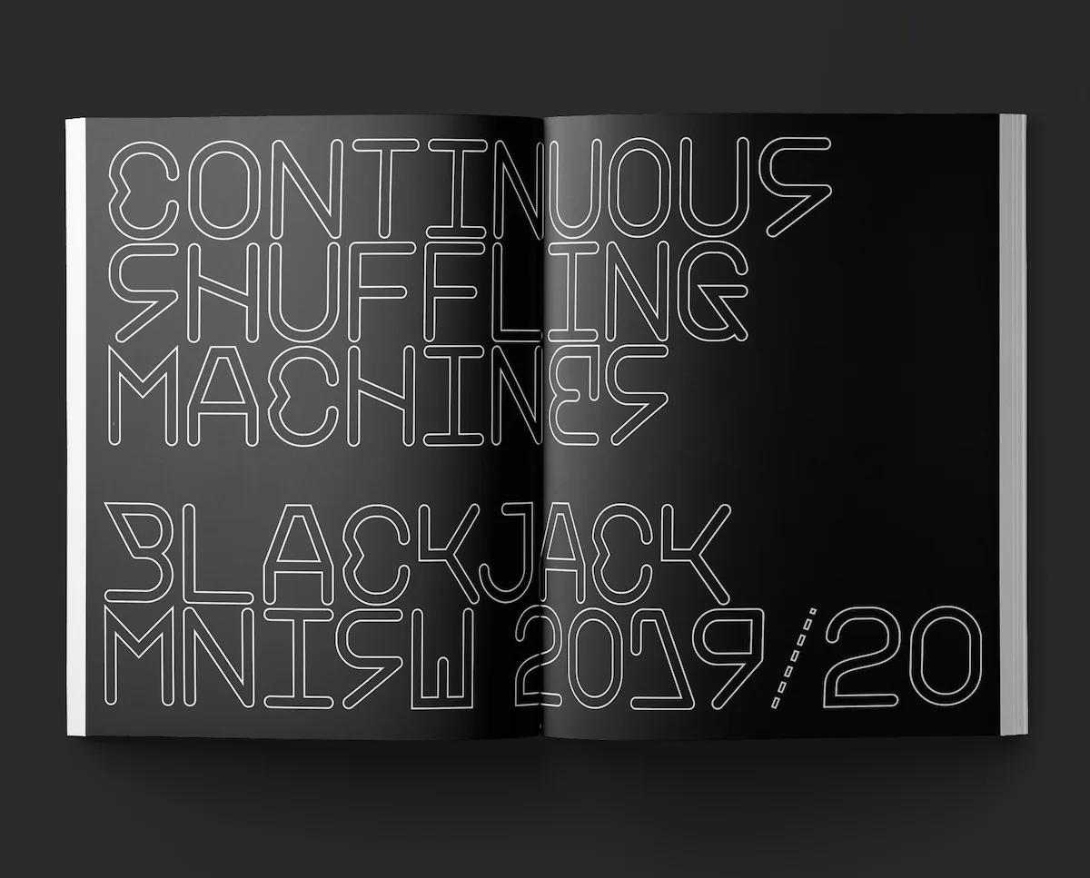
‘For these fonts, there is a stronger material dimension’, MNIW explain. ‘We like that… It’s due to the fact we consider both typography like letters and visual forms. For us, serif typefaces are more precious, they are dancers who play with backgrounds and light, with full and empty spaces. They are also interesting’. It’s true that modern experimental serifs seem to find their characters in close attention to detail and a sense of ‘preciousness’; often expressing their beauty or presence between unusual ligatures and intertwining glyphs. But BlackJack’s monospaced structure means as an experimental sans typeface, its strength lies in the bold distinctions between glyphs; created through its stark angularity and the odd contrasting curve.
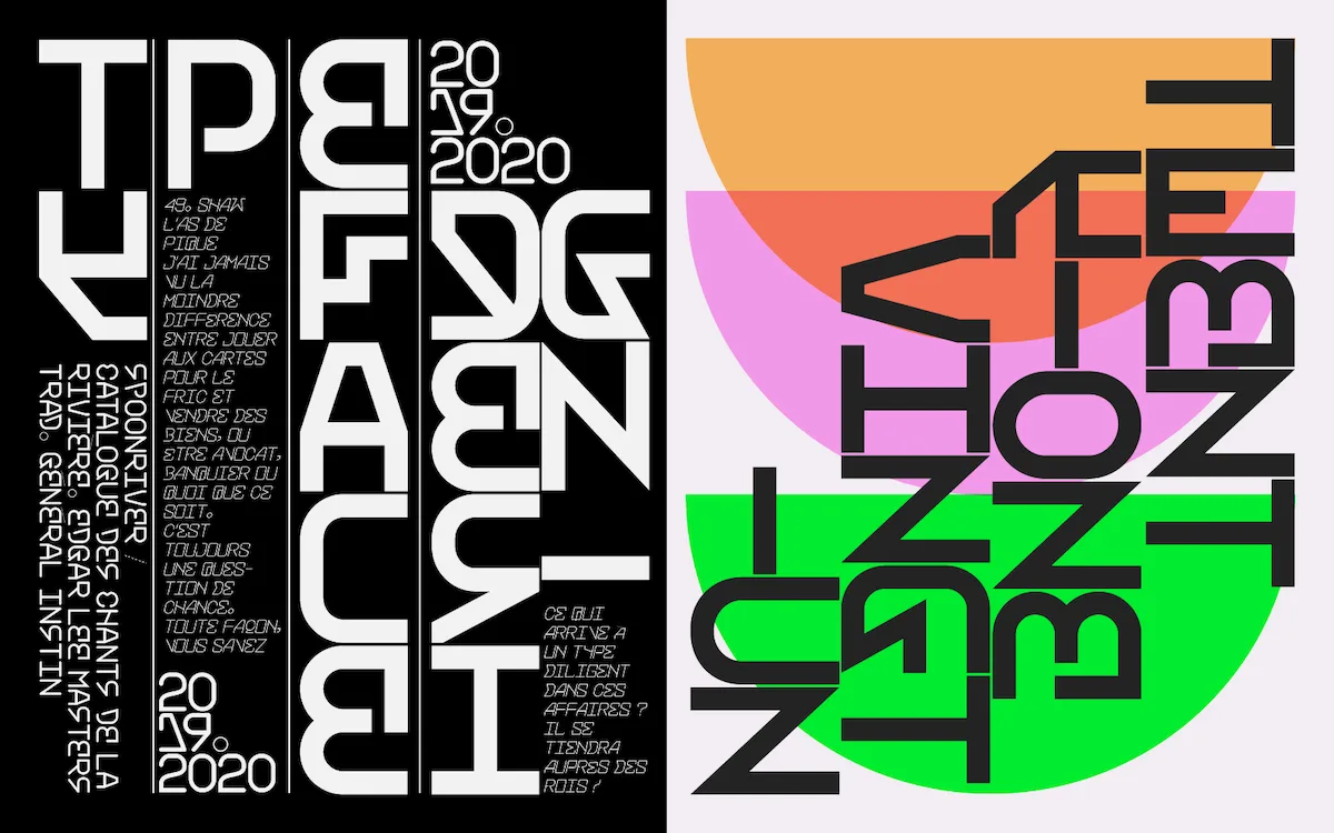
BlackJack is full of contrasting curves and angularity which gives it a dynamic visual presence. ‘It started with one letter’, MNIW explain. ‘We regularly create typographical compositions and lettering for commissions and among our sketches, there was one letter with a nice form… We drew whole alphabet – Blackjack Regular – and we liked it but it was too sweet with too many curves. We therefore drew a more brutalist version, very bold like a contrast, which became the Black weight. We drew the Light weight like a response to the other two and lastly, we finished the full pack taking into consideration three weights like a set’.
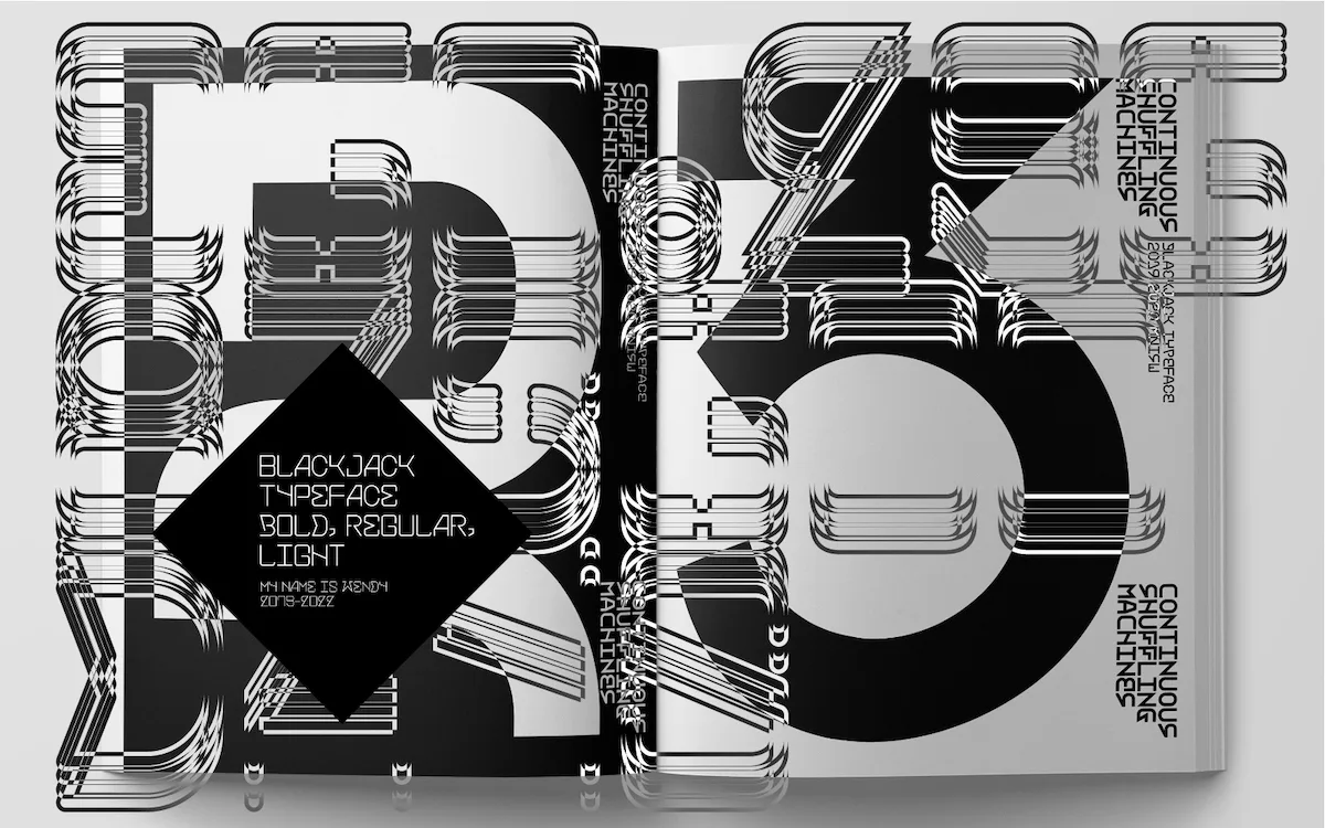
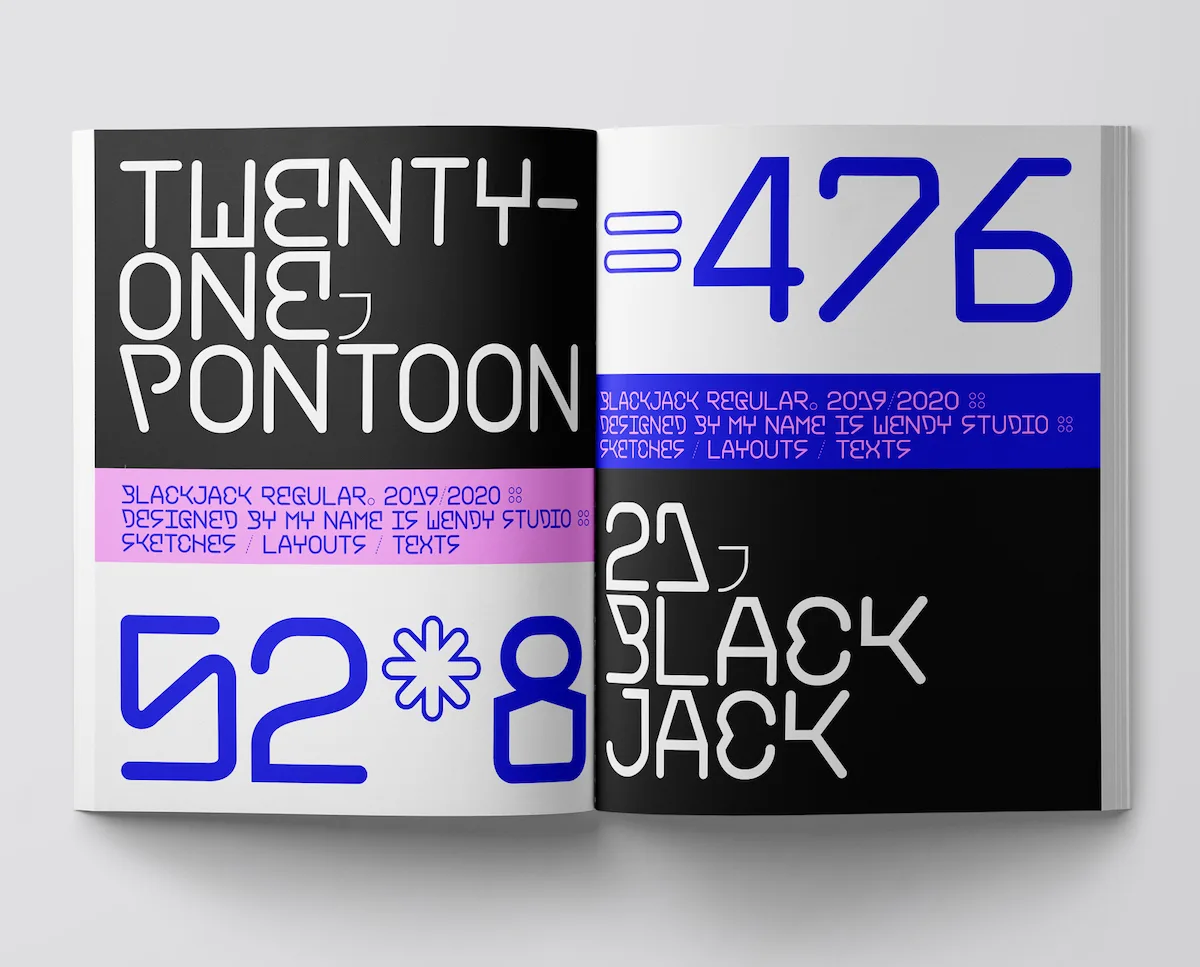
Whilst MNIW have created various other typefaces, BlackJack is their first to go on sale. As they expand, ‘from 2006, we created Wendy (sans-serif, mix of upper and lowercase), ViewWriter (Serif, two versions, 5 weights), Freaks (alphabet, exotic), Burlesk (serif), Newfabrik (sans-serif, uppercase), Klint (serif), Paulownia (Serif), Pogliotte 2, Turnover (monospace, sans-serif)… Following consideration of a series of requests, we decided to offer our typefaces for sale. Also, it’s important we check each typeface in order to offer a useful set of glyphs, so we take into account our own needs when we buy a typeface to ensure this’.
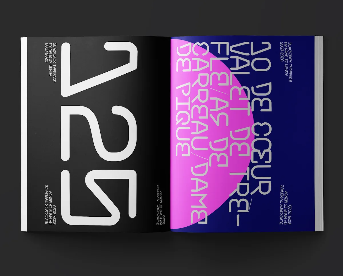
We’re obsessed with BlackJack’s bold and dynamic visual presence – it’s always so exciting to see the new experimental takes on sans displays. We can’t wait to see BlackJack in-use and we think it would look incredible in supersized headlines and visual identities for cultural exhibitions/events, as well as branding. BlackJack is available for purchase through My Name Is Wendy.

