Since its launch in 2019, Mark Bloom’s London-based foundry CoType has consistently produced high-quality typefaces that designers can count on for everyday design use. Now, they’ve launched their first superfamily, Lock, featuring a complementary sans and serif duo that offers versatility for a range of design needs and environments.
“Lock represents a new chapter for CoType Foundry, not only because it’s our first superfamily but also because it’s the result of a truly collaborative design process,” Bloom tells us. In contrast to CoType’s previous releases, such as their sans-serif Aeonik or serif Orbikular, a serif and sans-serif are brought together in one cohesive family. “The goal was to create two distinct voices—a clean, functional sans and a sharp, expressive serif—that still shared a unified tone.”


An Overview of Lock
Lock stands apart from other superfamilies with its more decorative approach, contrasting with the highly robust, extensive workhorses that lean more into function. Here, Lock’s concept blends tradition and constructivism with a hint of industrialism. Founder Mark Bloom and lead font developer Diana Ovezea collaborated on the undertaking, with Lock striking a balance between these elements and reflecting their personal styles—Bloom’s modular, constructed approach and Ovezea’s humanist, calligraphic sensibility. “Blending these two approaches into one cohesive design was the biggest challenge,” Ovezea adds, “but also the most rewarding part of the process.”
Calligraphy forms the backbone and starting point of Lock, where Bloom began by sketching the letterforms with a broad-nib pen “to capture the natural stroke direction, including the thick and thin contrasts.” This, according to him, helped define the core shapes of the typeface. From there, they refined the lines with custom brushes in Illustrator before bringing the shapes into Glyphs for further refinement.

The Design Process – It Takes Two
Created over a two-year period, CoType crafted a cohesive superfamily through a uniquely non-linear, back-and-forth process. Developing the four subfamilies simultaneously allowed for a unified skeleton and proportions across all styles and weights. Built in parallel, the sans and serif continually informed each other—changes in one subfamily would ripple through the others, resulting in a harmonious typeface designed for seamless integration.
In hindsight, Ovezea tells us, she would have factored in more ‘breathing room’ into each design stage. “Although I did take time to step away when needed, I often felt pressure to push things forward and struggled with the feeling of being ‘stuck.’ What we learned is that projects of this complexity need dedicated “away” time to reflect and reset.” Upon return, it was easier to find solutions, ultimately improving both the process and the outcome.


Sans and Serif
Each subfamily contains six weights and includes glyph alternates, culminating in a superfamily of 24 styles. As Lock sits on the ‘smaller’ end of the superfamily scale, designers are able to create striking, cohesive visual identities without feeling overwhelmed by endless options.
The sans-serif subfamily of Lock is characterised by its clear, understated design, featuring smooth, unadorned letterforms that prioritise clarity and readability. The serif, meanwhile, presents a more expressive and sharp appearance and incorporates traditional serif elements, yet maintaining a modern, constructed feel.
As one of the superfamily’s defining features, the stencil versions of Lock were designed to add a playful and bold dimension to the Lock family, working particularly well in larger-scale uses like headlines. “The stencil cuts bring a fresh, experimental element to both the sans and serif styles, without losing their core identity,” says Ovezea. “For me, the stencil versions provided an exciting opportunity to push the boundaries of Lock’s design, allowing the family to stand out in more creative, expressive contexts. Like the sans and serif typefaces, the stencil versions were developed in parallel to maintain cohesion. As such, both the sans and serif can be swapped with their stencil counterparts without disrupting the text flow.
Lock in Use
While Lock lends itself well to headlines, CoType emphasises that the subfamilies excel at all scales. The sans’ clear functionality is well-suited to body copy and longer passages of text, while the distinctive and expressive nature of the serif is perfect for headers and shorter text. Bloom and Ovezea envision Lock being used across a wide range of applications, from editorial work and packaging to posters, logos, and branding.


Stavro’s Specimen
After being viewed for months—years!—through a screen, there’s nothing quite like seeing the intricate lines and carved forms of a typeface come to life on paper—and the tangible, tactile experience that comes with it. In this way, a printed type specimen is not only a demonstration but also a celebration of a typeface in action. This is no less true for Lock, whose specimen beautifully showcases the superfamily’s versatile and modern humanist traits, thanks to the design direction of Astrid Stavro.
Bloom invited the internationally renowned, London-based designer to design the publication, having long admired her work. “After meeting up with her last year,” he says, “I started talking about our upcoming typeface, Lock, and showed her some work-in-progress examples of the superfamily, along with a few teaser Instagram posts featuring the serifs in red and the sans in blue. Shortly after that, I decided to commission Astrid to design the type specimen book for Lock.”

The pair agreed to maintain these contrasting colours as a key design element. The rest of the brief, however, remained open for Stavro to interpret. She explains that the design’s foundation was inspired by taxonomy and the science of classifying the natural world. “The words ‘type’ and ‘specimen’ sparked an exploration into type classification systems,” she notes. “What makes Lock truly unique is its pairing of serif and sans serif—enhanced by striking stencils—all within a single type family.
Each style complements the others, yet stands strong on its own.” Using a taxonomic framework, Stavro and CoType showcase Lock’s rich typographic ecosystem, weaving together a collection of botanic-inspired words and forms that reveal a story across multiple pages. “Type designers create the letters that graphic designers use to shape entire worlds. We hope this collection of botanic-inspired words and forms offers inspiration, unlocking exciting typographic possibilities,” she concludes.
For both designers and type-pairing aficionados, this release is an exciting offering. Recognising that serifs and sans are frequently paired in graphic design yet rarely found together in a superfamily, CoType has ensured Lock’s subfamilies are harmonious, regardless of how they’re mixed and matched in designs.
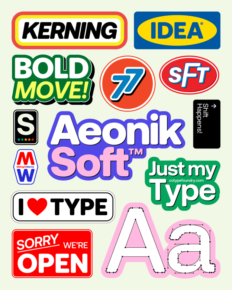
Currently, CoType has no immediate plans to expand the Lock superfamily, “but that could change in the future,” says Bloom. “Our best-selling typeface, Aeonik, has evolved over time to include Mono, Fono (fake mono), and additional language support, and Lock could follow a similar path. For now, we want to see how Lock resonates with designers and how it integrates into their projects. That feedback will naturally guide any future developments.”
For more information on Lock’s licensing details and language support, check out CoType’s website. And to stay updated on future developments and releases, give them a follow on Instagram/X/LinkedIn.
Browse more of the world’s latest font releases here.


