Awista Montagne describes his understanding of typography as ‘a pattern and a unit of letters which creates a dynamic… this dynamic giving meaning to a concept’. This description seems to hit the nail on the head when looking at Awista’s work. The unfolding dynamics of his forms are abstract and intermittent; his typefaces unique and destabilising. They leave you disorientated, but in the best way possible. Creating a lasting impact, we find his work to be a real breath of fresh air.

The 25 year old French graphic and type designer is based in Paris. Having begun studying design at 16 in Claude Garamont High School of Graphic Design and Printing Materials, the culmination of Awista’s third year of ECV PARIS eight years later marked the end of his formal design education. ‘I decided to drop out of studies’, Awista says. ‘I made this decision because of the feeling of stagnation and slowing down… I couldn’t move forward and work freely. However, it was a really great experience, I had a chance to meet and to work with a lot of interesting people’. Now, the creative works as a freelancer developing various projects as an art director, alongside working on typefaces, logotypes and editorial design. ‘I’m really excited to do this; my main passion is to create intriguing lettering and typefaces’, he adds.
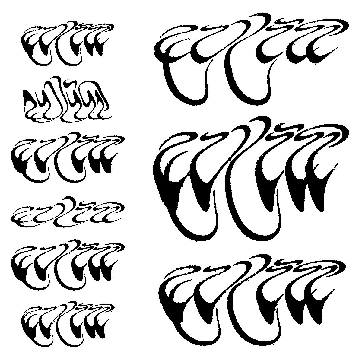
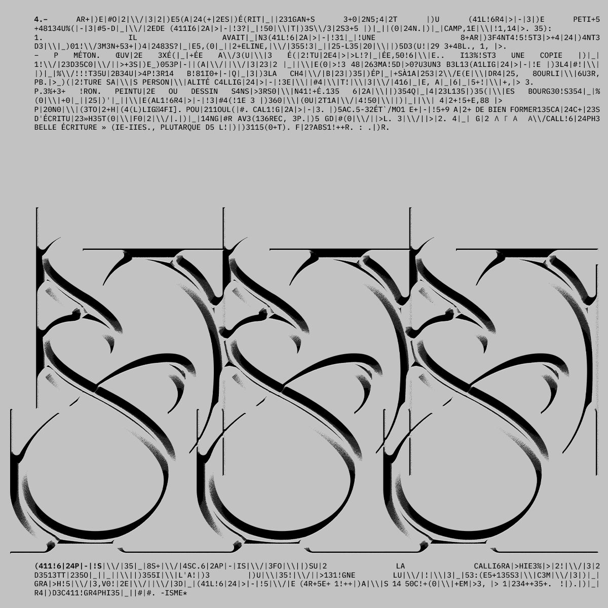
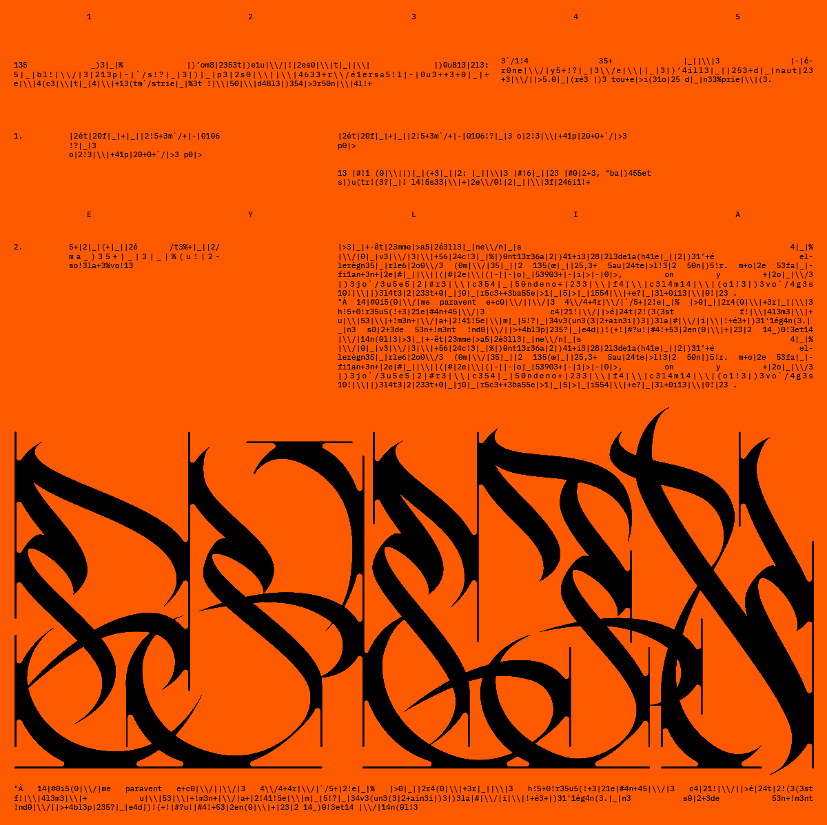
Awista’s comments on his design approach are compelling to hear about, and there’s no doubt they seem totally authentic to the visual side of his work. ‘Initially, when I design an alphabet I don’t think about its readability,’ he tells us, ‘but more about the rhythm and the meaning it should transmit. Then I adjust the alphabet as it’s possible, to make the reading more logical. My inspiration comes from everywhere, from elements of nature, old stuff from the 90’s, Persian calligraphy, my roots, leetspeak, random things from the street… I don’t have a predefined style and I’m always trying to experiment on the ways of liberating the letter’.

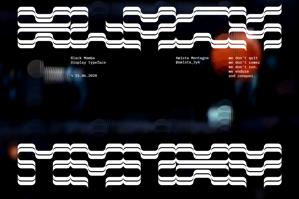
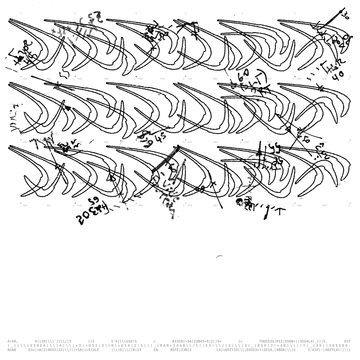
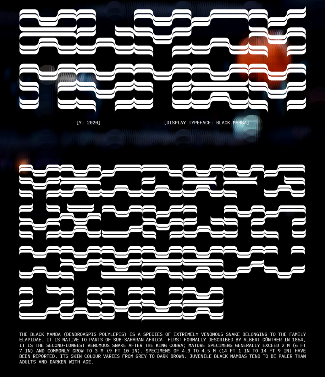
One of our favourite pieces of Awista’s work is Black Mamba Display, so we wanted hear more about the typeface’s background. ‘Black Mamba Display is a monospace tribute typeface to Kobe Bryant’, Awista tells us. ‘In this project I wanted to merge basketball universe with properties of the « Black Mamba » snake. I was looking for something speedy, unstoppable, long; something meandering as a snake and moving as a basketball player. After watching many videos I started by drawing long lines with certain dynamics (using a calligraphic pen) in my sketchbook. Repeating those lines, I found a way to make it readable. After that, I drew those letters on my computer and played with them to develop it’. Black Mamba is a sensitive, insightful tribute; we’d definitely urge you to give it a closer look.
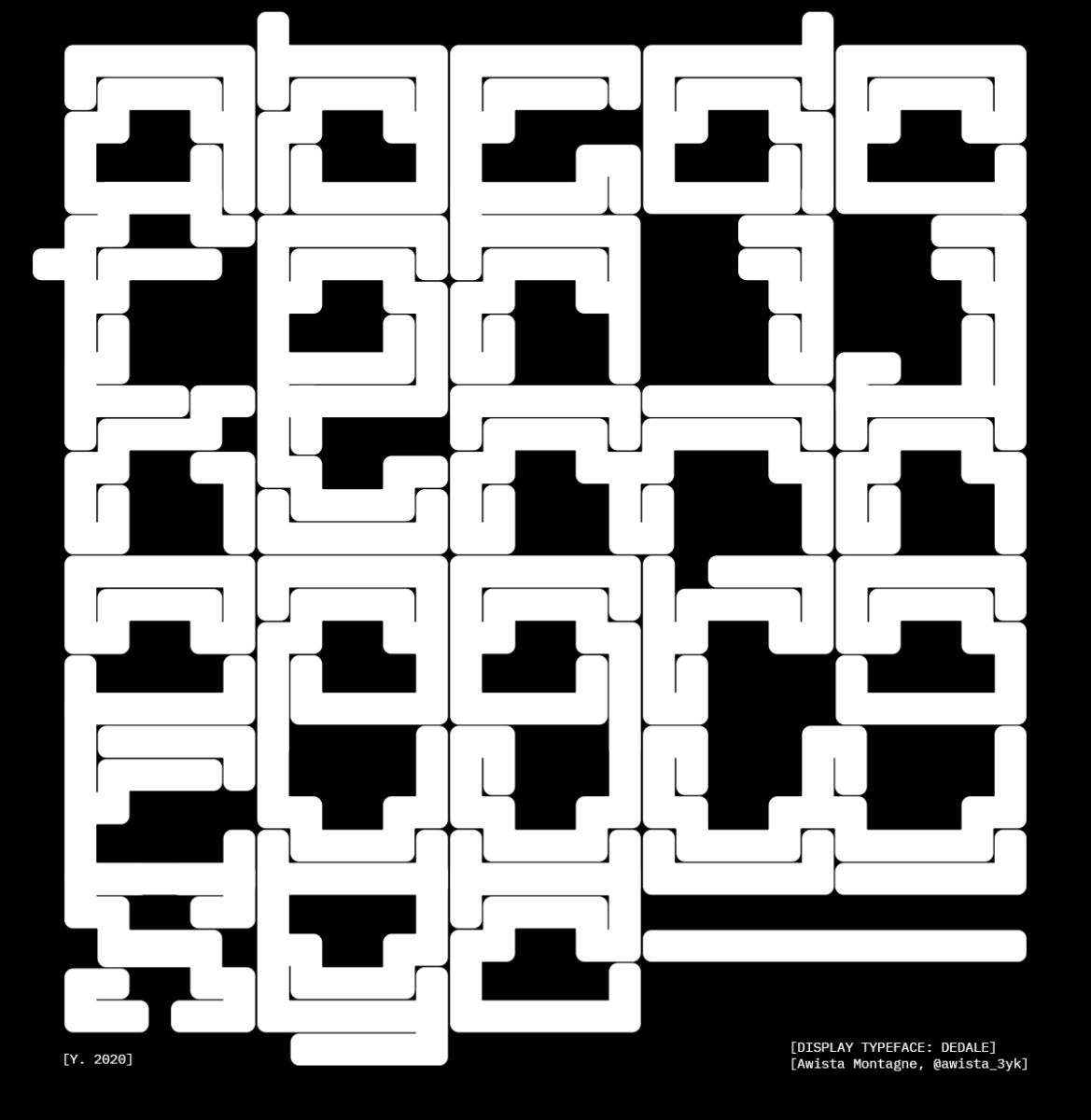
We also wanted to hear more about Awista’s WIP typeface, Dedale Display. ‘Dedale, or Daedalus [the typefaces namesake] was an inventor, an architect and a sculptor in Greek mythology’, Awista tells us. ‘He created the labyrinth; an elaborate and confusing structure for King Minos of Crete at Knossos to hold the Minotaur’…
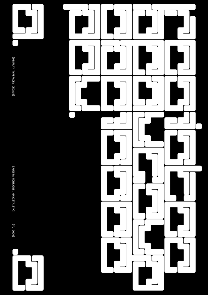
‘Dedale Display is an experimental typeface, inspired by the representations of the labyrinth on the old silver coins from Knossos (400BC). I decided to mirror the maze component of the myth Dedale’s Labyrinth in my typeface. I purposefully focused on the complexity of this typeface, making it confusing and difficult to comprehend at first sight. Taking one’s time and concentration are key to both solving the maze and deciphering this typeface. Thanks to the small leading, some letters overlap and create an intriguing pattern’.
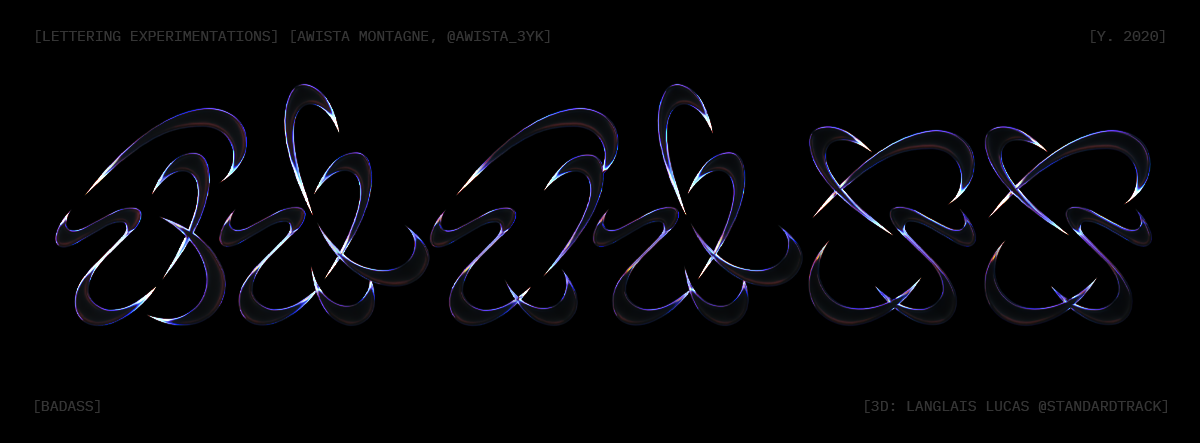
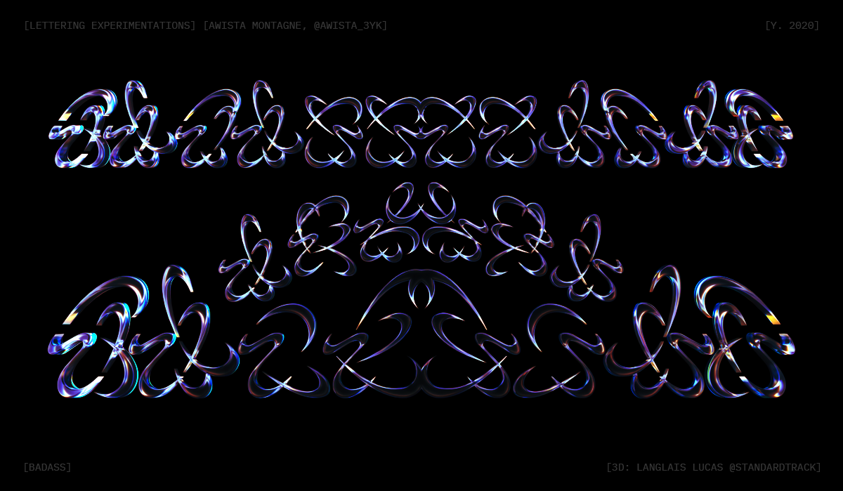
We’ve loved hearing about Awista’s refreshing take on type design. If you’re intrigued and want to keep up with Awista, be sure to check out his Instagram and Behance. We can’t wait to see Dedale Display in its finished form, but for now, thanks, Awista!

