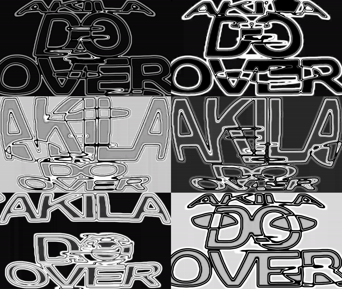
Not many creatives can capture the emotional essence and expressive power of typography and experimental type as effectively as Vlad Boyko. Known for his experimental digital collages and dynamic, type-based designs, his work pushes the boundaries of legibility and functionality, transforming text, texture, and motifs into a richly emotive and eclectic visual experience. As his portfolio will attest, no two pieces are similar, leading to exciting clients and collaborations such as Polish post/clubwear brand Doom3k, a cycling apparel brand, and a slam poetry festival.
Balancing the demands of freelance life, the Brussels-based Ukrainian designer consistently questions and nurtures his creative process and channels his insights into fostering a like-minded community — the highly collaborative platform Processed Lab. We had the pleasure of chatting with Boyko about the roots of his career, the inspirations behind his unique style, and how he hopes he can continue to collaborate and push an alternative design education in his way.


Poppy Thaxter: Hey Vlad, how are you?
Vlad Boyko: I’m okayyy 🙂 I’ve never really known how to properly answer that type of question but I guess it’s been good! Just trying to balance life and work as a freelancer and explore myself a lot 🙂
PT: It’s great to hear that you’re finding balance! Freelancing can be quite a journey. We’re intrigued, when did your love affair with design take root? Were you one of those kids who was always creating?
VB: I guess so, I’ve always been this kind of creative child, but I’ve never really had an exact passion like “this is gonna become my job.” I just liked trying out different creative stuff, especially coming up with different characters and worlds around them – drawing comic books or writing stories. However, the design route happened quite spontaneously. When choosing a university to apply to, the only thing I knew was that I wanted to do something creative, and at that point, graphic design sounded like something both creative and commercially applied, so I decided to go for it. And it stuck 🙂
PT: What inspired your current, digital-collage-like, approach to design?
VB: It’s a bit hard to figure it out for myself at this point! 😅 My style and approach has been changing a lot but it was mostly influenced by the work of other people I’ve been finding inspiring. Back at uni, I was really into this very Swiss, grid-based design, because it was easy to analyse and understand, as I didn’t have any visual art background. And I just went for what seemed the most logical at the time. However, after a while I felt like I wanted to introduce more expression and emotion to my work, so I started to seek something more flexible and playful.
PT: What fascinates you about creating eccentric type and pushing typography to the limits of expression and legibility?
VB: For me, it’s all about the emotions behind it. As many of my works are very type-based, I want the type itself to be playful, funny, sometimes dramatic… I feel like there’s so much potential in working with typography, apart from just pragmatically using it as a text visualisation tool, so I tend to explore the different emotional directions it might take.
PT: Out of everything you’ve created, what works are you most proud of and why?
VB: It’s hard to highlight something out of the whole spectrum of work I’ve created ‘cause my favourites change all the time 🙂 But if I were to pick a few out of the recent projects, one would certainly be the collaboration with Polish clothing brand DOOM3000 (@doom3k). I’ve designed two scarves and beanie hats and directed little campaigns for each of them, mixing my own photography with AI, which I’m very proud of 🙂 There were also multiple things that have not been released yet, so it’s a truly amazing, ongoing collaboration.


I’m also really happy with the work done for RoadWorldwide, a US-based cycling apparel brand. Together, we created a T-shirt and a whole lore around it, including an animated teaser video (with my friend Kuba (@kubamatuszczak) and a zine. The zine tells a fantasy story about primal cyclists who invented the first bicycles and used them on their spiritual journey 🙂


PT: When working with type, how do you approach the challenge of balancing functionality and aesthetics in your designs?
VB: For me, function always comes second, as I try to explore the emotional and aesthetical side of typography first. The thing is, sometimes the design doesn’t have to be very legible if it’s purpose is mainly to set a vibe or an emotion. But if legibility is important then I try to add some additional context to it or try to reduce the emotional part and balance it out. At the end you can always add a smaller text block repeating what an expressive piece of lettering says, so you won’t have to sacrifice the expression.
PT: Could you tell us a bit about Processed Lab? Where did the idea come from, and what is your vision for the platform?
VB: I like to think of Processed Lab as my alter ego, a collaborative platform, where I can realise some of my ideas around design education. Last year I really felt the urge to teach and while I haven’t found a job as an educator, I decided to organise workshops and build community on my own. For now, it’s mostly been graphic design workshops with a special focus on type and so far I’m super happy about the community building around it.
I’m trying to push an alternative design education with both the process and the result being a collaboration between all the participants – whether it’s an experimental publication or a typeface where each participant has designed a few individual characters. There will be more workshops upcoming (both online and physical) soo stay tuned!


PT: Which tools, materials, and software have a special place in your toolbox?
VB: For the last couple of years it’s been mostly Adobe Illustrator and After Effects. I use Illustrator basically for everything, it’s a base for almost any project I do. After Effects, however, can also be a great help in creating static visuals, not only motion work. Sometimes a project can start with some animated sketches and still frames can later become posters or logotypes.
Recently I’ve started to explore analogue tools a lot and now I feel like I’ve created a new comfort zone for myself, which results in multiple projects of mine having been drawn with ink or blow pens (those are actually super fun). Recently I’ve been coming back to actual drawing more often because I feel like it’s a really natural and simple way to visualise what you feel – it’s like a brain directly connects with the hand.
PT: And when it comes to type, are there any particular foundries or typefaces that you’re drawn to?
VB: The funny thing is that I almost never use typefaces from established type foundries. Instead, I can spend hours scrolling through endless archives of free fonts libraries at dafont.com or 1001fonts.com. Sometimes it feels really cool to discover a funky typeface designed by someone back in 2004, then you realise that the website of that designer is still running, with the last update made 15 or 20 years ago. Then you truly feel like an archaeologist who has just discovered a long-forgotten typeface and can now bring it back to life. But if I were to mention the foundries that I love, they would be ABC Dinamo, WiseType, Velvetyne and ADVE.tf.
PT: Outside of the design world, where do you go for inspiration?
VB: I often look for some textures, scratches or traces when I go outside. That might not be the most original thing to do but somehow all the pictures you take end up unique anyway – you never know if someone has ever taken a picture of the same scratched wall. After months of collecting I have ended up with a solid archive of real-world textures; some of them can later become a base for a poster or cover artwork, while some can remind of a letter or a symbol, which can also be put in use. That’s some kind of an archaeological activity as well 🙂

PT: How much of your time is dedicated to sharpening your skills and exploring new territories?
VB: I try to slightly push myself with every project I do, like to try something I haven’t done before or something I’ve been wishing to try for some time already. And it often results in a lot of reflection in the process. This exploration usually happens while working on commissions, since I don’t really create lots of personal work. Recently I’ve mostly been focusing on the soft skills rather than the hard ones.
For example, I really want to learn Blender or TouchDesigner but never had enough patience and time to do so; instead, I like to challenge my way of thinking and how I approach the creative process to see what else I can get out of the knowledge and skills I already have.
PT: In your opinion, do you think it’s important for creatives to create physical sketches and work away from a screen?
VB: I think that everyone should have their own approach and trust their needs and feelings. Back at the uni, we were told to sketch A LOT and I was doing it mostly ‘cause I had to, without really understanding why. I’ve been working mostly digitally for a few years, and it’s been totally fine. However, for the last couple of months, I’ve been feeling the need to touch paper more 🙂 Ultimately, if you feel like you want to draw or need to sketch before going on with the project – just do it! But it’s totally fine to be very digital, as long as you’re happy with the process and the result.


PT: Could you walk us through your creative process when it comes to, say, designing a poster? What are your starting points, and how does the design gradually take shape?
VB: To be honest, my process is often quite chaotic! If I were to put it in some order, it usually starts with a general idea of the desired feeling. Then I decide how to achieve it: through overall composition and colours, wordplay, or a particular illustration/object. I do lots of tryouts to match the idea in my head until it clicks. Then I organise the chaos I’ve made and work on the final steps.
When I’m stuck, it helps to leave it for a couple of days and come back with a fresher mind (if the deadline allows). Otherwise, a classic ‘taking a shower or a short walk’ can also work. Another thing that sometimes works for me is to stare at fonts until I find something that could work well for the concept—sometimes a random font can spark nice ideas.
PT: Are there any techniques, effects, or mediums you would like to try?
VB: Among digital ones – Blender and especially TouchDesigner. I also want to use more Aftereffects plugins ‘cause it very much extends the possibilities of what you can do with AE. And when it comes to manual tools – I reeeally want to try to do something with airbrush (especially on clothes).


PT: On a broader note, do you have any big career aspirations or dream projects/clients you’d like to work with?
VB: I’d really like to work on something BIG, like continuously curating and creating visuals for a club or institution, working on graphics for a clothing collection, or art directing an edition of a magazine. So if you’re reading this and have something to offer, let’s workkkk 🫶🏻
PT: To round things off, are there any other creatives you draw inspiration from, or you’d like to recommend or give a shout-out to?
VB: I think among recent major inspirations I could totally name Jonathan Castro (@jonactan), a creative duo of Christophe Synak (@el_papi_kriko) and Nina Muro (@nninamuro) and their work for BrainDead, crazy world of posters and artworks by @jaaaaaanoooo and @safkan.tehlike. You should also check out Hii Magazine Issue 3: Punk in the Post Apocalypse – art-directed and designed by @drewknowitz. I think that’s been my biggest editorial inspiration lately.
Browse more of our industry interviews, or typography features.


