
We speak with Tom, Creative Director at the incredible Wolff Olins, about how to use typography to tell stories with meaning.
ZLM: Hey, Tom! Tell us about yourself 🙂
T: Hello, I’m Tom—Creative Director at Wolff Olins (@wolffolins). I’ve spent most of my career working at brand agencies in the UK and Australia but recently returned from living in the USA—working at Facebook Reality Labs (now Meta) on their AR/VR hardware products.
Thank you for inviting me to talk about all things typography—probably the thing that originally got me interested in design. I’ve spent way too much time scouring car boot sales for letterpress, gawping at typefaces or noticing how a leaf looks remarkably like a letter G. So it’s a pleasure to be here.
ZLM: There are so many different tools and approaches being taken by branding studios today—what is Wolff Olins’s culture & approach?
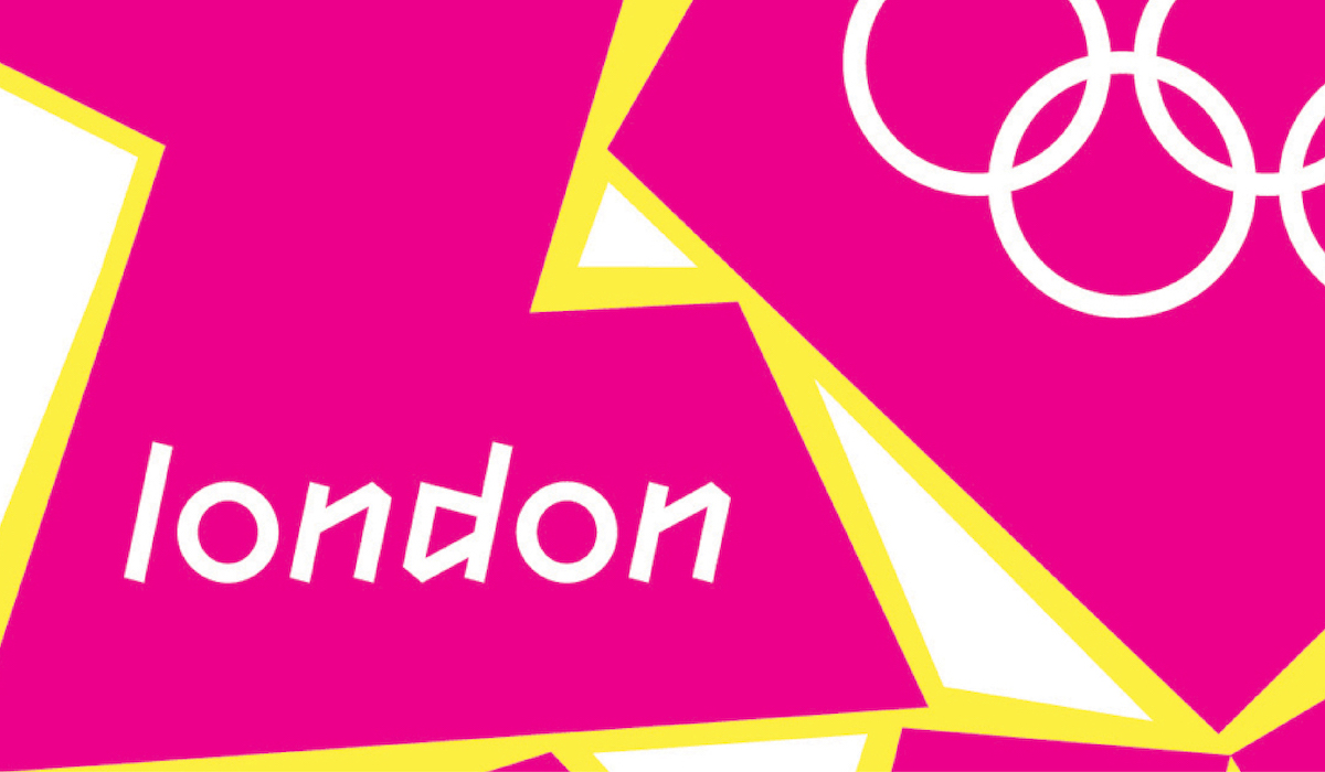
T: What attracted me to Wolff Olins was the ambition and culture of creating things that the world has never seen before, the attitude that things can and should be different, encapsulated best in the London 2012 Olympics. That spirit and culture lives on today—we don’t do the ordinary, the predictable or the fashionable. We aim to look at things differently, to always question why, to transform businesses and to never stop pushing until we’ve created something remarkable. The culture is to push the work, but to look after each other and make it fun. I believe the best work is done when you’re designing with a smile on your face.
ZLM: Yes, definitely. In your experience, then, what is the role of type and typography in building a powerful brand? What can well-crafted/selected type do for brands?
T: In short, massive.
An old (but still useful) way to think about a brand is as a person. And like a person a brand needs to show its personality—typography is a powerful way to do this. Whether it be loud, soft, funny, caring, intellectual or a wild child. The right choice of a typeface and the right treatment of that type can show off who that brand is and give a sense of its personality. The wrong choice can leave a brand feeling boring, predictable or just of the moment.
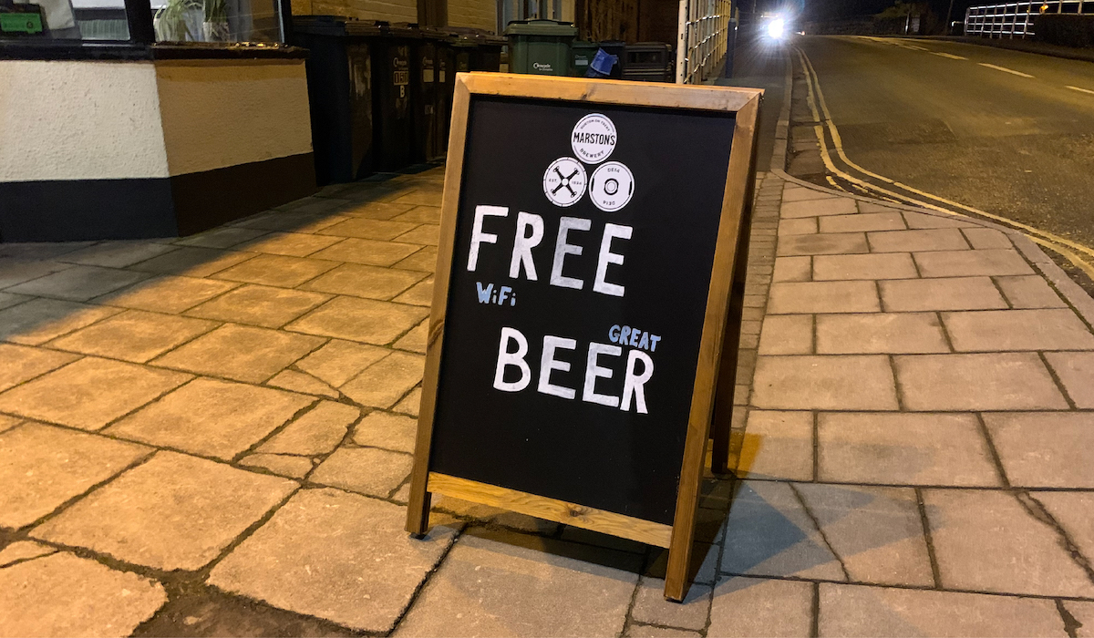
To continue the analogy…great brands aren’t just about what they look like, it’s about what they say. Naturally, there’s a strong connection between language and typography so it’s important you get both right. The same word can feel so different depending on how it looks. The wrong typeface, the wrong size or placement and it can mean the wrong thing. But the right words with the right type is one of the most powerful things for a brand—think The Economist ads, or Nike’s ‘Just Do It’. When the choice of typeface, size and placement perfectly match what’s being said, it leaves you convinced that these brands know who they are and what they’re about. Even my local pub knows the power of typography; the words ‘Free’ and ‘Beer’ are huge on their A-frame, and only on closer inspection do you read ‘Wifi’ and ‘Great’ in between (Free Wifi, Great Beer).
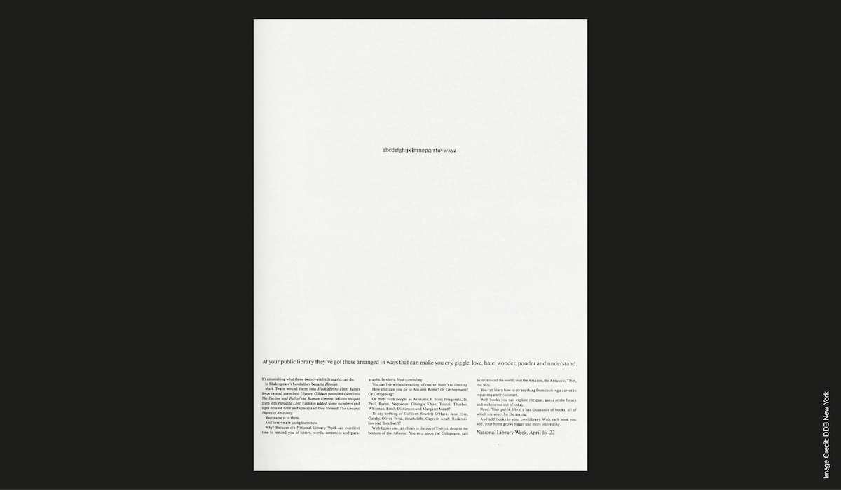
Probably my favourite piece of design is a poster for National Library Week in 1966. The alphabet set at the centre of the poster in tiny type with a sub line reading ‘At your public library they’ve got these arranged in ways that can make you cry, giggle, love, hate, wonder, ponder and understand’. The restraint of the typography is so superb and lets you focus on the joyous writing. Brilliant.
ZLM: That sounds amazing…and it highlights the way that typography in brand design needs to be purposeful, not just kind of eye-catching, but integrated in a sophisticated way…How do you tell a story with typography in a concise way?
T: With great care. When telling a story we choose each word with great care and it’s the same for typography. We choose the typeface, placement and styling with great care so it purposefully keeps your focus on the most important thing: the story.
ZLM: Where have you done this in your own work?
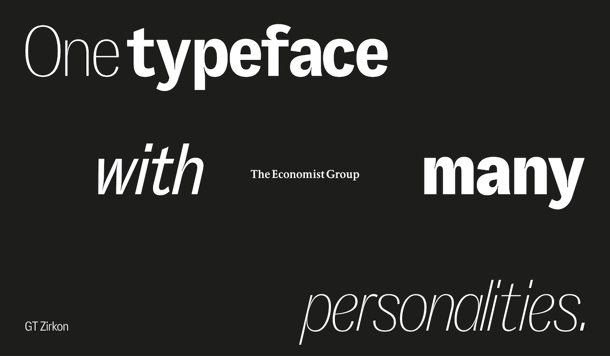
T: We recently worked with The Economist Group to help them simplify their brand architecture of over 50 brands down to 4. For those 4 brands, we needed to create a red thread that connected them but still allowed for each to show off a different side to The Economist Group’s personality. Those personalities ranged from bold and impactful to precise and expert. We worked with GT Zirkon—one typeface with many personalities. GT Zirkon Black for boldness, Ultra Light Italic for precision and intelligence. The single typeface helped us to match the architecture of one company (or family) with each brand (person) with its own personality and font.
ZLM: With so many tools that can be used to grab the eye—kinetic typography, 3D, etc.—what tips can you share on how you can use these purposefully and intentionally in tandem with type?
T: Great question, as this is super important. It’s easy to be seduced by the incredible tools out there (motion and 3D as you mention) as they’re powerful ways to bring to life typography and almost instantly feel cool. But designing with purpose and using these tools in relevant ways that connect to the idea behind the brand makes them so much more powerful.
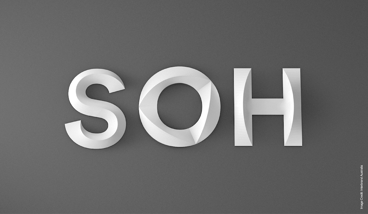
For example, when I worked on the rebrand of the Sydney Opera House, we used 3D sculptural typography to bring to life the truly unique building in a way that felt appropriate and sensitive to the architecture. We ensured all the type was created with structural integrity so it could exist as a piece of sculpture or architecture in its own right. The only reason this worked was because it was the Sydney Opera House.
When the Wolff Olins team worked on the rebrand of Uber they were inspired by movement (pretty relevant for a company all about mobility). Kinetic typography became a powerful way to bring to life the idea of mobility through a typeface (also inspired by transportation). If it wasn’t Uber, it would just be moving type. But because it was Uber it was perfectly aligned to the business and the bigger idea. They also had to consider the role and purpose of typography for the brand—it wasn’t about designing a font that ‘wants to be your best friend’, it was about designing a font that helped show you exactly where you needed to go.
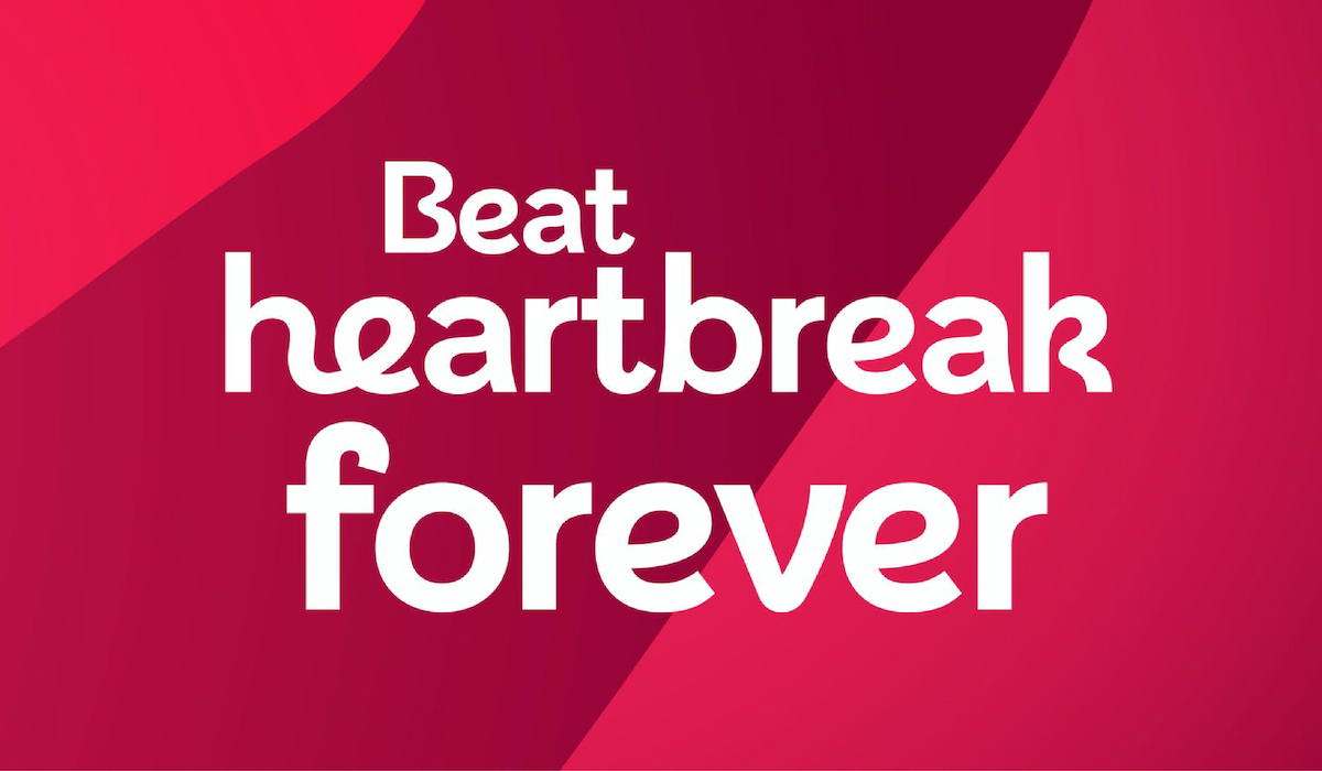
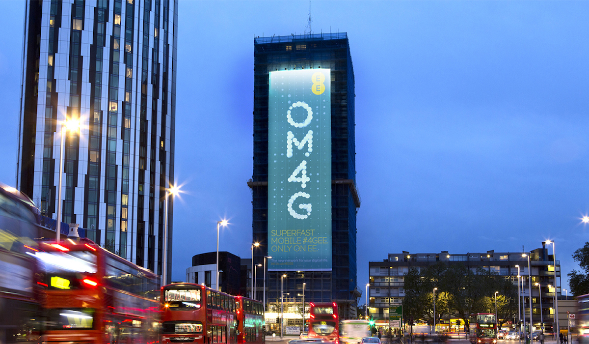
A lot of the best Wolff Olins work has had a striking typeface that ties closely to the idea behind the business and brand. But often it’s not a beautifully simple sans serif—it’s a beautifully weird typeface that you could recognise at a glance (even in black and white): London 2012’s angular typeface in collaboration with Gareth Hague, British Heart Foundations flowing typeface with Rick Banks or EE’s particle typeface with Miles Newlyn.

ZLM: What kind of technology, aesthetics or approaches do you think are going to be big in branding in the years to come?
T: With all tech advances and aesthetic trends it all really comes down to one thing, if they don’t have a brilliant idea that connects to the business and brand then it really doesn’t matter. Don’t get me wrong, I love technology and seeing new fresh trends but for me the idea is so much more important. I’m always excited when you see the two things combined, but often the best work doesn’t rely on tech or purely aesthetics. The ability to stand out and be different is more and more important as the base level of design and experience is so high. The most difficult but exciting challenge is: how do you do something completely different or unexpected to what else is out there?
ZLM: And lastly, what can we look out for from you in 2022?
T: We’ve got 2 huge rebrands coming out this year. That’s all that I can say haha (sorry). We’re also looking for wonderful people with wonderful talents to join our team this year. If you’re ambitious to create unexpected, unimaginable and unforgettable brands, get in touch.
ZLM: Thank you, Tom, and thank you to everyone at Wolff Olins!
T: Thank you again for having me, it was a real pleasure to spend some time talking type.


