
We take a look at Making Sense of Dyslexia – an innovative typographic project that aims to educate people on dyslexia and how it is experienced.
Whilst working for the branding and advertising agency BBDO, Mohamed Samir—a multidisciplinary designer whose work has spanned engineering to freelance design, to a global mix of design studios and agencies—was tasked with creating a type-focussed project for Sydlexia.
The company, which is focused on raising awareness around dyslexia and supporting dyslexic children in their learning, wanted a rebrand that would educate others, whilst using typography to sensitively relate to people with dyslexia.
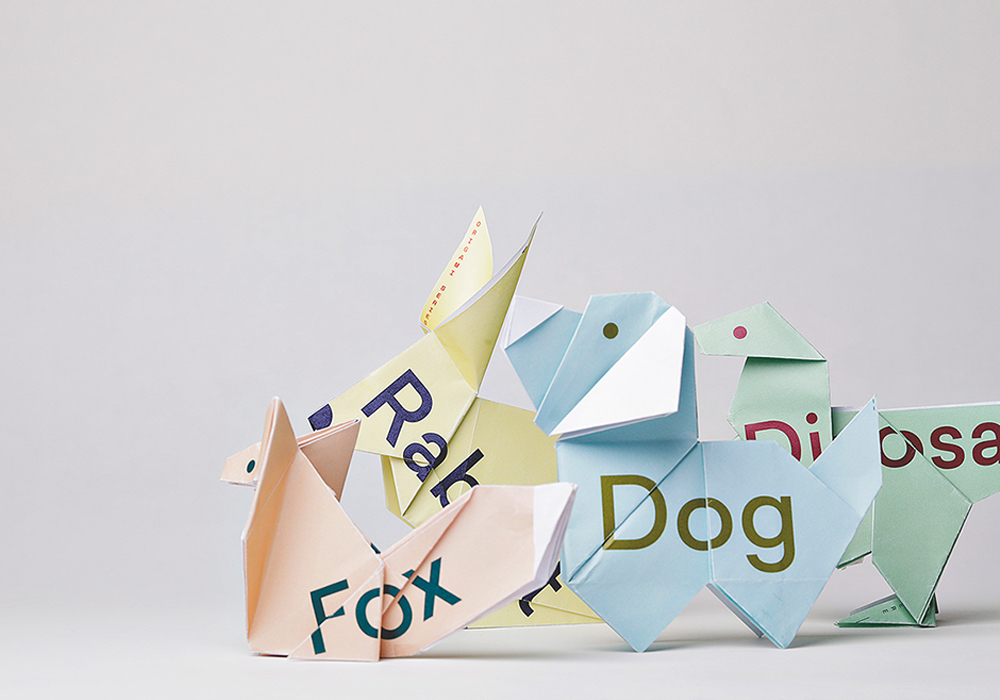
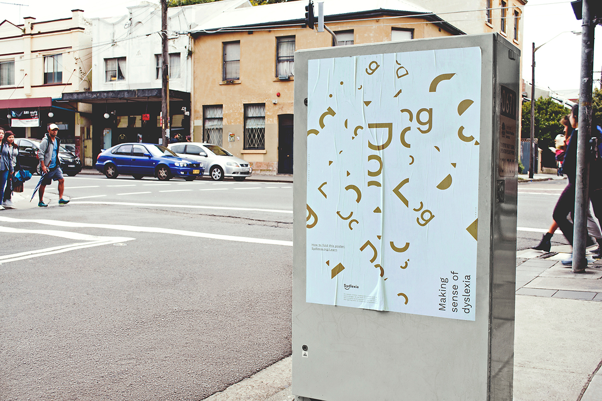
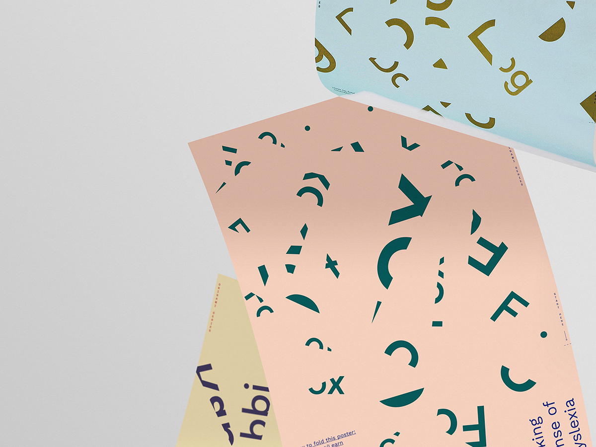
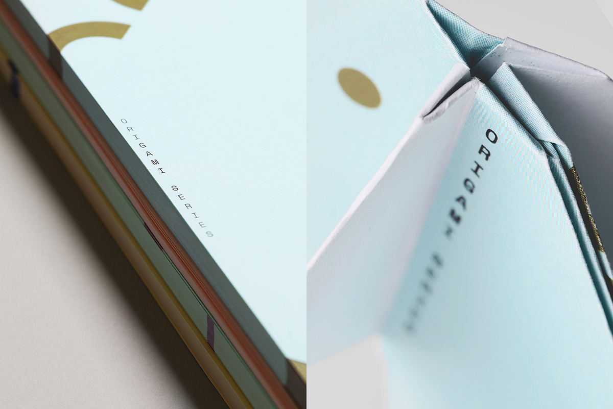
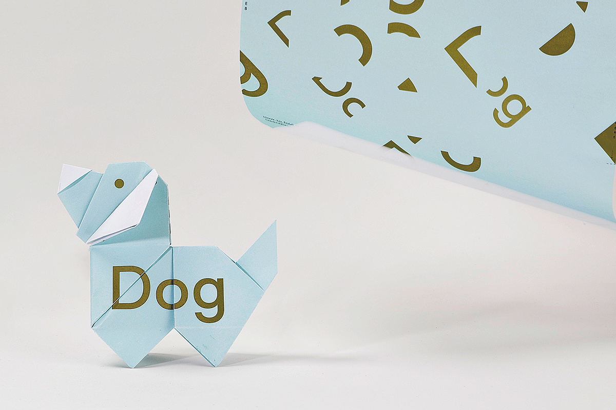
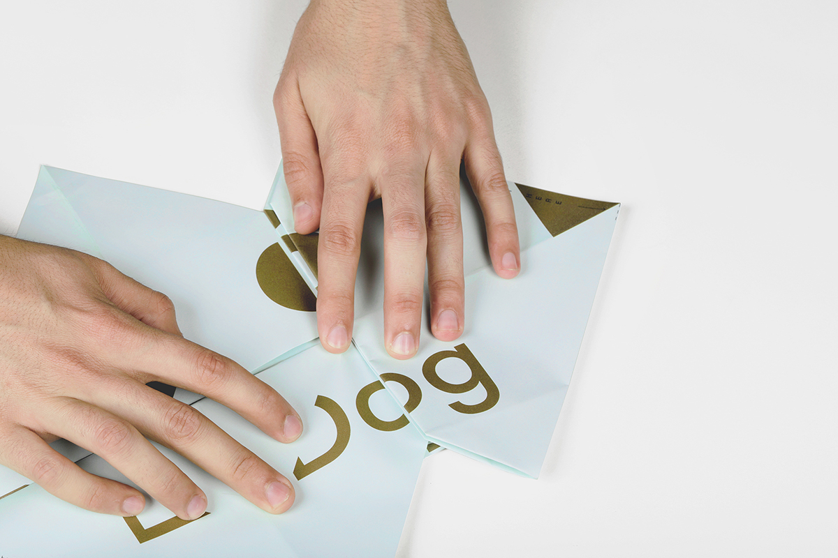
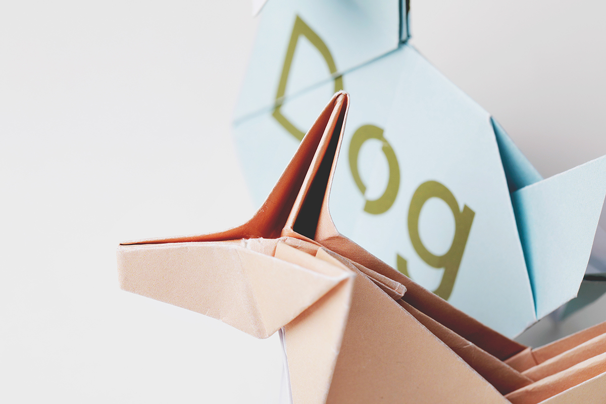
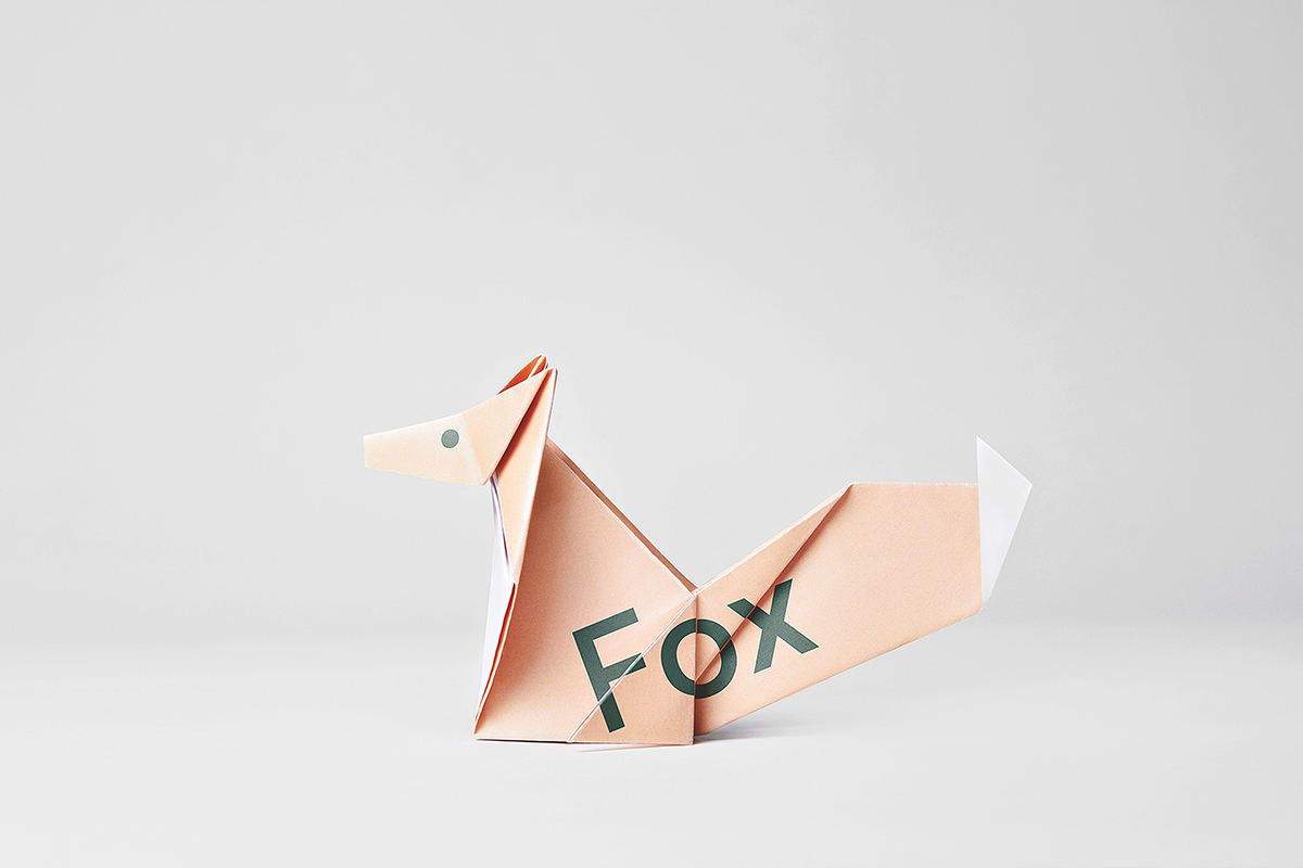
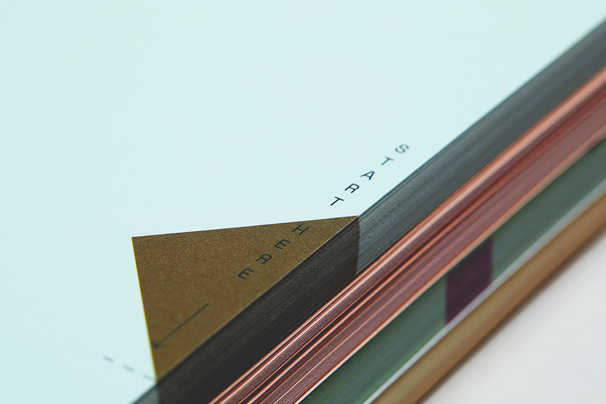
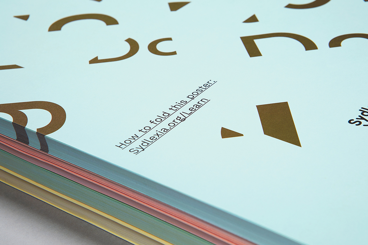
In response, Mohamed and his colleagues from BBDO, including Ryan Atkinson, Rijin Kunnath, and the video editing and copywriting teams, created a pastel-toned series of fragmented typographic posters. Through origami folds, these posters can be built into structures that join the letterforms together, creating small paper sculptures that bring the words to life.
Designing a journey from 2D fragmented forms to tactile 3D objects was a carefully and deliberately constructed approach. As research has shown, children with dyslexia can benefit from alternative learning methods, and so BBDO’s idea here was to engage viewers through a dyslexia-friendly lens.
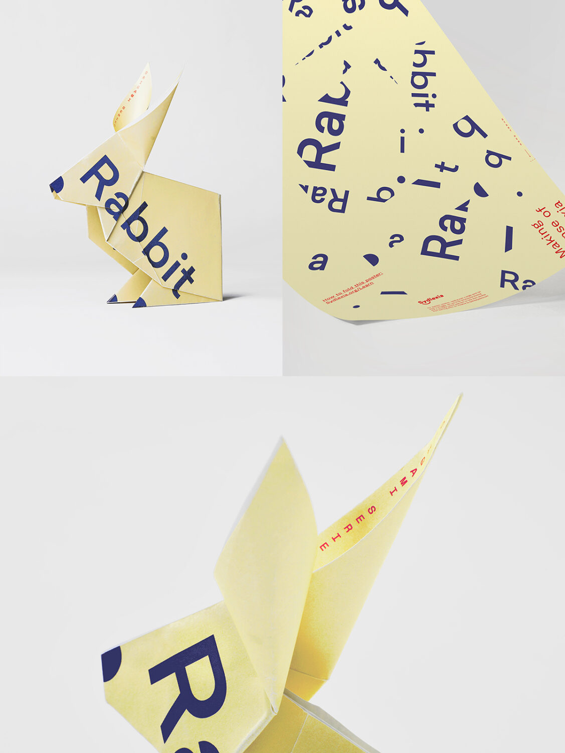
Mohamed explains: “We started by analysing how the company help dyslexic children through morphing the clay into shapes and letters to make it easy for them to picture words and their meanings. We tried to mimic the idea using paper and letters. By having the letters scattered on the posters we wanted to draw people’s attention. We added a link to each poster that people can go to to learn how to fold these posters—which were part of newspapers and other mediums. Once they follow the instructions, the letters start to connect and they end up with an animal with its name written on top of it.
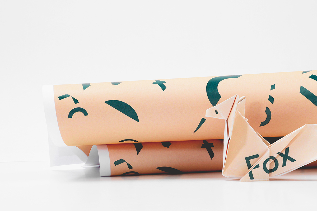
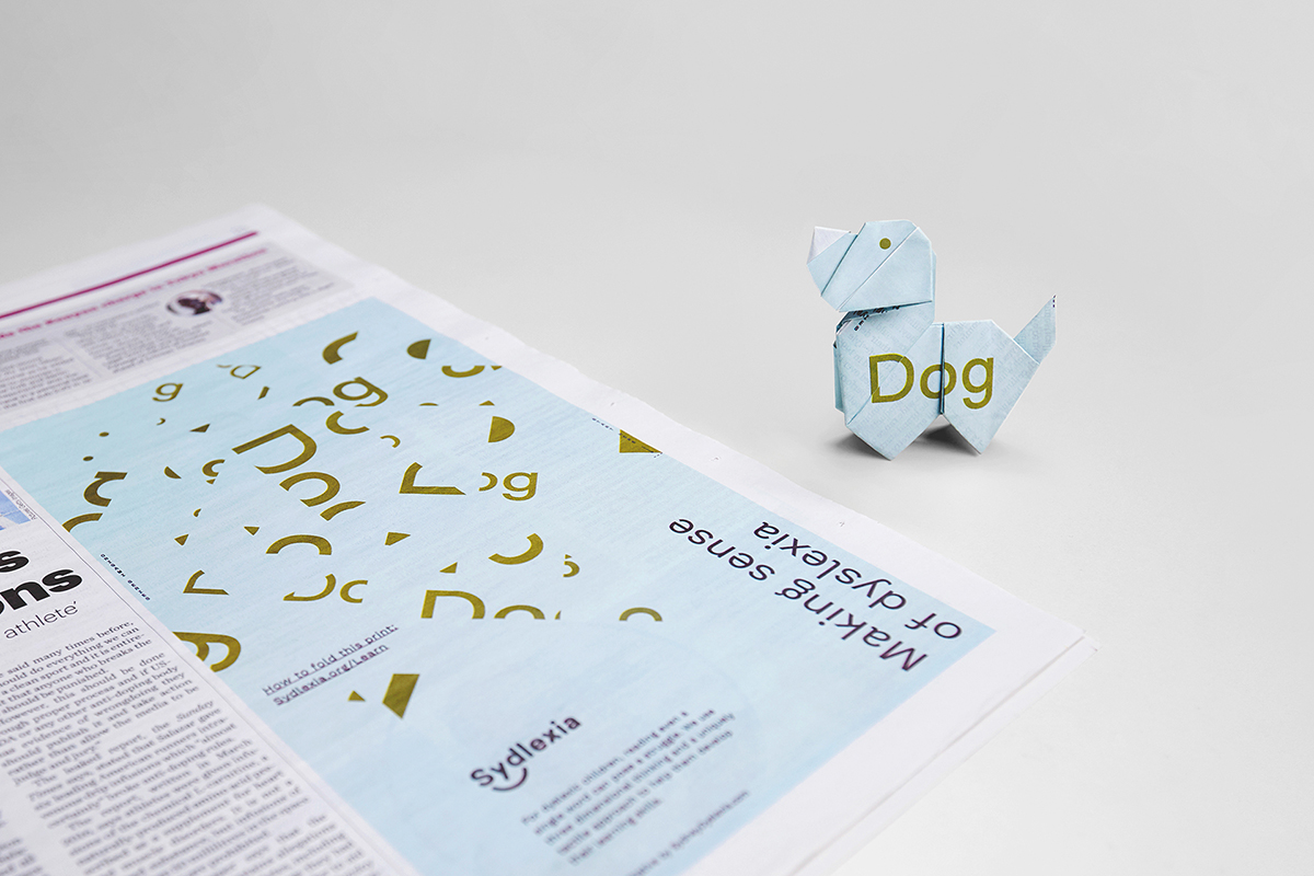
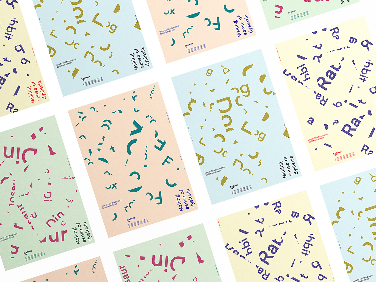
“These posters have been used also as educational tool for kids. A simple typeface and pastel colours were chosen to make it easier on the eyes of dyslexic kids and also to communicate the brand personality. We also tested many origami folds to make sure we use the simplest shapes and folding mechanisms. The project aimed to raise awareness not only about the company ‘Sydlexia’ but also dyslexia itself as a topic. It is also aimed to be used as a learning tool for dyslexic kids.”
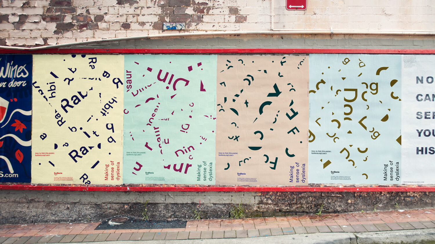
BBDO’s thoughtful work on this typographic rebrand earnt the project a D&AD Wood Pencil. This end result is an impactful and sensitively created typographic project that engages with dyslexia and the experiences of people with it. This year, Mohamed aims to focus on creating more international typography—you can keep up to date with his work on socials and Behance.


