
Based in Budapest, Miklós Kiss (@kissmiklos) is a designer and visual artist with a broad, unconventional approach. Studying at the Hungarian Academy of Fine Arts, Miklós started out in the Fine Arts and Painting department and ended up in Graphics; which seems to be at least part of the reason he’s such a distinctive designer today. ‘I’m not a typical graphic designer’, Miklós explains. ‘I’m a visual artist because I’m working on many different kinds of projects, from graphic design (typography, type design, illustration, logo design, branding), through interior design to fine art. I think a strong artistic approach and outstanding aesthetic quality characterize my art.’
Drawn in by Miklós’ blended approach, we were curious to hear how his broader work shapes his typefaces. So, we got in touch to find out more about some of our favourite of Miklós’ typefaces, and pick his brains about how he works on such a wide variety of projects.
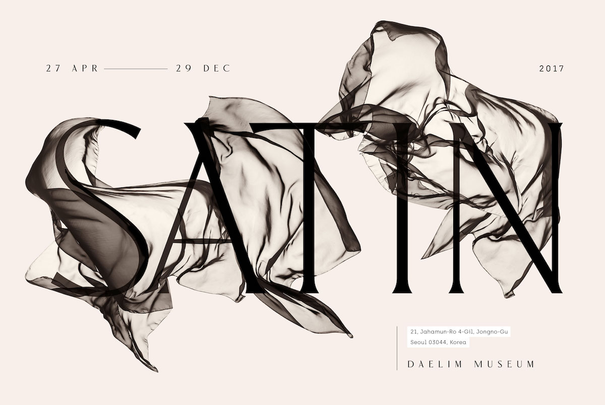
Hi Miklós! We love your Masqué typeface so much… What was it about creating a hairline typeface merged with Didot inspired forms that attracted you?
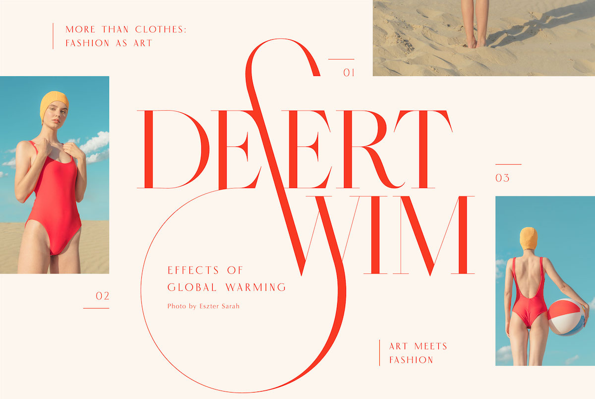
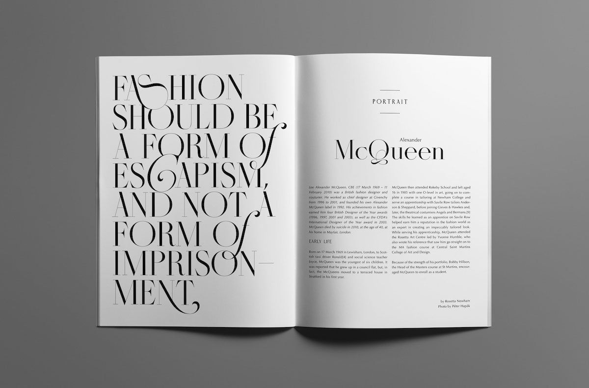
I love hairline typefaces because we need to use them on a large scale. I really love the letters shapes, but mostly we cannot see all the beautiful parts of a character. The hairline typefaces work best for headlines, titles, or shorter texts (if we change the weights for logotype) and nice typographies. These typefaces are like ballet dancers, they are mostly very flexible, graceful and have amazingly beautiful details. Everybody loves Didot typefaces. For a long time, this font symbolized luxury and fashion. This is one of the biggest icons of the type’s history. I love fashion and lifestyle magazines. I love beautiful albums and wanted to design a font that I can see again in a nice book or magazine – that would make me terribly happy.
One of the things which really stands out about Masqué is the punctuation and alternates (the ornamentation in the uppercase Q amazing!). How do you go about designing these details and how important are they to you as a feature of the typeface?
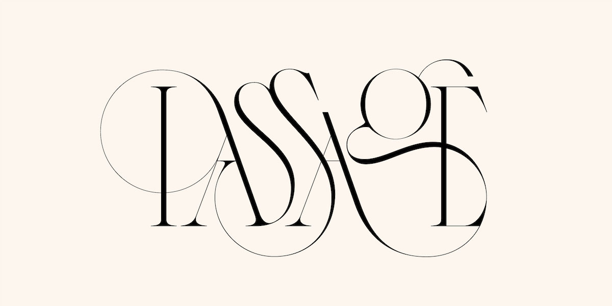
Most of my followers said that these curly, flexible dancing lines are a significant kissmiklos style. I like to draw them. I love their lightness and airiness. To me, they always show something of the higher beauty of human culture. I would also like to create public sculptures from these characters.These details are very important because they give the font its uniqueness… It was very important to me to have recognizable features in my first font.
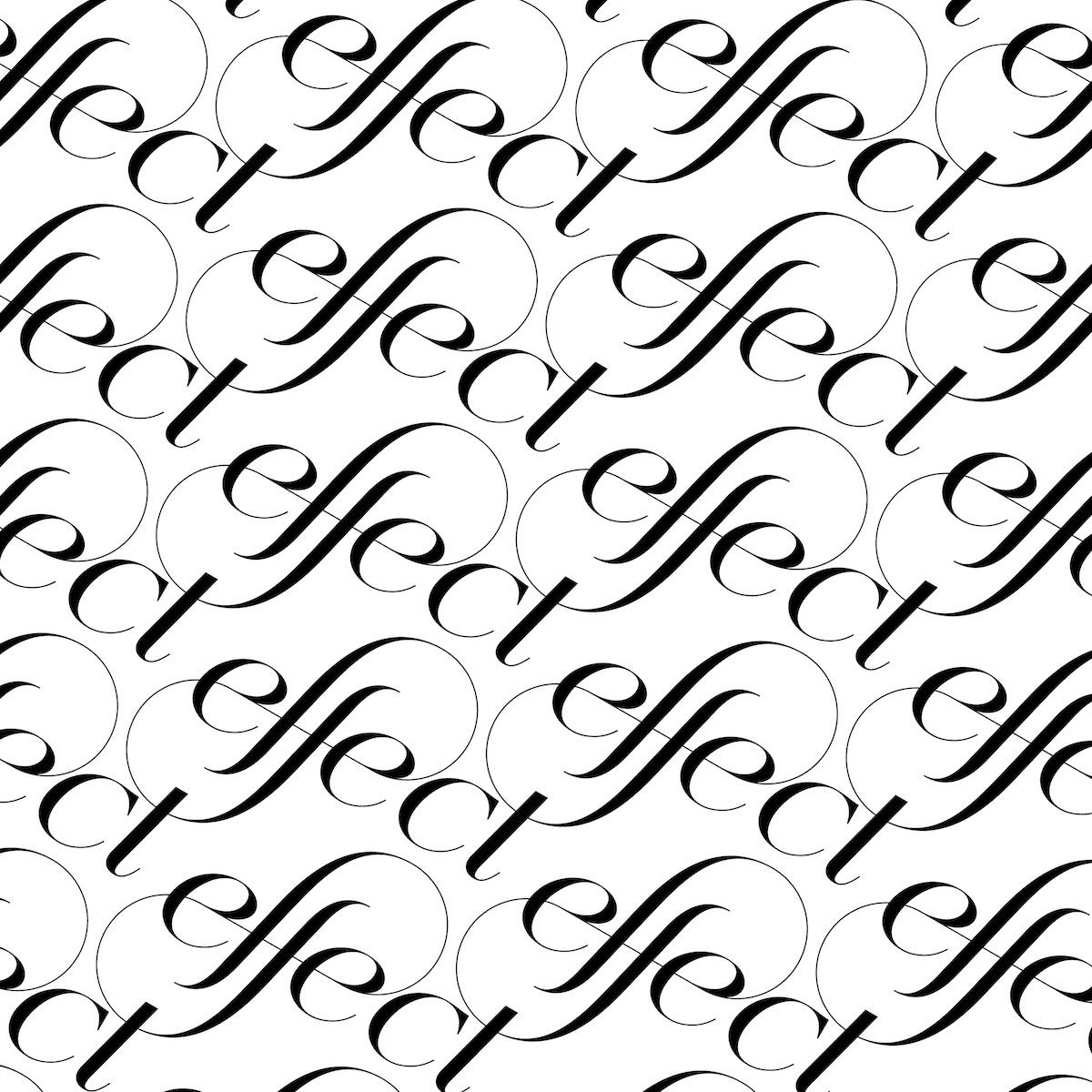
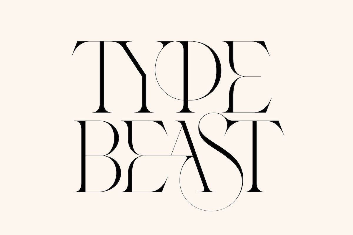
We also love your Type Beasts series, which has a kind of similar feel of lightness. Do the connections between letterforms come naturally to you? Do you use certain references and design around them or is it all experimental?
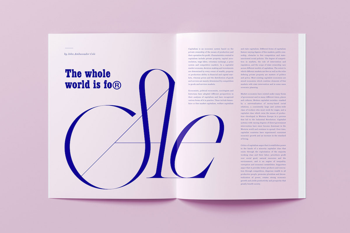
Thank you. When I was in London for the first time in my life I saw the V&A logo, which had a huge impact on me. Then I started exploring the ligatures. I really liked them. I’ve always felt that playing with letters is a higher level in graphic design. There are times when I see such a letter relationship in mind. There are times when I use a number of sketches or digital sketches to discover the connection points between two or more letters.
The scope of your work is really broad and varied – do you have any favourite ways to work or do you thrive off variety?
I love variety. I find it strange that the world tries to put creators into a box and the creators do the same with themselves too. I wonder how long it is interesting for us to repeat ourselves. I repeat myself so it’s good to have something out of this status. Of course I understand the material point of view of the repetition, but I think it’s good to experiment. I would enjoy it best if these of my typographic works would appear in space. As an element of a space. As an installation or as works of art. I’m working on this.
What have been your favourite or most important projects yet?
Of course, I like to work the best on my own exhibitions. I like to create the concepts for bigger projects, I think it’s my favorite when I can figure out the base of a bigger project. Of course, I want to collaborate with several popular brands because they can also be super projects.
What advice would you give to budding designers on honing their craft and finding themselves creatively?
Thinking. Get inspired. Steal but NEVER copy. Steal colors, thoughts and reshape or recreate in your own style. I think diversity is the best. The best part is that there are a lot of creators all over the world and you can discover another brilliant piece every day. This sometimes discourages me and sometimes gives me more power. It is important to see other thoughts and try to understand, try to accept. Don’t leave jerk or pointless comments during the work of others.
Thanks, Miklós!
Miklós’ newest typeface, Veronesi – inspired by Roman Trajan letters and inscriptions carved into old stones, tombs and monuments – was published this week (just yesterday!). It’s his second ever typeface and is a modern, variable serif with some really unusually constructed letterforms… It’s stunning. We strongly advise any ligature lovers to check it out!


