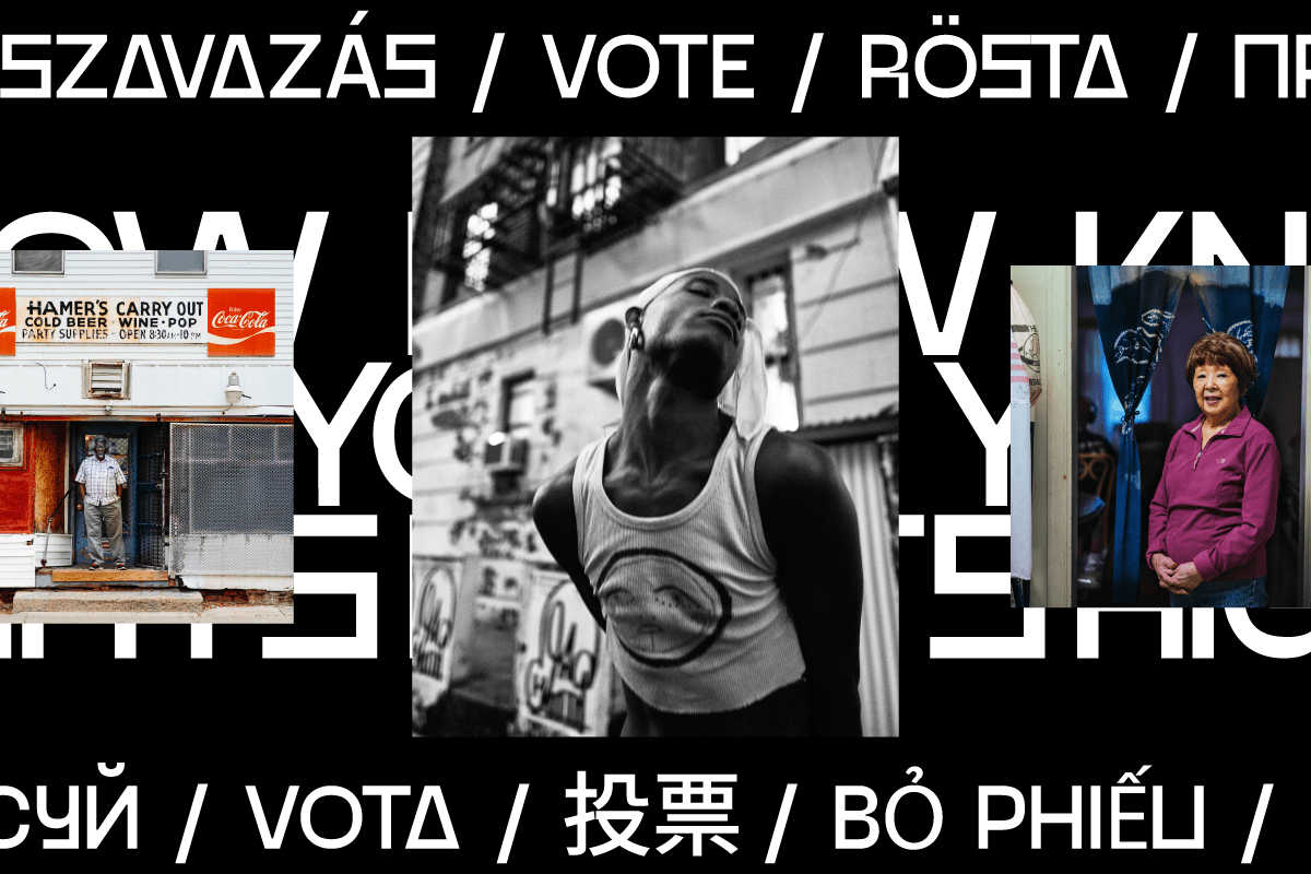
In the face of the 2020 US election, tons of creatives used graphic design and typography to gather momentum within their communities and rally the power of voters; ultimately helping to shape one of the most high-stakes elections of all time. In our eyes, the bold, brazen typographic designs of New York-based Graphic Designer and Illustrator, Oscar Saylor (@el_guapo_ny) were amongst some of the most powerful. Full of busy, dynamic shapes, Oscar’s designs offered crystal clear, empowering, useful messages alongside a no-nonsense, straightforward aesthetic.
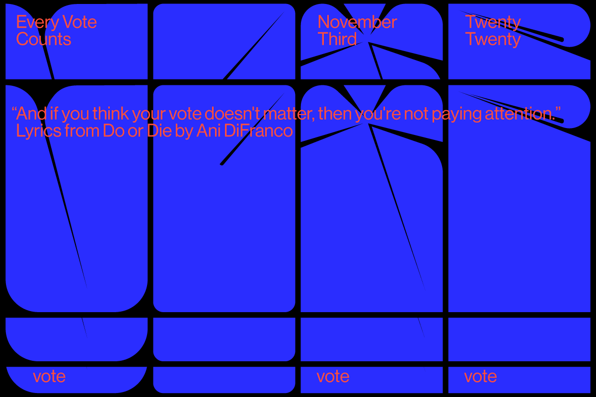

Having never really made directly politically engaged work before, Oscar’s motivation for creating these pieces seems to have grown from a feeling of frustration when it comes to communications around politics. Filled with jargon and complex language, he tells us it had always seemed kind of confusing or inaccessible to him. However, considering it seemed likely he wasn’t the only one who felt that way, he began to think about how he could use his skills to help. ‘This is why I try to create simplified images from complex contexts’, he tells us. ‘The majority of this was mostly sparked by my friends that are mostly minorities. They reached out for collaborations. My best friend said, “everyone just has to do their job” which really made me think that I was capable of helping. Many of us feel useless in times like these, when in fact, everyone has a skill to share. So I tried to see how I could help.’

‘I base my work on five designers: Massimo Vignelli, Milton Glaser, Aaron Drpalin, Herb Lubalin, and Wim Crouwel’ Oscar continues, noting he doesn’t consider this work to be necessarily “innovative”, but instead routed in well-trodden paths of effective, strong, clear design. For Oscar, a no-nonsense, straight-forward approach is crucial in designing for political communications. ‘The message that always stays in people’s minds is simple and straight forward’, he elaborates. ‘The message that needs less explaining is what causes a movement’. Intrigued by this perspective, we wanted to understand a little more about Oscar’s views on sharing complex messages in digestible ways – something which can quickly become fraught through a lack of complexity or balance, or leading to the circulation of fake news, for example.

It certainly chimes true that indisputable, immutable messages are likely to resonate most strongly with audiences – you need only think about the the rallying strength of clear cut, simplified messaging throughout history. But of course, a lack of complexity can be dangerous. Simplified information in political spaces can be used to ward off complexity, scapegoat marginalised people and communities, and work to support the systemic funnelling of profit, power and privilege into the maintenance of patriarchal, racist, ableist structures.

Oscar’s work speaks to how information in bitesize form can be used to deliver practical, useful messages routed in compassion and action. ‘A lot of messaging can feel forced – almost begging you to go do something’, he says. ‘Some information can be read as INFORMATION rather than a give a message or ask a question. The idea for me is not that you voted early, voted yesterday, voted last year or that you will vote again in the future. For me is about how can I share with people that the word “VOTE” is a small word, but has just much of an impact as the word LOVE. And we should use it more.’

‘VOTE should feel like a necessity and be used when needed. Similar to the word love. You’re not a cool person because you used to love in the past. The point is to LOVE now and always. We need it. We need your vote. We vote to keep the things we love’, he elaborates. ‘We all focus on teaching others how to walk correctly, how to stand correctly, and speak correctly. But not many of us are taught to spread love, or in this case, to vote. This issue is higher than the taxes. We should be teaching this about voting in high schools, rather than learning history from books based on fake facts… So when I designed my political work, I didn’t want it to be seen as something political right off the bat […] It shouldn’t feel like you’re sharing a flag of your country, it should feel like you’re wearing a shirt FOR THE PEOPLE, DESIGNED BY PEOPLE. Voting doesn’t only count in America or in voting booths. We vote every day, it’s just not in a booth. The word CHOOSE is also the same as the word VOTE.’

Using visual means as a way to share his messages, Oscar felt he could communicate in a way which made sense to him, and which could also connect with others. ‘I’m a person that struggles with memorizing words, names. I even struggle with understanding the meaning after I’ve read the definition a few times. If I can’t visualize a picture, I won’t remember the word. If I didn’t relate to it in the past, I have to find a way to create a picture, using past imagery. So 90% of the time, I don’t have a font to use. I look at the words as shapes and see if I can create a lock up or some sort of an image’, he explains.

‘It’s similar to how a kid plays with legos. They really don’t care what color they use or shapes to build the house, as long as the house gets built and it holds. For example, when I read the words Joe and Kamala, I realized these were 12 letters, and I can stack them in threes. Then I just searched for a font that world looks good stacked.’
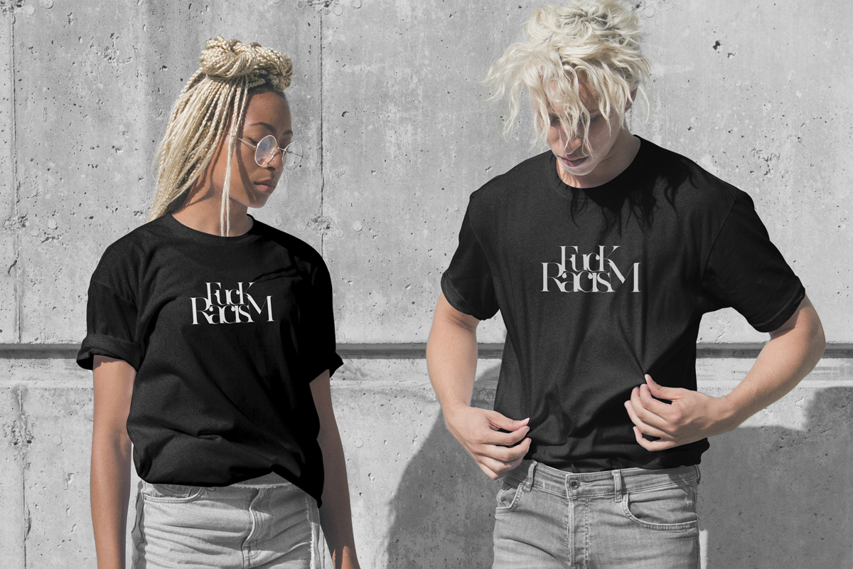

Oscar urges other designers not to feel intimidated by using their work to engage politically or to work toward social justice, and to reach out to friends and peers to work collaboratively. ‘Don’t worry if it’s for a big cause or a little one’, he says. ‘It wouldn’t be called an issue if it didn’t cause harm. Everything counts and everything needs some adjusting sometimes or another. It’s like that saying, it all starts with little steps or it’s the little things in life that make a big impact. Don’t look at it as a political issue, look at it as something a personal project that you want to resolve.’

