
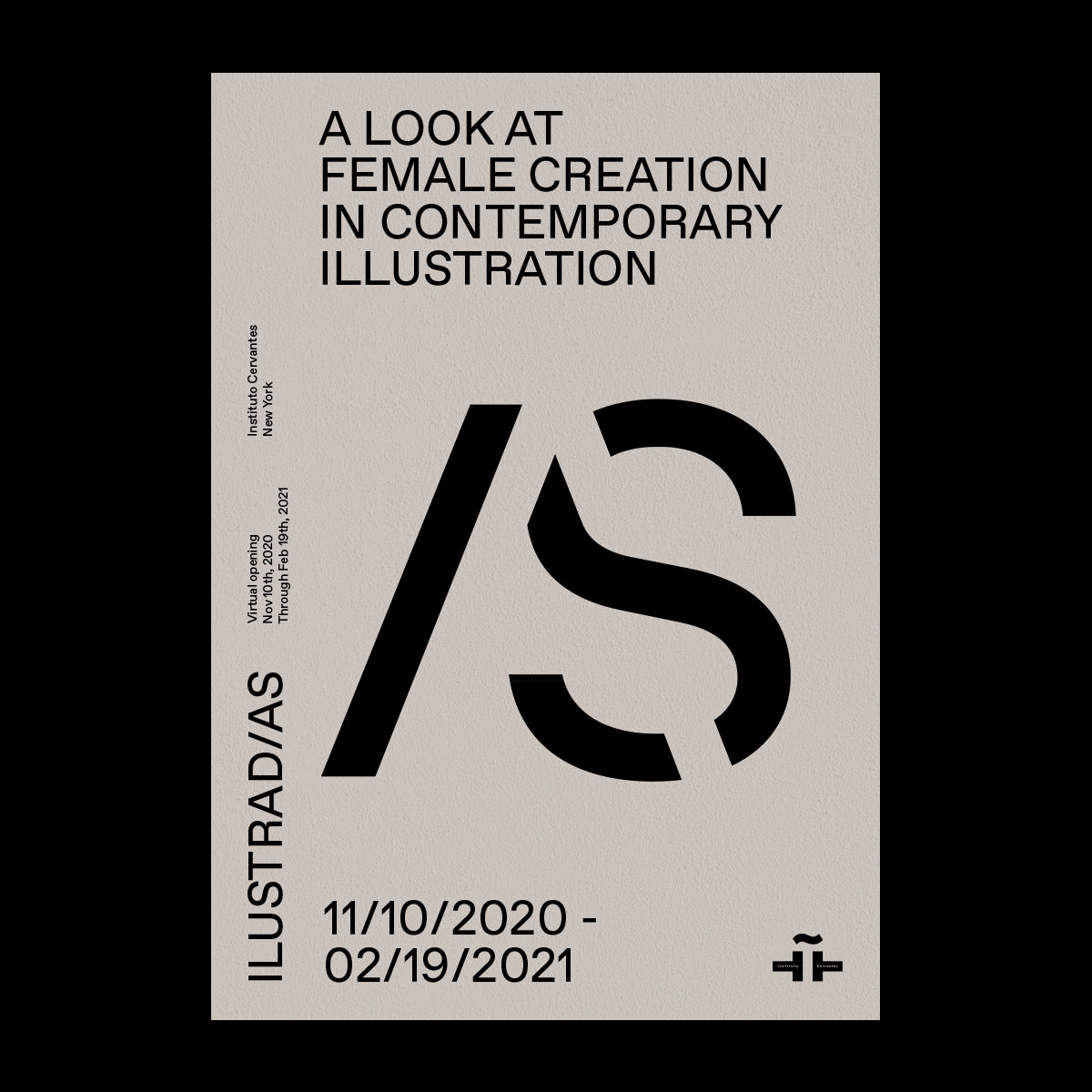
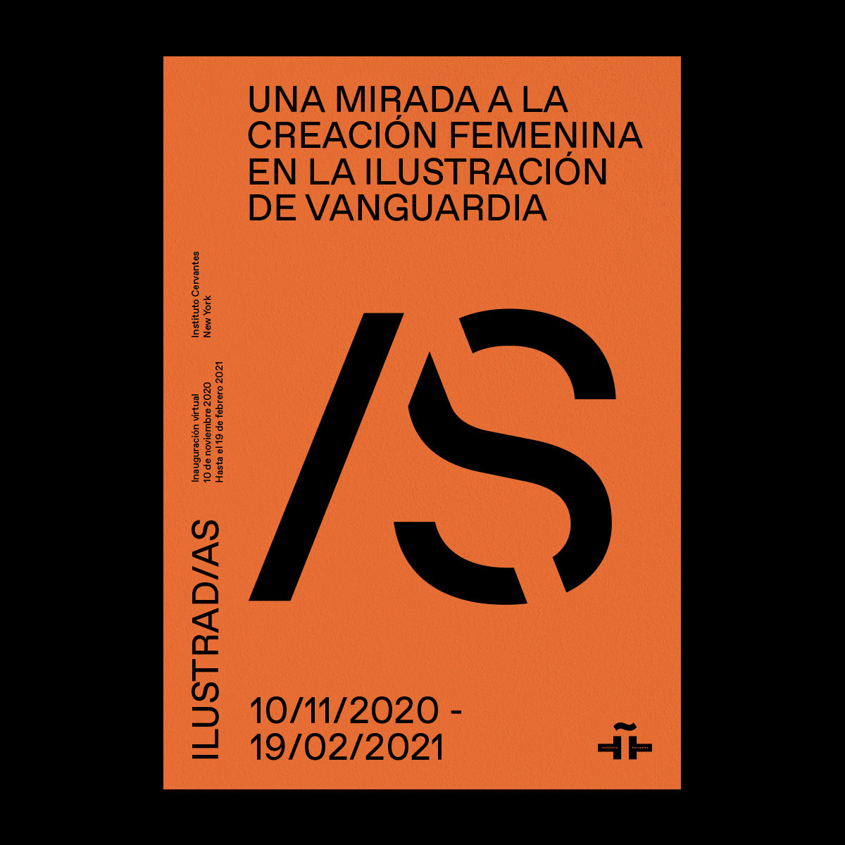
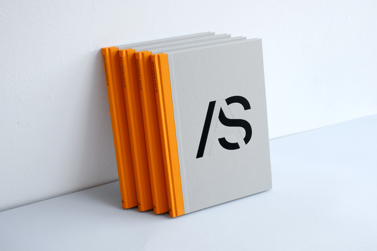
Founder of Arce Studio, Rebeka Arce, is the designer behind the visual identity and book design which accompanies ‘ILUSTRAD/AS. A look at female creation in contemporary illustration’. The exhibition, curated by Matilde Rodríguez, is showing at Instituto Cervantes New York until the end of March and offers an in-depth look at the work of contemporary female illustrators; celebrating the breadth of their outputs. Aiming to increase visibility while exploring the more explorative, uninhibited sides of their practice, the exhibition is a celebration of the depth female creativity.
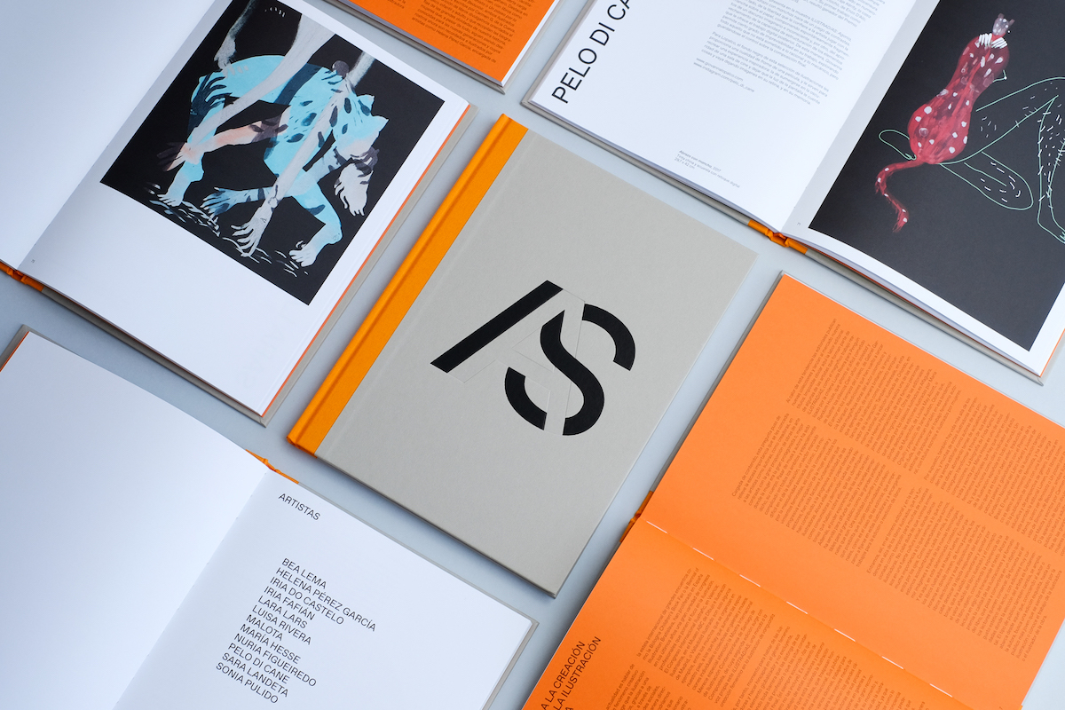
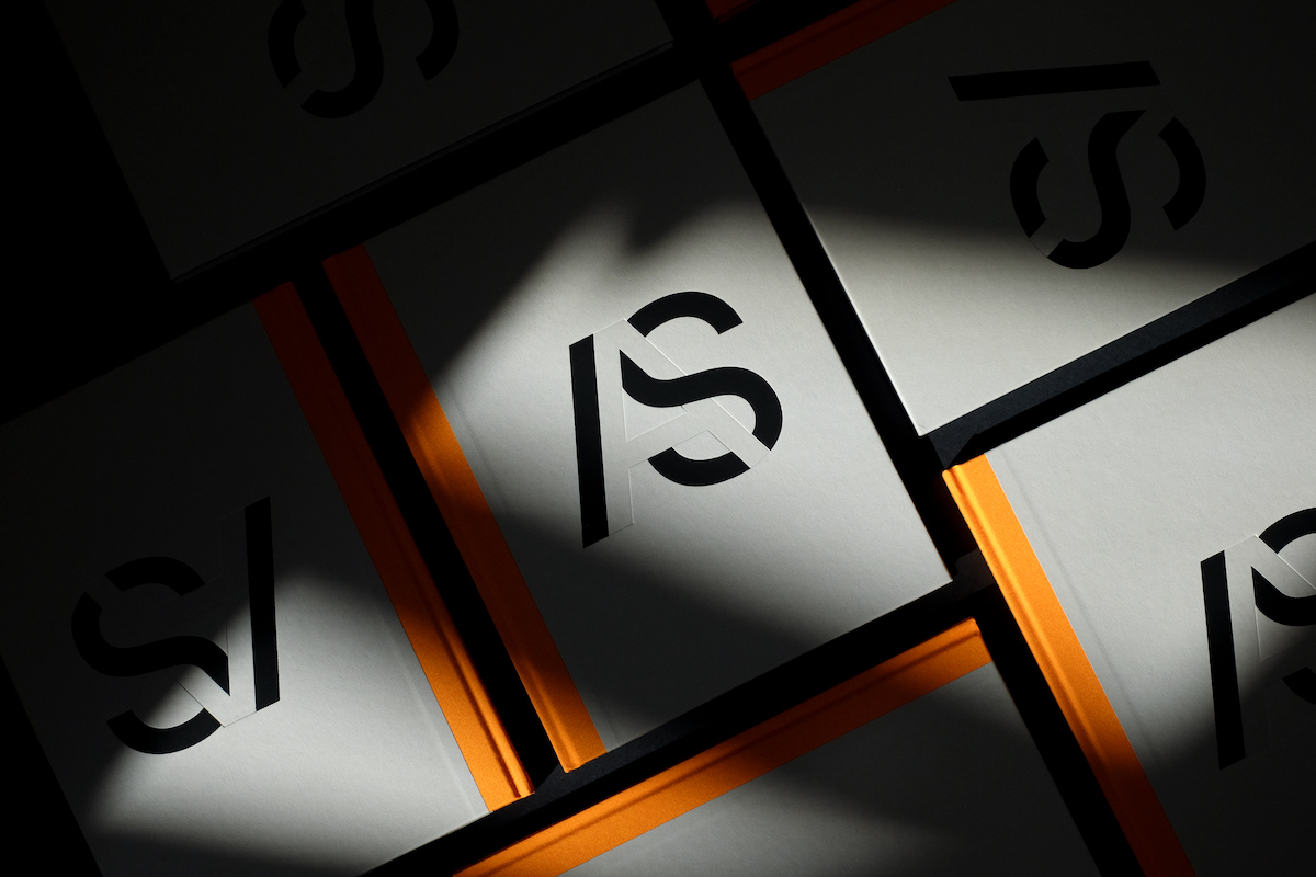
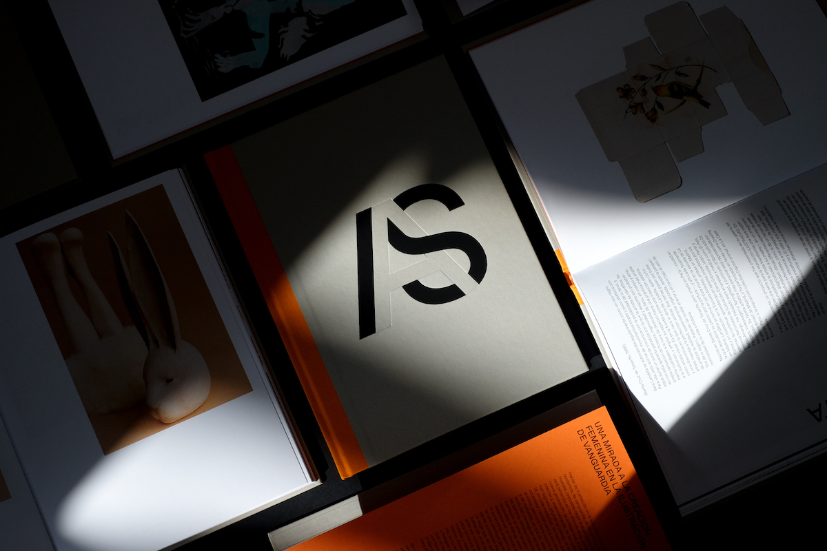
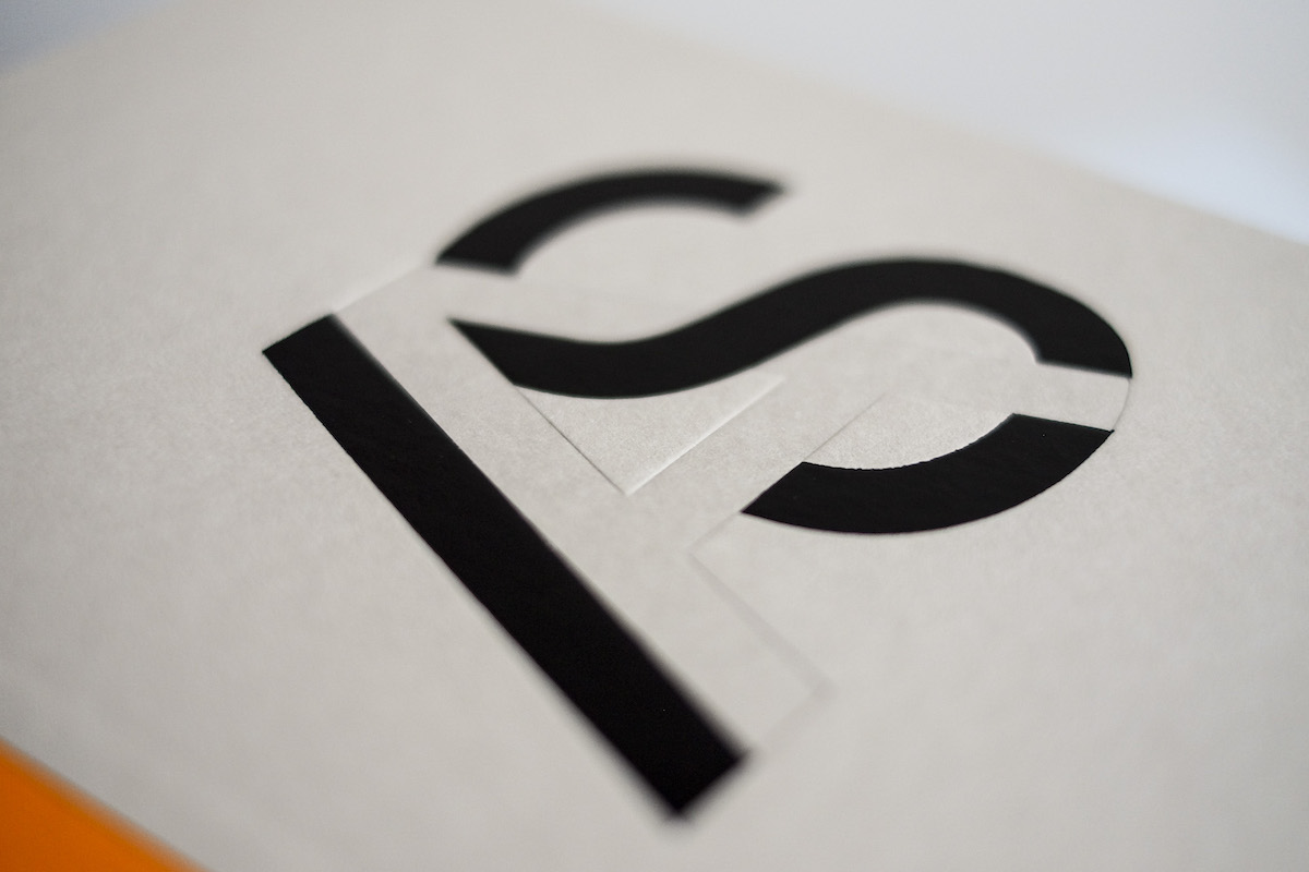
Rebeka’s exhibition book design homes in on a concise, typographic expression of the issues at play surrounding women and the creative industries. ‘In Spanish, gender is defined with /OS or /AS at the end of the word’, Rebeka writes. ‘The use of the ending to determine gender is in itself an ironic paradox, in which gender continues to be kept at the end and behind a slash, that due to its inclination seems to “push” it. Our goal with the visual identity is to play through negative space with (in)visibility, placing the letter “A” as the “invisible” protagonist and generating a game of false perception of what seems not to be seen, but it’s actually there.’
Managing to distill such complexity into such a seemingly simple, eye-catching wordmark is by no means an easy task, but for Rebeka, it’s key to the success of her work. She describes the interaction between typography’s linguistic and graphic qualities as a ‘dialogue that begins with the impact at first sight and continues when the viewer receives or discovers the message’.
‘It translates a message into visual language through the form of the word itself’, she adds. ‘A perfect dialogue.’
While the communicative power typography is huge, Rebeka highlights that we still aren’t doing enough to harness this power to tackle gender inequality and representation within the creative industries. ‘Segmenting products for men or women became a great sales strategy in the second half of the 20th century, and today gender biases and stereotypes continue to invade everything we consume on a daily basis – despite the fact that in recent years genderless products are taking centre stage’, she explains. ‘And when it comes to design, we continue to come across clichéd justifications when selecting fonts and colours for a project – often opting for a neutral and ‘respectful’ decision seems to put you as a designer in a more powerful political position.’
‘Typography appears to be a particularly male-dominated area of the design industry’, she continues. ‘In my favourite contemporary foundries most of the designers are men, even though brilliant type designers have always been there like Sara Soskolne, Laura Meseguer or Nadine Chahine. It is as if within the design sector, type design is a technical thing where men gain relevance and women are pigeonholed into designing of fonts for specific communications, but not developing an alphabet. But, hey! I do suggest checking out Typequality – it’s a database of typefaces designed by women.’
Moving forward, Rebeka believes we will need to start making more design decisions which go beyond aesthetics, and centre what’s most respect and supportive for human beings. ‘We need visual design choices to hold mirrors up to problems with the ways we use language in terms of gender’, Rebeka adds. ‘I believe that someone with concern and sensitivity to the environment will not only be able to question established gender dynamics, but will also adopt the questioning as part of their work methodology.’
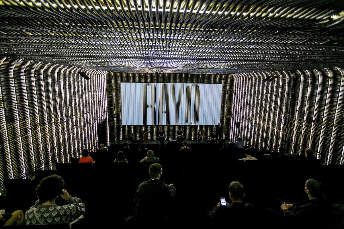
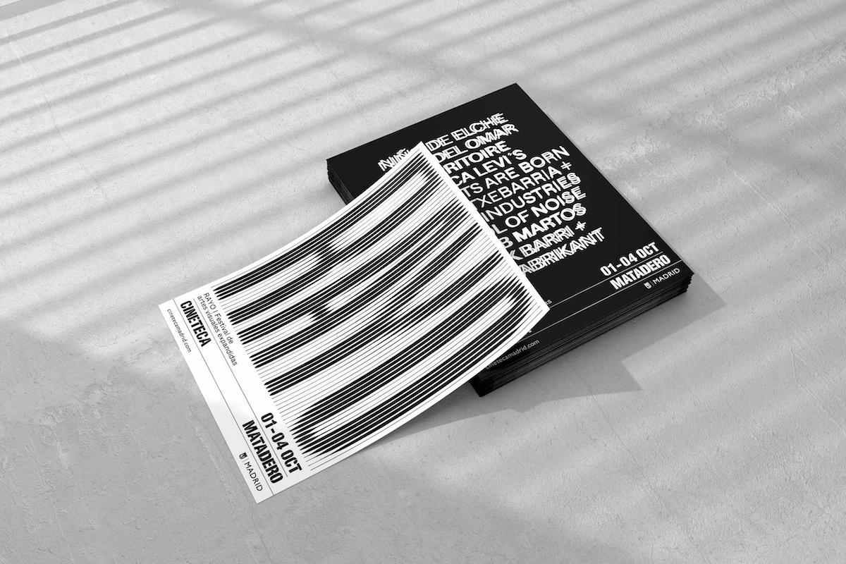
On another note, we also highly recommend checking out Rebeka’s recent work fro the graphic campaign for the expanded visual arts festival, RAYO. ‘For the second year in a row, I have explored the limits of typography and forms of the word itself making it the central visual element’, she comments. Thank you so much, Rebeka!


