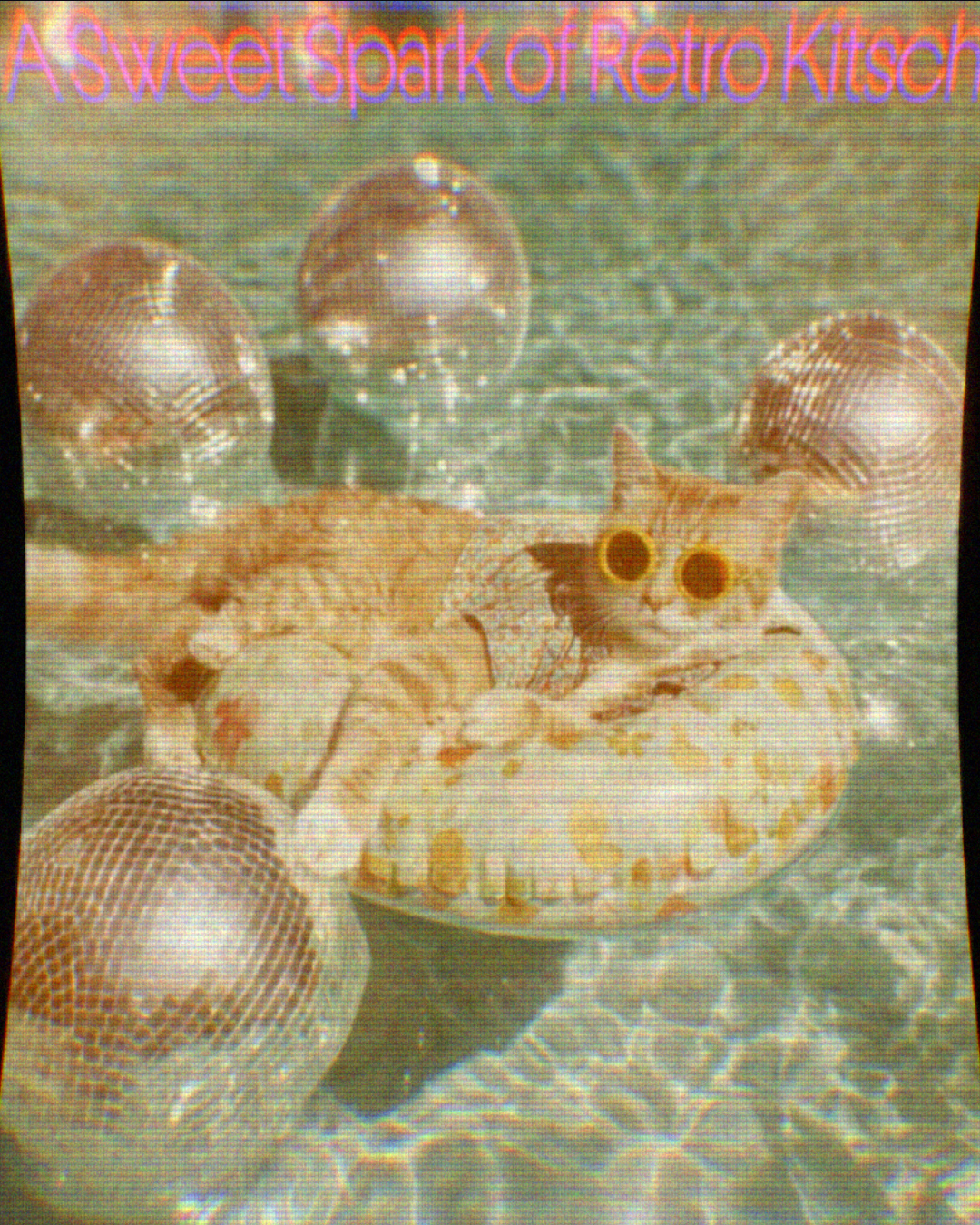

Four years of Interval Type
When we last spoke with Paris-based Interval Type in 2022, it was, in founder Ilya Naumoff’s words, “still a bit of an experiment.” The website had just launched, and he wasn’t yet sure where the practice might lead. Over the last four years, however, Interval Type has found its stride, sharpening into a dedicated foundry for both custom commissions and an ambitious retail catalogue.
With Riegla (2023), a “non-neutral grotesk” inspired by pre-rationalisation 19th-century sans serifs, and Oceanic (2023–2024), which reimagines 18th- and 19th-century fat faces with unsettling “prehistoric oceanic creature” terminals on ‘c’ and ‘e’, the foundry shows historical rigour can be playful. In 2025, this systematic approach expanded with Algorytm, a 51-style early-gothic toolbox spanning six sub-families, from high-impact Algorytm Sport to reverse-contrast Algorytm Flip.
That momentum has culminated in a busy 2026, another milestone year: alongside a refreshed website and a massive expansion of Oceanic Gothic from 12 to 72 styles, Interval Type (because we are 2 designers on this project, not only me:) has turned its attention to the sweet, kinetic world of retro-futurism.
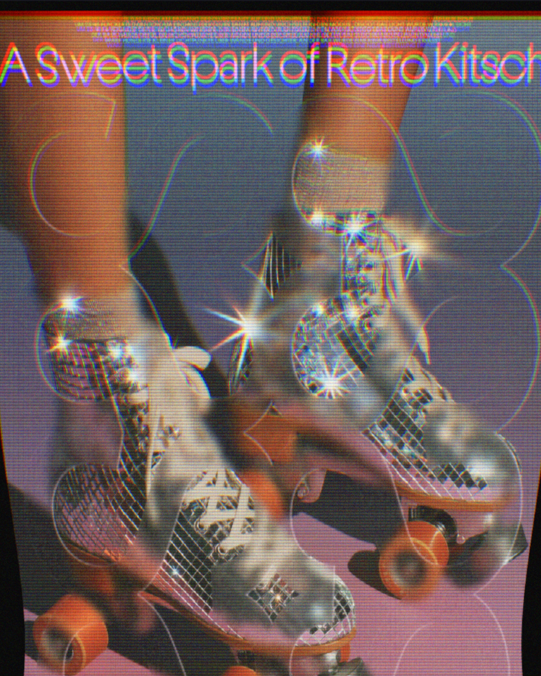
The space-age starting point
At the heart of the foundry’s latest release is a fascination with yesterday’s visions of tomorrow. Or, in other words: retro optimism. During the 1960s and 70s, cultural imagination was defined by space-age dreams, early synthesisers, and the psychedelic textures of counterculture art.
Even in these politically and economically turbulent decades, graphic design and advertising leaned heavily on bold geometry and collective joy. Interval Type sought to capture what they describe as “naive modernism” – the intersection where technical precision met everyday sweetness, evident on the covers of early video game consoles, product manuals, and space-age packaging.
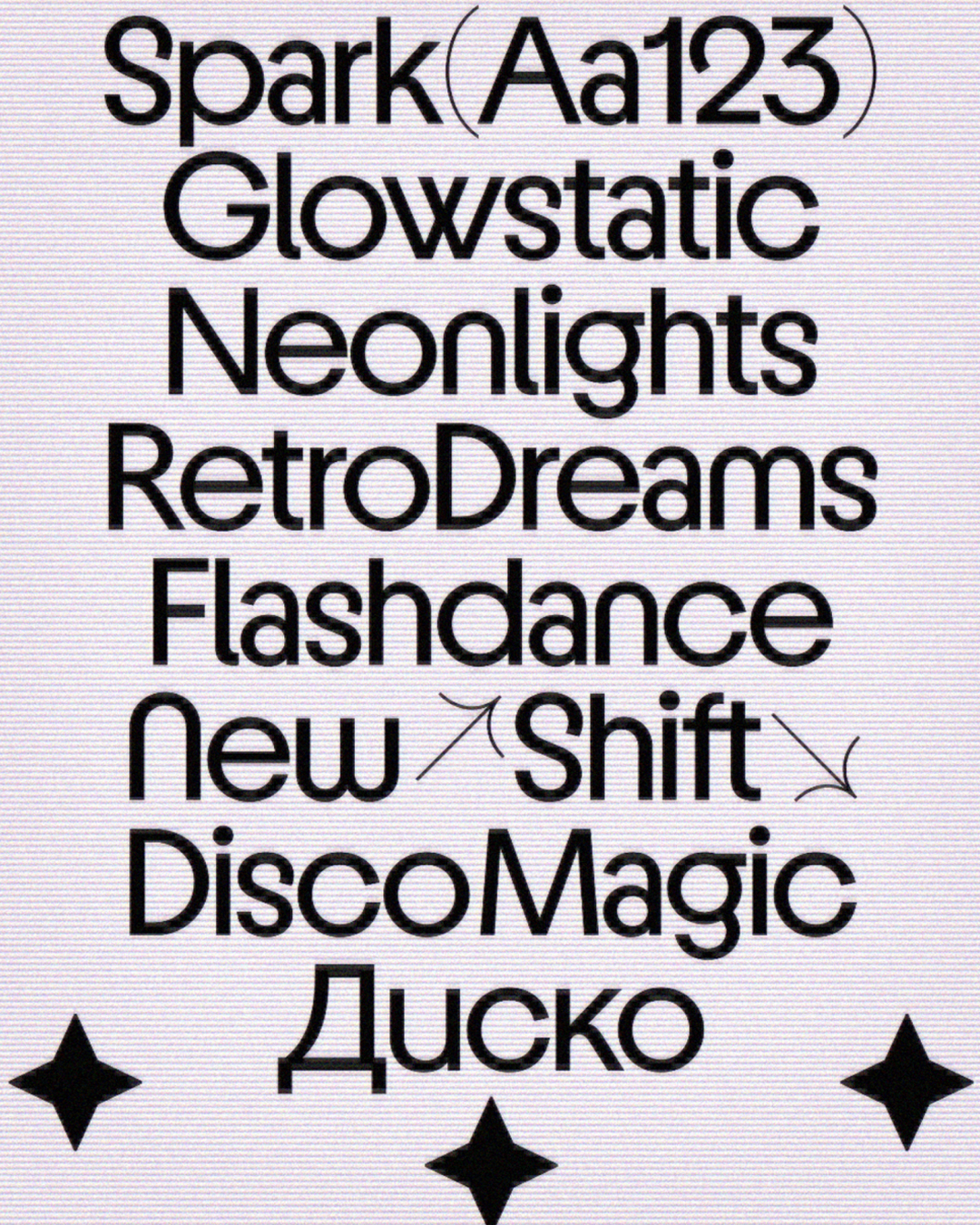
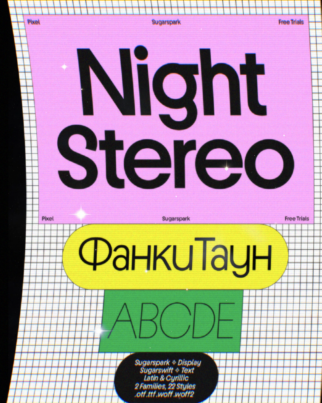
Energetic, geometric, and unapologetically display-led, the resulting headline family was christened Sugarspark. “The idea of ‘Sugar’ came from the typeface’s sweet, maybe even candy-like feel,” Naumoff explains. “It can be a little childish, naive, and over the top in places. So the two parts of the name – Sugar + Spark – created the emotional connection we were looking for.”
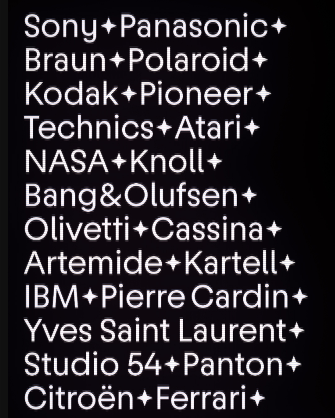
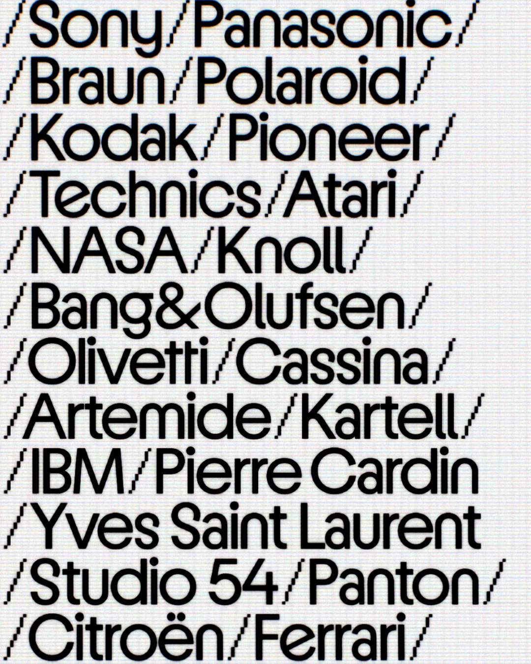
Bauhaus, Kabel and Avant Garde
To build the fittingly named typeface, Interval Type brought together three distinct typographic touchstones from the era.
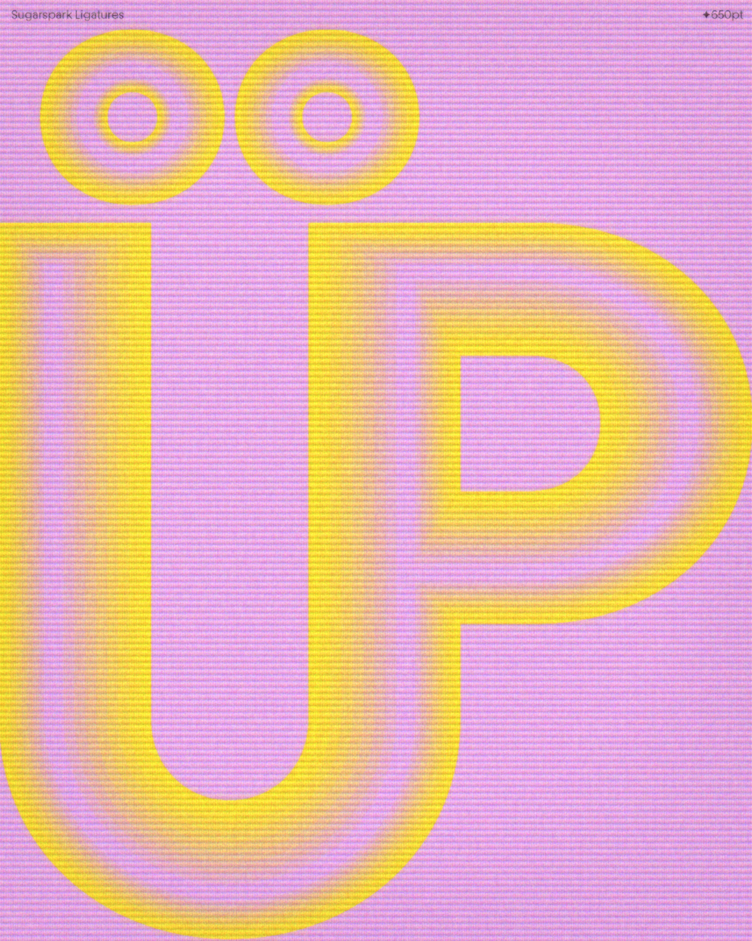
From the geometric simplicity of ITC Bauhaus, alongside the rounded forms of Blippo and Pump, the foundry borrowed a sense of childlike simplicity. Many of Sugarspark’s core monolinear letters feel almost as if they were bent from a single piece of wire, aided by spurless ‘n’ and ‘m’ constructions that keep the word-shapes open and uncomplicated.
To stop that simplicity from feeling sterile, Interval Type looked to the eccentric geometry of ITC Kabel. Kabel’s DNA injects unexpected quirks across the character set: angled terminals introduce a lively imbalance. At the same time, the distinctive lowercase ‘g’ and diagonally sliced ‘e’ alternate directly informed the design of Sugarspark’s snaky, kinetic ‘S’.
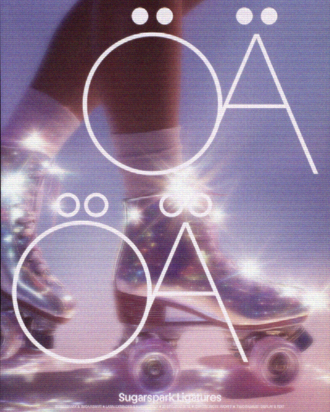
Finally, the architectural precision of Herb Lubalin and Tom Carnase’s Avant Garde Gothic steps in to ground the family, lending graphic punch to structured characters like the primary uppercase ‘W’ and inspiring a deep well of tightly locking ligatures.
Together with a tall x-height, snug spacing, and aligned horizontal strokes that form a bright, continuous midline across words, Sugarspark gives headlines a crisp, rhythmic energy.
One idea, two roles
While Sugarspark was engineered to make an immediate statement at large scales, it eventually hit its limits when pushed down to smaller reading sizes.
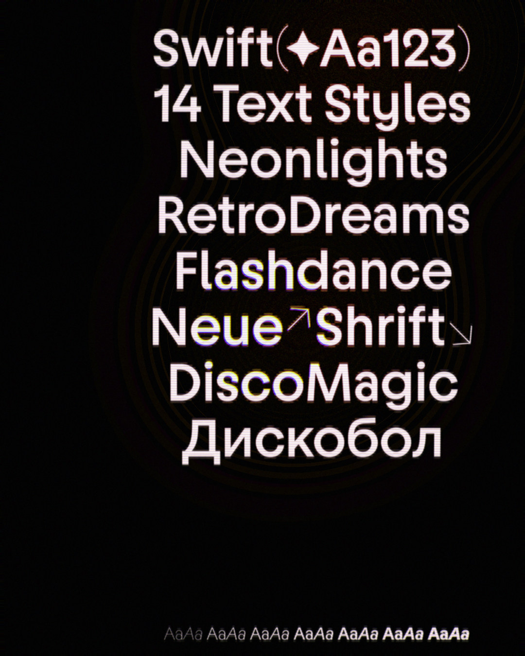
“Initially, we thought of naming the two versions Sugarspark Display and Sugarspark Text,” Naumoff recalls, “but eventually decided to take a more ‘fun’ route.” While keeping the ‘Sugar’ prefix to link the two siblings, the studio named the text companion Sugarswift – a direct nod to Swift, the famous legibility-driven typeface designed by Gerard Unger, who taught Naumoff at the University of Reading. “Swift was designed with legibility in mind, which felt like a fitting reference,” he adds.
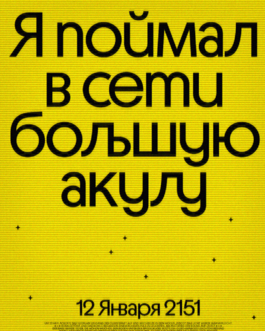
Here, Sugarswift translates Sugarspark’s spirit into something calmer and more fluid. For example, whereas Sugarspark aligns its ascenders directly with the cap height for a compressed, graphic block, Sugarswift raises the ascenders, opens the terminals, and loosens the overall spacing to make reading easier at smaller sizes. Even Sugarspark’s signature midline is tamed, shifting from mathematically centred to optically adjusted so letters feel balanced in running copy.
Cyrillic script approach & a near-2,000-glyph library
That split between display exuberance and text calm also plays out across the Cyrillic script. Interval Type took an unconventional route, importing handwritten, cursive-inspired forms – typically reserved for italics – directly into the upright styles to add spontaneity and warmth. For Sugarswift, those eccentricities step back in favour of classical Cyrillic constructions, prioritising instant familiarity and visual calm across body copy.
Both families span seven weights: Hairline, Extralight, Light, Regular, Medium, Bold, and Poster – with Sugarswift adding matching italics across all weights to bring its total to 14 styles. “The Hairline weight,” Naumoff explains, “was part of the concept from the beginning. It works beautifully at large sizes and is one of our favourite weights. Details like the ring-shaped dots on the ‘i’ and ‘j’, along with the ligatures, really shine in this style. Later, we decided to bring Hairline into Sugarswift, adjusting it for text use.”
While static files (OTF/TTF/WOFF/WOFF2) form the standard retail package, variable versions “can be provided on request if there’s a real need for it.”
True to Interval Type’s fondness for versatile design systems, the glyph set evolved organically into a nearly 2,000-glyph playground. “Ligatures,” Naumoff notes, “weren’t part of the original plan, but we eventually ended up creating almost a thousand of them!” Meanwhile, the extensive OpenType alternates were present from day one.
Across Extended Latin and Cyrillic scripts, Sugarspark packs in 12 stylistic sets (SS01–SS12) – including single-storey ‘a’s, circular dots, and curly arrows – alongside three distinct flavours of ligatures: Straight, Diagonal, and Rounded. “The idea behind Sugarspark was to create a kind of toolbox typeface, giving designers the freedom to swap letters and shape the mood of their work,” says Naumoff, noting that Sugarswift intentionally pares back this variation to stay focused on function.
What’s next? A serif in the works
Looking further ahead, Interval Type is already laying the groundwork for 2027, quietly developing a new serif typeface that has been in incubation for the past three or four years. “It’s a complex project, so it’s taking time,” Naumoff concludes, “but we’re really excited to share it at some point in the future.”
Browse their fonts here.
Enjoyed this piece? Read more of our type foundry spotlights here.