
A brand new year ahead, and a bunch of fresh new fonts to keep an eye on! We selected 11 of our top favourite fonts that you need to know about in 2023.
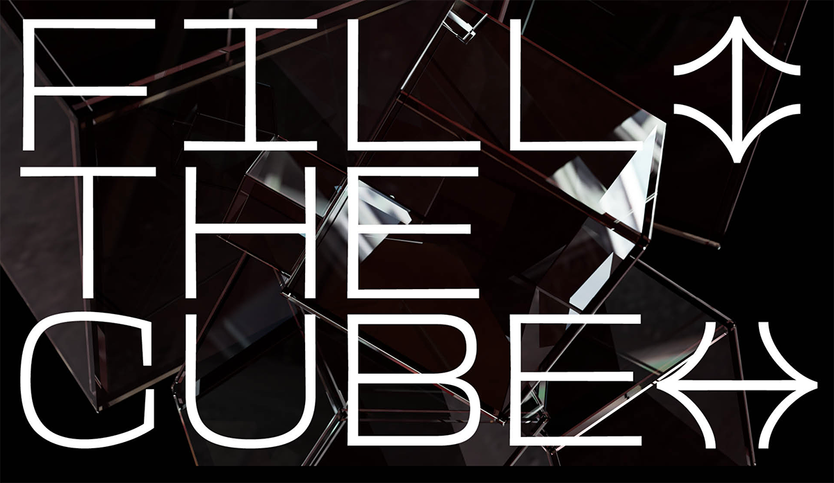
Rabbit Hole Display
Twisted characters from a secret world of a rabbit hole, designed by BOAFFF. A huge trend of 2022, saw the stunning combination of two extremes, an experimental typeface fused with a clean grotesque. Rabbit Hole Display is one of few examples where this style has been executed successfully. Fall into the hole, it’s time!
See all its features, and download the free trial on Type Department.
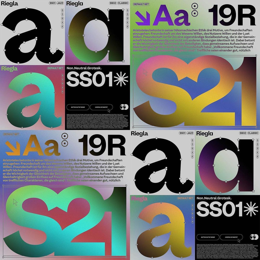
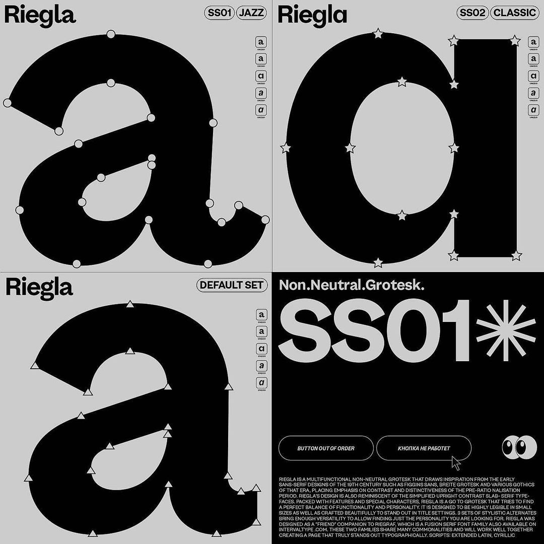
Riegla
Designed by Interval Type, Riegla is still just a tease – but one that we are excited to track! The font is a non-neutral grotesque, and you can learn more about its future release following Interval Type on Instagram.
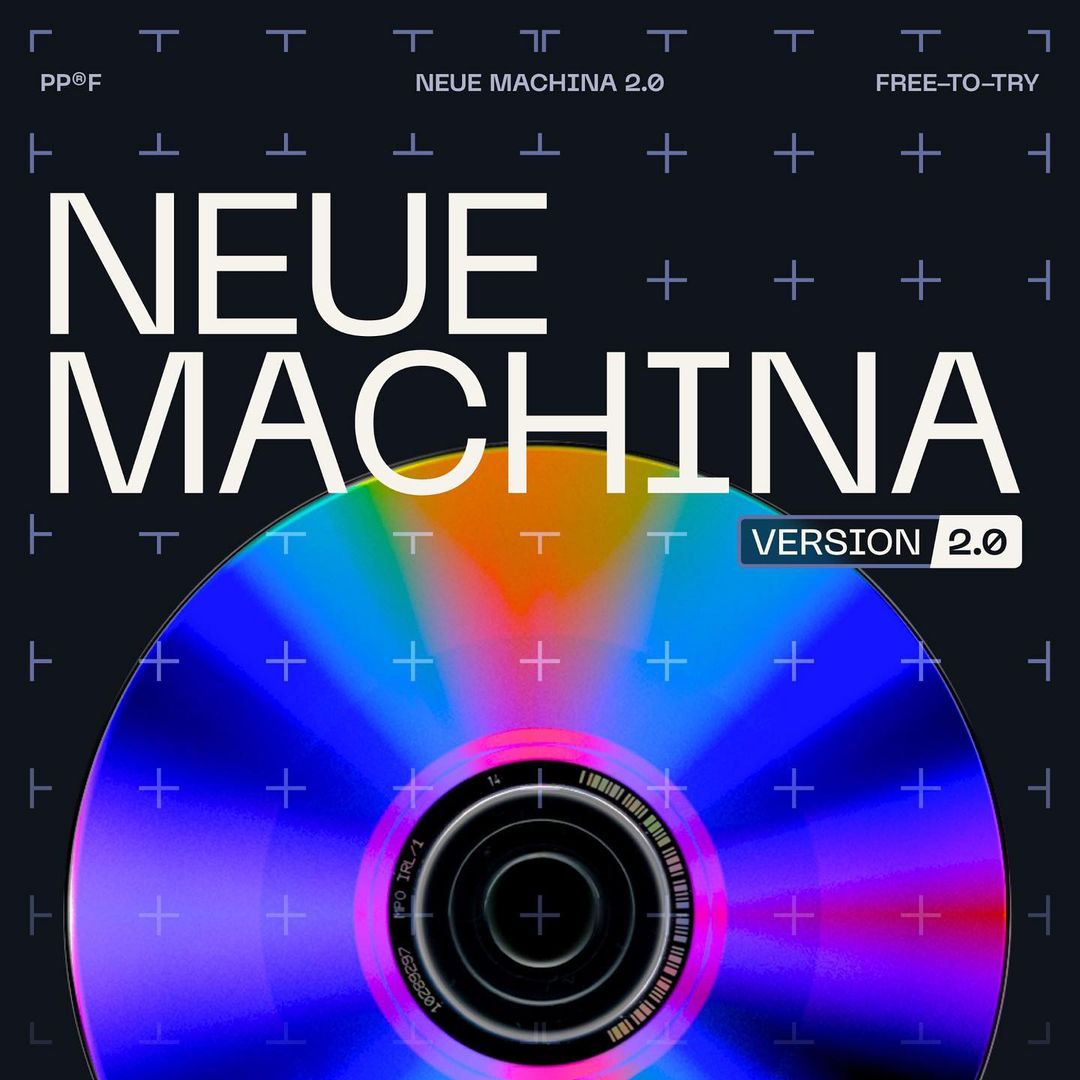
Neue Machina 2.0
Neue Machina is a powerful and meticulously crafted typeface boasting monospace/geometric type features as well as apparent and deep ink traps in its heavier weights. Designed by Pangram Pangram Foundry, the typeface is inspired by the aesthetics of robotics and machines. Equipped with an ink trap cut, as a standard style, each cut comes with its corresponding italics and everything is variable for maximum versatility. Check all the information on Pengram Pengram Foundry’s website.
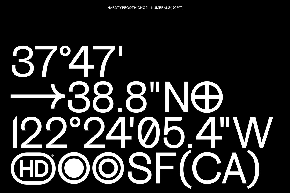
Microbic
This is the first typeface to be released on the newly created type foundry, Hard Type. Designed by Laura Garcia, Microbic holds a concept that revolves around a légère roman typeface with a scotch heritage that has an aseptic and passive-aggressive behavior.
The name comes from viewing it as a lab Petri dish where many colonies of different genera/species of microorganisms are living and growing in the same environment. The upcoming release will have 4 styles (including italic and monospaced) equipped with 800+ glyphs and many stylistic sets, ligatures, and alternates.
We interviewed Hard Type in more detail on TYPE01 here. Access Hard Type’s official page for more information.
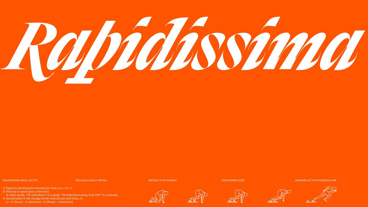
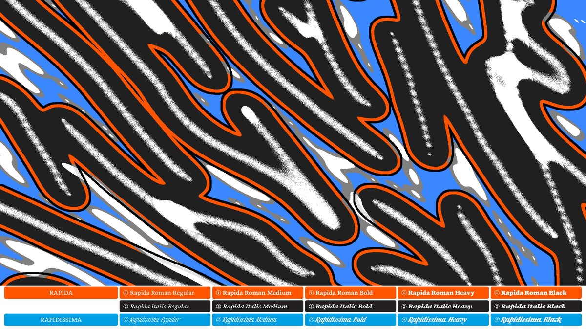
Rapida and Rapidissima
Designed by the Italian Type Designer, Michelangelo Nigra, the idea of separating Rapida from Rapidissima is to investigate how italic, a system of cursive styles, became not just the counterpart to the Roman, but a separate entity – with its tone of voice, claiming its own space.
While Rapida is described as a serif typeface family for continuous text setting, distinguished by how it both follows historical conventions and introduces unusual abrupt detailing, Rapidissima presents an extreme visual rendering of the idea of speed on an italic-only display group of fonts.
Read their full interview with TYPE01 here. Find more information on Rapida and Rapidissima on Typotheque.
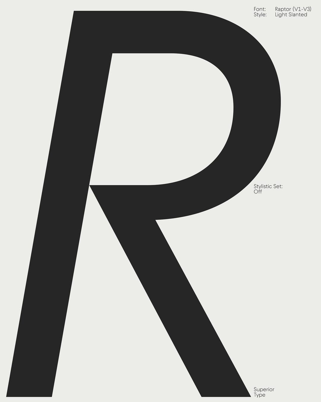
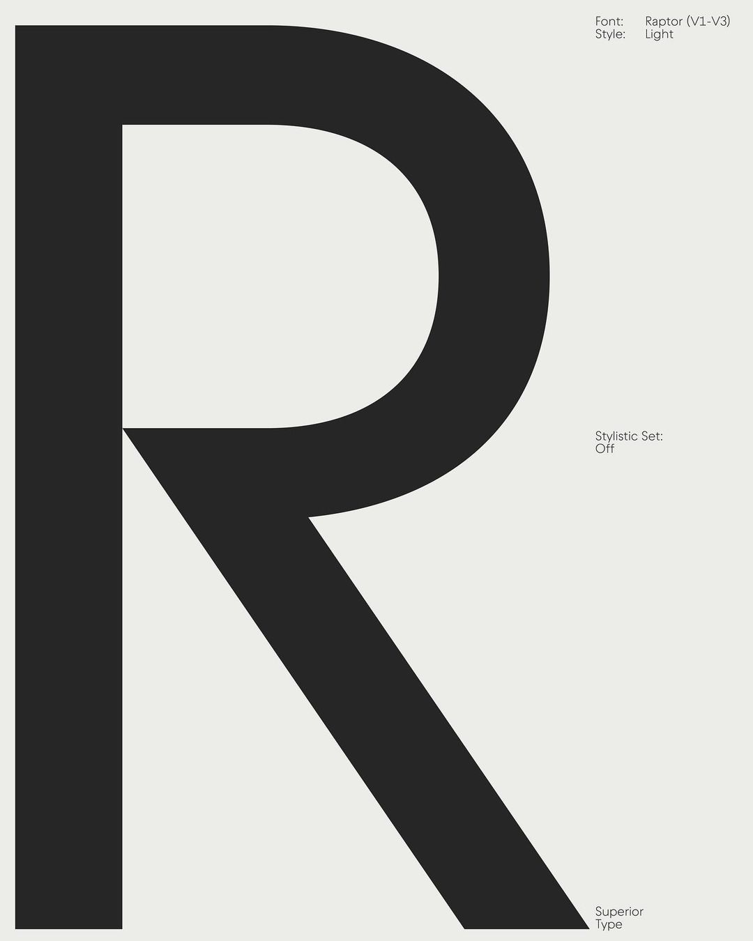
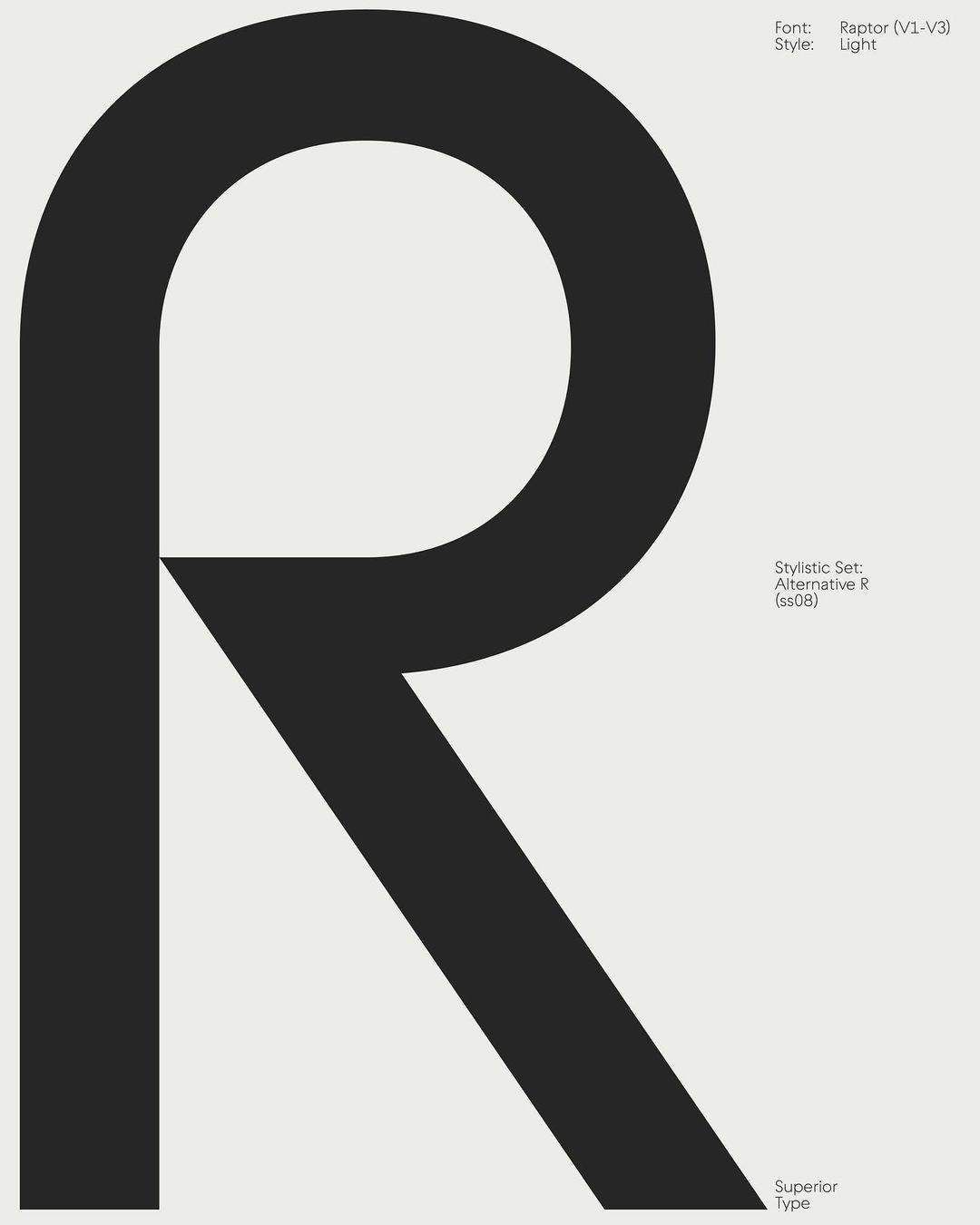
Raptor V3
Designed by Vojtěch Říha at Superior Type, Raptor V3 features classic ends of characters and connections. Most noticeable in A, M, N, V, W, X, and many Greek and Cyrillic letterforms (with language support for Belarusian, Romanian, and Vietnamese).
The typeface was designed for a fresh and almost comfortable design. It relies on history but includes many details that are behind fashion waves or movements. Every version (V1—V3) is now available in six styles: Light, Regular, Medium, Semibold, Bold, and Black, and their respective Slanted versions. Read more about Raptor V3 on its official page.
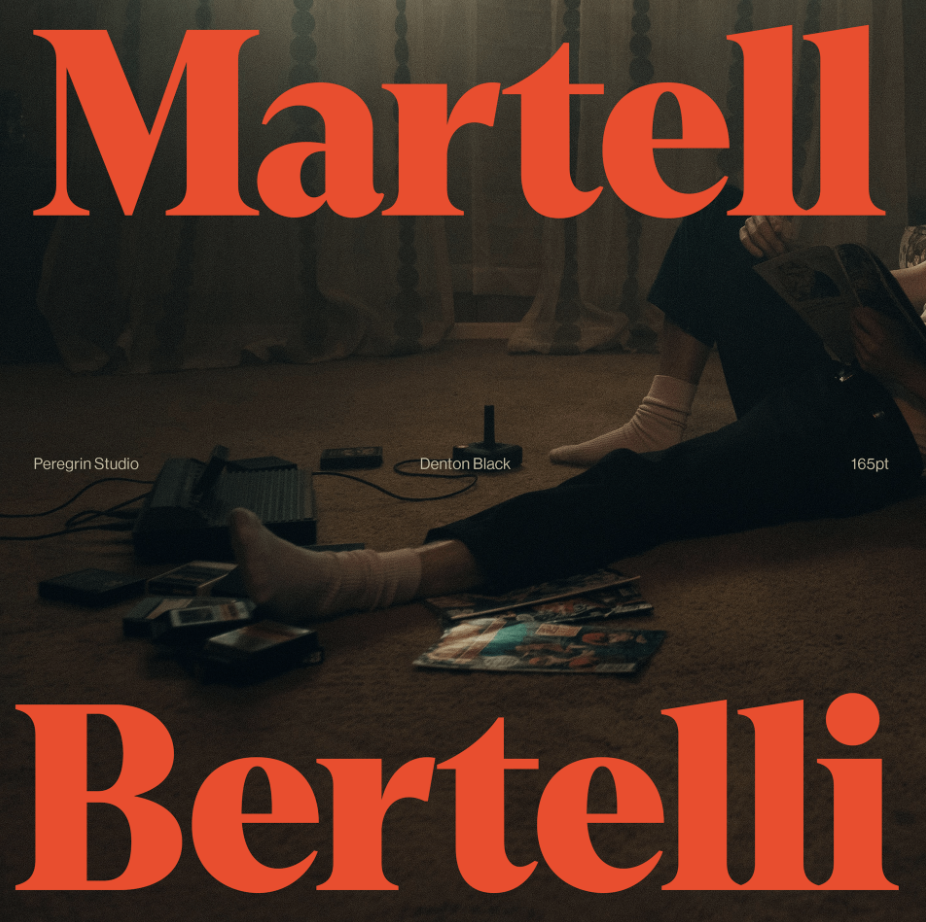
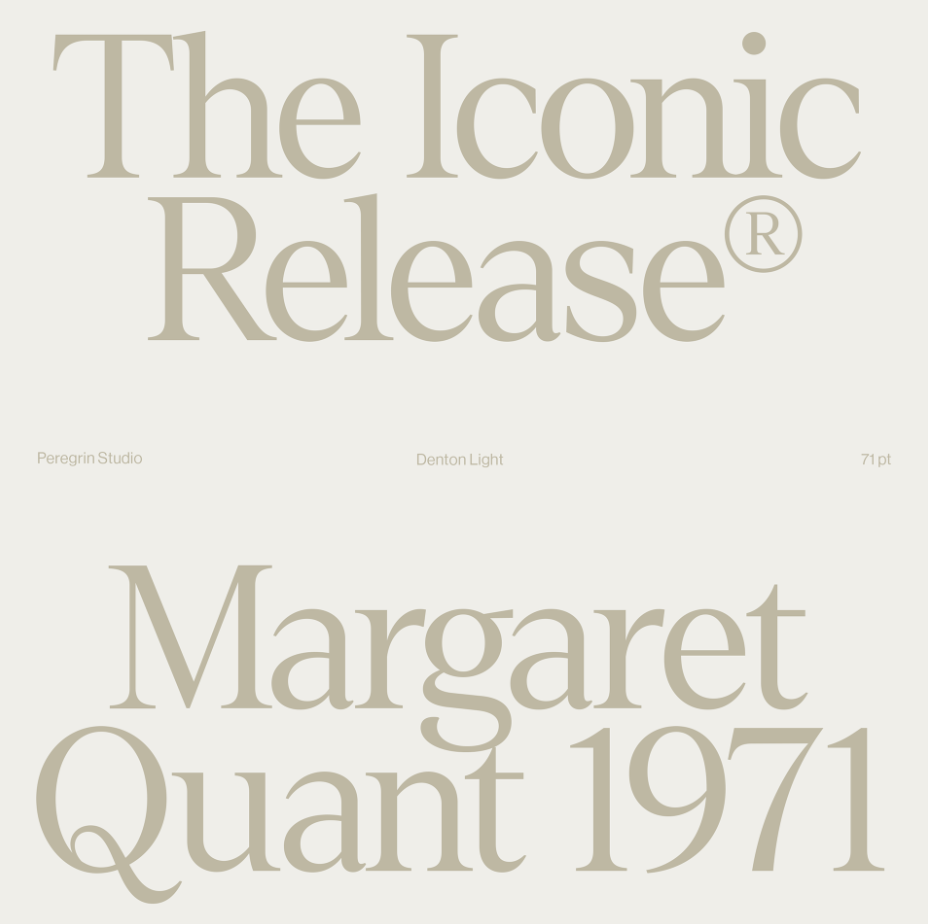
Denton Typeface
Denton is a typeface full of warmth, bringing expressive 70s design into modern use. Designed by Peregrin Studio, it originates as a modern re-interpretation of the cozy, tightly-set typefaces that made the headlines of the phototypesetting period. Denton has a smooth uniformed rhythm with carefully designed letter interactions. It also comes in a variable-weight font.
Denton is available to download for free & try (including the variable version) at Peregrin Studio’s official page.
T1 Korium
T1 Korium is a powerful, contemporary sans serif font family of 5 separate cuts equipped with variable font technology, available at our very own foundry, T1 Foundry. Packing a punch with its dynamic rhythm, beginning with the highly stressed Ss, definitive features were designed to merge at the same height to keep a consistent texture across long words while remaining bold and expressive.
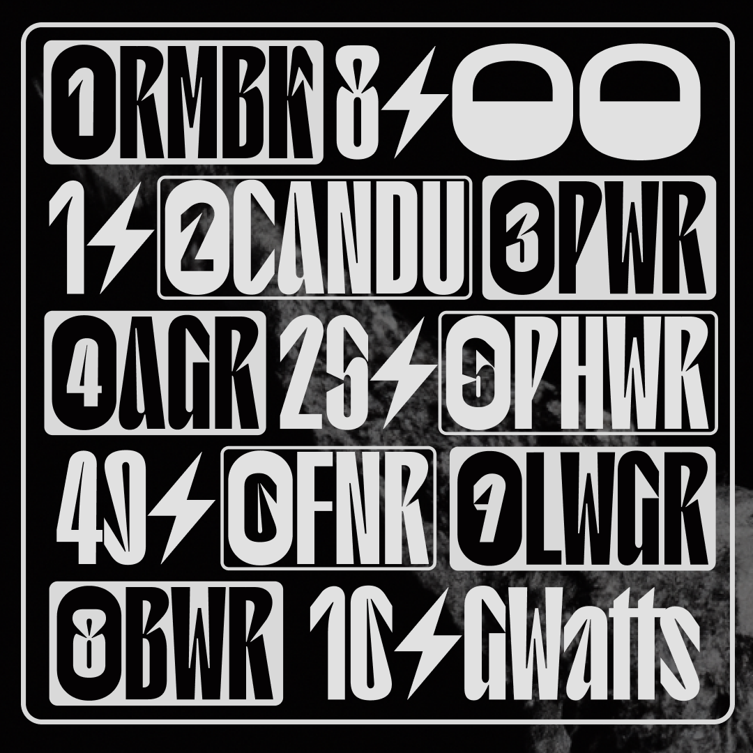
T1 Korium’s namesake was inspired by corium, a deadly, lava-like material created in the core of a nuclear reactor during a meltdown incident. Read more about Korium on its official page.
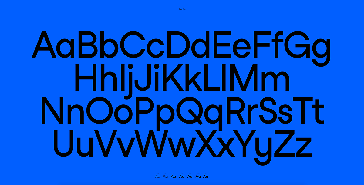
Sans Mono
Designed by Felix Pfaffli and Robin Eberwein for Studio Feixen, the hot-release Sans Mono comes in ultralight, light, book, medium, semibold, bold, and italic, and grants a font with a form that follows beauty, geometry, naivety, and linearity.
Studio Feixen is an independent Design Studio based in Lucerne, Switzerland that creates visual concepts. Find the Sans Family on their website.
Square
Square is a mono font, designed by Raphaël Lefeuvre and available at Blaze Type. Each sign is built within the constraint of a square, which enables it to be written from top to bottom and horizontally and vice versa.
Find Square Mono at Blaze Type.

Rigatoni
Rigatoni is a wide, extended grotesque typeface designed to create a brutalist look in all caps, met with a quirky and mellow feel in the lowercase. Designed by Giulia Boggio, and available at Type Department, Rigatoni is a flexible face able to adapt to a range of settings. The heavy weight of the characters is balanced by an alternate set of thin symbols and punctuation, while the loose design creates an overall friendly feel. Now available in not one, but three weights!
See all its features in Type Department.


