
The Brand Identity (@thebrandidentity) are a platform committed to supporting and empowering graphic design communities. Regularly publishing articles, deep-diving into design news, creating incredible brand-based content, designing their own products and collaborating with designers and brands, The Brand Identity have their finger on the pulse of the most exciting and inspiring branding design projects out there. We’ve been chatting with The Brand Identity founder Elliott Moody to learn more about their creative journey as a platform, and to explore his thoughts on the role of typography in branding and visual identities right now.
Please tell us about what you’re up to these days and how COVID has affected your work?
We recently relocated back to my hometown of Norwich, which naturally took a little longer than expected with many a COVID-related delay along the way. We’re settled now though and working remotely with our small team of collaborators and contributors across the UK and Germany. Luckily, COVID hasn’t affected us too much as we’ve always worked remotely and never had too many overheads to worry about. Let’s see what happens over the next few months though!
The Brand Identity has grown into an impressive and vast community of followers, what do you think is most valuable about it?
Thank you! Our aim is to provide a platform and resource for the graphic design industry that’s accessible, considered and consistent, so I hope that comes across to our followers. I never thought it would grow to the size it has, which is pretty rewarding and I’m very grateful to everyone that’s supported us over the years. I think the most valuable thing about it for people is having a place to go to learn, feel inspired and get some things that help them with their work. If we can do even one of those things for people, then I’m happy.
How have you seen branding change over the past few years?
I wouldn’t say there’s been a huge visual change since we started out in 2015, although the projects themselves to seem to be much more multi-faceted. Rarely do we see a project or receive a submission that’s just a logotype and a business card any more. Instead, there tends to be layers of illustration and typography working together in a rigorous system designed to appear on everything from apps and websites to signage and books. Maybe that’s always been the case to a certain extent, but it’s something I’ve particularly noticed recently.
Do you think that type is becoming the forefront of branding trends in 2020?
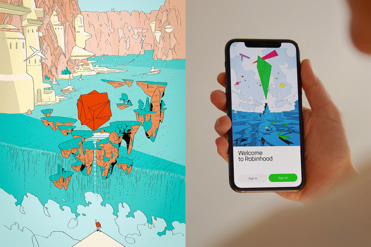
Type has and always will be a fundamental part of successful identity systems, however I’ve actually noticed a resurgence in illustration in identities over the last few months. The key to these being successful in the long-term is a robust typographic system that exists alongside the illustrations. If the illustrations grow tired or dated and the company are unable to commission a consistent stream of illustrations, thoughtful typography will always give identity to a brand. A recent example of this is COLLINS’ work for Robinhood, which incorporates the work of over four illustrators without being dependent on it.
How have you seen type treated in branding scenarios recently? Is it becoming bolder, more unique? Why do you think that is?
Scrolling past the last few months of articles on our website, it’s still as sans serif-centric as it has been for quite a few years – but that ultimately comes down to what I’m in to. Saying that, there has been an influx of serifs recently that are being used in a more experimental manner or leading role compared to how they’re traditionally used for book-ish body copy. Studios like Actual Source and Never Now come to mind as doing this really well.
What’s your most recent favourite example of type in use in a branding context?
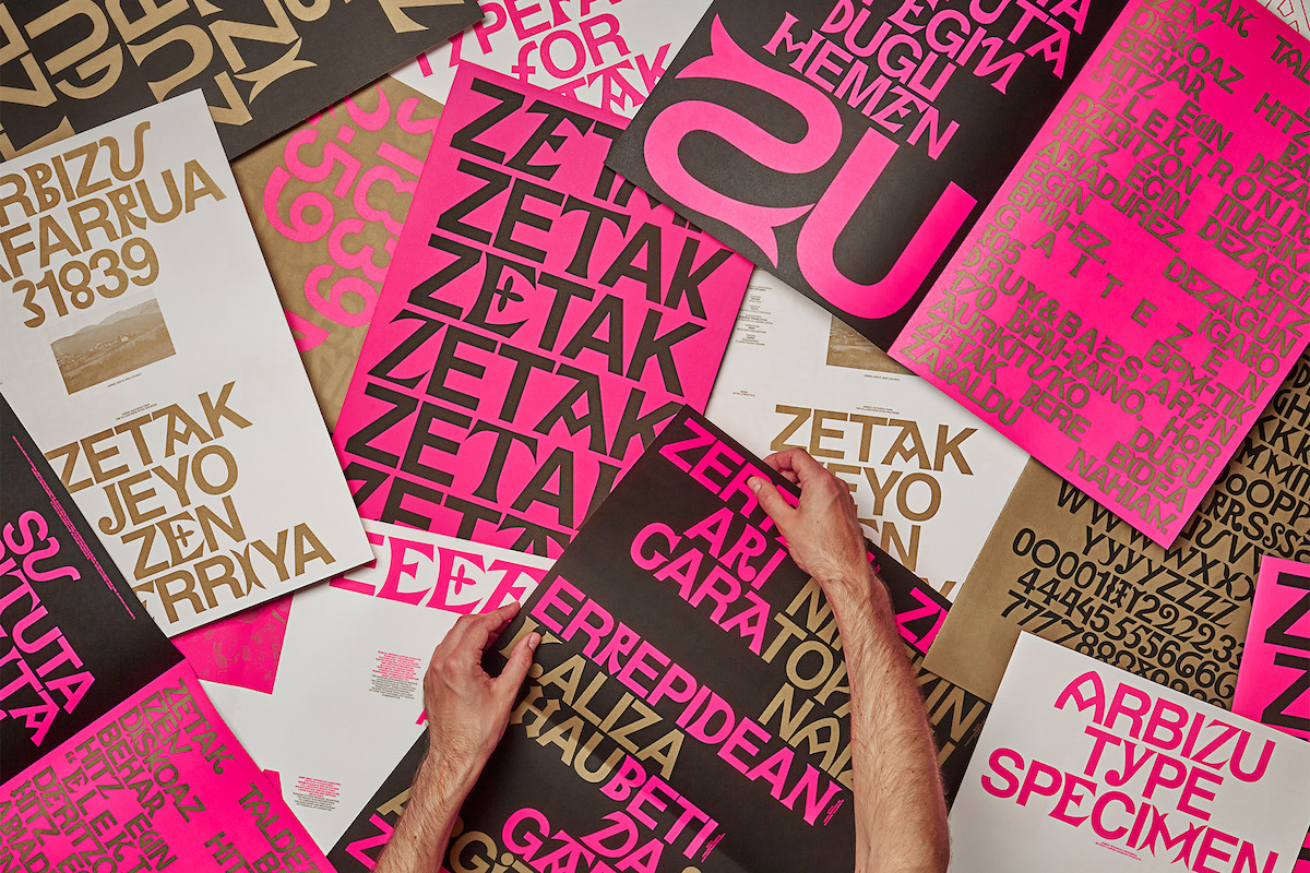
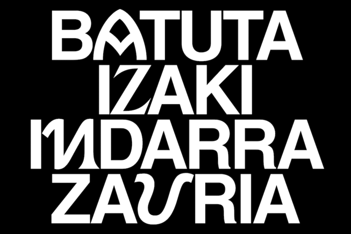
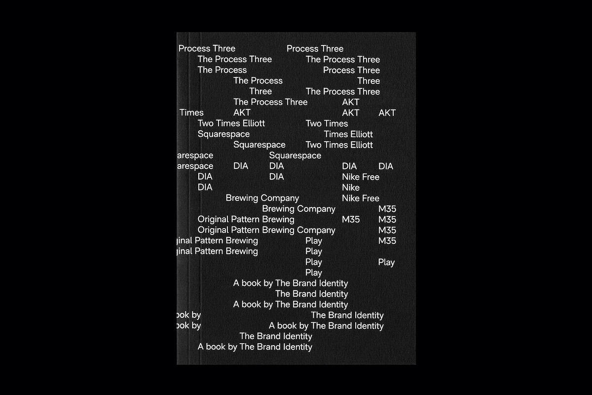
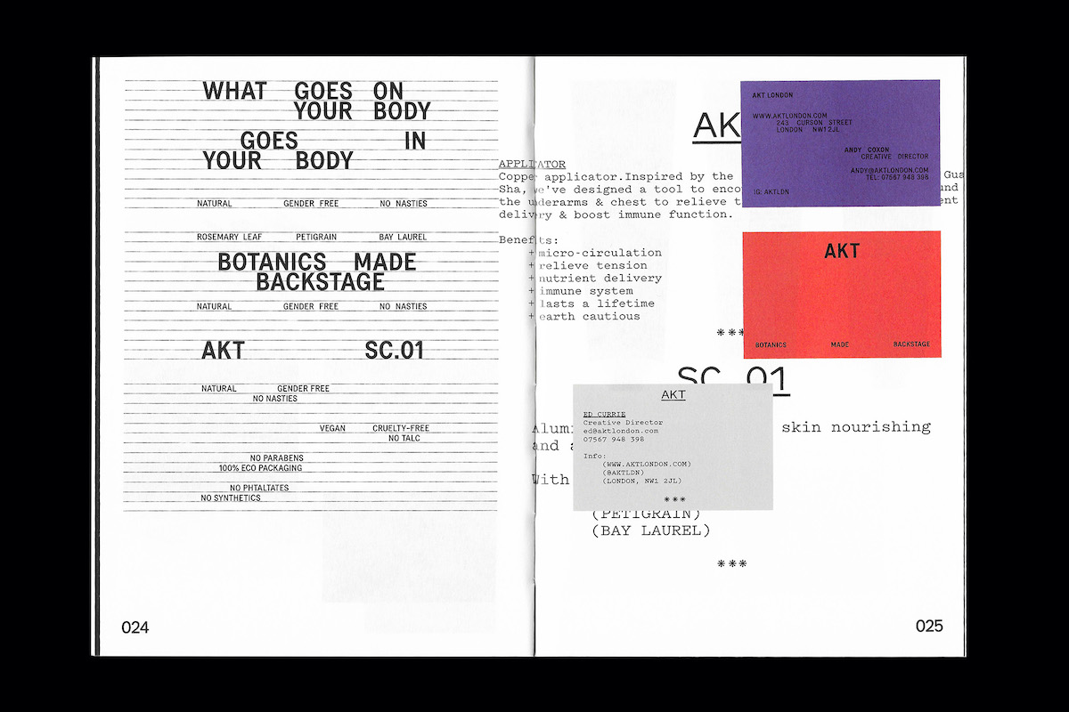
Pràctica’s custom typeface Arbizu, which they made for electronic musician Pello Reparaz’s ZETAK project, has been an instant favourite since they first shared it with us. The typeface is a revival of ancient Basque letterforms, which are pretty unusual in themselves, but when paired with Helvetica throughout the identity, makes for a pretty challenging mix. I love it for how direct and unapologetic it is, especially when printed in fluorescent pink, black and metallic gold. Other favourites would be SOME DAYS’ identity for FACULTY, which uses a growing system of ‘F’ logos pulled from various typefaces, and Two Times Elliott’s work for AKT for its perfectly playful simplicity.
What do you think brands are after when searching for the right font?
I think that, just like their brand as a whole, they want a typeface that suits their personality and doesn’t scare off potential customers. Sometimes type is the brand, sometimes it’s primarily there to do a functional job, so it’s hard to define a one-size-fits-all kind of answer.
What advice would you give to a type designer who wants to create a font/typeface to be used in branding contexts?
Try to always have a reason for what you’re doing, even if that reason is just to experiment and learn. People often say that we don’t need any more sans serifs like Helvetica, but if you feel you can bring something to the table that has a purpose, then do it. And be inspired, but don’t copy people, as more often than not, you’ll get called out at some point.
Finally, what are you working on right now? Any new projects that we can expect from The Brand Identity?
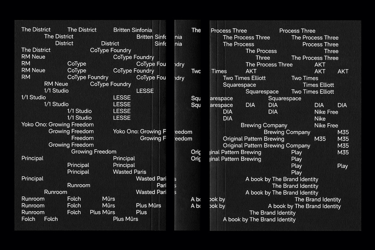
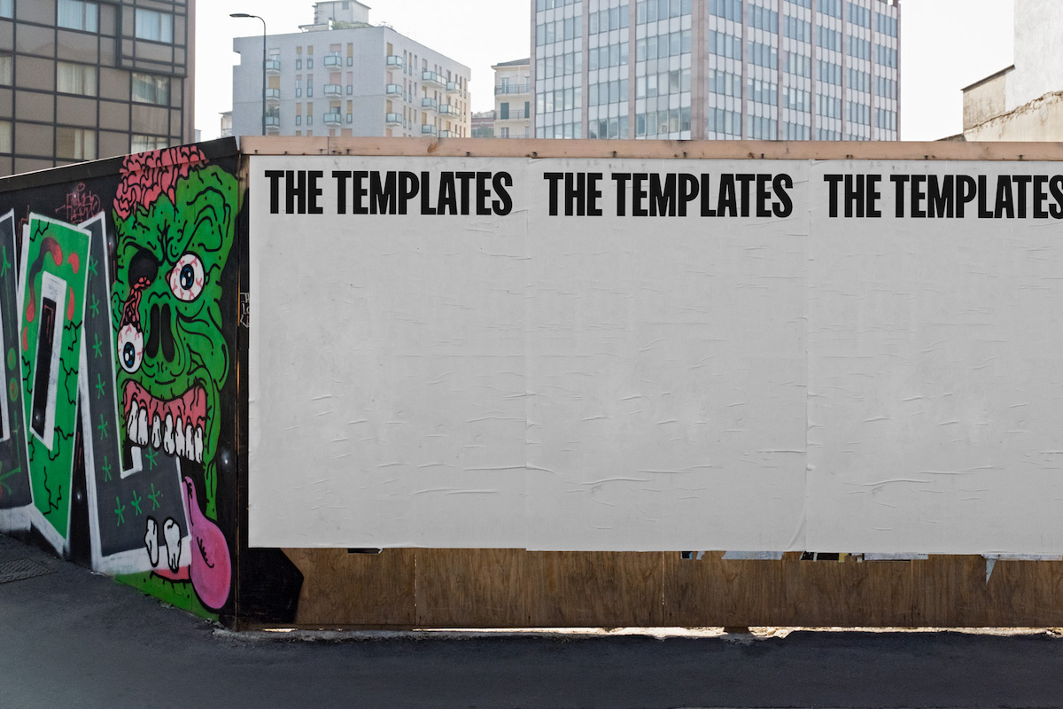
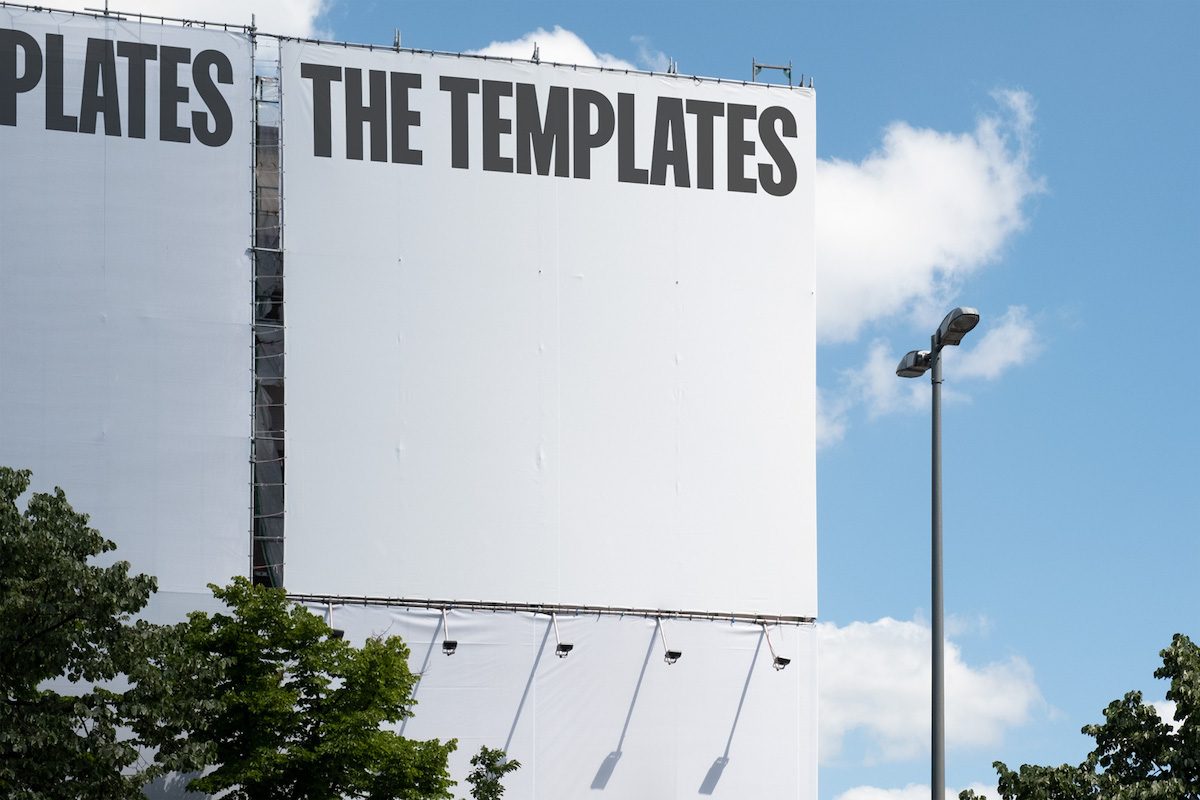
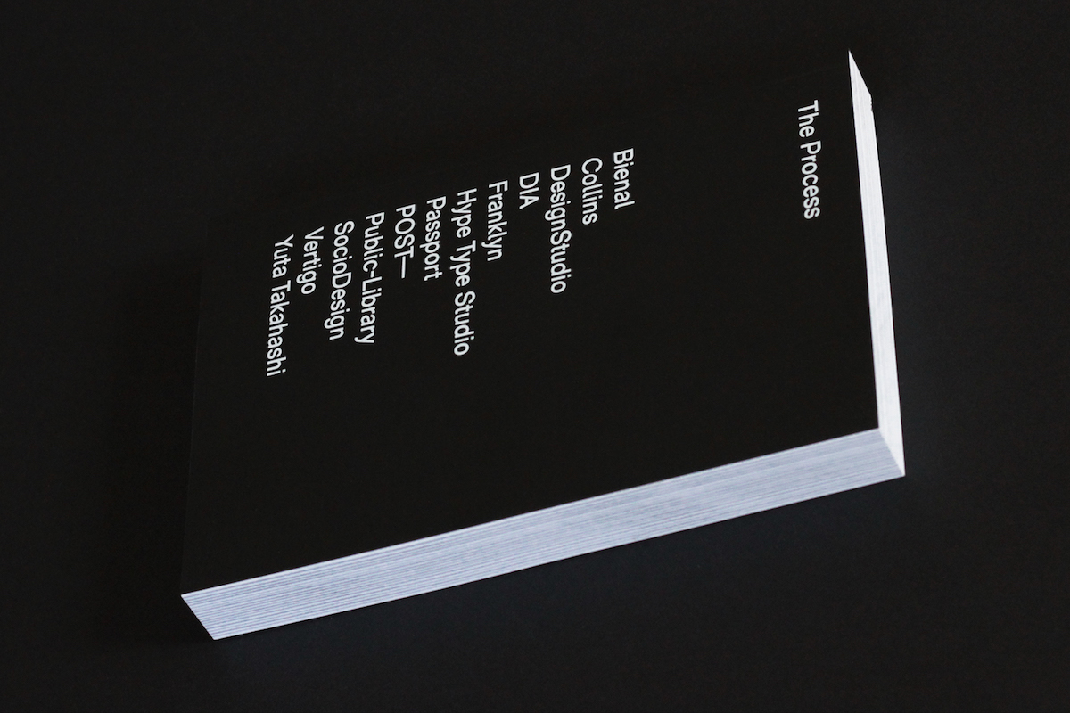
We’ve just released our third book, The Process Three, which we’re super proud of and I personally feel is the strongest, most complete thing we’ve done so far. Our main goal for the next few months is to relaunch our website, just to make it a better experience for users overall, and to give us a solid base to introduce new things in the future. And THE TEMPLATES of course, we’re working on lots and lots of new images to add to the collection on a more consistent basis. And the next The Process book, which I thought a few days ago could be a typography edition, so stay tuned for that over the next few months.
Thank you so much to The Brand Identity for sharing these wonderful muses and insights. The work they do is so exciting and it’s great to be able to take a deeper look at type’s role in such a directly influential setting as brands and identities. If you don’t already follow The Brand Identity, be sure to check out their Instagram @thebrandidentity and check out their website to stay in the loop with current branding-focussed trends and projects.


