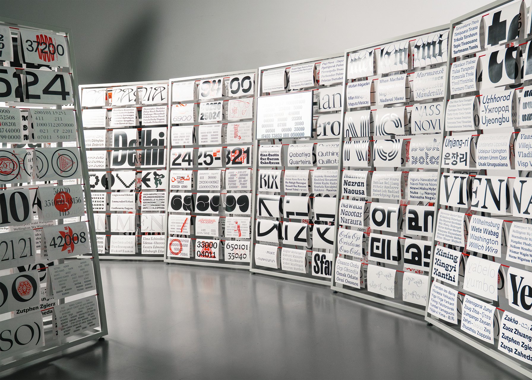

Running from October 22 to December 18, 2026, the installation from ECAL and ArtCenter highlights typography as a visual, cultural, and linguistic practice while documenting how letterforms are developed across different educational environments.
–
In the type design world, Switzerland, and Lausanne in particular, has long been known for the strength of its teaching. ECAL, the Lausanne University of Art and Design, is one of the most prestigious art and design schools not only in Europe, but globally. And so students come to it from everywhere: “around 600 students representing more than 40 nationalities choose this institution for their course of study,” according to Lausanne Tourisme. Now the school is going to them, taking its students’ work on a world tour.
The touring exhibition, A Typographic Atlas, puts two schools side by side. On one side are more than 300 typefaces made by students on ECAL’s Master in Type Design and BA in Graphic Design. On the other are more than 60 typefaces developed by ArtCenter College of Design students in Font Design 1 and 2. Together they make a big, varied picture of how type is taught, and what happens when two different teaching approaches look at the same discipline.
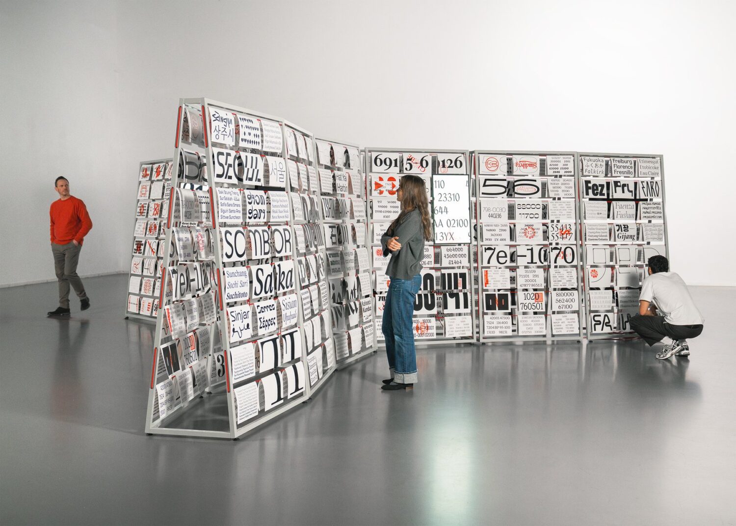
Organised, as the name implies, a typographic atlas, the show takes an expansive view of the ‘type specimen’, transforming it into a map that you can wander. Visitors can trace how ideas move between studios, how briefs become letterforms, and how a student’s first rough drawing turns into a working, usable typeface.
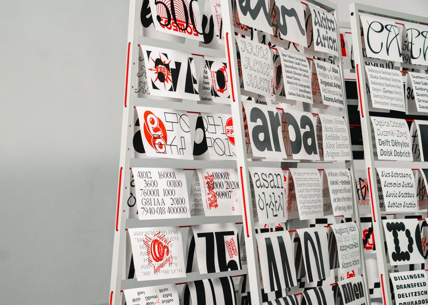
According to the organisers, the resulting typefaces range from “classical, highly legible text faces intended for running copy” to “experimental and expressive display forms, including revised historical models and forms that test the boundaries of readability.” Some are restrained and systematic, very much in the Swiss tradition; others are loud, playful and happily strange. The span also reflects “the increasingly global nature of contemporary type design and the cultural connections that shape its practice.”
Holding it all together is a modular display by Swiss designer Adrien Rovero, arranged using an alphabetical and numerical indexing system. Built to be taken apart, packed up and rebuilt in a new city, it adapts to each venue without upstaging the work, framing the typefaces and then getting out of the way. It suits a show that has been on the road for a while.
Its route across Europe and over the Atlantic has included Turin’s Circolo del Design, Leipzig’s HGB (Hochschule für Grafik und Buchkunst) and Paris’s Program/me, followed by The Cooper Union in New York and the Université du Québec in Montréal.
Now it’s ArtCenter’s turn to host, which feels fitting given how much of the show comes from its own students. After Pasadena, the atlas heads home to Lausanne and ECAL, before travelling on to Tokyo’s SKWAT Kameari Art Centre. With each stop, the map gets a little bigger.
Rather than a victory lap for one institution, it’s an open look at how type gets taught: shared between two schools, and between audiences around the world. For anyone curious about where the next generation of type designers is coming from, it’s well worth tracking down.
ECAL: A Typographic Atlas / ArtCenter Font Design runs until 18 December 2026 at ArtCenter College of Design, Pasadena. Open daily, 9am – 7pm. Closed 11 November (Veterans Day) and 26 November–2 December (Thanksgiving).