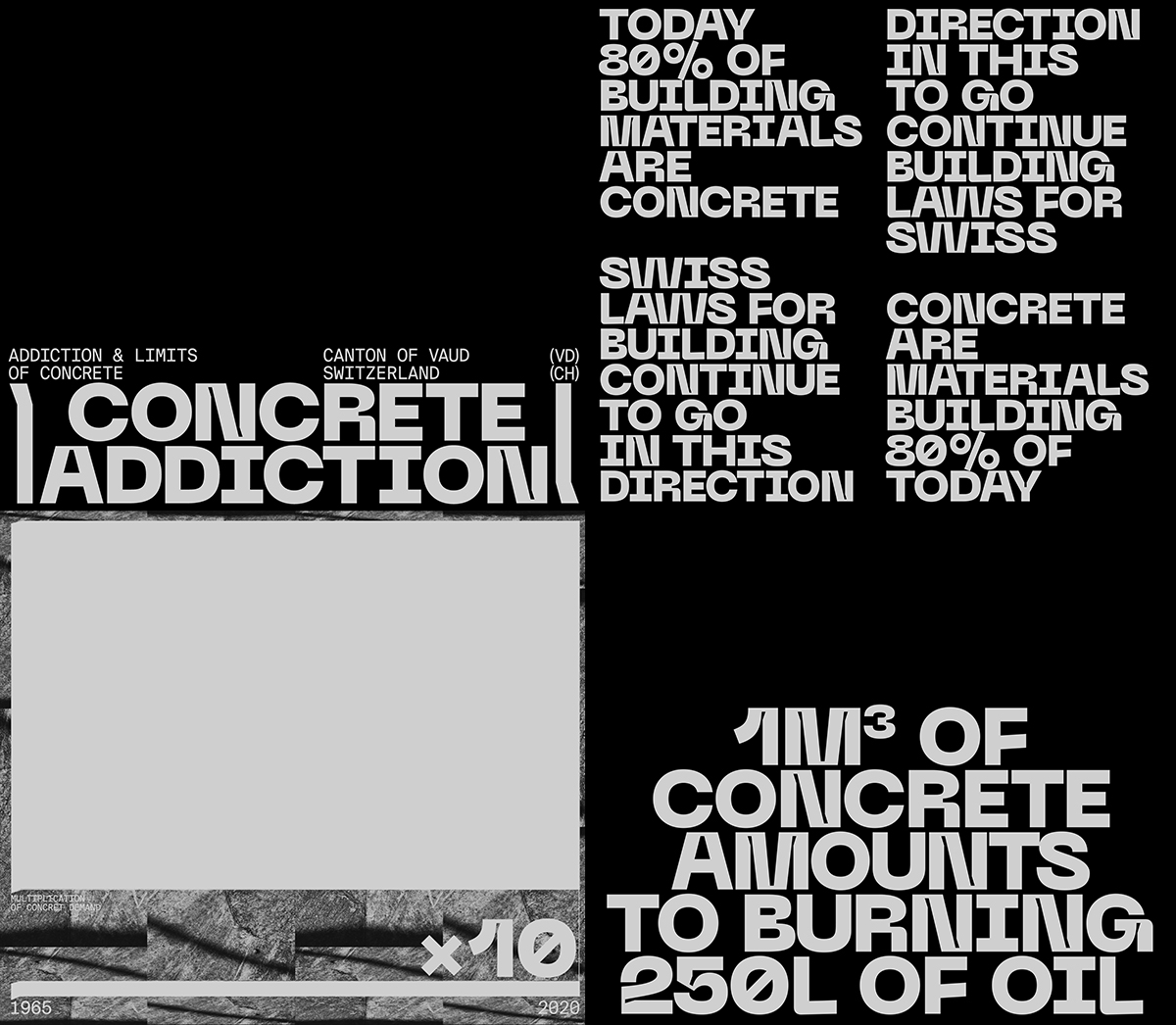
Through the fusion of kinetic type and installation, Geneva-based Multidisciplinary Designer Leo Monnet (@monnet_leo) has been offering a fresh perspective on the environmental impact of our “addiction to concrete” in urban growth.
The installation creates a comment not only on the impact of rapid urban development, but on the wider impact of rampant consumerism in the face of diminishing resources and vast global inequity. With Concrete Addiction, Leo tackles intersections of geographical privilege, environmental concerns and the vast overuse of finite resources. Investigating society’s pursuit of constant growth, he says, “‘Concrete Addiction’ questions and sheds light on our addiction to concrete. By addressing the mainly environmental limits that materials face, it invites us to rethink our model of construction in building and town planning.” Alongside a combination of projection mapping, industrial visuals and a jarring, fast-paced soundscape, Leo utilises kinetic type to invite us to raise questions around what has become a ubiquitous – but very powerful – risk to our world.
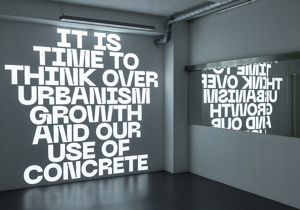
Selecting a combination of one display and one body text font to create kinetic type hierarchies – Neue Machina by Mathieu Desjardins of Pangram Pangram, and Suisse Int’l Mono by Swiss Typefaces – Leo stays in traditions of Swiss style typography throughout the installation. This reads, whether deliberate or not, as another, more subtle comment; it is using the very design aesthetic which has been so loyal to concrete over the years, hailed by modernist architects for its ability to look minimal and functional. The popularity of concrete in these design traditions cannot be ignored, and using type that adheres to the same school of thought highlights how contradictory the reality of concrete’s use really is – this use being vast, damaging, and quite the opposite of minimal. It remains undercover and masked, because it is everywhere.
Winding back to the beginning, Leo says his initial idea for the project was to focus on our obsession with constant development of new technologies and acquisition of new devices. He started looking into the extraction of rare earth elements, used in technological devices such as smart-phones, LED lights and flatscreen TVs. “For the European consumer,” he says, “this is a very remote concern, as the extraction and production of rare earths takes place mainly in China and South America. This can be looked at from a vast array of perspectives, but it is important to set limits and a frame for this type of research. Therefore, I chose to restrict my research according to geographical criteria, and examined the questions raised in the region where I live.”
“Many things happen around us,” he adds, “but we are rarely informed about them.”
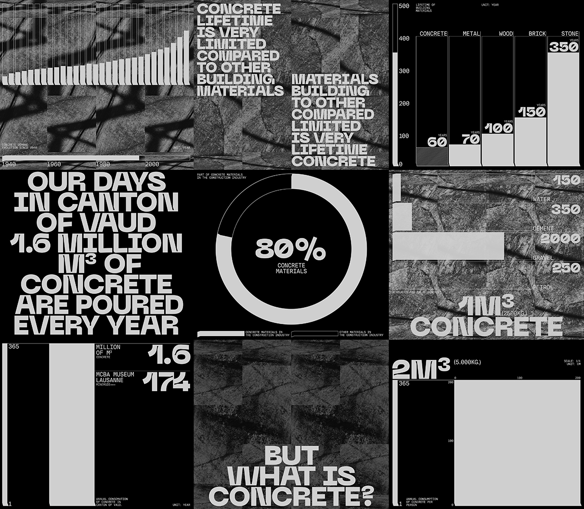
Mirroring building blocks which swiftly crumble away, Leo’s kinetic type helps to build the installation’s narrative through the use of powerful typographic hierarchies. “Visually,” he says, “the graphic system relies on two aspects: a pattern and a kinetic typographic system, compiled with a data design system. The concrete pattern in the background emphasises the aesthetics of this material. First, I had imagined introducing this texture by applying a colour giving the shine of concrete to my installation. But, after a weekend in Zurich, I had made a compilation of videos showing concrete walls from different angles, from close or far away. So, finally, I chose this approach and proposed a loop-shaped pattern that unrolls during the whole projection, just like the conveyor belts visible on industrial sites where concrete is produced.”
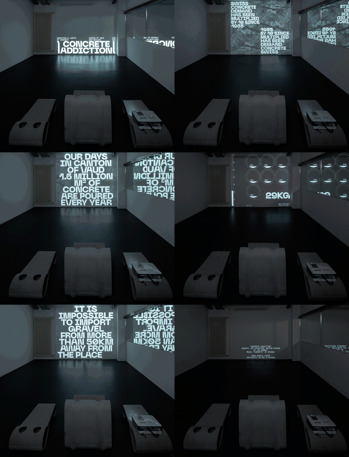
“The remaining elements of the graphic system are based on the forms and curves of the chosen typographic font, Neue Machina,” he continues. “I took over the details of the glyphs’ inktraps in order to create my data design scheme’s specificities. So, we see again small incises on the entire graphic skin, creating a visual link between the typography and the graphic skin.” Set within a soundscape created by the Italian producer Neunau, entitled “Concrete,” the atmosphere between the harsh sounds, dizzying projection mapping and dynamic, hard kinetic type is both immersive and claustrophobic. “The atmosphere created in this way gives the feeling of oppression and incessant repeating compression,” Leo adds. “There is no time to breathe and the immersion sweeps us along, as if we were on an industrial production line.”
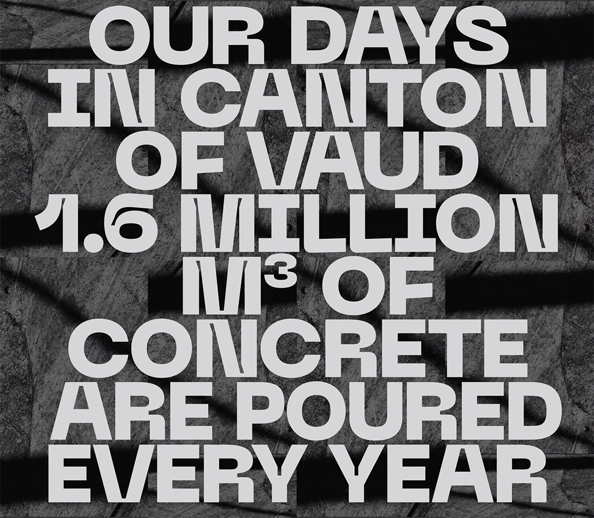
On his font choices, Leo explains, “The Neue Machina impressed me for its originality and its strong impact, to the point that in my clip, one could get the feeling that each word is a brick, piling up to form a wall. Using it only in capital letters also strengthens this feeling of emergency, which I wish to share in relation to the importance to question our construction habits. The very name of this font suits the world of concrete and constructions in which machines are constantly used. This character attracts the attention, and its inktraps are one of its beautiful advantages.”
“Its layout is also important,” he continues. “For example, the spacing between the lines and between the letters is very weak and the viewer has the feeling that they do not have time to breath between on information and the next…Using Suisse Int’l Mono in capital letters makes me think of the typography in written technical books, with instructions for use or construction plans with technical contents. This font functions perfectly in the captions, as well as for my data schemes. Its fixed width evokes the notion of a module as well as a repetitive sound that is to be found visually in the background video pattern and in the sound design.”

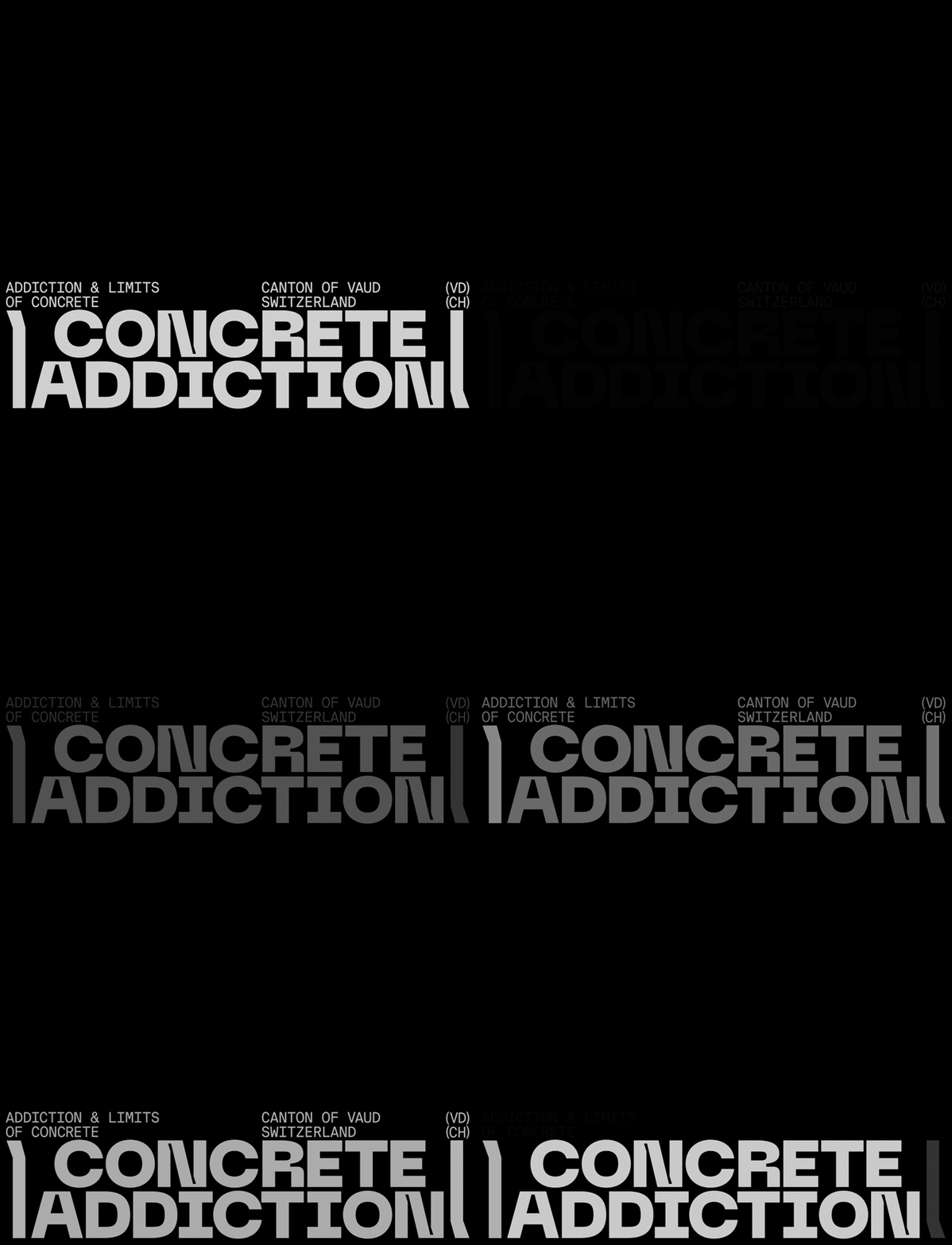
Currently, Concrete Addiction has only been shown to a limited number of students at HEAD-Geneva, due to the pandemic. In the future, Leo hopes to exhibit the installation to a wider audience, in institutions such as architecture and design schools, research centres, festivals, fairs and conferences about architecture and design. “I would like to take this opportunity to call on the community,” he says, “if you are interested, do not hesitate to contact me.” You can watch Concrete Addiction below.
Thank you, Leo!


