
We’re super excited to introduce this shiny new update for Morgane Vantorre’s much loved, delicate-meets-majestic display typeface, Arthemys.
Based in Pairs, Morgane is a graphic and type designer whose work is pretty breathtaking. Not only are her typefaces stunning, but they are also meticulously well-designed and accompanied by rigorous conceptual thought.
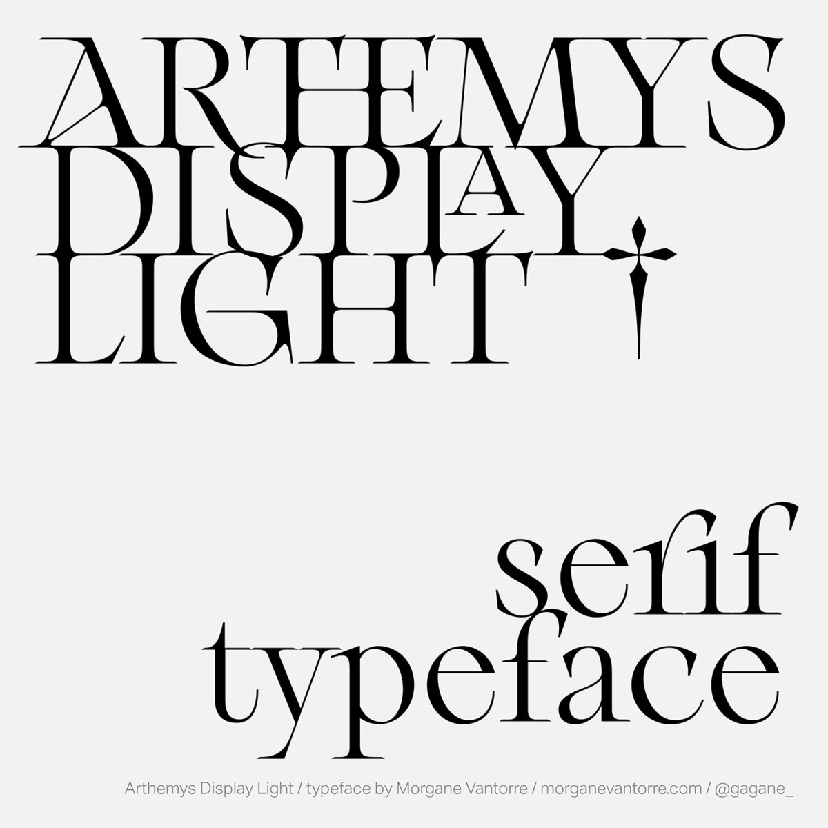
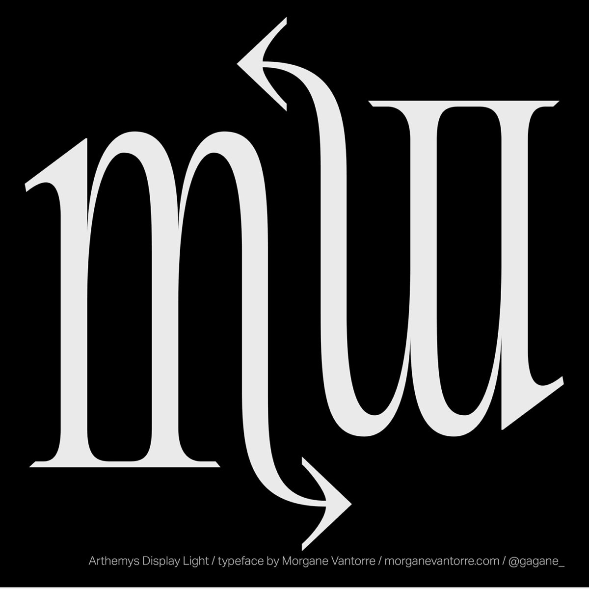
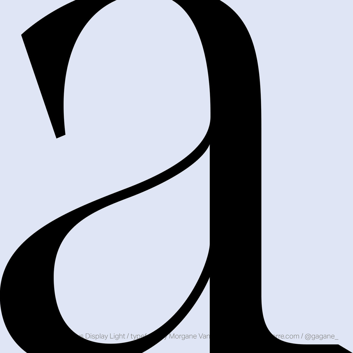
Arthemys has been a fav of ours for a while now. Inspired by an amalgamation of XVIIIth century aesthetics, engraved lettering found in cartographies and the type specimens of Nicolas Gando, Morgane calls Arthemys ‘a singular union between shapes from past and a contemporary eye: a kind of fruitful revival which highlights the sensitivity of two eras‘… And Arthemys Version 2 brings us all this good stuff and more.
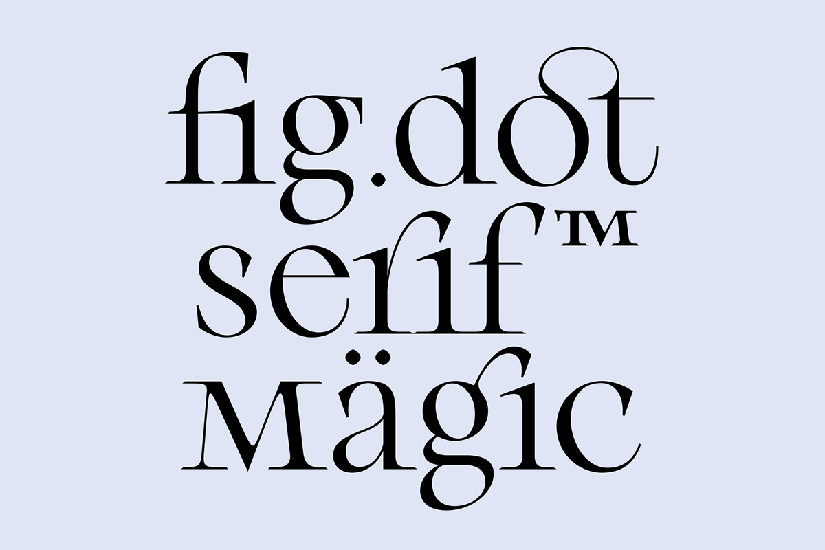
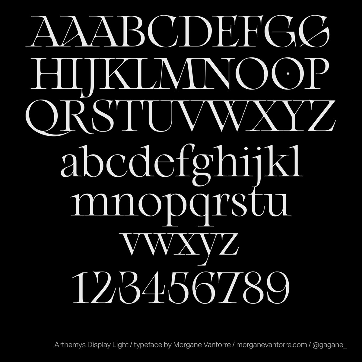
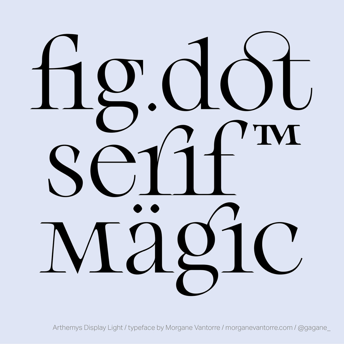
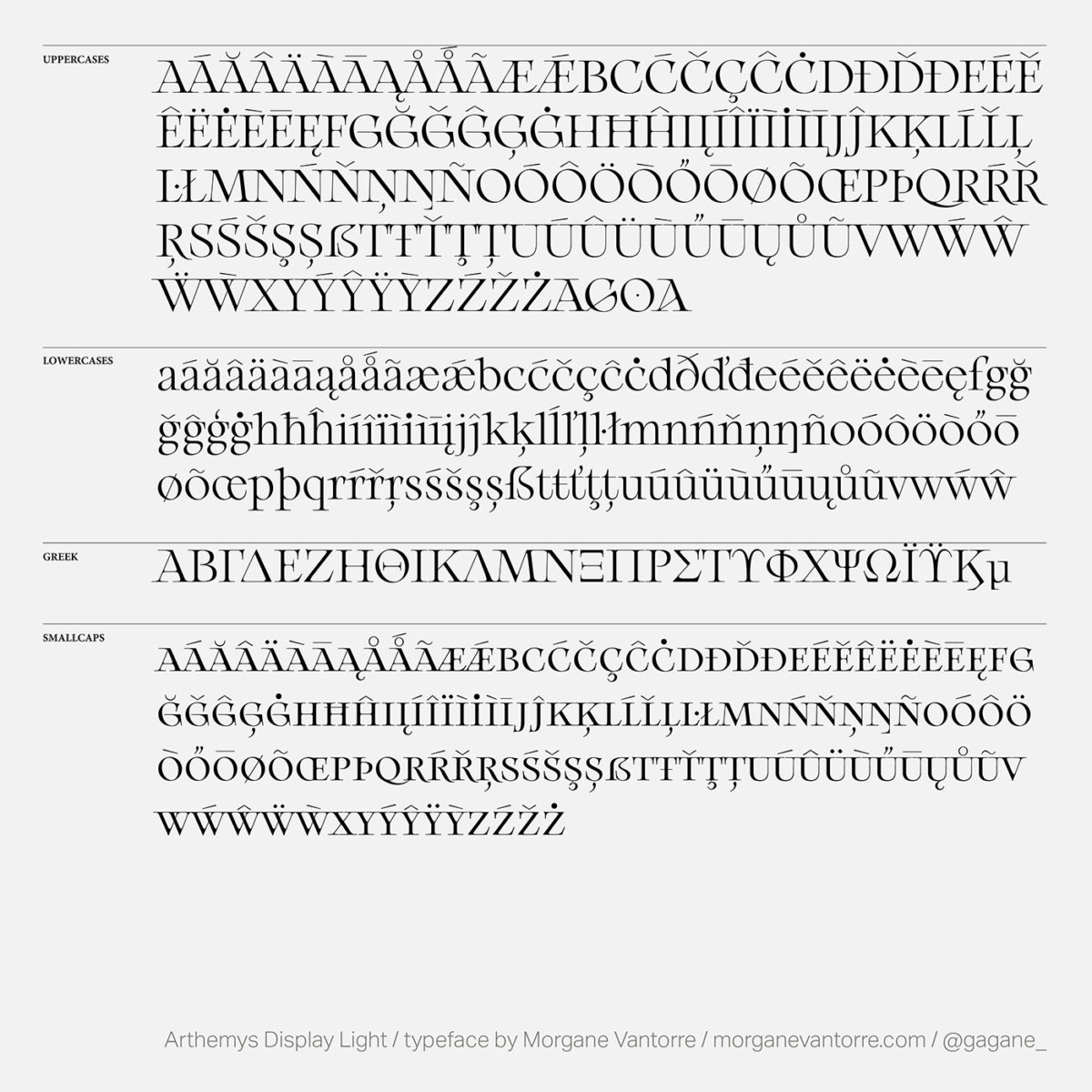
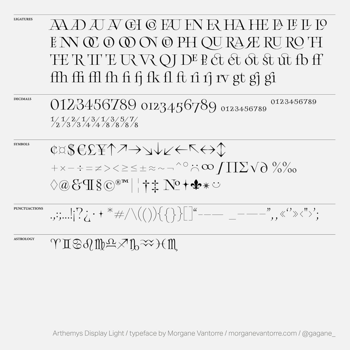
The typeface now includes 705 glyphs, added diacritics to small caps, completed fractions glyphsets and some gorgeous new ligatures. Morgane has also added in some drawing corrections to the original symbols/punctuation, modified the diacritics with added contrast (to improve legibility) and made some tight improvements to the spacing/kerning.
Now even more addictive and user-friendly than before, this enhancement of Arthemys gives it a whole new level of refinement. Check it out now on Type Department!


