Hi! Thanks so much for chatting with us today. First off, could you introduce Tondi Type a little bit and tell us about the foundry’s work, culture, aesthetics and ethos?
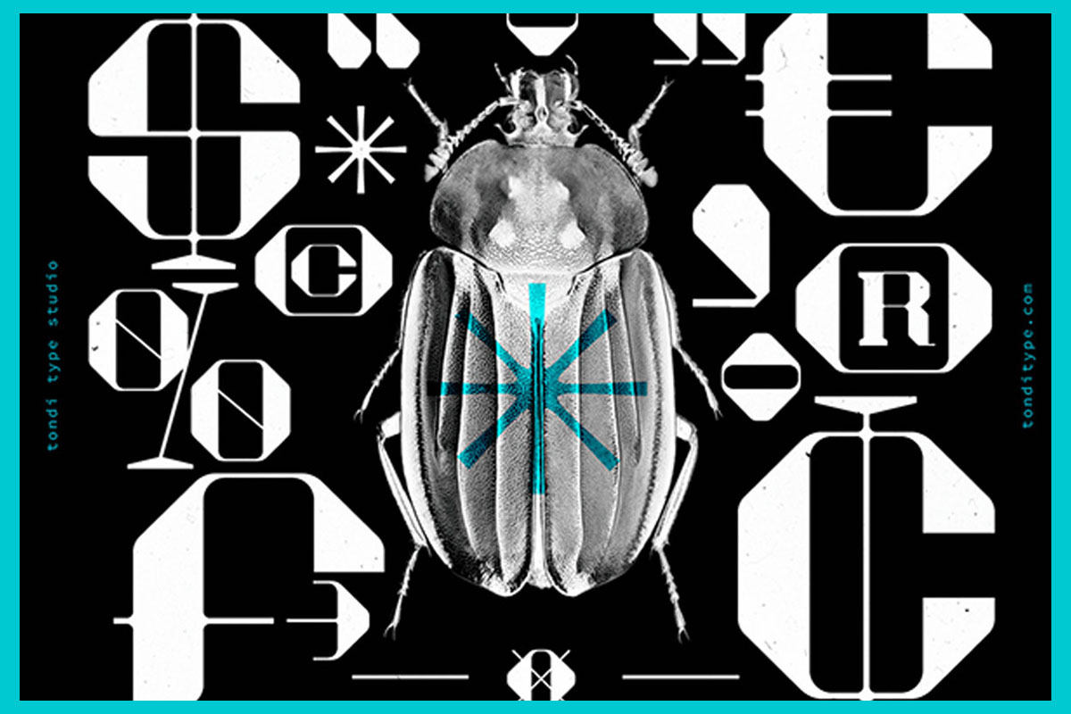
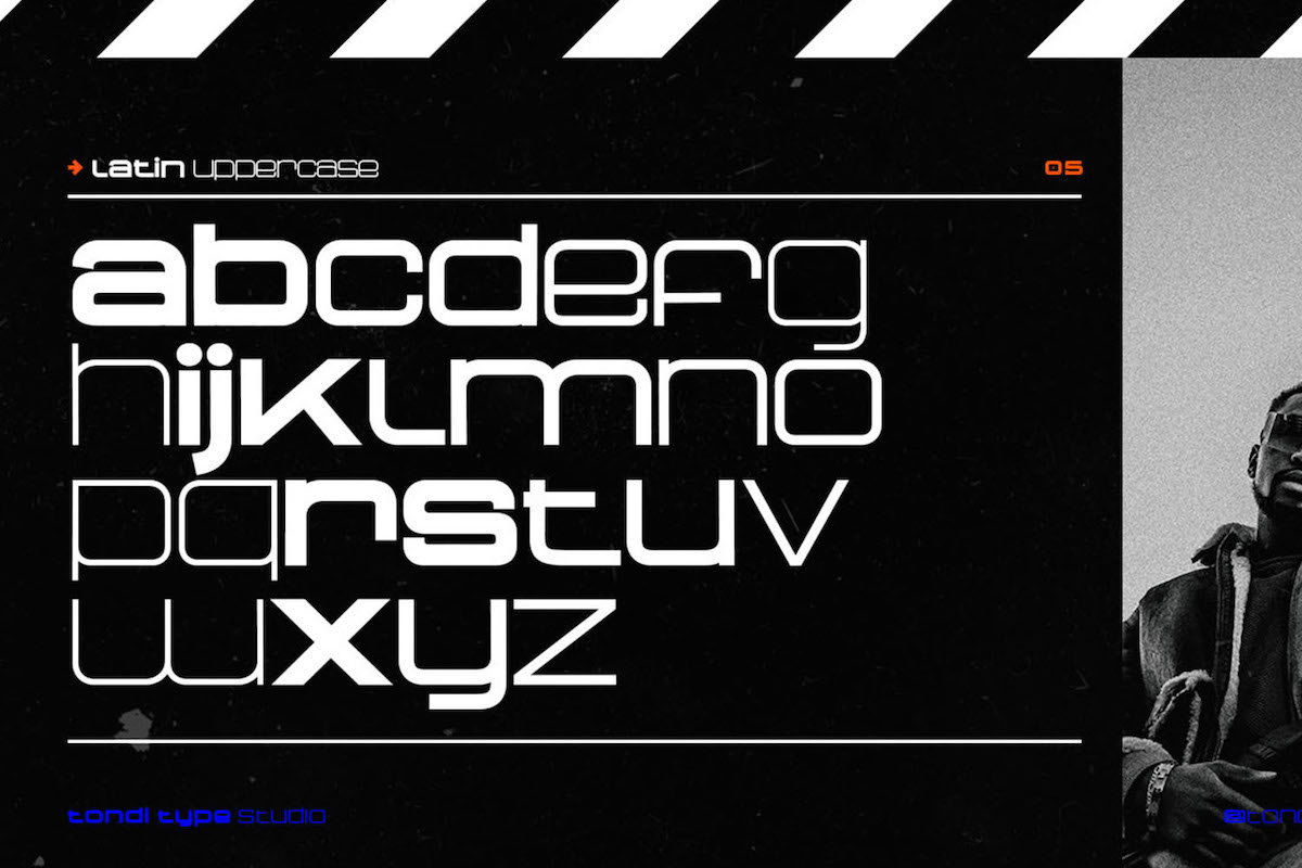
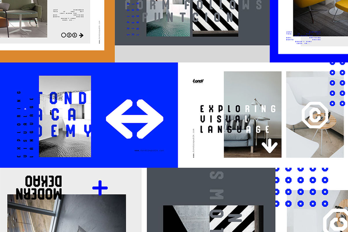
Tondi Type (@tondi_type) is a South African digital type foundry founded by designer, Fhumulani ‘Fumz” Nemulodi, in late 2015. The vision for Tondi Type emerged with the release of Bebop Slab in late 2015… Tondi Type’s work is a product of experimentation. We are inspired by a variety of type design styles (old & new) and in our explorations we also try to bend or break the rules in order to create something unique. Our catalogue is a collage of different explorations. We are not pushing one particular style or ideology in type; we are explorers of type.
Our ethos statement is Type is Voice. This speaks to the ability of typography to act as a voice in written language. It adds a layer of personality to the otherwise functional process of consuming information through reading.
Tondi Type describes itself as ‘dedicated to influencing iconic and aesthetically pleasing visual narratives using typography’, can you tell us a little more about the ways you feel typography can create particular narratives, and how these narratives can shape our communications and interactions with visual work?
Letterforms are a very interesting element of design and visual communication. Functionally, they are able to communicate spoken language visually, but there is an extra expressive layer to them which comes from the way the letterforms are designed. Subliminally, type depicts character. When you speak to another person face to face it is not only the words they say which deliver meaning but also their attire, their perfume or the tone of their voice. These things deliver meaning in a way which cannot always be explained through words. Such is the same with type.
Typography gives us the ability to communicate written language and express a sense of character simultaneously. Type can be both functional and expressive.
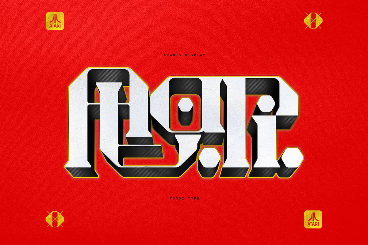
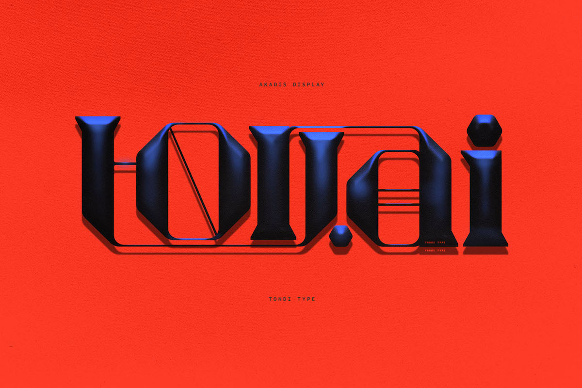
We love your latest release, Akadis. Where did the initial idea for Akadis begin, and what twists and turns did the typeface encounter through its development?
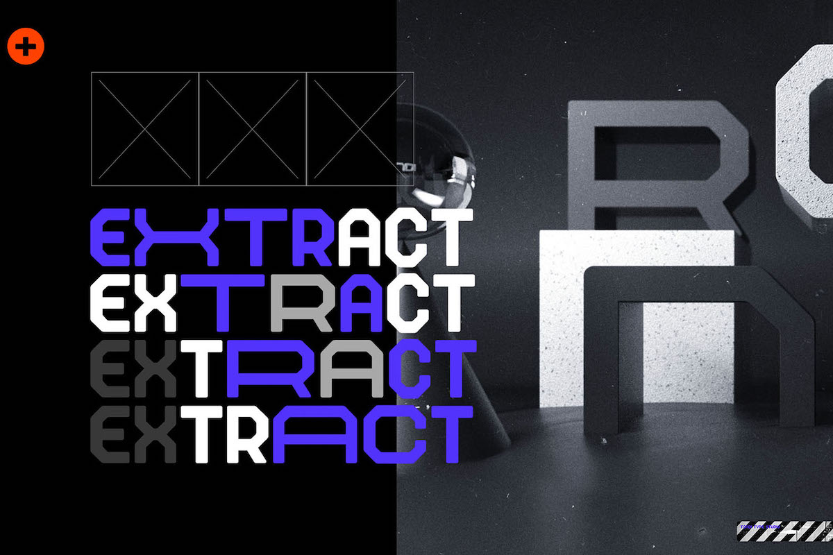
Akadis display is a typeface that came out of experimentation. The majority of our catalogue is comprised of bold and geometric type designs with little (close to no) contrast in vertical and horizontal stems. In an effort to experiment with such, we worked off an existing typeface which has yet to be released. Initially, it was experimentation just for the sake of experimentation, but eventually we ended up releasing the typeface.
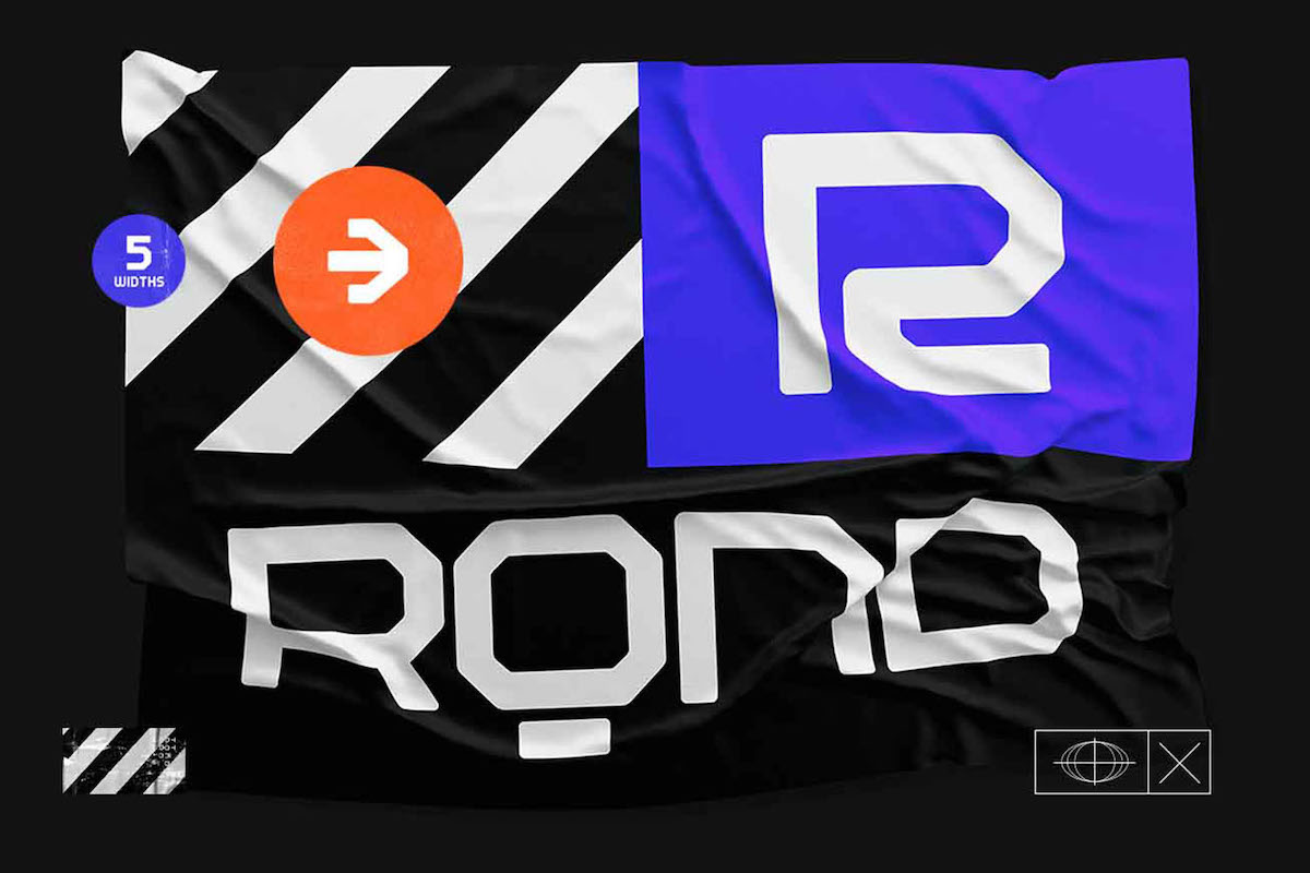
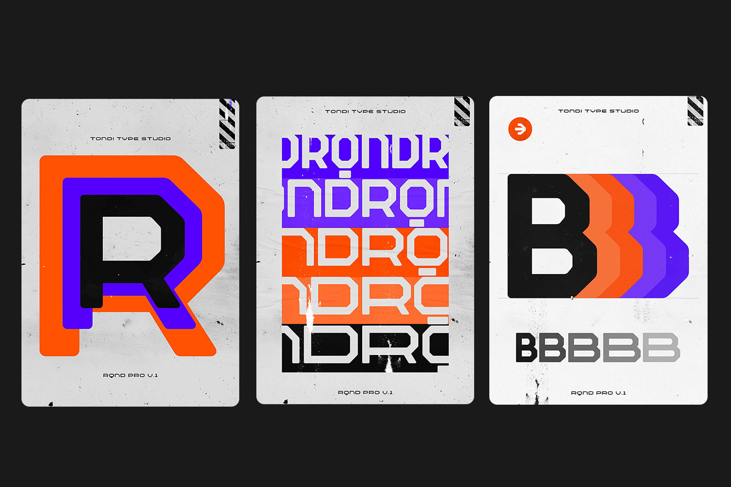
This is often the case. While some of our typefaces are solid ideas from the beginning, others are the result of evolution and we tweak aspects of the design over and over until it feels right. Another typeface which underwent the same type of evolution is RQND pro. The typeface came out of experimentation with an existing typeface, Reqnad Geometrik. In this particular case we wanted to explore multiple widths and simplification of the letterforms.
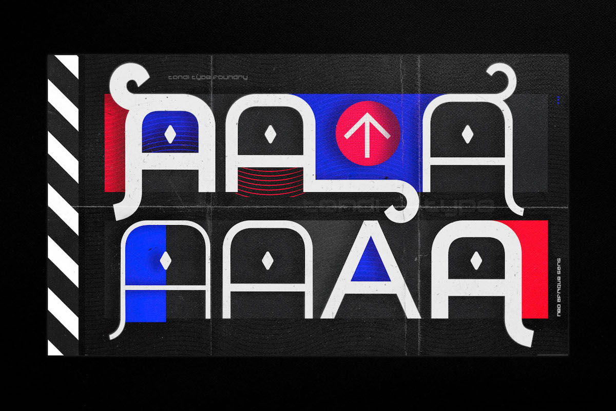
Described as ‘a hybrid between industrial and geometric sans shapes, fused with contrast and other features from contemporary serifs’, Akadis is definitely a real blend of typographic traditions and techniques. What kind of challenges or design decisions were faced in infusing all these qualities into the design of the glyphs?
As part of our process, we will allow a typeface to “breathe” once it’s reached completion only to revisit it some time later on. This allows us to view the design with fresh eyes so to speak. Upon revisiting this typeface, it just looked too stuffy and busy. That’s where the idea of adding contrast came up.
We are a young type foundry with no formal training in the field, so all our typefaces are products of trial, error and often happy mistakes. Browsing through Behance for new type releases we fell in love with the work of Violaine & Jeremy; they create some amazing typefaces that are somewhere between classic and contemporary. With Akadis we wanted to have a classic serif that still felt like part of the greater Tondi Type family of faces which are very industrial and modular in design.
What excites you at Tondi Type abut the current visual and technological landscape of type design? What trends and movements do you see growing that you’re fascinated by, or what technological advances have you found to super exciting of late? (Or, what are you excited/ interested in around the future of type?)
Variable fonts are a great area of interest for us. The technology creates a whole world of opportunity and flexibility. As a designer you find yourself in many situations where you need a typeface to be just a little bolder or just a little less condensed in order to suit a particular aesthetic you want to bring across.
With traditional font formats what you get is what you get, so we are excited about this technology and the ability to give the designer flexibility in how they work with type. We can’t wait to release our first variable typeface and to see how designers would interact with it.
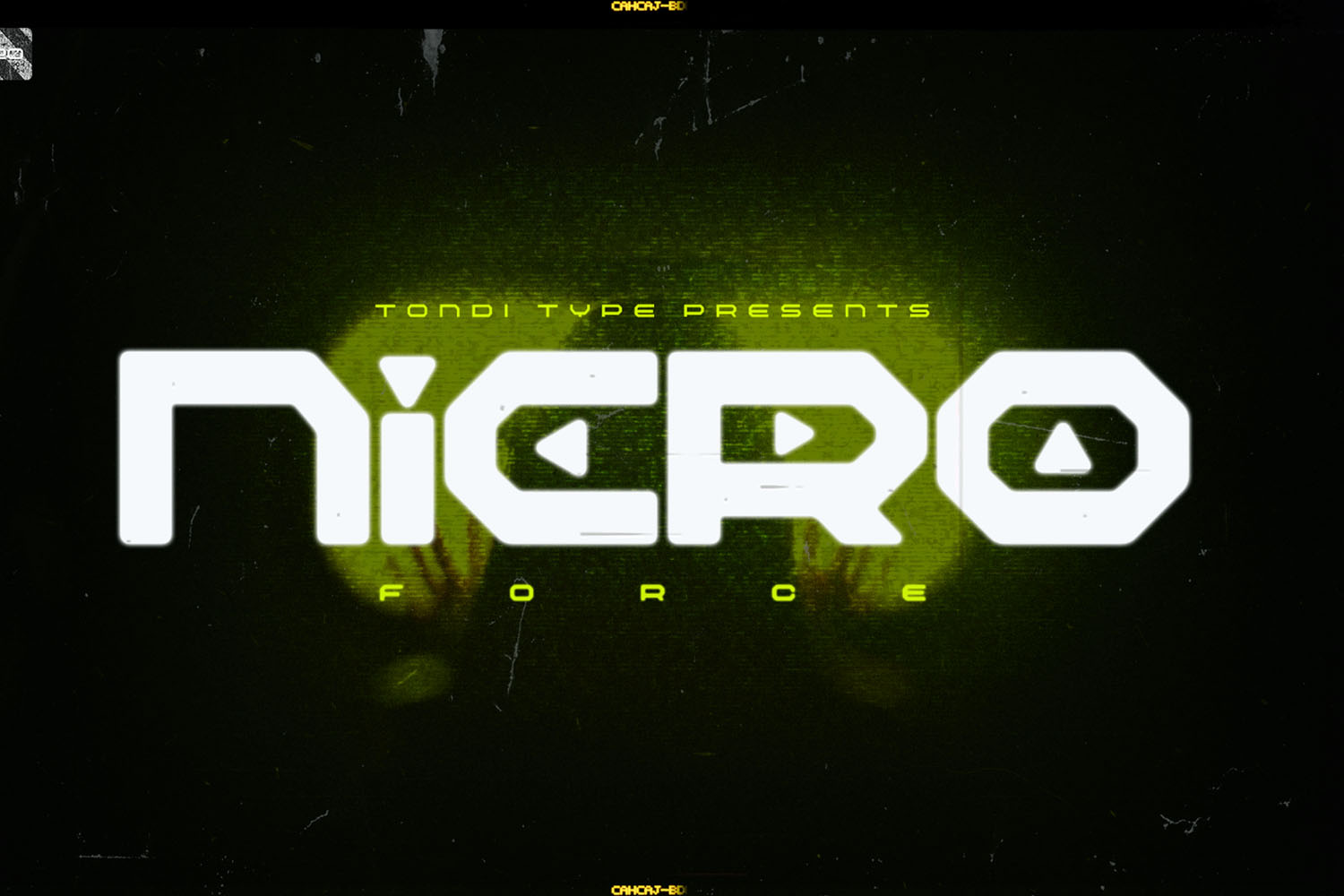
Another WIP font of yours, Nicro Force, looks really great. Can you tell us a little more about the ideas behind the typeface?
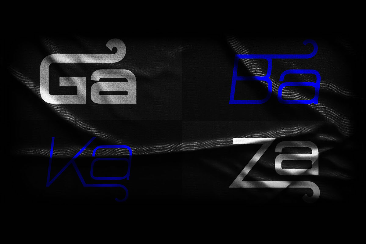
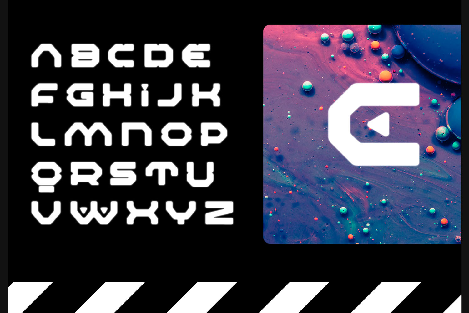
We are anime fanatics. This typeface was inspired by Mecha anime typography and also the Mechanoid designs within this sub-genre of anime. This is a display typeface to the core, after designing the letterforms we started playing around with the negative space around them. Cutting the stems of some with a rounded triangular shape and also adding the rounded triangles into some of the counters.
The result was a typeface that would blend in easily in a futuristic dystopian Blade Runner or Gundam Seed world. The typeface is still in development but we decided to release a free WIP version so long for designers to play round with.
We see you also offer custom hand lettering and 3D type design. What are some of the foundry’s favourite ways to work? What might your dream brief look like?
Hand lettering is a great part of Tondi Type. Type design can be a long and tedium filled. Hand lettering and 3D typography wether for a client or just for fun serves as a playground of sorts. Our dream brief would be to create lettering for a Netflix original.
What does the future of Tondi Type look like at the moment? Any exciting future ambitions or upcoming projects to look out for?
The type design industry is almost non-existent in South Africa. While we do have some digital type foundries in the country, typography as a standalone design practice is not as recognised. Our vision is for Tondi Type to become a beacon of light to brands and design agencies in South Africa and Africa as a whole.
What advice might you give to new designers and creatives starting out in the industry?
Advice to upcoming designers would be to trust the process and give themselves fully to the craft as it’s the only way to see growth.
And, lastly, where do you look for inspiration? Any particular mediums, movements or designers catching Tondi Type’s eye at the moment?
We find our inspiration online. The digital space is a great melting pot of different styles and design movements and there is a lot of inspiration to be gained from there. Other than that our work is inspired by day to day experiences here in South Africa. We are also highly inspired by the work of type designers Andrew Footit, Osmond Tshuma, Tapiwanashe Sebastian Garikayi and Katt Patt.
Thank you for reaching out, It’s always reassuring to receive contact from other designers and entities within the global type design community. It assures us that the work we are doing is making an impact. Thank you!
Many thanks to Tondi Type! To check out more of their amazing work, be sure to follow them on Instagram and have a look at their website, too.