
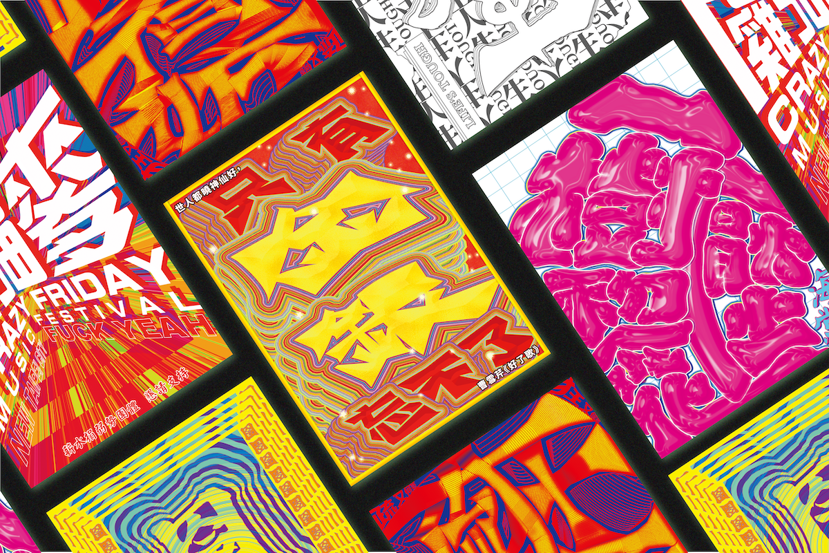
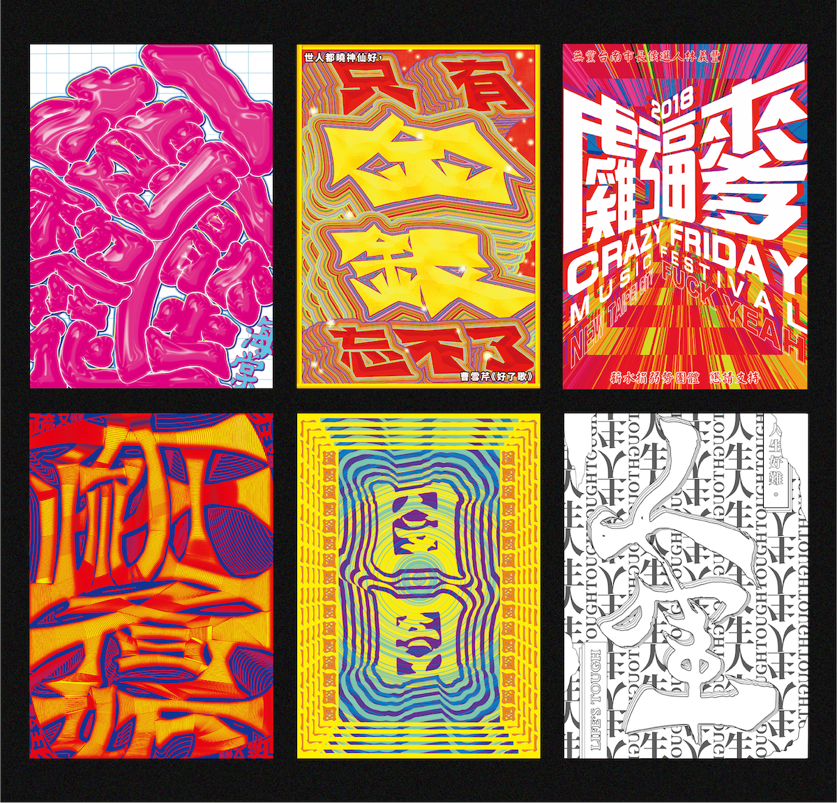
In this series of Chinese typographic posters, Syuan Yun (@sythewoman) has been flexing her capabilities in typography—as well as the potential of the characters themselves—to explore the resonances between Chinese type and the culture, aesthetics and visual languages of Taiwan. ‘With visual design and social design specialisms in my Masters and a cross-cultural background, I love exploring the possibility of design and art under different cultures, perspectives, and media. Developing design skills and methodologies in two countries enables me to be empathetic and flexible, creating localising design with profound understanding,’ she says.
Syuan, originally from Taiwan, is currently living and studying in Denmark on a Design for People MA program. Specialising in communication design, social design and visual art, she says, ‘While as a Taiwanese feminist designer, I’m passionate about building compassion and bringing awareness to feminism and cultural diversity through various design tools and techniques, this work is from my course in Visual Design master in Taiwan—which is also a design experiment exploring Chinese Typography under Taiwan’s cultural context.’ In this way, the bold, bright style of these posters emerged form Syuan’s intention to create a gateway through her designs to look at, as she explains, ‘the connections between meaning, form, and the visual language of Chinese typography and Taiwan’s culture.’
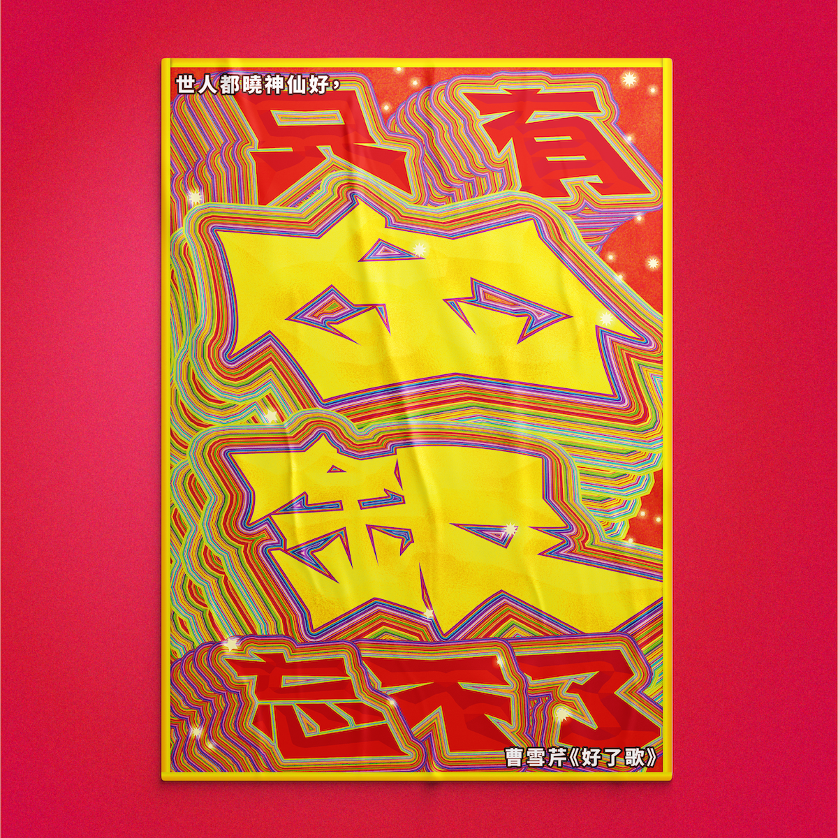
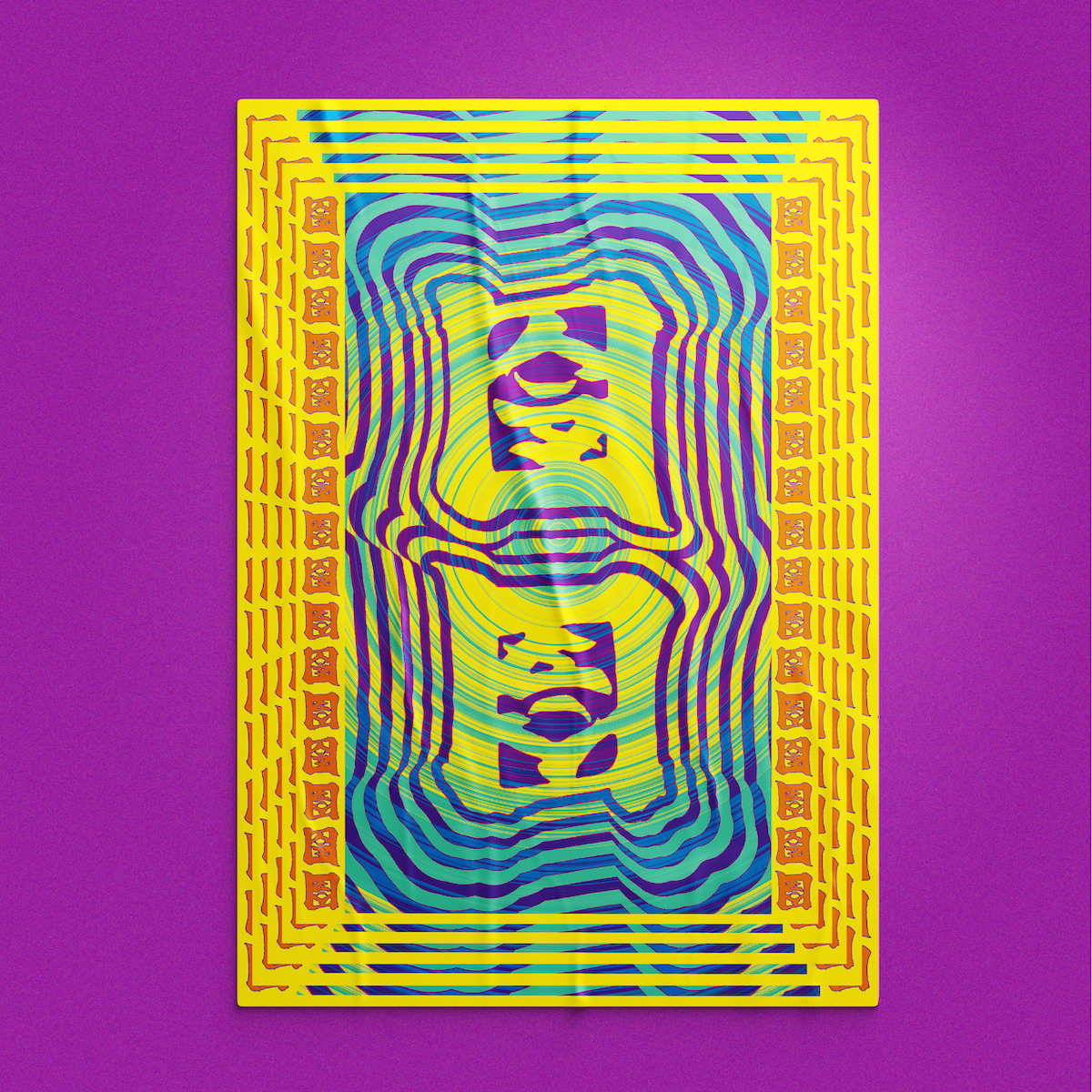
By bending and playing with the conventions of Chinese typography, Syuan explains she ‘tried to push the boundaries of Chinese typography design and create unique aesthetics of Taiwan,’ noting that ‘in Chinese characters, every component carries distinct meanings and combines multiple components into characters or words, thus creating complex meanings.’
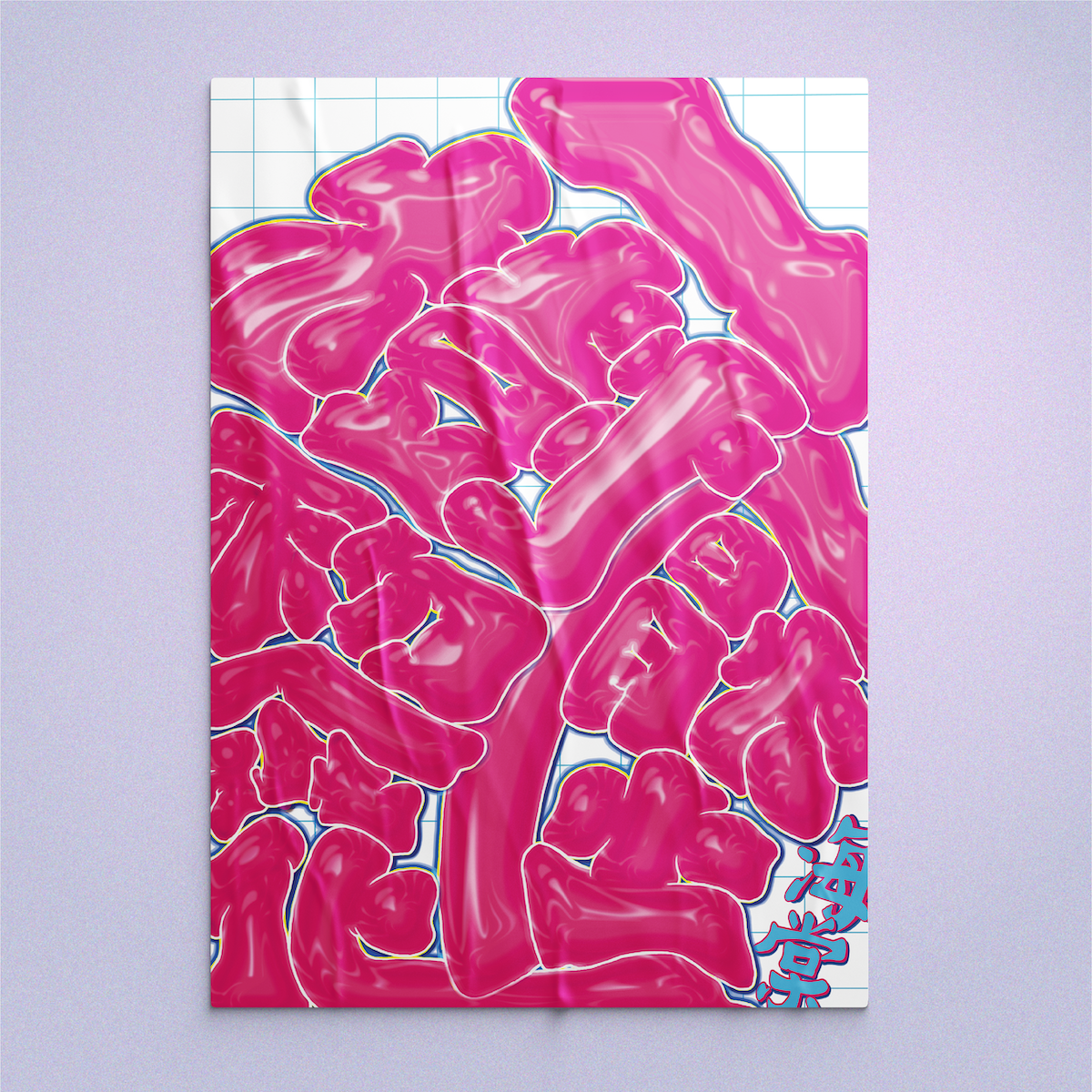
‘Through this project,’ she continues, ‘I merged my everyday life in Taiwan and everyday objects into the visual language. Moreover, in some of the posters, I visualised the literal meaning of words and sentences and pushed them to the extreme, expanding the possibility of Chinese typography’s forms and meaning…I wanted to convey that it’s important to cherish and embrace our own unique cultures and discover potentiality and beauty in them.’
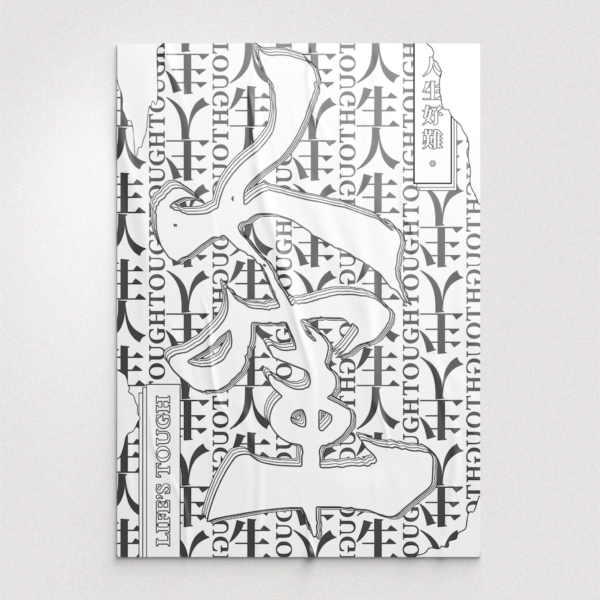
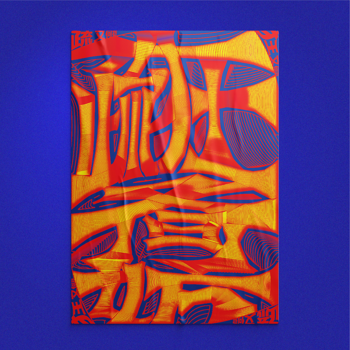
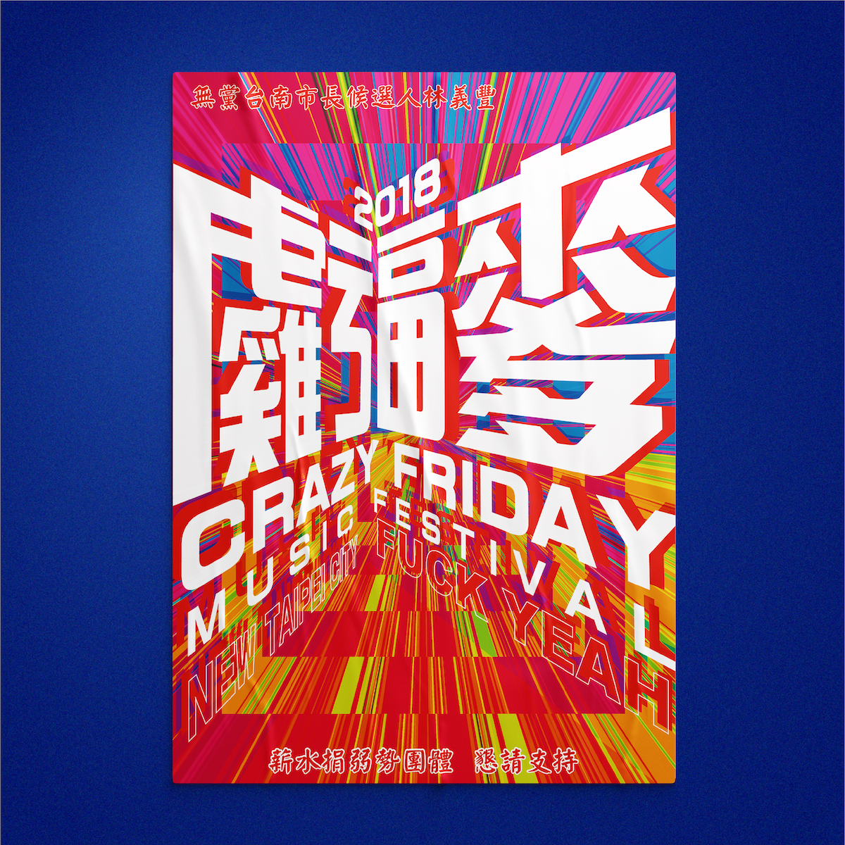
Using a pencil, a sketchbook and daily observation alongside Adobe Illustrator and Photoshop as the main tools to create the series, Syuan highlights some specific experiments with Chinese typography she explored through the project. ‘One is merging the Chinese and English into one typography by rotating the typography angle,’ she tells us, ‘the other is challenging the readability by omitting and reorganising some of the components in words, and another is visualising the words’ literal meaning and connecting into everyday objects…The bold visual style mainly comes from my everyday life and observation, full of lively mood, bright and contrast colors, and big, bold typefaces on the signage and traditional market.’
Dissecting her process, she tells us, ‘For this work, the main key is to collect the inspiration physically and be brave in pushing into the extreme. First, I brainstormed the words, the scenario, or the objects I wanted to focus on. Then, I observed my everyday life to find concrete and more profound connections and ideas for the stories behind words. With the ideas, I made the visual mood board with a collection of relative daily objects or experiences and stories that inspired me, instead of looking at the design and pictures on the internet. Afterward, I analysed and clustered the shape, outline, and primary colour of the mood board and developed the scenario. Then, I sketched the form and the outline of the typeface and the layout, and finally, I imported the sketches into Illustrator and Photoshop to explore different visual effects to convey the stories and atmosphere behind words.’
Recently, Syuan has been exploring the potential of Chinese typography further through creating stage design with the main visual being typography—a stunning project you can check out in her online portfolio. ‘This was a fascinating project visualising the emotion of lyrics, and even involving motion design and music with Chinese Typography design,’ Syuan reflects. We’re also obsessed with her Design for Women, Design for People project, designed as part of MA application portfolio, so be sure to check that out.
Syuan is currently open to hearing about freelance opportunities and exciting side projects. Thanks, Syuan!


