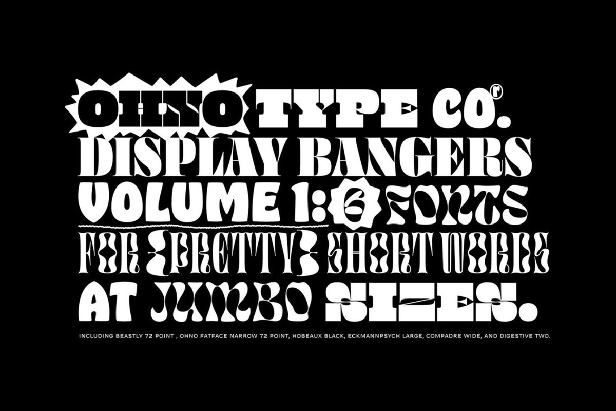
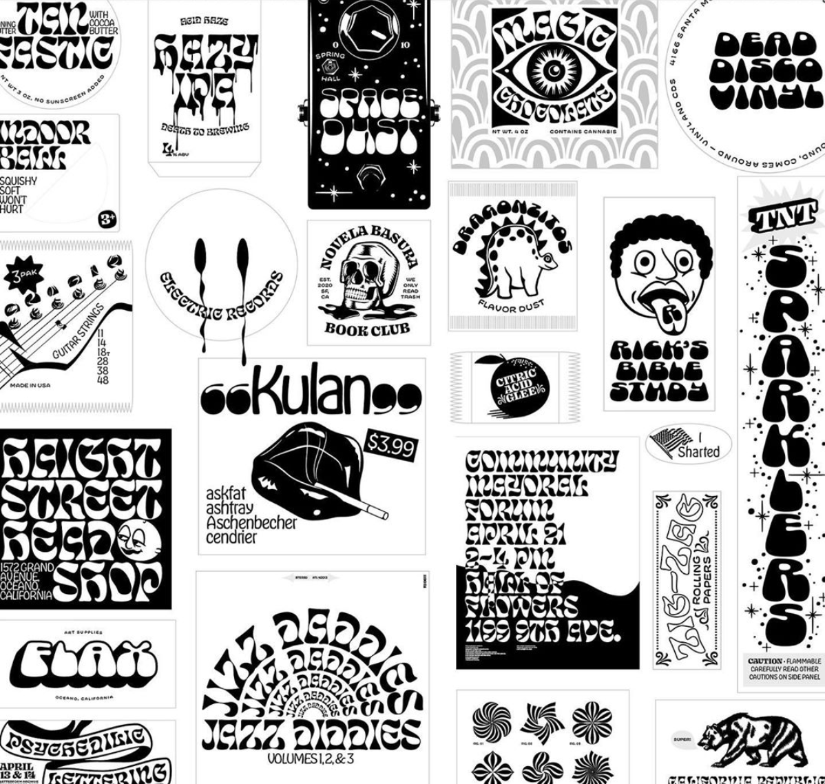
As part of a new series of articles, we’re speaking with the industries creative talent and putting together a bunch of useful resources for newly grads and those seeking additional professional tips and advice when it comes to design/working with type. We’re very excited about what we’ve got planned but first up is type design-guru James Edmondson, also known as OH no Type co. James founded OH no Type co in 2015 which has grown into a respected and truly valuable platform. His font designs are not of the ordinary, but it’s what makes them so brilliant and unique. We chatted to him briefly over email about his top tips about designing your first font. It can become an overwhelming task, but hopefully, these pearls of wisdom will help you through.
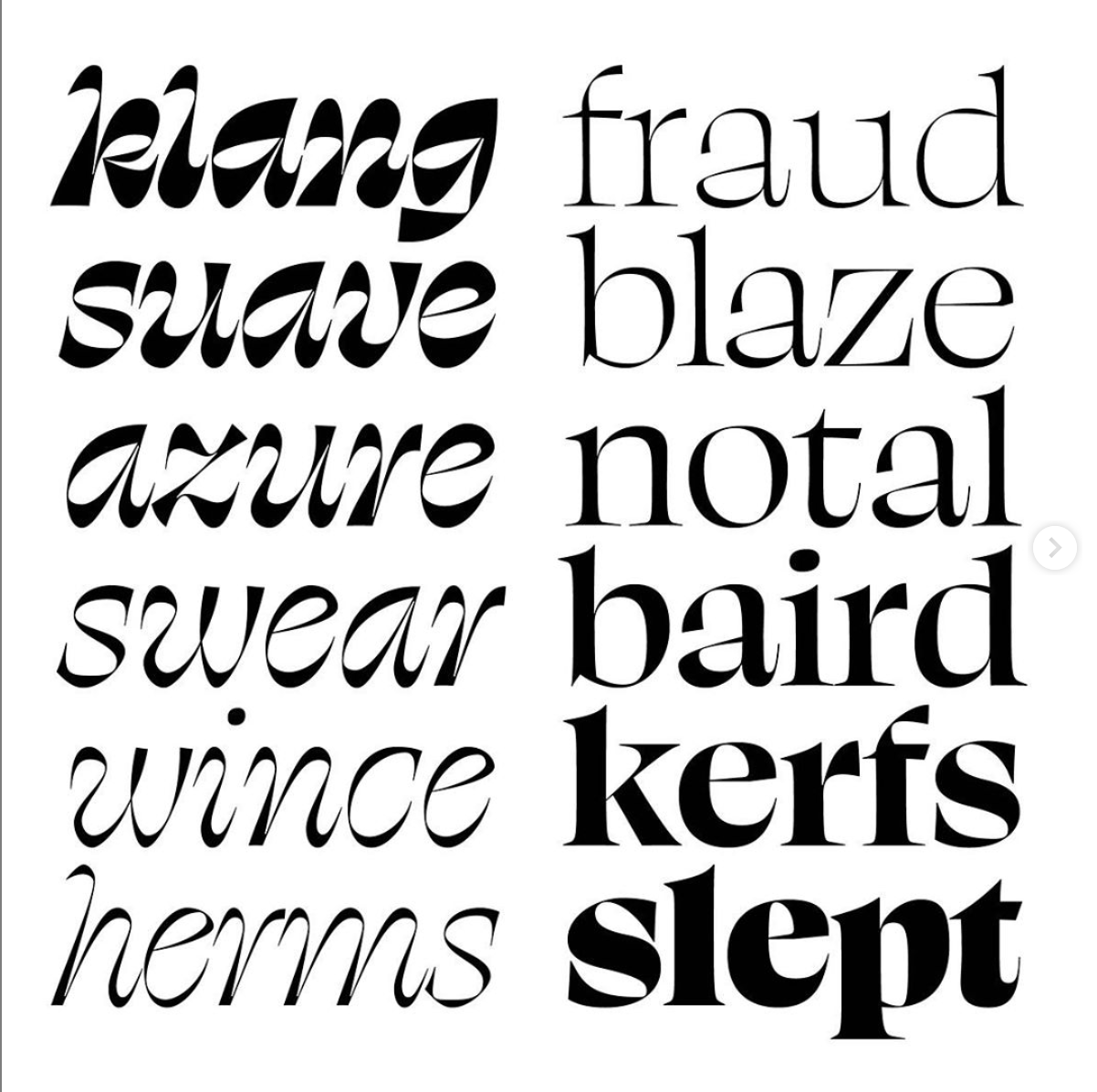
1. Limit the number of ideas. I once got some feedback from Jim Parkinson that has echoed in my brain for years. He was looking over a proof of a really early typeface of mine, and said, “I think this has, like, too many good ideas.” I immediately knew it made sense, but I was unclear on what defined an idea.An “idea” to me could be something as simple as high contrast Caslon, as in the case of Big Caslon by Matthew Carter. It could be “impossible geometry” as in the case of Macula by Jacques Le Bailly, released by Bold Monday. It could be “responsive, with minimal negative space” as in the case of Fit by @djrrb. A common affliction among students is that their enthusiasm gets the best of them, and they try to pack their typeface full of so many ideas, the concept gets muddied. And if you don’t have a concept, you have a misconception. I heard someone say that once.
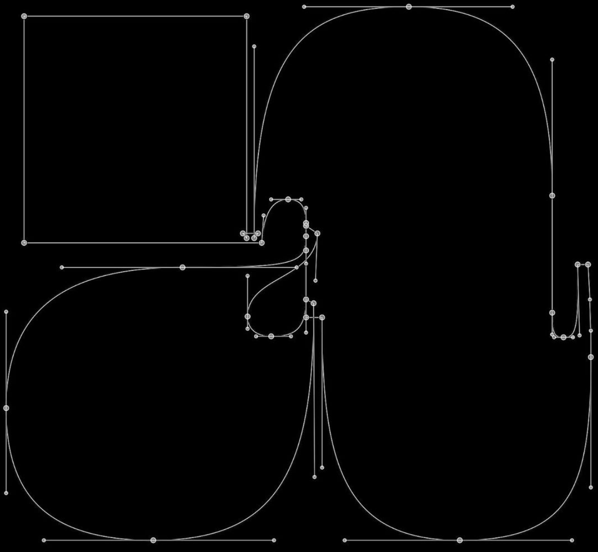
2. Space as you draw, draw as you space.The tricky part about type is that as soon as you got the letters how you want em, someone comes in and jumbles em all up! This simple fact—that type can be rearranged in any sequence—means that we have to evaluate all our micro decisions on a macro level. As type designers, it’s too easy to keep your eyes on a single glyph at 5000%. Drawing a letter is easy. Words are harder. Sentences are harder than words. Paragraphs and pages and books are the hardest of all. Evaluating your decisions in context gives you the awareness and perspective to be confident about our design decisions. Finally, the negative space inside and around letters is just as—if not more—important than the positive spaces. The more we think about this, the more we realize that drawing and spacing are the same activity, and should happen at the same time for the best results.
3. Just do your best.There are so many things to keep in mind while you’re working on a typeface. With each character you add, more relationships are built, and the intricacy of your system increases. It gets overwhelming, especially for beginners. For this reason I think someone’s first font should be a doable project that builds confidence. Maybe it’s only 5 letters! Maybe it’s not even a font at all, and just a piece of lettering. Don’t bite off more than you can chew, and remember that (as Ira Glass has so elegantly articulated) your taste far exceeds your skill level. Just try to make every subsequent project a little bit better in some capacity. Have fun!
Thank you James for your time and effort. Check out the work of OH no Type co here.