
Type Department‘s new fonts deliver fresh, high quality design from independent creatives & studios across the globe. Here are the latest additions on our radar (plus a few freebies).
Power Grotesk
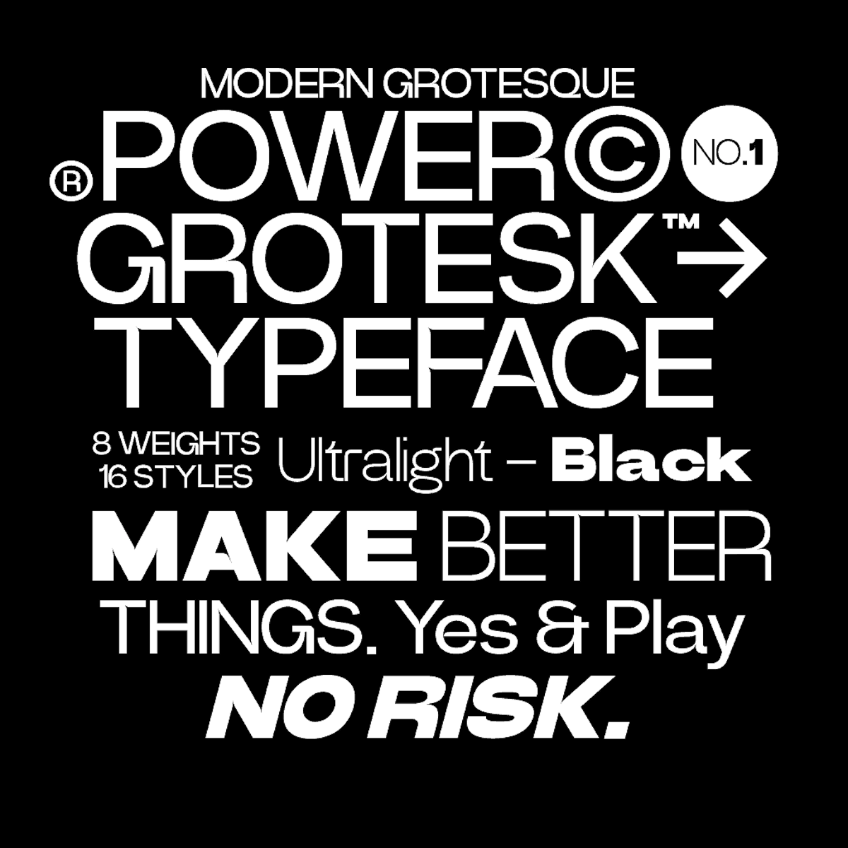
New from Power Type Foundry, Power Grotesk is a sans serif typeface coming in 16 weights from ultra light to black. Offering tons of versatility and lots of opportunities to optimise, the font’s goal is to offer crisp legibility and a good contrast between black and white, making it suitable for different sizes. A dynamic and valuable creative asset, the typeface also has a special feature that aids in reading and reproducing.
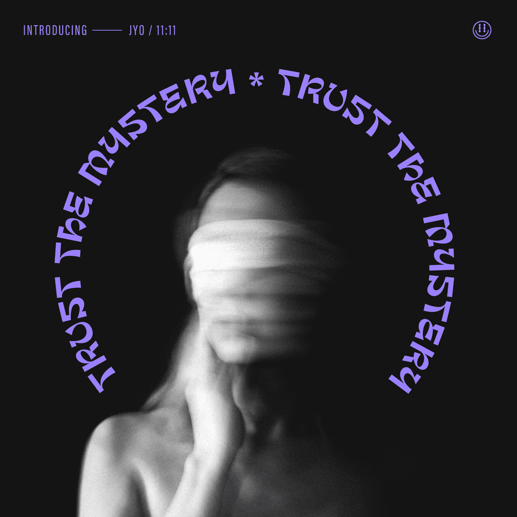
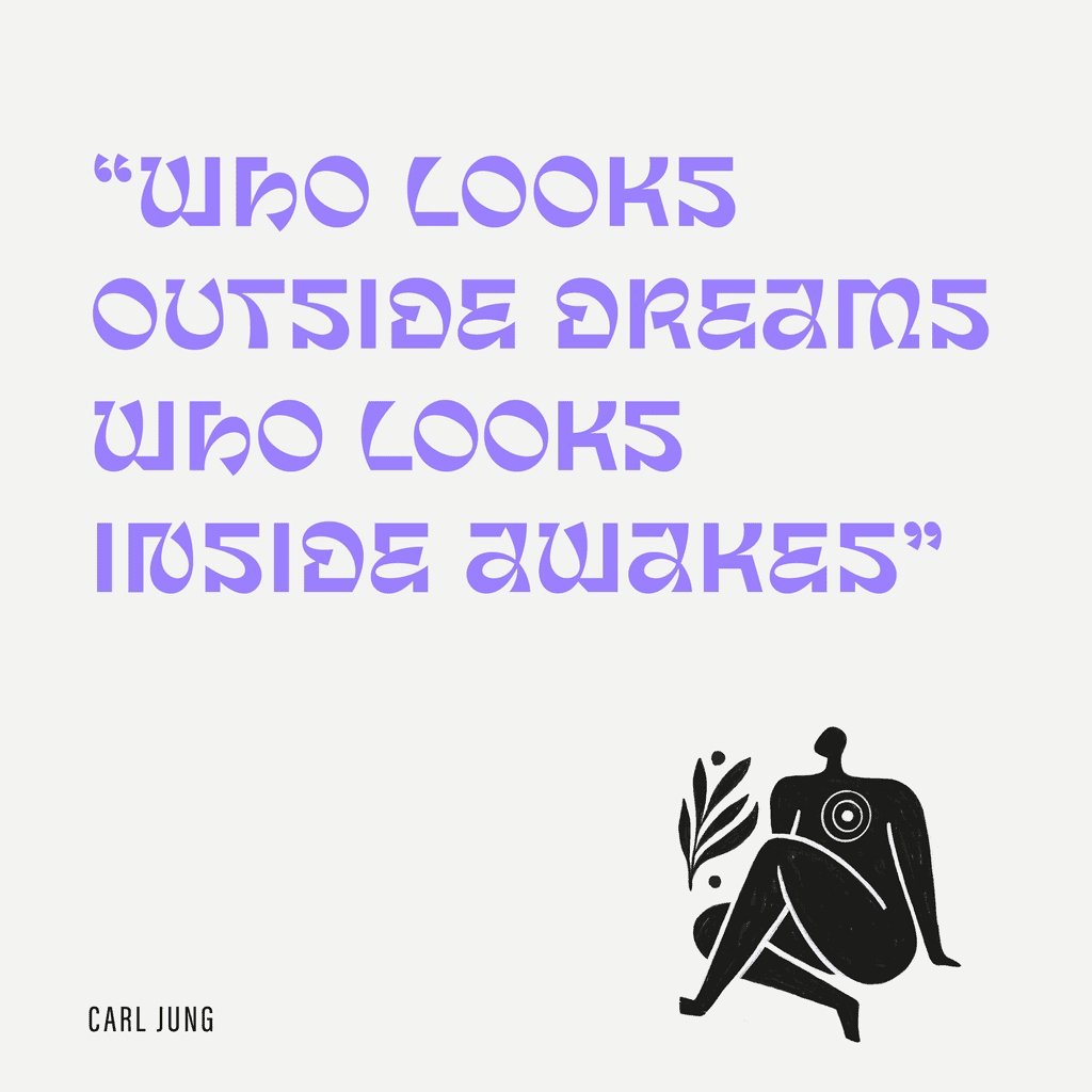
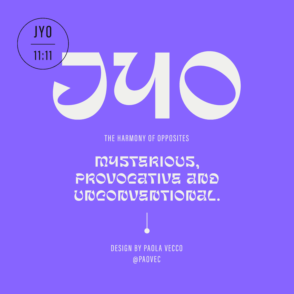
Jyo Display
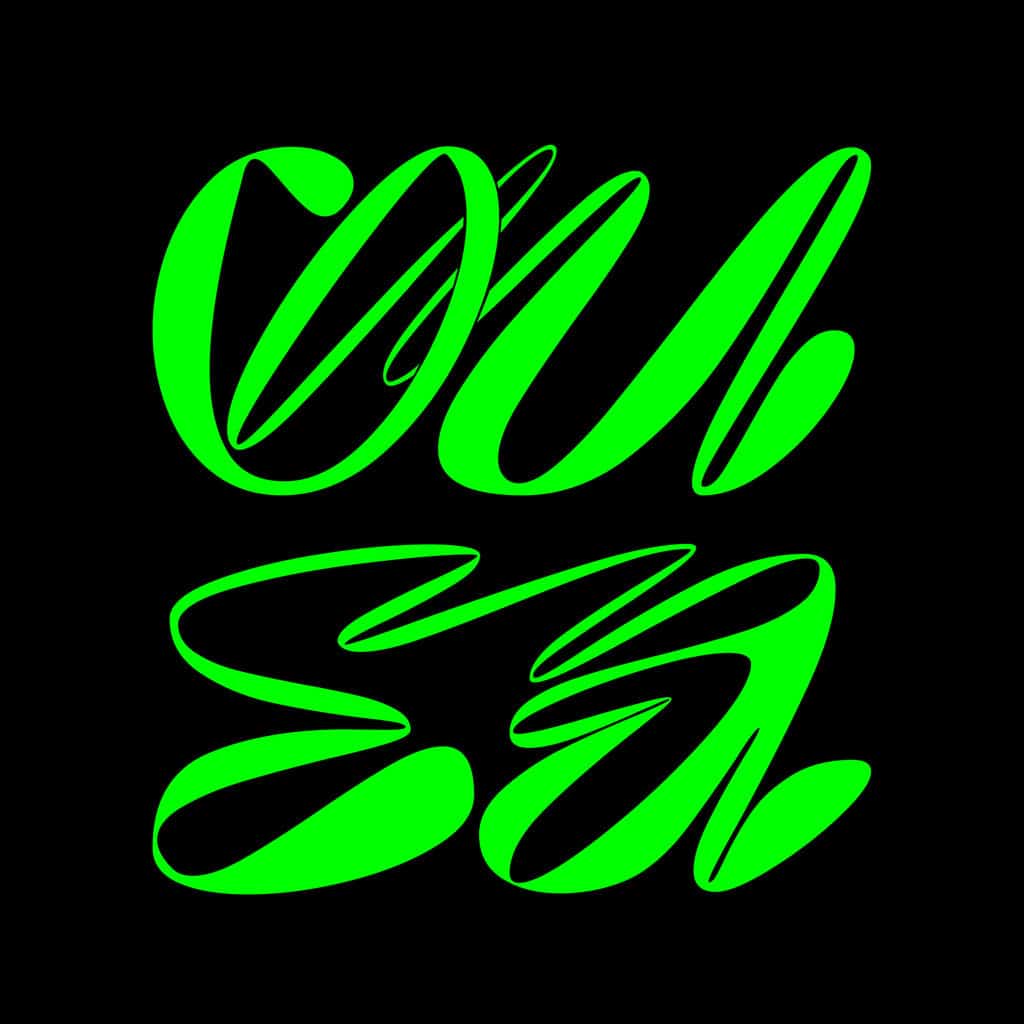
Jyo Display, created by Paola Vecco, is inspired by ancient Indian writings and Jyotish, also known as Hindu astrology. It embodies the duality between karma and free will, together with the contrast of sturdy and curvy shapes from old Sanskrit text. The result is an experimental display typeface that represents the harmony of opposites through the contrast; a geometric sans serif construction meets swift calligraphic strokes in a visual embodiment of the ethereal and the mundane.
Jyo Display feels mysterious, provocative, and unconventional. Bold and sophisticated in its own way, it’s perfect for stand-out statements, titles, and headlines.
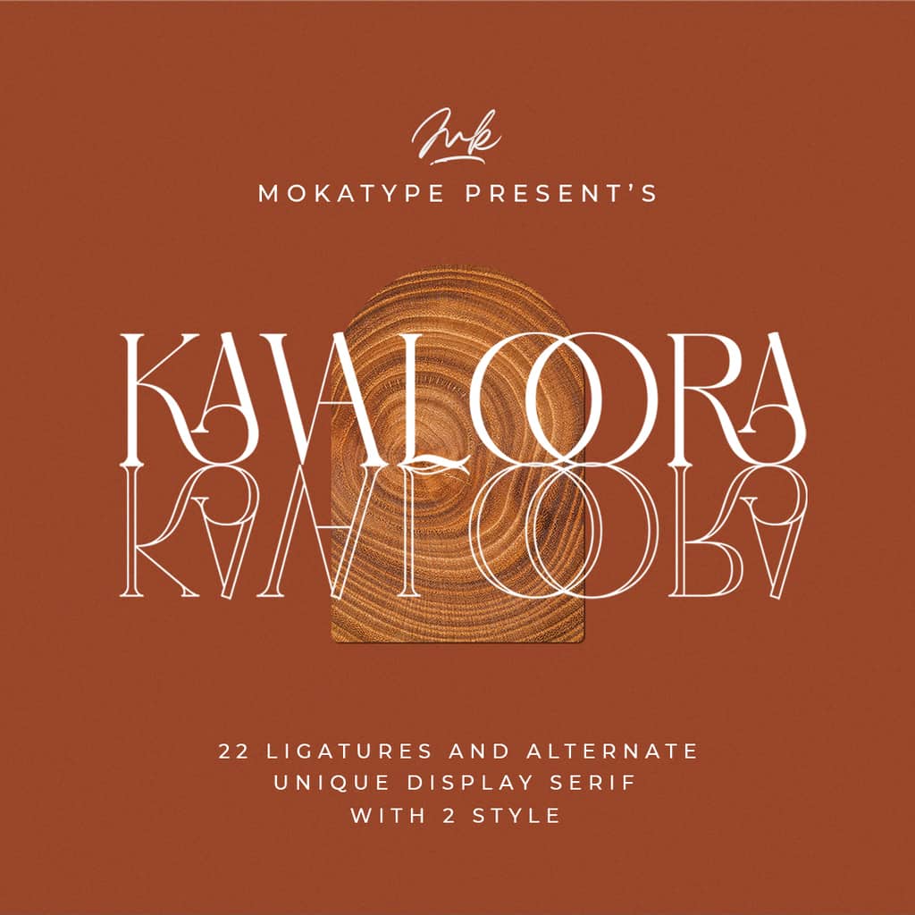
Kavaloora
Kavaloora is an elegant, unique font that uses ligatures to smoothly link letters. Designed by Mokatype Studio, this font is inspired by minimalist logos and has the potential to add a unique twist to your next project. Perfect in any display setting, use Kavaloora in brochures, videos, advertising branding, logos, and more. Kavaloora has two styles, Regular and Line.
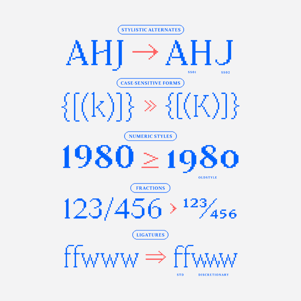
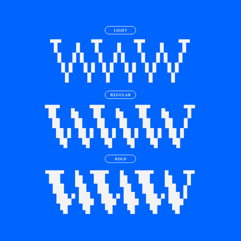
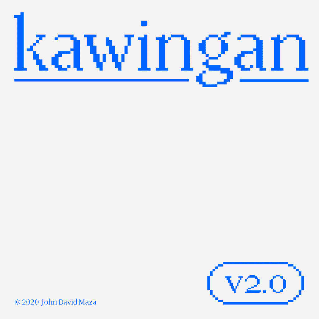
Kawingan V.2
Taking inspiration from obscure Filipino computer terminology, John David Maza designed Kawingan as a bitmap typeface. Its namesake is the Filipino word for “hyperlink.” Using the digital nature of pixels paired with the classic flavour of serifs, this font links modern technology and Filipino heritage. With a total of 645 glyphs and three weights, Light, Regular and Bold, Kawingan is an elegant option for anyone looking for a pixel font with a sophisticated aesthetic.
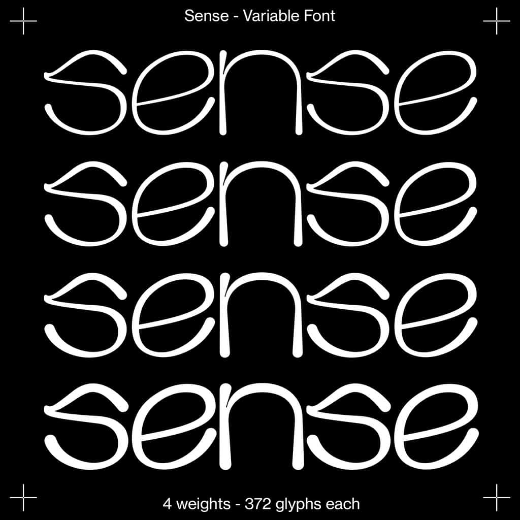
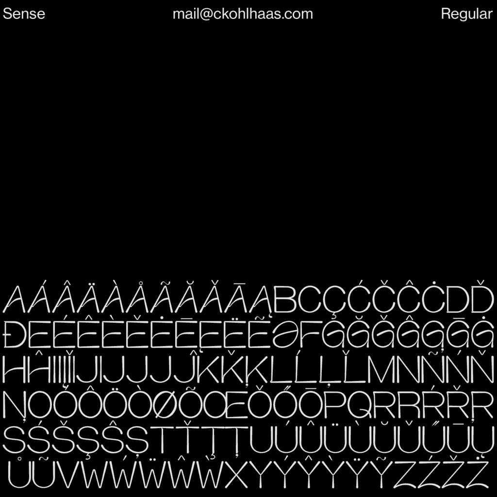
Sense
Sense, created by Constanze Kohlhaas, is a sans serif typeface with a modern touch of elegance. Available as a variable font, sense is full of energy. Featuring classy shapes and round corners, this font is most at home in larger headlines but also works well in short-mid text settings.

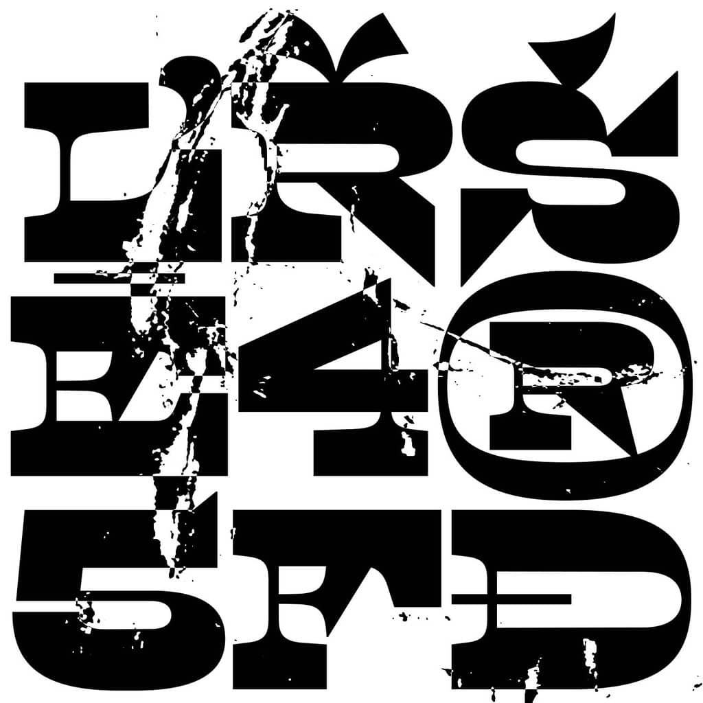
Hawk
Hawk was the result of Alfie Wheatley‘s final year university project. Researching the subcultures of rave and football hooliganism, along with influences from rhythm, dance and movement as well as other aspects, such as abstract sculpture, Hawk represents the freedom of the weekend; the letting off of steam at raves and football matches and the ecstasy that these subcultures generate. Hawk is a display font with various symbols and punctuation, as well as a few ligatures.
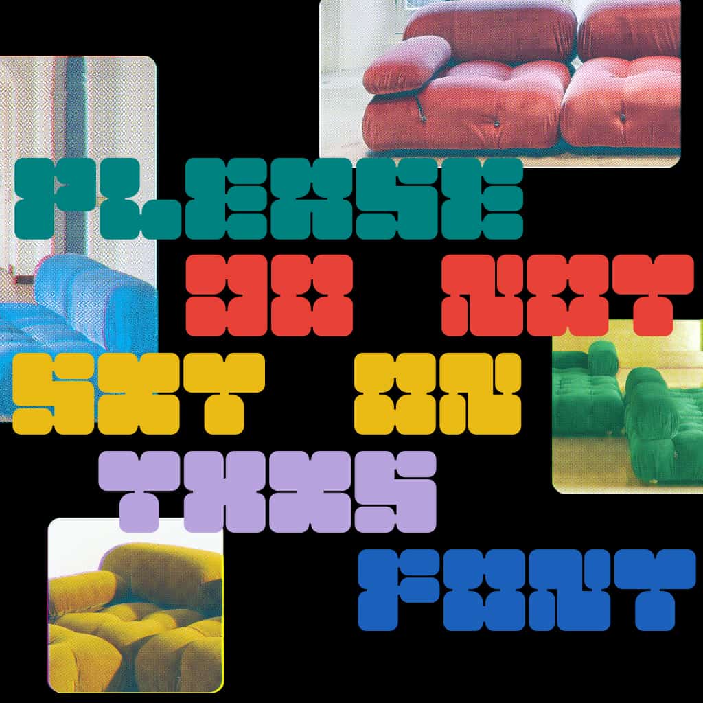
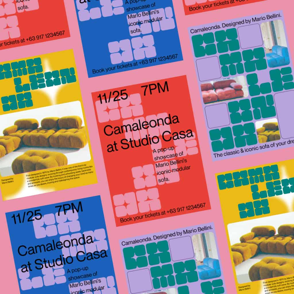
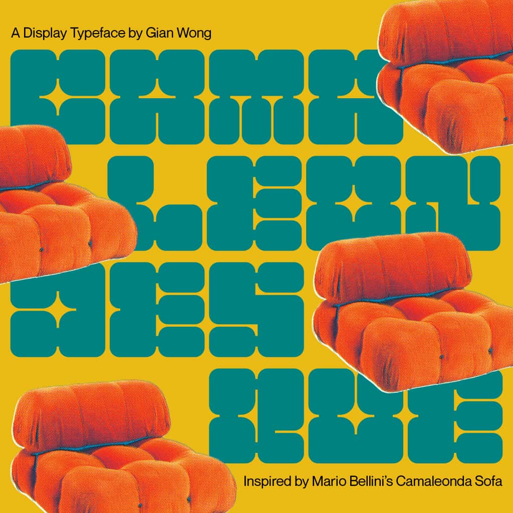
Camaleondesque Display
Camaleondesque is a modern display typeface designed by Gian Wong. Inspired by Mario Bellini’s iconic Camaleonda sofa from the 70’s, a lounge piece well-loved for its movable modules and detachable backrests and armrests, each letterform mirrors soft corners, button tufting, and modular shapes. This modular typeface was built for headlines, posters, merchandise, and statement pieces. Stacked, patterned, hero, or background—Camaleondesque can give any design the punch it needs.
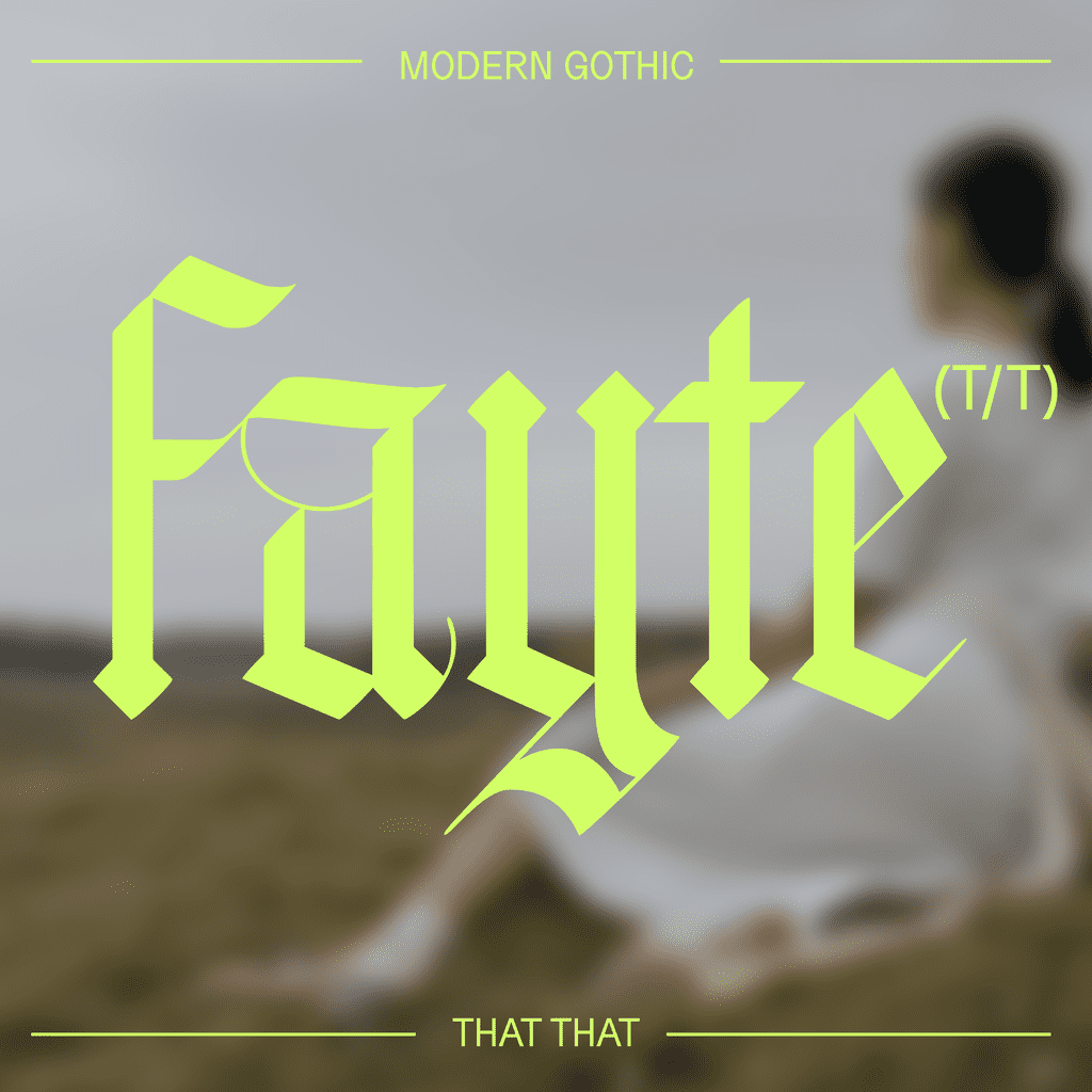
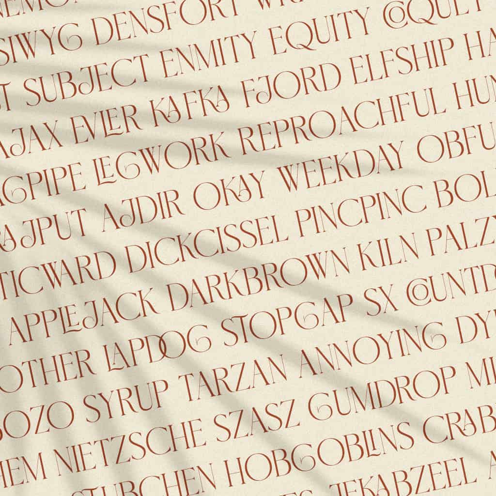
Fayte
Fayte, designed by That That Foundry, is a blackletter inspired by the minuscule characters of textura quadrata calligraphy, created with a few departures from the norm in order to bring it into the modern day. The upper case letters trade in the traditional ornate look for a more conservative structure that matches the lower case, the x-height is raised up to a level slightly beyond a traditional textura quadrata, and the width is slightly condensed, adding a strong vertical presence to the traditionally square letters.
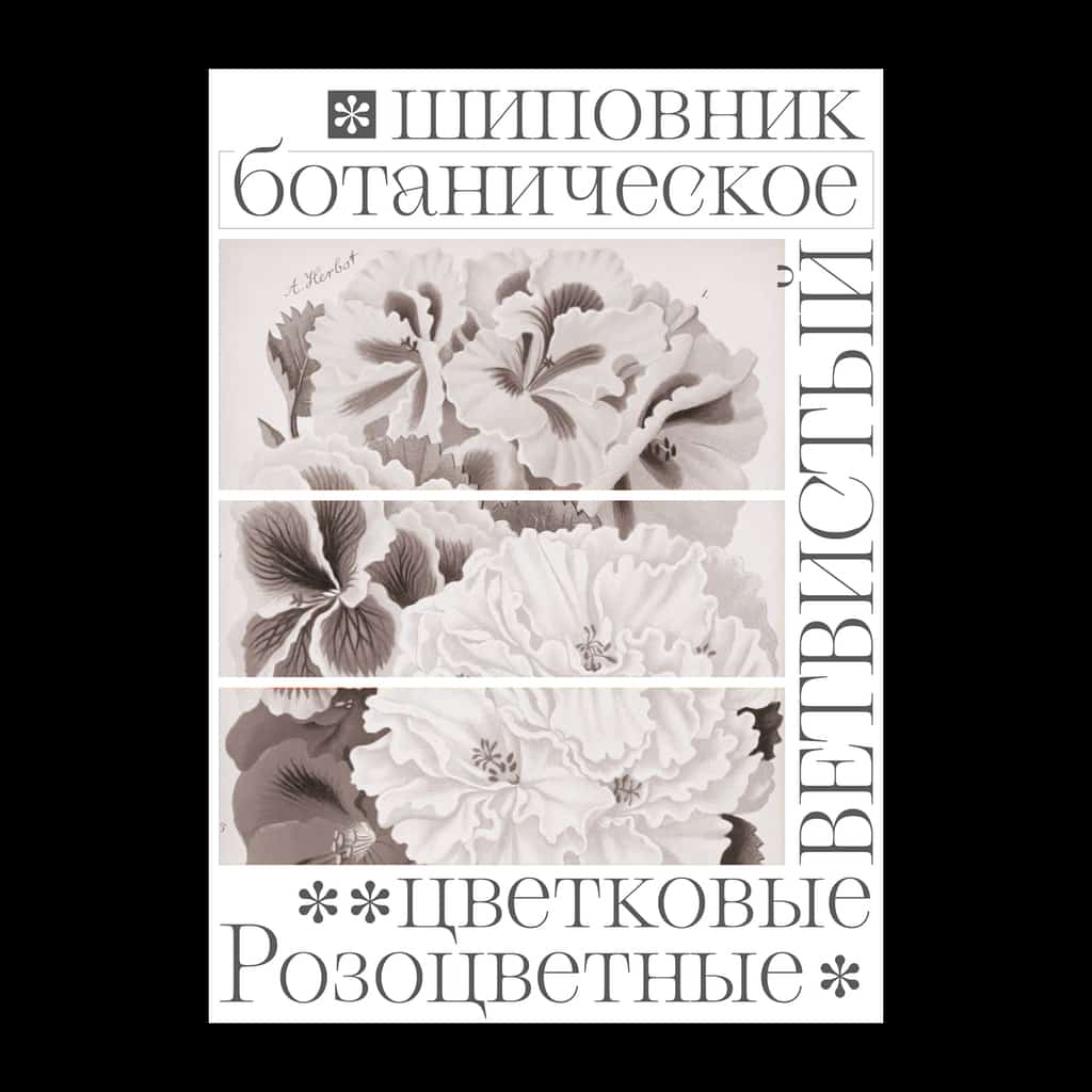
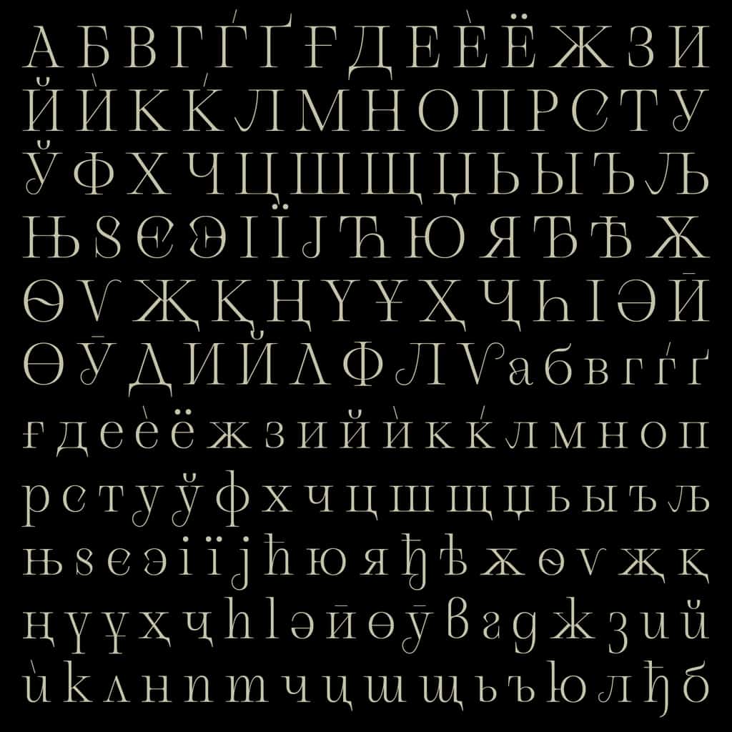
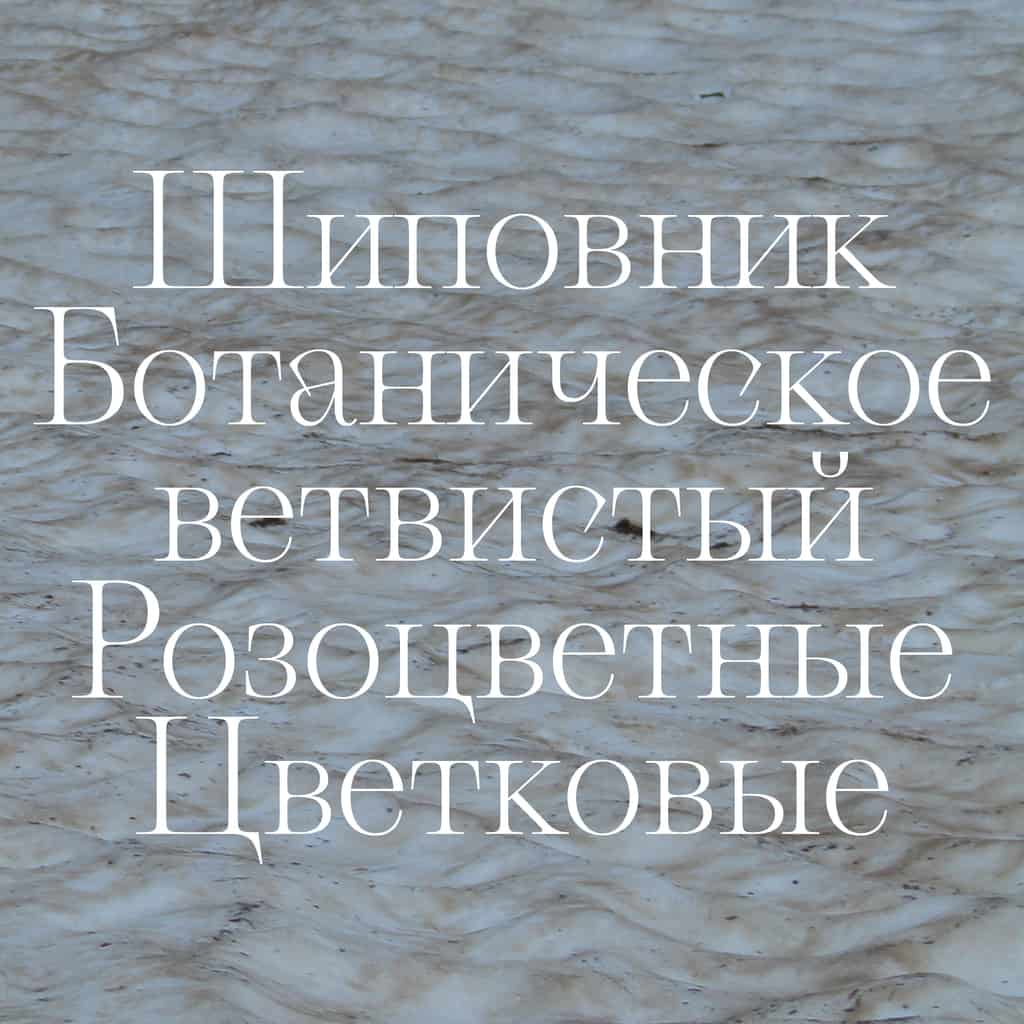
Gallique Cyrillic
Gallique, created by Emma Marichal, takes its name from the oldest of the garden roses, Rosa Gallica. The duality of soft petals met with prickling thorns soaks into the design of its juxtaposing forms to create a truly expressive, experimental take on a contemporary serif. Gallique Cyrillic has been designed to meet the needs of a wider range of users. This set contains the necessary alternates for Bulgarian, and a collection of alternates. The Cyrillic has the same spirit as the basic set, with delicate and fragile shapes that will suit your posters, books and websites.
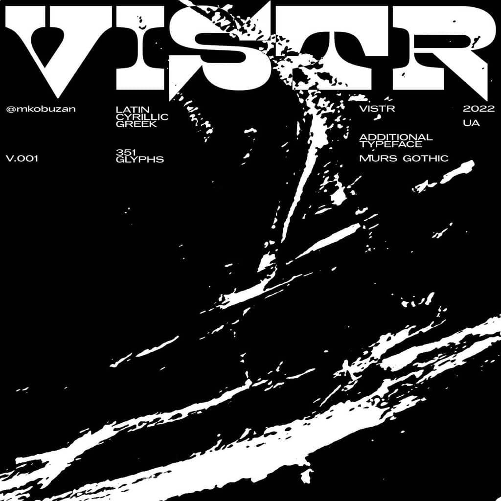
Vistr
A new font from Max Kobuzan, Vistr is a reverse contrast display typeface inspired by western movie and infused with the tension of classic horror films. Powerful serifs, smooth curves, sharp details and an impressive contrast of strokes are unusually combined with each other to create a dramatic, eye-catching effect—perfect for creating a gloomy mood in large size text, such as titles and headlines. This all-caps font supports extended Latin, basic Cyrillic, and Greek.
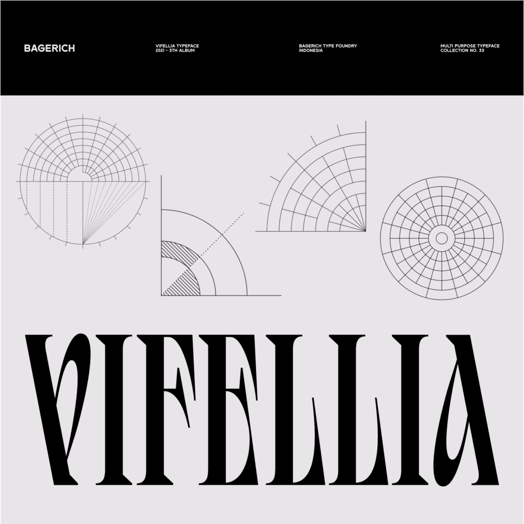
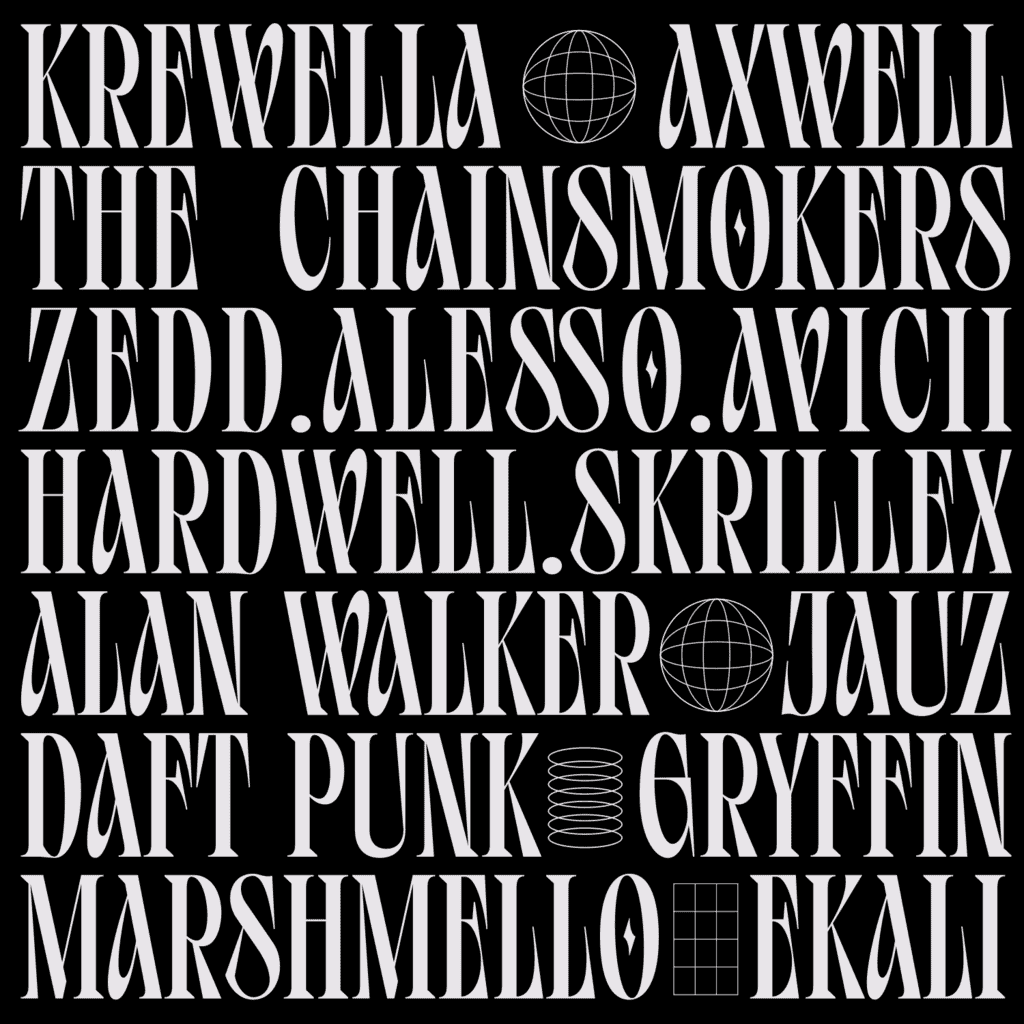
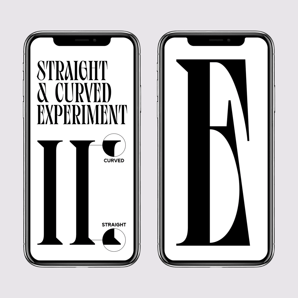
Vifellia
The latest offering from Bagerich Type Foundry, Vifellia, is a versatile and unique serif typeface—the result of combining curved serifs and straight serifs together in one font. Vifellia has a unique style with stylistic alternates, ligatures and support for multilingual languages. Create a unique and beautiful logotype, use it as an elegant solution for your next magazine layout, or choose Vifellia for graphics that require a sharp, expressive look.
ZT Shago
ZT Shago, designed by Zelow Type, is a font family of three eye-catching display forms. Each style possesses its own character filled with both very strong and soft angles—making this font perfect for creating a powerful yet playful look.
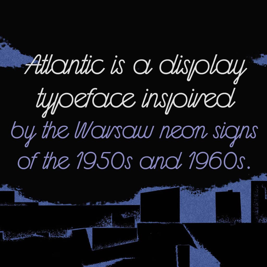
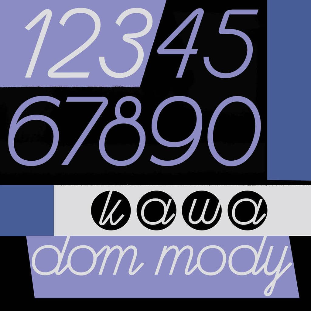
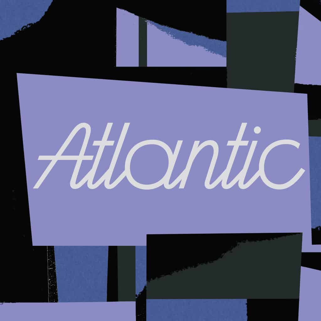
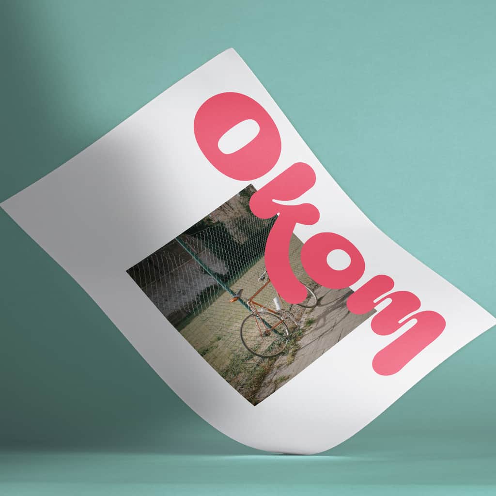
Atlantic
Atlantic, by Ola Szczepaniak, is a display font inspired by the Warsaw neon signs of the 1950s and 1960s. The name of the font refers to a cinema on Chmielna Street in Warsaw, which was decorated with the famous neon sign. The cinema still exists today, but no longer has the characteristic signboard. With a total glyph set of 1231 per weight, this vast and dynamic font is excellent in a wide range of settings.
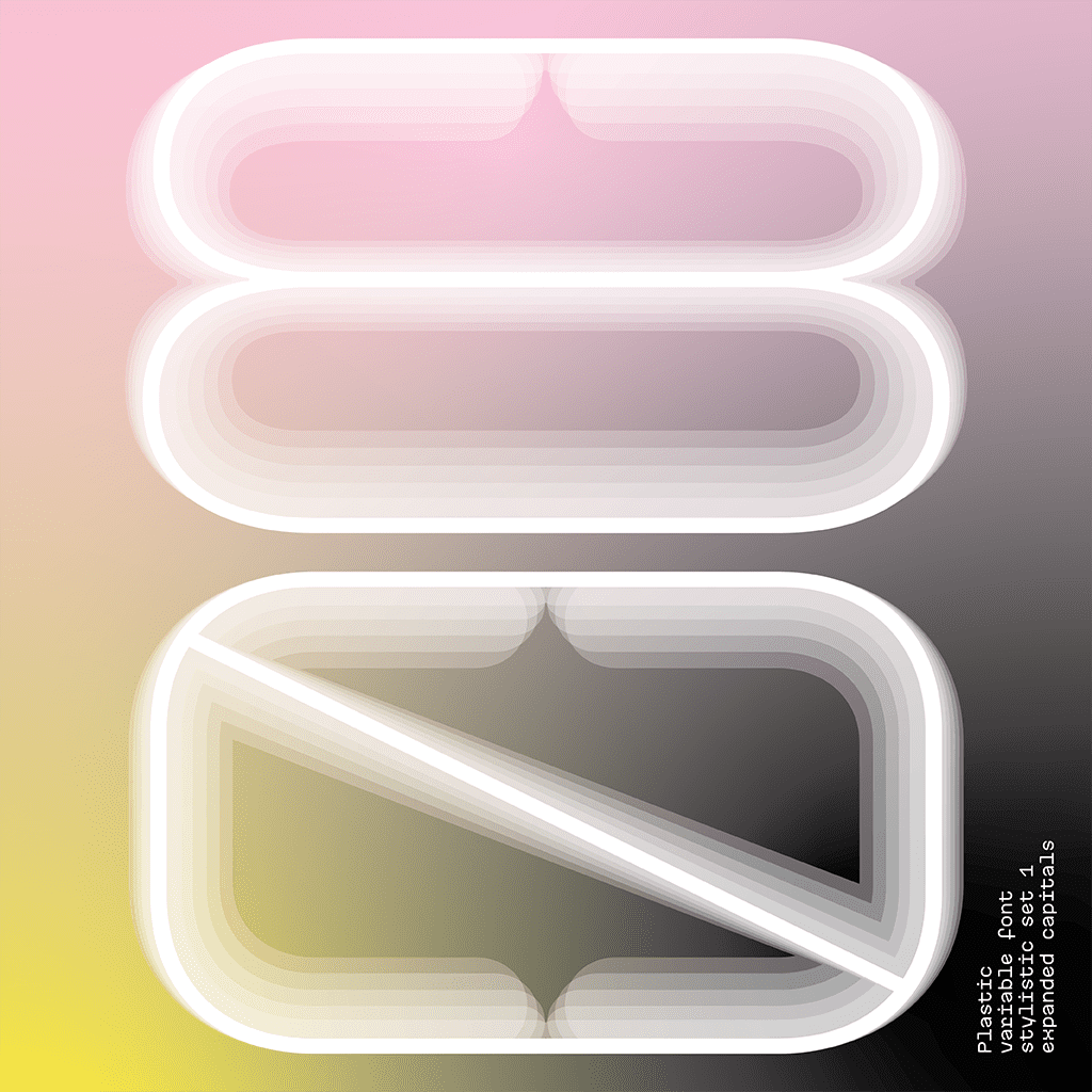
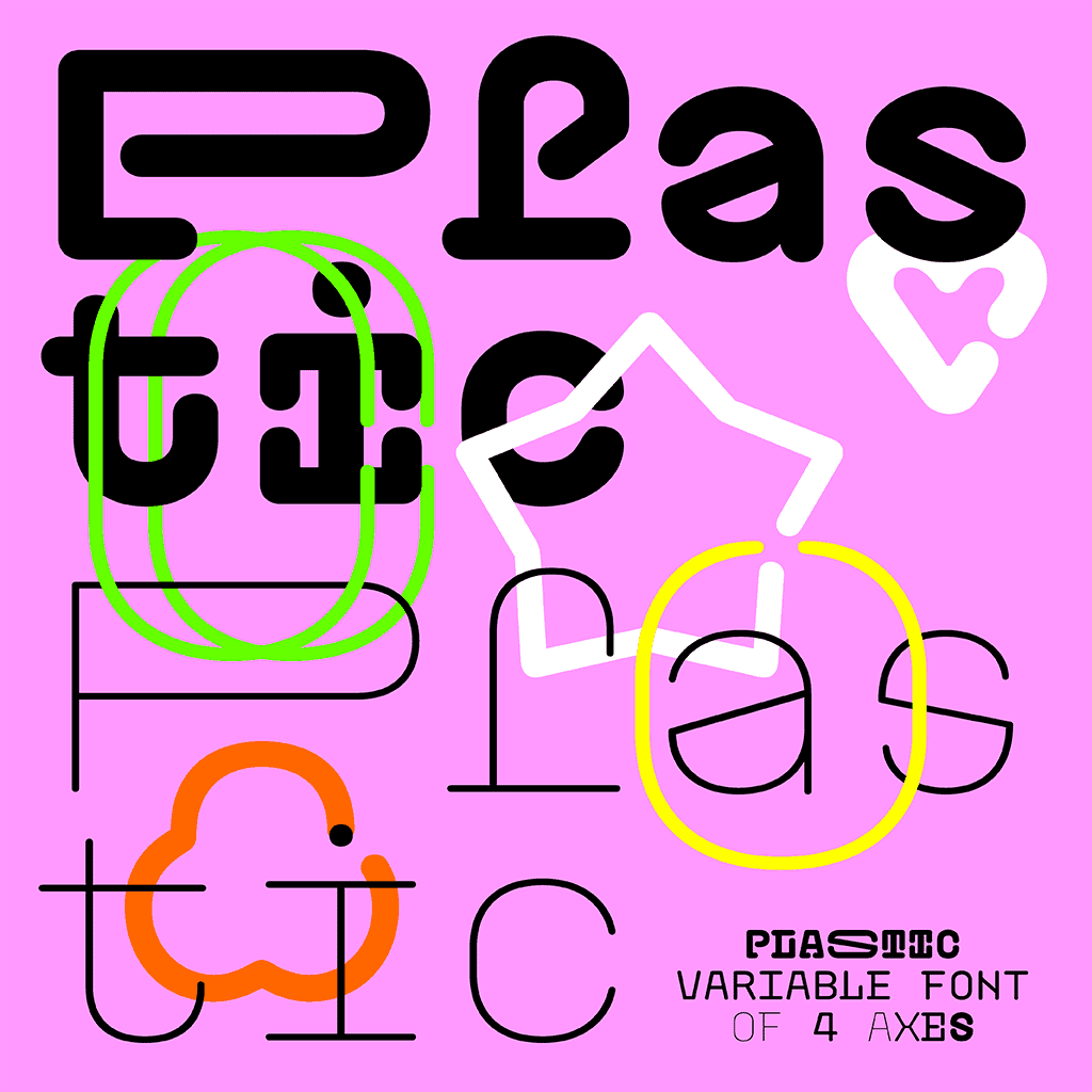
Plastic
Plastic, created by Jitka & Ivana, is a monospace variable font based on four master styles: Chain Black, Chain Thin, Simple Black and Simple Thin. The design of the “Chain” styles comes from the “Céčka fever”, a phenomenon of collecting C-shaped plastic hooks in the communist Czechoslovakia, which were originally manufactured to be hanged as decorative chains in windows and doors. The “Simple” styles, on the other hand, have no such feature and are better suited for longer texts at smaller sizes. The variable format enables interpolation between four extremes on two axis: stroke weight and length of serifs.
Pata Slab
Created by In-House, Pata Slab is the type equivalent of a catwalk stomp down a city pavement: a font that’s assertive, funky and more than a little sexy. Named after a colloquialism for ‘feet’, Pata features ultra-heavy slabs and contrasting hairline centers that rise from its chunky footprint. The resulting retro-inspired vertiginous curves add instant attitude to any design. Developed in 2020, Pata is a font of its time. All upside, Pata is a typeface with no descenders; a font that elevates all characters to grow upward from the baseline.
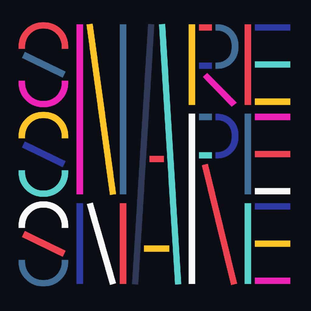
Snare
Created by In-House, Snare is a jazzy little display type that presents like a stencil but behaves in its own way. Featuring angled section breaks and variable heights, Snare keeps each character’s footprint steady as its heights change, revealing unique crossbars, periscoping capitals and deep-sinking descenders. Because each character follows its own rules, the more each word grows, the more it shows the beautiful rhythm of variety.
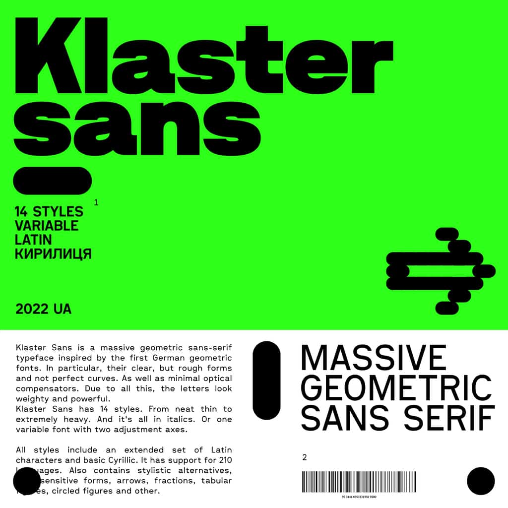
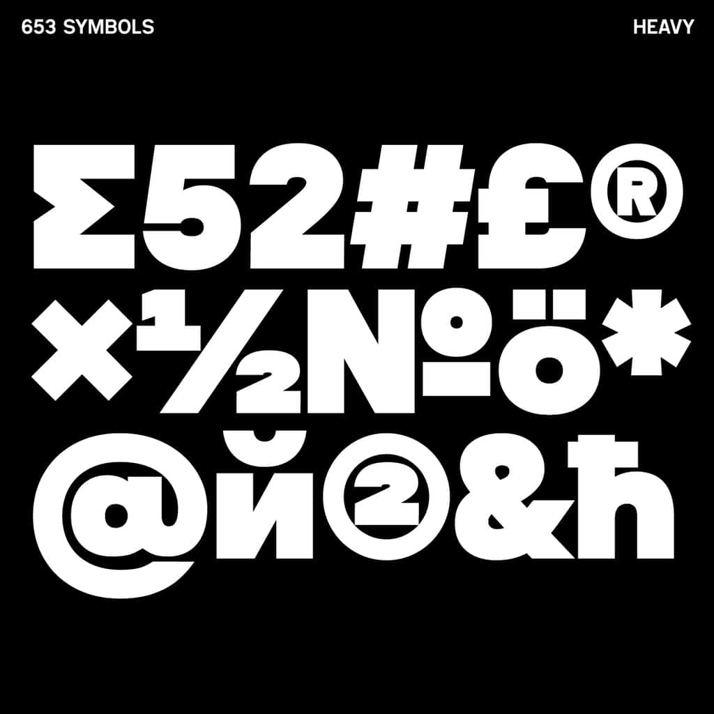
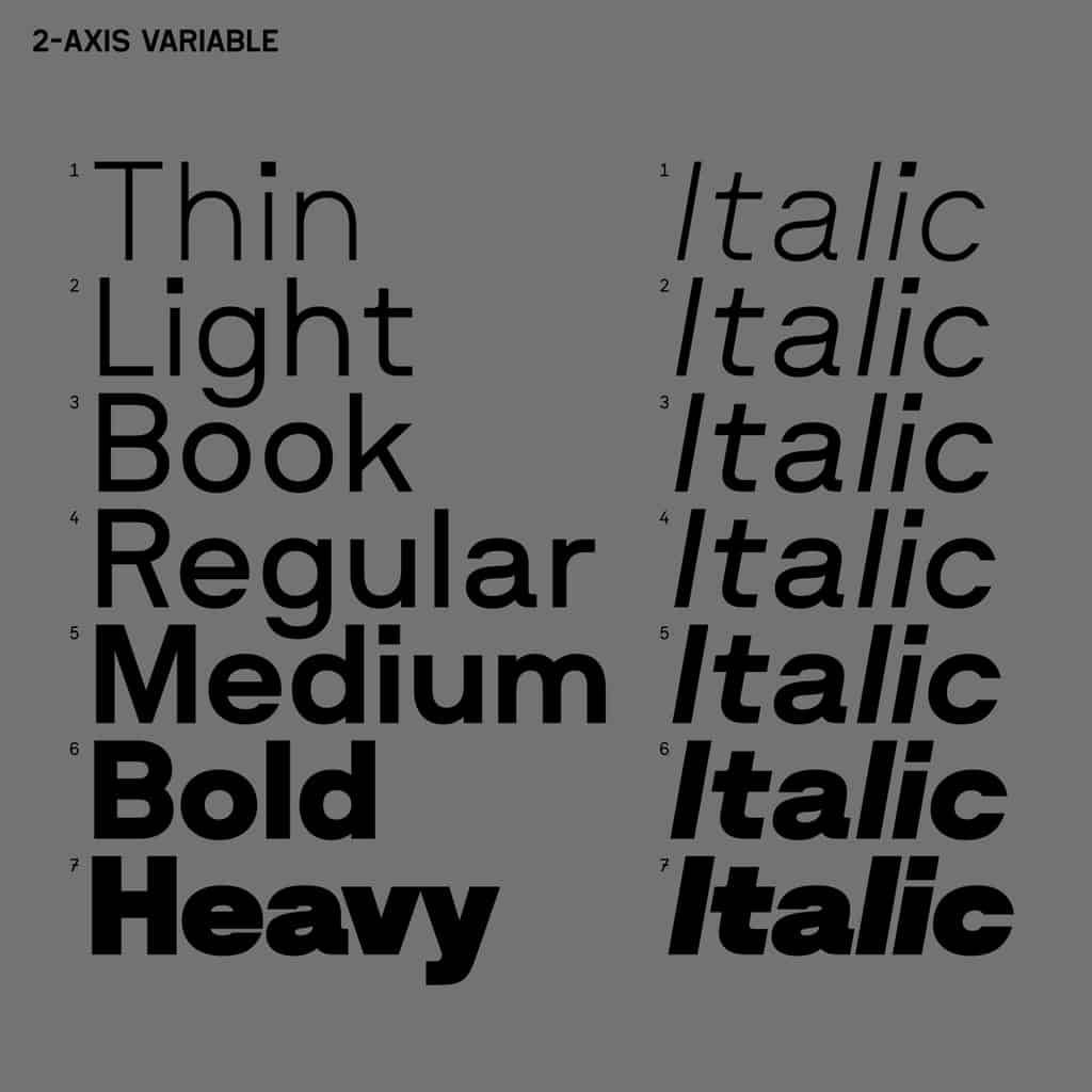
Klaster Sans
Klaster Sans, by Max Kobuzan, is a massive geometric sans-serif typeface inspired by the first German geometric fonts. A weighty and powerful look is achieved through clear yet rough forms and imperfect curves, with minimal optical compensators. Klaster Sans comes in 14 weights, including italics. All styles include an extended set of Latin characters and basic Cyrillic. It has support for 210 languages.
Kika
Designed by Alessio Trudu, Kika is a modern sans serif inspired by Celtic typefaces. It’s a good choice for those who love to play with typographic compositions and is best suited to headings, both digitally and in print.
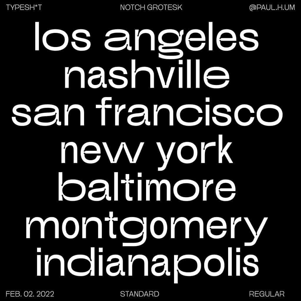
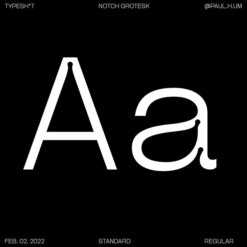
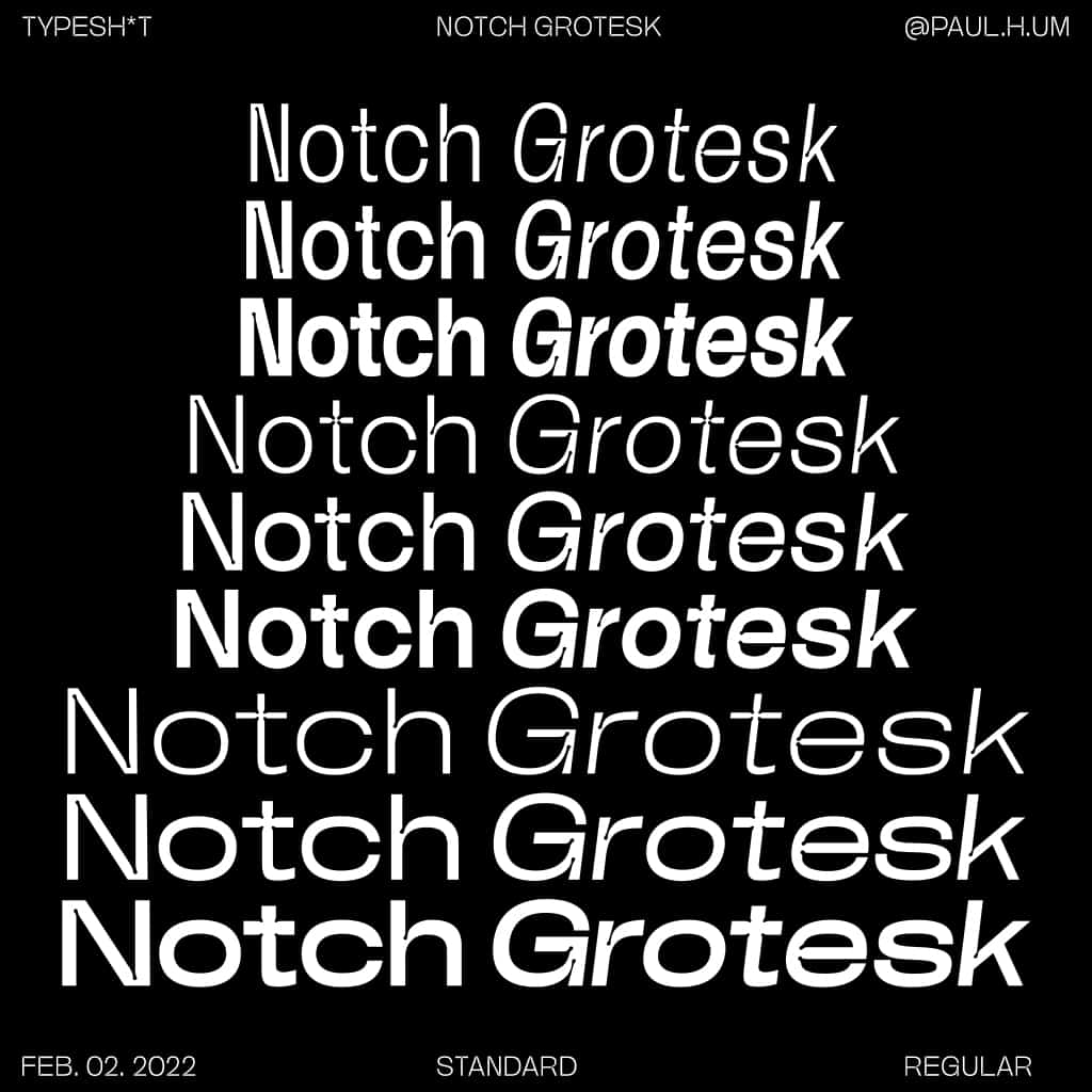
Notch Grotesk
Shaped by traditional sans serif fonts such as Akzidenz Grotesk, Notch Grotesk is a flexible font peppered with Futura-esque geometric details. Designed by TYPESH*T, Notch Grotesk is fresh and clean equipped with Extended and Condensed styles to meet your display needs, along with a standard font family perfect for smaller body copy. The addition of ink traps optimises legibility and offers a unique, characterful touch. The full family consists of three styles and three weights, making it a versatile, clean choice in a variety of context—both in print and digital.
Munchies
Munchies, new from W Type Foundry, is a reverse contrast slab-serif font family. Inspired by the volume and size of 19th century wood letterpress blocks and the Italian Caslon language, Munchies has 12 variants ranging from heavy to thin, complete with OpenType features. Munchies is divided into two subfamilies: Normal and Display. Normal has an appearance reminiscent of Western posters with a “measured” contrast, while the Display style takes the contrast to the extreme. Both styles are also available as variable fonts.
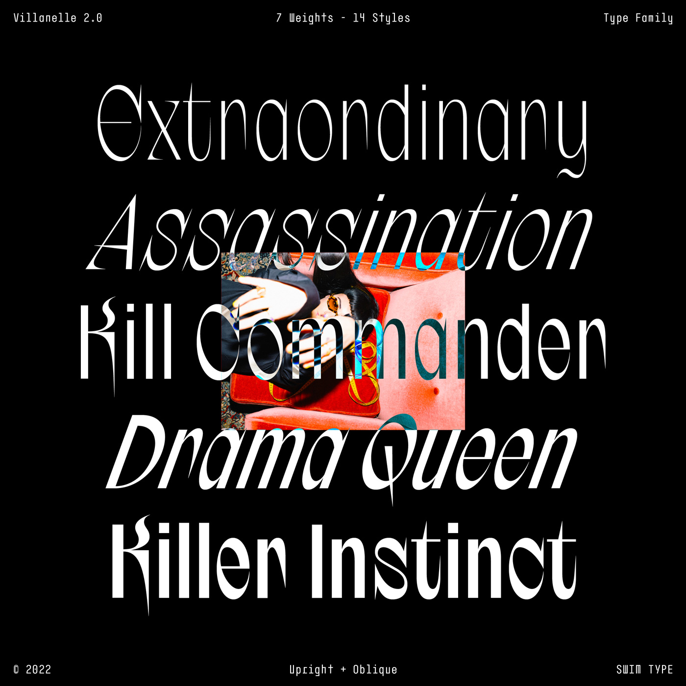
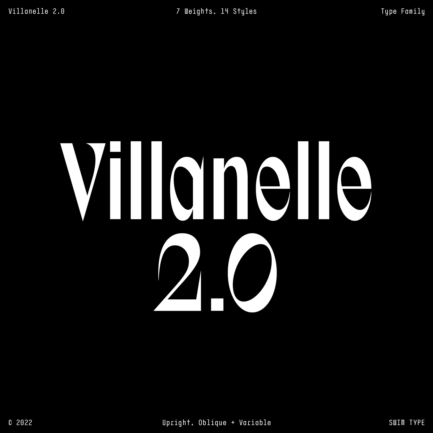
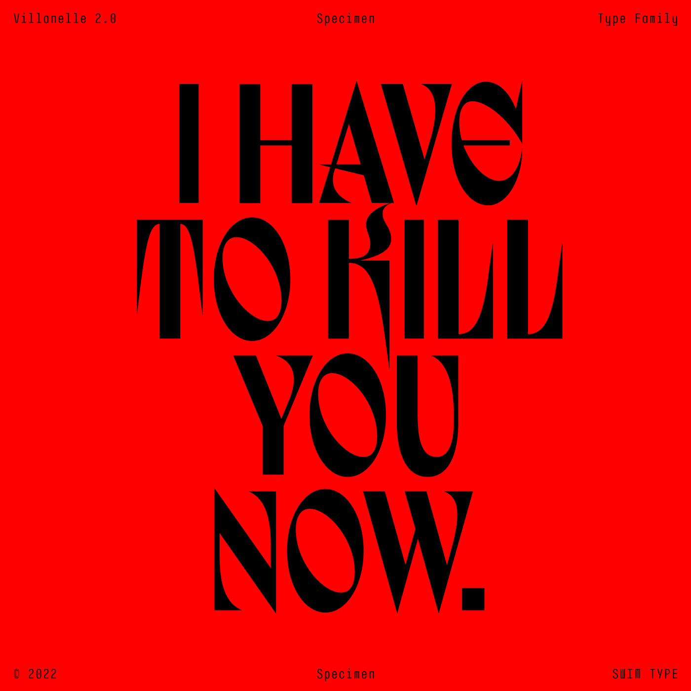
Villanelle 2.0
Villanelle 2.0 is a dangerously glamorous, high-fashion display type family inspired by the enigmatic assassin from BBC America’s Killing Eve. Created by SWIM Type, the first version was published as a single uppercase style in 2020—an early experiment in communicating an identity within a typeface. Villanelle 2.0 is a big update for the project. Every glyph has been completely redrawn—now with the full alphabet, 7 weights, 14 styles, a variable font with 2 axes, extended Latin language support, discretionary ligatures, stylistic sets, improved spacing and greater consistency.
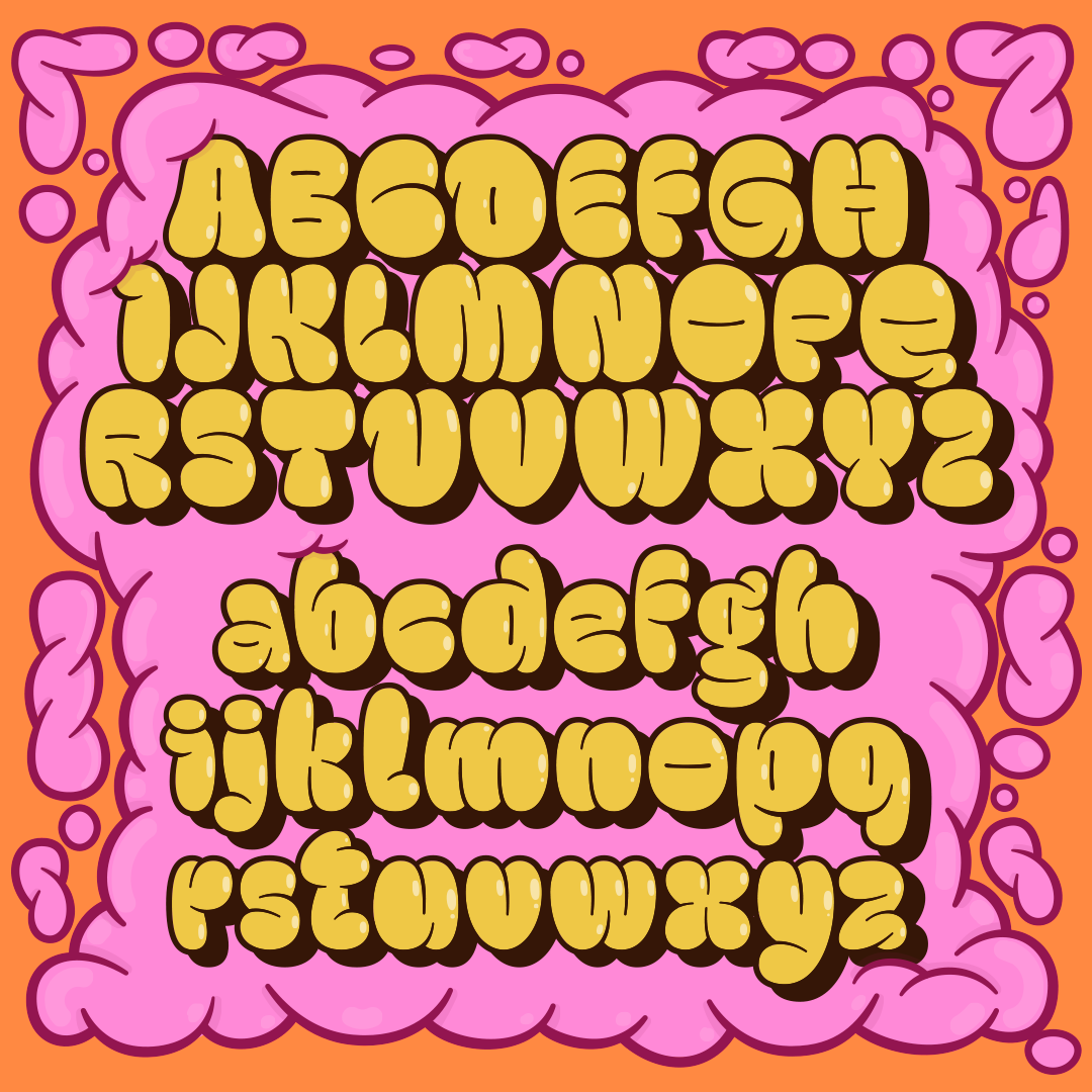
& Some freebies…
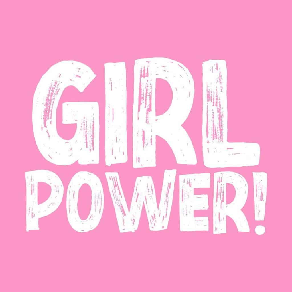
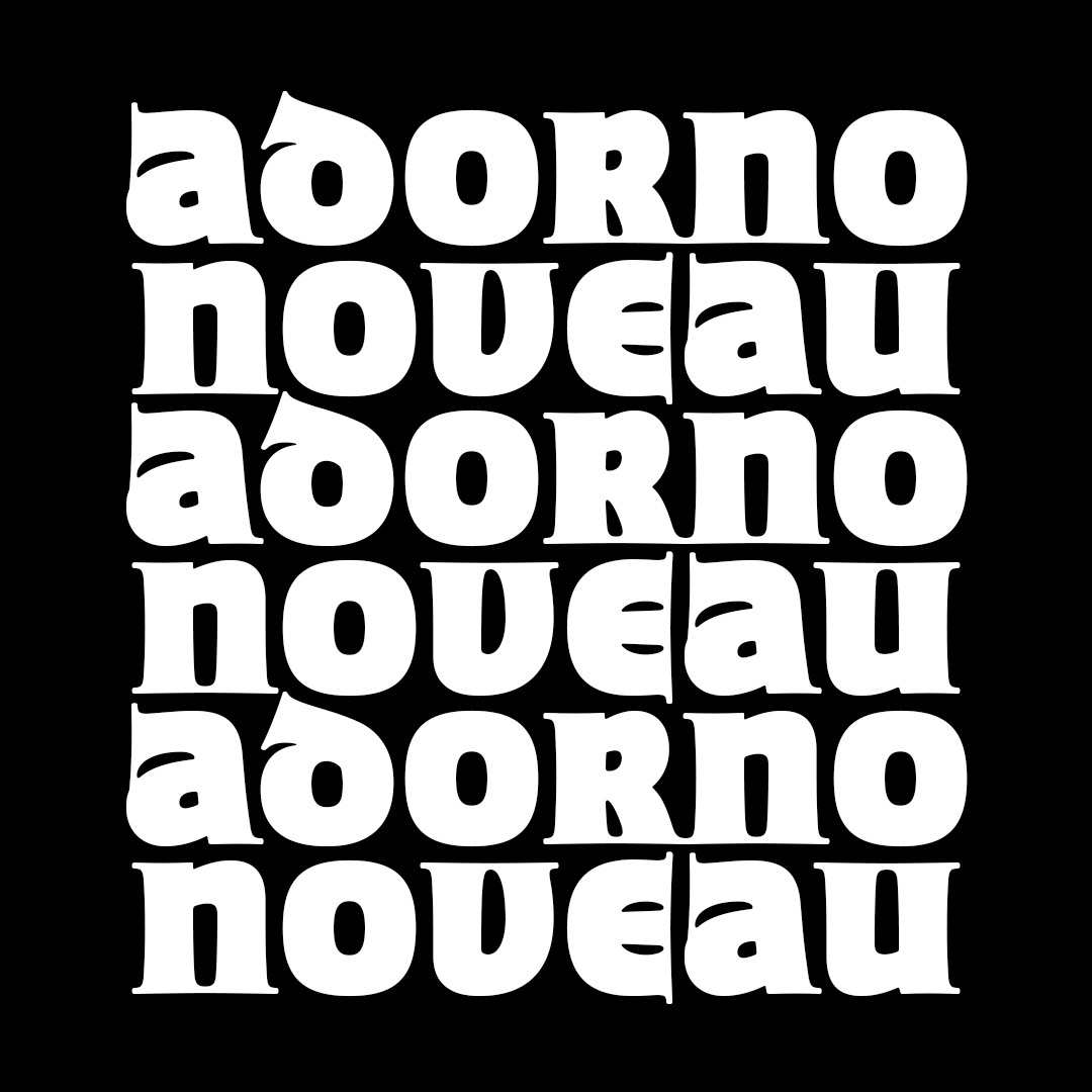
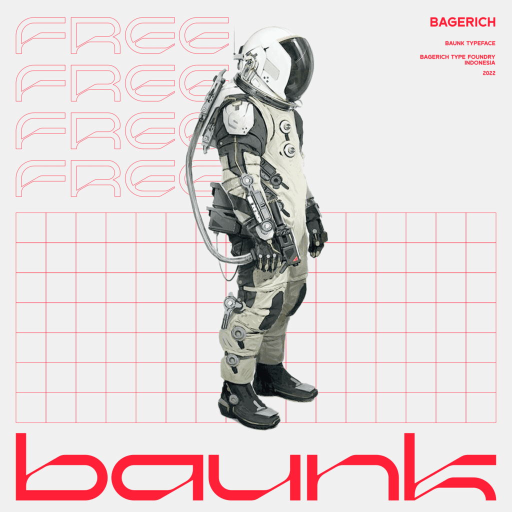
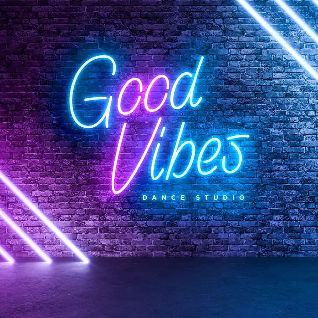
You can access ZT Shago Free, along with the rest of our free font pack, when you sign up to our news letter here. Other new free fonts on Type Department include Neonsign, Dry Hard Sans, Studio Grotesk, Throwup, Adorno, and Baunk.
To access these fonts and more, head over to Type Department.


