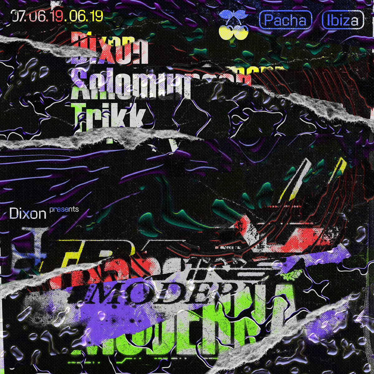
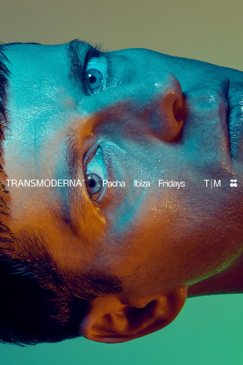
Michael Clasen is a graphic designer, type designer and art director based in Munich. Graduating from Pforzheim‘s University Design PF in 2018, he began working self-employed the year after. Kicking off his self-employed career, Michael was met with a request from House DJ legend Dixon to be the art director and designer for his event series Transmoderna. ‘This project gave me a huge push and was a great learning experience when it comes to large sized projects and working with complex client structures’, Michael says.
Since, the designer has worked with tons of other clients predominately in the cultural field, alongside teaching at the Stuttgart Media University for two semesters, which Michael tells us ‘was a super enriching experience where I found out about myself that I really want to teach some time in the future’. For the last year and a half, the designer has been working freelance for Wiegand von Hartmann with clients such as Marc O‘Polo, the Jewish Chamber Orchestra Munich and the Münchner Stadtmuseum.
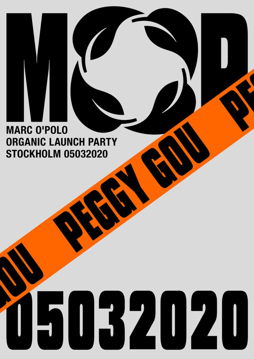
‘My design approach and visual ethos changes as I evolve’, Michael explains. ‘It is very important for me to let that happen – to embrace changes of perspective so I never get stagnant and stiff. That keeps my curiosity and passion alive, which are my major motivations.’ Michael’s work certainly seems to shift and change in terms of in tone and style a lot, moving form clear-cut Swiss-style designs to grainier, grittier (but equally as bold) typographic posters and layouts which evoke a more DIY, cut-and-paste, punk feel. As Michael elaborates, ‘I would say my approach evolved from being theoretically and aesthetically conceptual to a more visually conceptual direction, if that makes sense. I am now more interested in visual systems and intelligent ways to convey information visually, instead of making something just look good or making it a visual reference to some vintage aesthetic’.
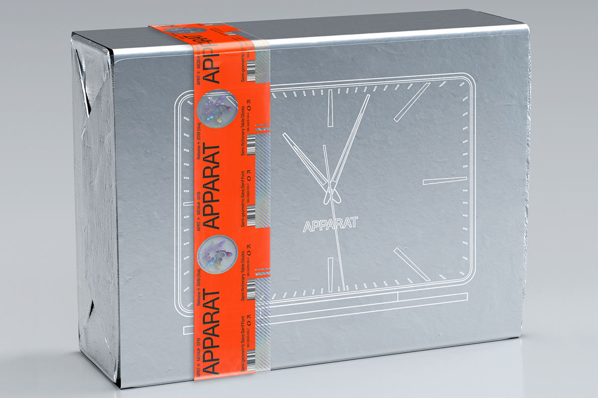
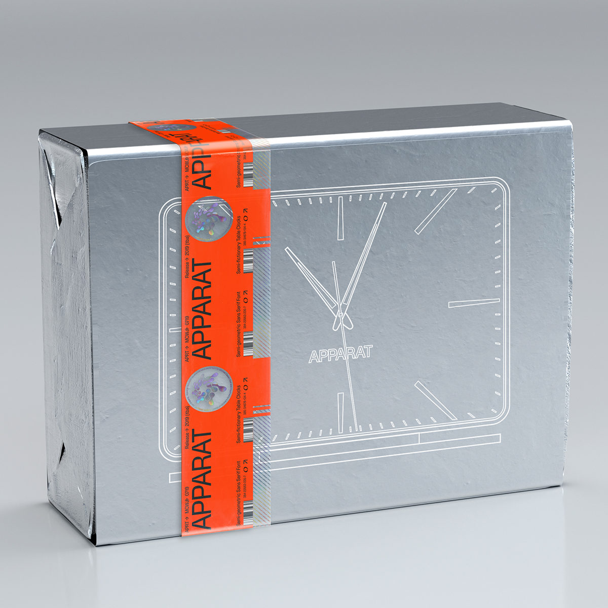
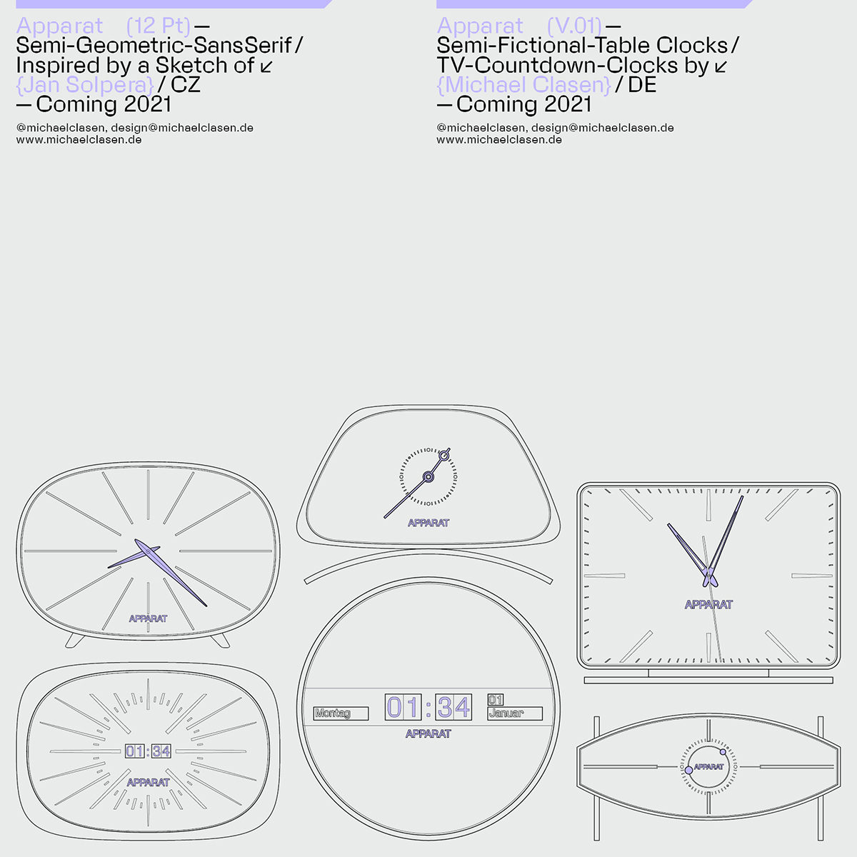
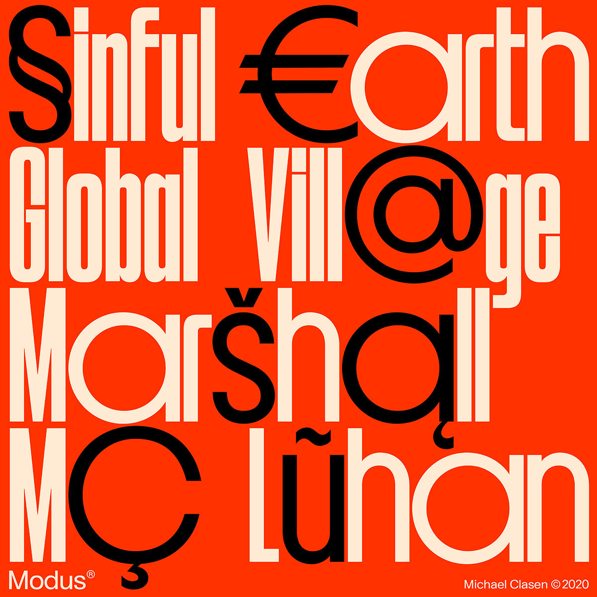
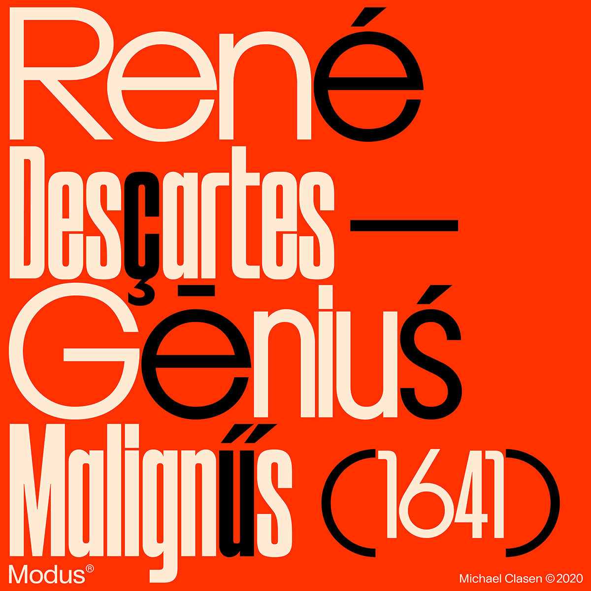
Michael tells us about his varied approach to design by introducing his typefaces Apparat and Modus; the former being a semi-geometric sans and the latter an Art Deco inspired modular display. ‘If you look at Apparat for example, it started when I saw a sketch of Czech graphic design legend Jan Solpera, where the inner shapes of the letters were blocky while the outer shapes were much rounder. I wanted to see that idea implemented in a whole typeface. I later drew vintage table clocks, because I was really fascinated by them as design objects at that time and was wondering why they don‘t really exist anymore… More and more it became a mystery surrounding whether those table clocks are a real thing and if Apparat is even a typeface or an industrial design brand.’
Michael’s outlook on the current culture of the design world speaks volumes about his desire to remain open about what he creates and how, as well as his resistance towards polarisation between practices of design. ‘What I observed during the uprise of Instagram as a major platform for the consumption of design is that two camps of designers started to emerge. One is the camp of classical graphic designers, driven by concepts and reduction, and the other is camp driven by aesthetics – often posting self initiated projects like flashy cover art. I don‘t want to position myself in that discussion because I think those two camps are something completely different that cannot really be compared’.
This being said, Michael feels that Instagram is more responsible for this divide than the designers themselves… ‘It is more or less clear to me that these fast paced, sometimes a bit superficial designs appear on Instagram because the app itself shapes the face of design. If you don’t spend more than a few seconds on one post, it’s totally understandable that the works shown on the app get more and more loud, flashy and often bland because they just have to click instantly. But I also have to say that I don‘t think graphic design and making cover art is the same thing, and they both have be respected and looked at separately.’
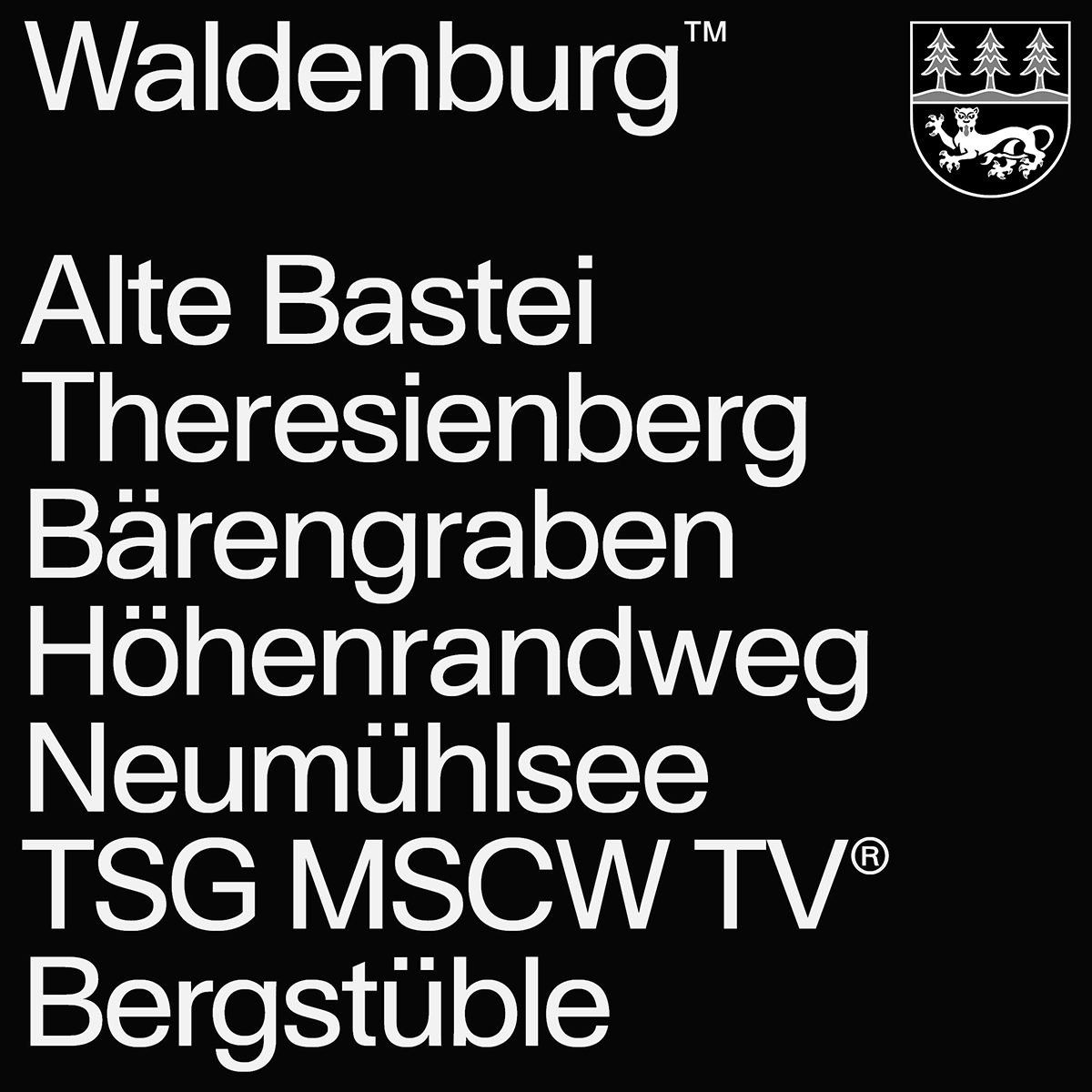
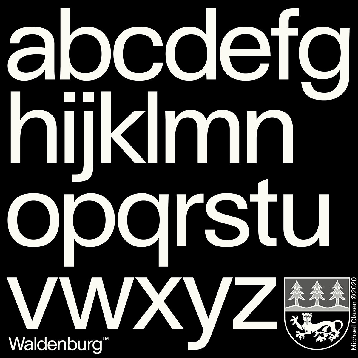
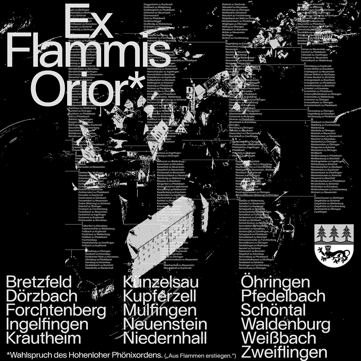
Whilst these two modes of design are simply different – neither more or less – Michael feels there’s a lot of value to be found in creating outside of this fast-paced, at times disposable culture; reflecting on his most-loved and most longwinded typeface, Waldenburg. A love-letter to his hometown in southwest Germany, Michael describes Waldenburg as a ‘classical univers’esque sans serif typeface’, continuing ‘it is the typeface with the most sentimental meaning to me. Everything I learned about curve tension during the process of Apparat and width relations between letters in Modus culminated in making this typeface. Waldenburg’s shapes are a bit extended because the round shapes were the basis for the whole anatomy, so the relations between the shapes look really balanced out. There is a slight contrast between the vertical and horizontal shapes which gets amplified by strong curve tensions. It is the first time I really got deep into legibility and it changed how I design in general. I‘m now much more interested in details and making things really high end’.
In design cultures today, Michael believes it’s super important to take time outside of social media trends and fast-paced, consumption-based demand to really discover your practice – how to use your skills and what design means to you. ‘I often see a problem for designers that are known for one particular style… They can be very successful and reach quick fame but I sometimes ask myself what will they do if the zeitgeist change. Can you adapt aesthetically to the fast changing industry?’ he muses. ‘At the end of the day, I think for me ideas are the best quality to have as a designer. Good ideas are timeless.’

