
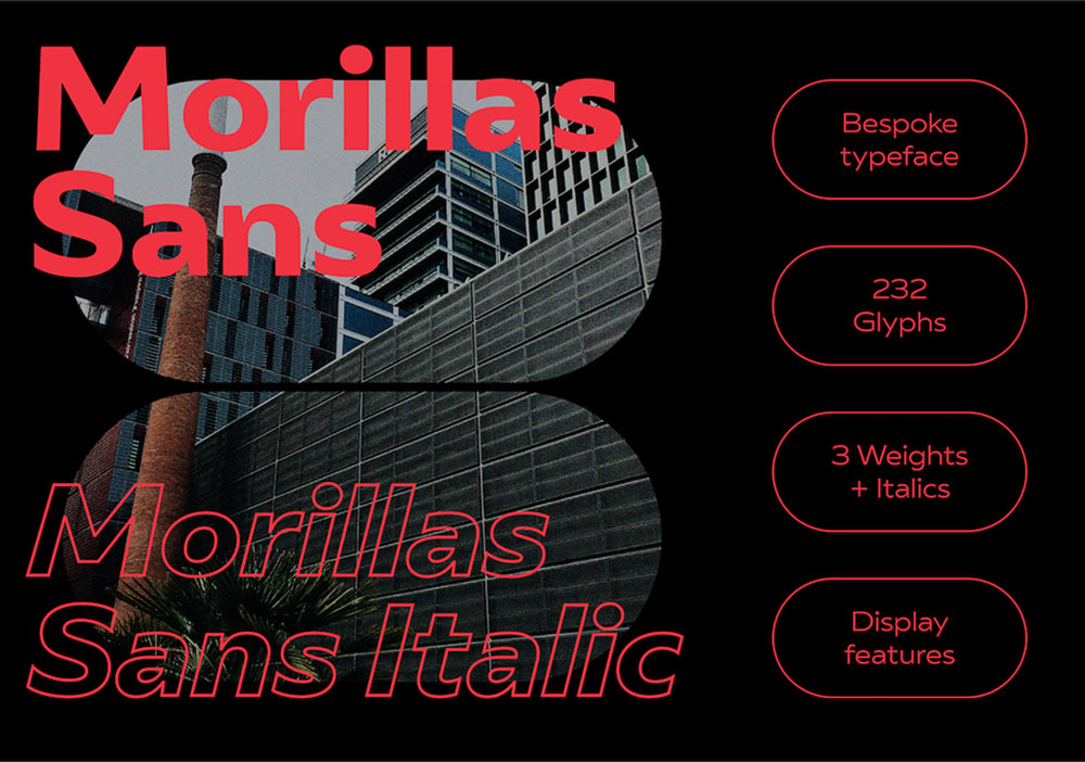
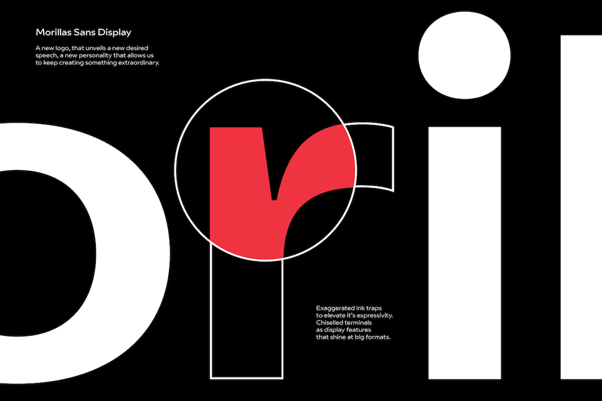
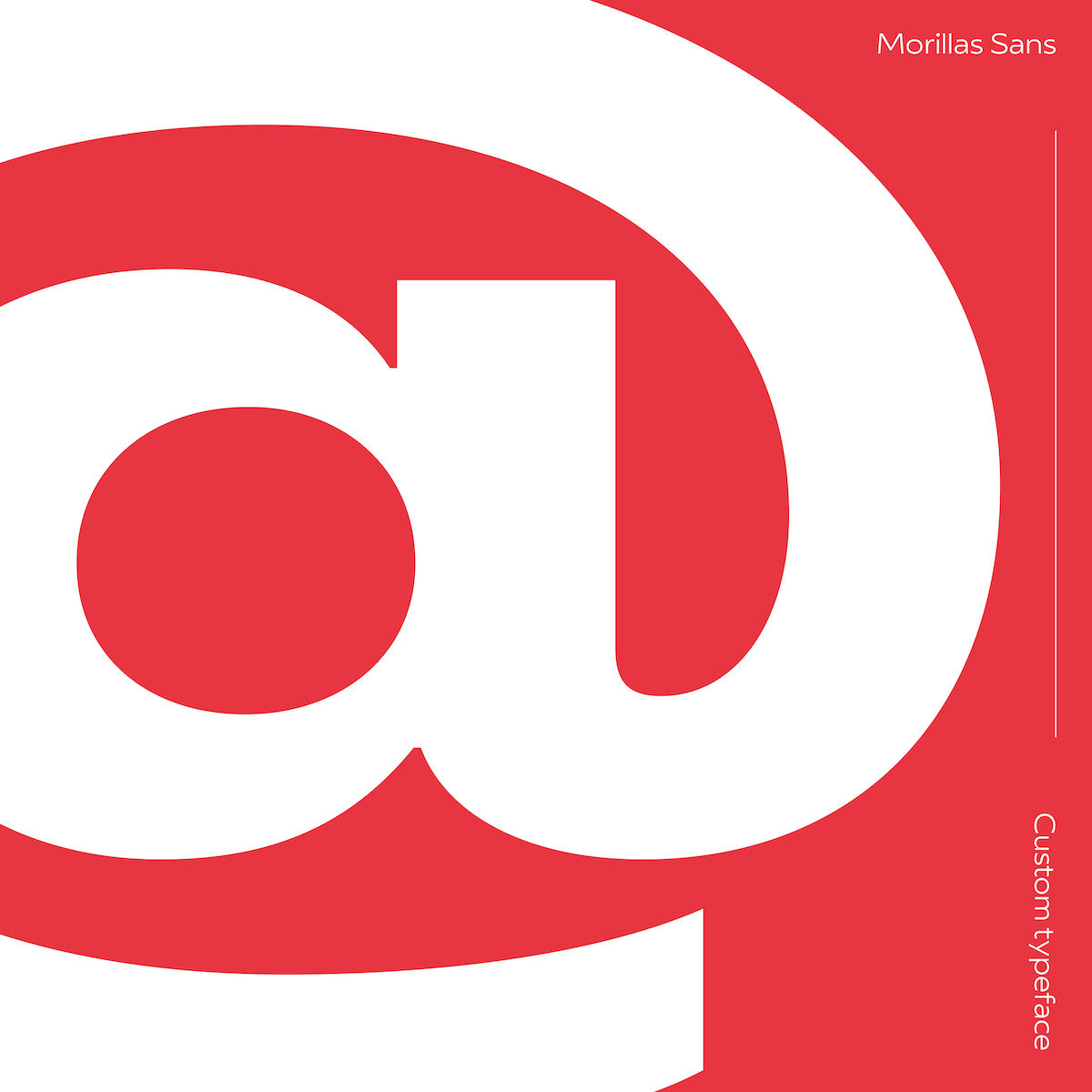
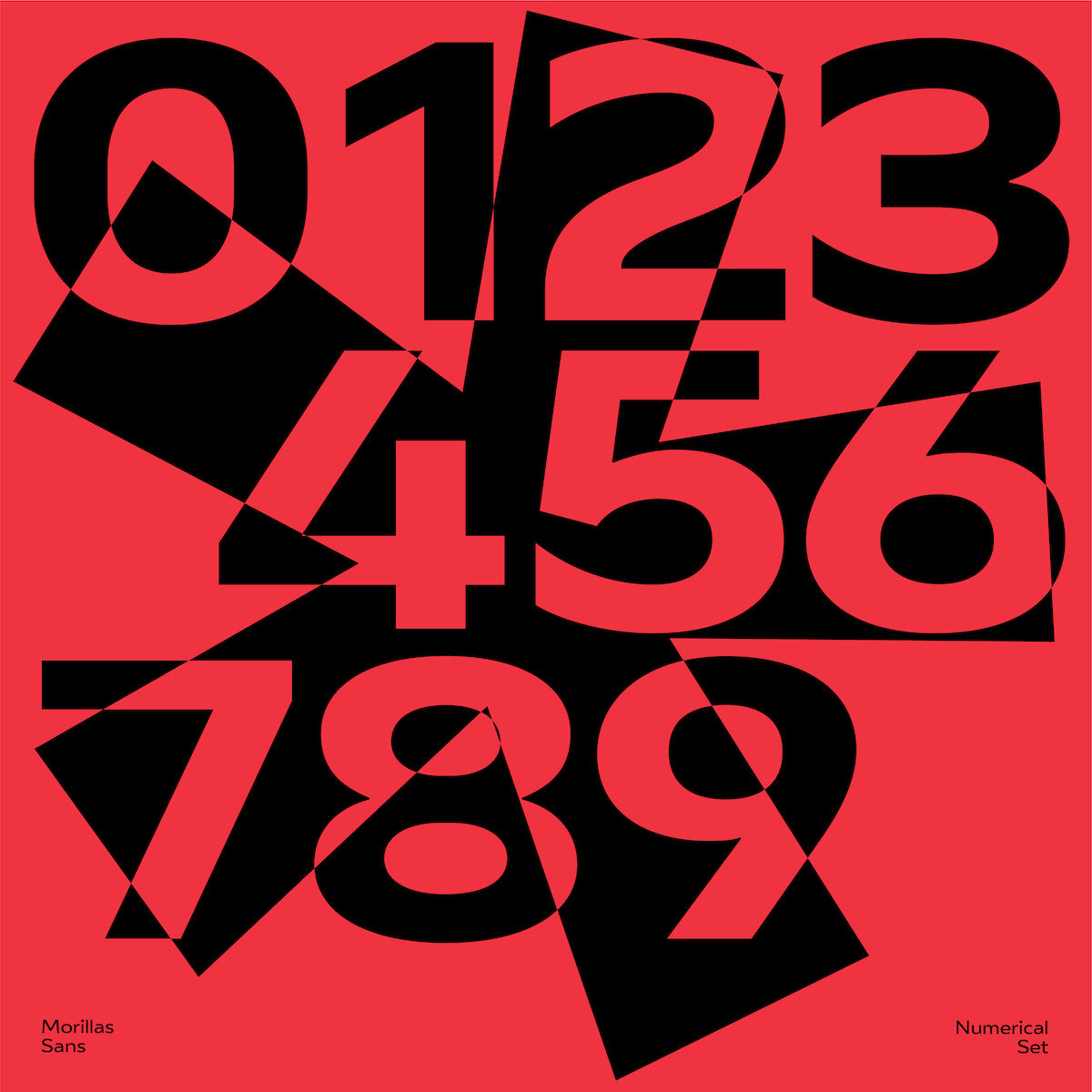
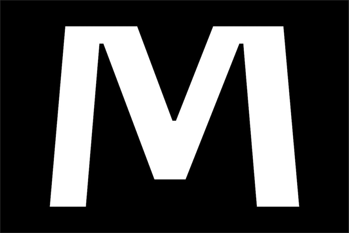
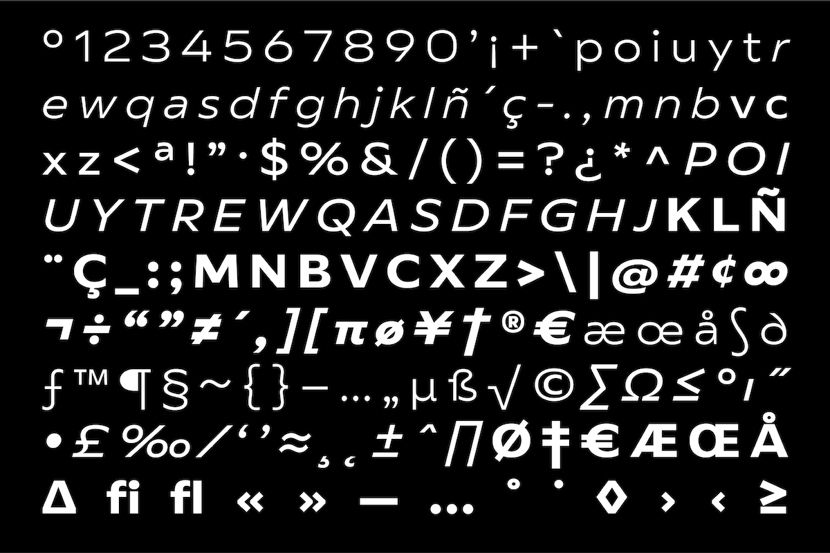
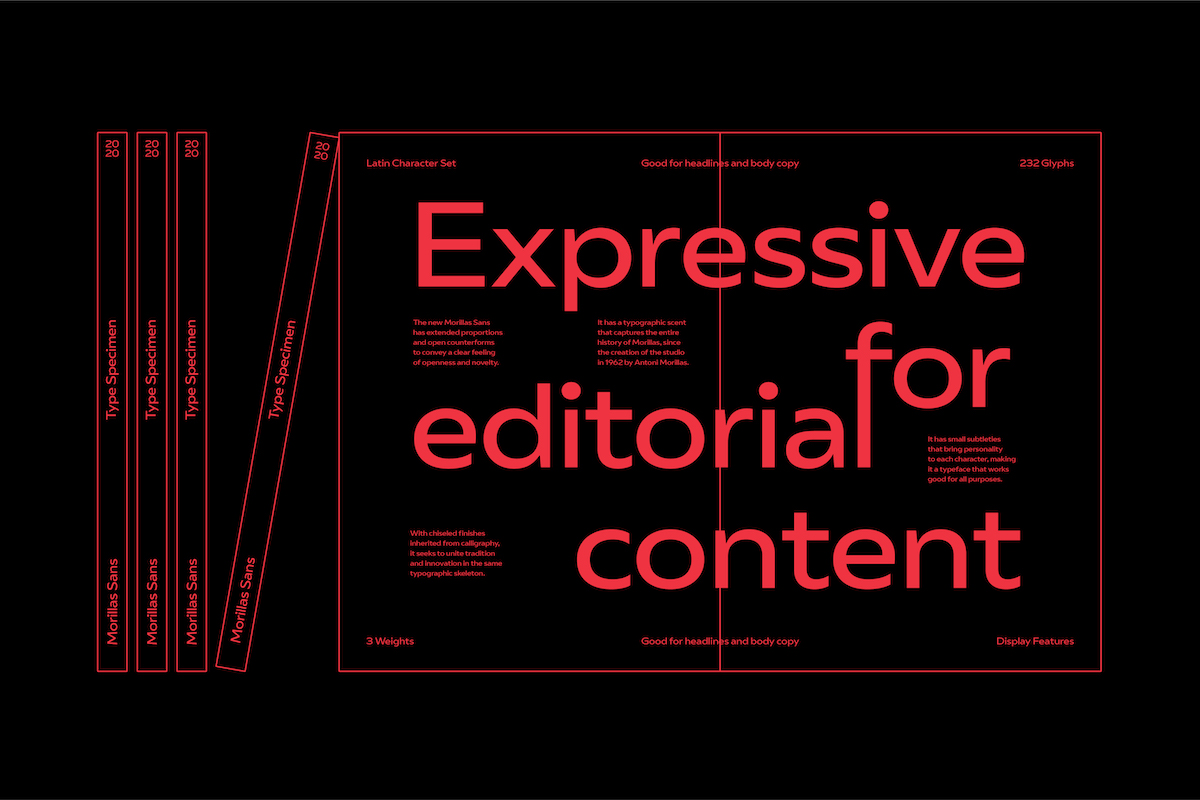
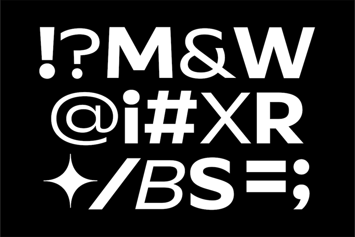
With chiseled finishes inherited from calligraphy, Morillas Sans is a new, contemporary yet timeless typeface that seeks to unite tradition and innovation in the same typographic skeleton. With extended proportions and open counterforms, the typeface reflects in its shapes the feeling of openness and novelty which surrounds its story; one of the newly emerging brand universe of Barcelona-based Brand Design Agency, Morillas (@morillasbranding).
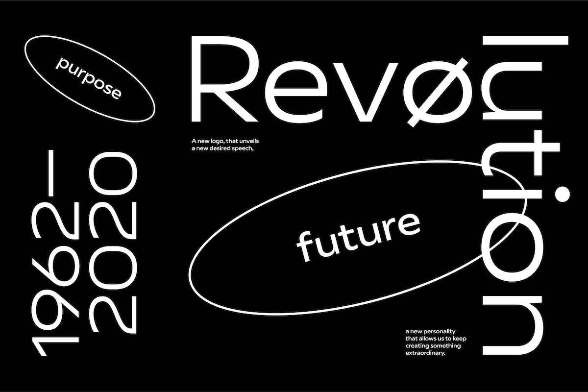
The agency, which was created by Antoni Morillas in 1962, has just undergone a massive identity refresh which saw it renegotiating the relationship between its visual presence, its heritage, and its DNA. Morillas understand typography, as a medium they say “permeates” through all their touchpoints, to be a powerful vehicle in ingraining their story into all of their communications. So Morillas sans, with its contemporary feel and playful subtleties, was created as the cornerstone of their new look—emerging as the face of their brand revolution and expressing their values in a concise, celebratory way.
“Morillas Sans helps us build a solid narrative and a strong personality when we need to talk to clients or the general public, distinguishing us from the rest of players in our field,” Morillas explain. The name of the typeface pays homage to the studio’s founder, and, as they note, “has a typographic scent that captures [their] entire history, from the creation of the studio in 1962 to the present.”
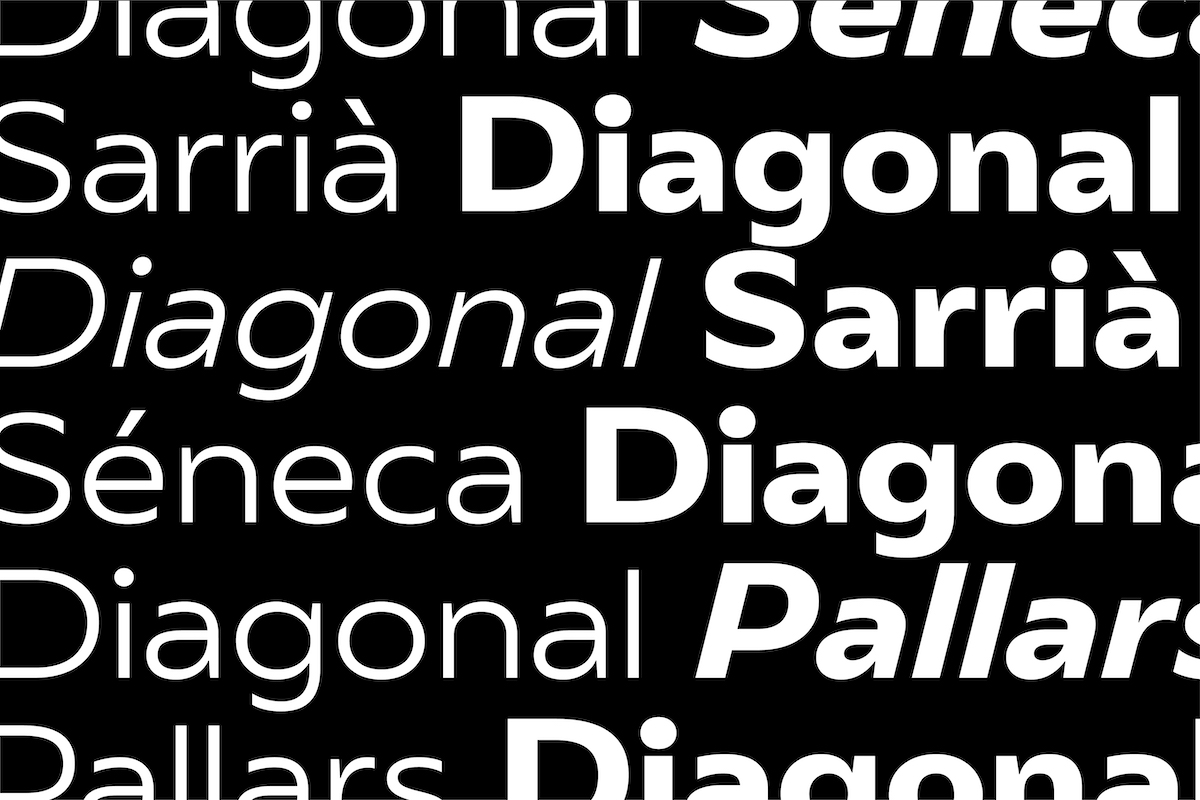
Respects to Antoni Morillas are paid not only in the typeface’s name, but in the typographic references set in the design’s core. During the construction of the family, Antoni Morillas’ 1970’s typeface ‘Diagonal’ was a key reference point. Reflecting the intentions behind the new identity design as a whole—which aligns itself with the fast-moving change and evolution ever-present in our new era—these references are merged with the values of Morillas Sans’ designer, Pedro Arilla, whose curiosities surround type’s narrative role at the intersection of culture, technology, and sociology, as well as how these powers can aid brands in building their communications strategies and visual identities.
This brave new typeface is the result of an extended project between two major type foundries. Starting in London’s Fontsmith foundry and making its way to Monotype—where Pedro and his team immersed themselves in Morillas’ history and culture—Morillas Sans was created to reshape the agency’s values and heritage; forming a gateway to the new Morillas.


