

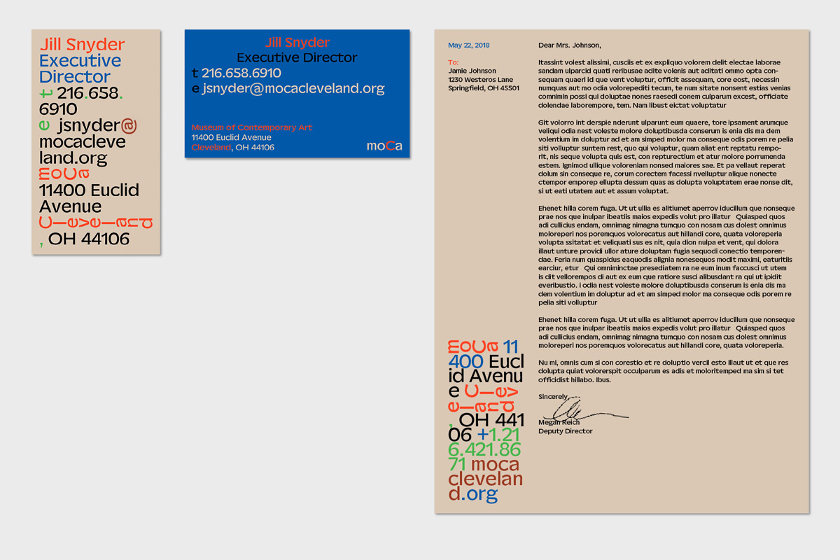
The Museum of Contemporary Art Cleveland (moCa)’s new visual identity emerged, broadly, as a response to modern art’s demand to be viewed from multiple perspectives. Through concepts developed by Michael Aberman, the graphic designer behind the identity, Camelot Typefaces were tasked with creating a unique custom typeface to articulate the museum’s story; the juxtaposing qualities of its architecture, its sense of creative community, and its varied cultural programme.


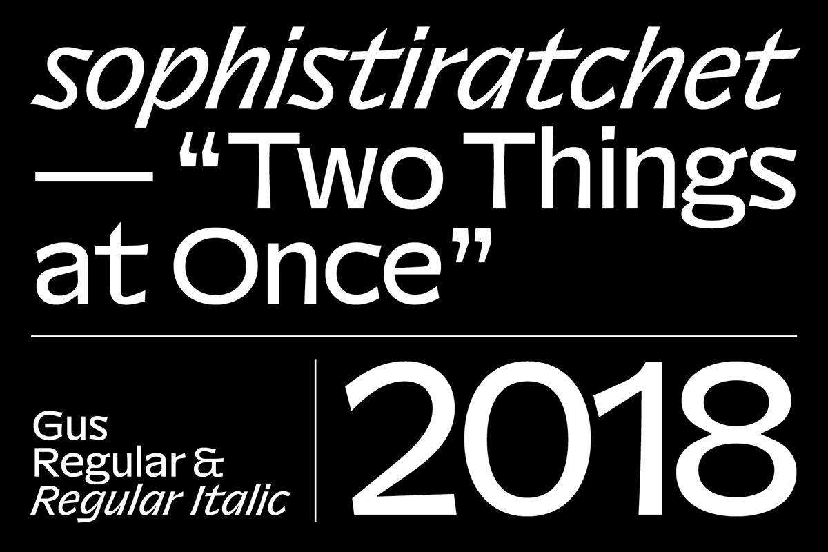
Founded by Maurice Göldner, Katharina Köhler and Wolfgang Schwärzler, Camelot Typefaces is an independent Leipzig-based type collective known for creating strong contemporary typefaces enmeshed with various cultural dialogues. Given the chance to take a unique creative route, Camelot’s custom typeface for moCa builds on the core principles of Michael’s identity design: the ‘remix,’ borrowed from music, wherein elements are reshuffled and rearranged around an ever-present baseline, and multiplicity—‘two things at once.’

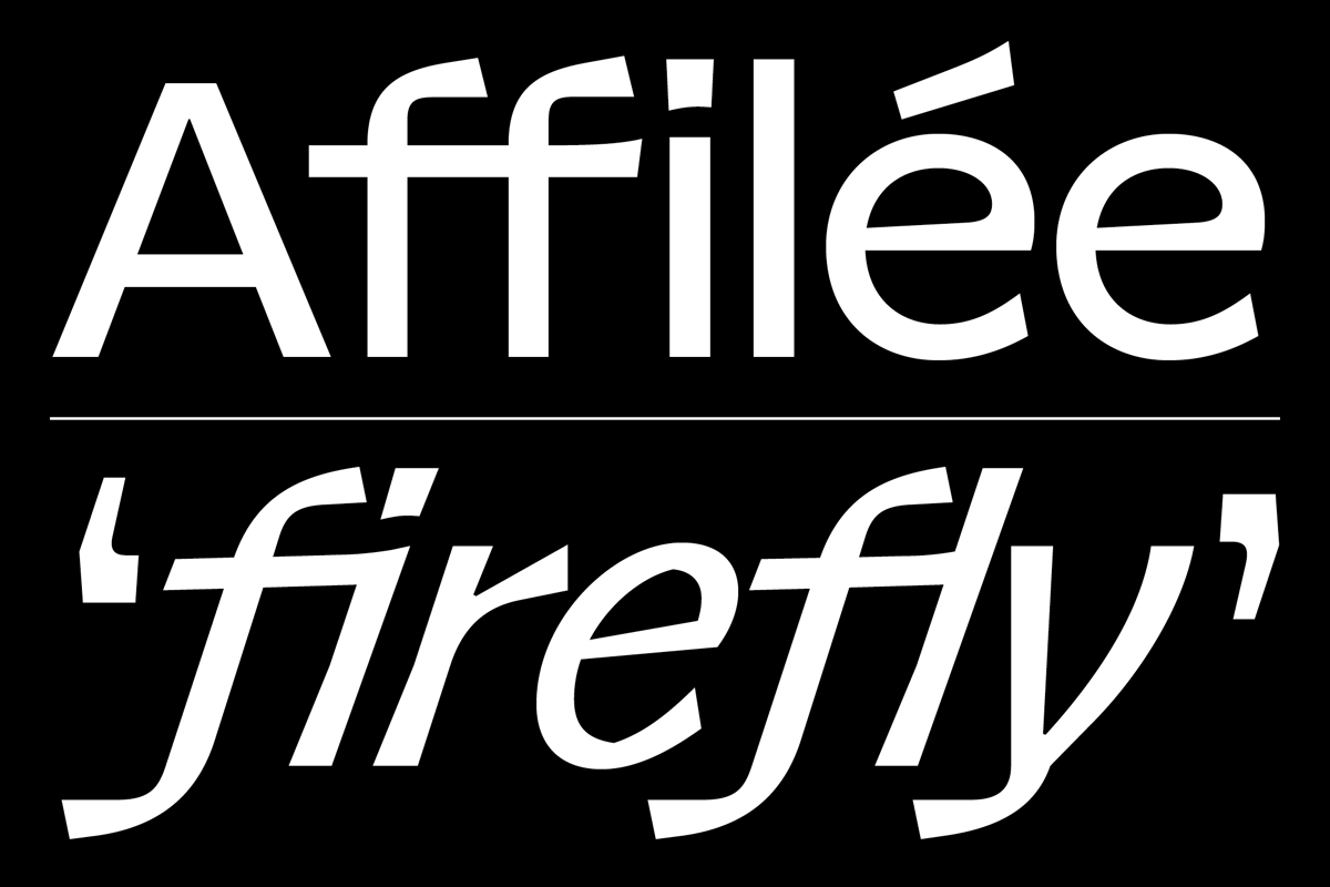
Through their creative strategies and the sensitivity of their design, Camelot build on moCa’s architectural themes by opening up ideas around multiplicity and dialogue, delivered through a combination of bold, rigorous forms wrapped up in a warm and inviting tone. Led by Michael Aberman’s articulation of multiplicity through the graphic design, Camelot‘s sharp contemporary sans is punctuated by gentle curves and irregularities in the letterforms—calling readers to look twice at each character and reinterpret its different qualities. As Camelot explain, “This refers to the ambiguous surface of the museum’s building—a razor-edged, dark and rigid form which at the same time is lively, dazzling, warping and colourful through the reflections on its surface.”
It has to be said that this is what emerges most beautifully from the custom typeface—its embodiment of the space that moCa’s building was intended to be. As the building’s architect, Farshid Moussavi, writes in her description of its design: “MOCA Cleveland is a contemporary art museum designed to serve as a public ‘living room’ in a cosmopolitan Cleveland neighborhood, and to act as a catalyst for creativity and growth for the city. Its twisting architectural form shifts from a compact hexagonal base to a rectangular roof, creating a new public plaza, a soaring atrium and a dynamic double-decker staircase.”


Through the seamless combination of geometric lines and unconventional formal gestures, this typeface successfully carves out a distinctive, engaging new typographic voice for moCa; drawing from both its place in the community and its engagement in modern art. Formed from a shifting sum of parts which converse in various ways, the identity and typeface come together to voice the complex story of moCa, all while remaining clean, compelling and current. Thank you so much to Camelot Typefaces for sharing more with us on this project! Be sure to keep up with Camelot on socials, and delve in their font library for regular doses of delicious type.


