
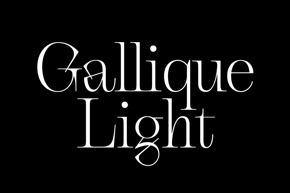
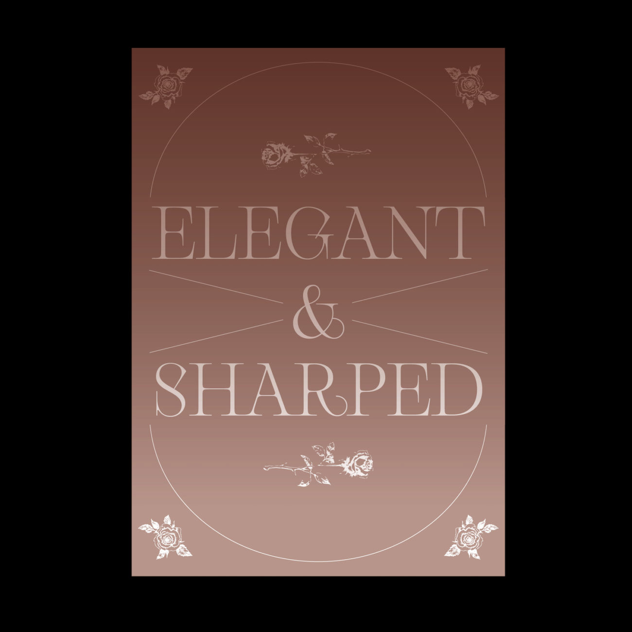
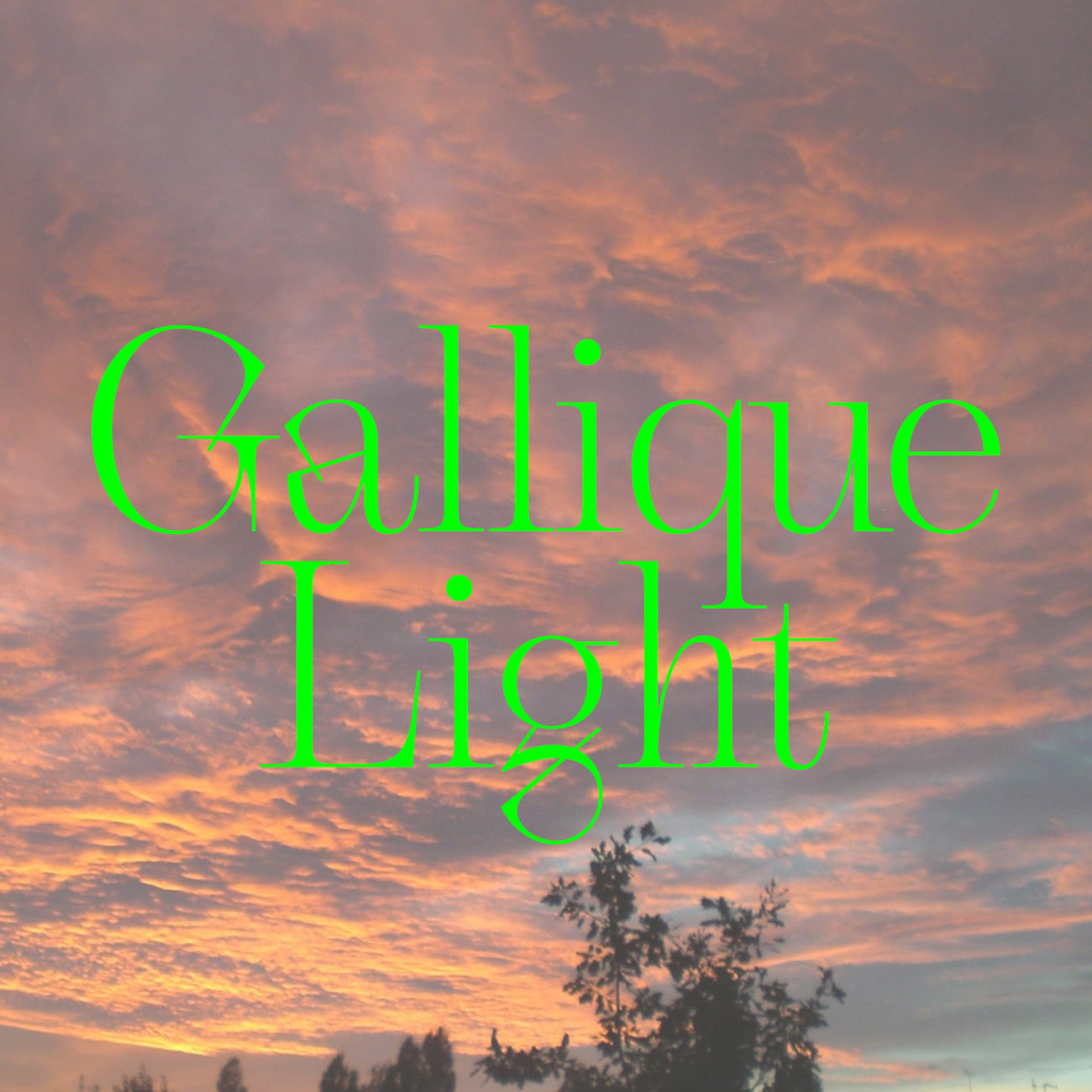
From the incredible Emma Marichal (@emmarichal) Gallique Light emerges as a typographic force to be reckoned with. Available now on Type Department, Gallique Light is full of characterful twists and turns; both elegant and refined, aggressive and formidable. The specimens for Gallique are as stunning as the typeface itself, and it’s undeniable that Emma’s visual eye is impeccable. However, perhaps most intriguing about Gallique is its conflicted, defiant sense of character.

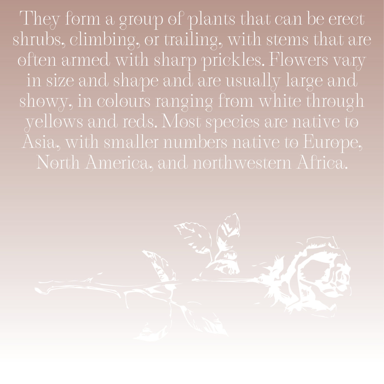
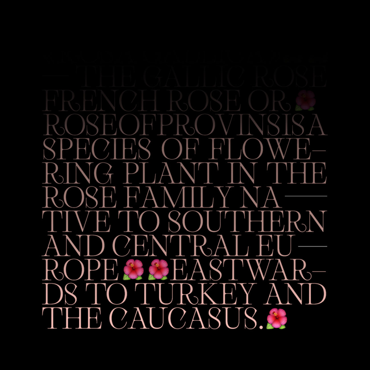
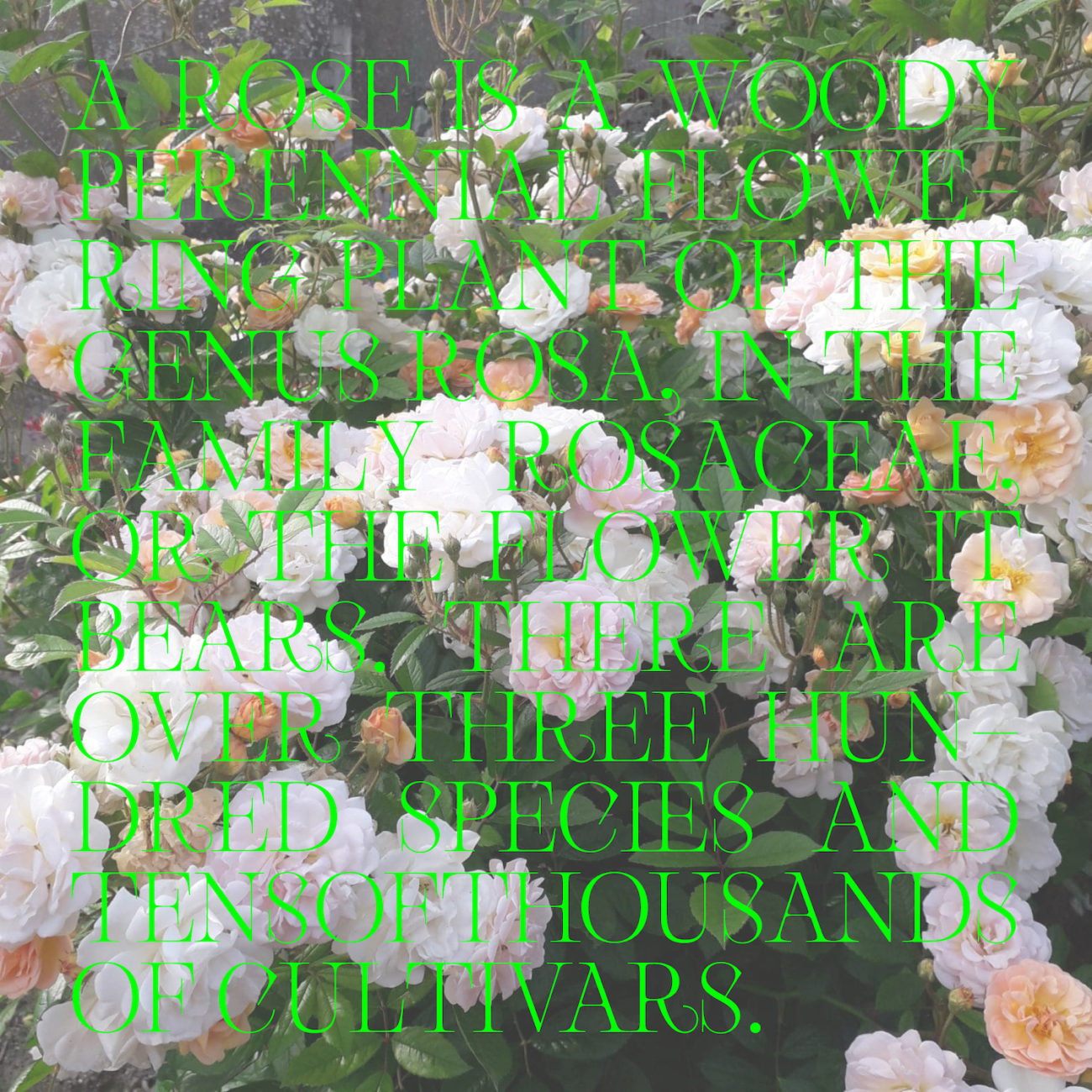
Gallique’s namesake, Rosa gallica, is thought to be the oldest of all garden roses. Soaked through with the contrasting duality of soft petals and sharp thorns, Gallique is designed to play on the duality of the rose as a feminine symbol; demanding forthright the recognition of its multifaceted nature. Filled with gentle, addictive curves and angular, elongated serifs (which terminate in deadly points) Gallique melds beauty and softness with aggressive, assertive and nuanced depth of character.
The French designer is currently studying at ESAD in Amiens, and her approach to type appears to fall in line with her background as a graphic designer; beginning with manual processes such as drawing, calligraphy, paper cutting and linocutting. Both visuality and tactility thus feel key in Emma’s inspiration and approach; meaning her letter-shapes feel intimately connected to her hand as a designer. In this way, Gallique is fuelled both by the integrity of Emma’s skill and craft as a designer and her fascinating conceptual imagination, meaning as a finished product, it is transfixing and unique; addictive and hypnotic.
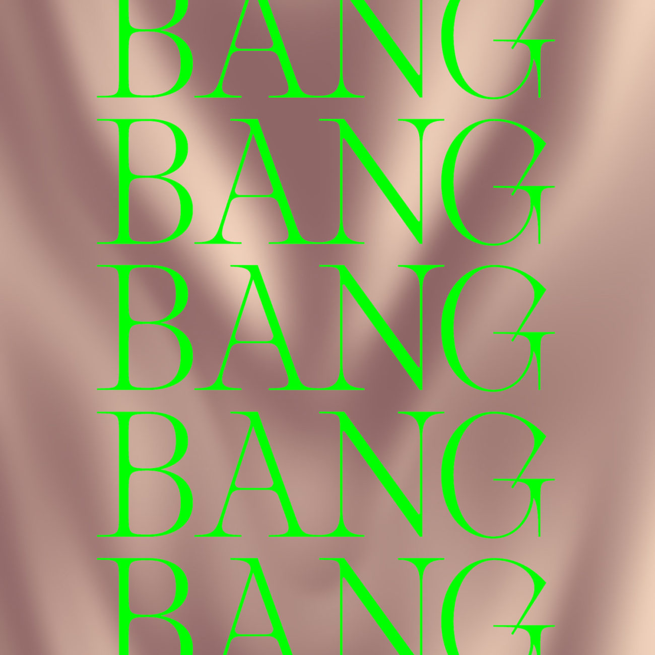
Another stunning feature of the Display typeface is its intertwining ligatures. Not only do some of the characters, such as the lower case ‘a’ and uppercase ‘G,’ fold in, penetrate and intertwine within themselves, but the ligature glyphs provide even more possibilities. Designed to tangle together – almost like a thicket – Gallique’s ligatures compliment its contrasting shapes and features in ways which are both visually compelling and satisfying, whilst lending greater depth to its conceptual undercurrent.

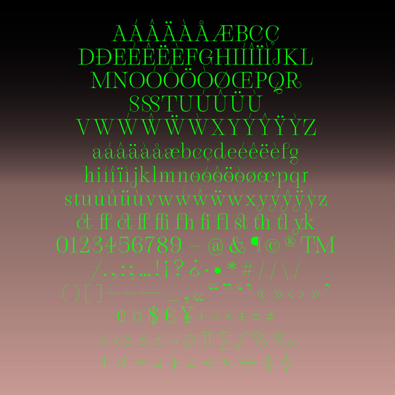
Decorative and delicate at first sight (Gallique is currently only available in Light) this typeface packs an aggressive punch. It masterfully brings together ornamental, intricate and gentle qualities with a strong, harsh edge – a masterful exploration of visuality and character. We love this typeface from Emma, and feel its display possibilities are endless. To find out more about Gallique and options for purchase, visit Type Department.


