
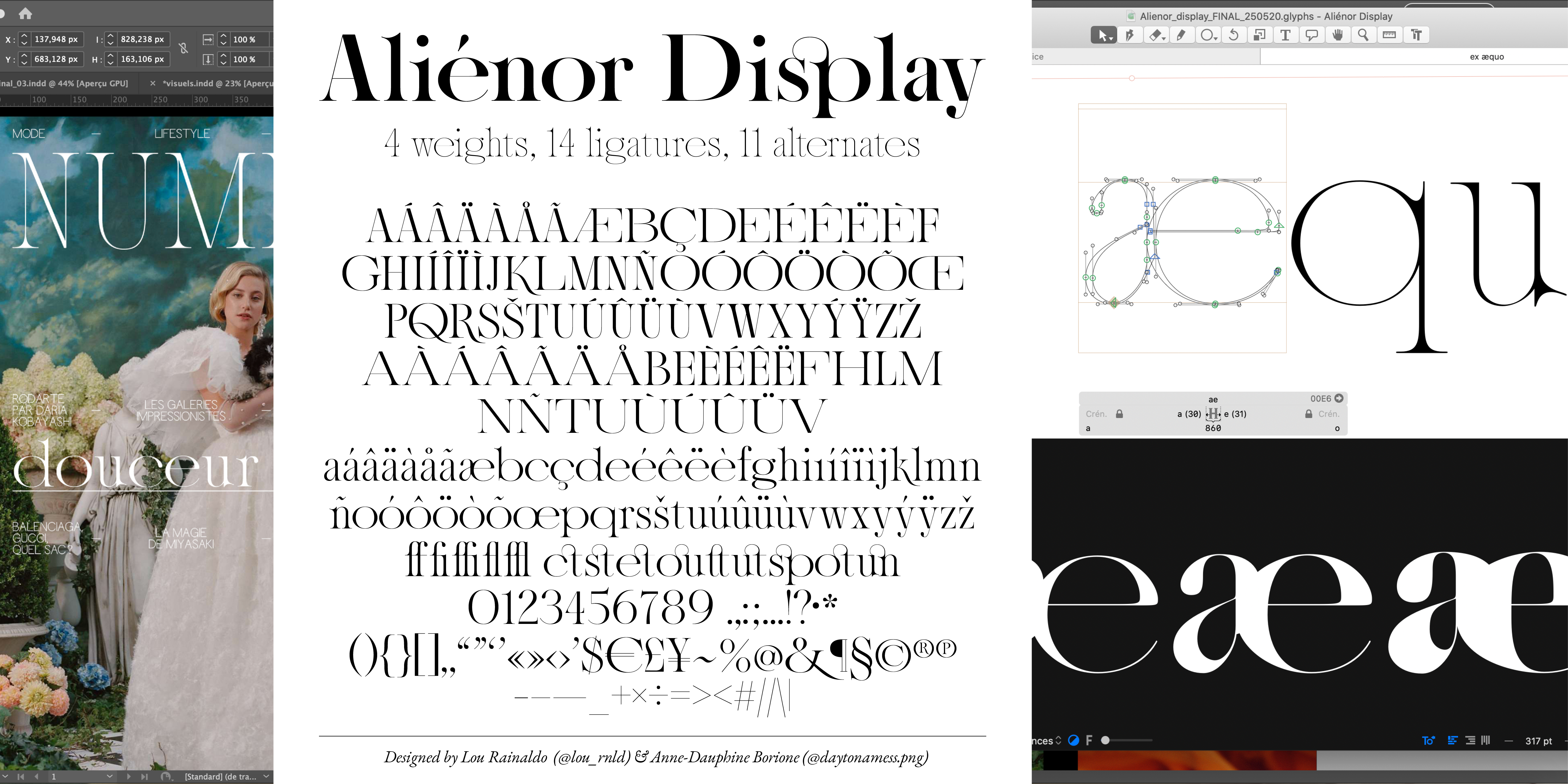
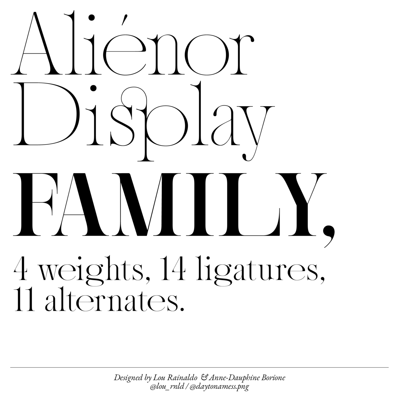
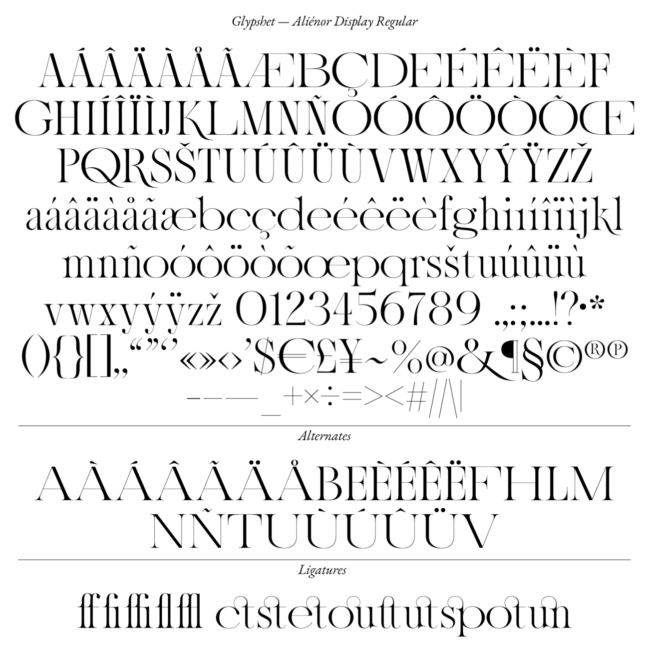
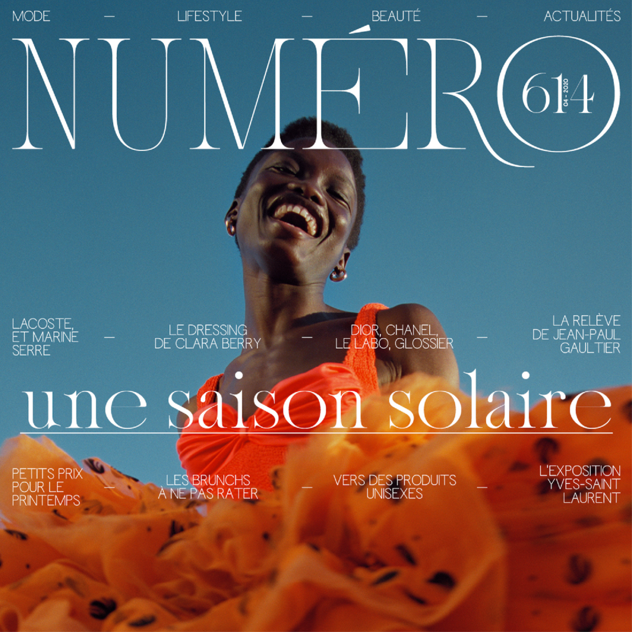
Aliénor Display, newly released on Type Department, is a rhythmic, undulating, melodic typeface with a unique and elegant character. Designed by Lou Rainaldo (@lou_rnld) and Anne-Dauphine Borione (@daytonamess.png) Aliénor Display’s wide, looping bowls and counters contrast beautifully with its relatively narrow apertures; meaning it tumbles across the page with a dynamic, almost hypnotic, sense of rhythm.
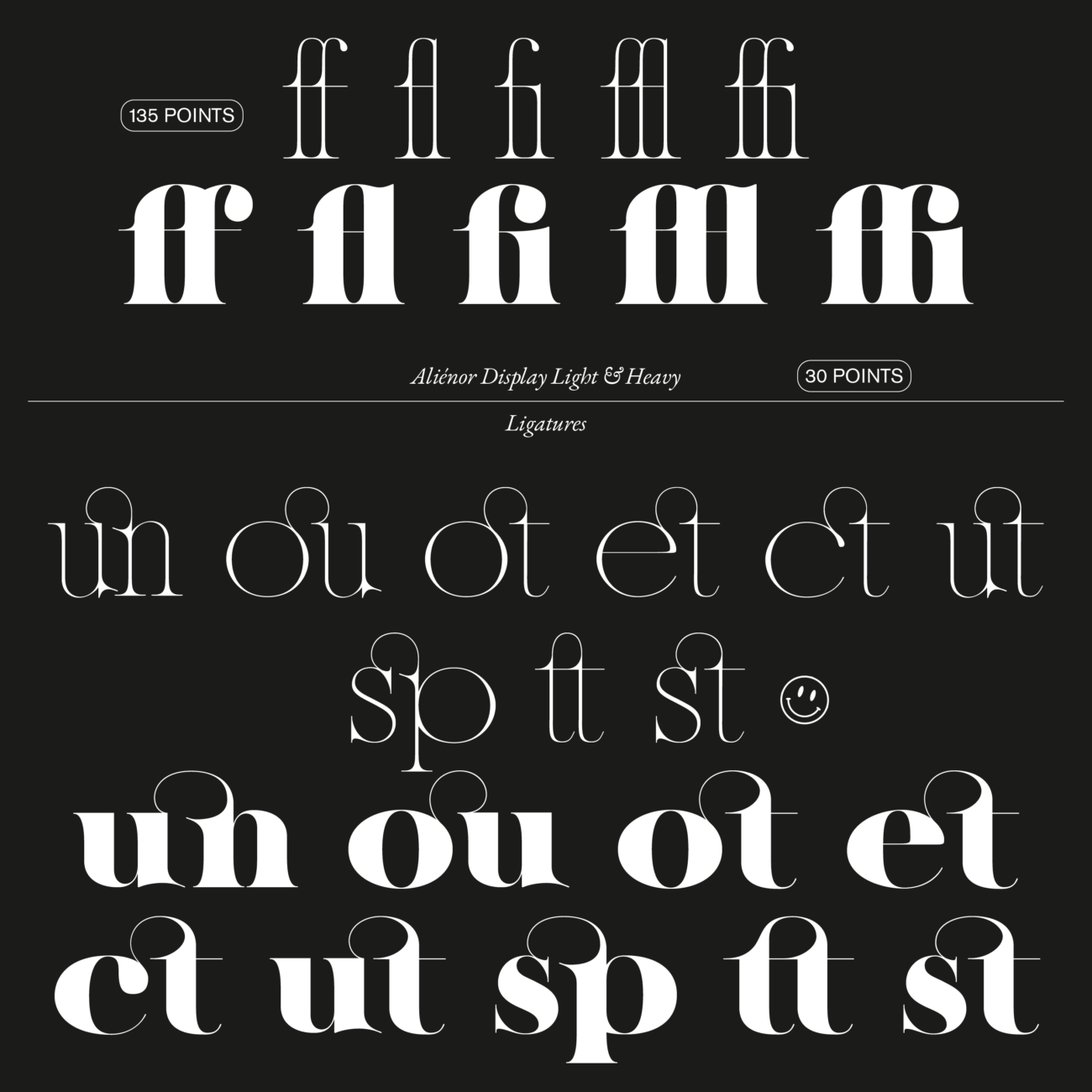
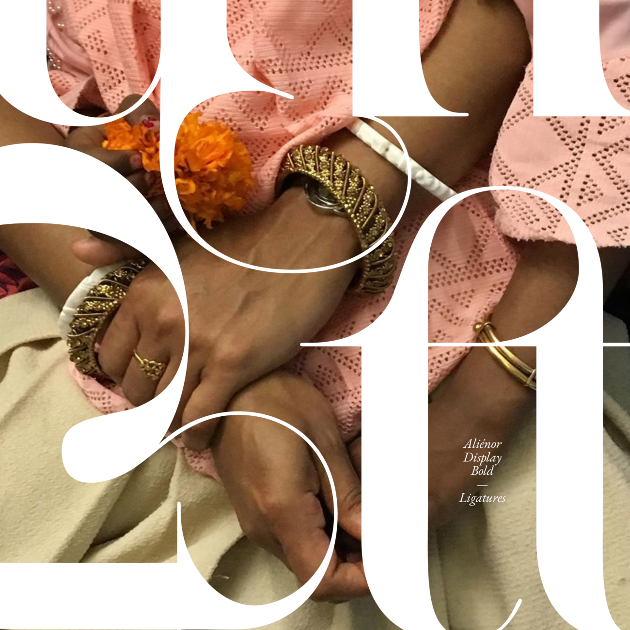
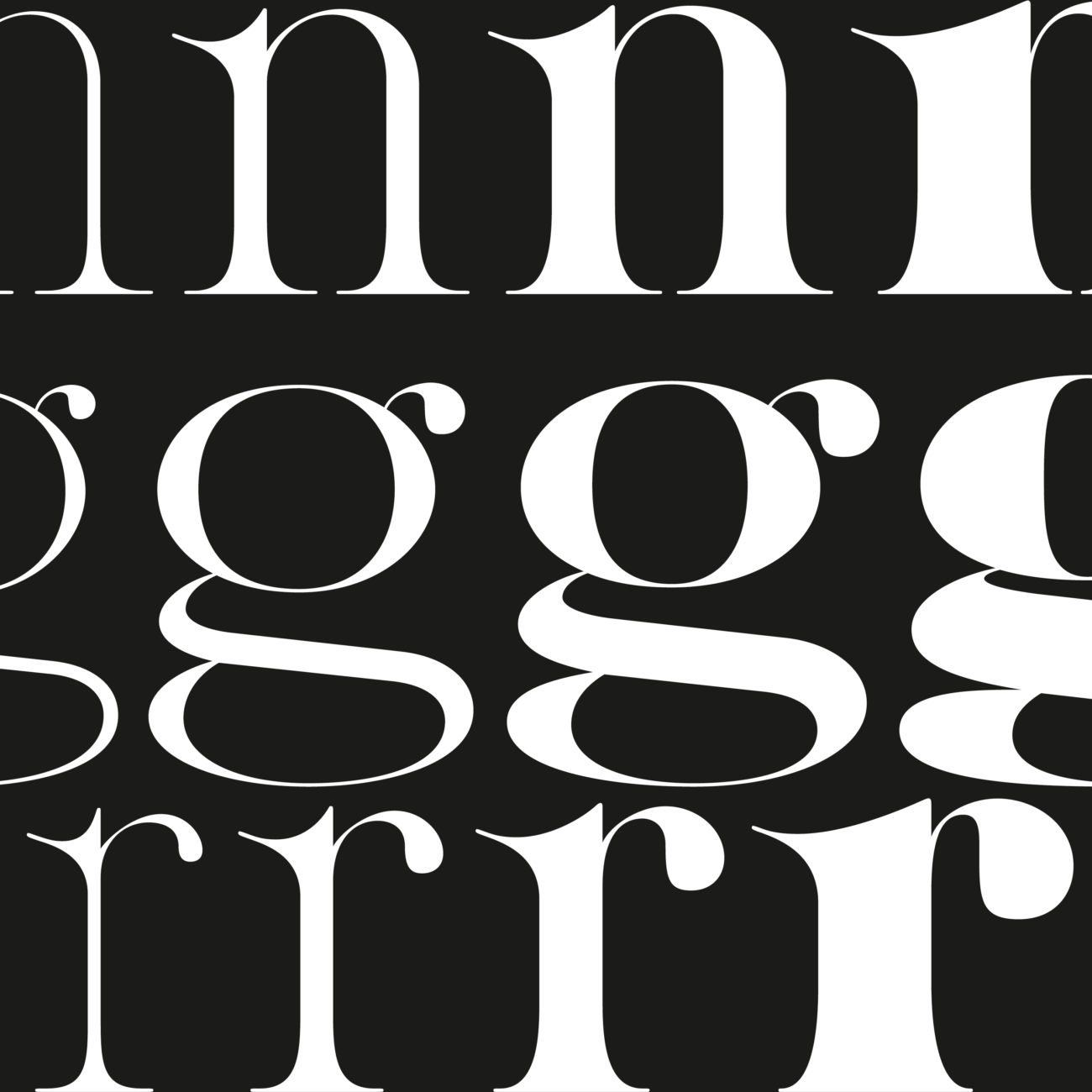
Created with the intention of conveying ‘elegance in its purest form,’ it is undeniable that Lou and Anne have delivered with their vision for Aliénor. Firstly, it is filled with unique flourishes. One of our favourites is the connections between stems and serifs, which have their own unique, characterful curvature and taught feeling of extension. Tying together these curvatures, details and contrasting widths are fixed upstrokes; which add a sense of refined uniformity to the typeface’s flowing nature.
The fixed upstrokes also mean that as the weight increases, the contrasts are accentuated; creating a transformative quality between weights. Whilst the light style radiates a spindly, fragile, yet quietly lethal elegance through its stinging, pincer-like serifs, deep apertures and wide counters, the heavy weight finds its contrasts through strong, grounding stems and a tactile, inky, letterpress feel; alongside its exaggerated width variations within the basic alphabet.
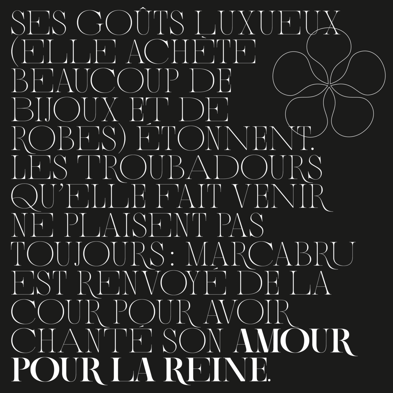
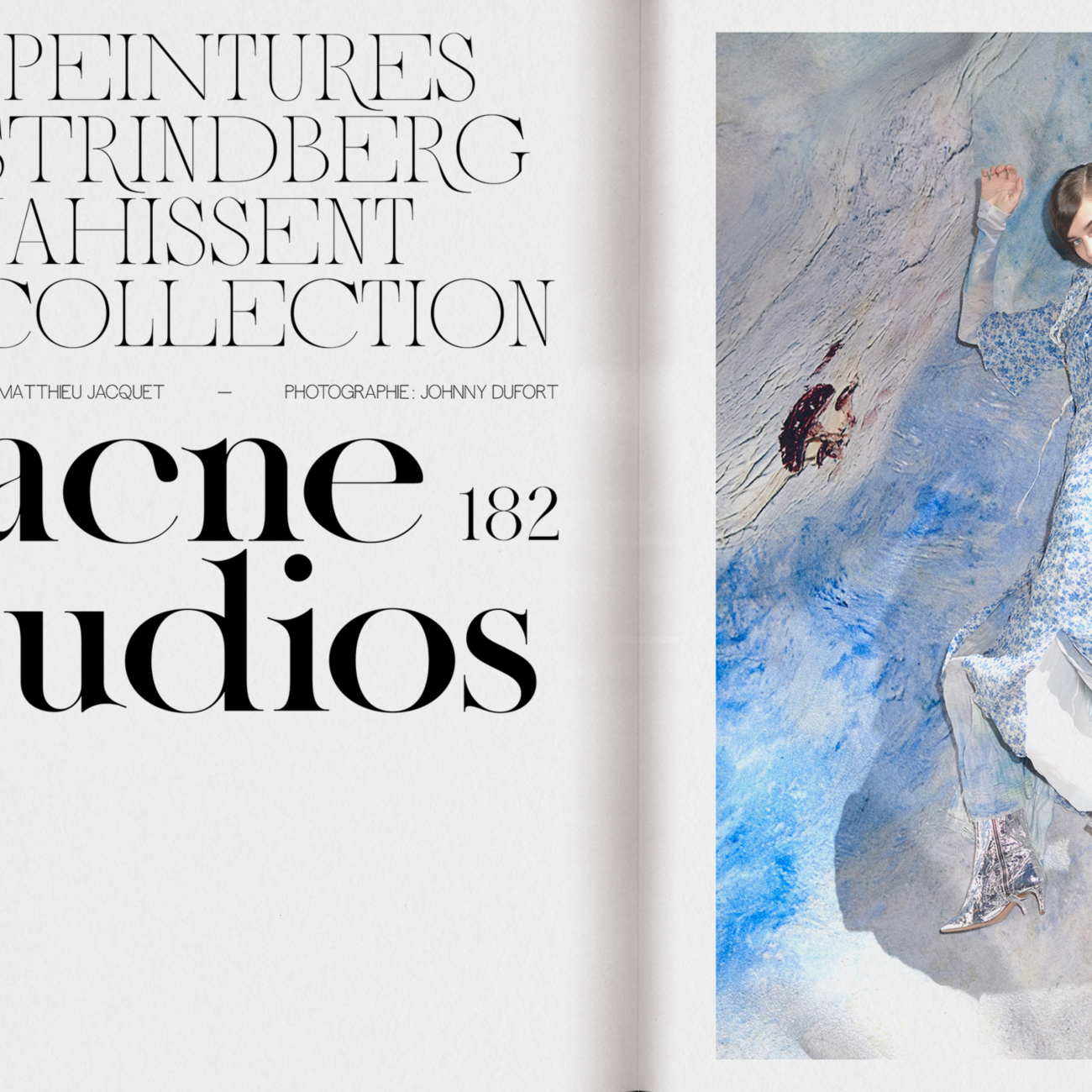
The elongated, flowing quality of the legs – particularly in the uppercase letter-shapes – also adds a stunning finish to Aliénor; making it instantly inspiring in terms of its potential display uses. These details, alongside the fixed upstrokes and consistent x-height, work together to accentuate the push and pull between Aliénor’s calm sense of tranquility, and its more expressive, unusual and ornate flourishes.
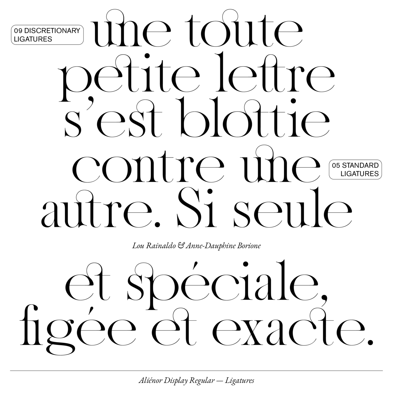
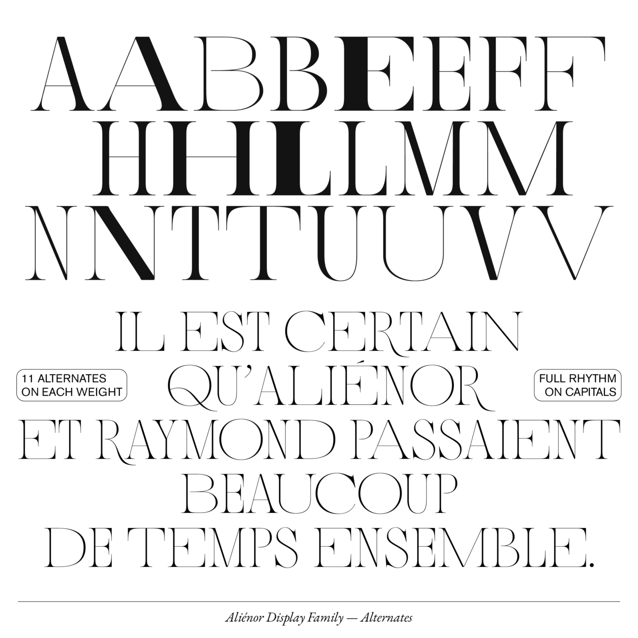
The typeface also offers a variety of alternative glyphs, so that text composed from capitals alone can emulate the same elegance and harmony as the lowercase characters. Its many additional ligatures also provide the opportunity for further versatility, as well as the ability to alternate between wide and narrow widths on eleven letters. The overall aesthetic of Aliénor almost feels akin to sheet music, and its carefully devised contrasts and consistencies mean that its individual character can shine through whilst being accessible, calm and easy on the eyes.
To find out more about Aliénor Display, visit Type Department.


