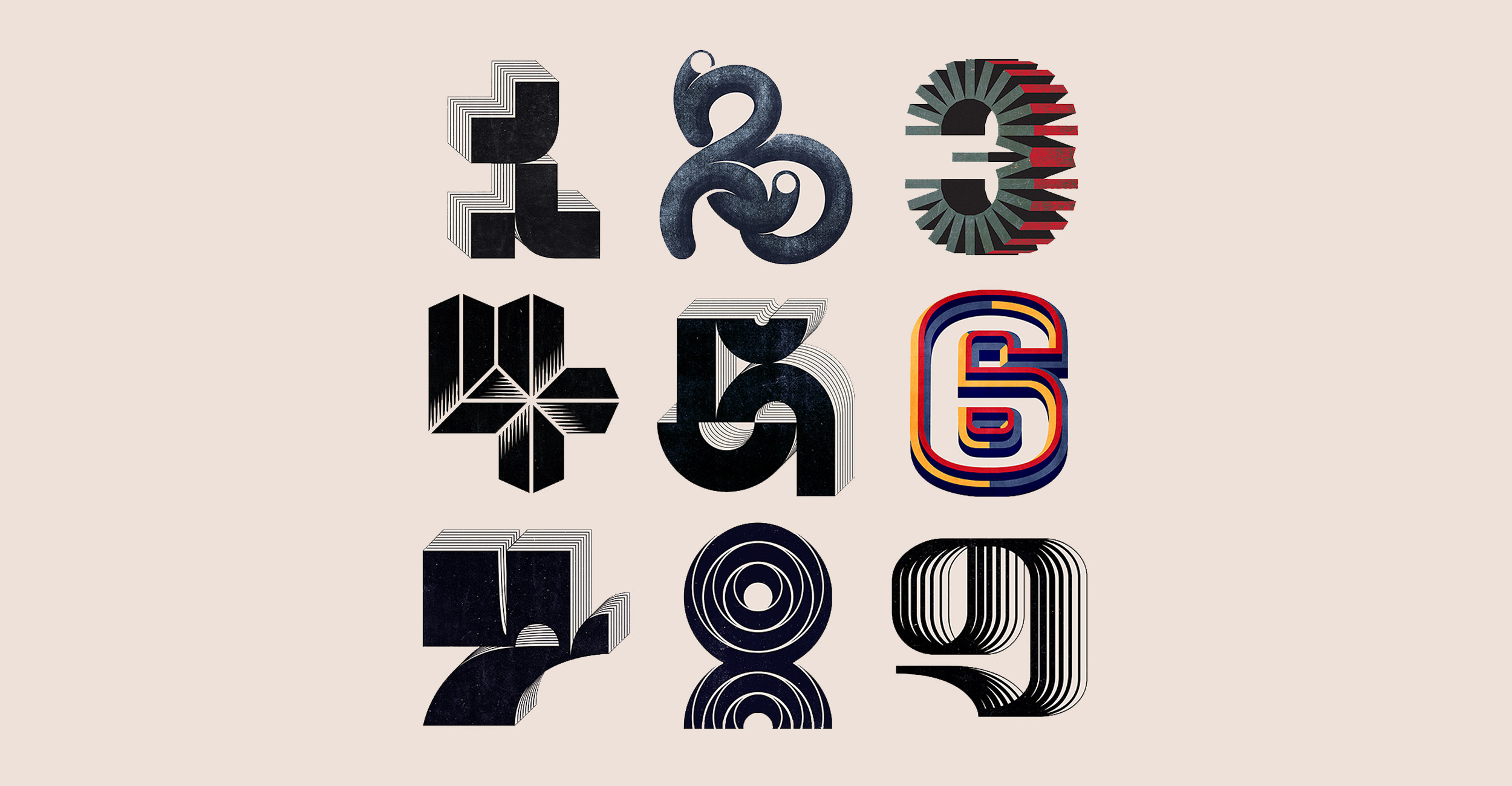
Belgrade-based Illustrator and Graphic Designer, Aliza Burzic (@alisaburzic) creates stunning letterforms and symbols with a dynamic and compelling approach. Recently, she has been sharing her 36 Days of Type series. Showcasing a range of eclectic and fascinating designs, each of her letterforms is surrounded by a unique, charismatic aura – so, we felt the series deserved a bit of a closer look.
Whilst all of her 36 Days of Type pieces are striking and unique in their own ways, Alisa’s illustrative touch runs throughout each of them; knitting them together with her own aesthetic and a textural, refined visual language. Using Instagram as the immediate platform to showcase this series of work, her confident mastery of composition feels evident straight away.
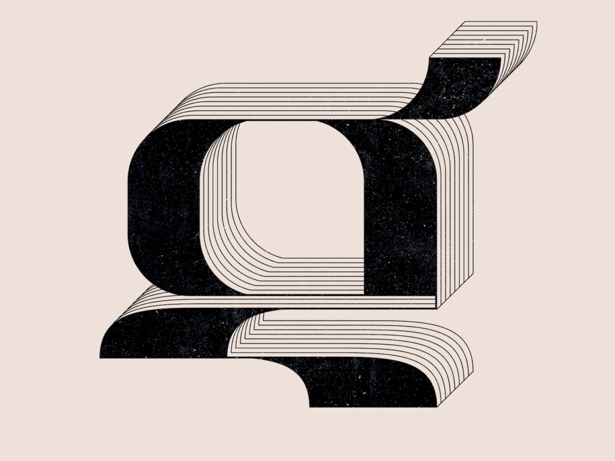
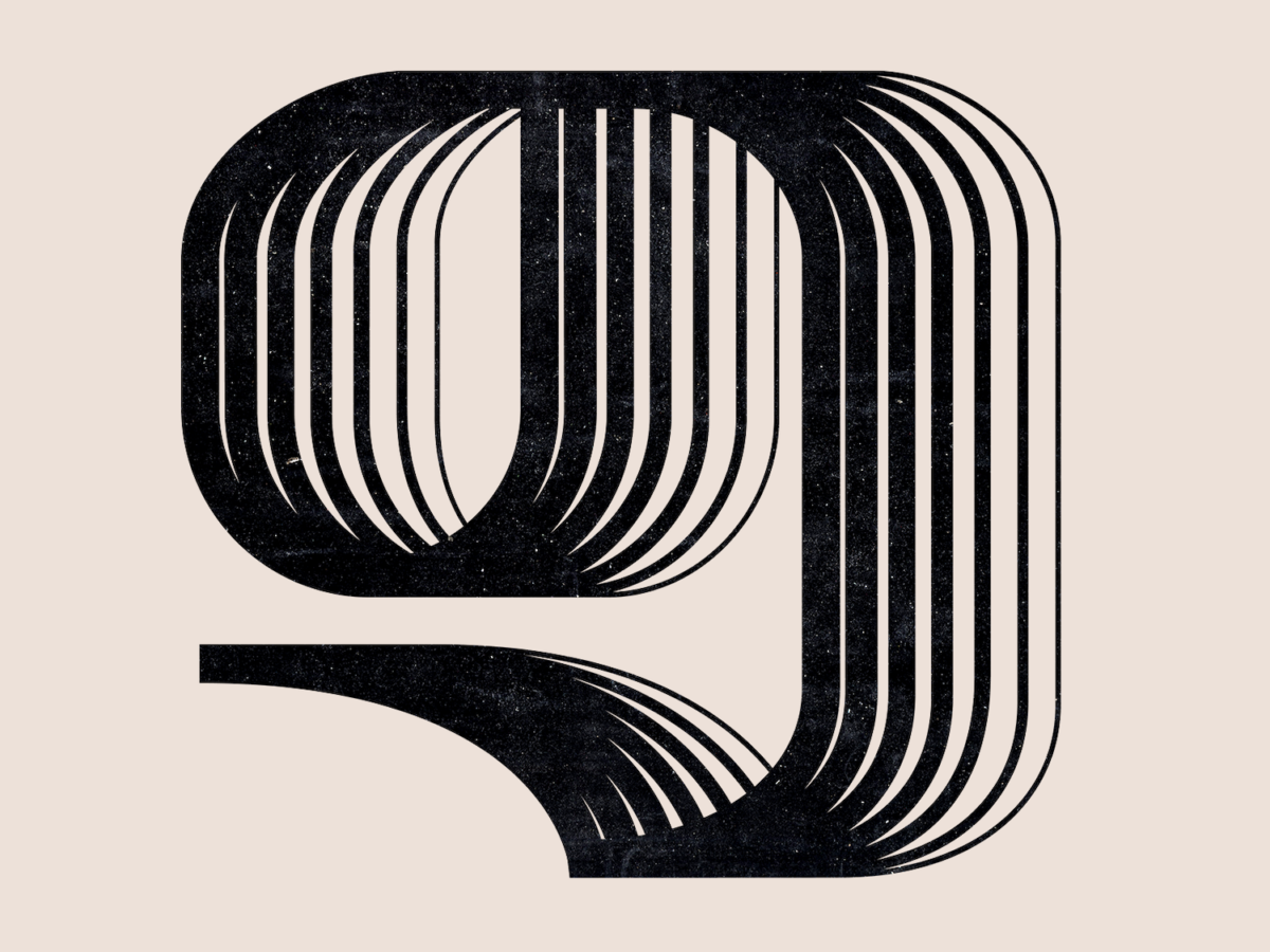
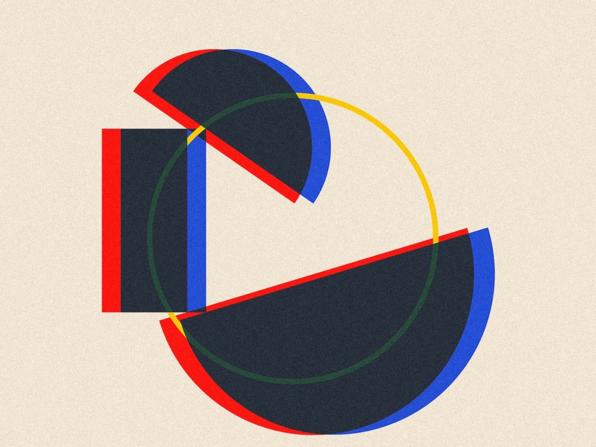
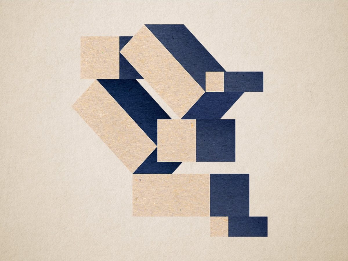
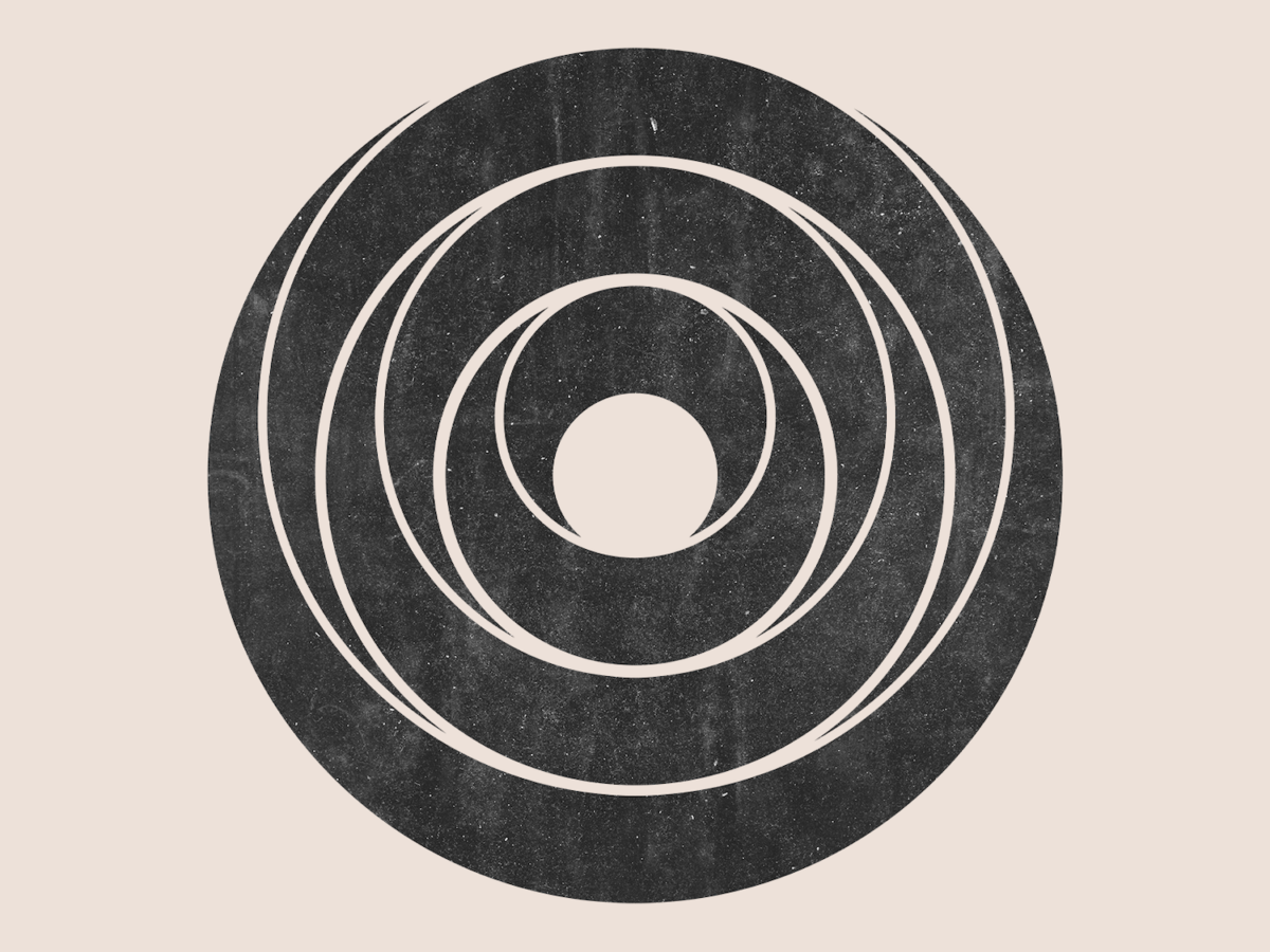
Within the square format, Alisa frames her work with purpose; each design feels comfortable and perfectly balanced in in weight, tension and movement in the conforming, tiled format. This varied and dynamic compositional use of a singular, uniform space – especially in Alisa’s manner and frequency – is a joy to behold.
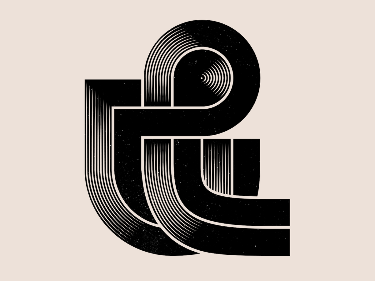
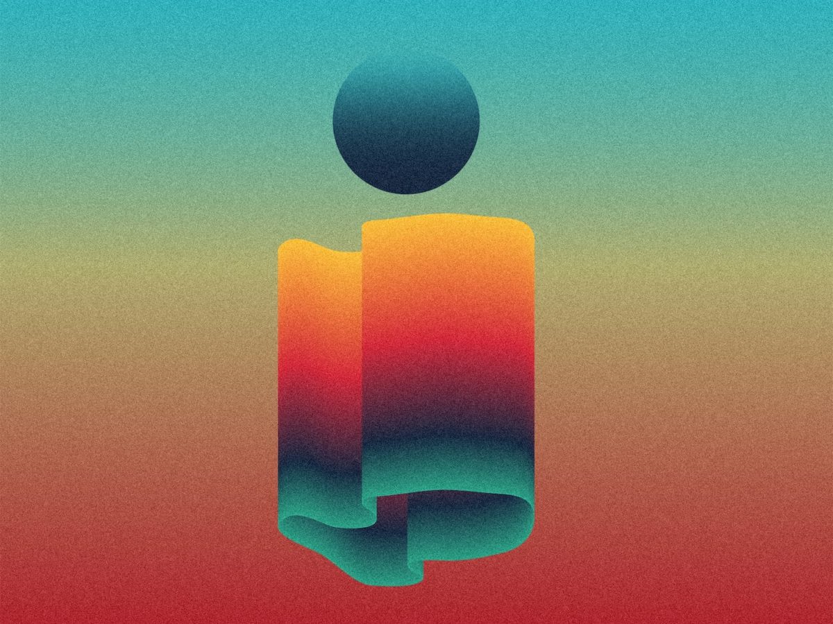
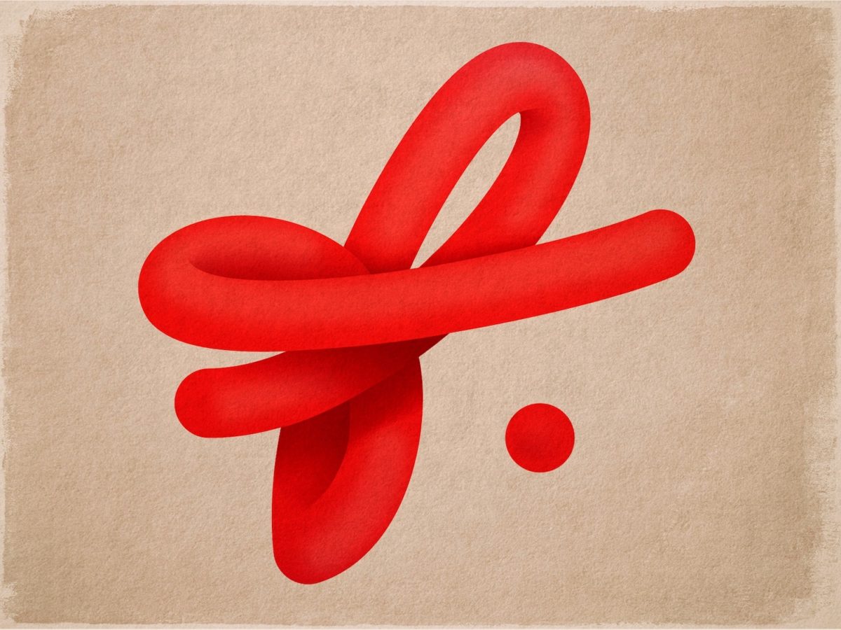
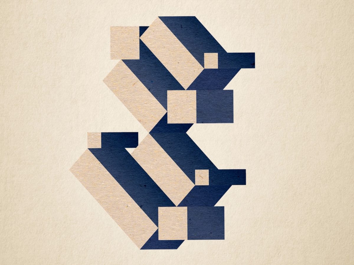
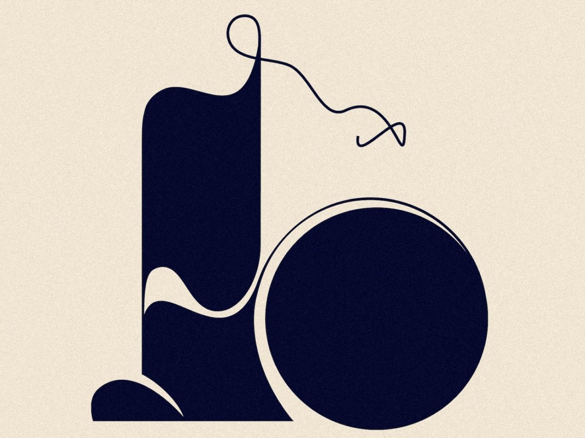
Characterised by bold, graphic shapes, each of the designs emerges through a granular, textured finish and – though her designs are often monochrome – her use of colour generally leans towards deep and dusty tones. Whilst these qualities conjure up a feeling of nostalgia, and an aesthetic reminiscent of the tactility of the letterpress, Alisa’s cubic approach to construction and fluid, curved shapes contrasted with squared terminals brings a touch of the futuristic into the equation.
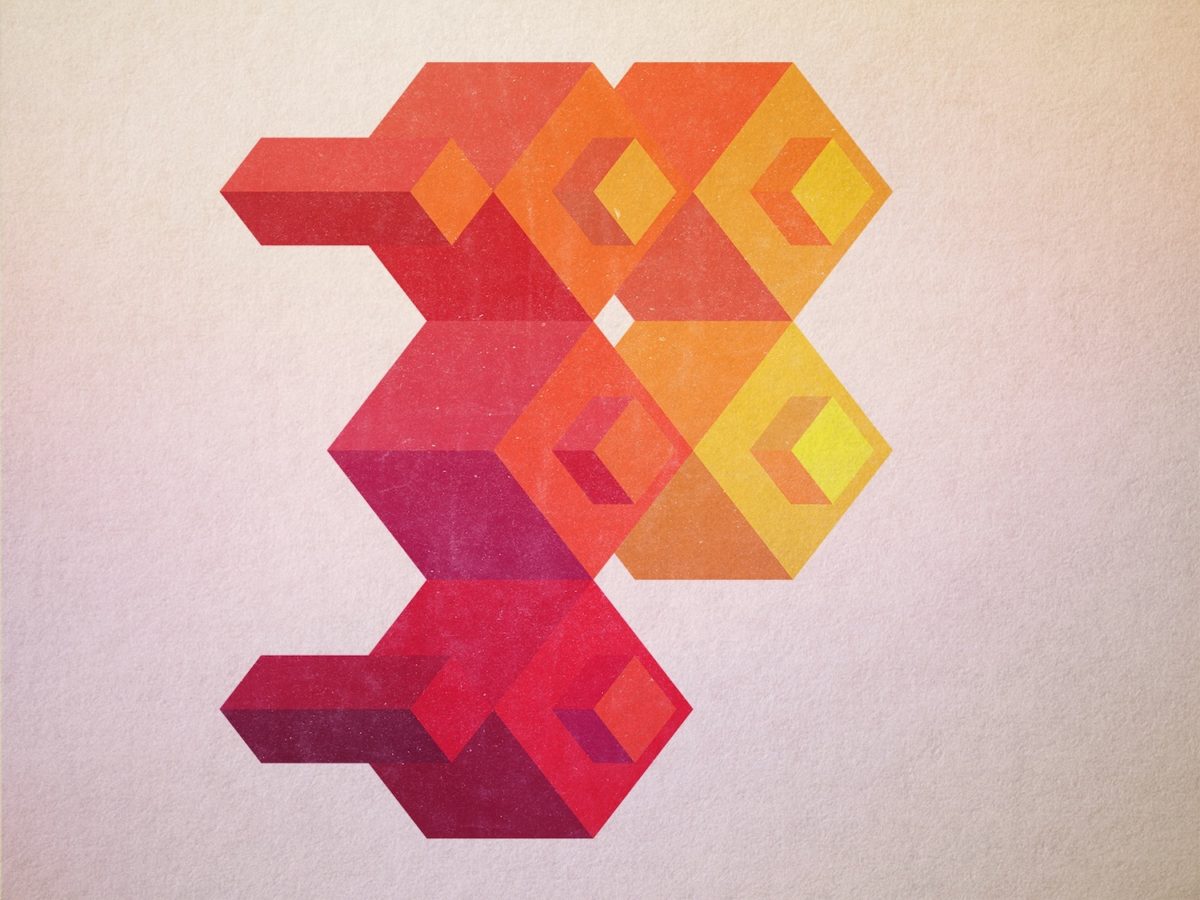
Another exciting element in Alisa’s 36 Days of Type series is the meticulous attention she lends to shadow, colour and light. Breaking the letters down into their nuances and modules in a way which almost boarders on abstraction, Alisa uses her sharp, illustrative grip of shadow, light and colour to accentuate the authentic breadth of character and possibility within each of the letterforms. In this way, the series as a whole feels like a granular breakdown of all the different nuances and character found within typographic design; as well as the expansive possibilities which appear when we pay attention to these specifics within different letterforms and glyphs.
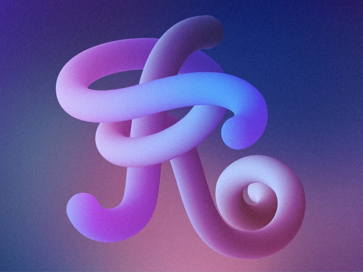

Though predominantly exploring Latin shapes, Alisa also exhibits works inspired outside of the Latin alphabet, through her broad calligraphic influence. Present in almost all of the individual pieces in some form – often in the different proportional weights of the line work, or in terminals which specifically mirror calligraphic makings – these details imbue each design with a dimensional, sculptural quality.
Alisa’s attention to detail and nuance throughout this body of work creates a sculptural, architectural, deeply artistic series. It is as if each individual piece is a monument to the letterform it depicts; in the sense that it actively explores and expands the possibilities and limits of the form in question. We love this body of work and highly recommend that you take a closer look!