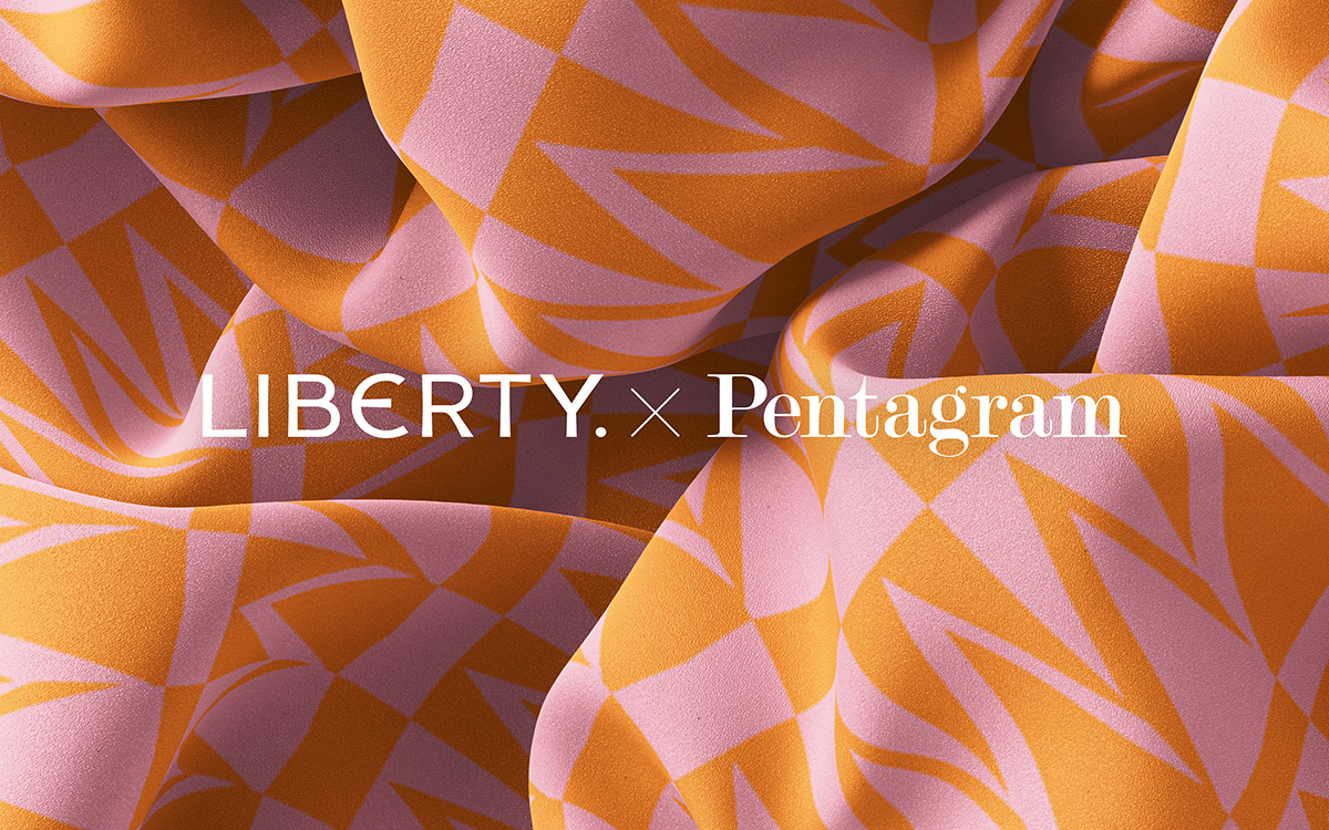
Liberty Letters is a bright explosion of colour and typography, marking the longstanding collaboration between Pentagram and Liberty.
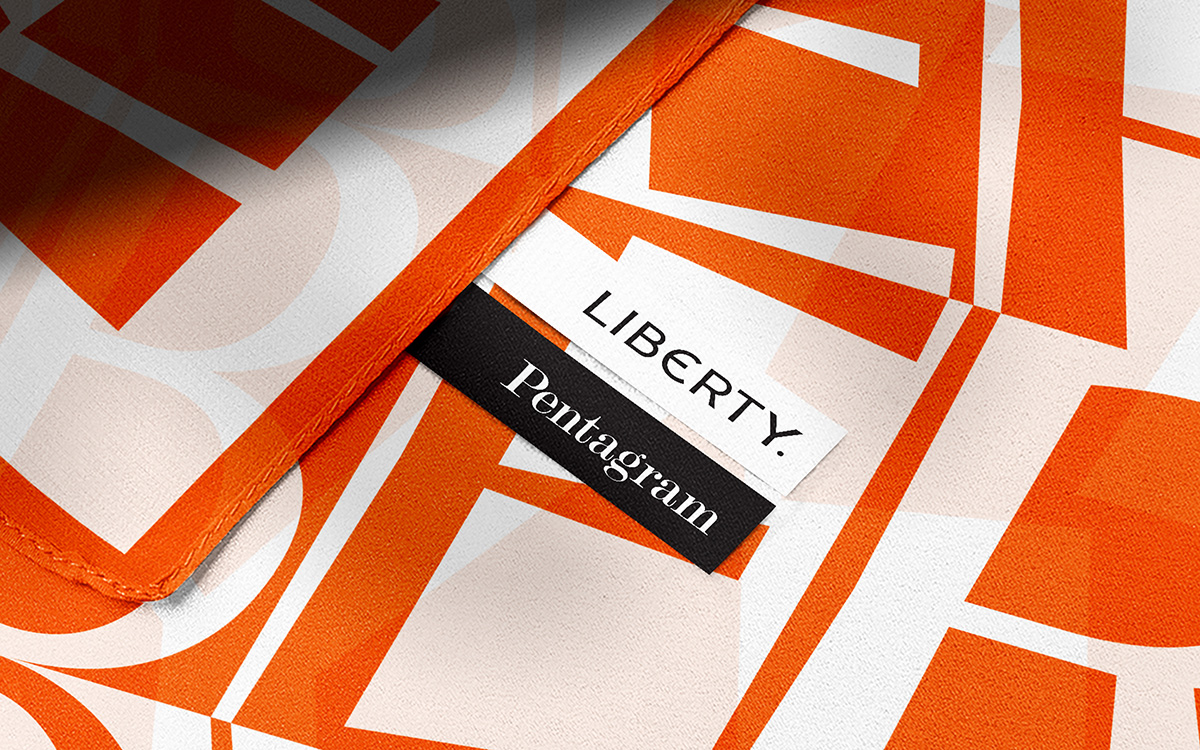
Since 1875, Liberty Fabrics have been at the forefront of British design and decorative arts. Synonymous with high-quality contemporary design, the luxury department store has garnered a reputation for its homeware, clothing, and, most importantly, its fabrics. They’re pleased to unveil their latest collection, the outcome of the collaboration between Liberty’s team of textile designers alongside Pentagram partner Harry Pearce and Associate Partners Johannes Grimmond and Tiffany Fenner.
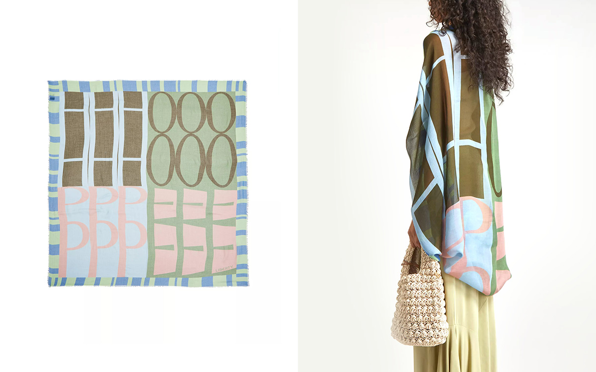
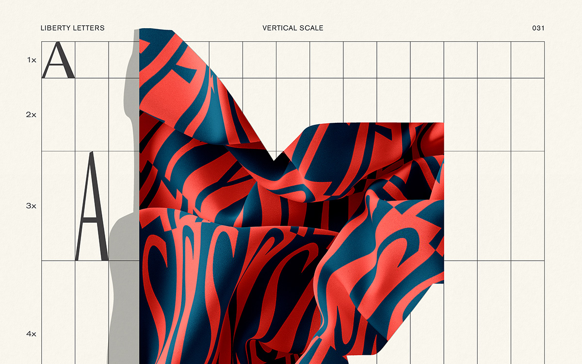
For context, Pentagram had been working with Liberty for several years on a complete re-imagining of the Liberty brand — an expressive new direction that also pays tribute to Liberty’s history. One key component of this was the new logotype, adapted from lettering in the original sign above the Great Marlborough Street storefront. And from there, they built an entire custom display typeface in partnership with Colophon type foundry: Lasenby Sans.
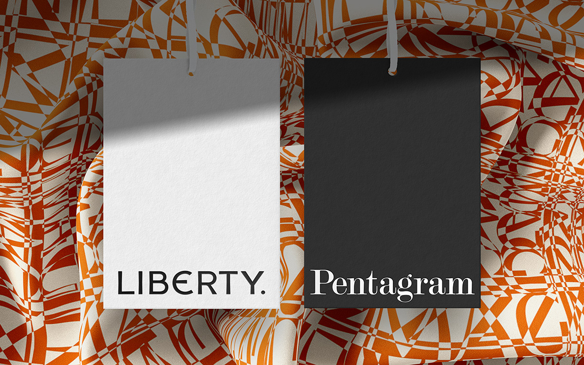
The starting point of Liberty Letters was a brief from Liberty Fabrics Design Director, Mary-Ann Dunkley, which invited play without a specific or strategic outcome in mind.
“Johannes and I had had thoughts right from the inception of the identity, of a font that could be an expressive tool for Liberty” Pearce explains. As a jumping-off point, he notes that concrete poetry and Dada typography provided useful references in the form of their attitude and approaches, rather than visual cues. “I created and gathered sketches and Johannes ran with it from there,” he continues. “We were in constant discussion pushing and pulling ideas around together. Johannes created all the final iterations of the typographic designs.”
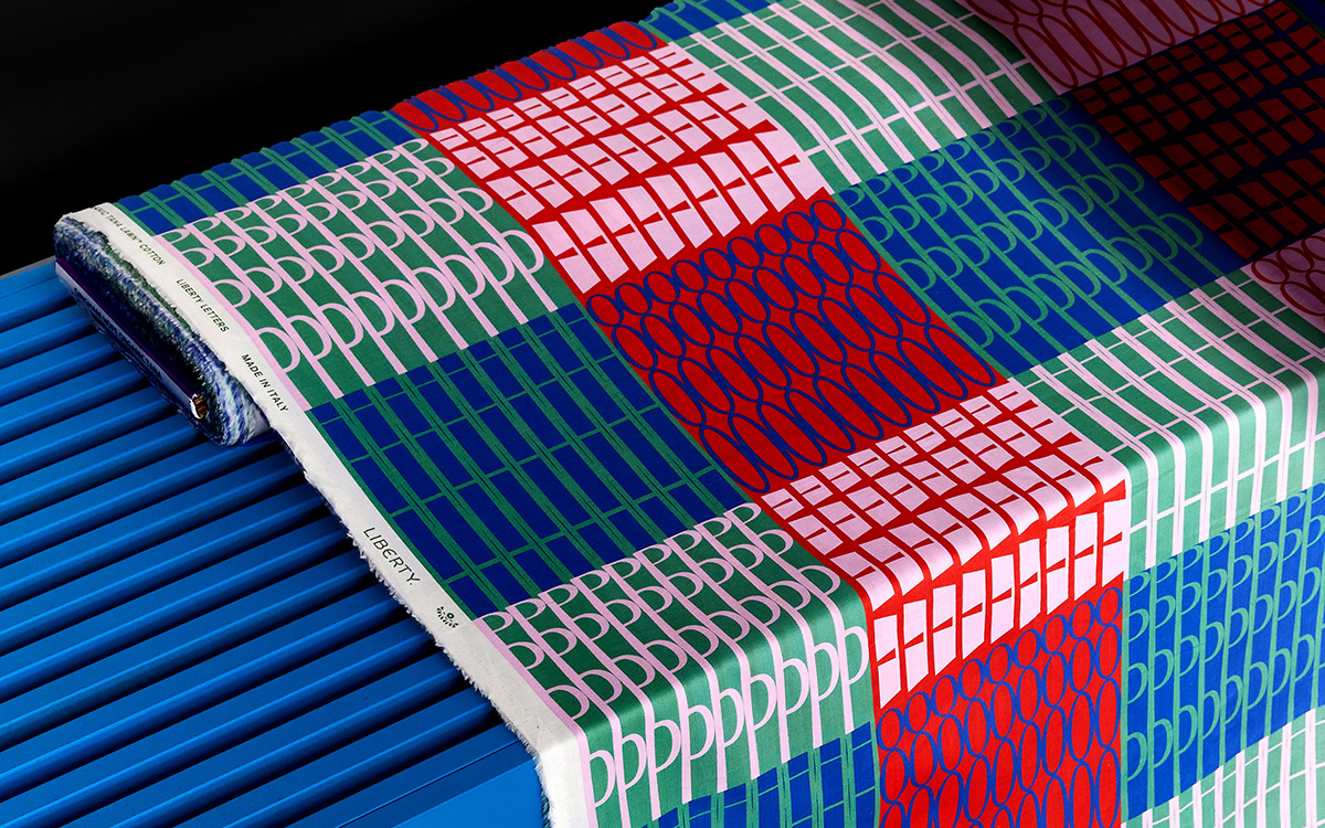
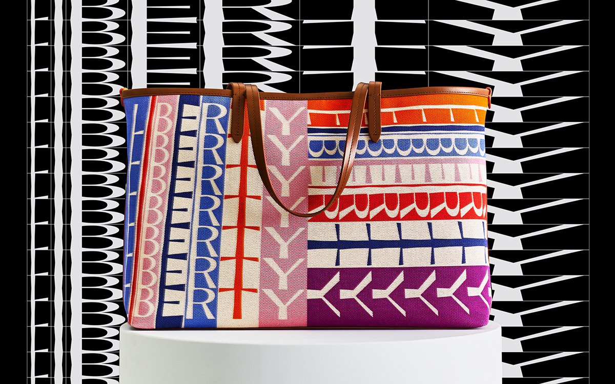
Embracing the ‘unapologetic eccentricity’ at the heart of Liberty’s manifesto, the team manipulated and repeated the forms of the Lasenby Sans alphabet, creating an array of effects resembling the geometry of abstract patterns. “Following our initial research and discussions we explored a wide range of approaches, from heavily grid-based designs to more free-flowing, abstract compositions,” Pearce and Grimmond explain. “Many of the patterns are based around a simple set of rules that determine things like the scale, angle, position and weight of the typography — changing and combining these rules allows for a huge amount of variation within the final designs.”
During the initial design development, the team focussed purely on black-and-white compositions. And once these were edited and refined, colour was introduced – resulting in the eye-catching designs on sale today.
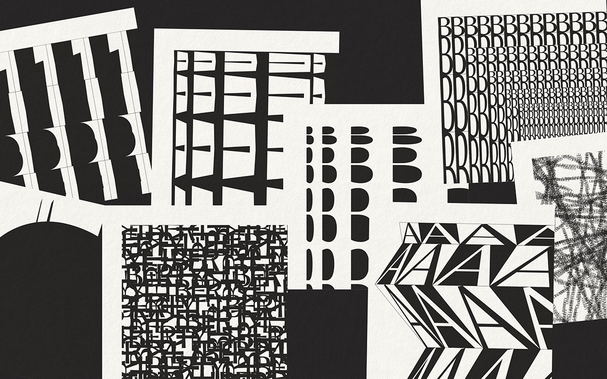
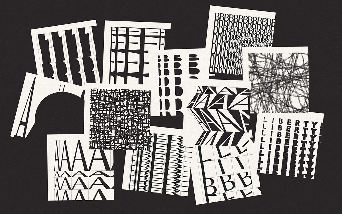
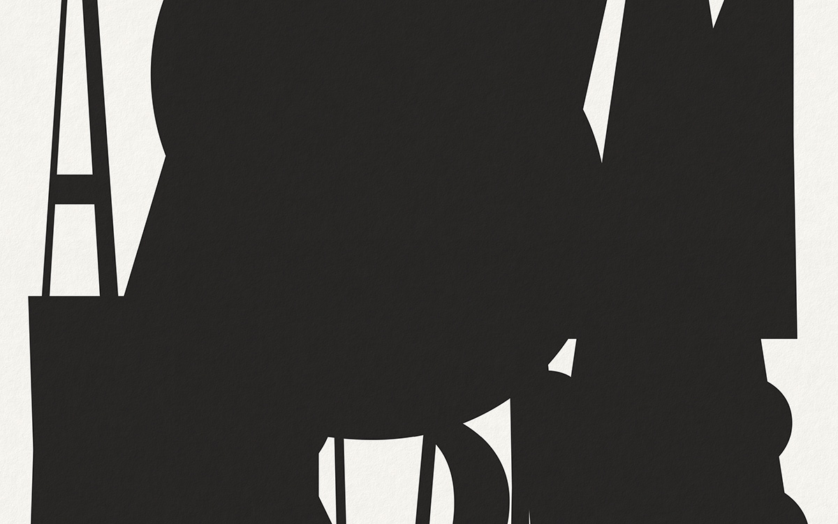
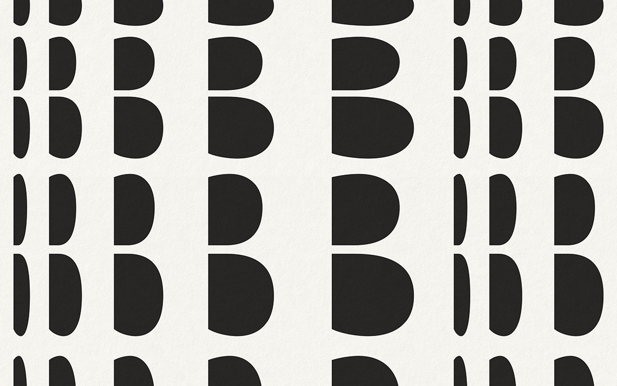
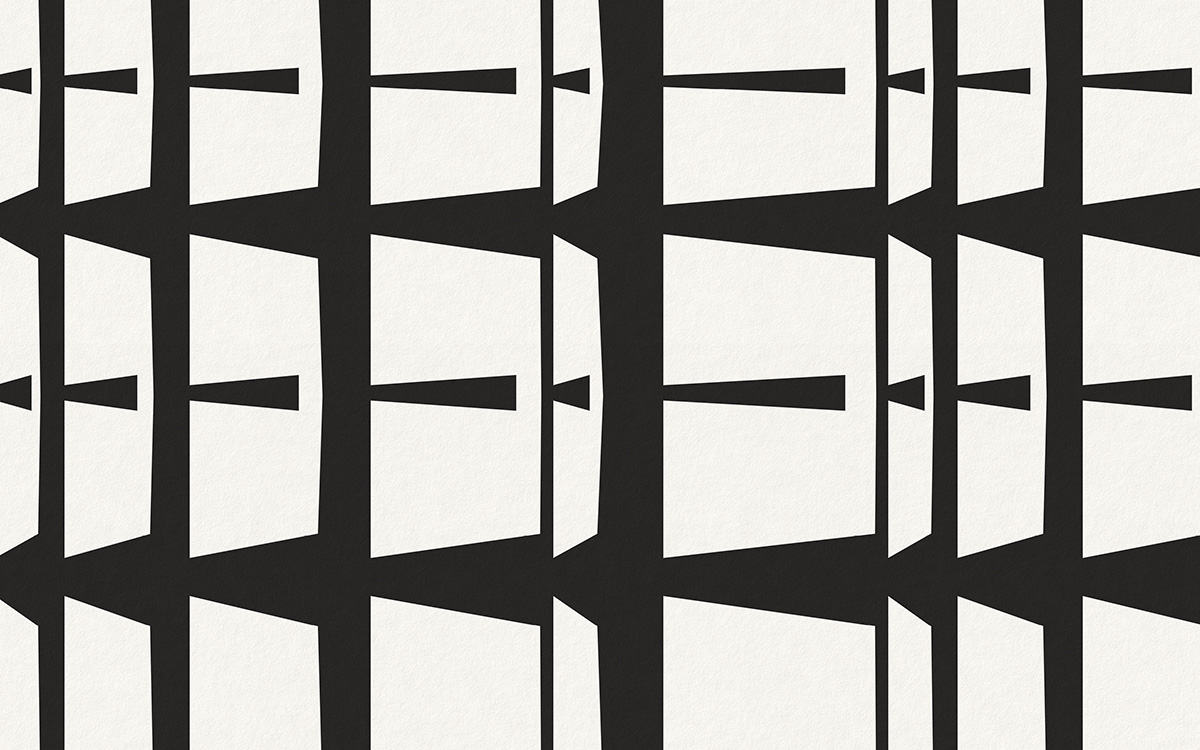
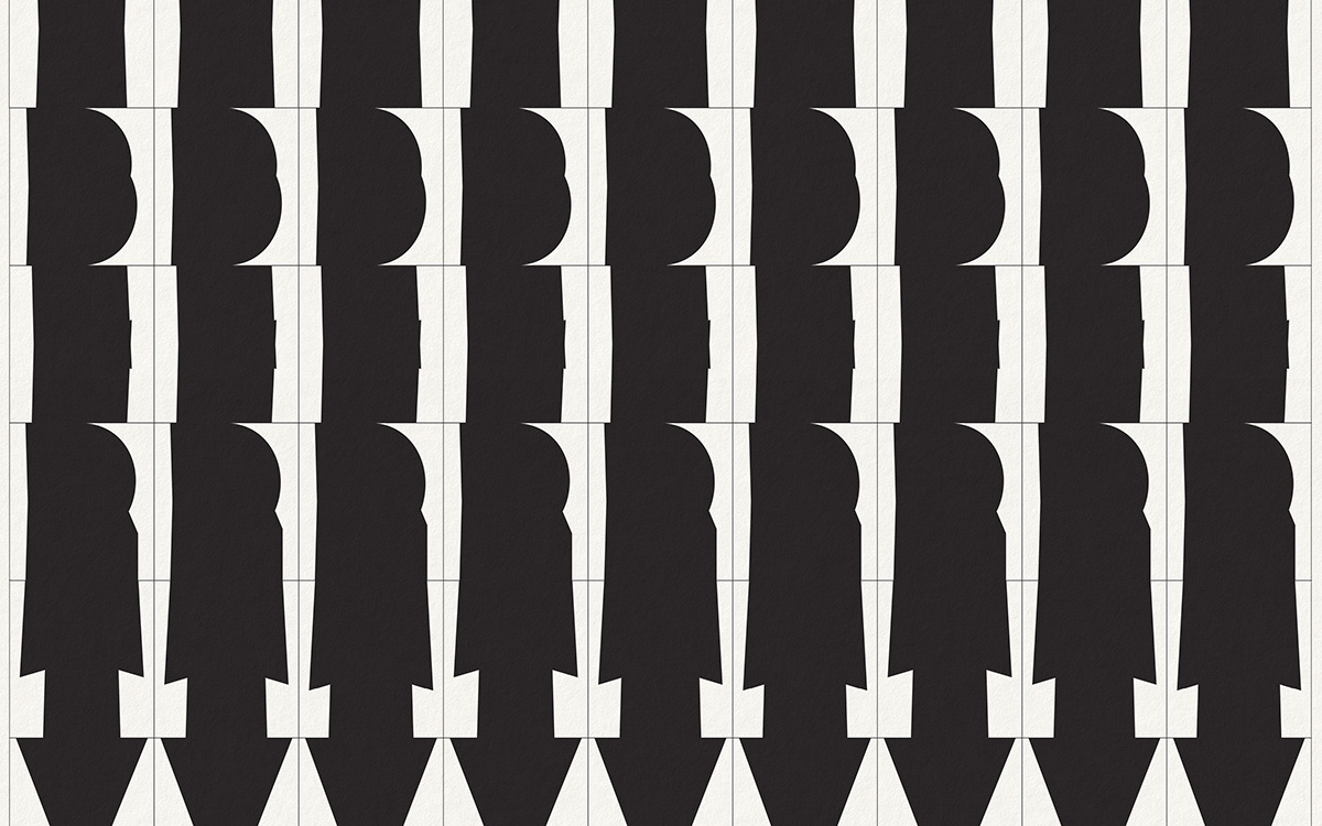
Throughout the project, were Pearce and Grimmond drawn towards any specific letters? “It’s really enjoyable when we work with the pure alphabet and abstract rather than the written word Liberty,” they respond. “As to the letterforms themselves, it’s impossible to choose. The more abstract the final result the better.”
The project boldly represents the expression of the brand and its versatility across fabrics and product outputs; from the lightweight sheen of silk to the heavier woven fibres of coats and bags. “We were so happy to see that our original vision and intent was completely intact when transferred into the fabric patterns and that what began as scribbles and abstract thoughts could build into something so complete and real as flowing fabrics,” the pair says, reflecting on the finished collection.
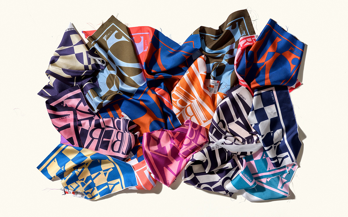
The Liberty Letters range launched with a special silk scarf created for 2023 Pride — showcasing the colours of the Progress Pride flag — in addition to a selection of fabrics and accessories exclusive to both Liberty’s online shop and London store. Pentagram have revealed that there are plans to expand the Liberty Letters collection in the future.
Pentagram.com
libertylondon.com
Read more graphic design and typography features here.

