
Following a long – somewhat roundabout – yet ultimately inevitable path, Marie Boulanger’s (@mariedansparis) passion for typographic design is finally taking centre stage in her fascinating, wide-spanning career. An independent French type designer currently based in London, Marie is working with various foundries and agencies on custom letters and typefaces for plethora of different projects. As the creator of some of our current favourite type design ventures, we got in touch with Marie to discuss the twists and turns of her paths into type design; and to delve deeper into the creative processes behind some of her most exciting releases to date.
‘Type design didn’t come quickly to me: it was a long road,’ Marie tells us, reflecting on her journey between first studying Linguistics at University College London to finally finding her place in the typographic world. Without the presence of an art and design practice in her day-to-day life, Marie explains that she felt unfulfilled. She decided to take the plunge and move to Paris to study at École Estienne, where she began to nurture her creativity through a BA in Graphic Design.
However, even during her studies in Paris, Marie remembers a hazy feeling around the recognition of her desire to pursue type design specifically; as she recalls: ‘I remember feeling inexplicably drawn to letters… I moved house recently and stumbled across an old sketchbook from 2015. There were pages about an exhibition on Diego Velazquez’s paintings in Paris. The only thing I drew in there was the titling type from the exhibition. The diacritics were heavily exaggerated and I wrote « theatricality » next to my sketches. At the time, I would never have said I wanted to be a type designer, but all the puzzle pieces were already in place.’
After studying in Paris, Marie moved to Brighton to work in publishing for a year which, in the end, finally shifted her trajectories towards typographic design. ‘One day, I was working on the cover of a typography book and it hit me: I didn’t want to make the cover for it, I wanted to be in it,’ she explains, ‘…this realisation finally took me to an MA in Art Direction & Typography at ECV Paris, where I was able, at long last, to take a deep dive into crafting letters.’ This deep dive has resulted in some stunning bodies of work from Marie, but we discussed her journeys in creating Faubourg, Vulva and Euphorie in particular.
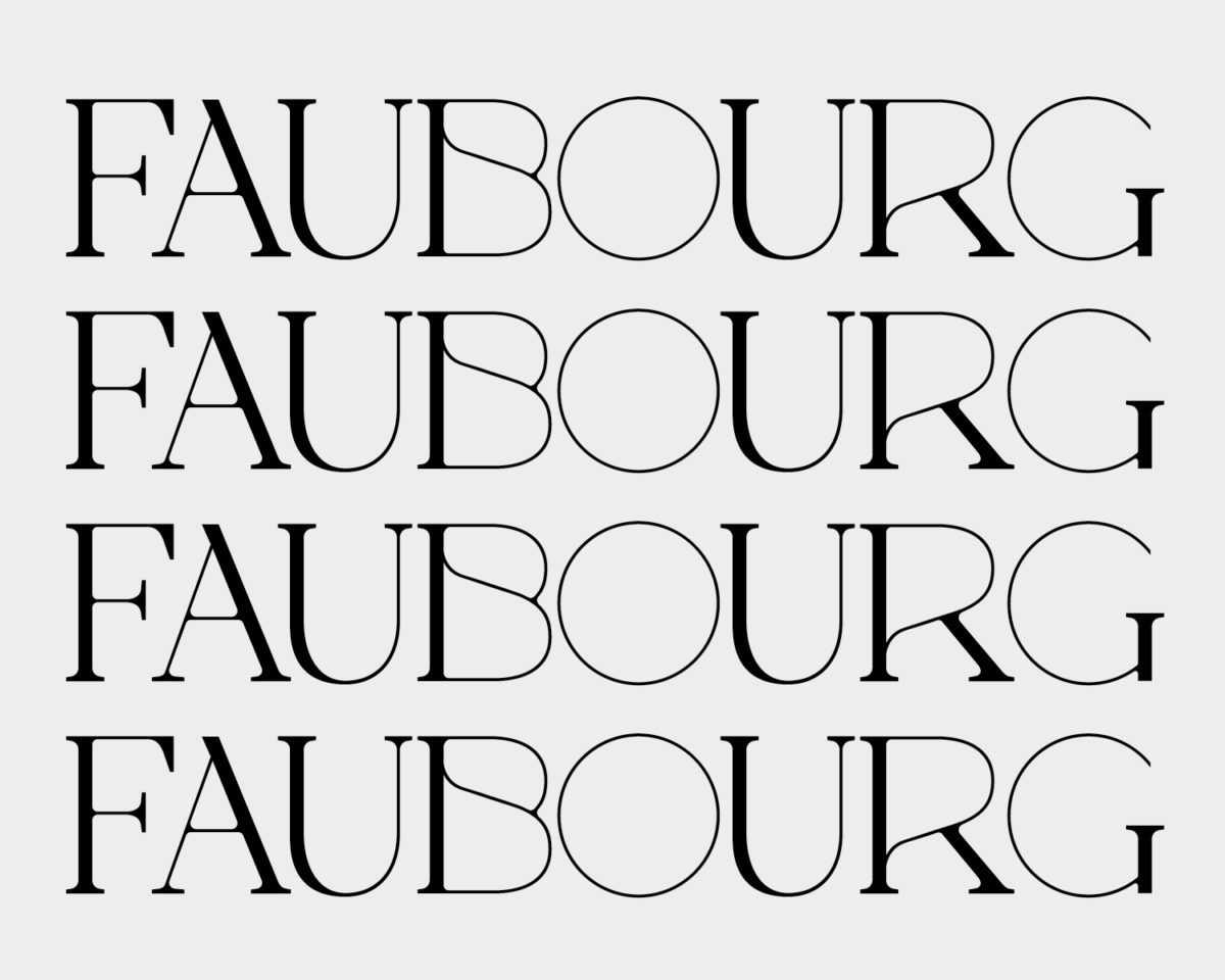
Faubourg Display
Daring and elegant, Faubourg Display mirrors a combination of the best French Art Deco titling, with high contrast, eighteenth century serifs. Highlighting that Faubourg is still undergoing conceptualisation, Marie explains, ‘With type design you don’t design letters, you design systems… and if your system concept is flawed then your letters don’t stand a chance.’
‘The origin of Faubourg is a mixture of very different things, but mostly a constant exploration of my parents’ library since early childhood, a deep love of vernacular letterforms, and a personal publishing project,’ Marie continues. Reflecting upon the way Faubourg has helped her to recenter her typographic practice, Marie explains that the project was initially born out of a desire to have some breathing space from type, and to work more illustratively. However, of course, these beginnings ultimately lead her to create the custom typeface. In this evolution, Faubourg distilled and clarified for Marie the balance of both freedom and constraint inherent in type design which, at its core, is perhaps what makes typography so attractive to her. Ultimately, the project served to circle her work back towards type design; but with a greater understanding of what she wanted to focus on and centre within her typographic practice. ‘For once,’ she tells us, ‘I can care a little less about legibility and more about visibility, which I am thoroughly enjoying.’
Vulva
‘If the message and thought behind Vulva aren’t clear enough,’ Marie asserts, ‘then my job isn’t done yet.’ On the back of years of thinking and researching the relationship between design – specifically type design – and intersections of gender-based discrimination, Vulva, Marie explains, arose out of a ‘visceral reaction to the news that Roman Polanski (a convicted child rapist and pedophile) would receive a César, France’s equivalent to Oscars.’
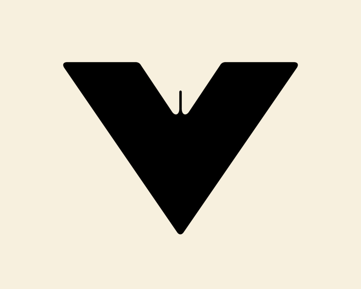
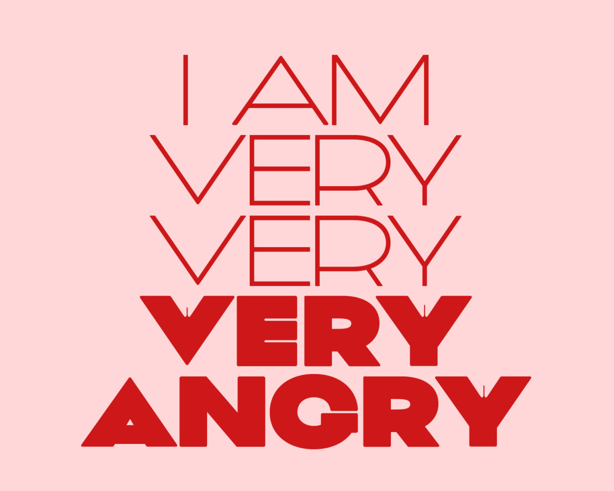
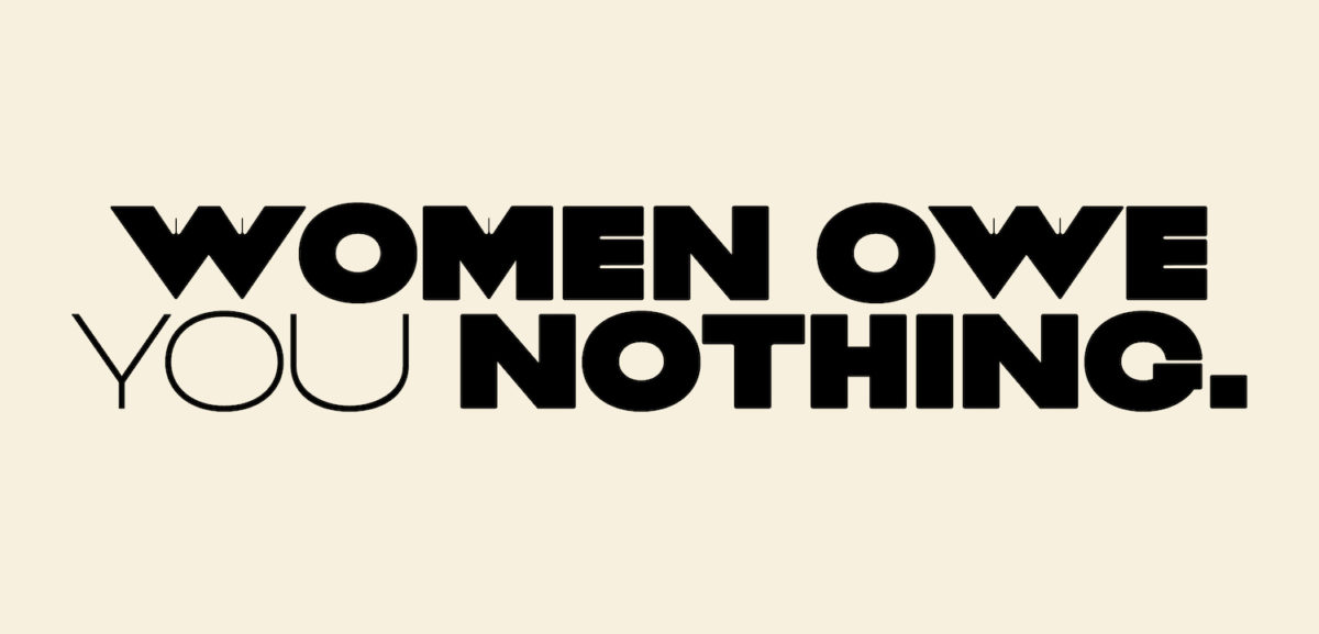
Marie therefore considers Vulva as a carefully crafted piece, which stands for an accumulation of years of personal research, as well as a means of unpicking and discussing gender through an entwined design practice: ‘Yes, it is called Vulva because because the female anatomy is still taboo, misrepresented and not understood by a vast majority of the population. A lot of people mistake vulvas for vaginas, so the word was important to me. Yes, the main weight of the typeface is Black because I wanted to take up space and be loud for once. Yes, the shape of a vulva is visible in V, W, X, Y and M because of graphic similarities between an actual vulva and the letterforms. But there is more to those choices. I think it was the first time that I shifted from using my typographic work as support for a message to using the medium as the message itself. The shape of the vulva is actually constructed by negative space: invisible space, if you’d like. That is a tribute to the colossal number of invisible women doing the work, walking so we can run. Also to those who were and are reduced to silence, in offices, homes or court rooms. To all the women who had their inventions and contributions to art and science virtually erased, and saw men taking credit for them. The typeface is actually variable, going from light to black with the vulva shape gradually appearing in the negative space of certain letters. That change is important, because the gradual movement echoes the fact that things are evolving, and voices are beginning to be heard.’
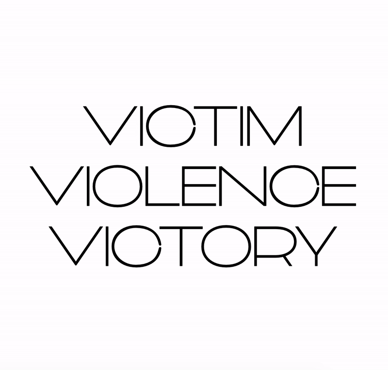
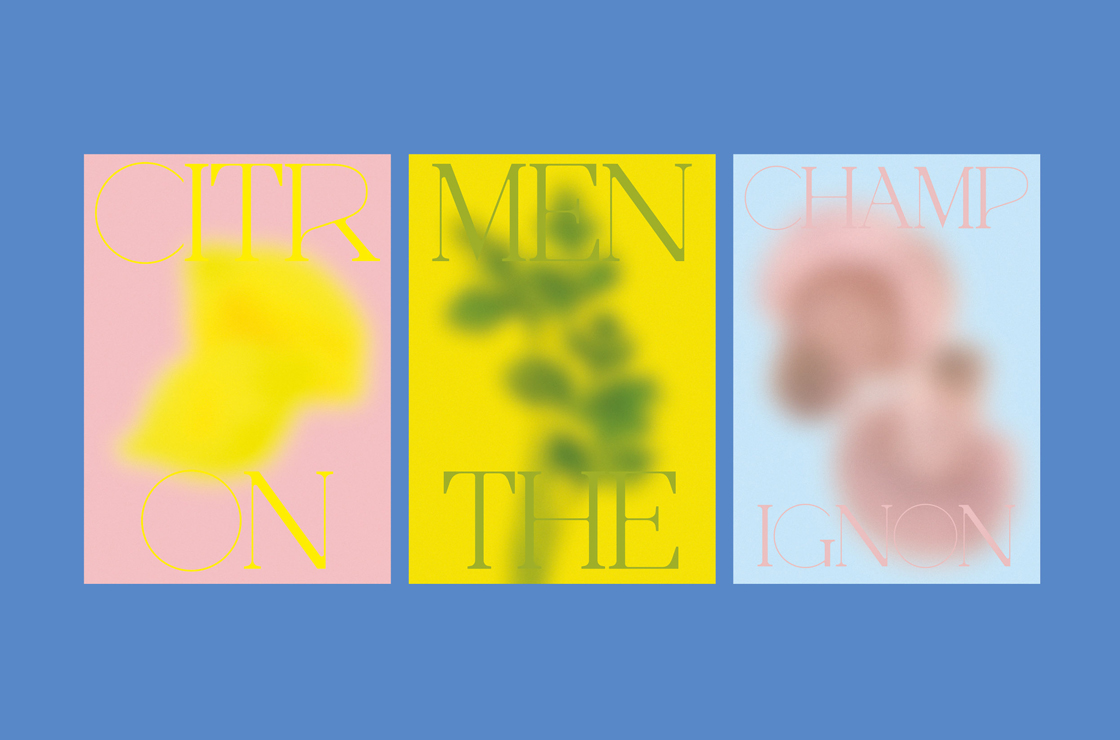
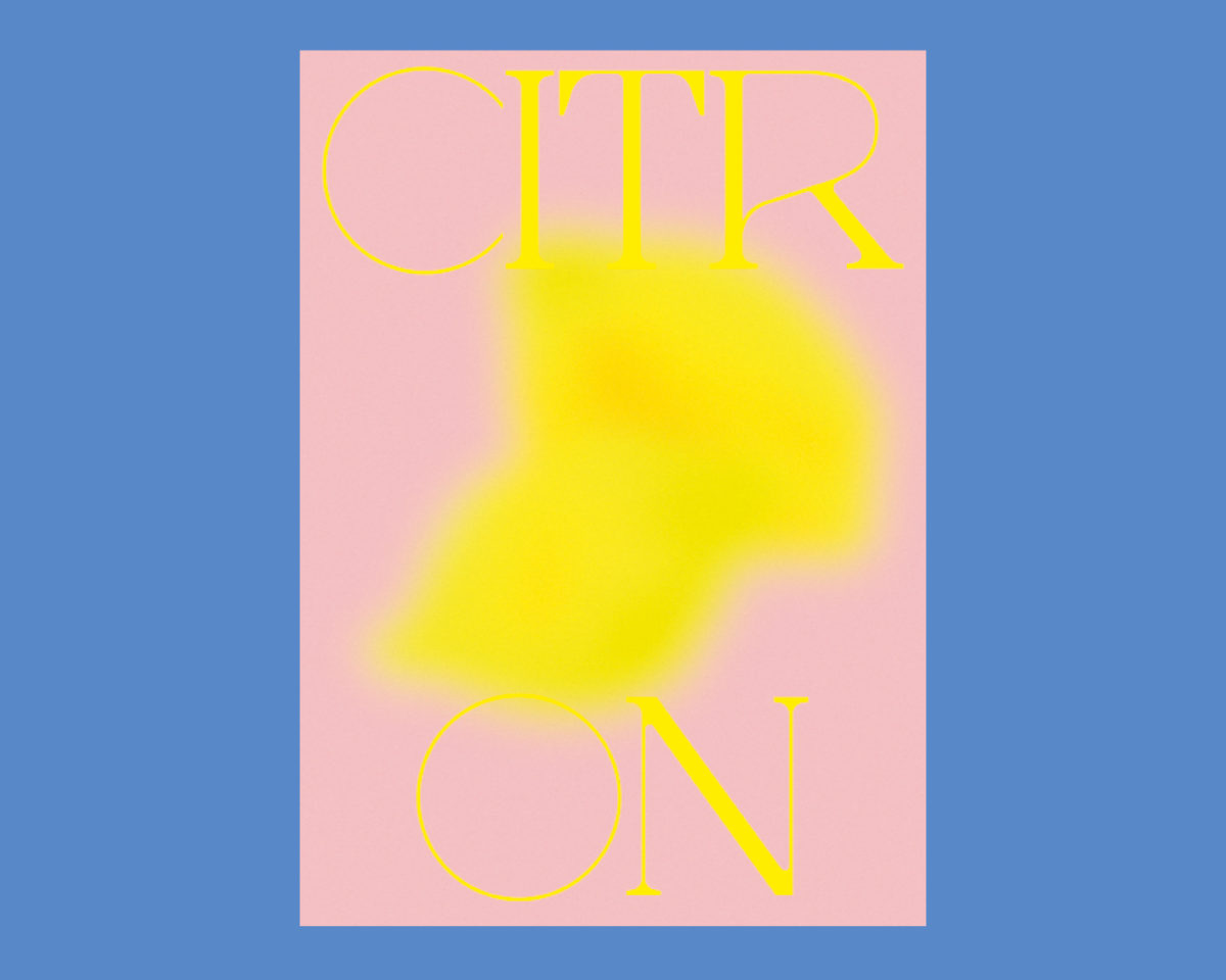
Euphorie
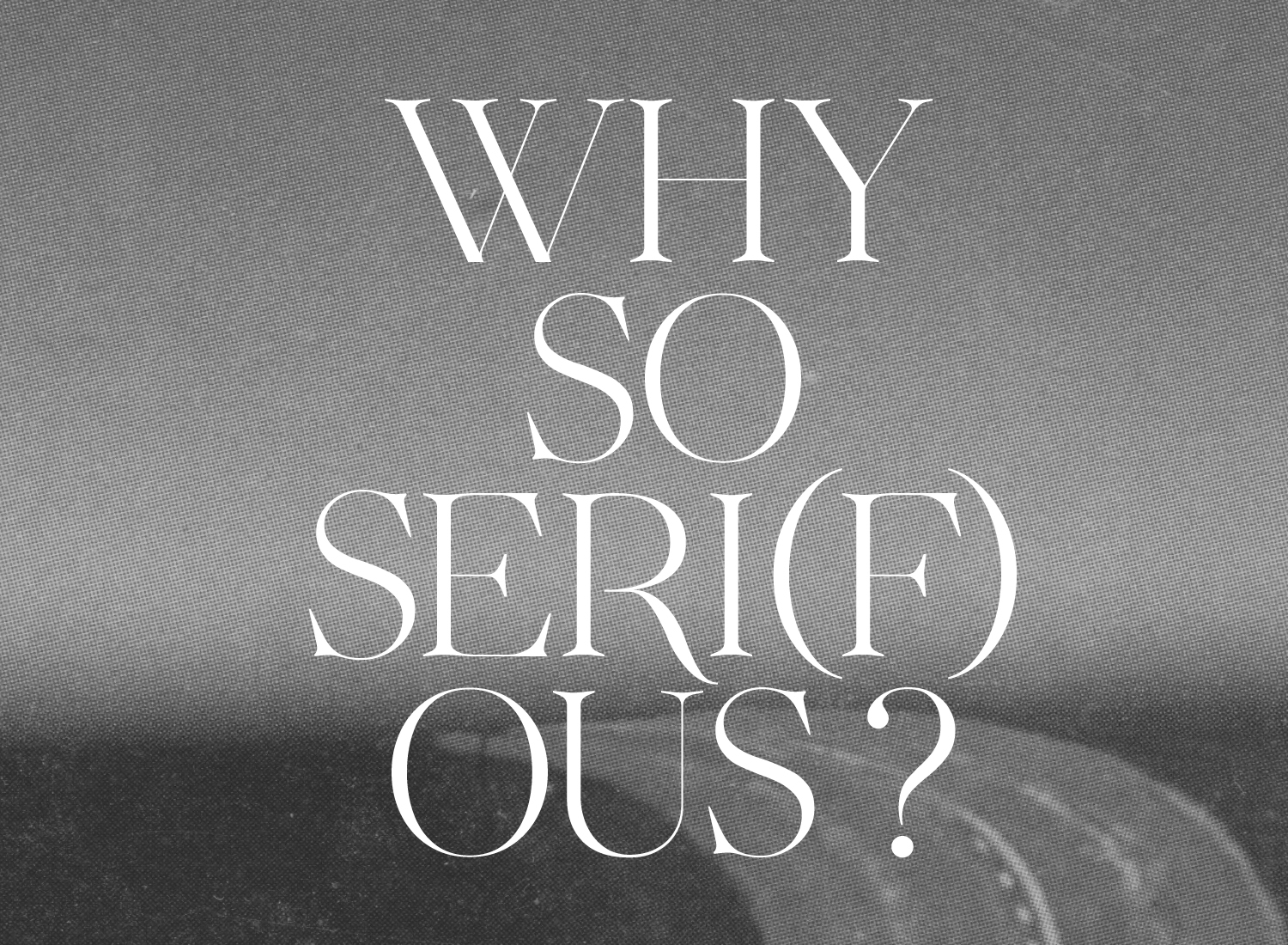
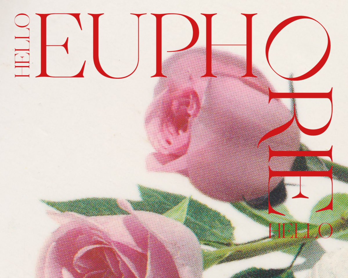
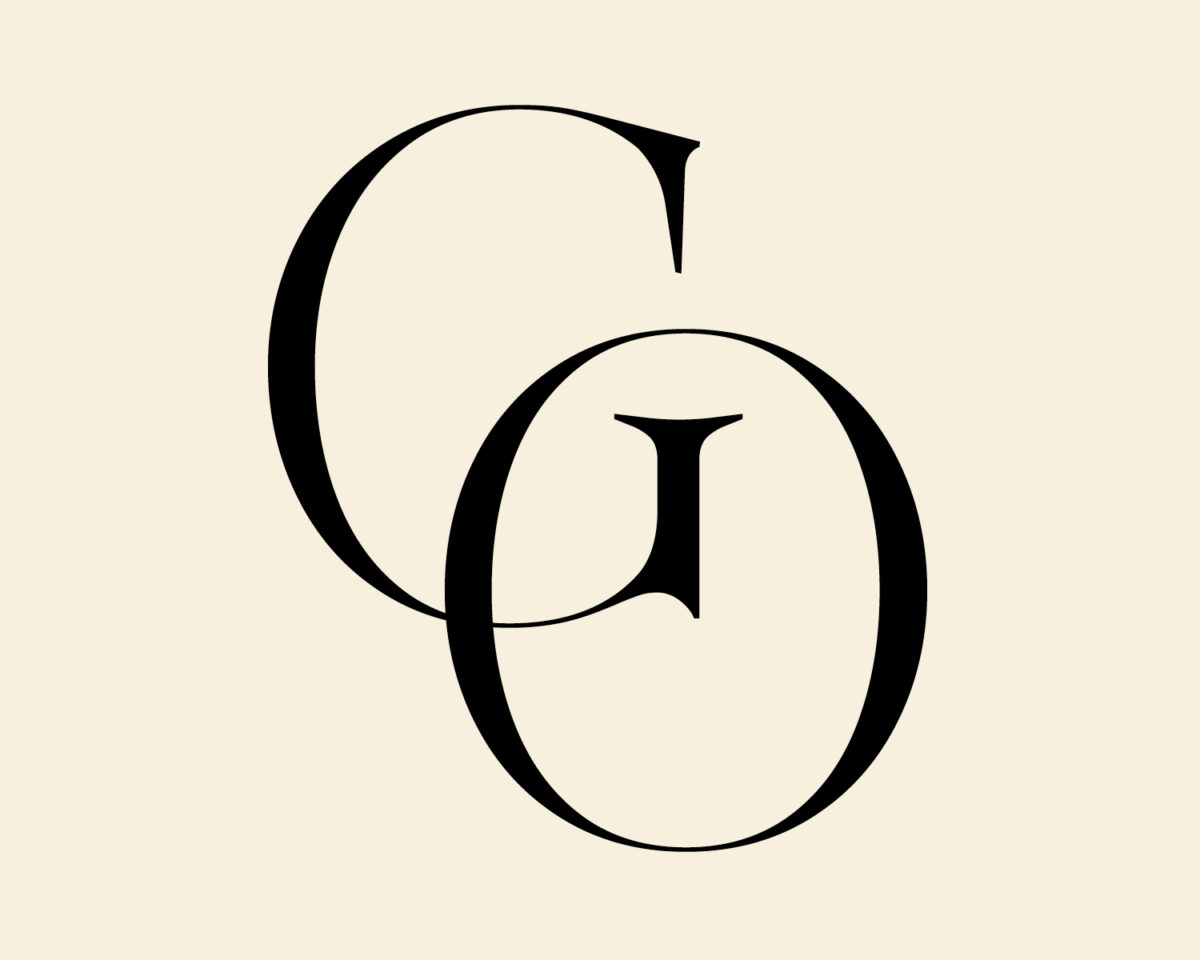
Lastly, we come to Euphorie. Less conceptual in its foundations, Euphorie was created as a labour of love; ‘to be perfectly honest,’ Marie tells us, ‘I made it because I liked it — which sometimes is all you need.’ Born out of sketches originally produced for a client who ended up taking a different route, Euphorie began when Marie had an idea for an Instagram post for which she couldn’t seem to find a fitting typeface. As Marie continues, ‘I only had a few robust letters at this point, including a W, which is definitely not usual in the process of drawing type. So I went back to the drawing board with H and O, to define contrast and serif shapes better. The Instagram post I had in mind involved a pun about serifs, so I knew I had to spend more time defining them and making them interesting. The result is Euphorie, and I must say it’s growing on me. The response to it has been amazing, even though it’s very far from complete in its current state…’
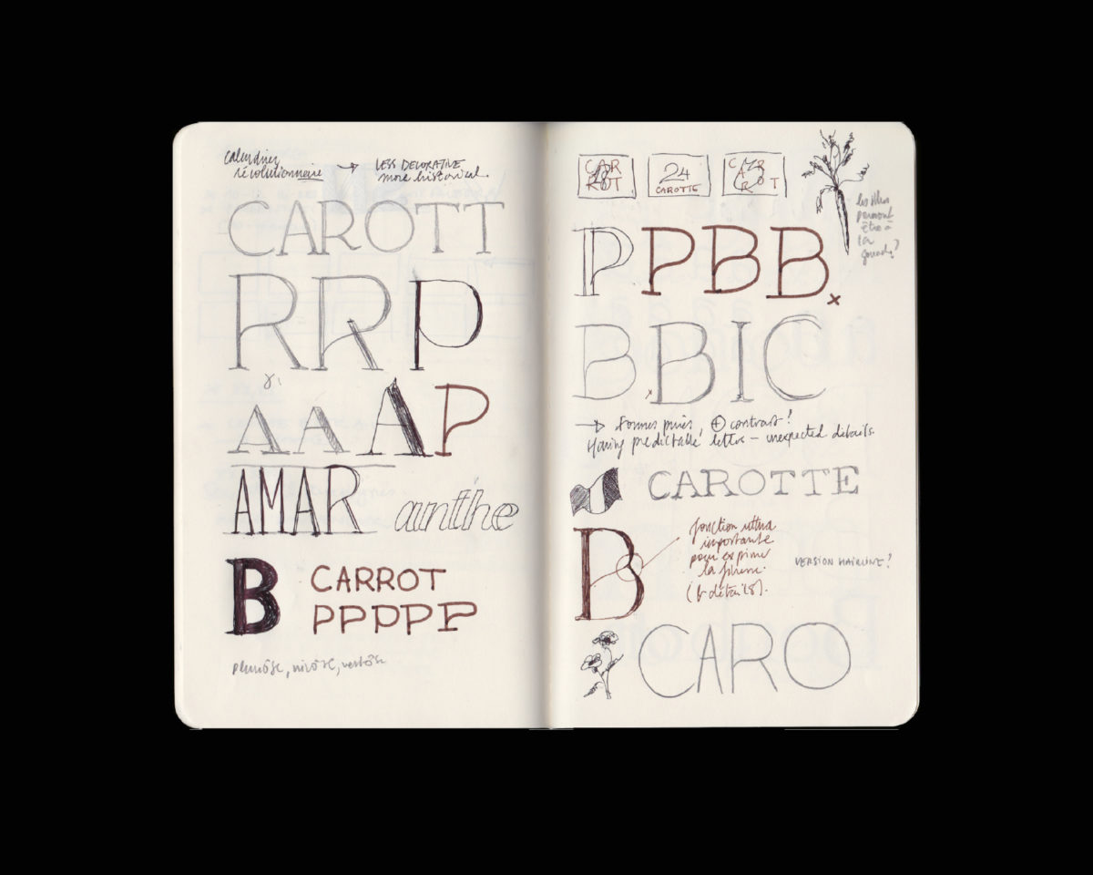
‘…I’ve had an R similar to this stored deeply in my mind for a few years now. Visual memory is a hugely important part of my work, I need to go back to notes of things I saw, liked and put down on paper. Please don’t think I have gorgeous sketchbooks — I truly don’t, they are incredibly messy and mix grocery lists, doomed business ideas and weird experimental shapes, but they are incredibly efficient ways of document things which have an impact on me. It makes it much harder to lack inspiration too, because whenever I go back to them I always, always find something.’
As is a common trend in Marie’s approach, the ideation and assimilation process began long before her practical creative expression of Euphorie. It seems Marie is often drawing upon ideas she has sat with for a long time before they reach actualisation through her practice. Perhaps this is why her work – both visually and conceptually – feels so multifaceted, authentic and wide-reaching. In every instance, it has arisen from years of careful consideration, before its expressive culmination as a tangible, visual piece. ‘Sometimes I question myself,’ Marie reflects, ‘shouldn’t I be looking to the future for inspiration, rather than to the past? This echoes a question valid for all type designers. I’m not sure there is a right or wrong answer to it, but I do know that there is value in staying true to yourself and your inspiration. I know that there is value in taking time to explore your aesthetic and being authentic in your work. For now I’m following what feels right, and taking time to develop my craft.’


