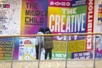
Informed by a decade-long involvement with graffiti beginning at the age of 14, Athens-based designer Filippos Fragkogiannis (@filipposfragkogiannis) tells us he is fascinated by language; by the ways the written word can be ‘archived, shared, printed, and reproduced’. To this end, Filippos is also the founder of Certain Magazine; an independent curatorial platform spotlighting incredible graphic/design projects from all over the world.

‘This premediated injection of verbal forms in public spaces has much in common with the way posters make walls speak’ he elaborates, telling us of his early steps in graphic design making posters for school parties, graffiti stores and rap artists’ concerts. Since graduating from his BA in Graphic Design from Vakalo Art & Design College and the University of Derby, Filippos’ practice has continued to grow through his fascination with language. Now, he tells us he enjoys using his type-led graphic design practice to explore ‘language’s capacities to produce designs with simple forms and condensed meanings, that can make as big an impact as possible’.
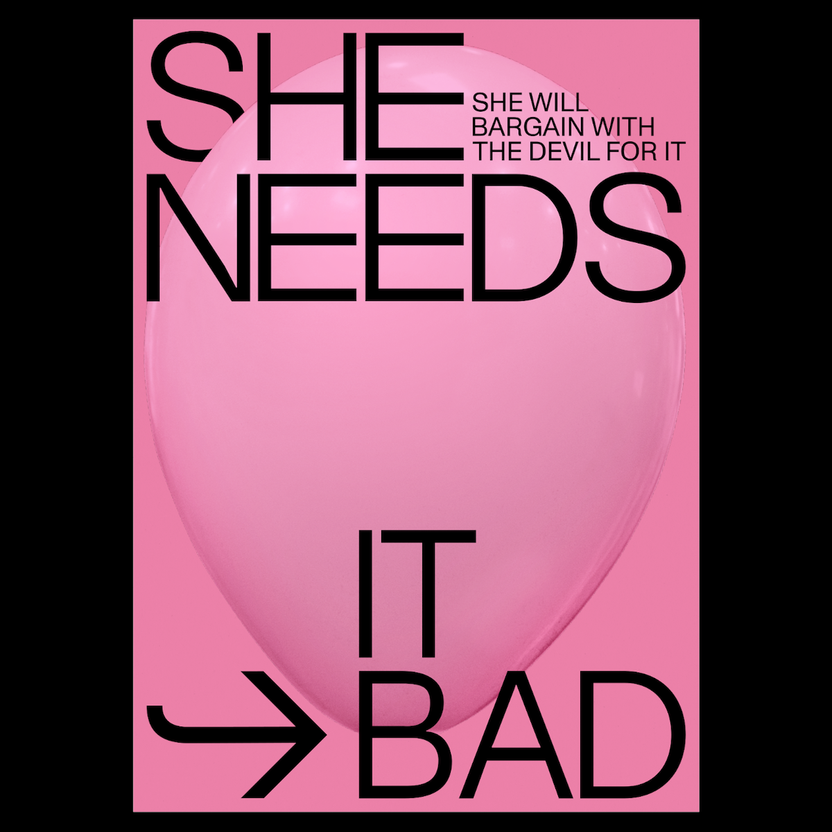
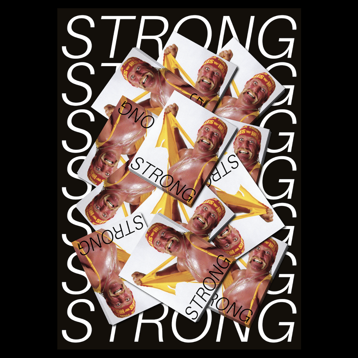
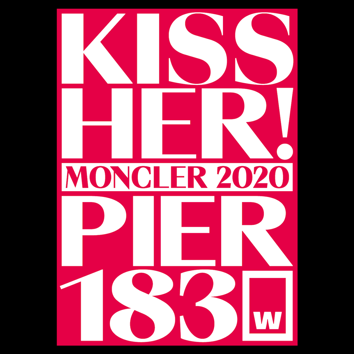
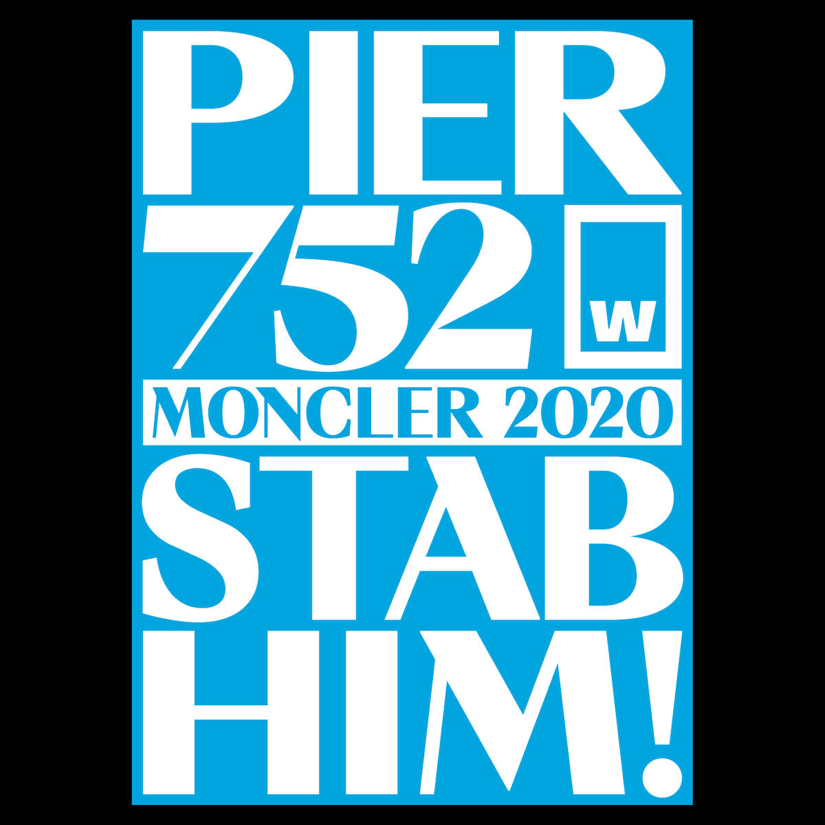
‘Slogans, one-liners, idioms, catchphrases, above-the-fold headlines, and other similar shortcuts to larger, more complex narratives targeted to mass audience are amongst the things that trigger my mind. I am fascinated by how language can take shape through bold typography to inspire or demoralize, unite or divide, raise awareness or spread false beliefs’, he continues.

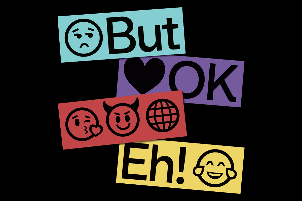
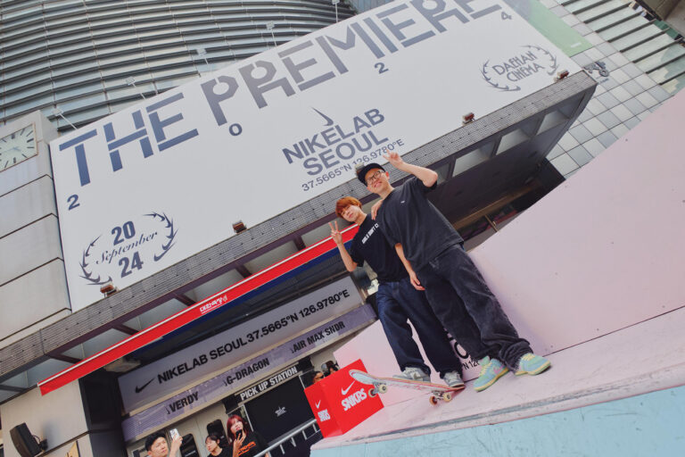
‘Typefaces, to me, are not only an essential design tool but also a true inspiration. I think of them as vessels for concepts, moods, and gestures. More often than not, a specific type will spark an idea in my mind, like the Plain Jane tee which sprung from the airport-related Valerio Monopoli’s Gatwick font’says Filippos. Working across digital campaigns, posters, print collateral and digital identities, Filippos’ love for typography shines through every time; regularly moving him to provide type foundries with bold imagery, and team up with type designers on promoting their products online.
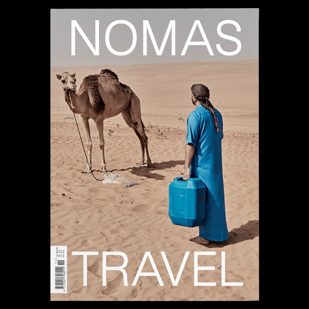
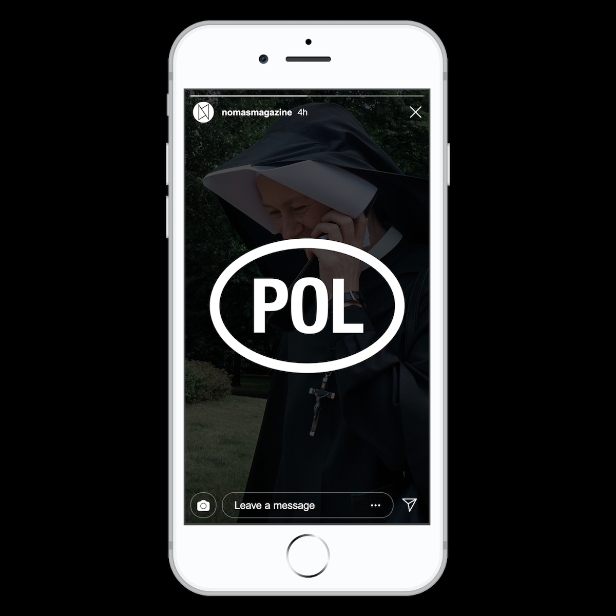
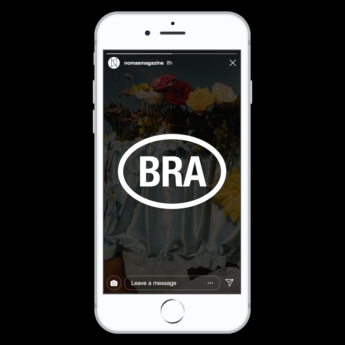
One of our favourite projects from Filippos has got to be his work for NOMAS Magazine; a travel edition for visually wandering the world. Among other things, Filippos tells us he was able to ‘imagine the code system of the featured countries using the National Codes Pi font, with the aim of showcasing its application both on paper and online’.
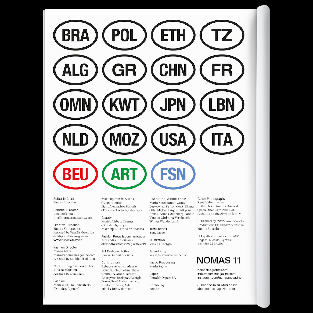
‘On the masthead of the magazine’ he adds, ‘three codes are highlighted in red, green and blue to hint at both the RGB system and the online extension of the project’. Filippos’ work tends to integrate intelligent nods such as this throughout his other projects. With a visual language which is sharp, direct and transparent showing up across his work, the designer elaborates, ‘I want the outcome to be direct and honest, to serve its purpose, and get the message across in a straightforward manner. It should be easily recognisable and aesthetically appealing, speak a universal language, and reach a wider audience’. Selectively – taking out everything that feels redundant – is a core aspect to Filippos’ approach.
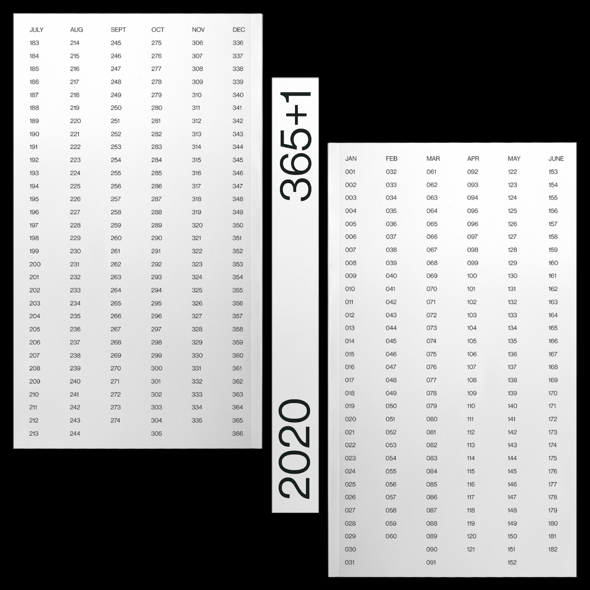
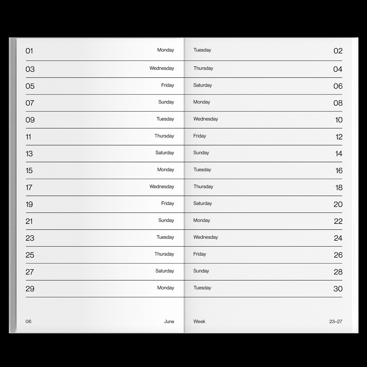
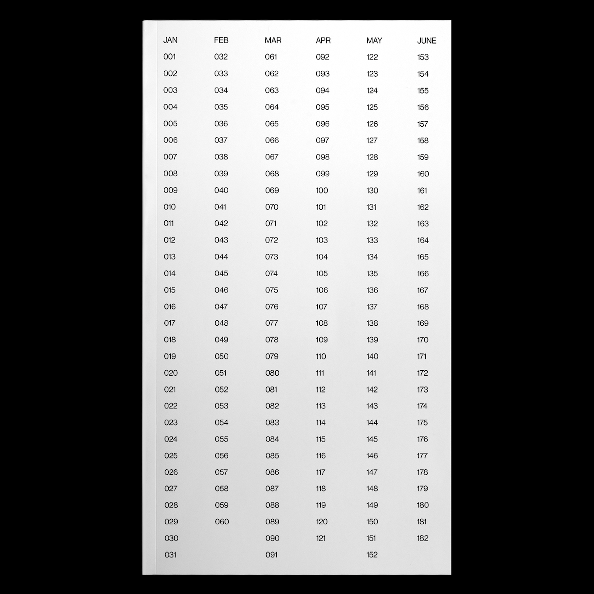
At the moment, Filippos’ collaborative 2021 calendar he created with Georgia Harizani, 365+1 Calendar, has just been released. Other merchandise will also be shortly available through a new online platform the designer is creating. In addition, again with Georgia Harizani, he is curating the type specimen for an incredibly exciting new typeface… In the meantime, we always recommend browsing through Certain Magazine’s platform to share the love of great design.

