Jo Malinis is a graphic designer from the Philippines whose work spans across brand identities, type design and working with letterforms in different forms. When the Category 4-equivalent Typhoon Ulysses (Vamco) struck the Philippines in November, Jo created a typeface to raise funds for the Philippines’ first and only Risograph art studio Bad Student Press, after they were heavily impacted by the typhoon. We got in touch with Jo to discuss her experience of using type for fundraising, the design of Salbabida Sans and how designers can use their practice for good.
Hi Jo! First off, could you give us a bit of background on what triggered you to create the fundraiser for Bad Student Press?
Bad Student, who also happen to be my friends, is the first Risograph art studio in the Philippines. They were one of the many that got severely hit when Typhoon Ulysses (Vamco), a category 4-equivalent typhoon, devastated our country last November. All their equipment (Risograph machines, drum inks, computers, and archive of art prints) and living space got flooded in just a span of hours. While all this was happening, they kept posting updates online regarding their situation. I felt powerless reading about their posts, knowing that I couldn’t do anything to help. So when some of my other friends started selling art prints online as fundraising initiatives to help with the studio’s rebuilding, I resorted to creating a typeface.
What were you ideas about the visual side of Salbabida Sans? What was behind the design?
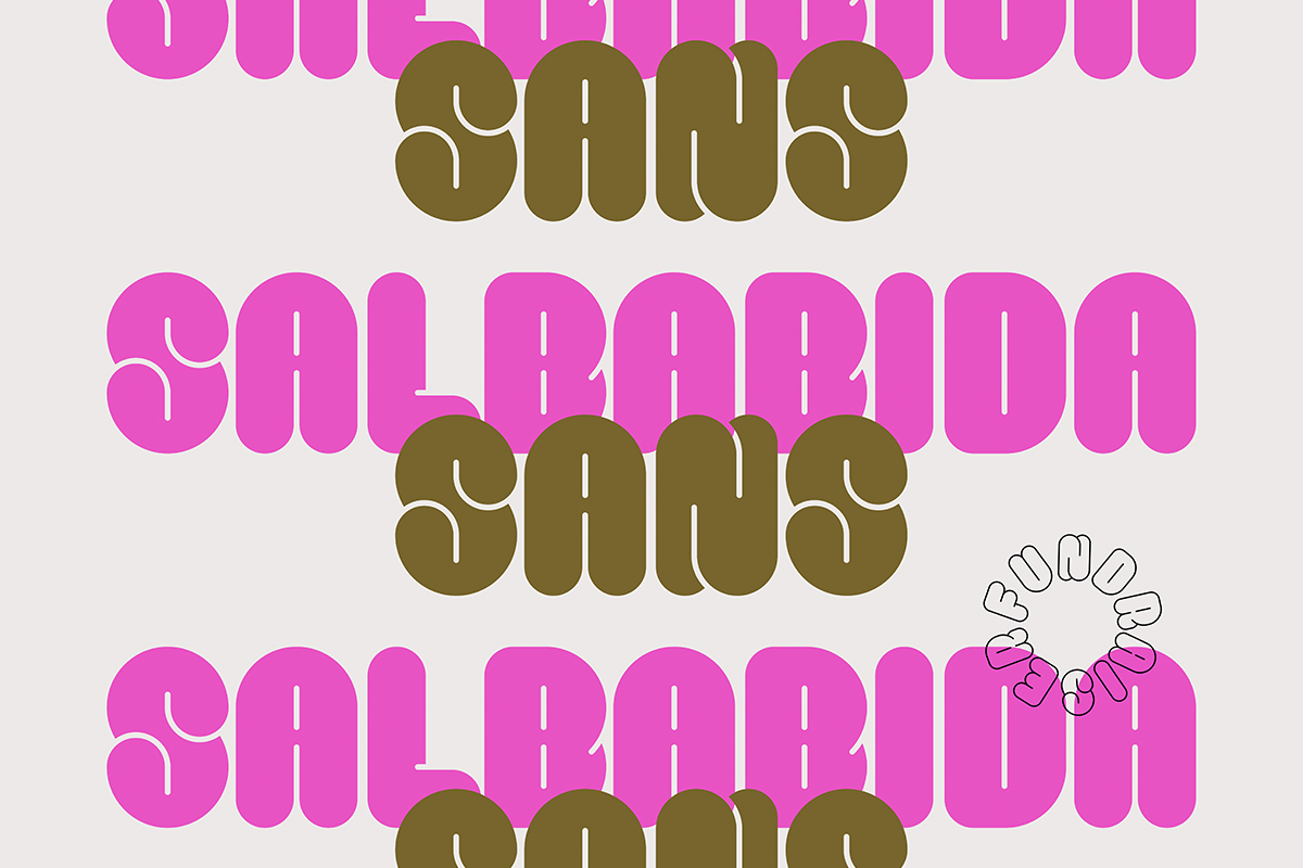
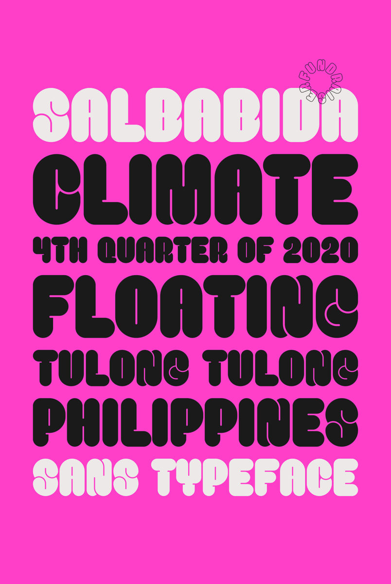
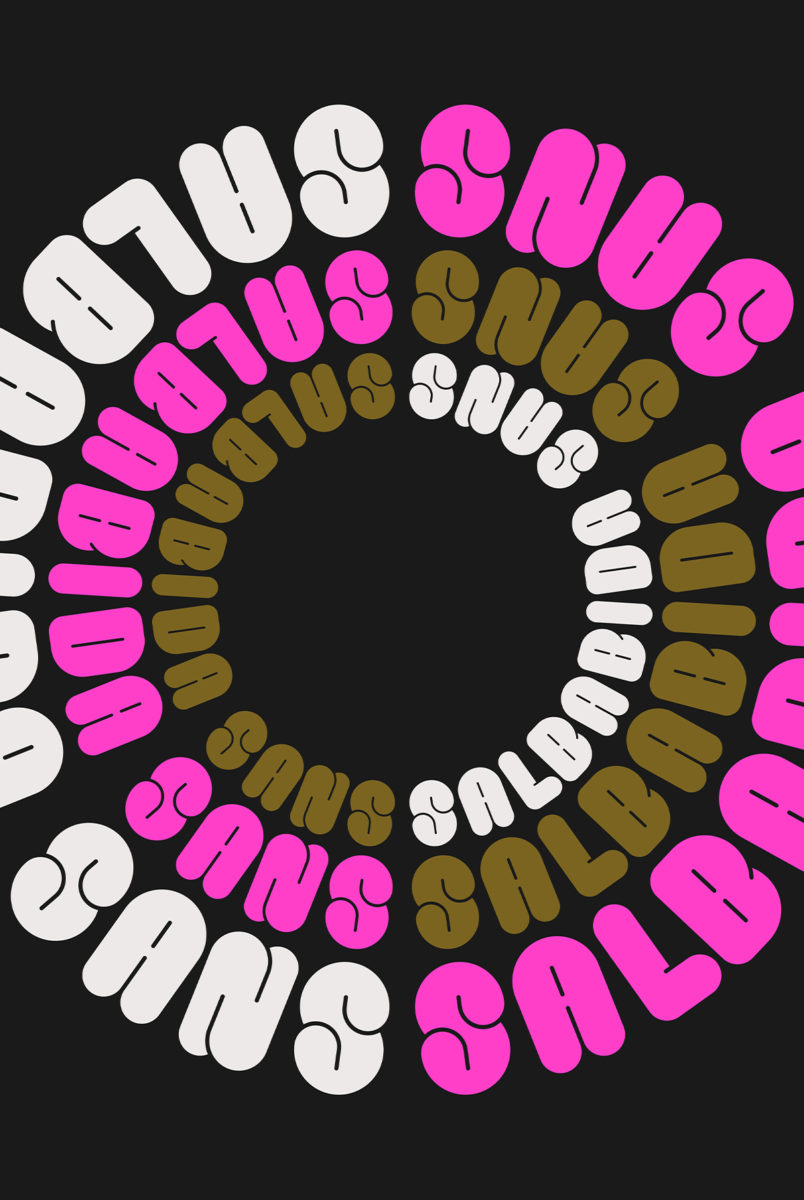
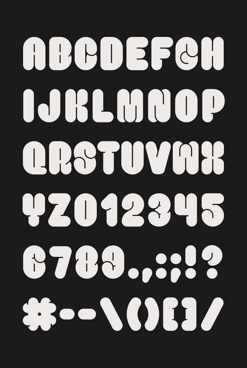
Salbabida Sans is based on the salbabida, which is the Tagalog word for “lifesaver” or “water floater.” The forms of this font mimic the inflated rubber vest or object that one can put on or hold onto to keep afloat in water.
I started working on this last March with the design of the letter S and slowly developed a few other characters as the year went by – the SONA tutorial for Type01 was made using the characters from this typeface. I didn’t have a name for it yet, and I wasn’t really in a rush to finish it since I was also in the process of working on a different typeface; but when I needed something to sell as a fundraiser, it was the first thing that came to mind and the name just followed afterwards. I finished all of the letters, spacing, and kerning all in one day.

How did you go about getting the word out and what has the response been like?
The response has been amazing! At first I was worried about donor fatigue since there have been so many donation drives happening since the start of the pandemic and from the other typhoon that hit the country (yup, another one) just weeks before. So when I posted the font to Instagram and Twitter, I only had hopes of getting a few of my friends to share it. It came as a wonderful surprise to see so many people from all over the country buy, share, and even use the typeface to create their own graphics for donation drives. A lot of people even donated more than $5, which was the price set for the font, and in just one day we were able to raise $1116 – not counting the ones that donated directly to Bad Student and different causes (which I personally emailed copies of the font to as long as they showed proof of donation).
Friends from outside of the country helped too. Before I released the font on Instagram I actually created drafts of letters to big type accounts like Femme Type asking them to help out with sharing Salbabida Sans, but I didn’t even have to do that since they were among the first ones to offer to feature it and help spread the word. I’m very grateful to everyone who helped.
It’s such an amazing project. How do you think designers can use their work to help others and do good? Can you offer any advice to those starting to use their work in this way?
It’s important for designers to remember that design doesn’t exist in a bubble. Sometimes we get too immersed in creating beautiful things that we forget that design is a tool used to communicate, fix, create, and even help aid our society. I’m not saying that design can solve everything – definitely not – but it’s a tool that we can use to help. Before all of that, though, it’s crucial to understand what you’re using it for in the first place and believe in that advocacy/cause/movement.
I think as long as you’re being sincere and transparent with your work and fundraising goals, people will naturally be attracted to that and would want to help out. And even if it’s not in their top of mind, having an incentive (which in my case was the font) makes it easier for them to contribute to a cause.

Thanks, Jo!
Salbabida Sans is available to purchase through Jo’s website. It’s a beautiful typeface doing beautiful work – definitely take a look if you haven’t already. Jo has also just released her latest typeface, Hook. A stunning serif display inspired by the hook of a song, it’s as confident as it is beautiful. Hook is also now available for trial and purchase on Jo’s website.