
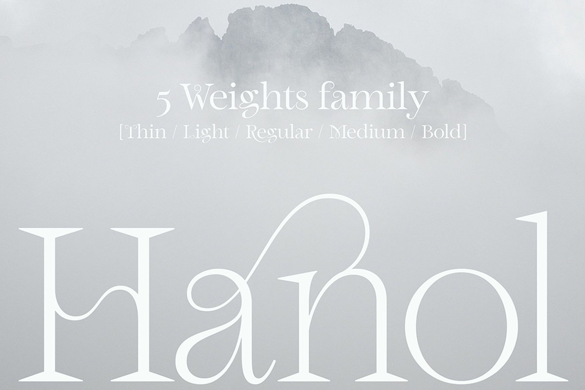
Hanol is a stunning serif typeface created by Paris-based Graphic and Type Designer, Bouk RA. Perhaps one of the most unique typefaces available on Type Department, Hanol blends an Old Style aesthetic with an unusual, contemporary edge. Filled with gorgeous details, unbelievable ligatures and beautiful diacritics, the latest update on Hanol offers an incredible expansion of an already breathtaking typeface.


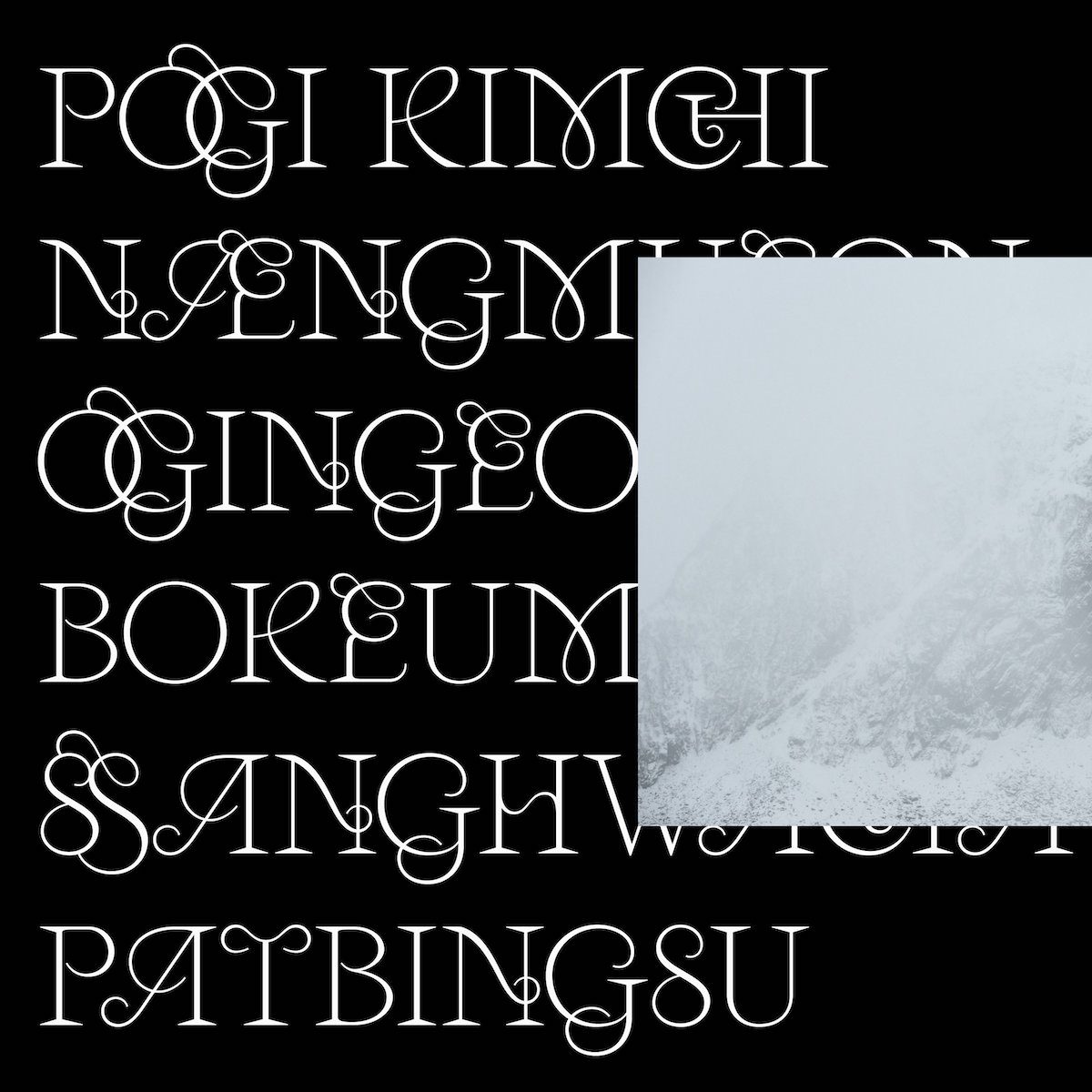
With its namesake derived from the Korean word for a strand or thread of hair, Hanol draws attention to the beauty found in the connective strands and curvatures of letterforms. Inspired by ‘the celestial robe of a fairy floating in the air’, Hanol‘s character is sprightly, energetic, light and lively.
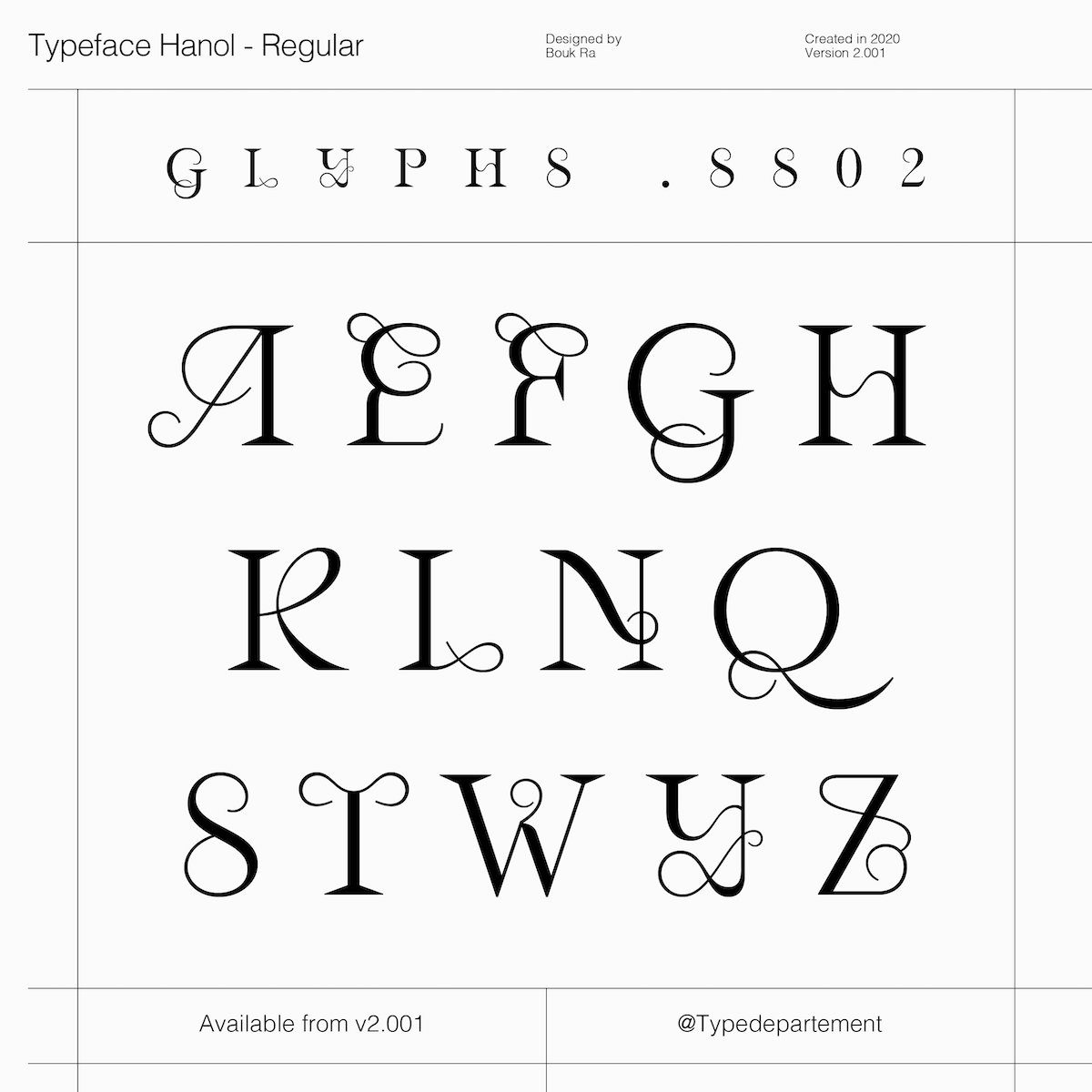
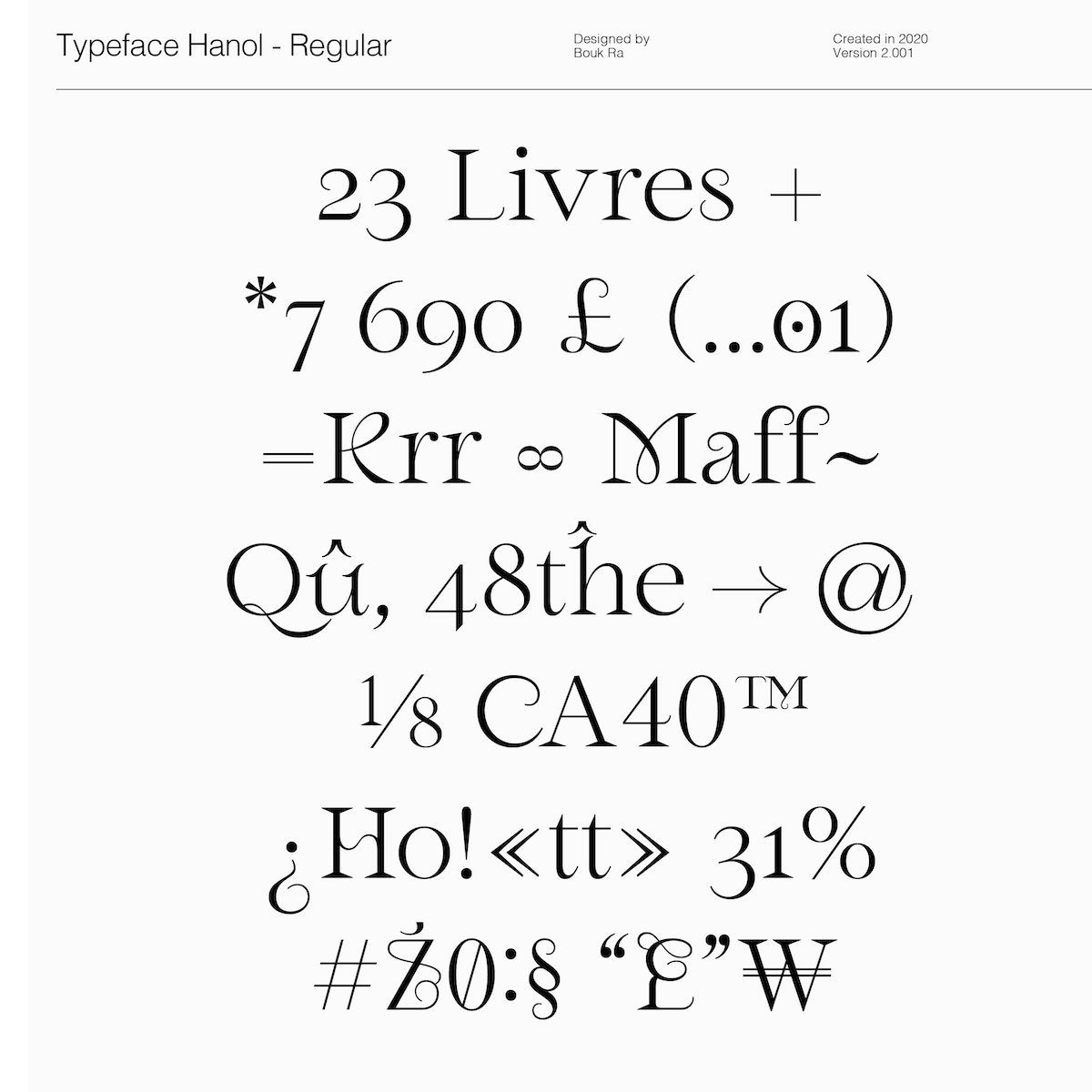
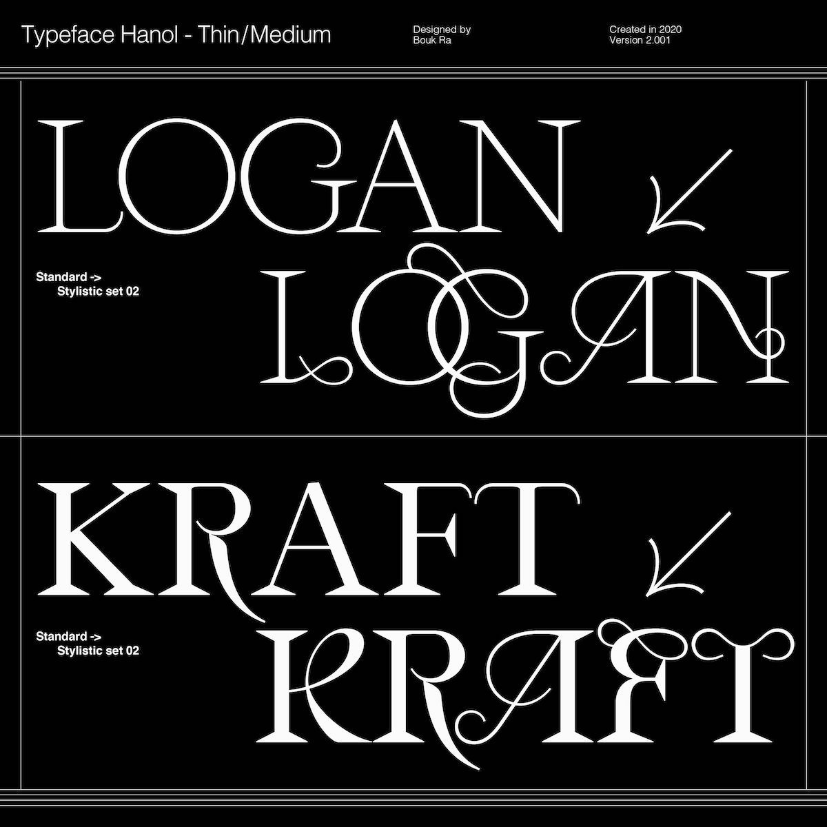
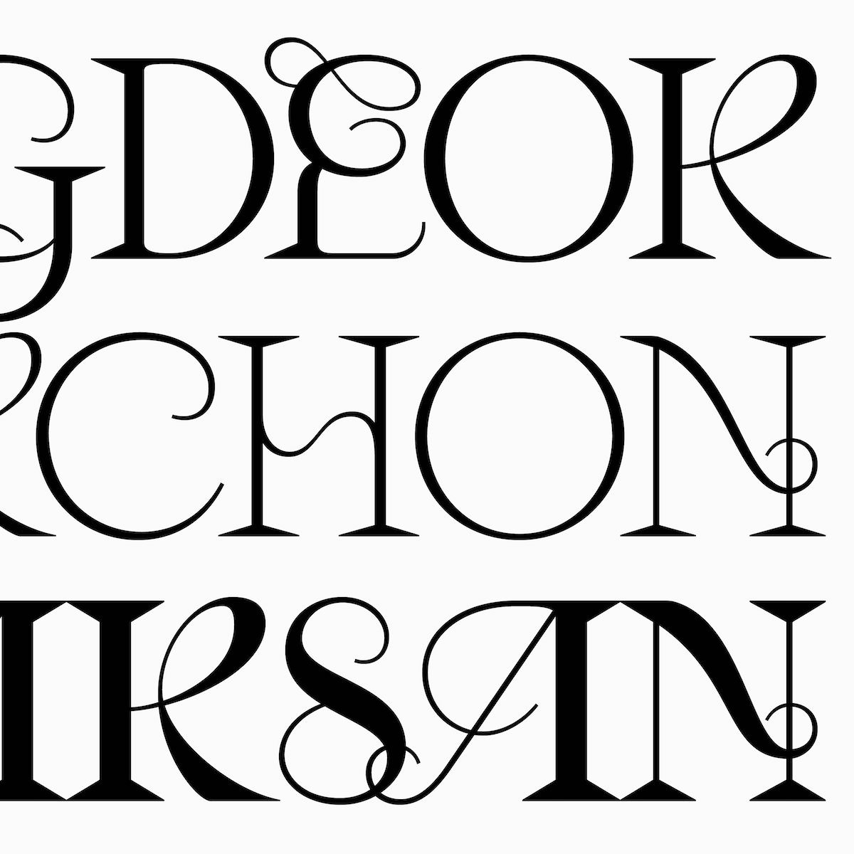
With its unique elegance, this typeface’s aqueous, curved terminals are met with a strong, classical and robust structure. Hanol‘s distinguishing ligatures – alongside the usual detailing on characters such as the ‘r’, ‘R’, ‘g’, and ‘M’ – bring bursts of freshness and flair. Hanol V.2 arrives as a stunning expansion on this typeface, offering brand new discretionary ligatures, redesigned glyphs, an additional stylistic set and more.
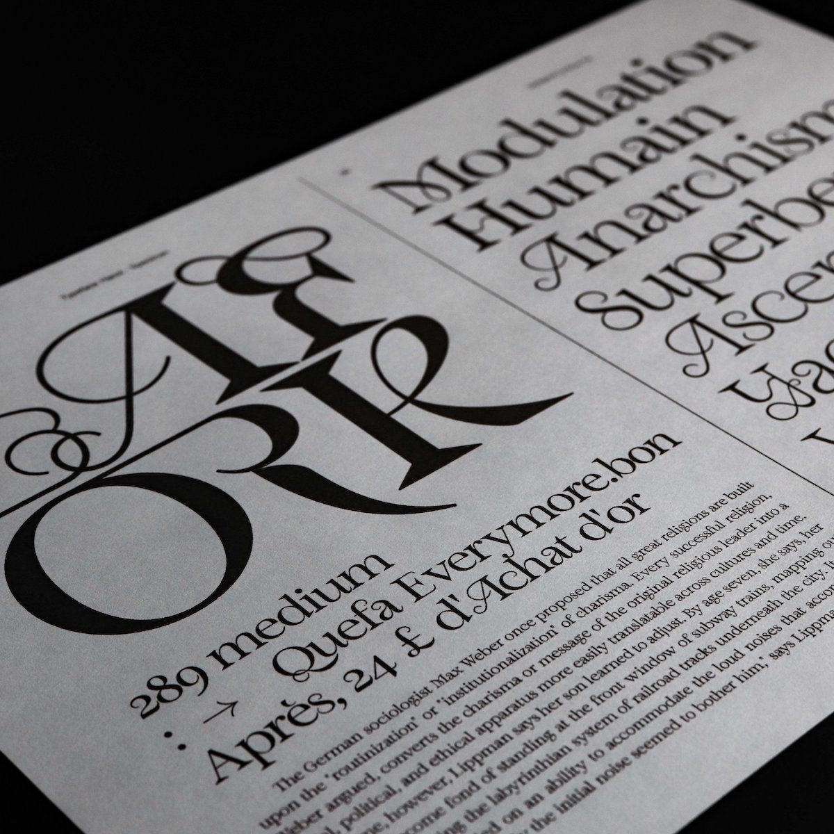
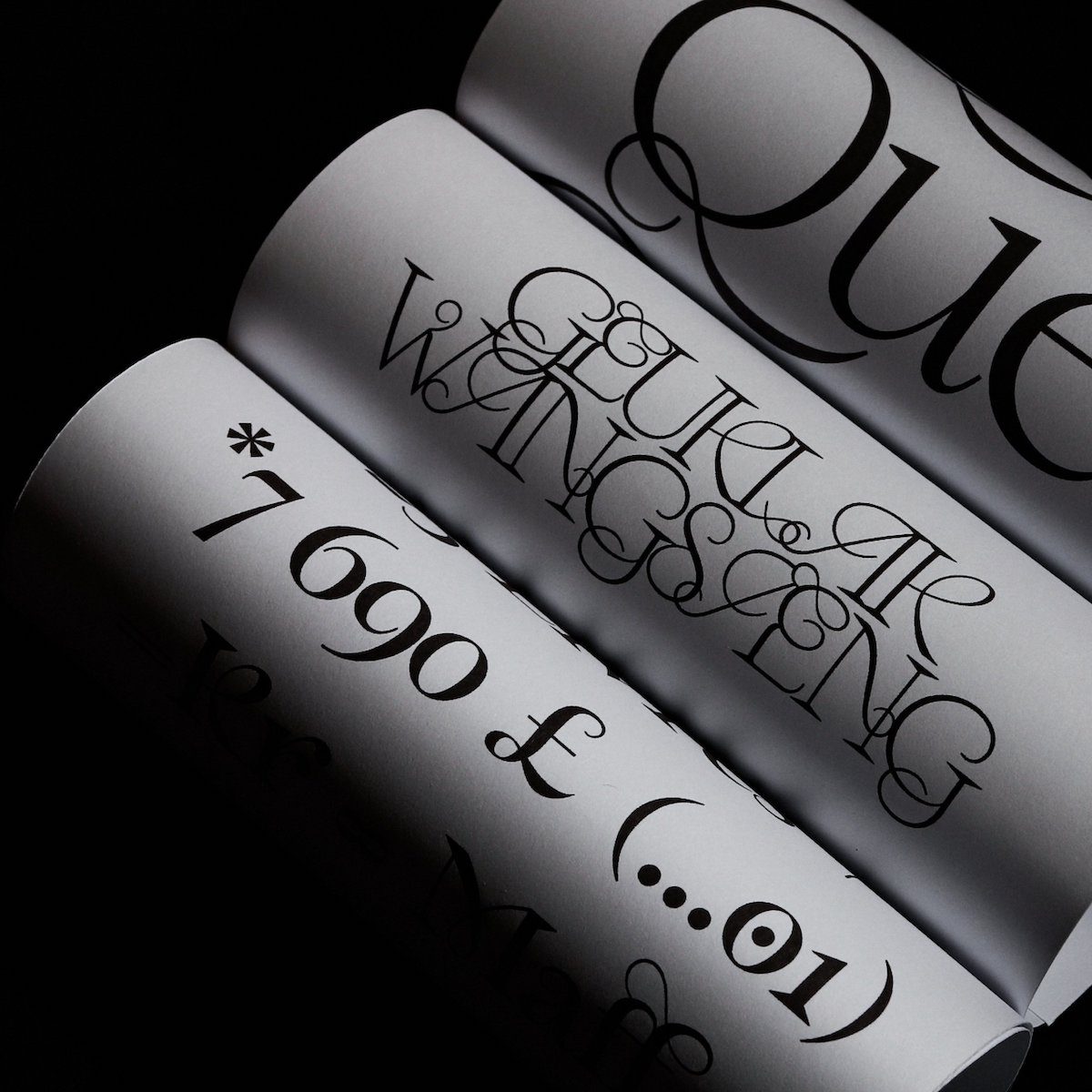
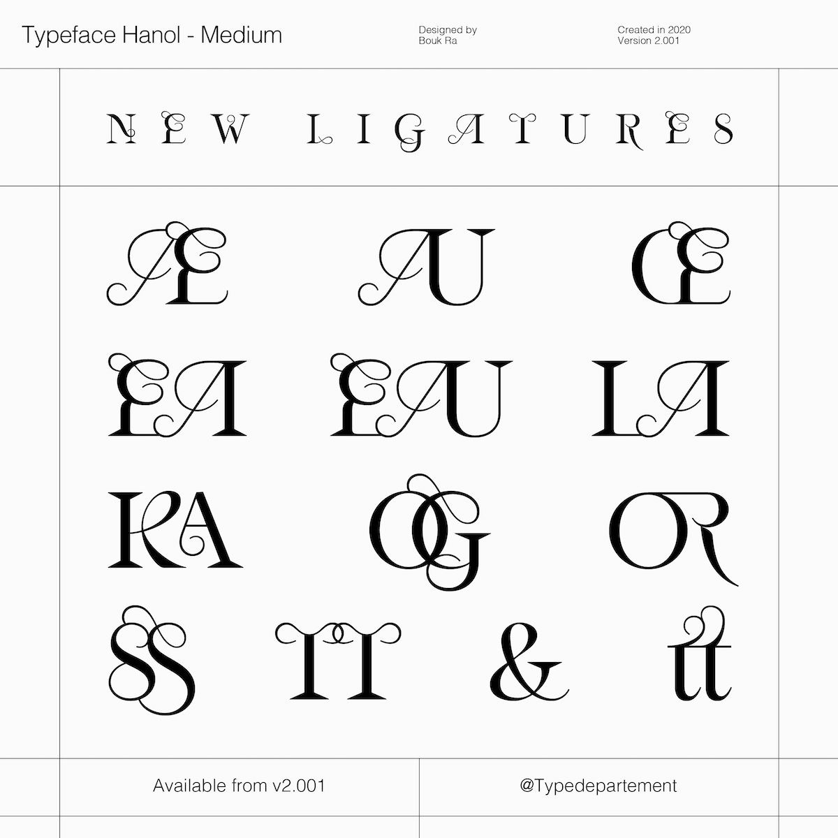
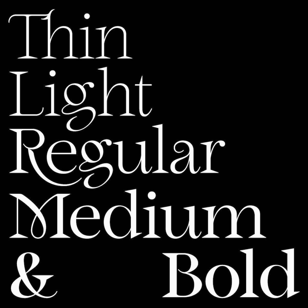
With a total glyphset of 634, including Open Type features such as uppercase, lowercase, numbers, diacritics, fractions, ligatures, stylistic set 01 and stylistic set 02, Hanol would be well suited to large and mid-length texts, and – with its robust structure rendering it particularly forgiving – it has the versatility to work in some longer text settings too. To see more, visit Type Department.


