New fonts from CoType Foundry! Whilst Aeonik Mono offers a true monospaced font, Aeonik Fono shapeshifts—giving the look of a mono, without all the typesetting struggles…
Building on the already much-loved Aeonik, Mark Bloom of CoType embarked on creating some monospaced friends for the font. Whilst Aeonik Mono is a typical fixed-pitch font, where each character fits in a box of the same width, the other is “a great illusionist,” posing as a mono when it’s actually proportionately spaced.
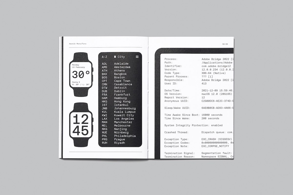
Looking to produce a monospaced counterpart to Aeonik, one that would preserve the features and charm of the original, Mark’s mission with Aeonik Mono was to formulate a fixed-pitch font that could be used anywhere, from graphic design to coding…Yet, however aesthetically pleasing, monospaced fonts do not come without their difficulties; in display settings, for example, the lack of kerning can cause some kind of annoying problems.
CoType’s answer? Aoenik Fono.
“We all appreciate the aesthetics of a good mono,” Mark recognises, “yet such a typeface can be difficult to use in running text or in headlines due to its large word spaces lack of kerning and some very narrow characters. For typographers seeking that mono vibe without the typesetting ‘inconveniences’ of a truly monospaced typeface, we created a fake mono – a Fono, if you will.”
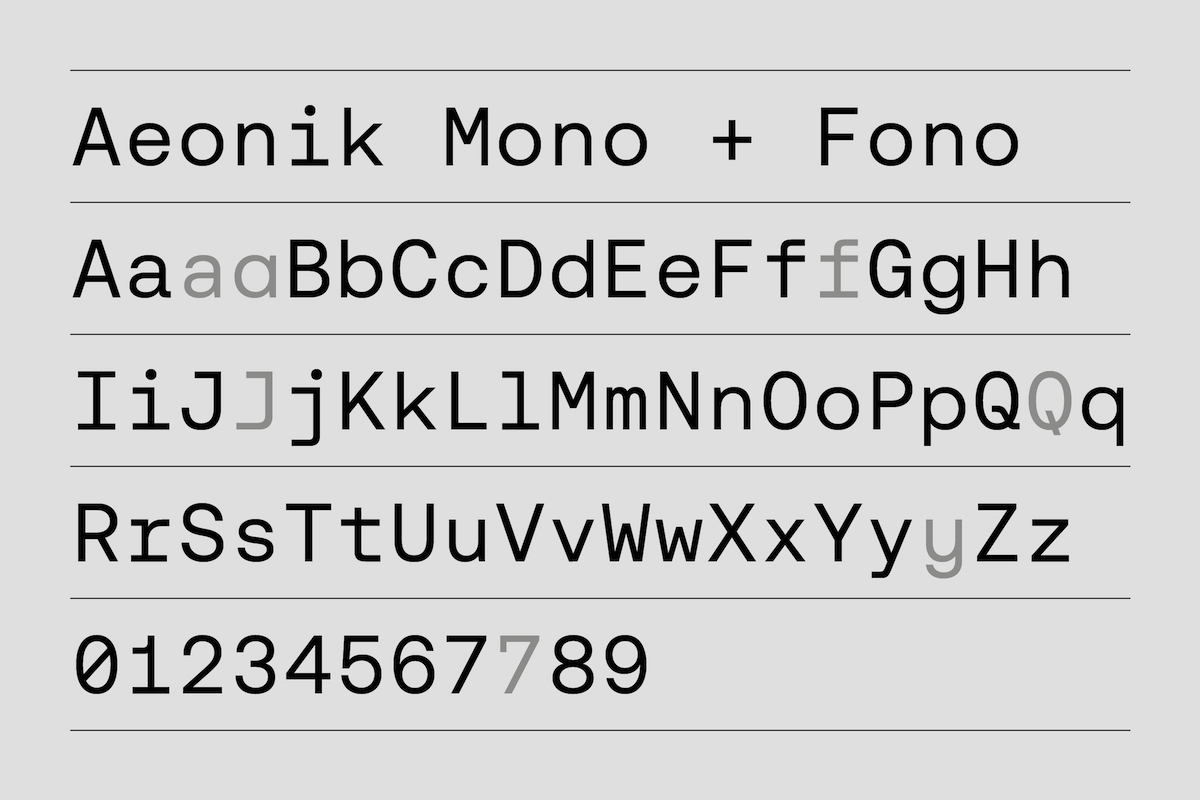
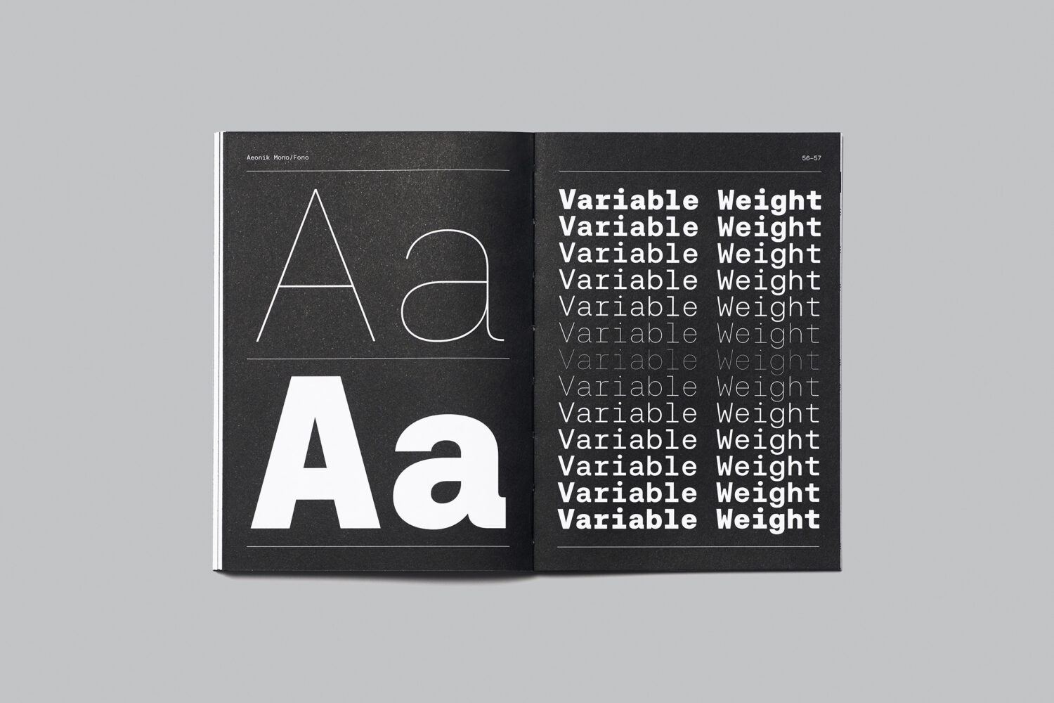
Aeonik Fono has been designed to live in the space between the classical Aeonik and Aeonik Mono. Letter shapes, for instance, are slightly less exaggerated than those of a true mono font, which makes it easier to read. It also features proportional spacing and some kerning, all of which make text setting a pleasure.
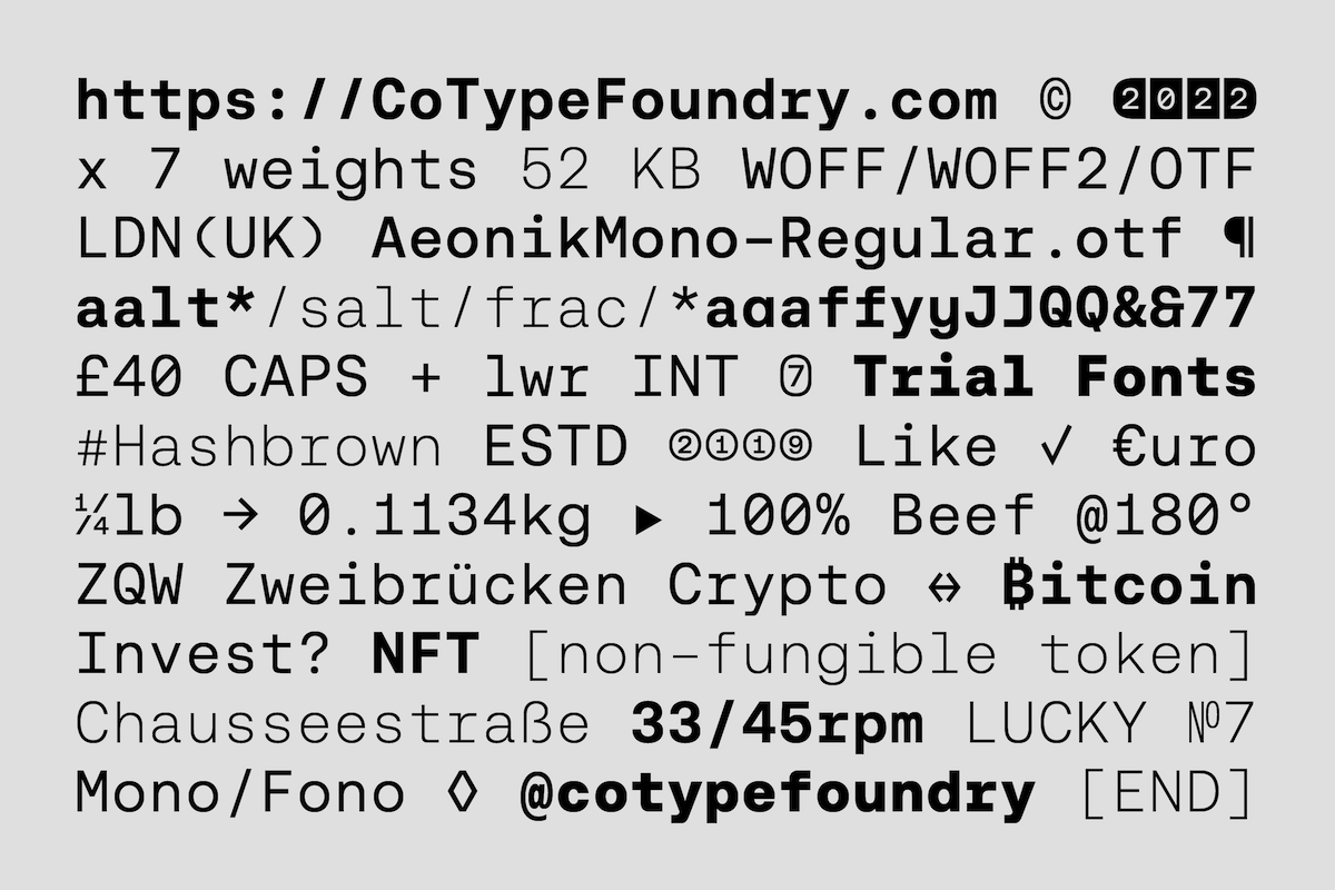
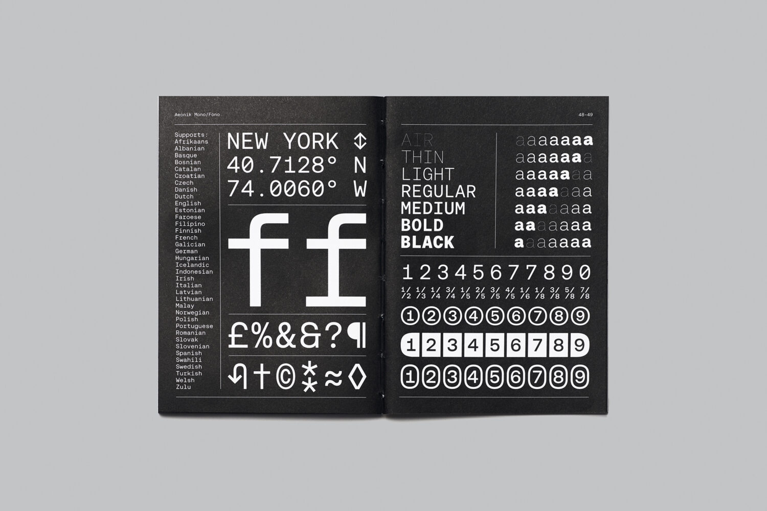
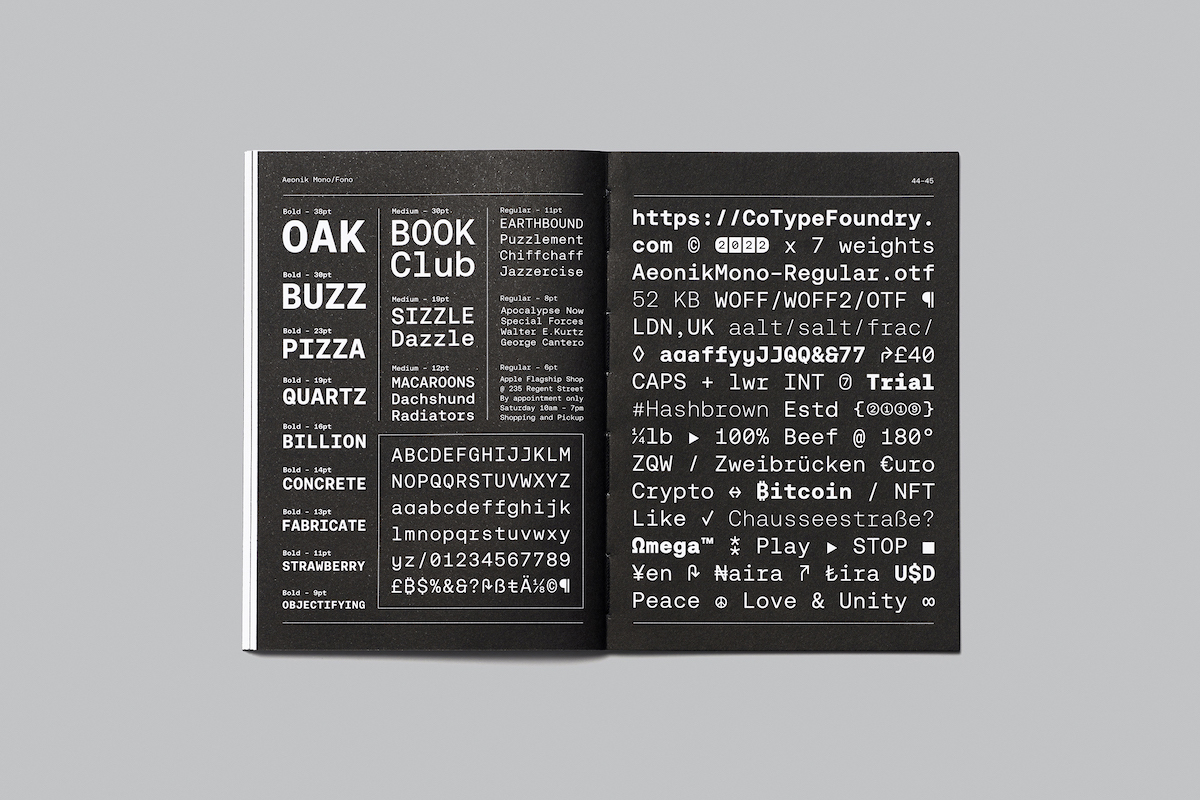
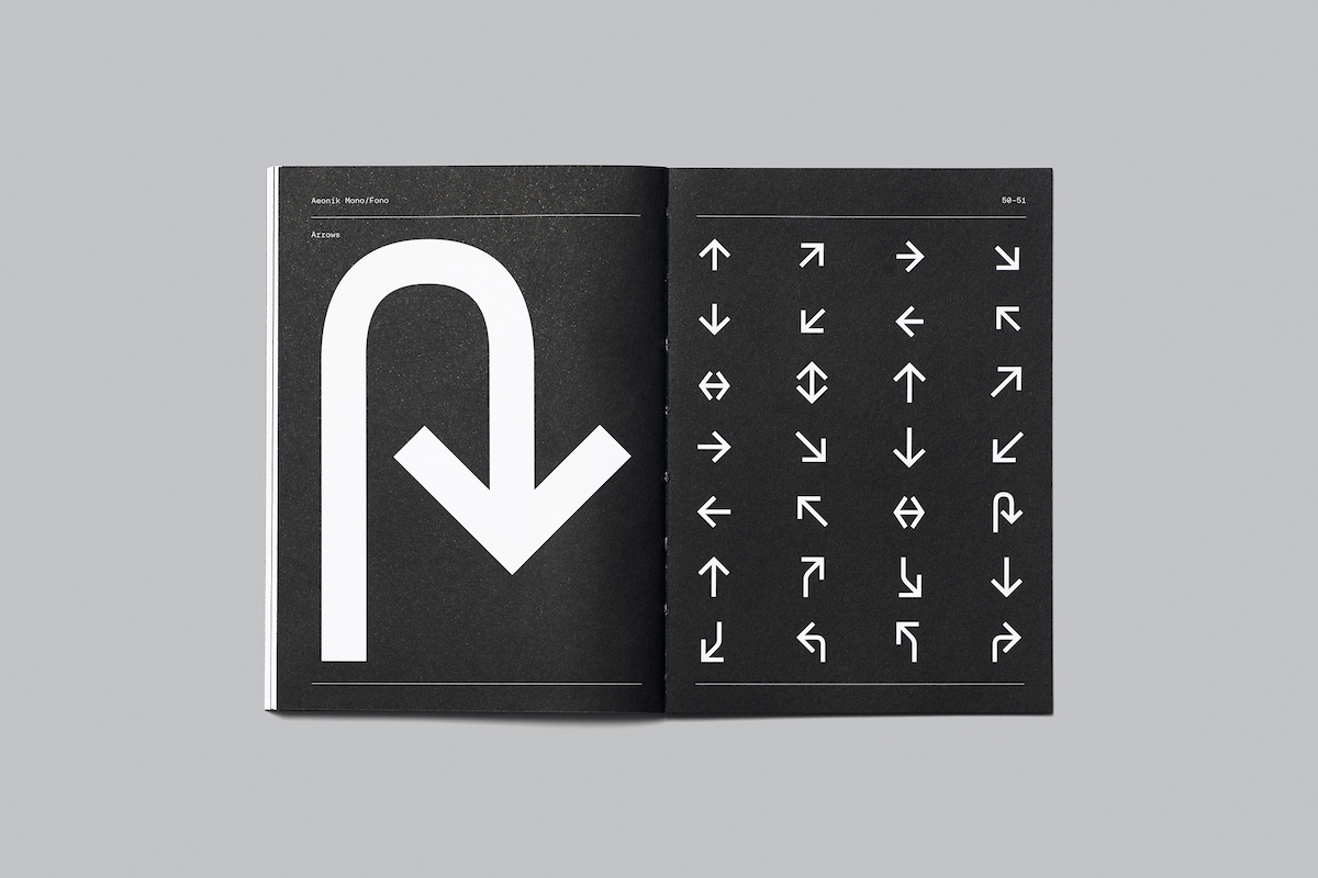
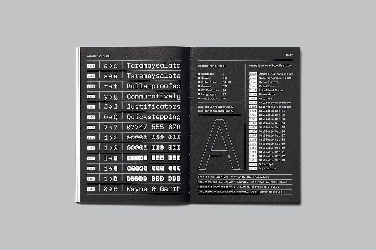
“Many might know Aeonik for its numerous stylistic sets,” Mark adds, explaining that “Aeonik Mono and Fono bring their own twist to this game, featuring many different boxed and circled numerals as well as alternates for the characters ‘a’ ‘f’ ‘y’ ‘J’ ‘Q’ ‘7’ and ‘&’…In addition to these, there are three sets of arrows included: simple small arrows, simple uppercase arrows, and navigational arrows.”
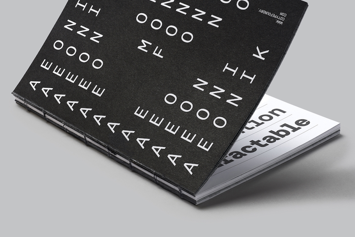
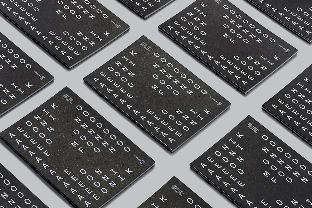
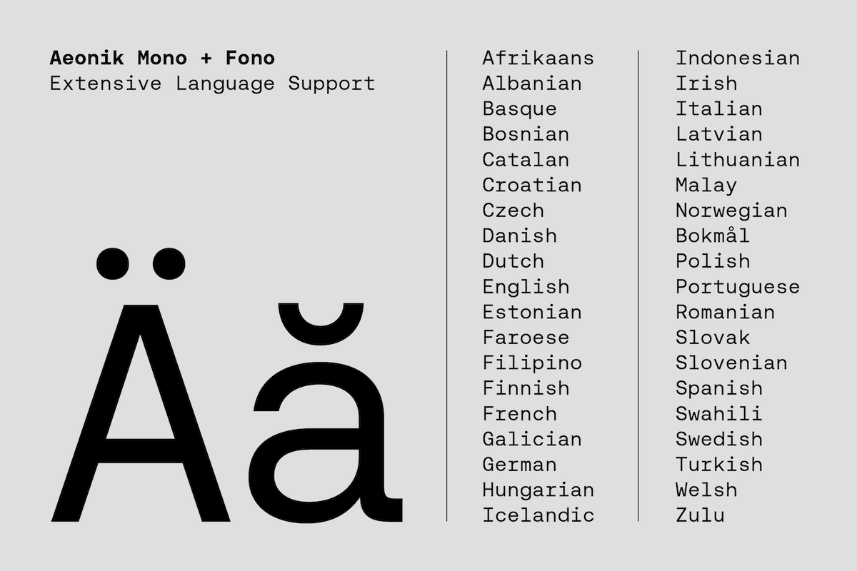
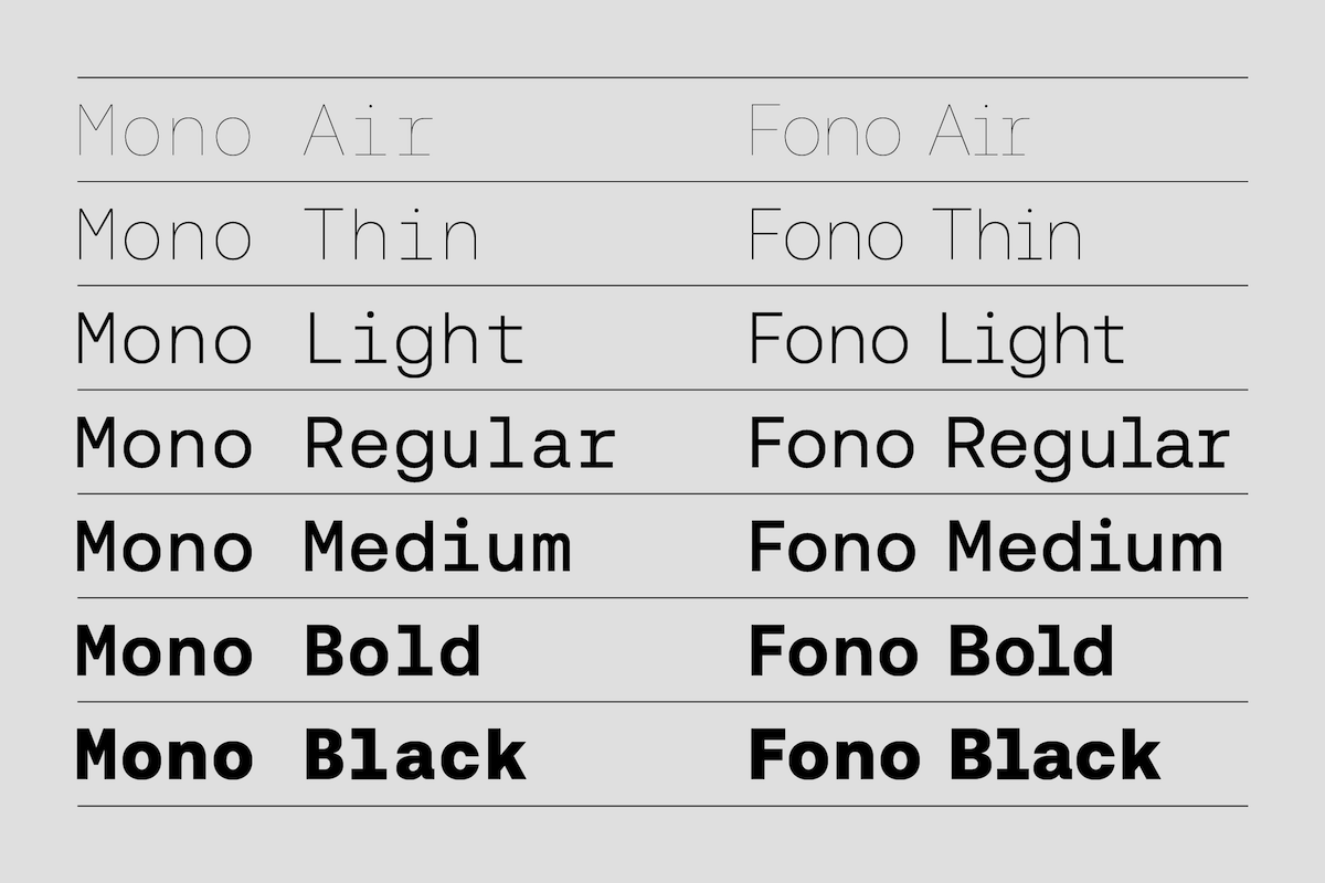
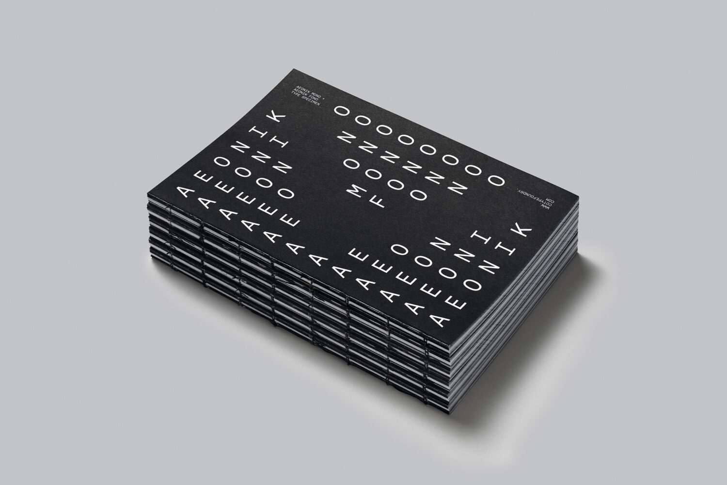
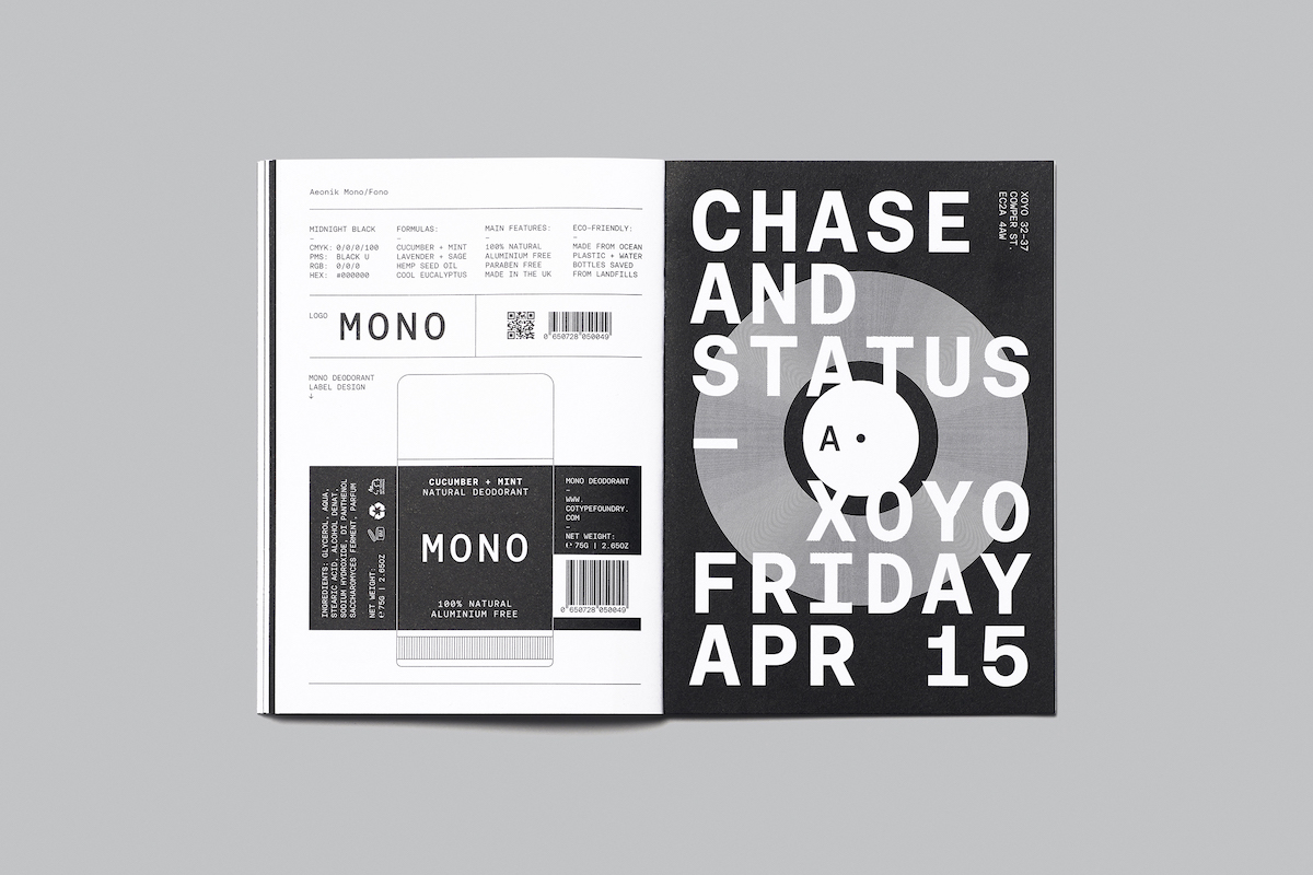
Aeonik Mono and Fono are available in 7 weights ranging from Thin to Black. The extensive language support (Latin Extended A) allows typesetting in most European languages written with the Latin script. There is also a FREE 68pp, type specimen book and variable font on all full family purchases, while both fonts are available to trial and buy exclusively from CoType Foundry.
Thank you, CoType!
Credits: Type Support: @blast_foundry, Printing by @identityprint, Photography by @garysmithphoto.