
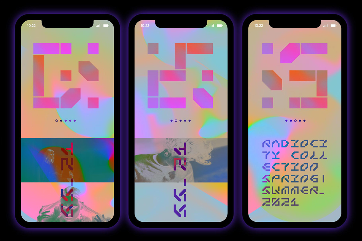
Peter Bushuev of NaumType discusses the combination of variable fonts with animation and the foundry’s latest font, Strikt.
ZLM: Hey, Peter! Firstly, can you introduce yourself and NaumType?
PB: Hi! I’m Peter, a 32 y\o designer from Pskov, Russia. From a young age, I was interested in various arts and crafts, which led me first to architecture and then to a graphic design career path. In a search for financial and creative independence, I stumbled upon the idea of reviving my passion for graffiti and street art into type design. In 2016, after almost a year of work and study, I released my first typeface, and of course, it happened to be a geometric grotesque. My first few typefaces were more on the traditional side and were decently successful. That gave me a base to take more risks, experiment, and explore aesthetic horizons.
In 2018 with an eye on the future I decided to move from personal branding and opened NaumType. The new brand has inherited my principles in a form of a mission to expand and explore the aesthetic boundaries of type and create innovative display fonts.
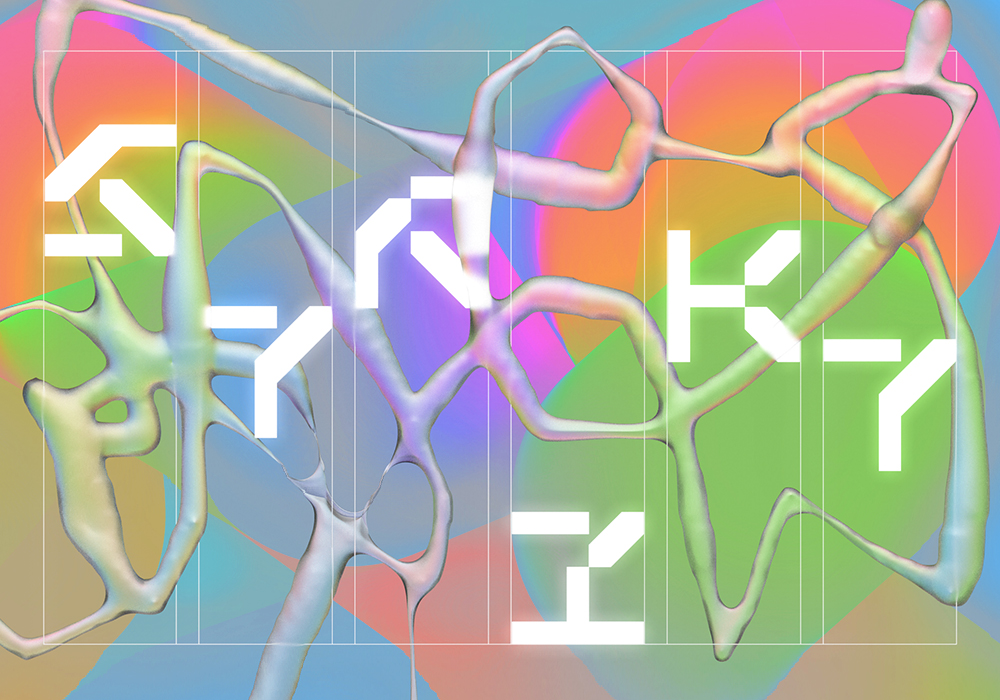
ZLM: Your Strikt font is really visually unique. Where did the idea for it first come from?
PB: Strikt was significantly inspired by Grammatography, the technology developed by Underware type foundry, specifically by their 2019 ATypI presentation. Underware showed the results of work with their custom software, which utilizes high-order interpolation (HOI) and variable font technology to develop fonts with built-in animation. Several animated typefaces they presented were impressive and inspiring; HOI opens great potential for experimental type design and kinetic typography. Underware has a great case study with examples if you want to learn more about it…But the downside of the Grammato is that it requires custom software to develop the fonts and custom scripts to make animations. So I decided to experiment and try to figure out if I can achieve some kind of morphing animation with just linear interpolation in a regular font editor.
ZLM: Why did you decide to explore variable fonts & animation together? What kind of creative potential did you discover?
PB: From my first fonts, I was fascinated by variable technology and always wondered what else, besides changing basic font parameters, it is capable of. I used it on almost every font family, and not only for weight. For example, my Cascadeur has 3 axes: weight, slant, and roundness. And for a long time, I was interested in 3D and motion design and was using After Effects to make little animations to show off my fonts. So it kind of was the next logical step, try to fuse those two skills.
In the past few years, there’s been an uprise in expressionist type design. Some designers reject font utility nature and use it as the medium of ideas itself, infusing the contemporary art field with new innovative pieces. GlyphWorld by Leah Maldonado is a great example. Variable type is a definite contender for the main role in this movement. It offers a new dimension of motion and interactivity to this art. I have a few expressive means up to my sleeve for future projects. For example, an idea for a gamified font, which to be able to read you need to tweak 10 or 20 variable axes to assemble it like a puzzle. Or I would like to try to combine optical illusions or moire with variable type in some way. But for now, I don’t think we can fully comprehend the possibilities of this bundle of technologies and what creators can do with it, especially if HOI technology would see progress.
Another potential direction is of course dynamic identities. More and more companies are using animation or interactive elements in their design code. And there is also a trend for the democratisation of corporate typefaces. So pretty soon we’re going to see more new examples of dynamic identities based on or saturated with variable type.
ZLM: How was the process of making Strikt?
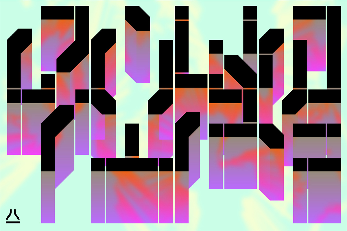
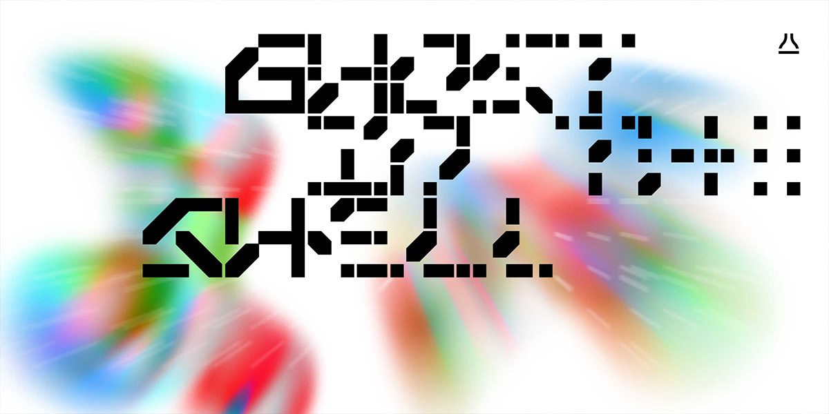
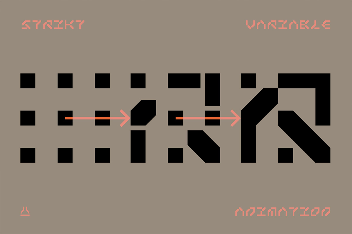
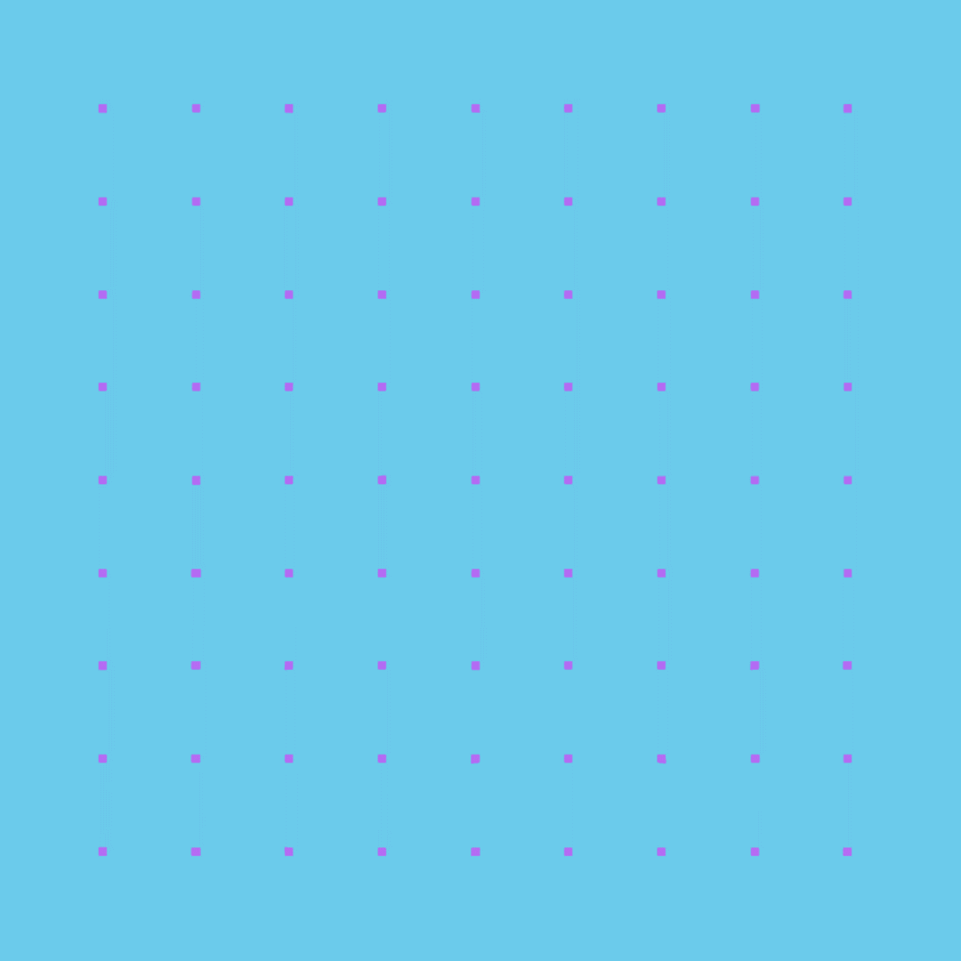
PB: The variable font format has some restrictions. Every axis that you add to your font gives you an ability for linear interpolation between masters. That means that the points of the contours can only move in straight lines. This restriction led me to the idea of a dot array, in which dots can change their shape and form different glyphs. The next step was to find the minimum amount of dots and their configuration that can shape basic Latin letters. I think that you could achieve it with fewer contours, but for aesthetic purposes, I decided to use a 3×3 grid. Keep in mind, there is also a pattern that the fewer contours you use, the harder it is going to make consistent and smooth interpolation.
So the basic structure was set. After that began the fun part of finding and choosing good-looking letterforms, comparing them to the others, and reiterating. In other words, trying to find a consistent style. After the 26 letters were designed it was time for numbers and punctuation. Here, some problems began to come up. The super-rigid structure of the font did not allow it to communicate some of the finely detailed glyphs. So I decided to make as many glyphs as the structure allowed and call it a day—after all, Strikt was planned as a display font from the start. As a result, Strikt does not have, for example, #, ©, or any diacritics.
After 86 glyphs of the font were completed and the animation axis bugs were fixed I decided—why not add a weight axis? That was a walk in a park, thanks to the modular and geometric nature of Strikt.
ZLM: How do you envision this font being used, or what would be your dream place to see it in-use?
As I mentioned before, I am interested in dynamic identities and interactive design. One of my favourite studios is DIA. So the dream in-use would probably be something similar to their generative kinetic designs. But I know that Strikt has a very brutal and futuristic appeal, and more realistically I could imagine it in something related to sci-fi or tech. Maybe game or movie titles, futuristic UI. Also, it would be very cool to see if someone could realise Strikt’s morphing potential in wearable tech or digital watches.
ZLM: Yes, that sounds cool! Lastly, have you seen any other creatives exploring this technology in fonts or type projects that you’ve particularly liked?
PB: Yes! So:
- Schultzschultz makes truly amazing interactive art, some of which use variable type.
- Synestype – this is a cool concept, a variable font that expresses emotions for movie titles.
- A similar project is an Emotional Type. Developed by Promphan Suksumek, it is a proof-of-concept experiment using font variations to communicate a continuous range of emotional expressions.
- WhirlyBirdy, made by Richard Yee and Alex Tomlinson, is a huge font family inspired by American 50s aesthetics and includes WhirlyBats, which is basically an animated analogue of dingbats.
- David Jonathan Ross is experimenting with colour, OT features, and variable type, and coming up with inventive and dynamic fonts like GIMLET X-RAY or Merit Badge.
- Otherwhere Collective is designing modern display fonts with the interesting use of variability. Take a look at their OC Blimp and OC Format Shards.
- Rotor by Jan Sindler is another great example of a variable font with build-in animation.
- Elias Hanzer did a really cool brutalist generative design tool, Phase, which uses variable type.
You may notice that most of these examples, as inventive and intricate they are, are using pretty primitive animation technics. Unfortunately, there is an obstacle in variable animation expansion.
Most people nowadays use After Effects for motion design, and for some reason, Adobe does not want to add support for variable fonts in it. Of course, there are workarounds, you can convert your text into curves and morph letters by hand, but it only works with small phrases. Or you can use Type Morph or another AE script, but they can be buggy and cost money. So if you are interested in motion and/or type design, please sign a petition on the Adobe website to add support for variable fonts to AE. I think that change could be a big leap both for motion and type designers.
How do I make my animations? I personally prefer Dinamo Font Gauntlet + any screen grabber (I use OBS Studio). It is perfect for simple showcase animation. Thank you, Dinamo, for this wonderful utility!
ZLM: Thank you, Peter!
You can find more of Peter’s work at NaumType.


