Matthieu Salvaggio founded Blaze Type (BLZT) in 2016, when he says there weren’t as many young foundries doing what they’re doing now, and that in the world of font licensing and selling, he wasn’t aware of many setups aligning with what he was looking for. ‘It seems at the moment, the type design world is in a massive stage of development in terms of font design and font distribution, which is a good thing’, he says, ‘but back then, I didn’t feel like there was a foundry with a company’s positioning to which I could relate. There was always something I didn’t feel linked to: the overall pricing, the license system, and so on’.
Starting Blaze Type as a way of making amends with the issues he was observing, Matthieu says starting the foundry has created the opportunity for him to work with some amazing people. Now able to host the work of others through their platform, Blaze Type spends a lot of fo time working with experienced, senior designers, alongside channeling energy into supporting young designers—students and graduates—in their budding type journeys. Their mission is to create and distribute ‘beautiful typefaces which will age gracefully and provide incredible functionality over the years’, working from their studio in Lyon, France.
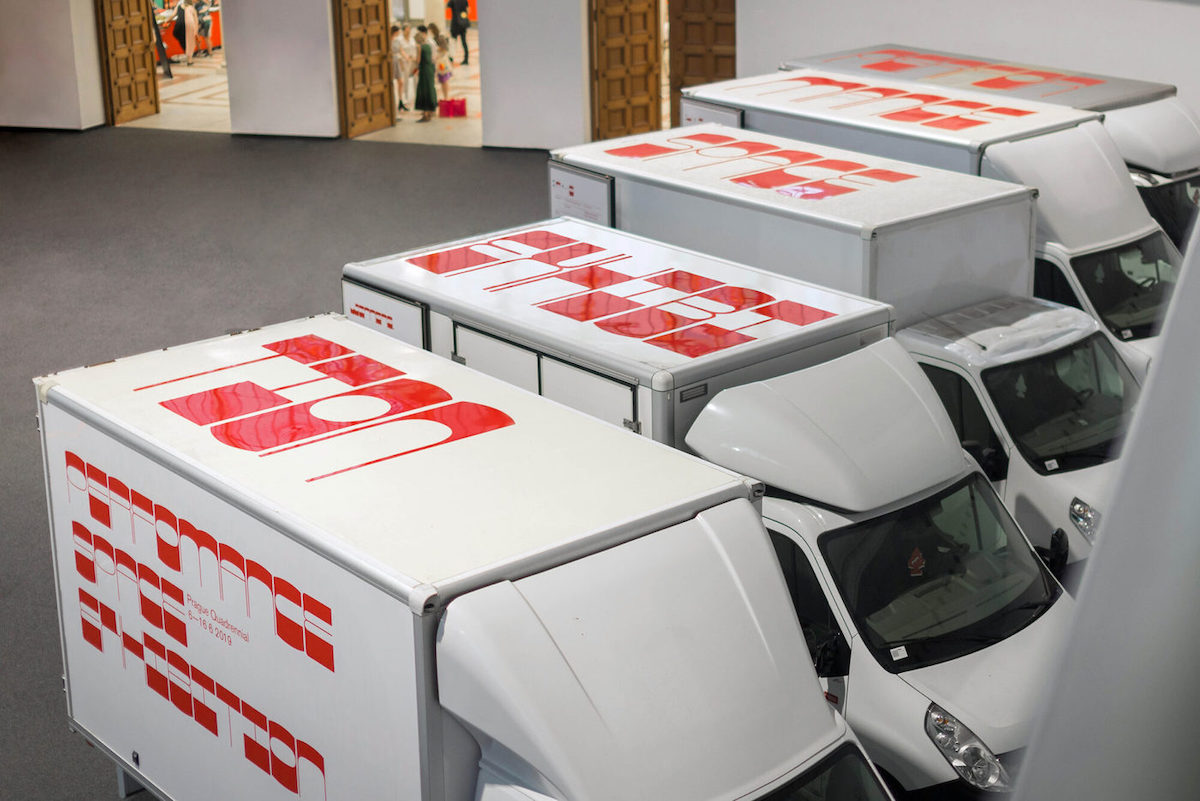
Image source: http://www.zerwox.com/performance-space-exhibition/
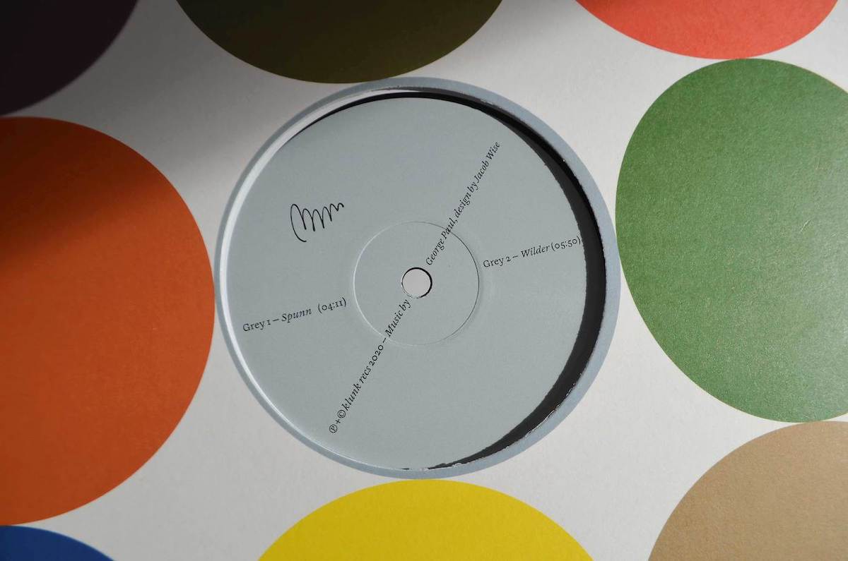
Image source: https://jabes.bandcamp.com/album/klunk002.
In his own type projects, Matthieu says he is inspired by exploring ‘mystical stories, religious mysticism, architecture, counts & legends and design systems’, and filtering his findings through type as a medium of storytelling. ‘When you see Apoc, for example, it’s another take of the Passion of Christ—and Sigurd, our January font release, is the story of the Nibelungen’, he says. ‘It’s pretty much what happens in all my font projects.’ Nowadays, however, Matthieu tends to spend more time accompanying other designers involved with the foundry on their font project. ‘We have some interesting things coming up with Léon Hugues, Guillaume Sbalchiero and Alain Papazian’, he says, ‘I’m really excited to have designers discover their amazing work.’
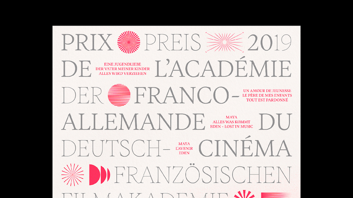
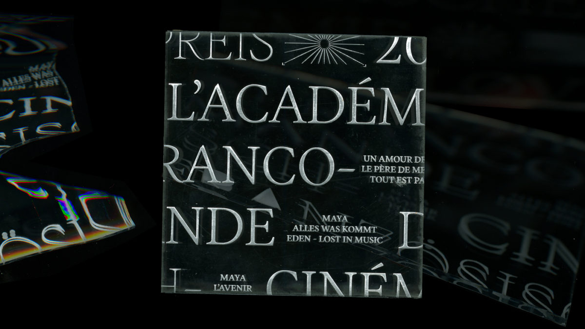
Image source: https://www.instagram.com/nclstd/?hl=en
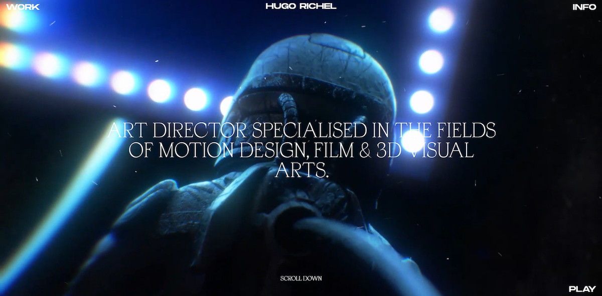
Image source: https://fontsinuse.com/uses/34057/hugo-richel-portfolio-website
‘The most important thing, I think, is the relationship between the designers and the relationship we have with those who support our work’, Matthieu continues. ‘I’m so proud every time I see a project featuring one of our fonts, and this is what keeps our passion for type design burning.’
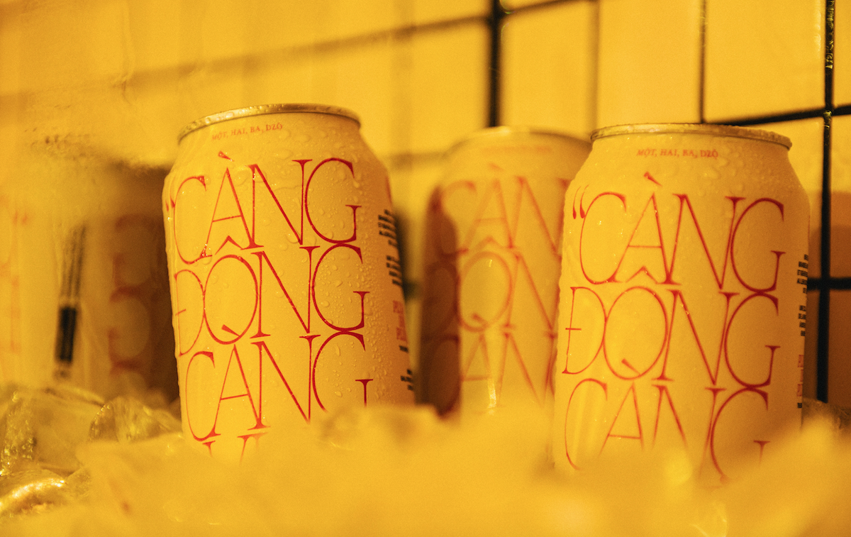
Image source: https://www.behance.net/_gpl
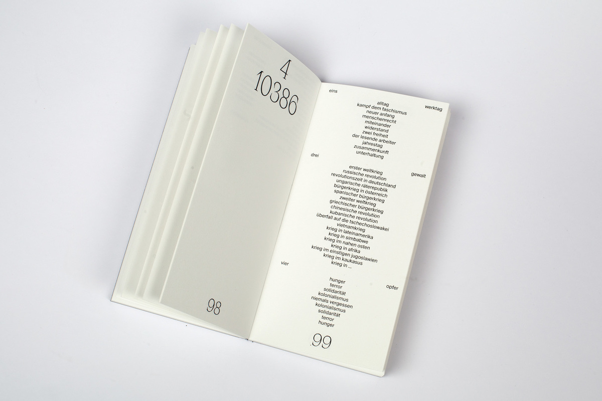
Image source: https://fontsinuse.com/uses/33092/table-poems
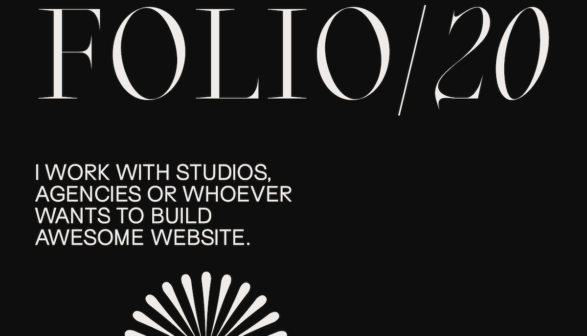
Image source: https://sam-phlix.com.
While Matthieu says it’s tough to choose favourites when it comes to projects featuring BLZT’s fonts, the projects he’s selected feature: Joly Text, designed by Léon Hugues, inspired by eighteenth-century Dutch type and coming in 5 weights (roman and italic); Inferi, designed by Matthieu, inspired by Garalde-esque fonts and available as an extensive family; Apoc, an elegantly pointed serif typeface designed by Matthieu, which comes accompanied by a Cyrillic set designed by Ilya Ruderman, and is also available as a variable font; Oroban, an angular serif designed by Matthieu, inspired by different flowers within the Orobanchaceae family and coming in three styles with matching italics; Surt, a flexible sans inspired by Norse mythology and Scandinavian Architecture; and Zoo, a strong, high contrast display typeface designed by Quentin Coulombier.
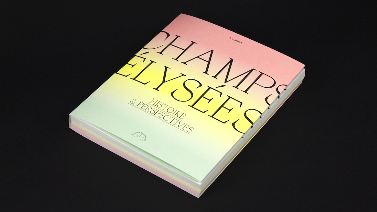
Image source: http://www.abm-studio.com/fr/projets/view/154/champs-elysees-histoire-perspectives
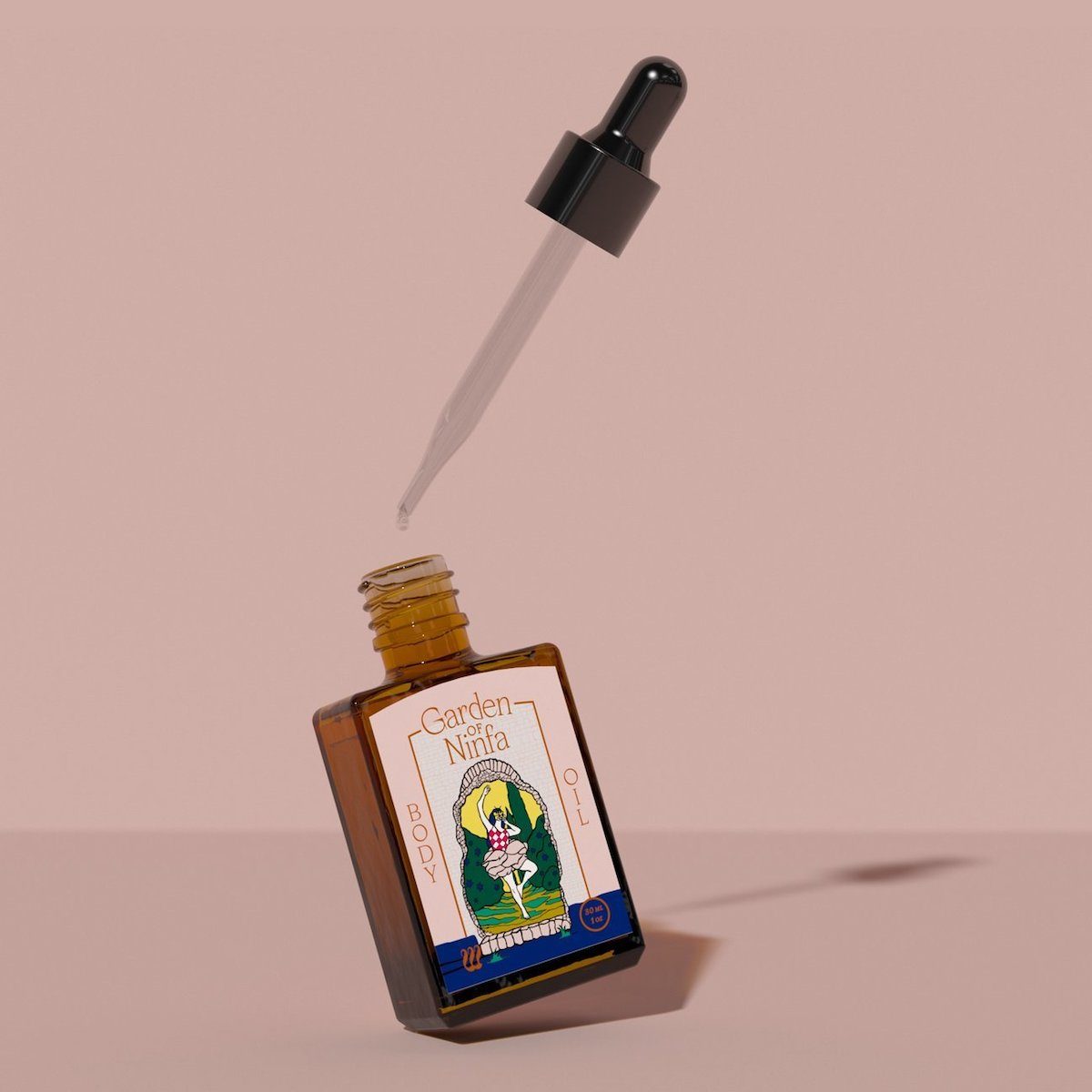
Image source: https://fontsinuse.com/uses/31524/wyrd.
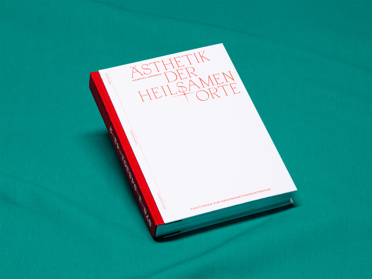
Image source: https://fontsinuse.com/uses/30782/asthetik-der-heilsamen-orte
‘In the end’, Matthieu says, ‘it’s just about having fun doing the work you love. That’s what we try to do: design fonts we like and want to see other people use…If designers dig them and want to use them, that’s awesome. If not, well, stuff happens.’ And speaking to young designers, he adds ‘Drive yourself into this work until it consumes you. The force of the dark side is limitless…Being serious: drop us an email if you want advice or want us to have a look at our work’. You can find out more about Joly, Inferi, Apoc, Oroban, Surt and Zoo over at Blaze Type, or browse the rest of their amazing stuff in their type catalogue. Thanks, BLZT!

