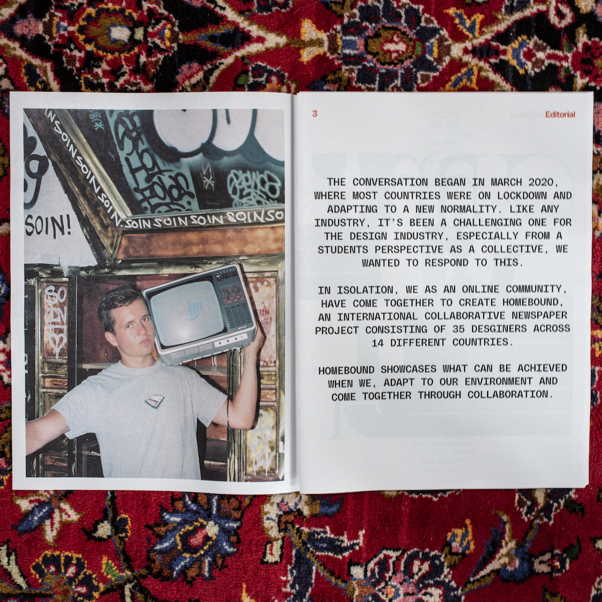
Cihan Tamti (@cihantamti) is a graphic designer based in Bochum, Germany. Specialising in visual identities, typography and printed matter, Cihan’s lockdown project HOMEBOUND was his first project as creative director. Prior to the pandemic, Cihan had been working in Munich on an internship but due to the virus, he had to move back home and work from there. Noticing a slump in morale in the design community due to lack of work or disruption to jobs/studies, Cihan initiated Homebound through an Instagram story as an open call to create a collaborative publication. We were so taken with the publication’s stunning type treatment and the collaborative, positive attitude behind it – so, we got in touch with Cihan to chat more deeply about the project.
Hi Cihan! First off, what was it like taking on the role of creative director for the first time?
I always wanted to get to a position like that. I never expected that I’d be able to create it for myself! The biggest challenge was at the start… How do I manage so many people? What do we use? Google Docs? Slack? WhatsApp? Dropbox? It was sometimes hard to make everyone happy when I had to make decisions. But everyone was motivated and had a lot of ideas. There was a big group of designers with different experiences and knowledge. I split the team in groups and each one was for a certain skill. We had type designers, editorial designers, poster designers and illustrators. All groups had one art director and one editor to make sure that everything was in the right grid and there was no mistakes for the print.
We love the the type in Homebound so much. Can you run us through the type treatment and your thoughts behind it?
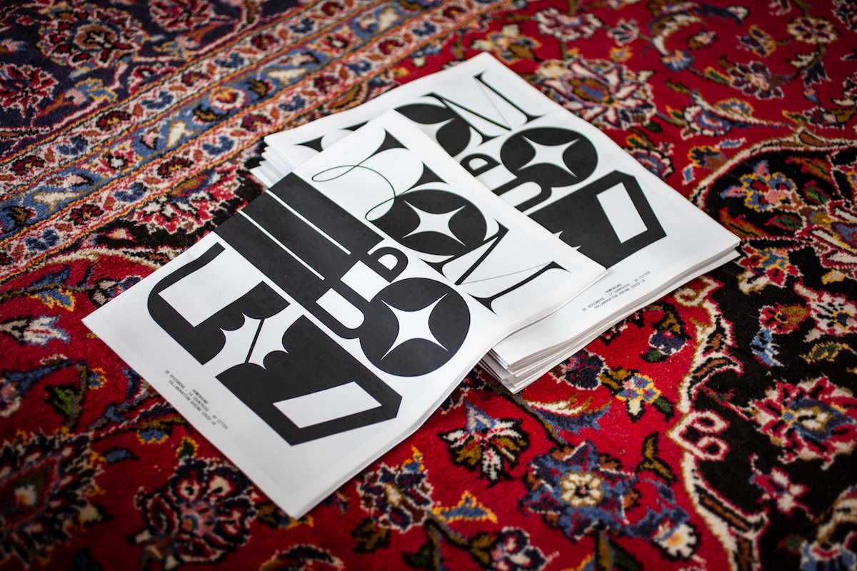
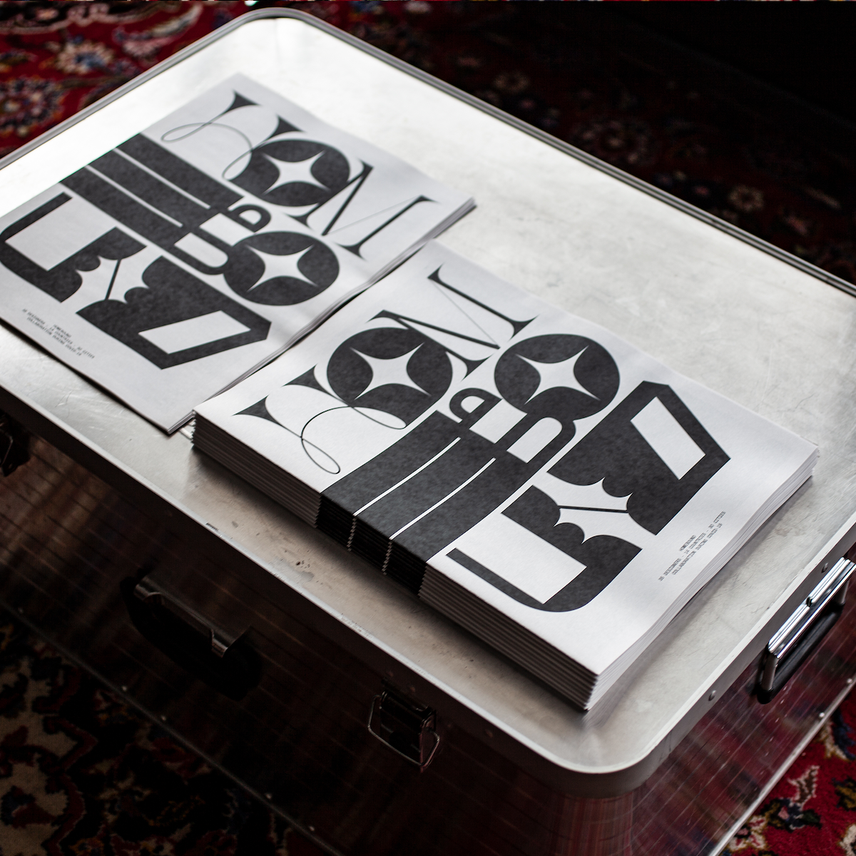
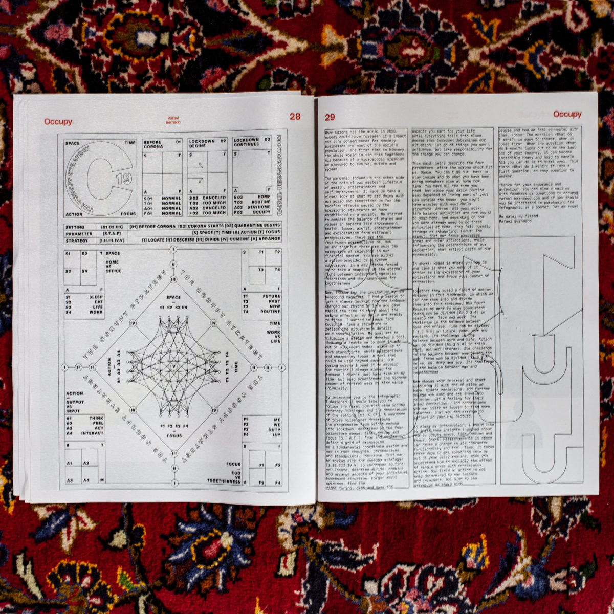
The Type Team was a group of 5 people. I gave all of them a chance to design one headline custom. Then I figured out that the styles were really different and it would be a big loss if only one type with variations would be on the headlines. So I decided to take all letters and add a few. Then I started to mix the typefaces. There was a big problem here of balancing different typographies. The best solution was to make ligatures. In that way, we had typographic mixed headlines with an extreme, loud attitude… Our headlines become illustrations. I was sure some people would say its not legible, so the running titles at the top of the pages always have the headline in a clean sans serif font with the pagination.
We used PolySans from Gradient type. We had the Regular weight for the running titles and the Mono for the texts. The Monotype gives the newspaper design in the editorial a certain feeling. It’s more modern and younger in this context instead of a usual serif font. The whole typography was getting an urban and young vibe this way. Edgy but clean I would say.
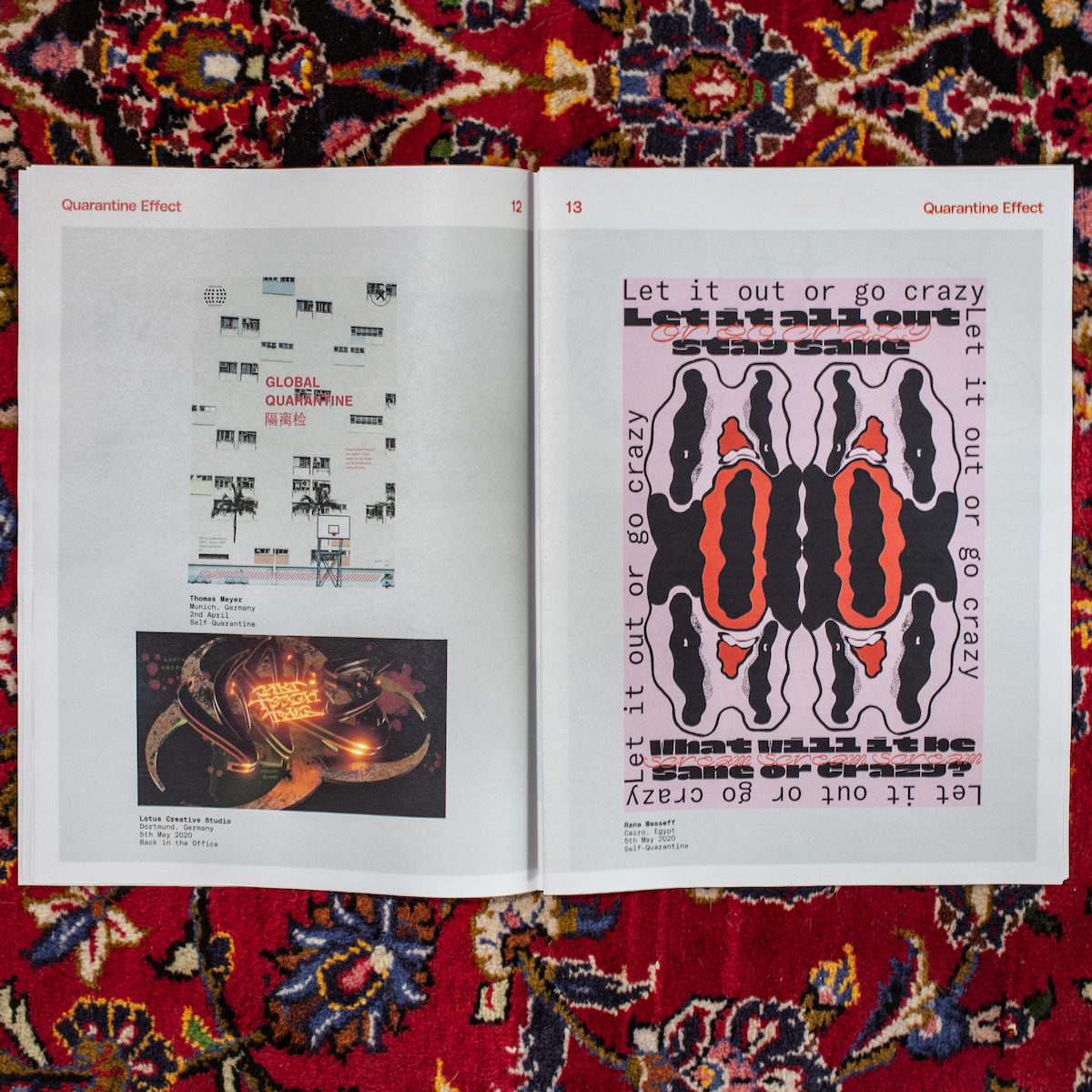
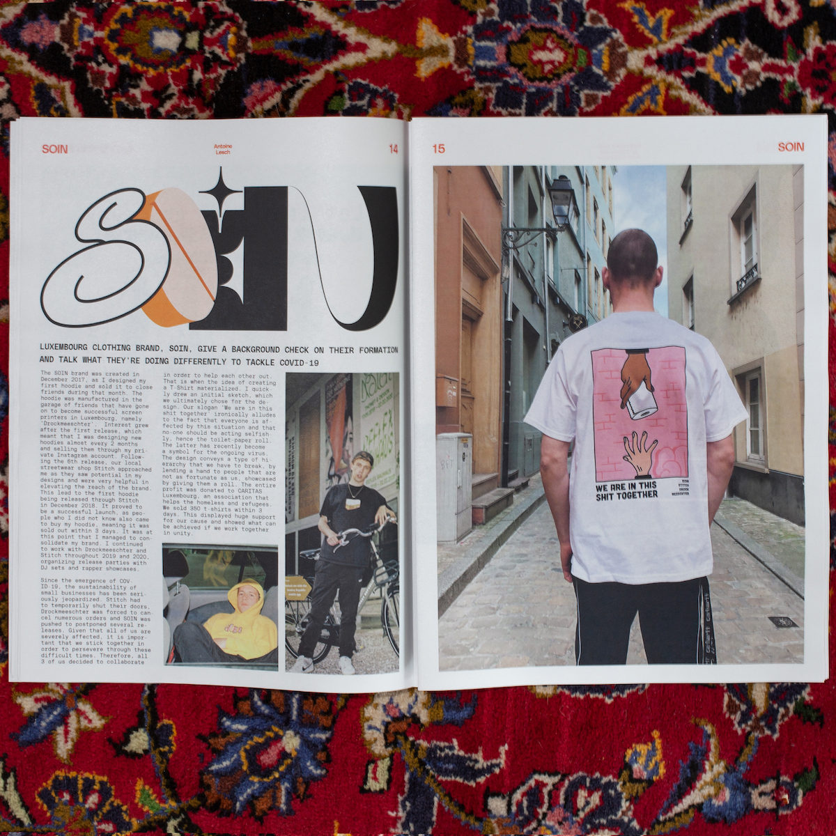
You describe the themes of Homebound submissions as ’emotionally conceived’ and say that throughout the project, there was a change in the mood of the visuals (especially as lockdown went on)… Can you expand on this a little?
Homebound is a real emotional documentation of the mood during each designer’s lockdown. The first time I realised it was when the print was in my hands. When you are leafing through the newspaper you can feel how the colours and the titles of the individual works have changed. At first we made fun of how people were buying so much toilet paper, then it changed to angry posters saying that you’re having a bad day and hate everything. As the death toll rose, most of the posters were black and white.
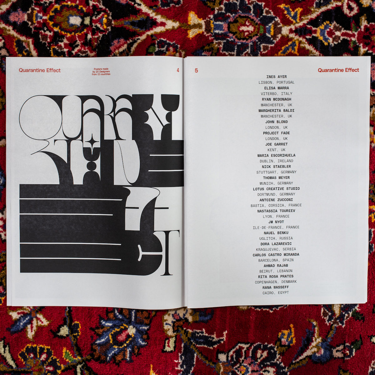
The title of the poster chapter is ‘Quarantine Effect’ and it was completely open to interpretation. The illustration chapter was called ‘Unlocked’. The individual designers worked separately and alone in different timezones, so the change in mood was organic. This proves once again that creativity likes to reflect society. Everyone has their own voice, but many have the same problem, struggle and concern. Through the project I realised how important it is as a designer to take something like Homebound in hand. That you just say what people think and feel. This project was a huge success not because it had a lot of reach, but because it touched a lot of people and got that ‘Oh yes, I know that’ feeling. I now have a different eye on my projects and also pay close attention to customers to know a project always has a connection to society or to the viewer. This ‘Oh yes, I know that’ feeling was the great experience in the end, and should be implemented as well as possible if it makes sense.
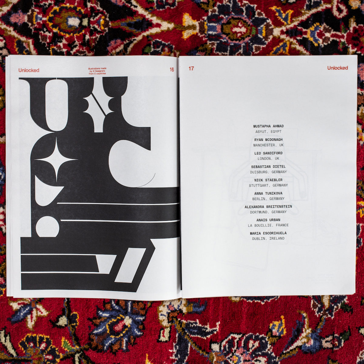
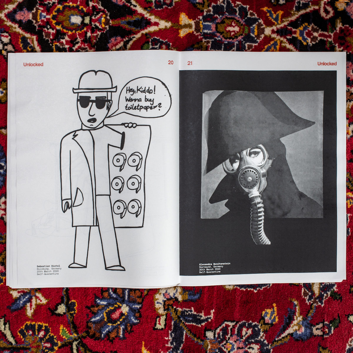
Lastly, how do you hope people interpret Homebound or what do you hope people will get out of it?
I hope that this project makes people realise how easy it is to do something like this. I hope that everyone recognises there is a community and it doesn’t matter how experienced you are – the important thing is the intention. It is important to learn from the matter. I wish Homebound will be seen as a collaborative project that makes it clear that you can make the best of everything, even in a situation like this. Cohesion has always been good. Cohesion makes friends and builds relationships. Cohesion solves problems more easily and it is easier to be heard.
On my part, the project was a gift for my community and friends. Everyone was allowed to participate and everyone was allowed to order as many prints as they wanted. I wanted to offer something to people who have lost their jobs, customers or something else. It was my reaction to the design community.

Thank you, Cihan!
If you love Homebound as much as us, be sure to follow Cihan on Instagram and check out his website to see where his work goes next.

