
Identifying as an anarchist and an anticapitalist, Kevin Yuen Kit Lo is the founder and creative director of LOKI; a small multidisciplinary design studio based in Montreal/Tiohtià:ke. The studio, he tells us, “works at the intersections of graphic design, cultural production, and social change,” and is built with social justice principles instilled at every level. Previously working for activist causes alongside being a digital designer at agencies, Kevin stared LOKI with their now designer (then intern), Marie-Noëlle Hébert, in a move he describes as a “huge leap of faith.” Despite the pandemic, LOKI are now working at a more stable, established level—and most importantly, they’re oriented around social justice and activism in everything they do.
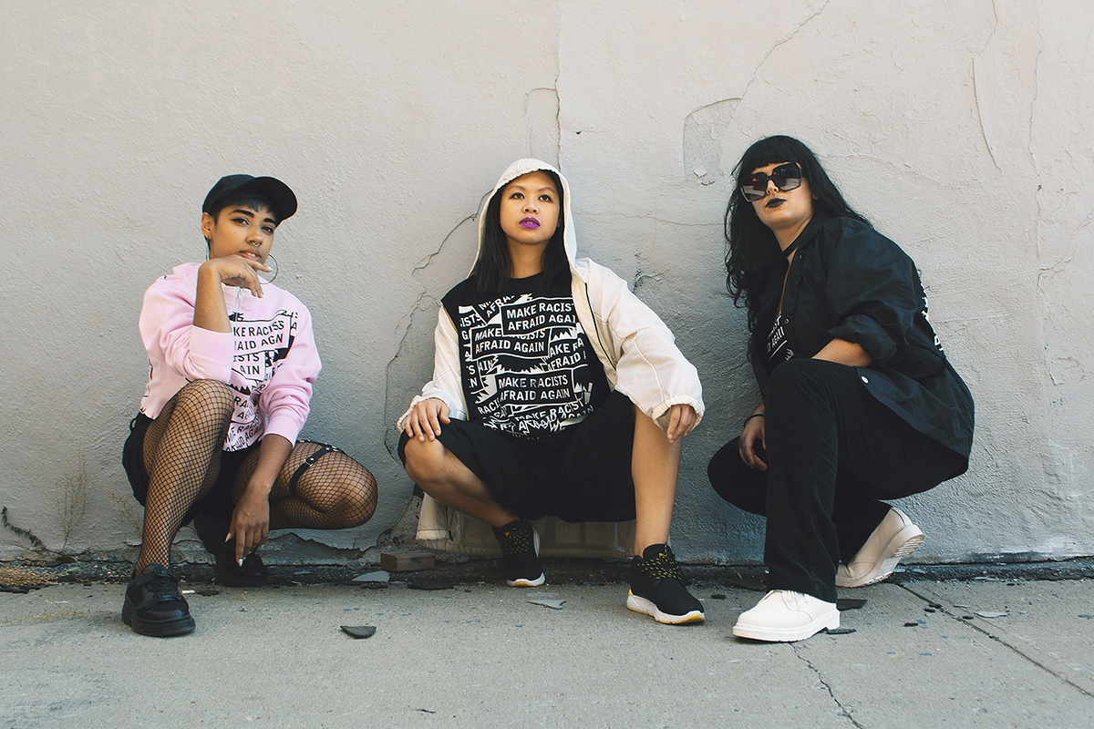
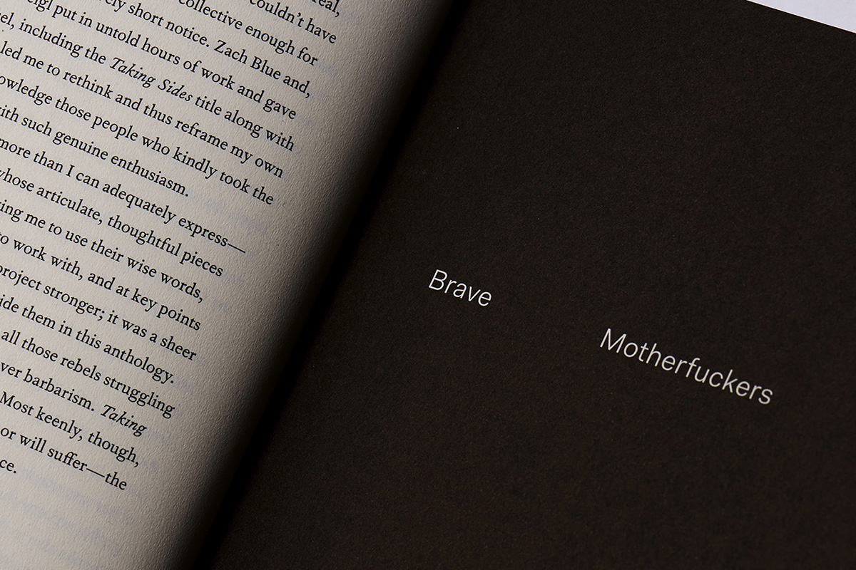
As Kevin says, “We work across a range of disciplines and sectors; we design books for underrepresented authors, visual identities and online platforms for arts organisations, develop campaign strategies and visual assets for activist groups, work with researchers to translate social data into accessible and engaging forms, etc. We also create zines, street posters, stickers and t-shirts in support of social movement struggles, all with the goal of nurturing a vibrant and diverse culture of resistance.” Kevin is also a member of Justseeds Artists’ Cooperative and the Memefest network, and is full of ideas about the relationships between culture, design and social change. We’ve been speaking with Kevin to explore these intersections and look at what it means to implement typography and graphic design authentically, as tools of social justice.
You say LOKI creates “images, objects and experiences that engage, empower and oppose.” Could you tell us a bit more about this?
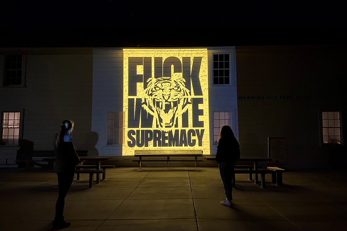
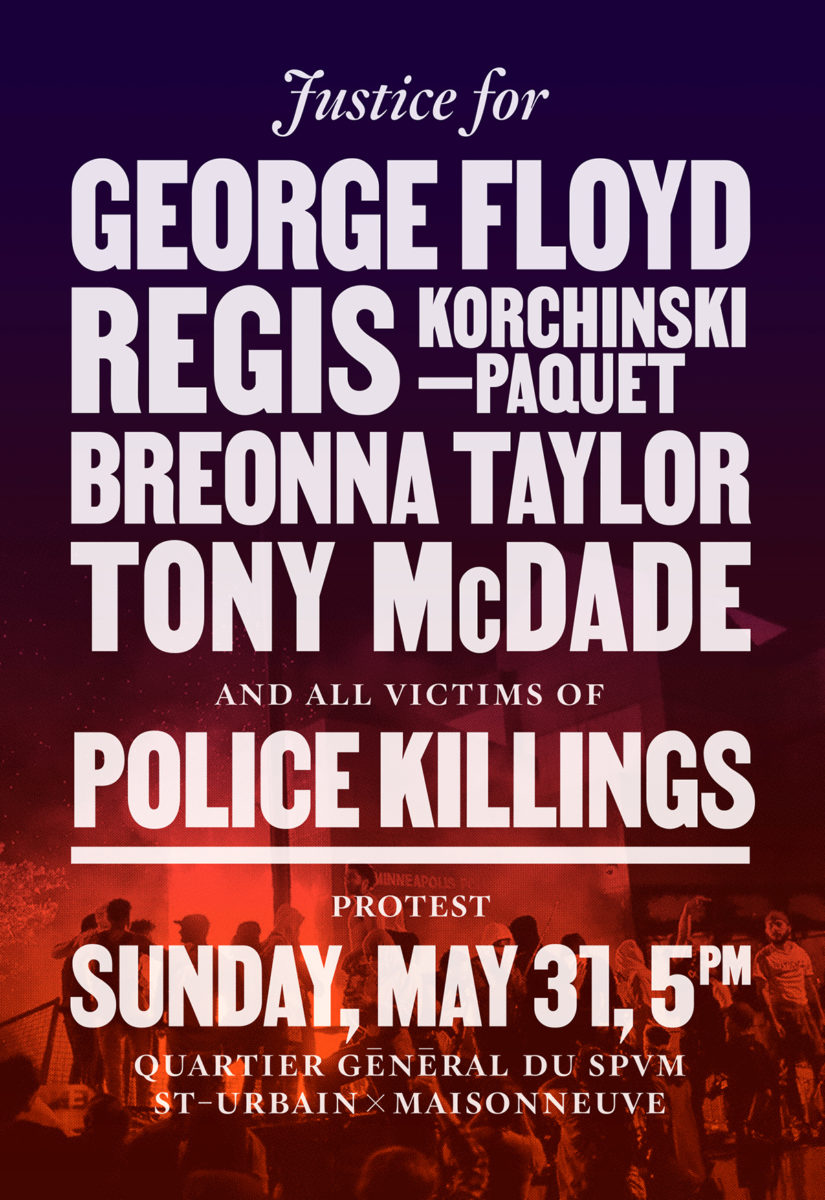
At its most basic, this relates to who we choose to work with, and how we approach that work. I find that design as a discipline tends to not have a very deep analysis of power, both within its practice and within society at large. I identify as an anarchist and an anticapitalist, albeit a rather practical one, so I am deeply critical of the uneven distribution of power across society, of the oppressive systems that we take for granted and think are immovable. As a designer, I see how this operates on a symbolic level, on the level of representation, so we work with our clients and collaborators, often members of marginalized communities, to challenge these entrenched systems of power and to present alternatives. As an activist, I also believe strongly in the power of collective protest and direct action, so we also create graphics, posters and placards for these types of actions, as manifestations of anger, solidarity, and critique. I think this oppositional approach is what sets our work apart from that of other studios doing “socially-engaged” design. We try and find the cracks in the veneer of capitalism and colonialism and pry them open to expand the scope of public debate and the realm of possibility.
Graphic design is also complicit in these oppressive systems, as a way of normalising and naturalising social hierarchies and specific ways of communicating, living and being. So part of our work is aimed at transforming the discipline itself through the aesthetics we deploy, the self-initiated projects we put out, and the research, teaching and writing I do.
How do your typographic choices communicate your brand ethos and push forward your projects?
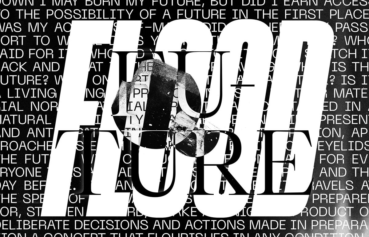
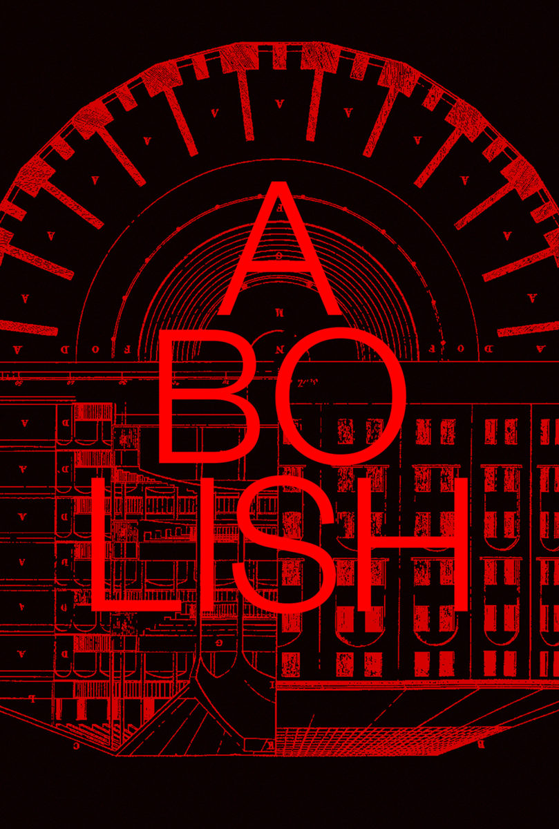
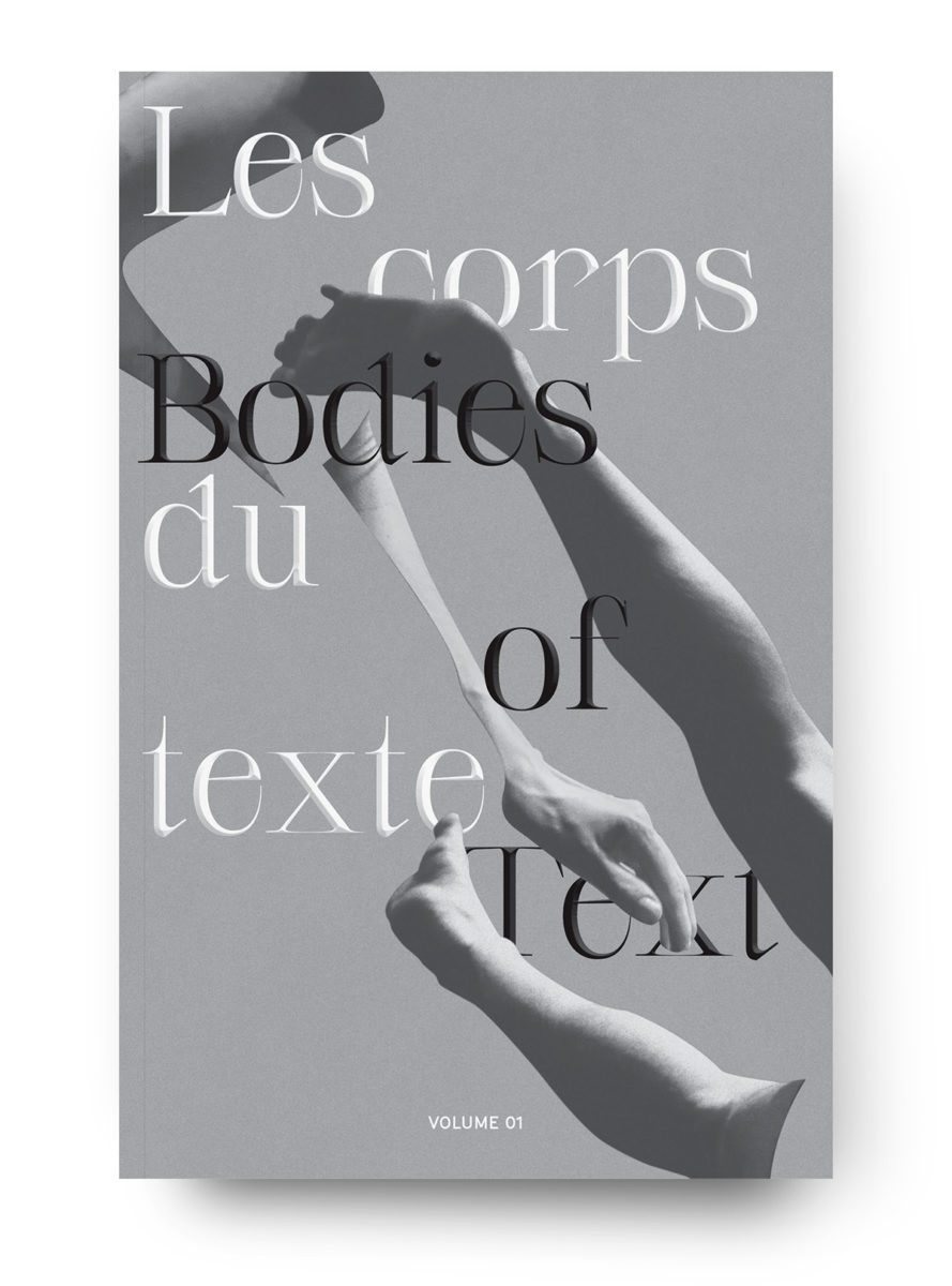
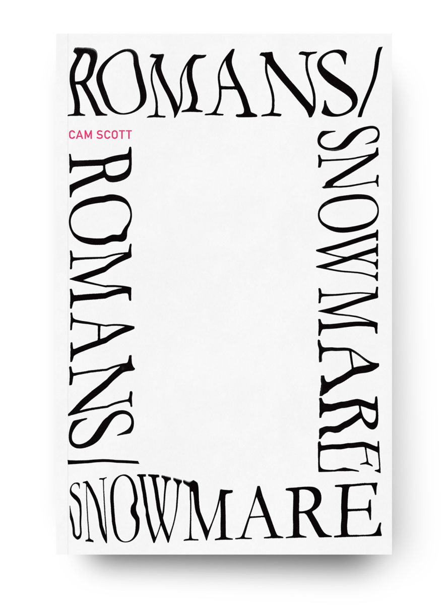
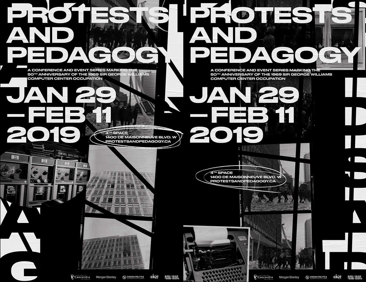
I would never consider ourselves a brand with an ethos, but our approach to typography is certainly central to our positioning and identity. I came of age in graphic design in the late 90s and early 2000s and was deeply influenced by post-structuralist thinking and how that expressed itself in the experimental typography of the time. Challenging norms of legibility, layering meaning, giving readers agency through multiple points of entry and interpretation, and working with typography as material in itself, are approaches that I still find incredibly relevant and exciting. Though it’s impractical to push these approaches to the extreme in a lot of the commissioned work we do, we do try to embed some of the thinking behind them into most of our designs. This can express itself through the choice of an unconventional typeface for a given context, the inversion or flattening of typographic hierarchy, graphic distortion, patterning or repetition, or interactive gestures, and these are never arbitrary or simply stylistic choices.
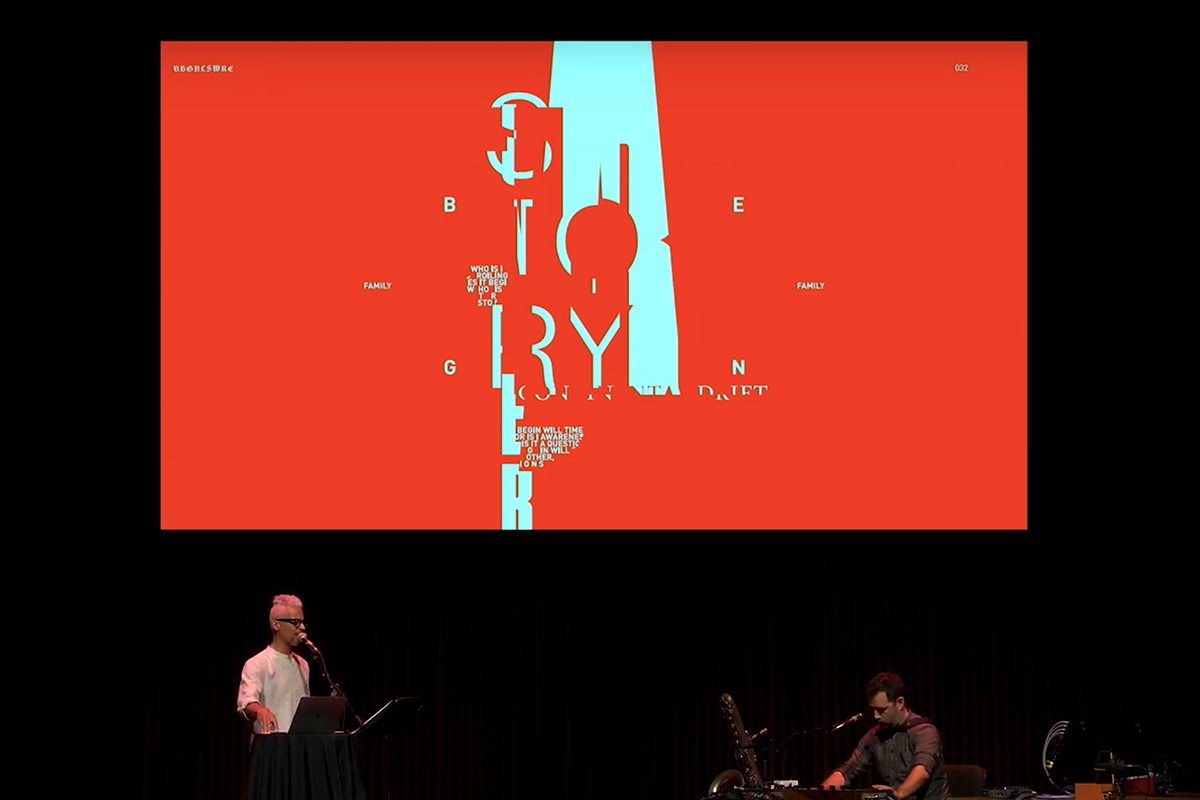
With some of my collaborations with artists, I’ve been able to explore these ideas further. In particular, my collaborations with writer, poet and sound artist Kaie Kellough have allowed me to “perform” live typography as part of a musical ensemble. This has been a lot of fun, and is kind of a throwback to my cut and paste zine days, but also a lot of work as I try and grapple with both the technology and my awful sense of rhythm.
How important is type for you at LOKI when it comes to communicating a message?
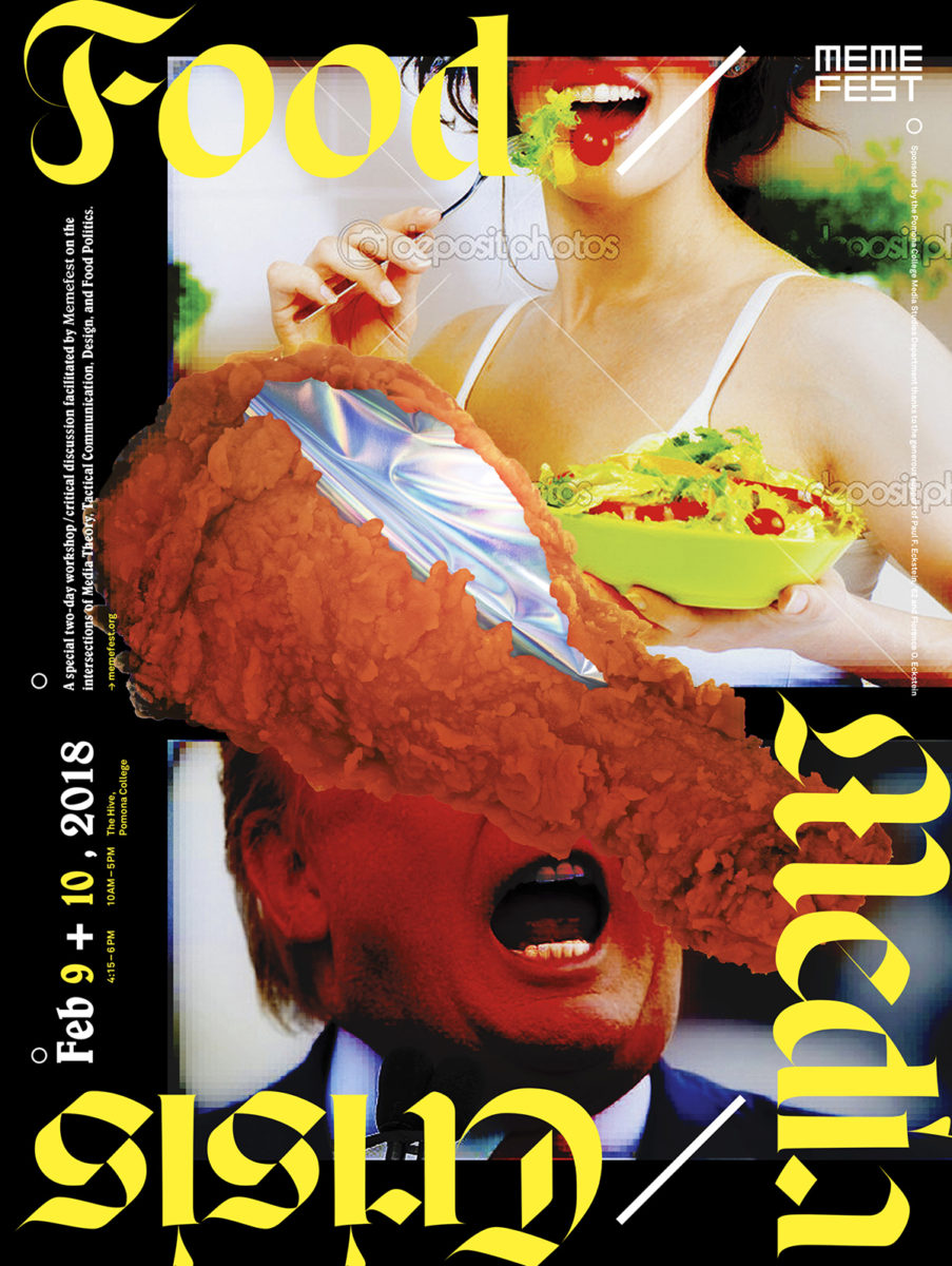
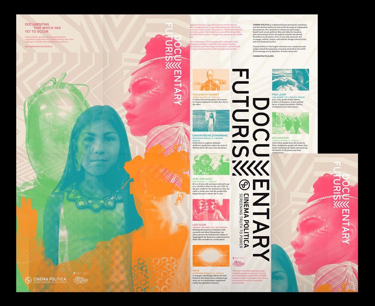
We often arrive at typographic solutions given that a lot of the ideas on social justice we try to convey are very hard to visualise, and images can sometimes fall into the trap of representation. The typography grounds any imagery or illustrative elements we might use into a specific message, allowing them to be more abstract, evocative or atmospheric. And I think using type as image, or in a conceptual way through its composition, can be just as evocative and engaging. Illustration and photography can sometimes overstretch the small budgets and tight timelines of many of the projects we work on, so a type-led approach is also a practical solution.
What do you think it means to build a design practice with social justice at its core, as opposed to one which ventures into social justice work, but is not necessarily built on it?
Working with the collaborators and communities we work with, trust and accountability are at the very core of our relationships and responsibilities. This trust can only be built through time and engagement both within and beyond the design practice, through my long-term community organising work, through meeting each other in the streets. It’s not just about understanding the challenges they’re facing, but about actually sharing in a broader common struggle. I think this makes all the difference.
Design in these contexts has such different goals and measures of success than design in a commercial context. Mobilising against systemic racism requires a different type of design thinking than selling Nikes. So much of “traditional” design is rooted in seduction, persuasion, packaging, marking ownership and exclusion through branding, or as “neutral” and “objective” communication of the client’s message. These values are diametrically opposed to the type of work we do, which require a wholly different approach to communication; one that emphasises positionality, openness and flexibility, care and honesty in its expressions of anger and injustice.
What do you think the world of typography can do in terms of fighting specific causes?
From the perspective of type design itself, I think there are some really interesting questions that need to be discussed. Vocaltype’s amazing work, highlighted by the mass BLM uprisings, is such an important example of historical positionality in design, that the design of a typeface can have a loaded political and cultural context. This also points towards the dire necessity for diversity within the type design world, in order for typography to address a broader set of concerns.
I also find really interesting the “debate” surrounding the recent CIA rebrand, using Grilli Type’s GT America, to attract a more “diverse” workforce. Can we think of new frameworks for licensing that treat type designs as not just another universal consumer product, but as cultural material? Stylistic appropriation, the co-option of visual language, can be very damaging to marginalised cultures of resistance, and this seemingly innocuous question of font licensing gets at the heart of it in some ways.
On the flip-side, I also think typefaces need to be made generally more accessible, cheaper, to democratise their usage beyond big branding studios. Many typefaces are exorbitantly priced, treated as luxury items, and I find this to be an elitist practice for a craft that is based in making language, stories and ideas universally accessible.
Finally, as a graphic designer, I think the first step is to actually engage in social struggles as a person first. The dangers of “parachuting” in with the best of intentions are well-documented. Go to meetings, get in the streets, make friends, and then see what your design can do. We need to think of our design engagement as a form of enacting justice, and not social justice as a form of design.
Thank you, Kevin!


