
We’ve seen some staggering work from independent type designers over the last year, so we thought it about time for a refresh on our last roundup. So here it is: our top 30 independent type designers you need on your radar in 2021.
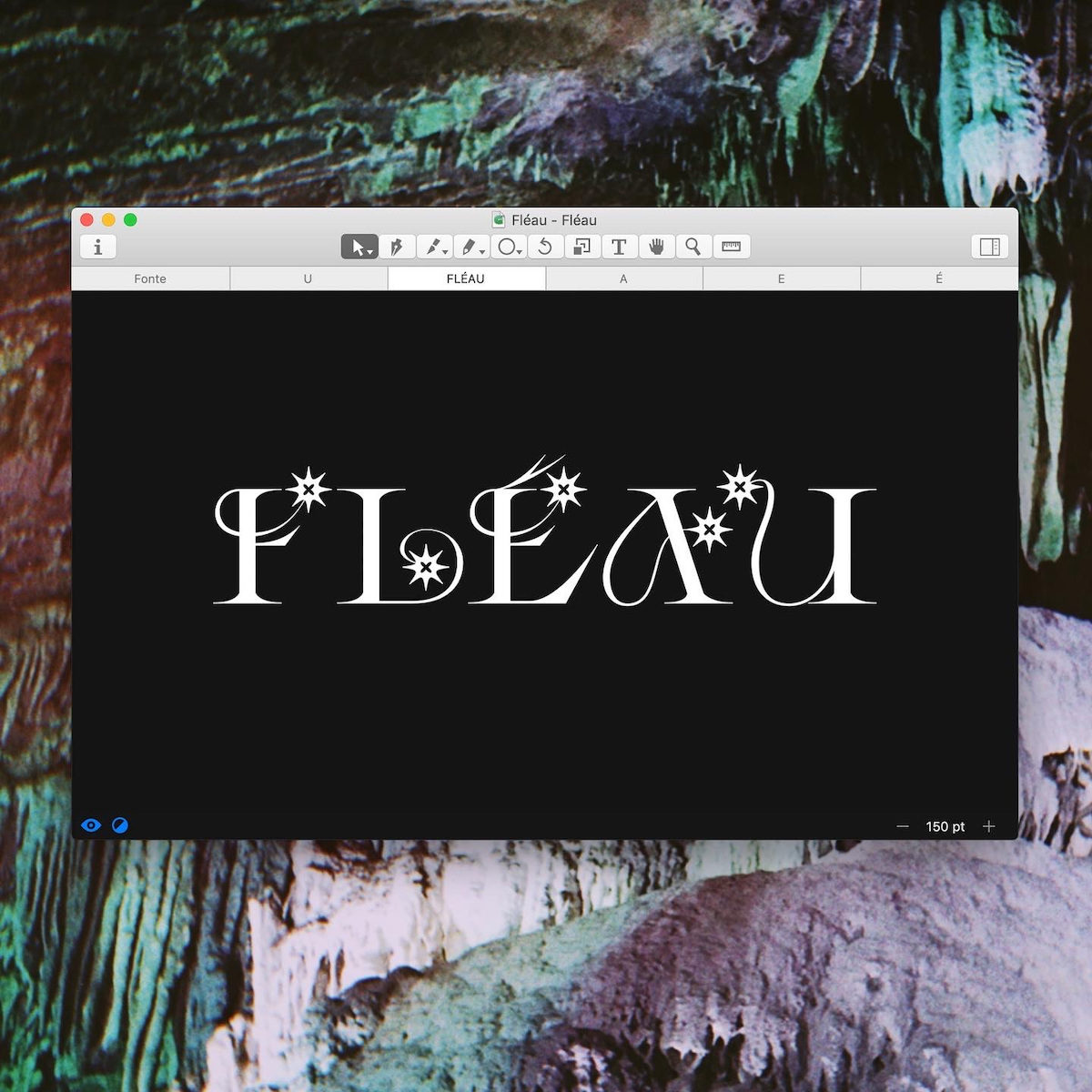
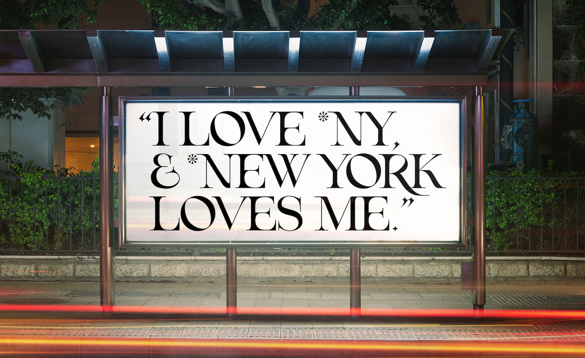
Morganne Borowczyk is the designer behind the stunning Peste typeface (previously known as Mournblade). This has got to be one of our top serif displays—it’s super innovative, fantastical, mysterious and a little gothic, meaning it’s full of character. Having just received a delicious update, Peste’s going from strength to strength. Morganne’s WIP typeface Fleau has also got us super excited, being a softer, gentler, but equally transfixing sister to Peste. We can’t wait to see what the rest of 2021 brings for this designer.
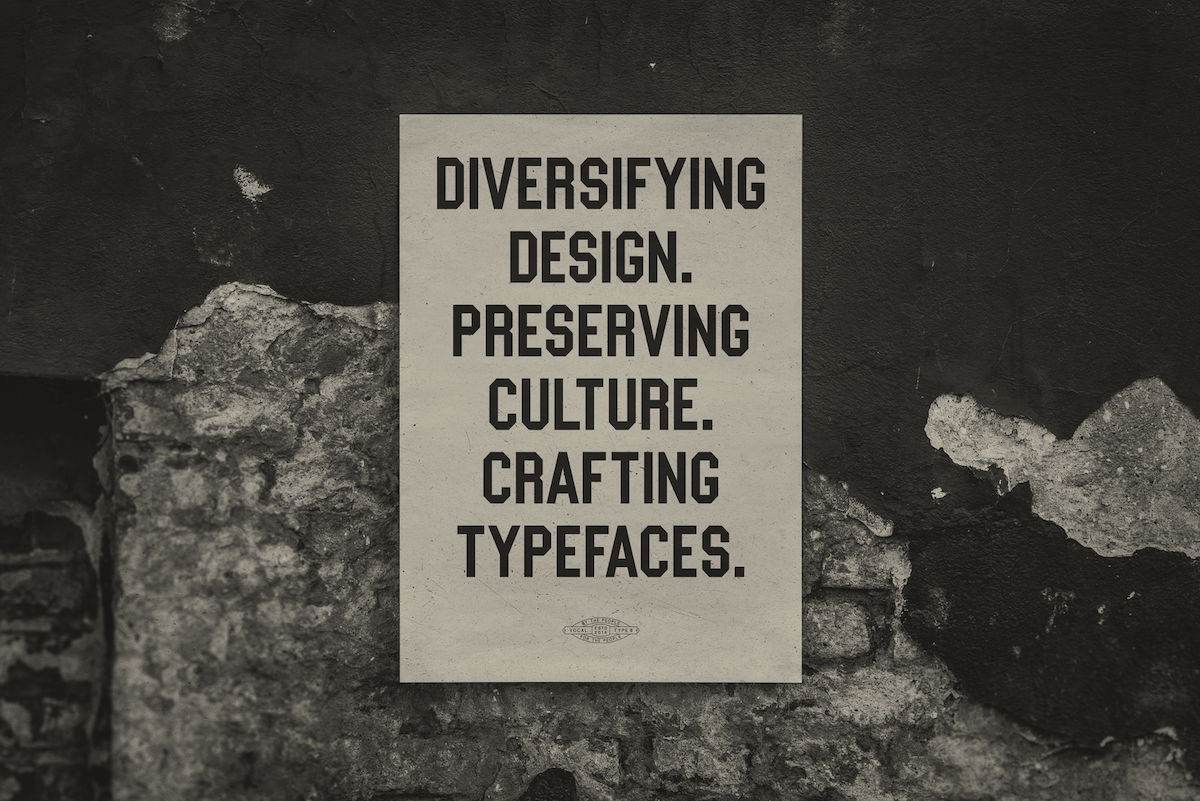
Tré Seals founded Vocal Type Co with the mission to diversify design and design references. Faced with data which showed him the lack of representation for Black designers in the industry, Vocal Type was founded to create typefaces that ‘highlight a piece of history from a specific underrepresented race, ethnicity, or gender—from the Women’s Suffrage Movement in Argentina to the Civil Rights Movement in America.’ With a beautiful collection of meaningful typefaces and inspiring WIPs, you need to check out Vocal Type.
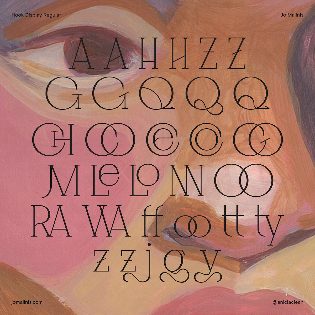
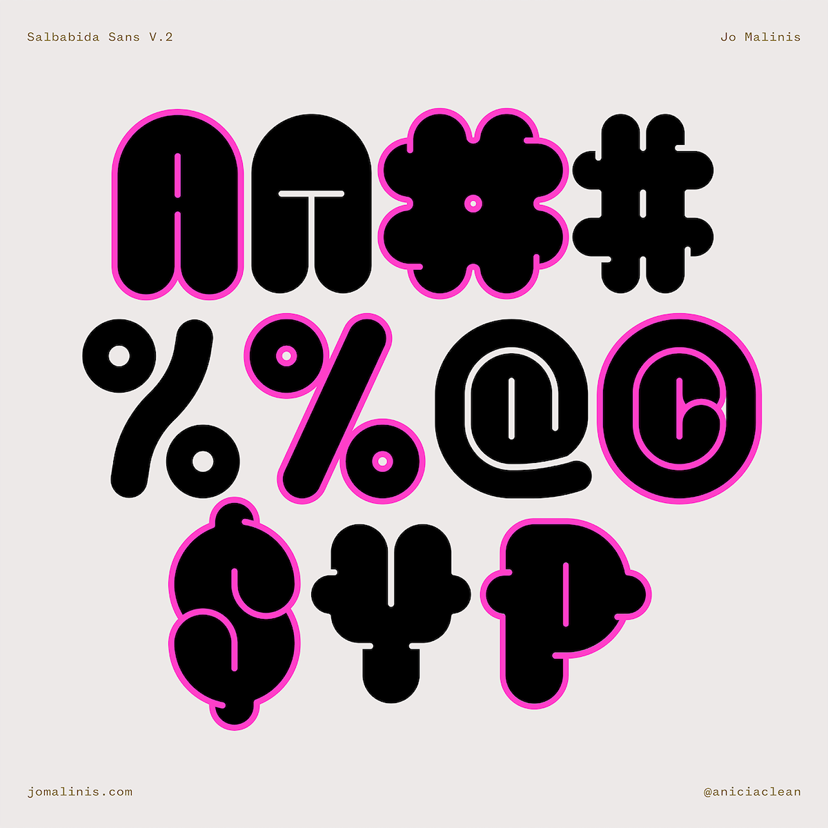
Jo Malinis is a graphic and type designer from the Philippines. The creator of Hook and Salbabida Sans, Jo is currently working on Terno, which she says is ‘inspired by the Philippine traditional dress “terno” that sports butterfly sleeves as its most distinctive feature.’ Hook is a lyrical, truly beautiful serif display, while Salbabida Sans, named after the Tagalog word for “lifesaver” or “water floater,” has just got a delicious new update. Hook and Salbabida Sans V.2 are available on Type Department.
Gydient is a multidisciplinary designer based between Vietnam and Germany. She’a a co-founder of Fustic.Studio and has worked on a ton of incredible projects, from creating the visual assets from the Adobe Max CoCreate Campaign 2020 to her stunning kinetic ‘Move the System’ series. Amongst a collection of beautiful typefaces, our favourite has to be Viaoda Antiqua; a beautiful balance of old and new inspired by Vietnamese cultural symbolism.
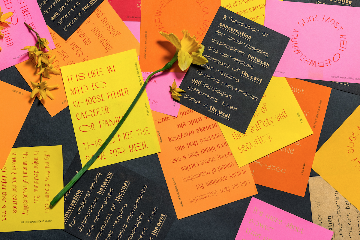
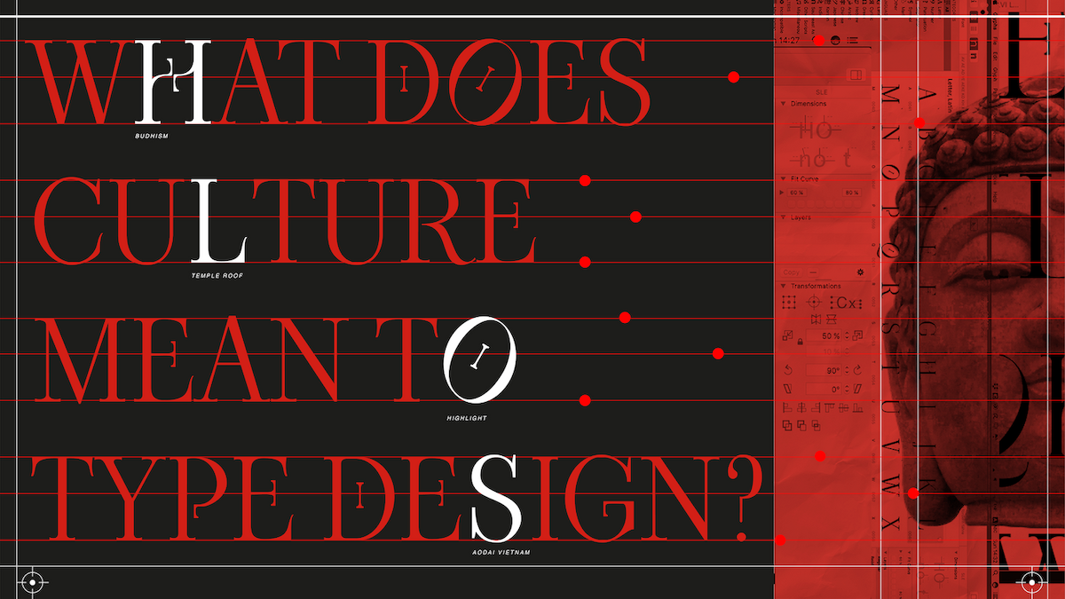
Aasawari Kulkarni—author of Why We Need To Stop Advocating Helvetica As The Best Typeface—is a graphic and type designer originally from India who explores ‘culture and conditioning, through design.’ Her expressive, interrogative Nari Variable typeface challenges ideas surrounding ‘typatriarchy’ and uses variable technology to explore what it means for a typeface to be feminist. Nari means woman in Hindi.
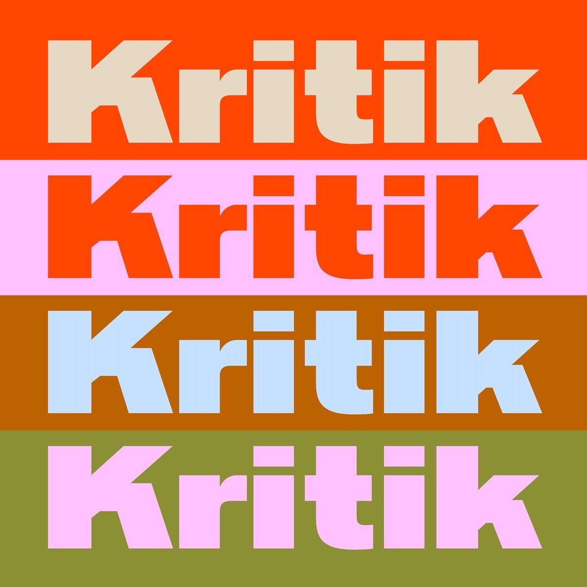
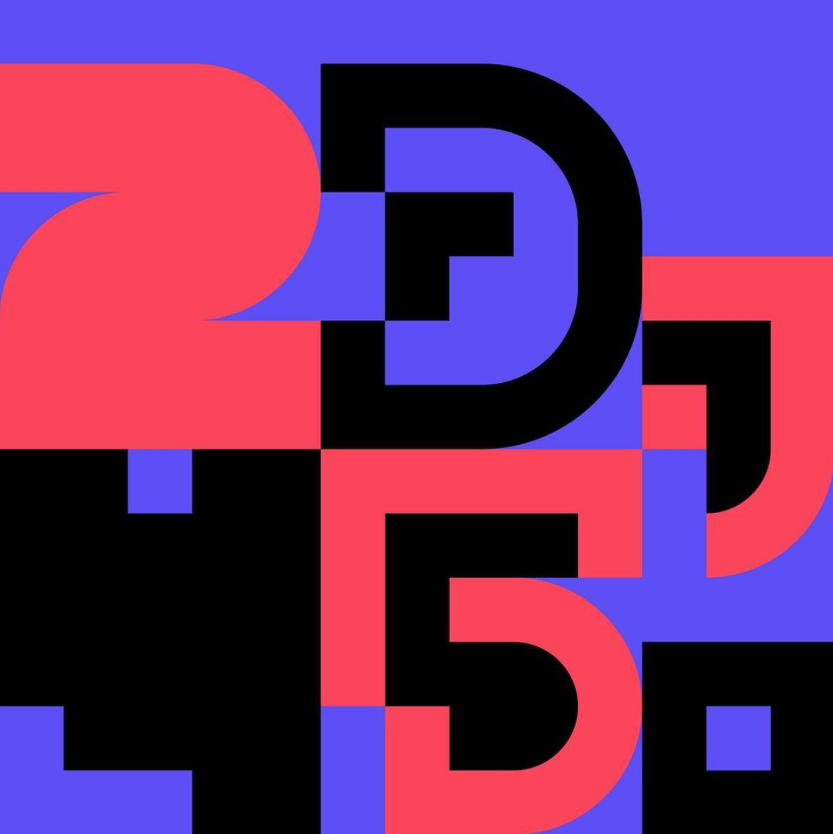
Berlin-based Graphic and Type Designer Daniel Stuhlpfarrer has a super varied, stunning collection of typefaces ranging from classical Swiss style type to more experimental styles. His architecture-inspired, impactful Kritik typeface is a solid favourite over at Type Department—a perfect choice for bold headlines and a sharp typographic presence.
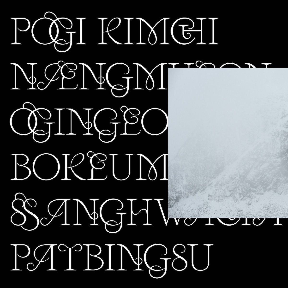
Bouk Ra, the Paris/Seoul-based designer of Hanol, is a no-brainer when it comes to type designers to look out for. Hanol takes its namesake from a Korean word for a strand/thread or hair. Through its etherial design, it’s a celebration of the beauty of the connective strands of letterforms, and is inspired by the celestial robe of a fairy from a traditional fairy tale. Now updated to V.2, it comes with a range OpenType features and sophisticated ligatures which showcase the unbelievable talent of this designer.
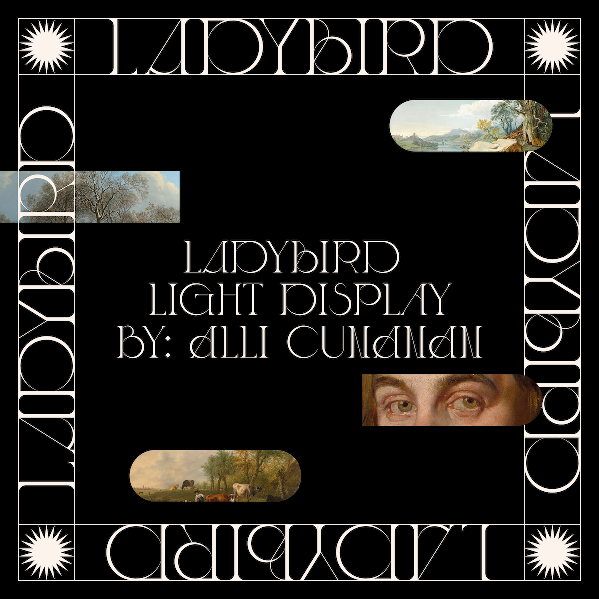
Alli Cunanan is the designer of the incredible Ladybird Light, the angular, delicate serif display font inspired by the elegance of Irish Actor, Saoirse Ronan. We adore this typeface—it’s truly unique and beautiful—and lucky for us, she’s working on a new WIP typeface that’s set to be hopefully released soon! Ladybird Light is available on Type Department.
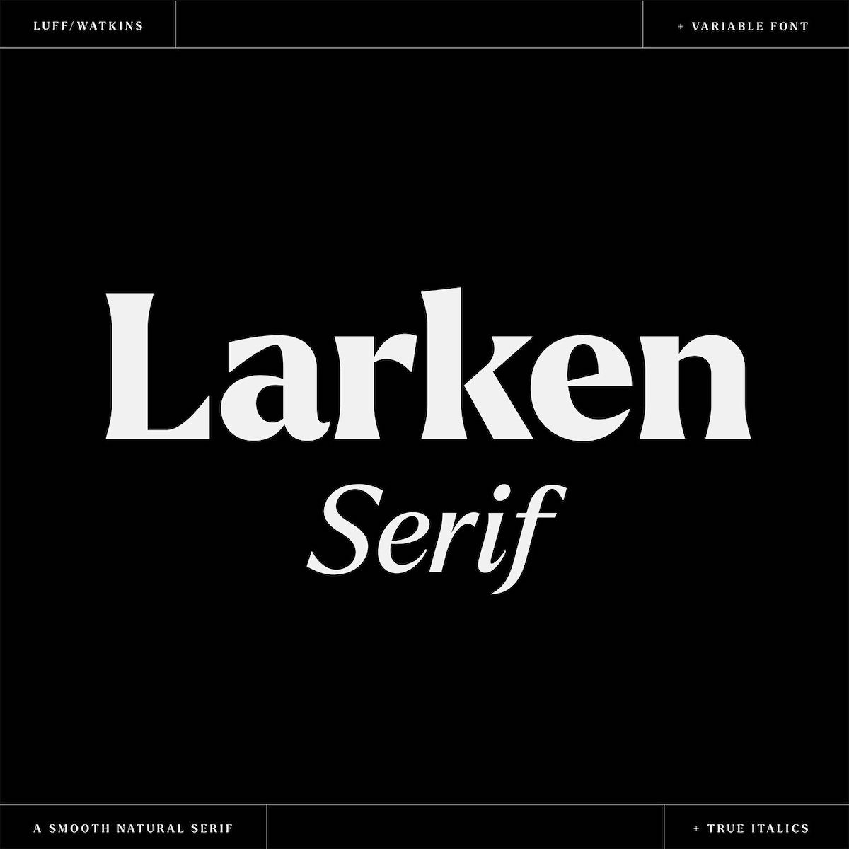
Ellen Luff is an independent type designer based in London. Her Larken typeface has to be one of our favourites—it’s a soft, smooth, nature inspired serif with just enough expressive edge to set it out of the crowd without being overwhelming. Larken, as well as with Ellen’s latest release Jeko, are both available on Type Department.
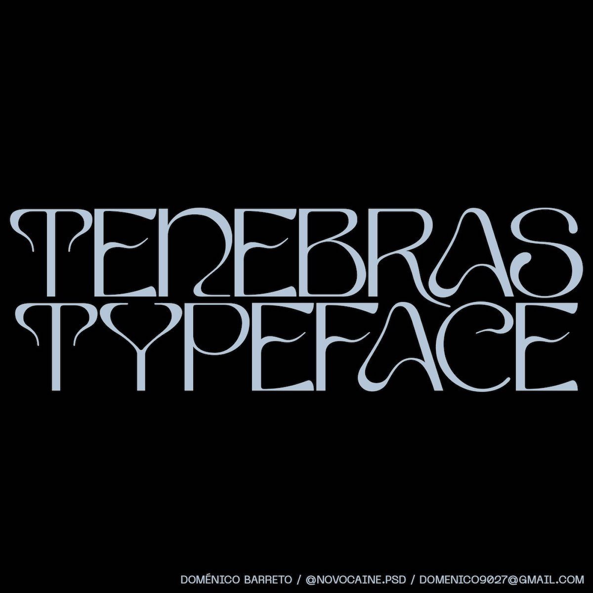
Doménico Barreto is an independent graphic & type designer based in Lima, Perú, whose typefaces Tenebras and Evangelion are so extremely different from one another you’d almost expect they were created by different people. Tenebras’ fluid, dynamic shapes are just so elegant—we’re obsessed. You can find Tenebras and Evangelion on Type Department.
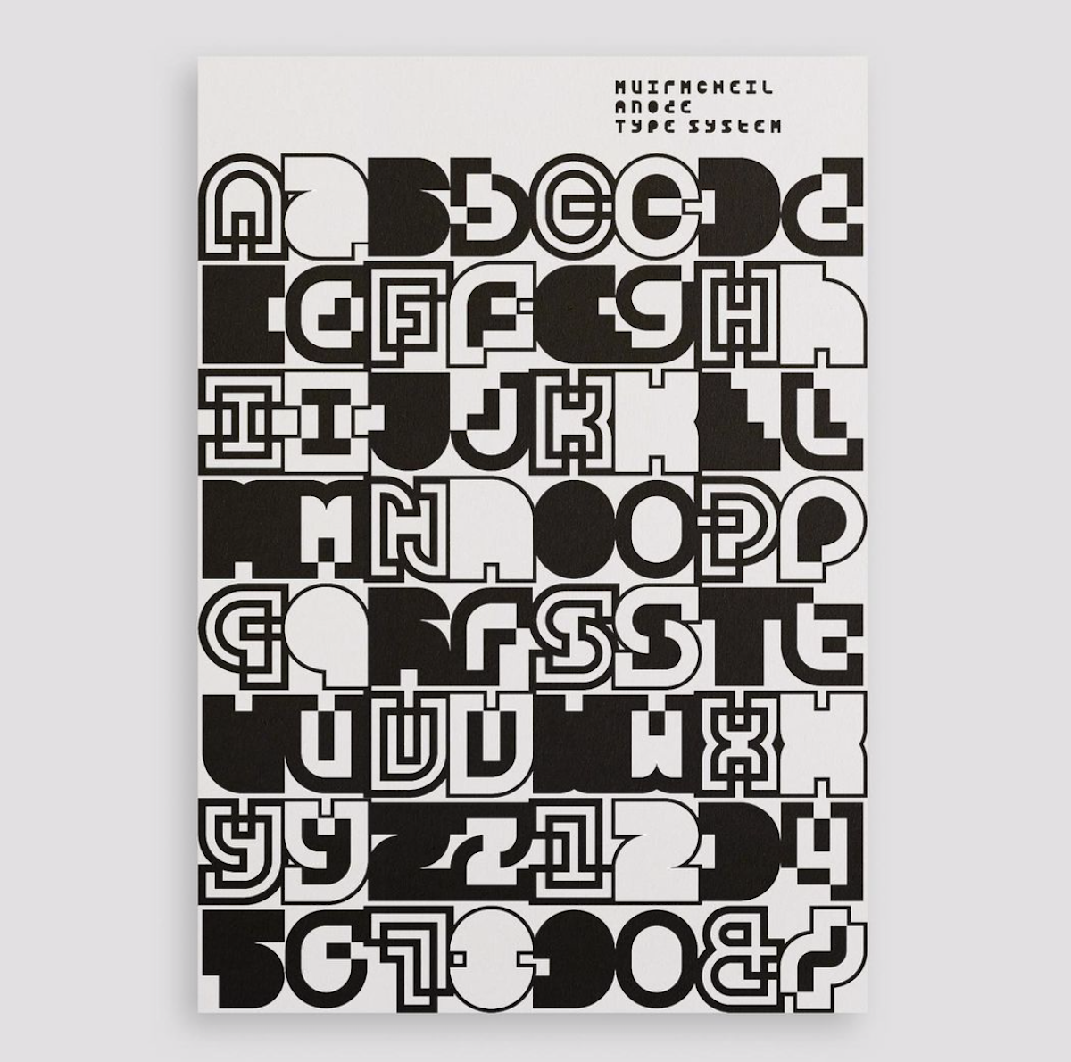
Natasha Lucas is the creator of the incredible Bisect, Diode and most recently, Anode type systems. The three typefaces, published by MuirMcNeil, explore correspondences between positive and negative spaces in alphabetic forms; exploring the abstract ambiguity and playfulness of type systems and the shapes that make up their forms. Natasha’s work is astoundingly unique—she’s definitely someone you need to be watching.
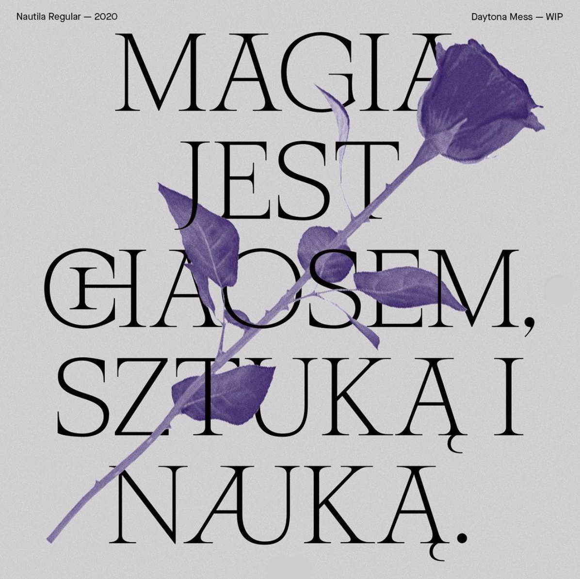
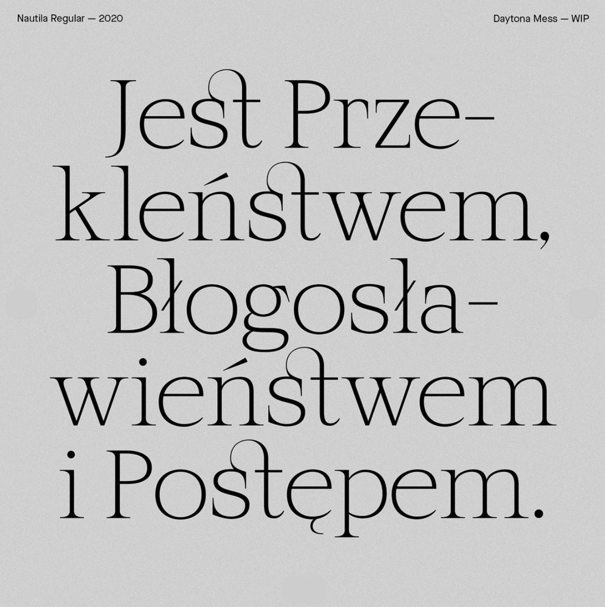
Daytona Mess (Anne-Dauphine Borione)
Co-creator of the stunning Aliénor Display, Daytona Mess is an art director, graphic designer and type designer based in Paris. While Aliénor Display, created alongside Lou Rainaldo, has got to be one of our favourite contemporary serifs, Daytona’s been sharing some teasers of her latest WIP typeface, Nautila Regular. Full of sharp serifs and tangled ligatures, we couldn’t be more stoked.
Based in Melbourne, Gemma Mahoney blew us away with Nurture Display. Her second typeface, Nurture was created in response to the tensions between the concepts of ‘nature and nurture,’ the result being a highly structured typeface with bursts of movement and flowing curves. It’s a feat of balance, this typeface; highly illustrative whilst remaining conservative with its flourishes.
Originally from Hong Kong, Jazlyn is a Sydney/Melbourne-based type designer and art director with some stunning work under her belt. The creator of Limpid, a delicate serif inspired by walks in nature, we love how Jazlyn’s contrasting methods of graphic communication—which developed from her years of experience in wayfinding in Hong Kong—manifest in different ways throughout her diverse portfolio.
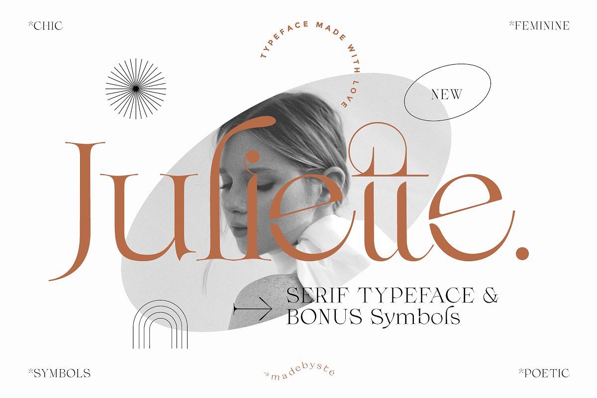
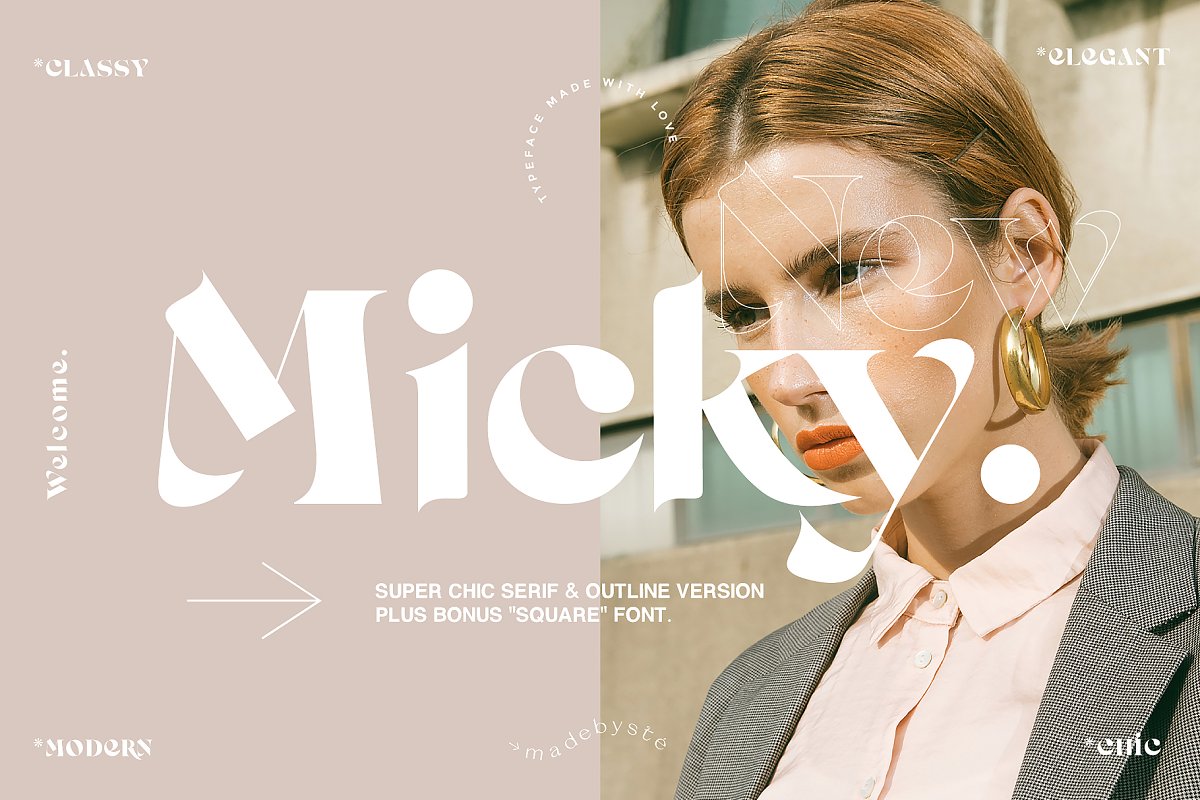
Based in Geneva, Switzerland, Stéphanie Brusick is an independent art director and type designer. Her latest typeface, Juliette, is an elegant serif comprised of two stunning serif fonts and a special symbols font. It is unbelievably versatile and beautiful. She’s also recently shared a teaser for new, bolder serif typeface, Micky, which comes with an outline version and is built with thicker shapes, all while maintaining that signature refinement and delicacy. Stéphanie’s typefaces are available to purchase online.
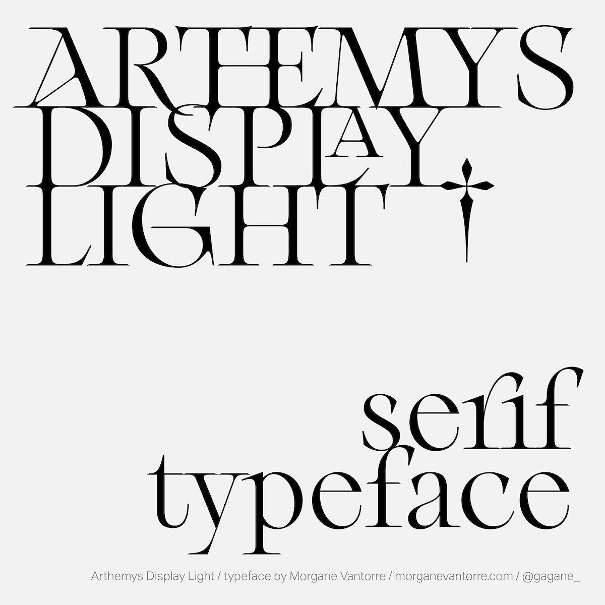
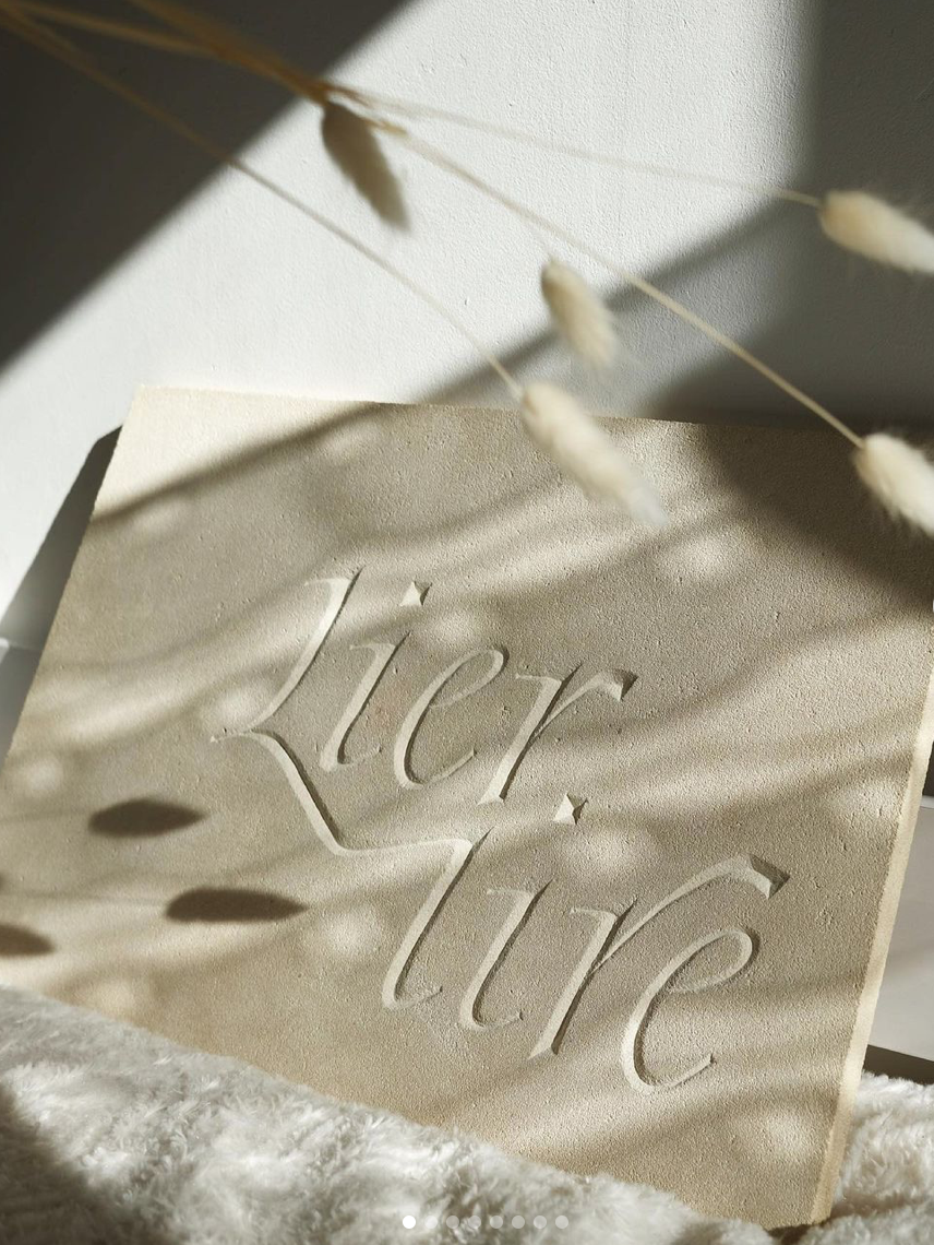
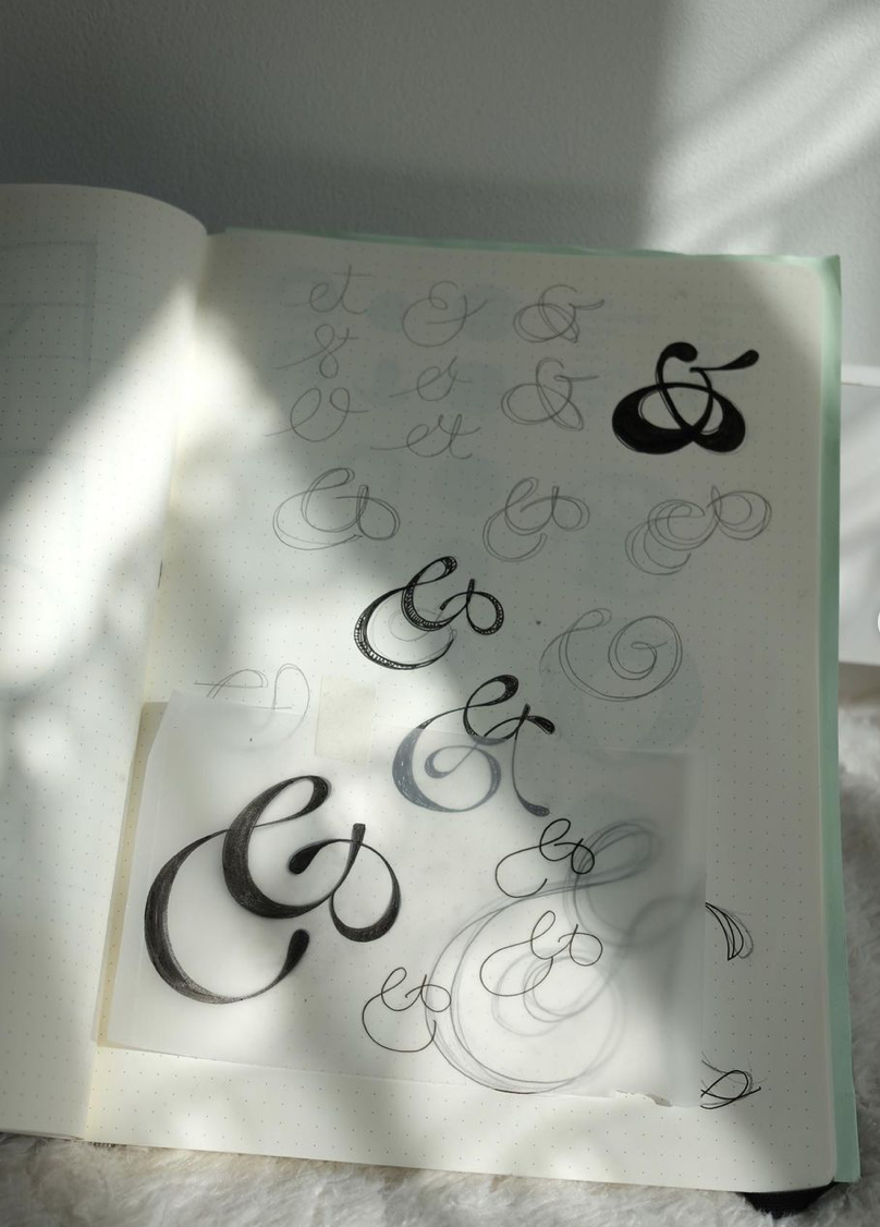
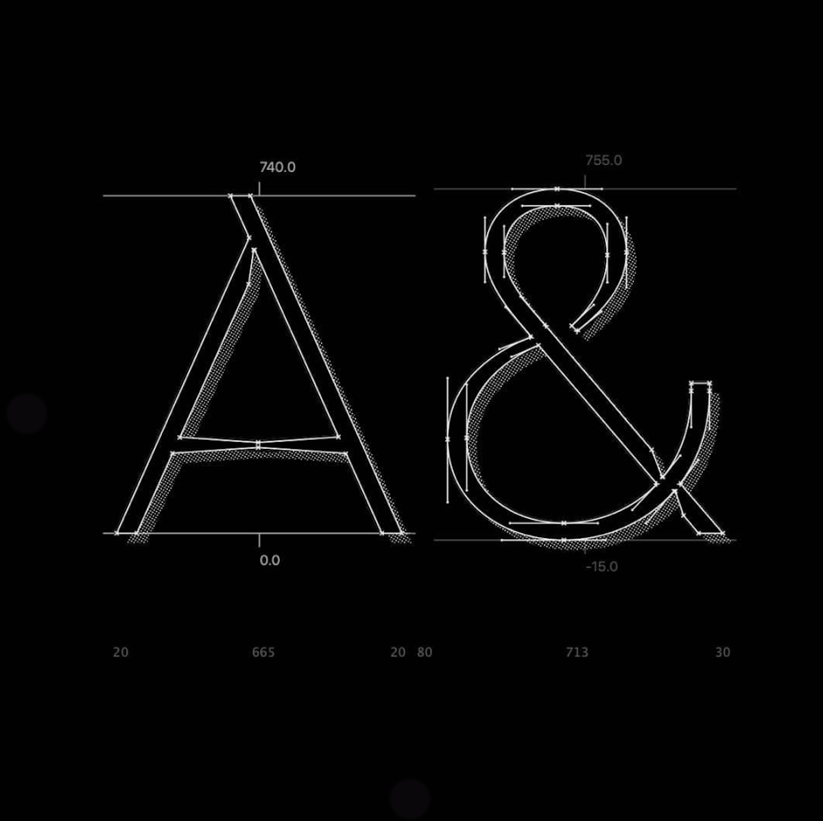
Morgane VanTorre is the Paris-based graphic and type designer behind our long-standing fav contemporary serif, Arthemys Display Light. Recently, Morgane’s been sharing her gorgeous stone-carving work (pictured left), and her graceful ampersand designs (pictured right) for Distillery’s Diversity Type Project, partnered by Femme Type. Excitingly, Morgane also has a new WIP typeface in the works. Designed in collaboration with Antoine Brun, this stunning WIP is an expressive sans serif inspired by Arabic calligraphy.
Morula Type (Valerio Monopoli)
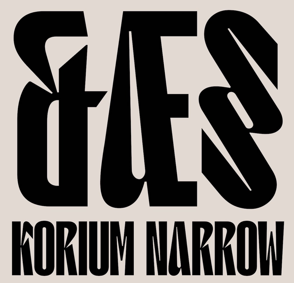
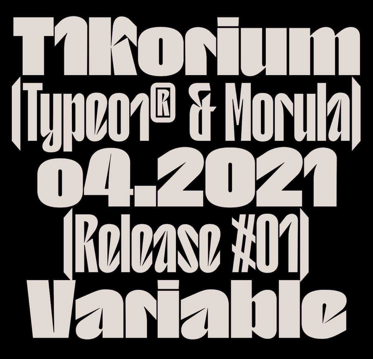
Creator of the stunning Migra Serif (published by Pangram Pangram), Morula Type recently collaborated with us on the release of Type01 Foundry’s first (!!!) typeface release, T1 Korium. At once familiar, hosting gentle, humanist-touched glyphs (check out the lowercase ‘u’ and ‘m’), Korium’s juicily condensed forms are soft on the outside and sharp on the inside—a contemporary sans with angular shapes and a badass attitude. T1 Korium creates a stunning juxtaposition to Migra—Morula Type’s stunningly assured yet delicate serif typeface—and showcases the diverse talent of this incredible designer. T1 Korium is available on Type Department.
MyType Foundry (Wayne Fearnley)
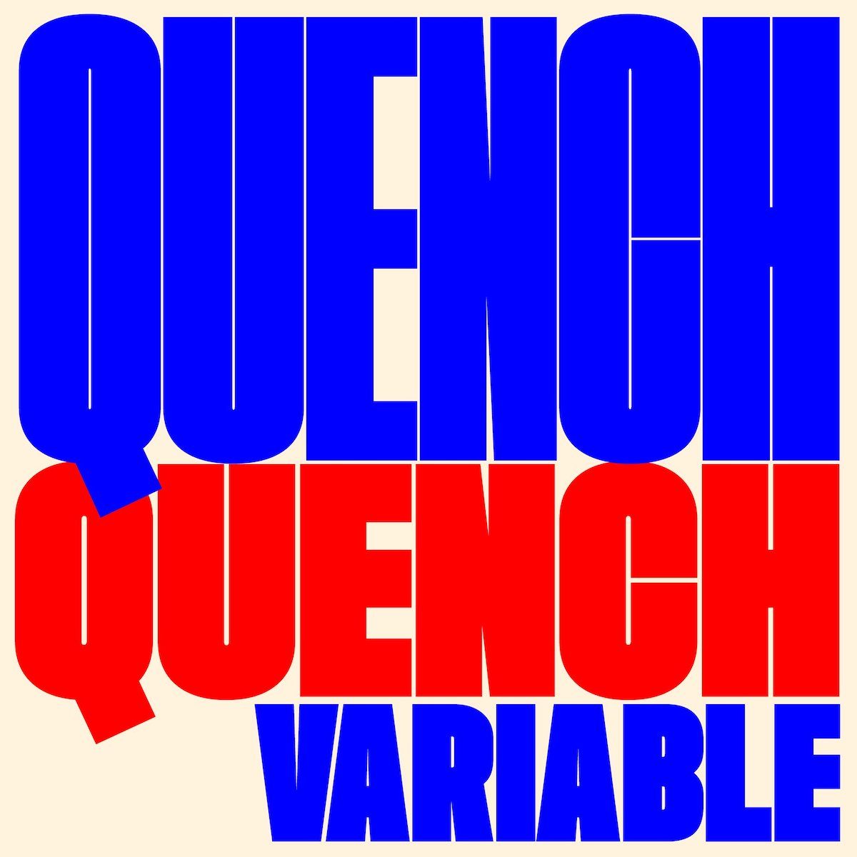
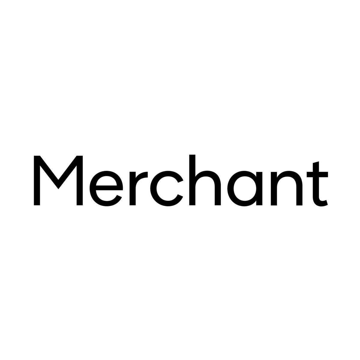
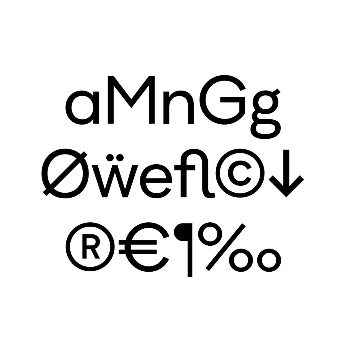
MyType Foundry, ran by Wayne Fearnley, offer an incredible selection of typefaces available to purchase over at Type Department. From the bold, juicy Quench Variable to the delicate stencil Céline, MyType Foundry create typefaces which are considered, versatile and meticulously constructed. Their latest release, Merchant, is a variable sans serif typeface inspired by 20th century British typefaces. Characterised by wide counters and clean cuts, it’s perfect for both text and display purposes.
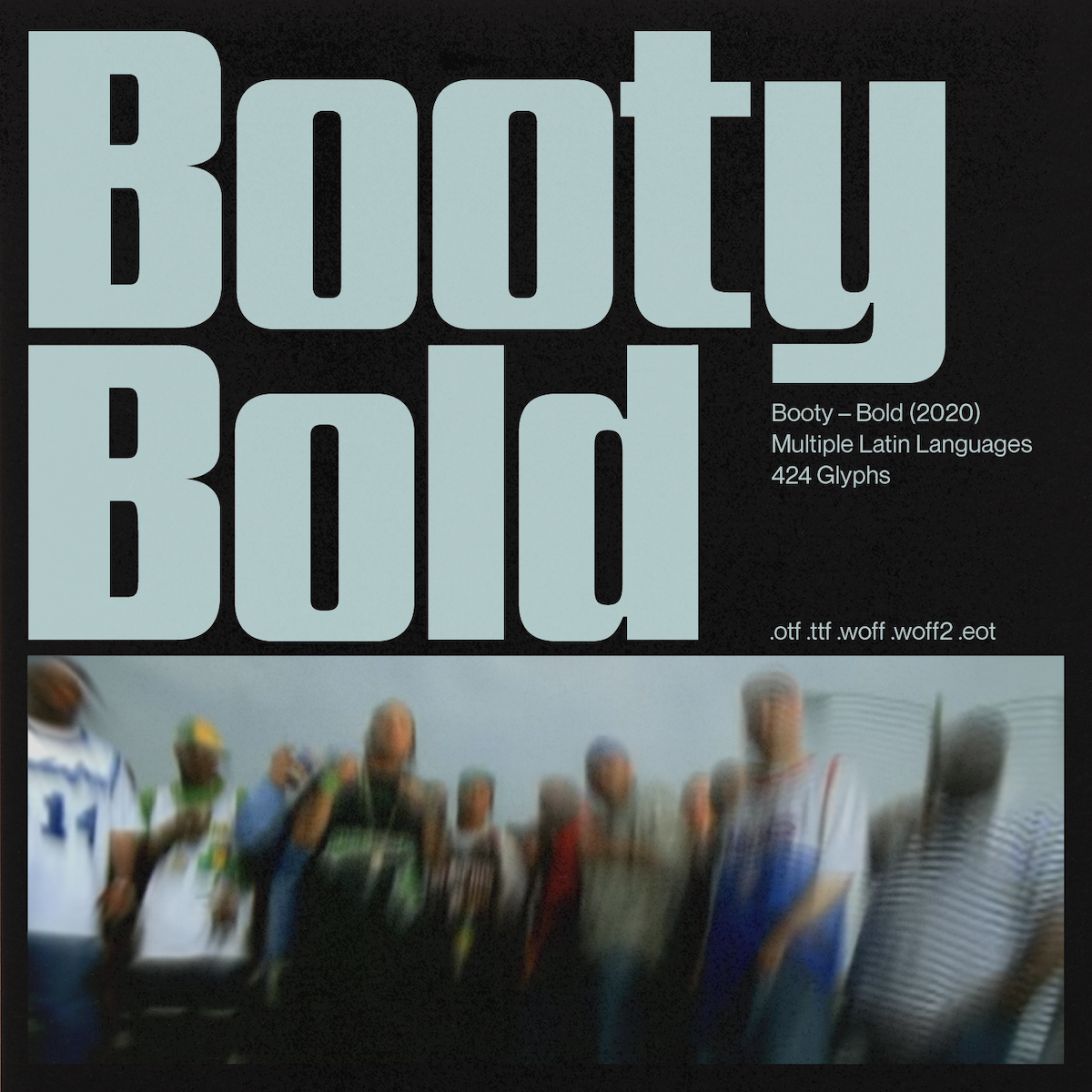
Designer of the loud, confident Booty Bold, Nat Brown’s type design skills are incredible. Booty Bold is nostalgic yet futuristic. Inspired by regional American club music and its intense obsession with large derrières, the uppercase and lowercase characters in this typeface hold an almost consistent weight, giving the font a digital appearance comparable to mono-spaced typefaces. We love love love this typeface and can’t wait to see what Nat comes out with next. Booty Bold is available on Type Department.
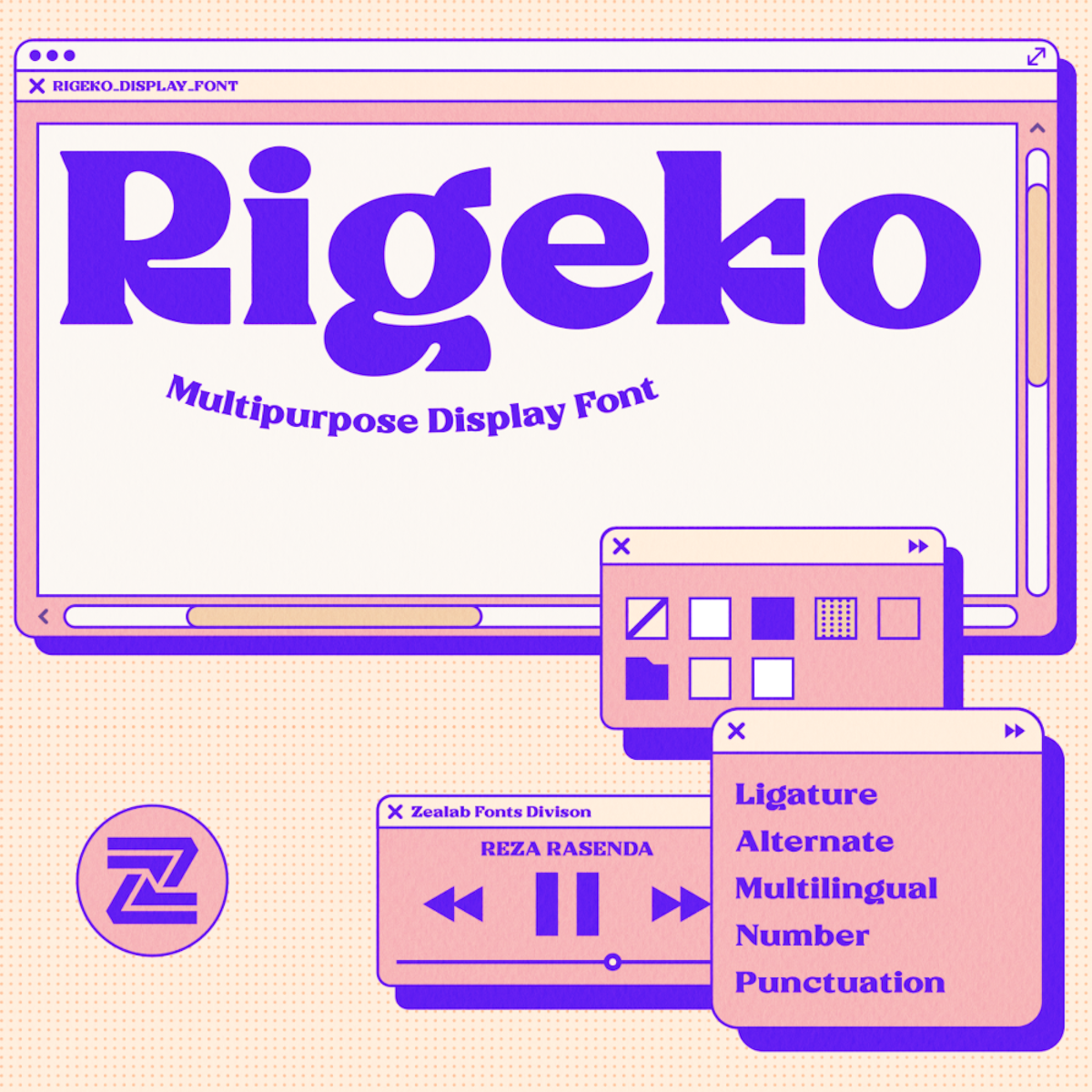

Independent digital type foundry Zeafonts focus on creating beautifully crafted multi-purpose display typefaces. Boasting a huge collection of diverse, versatile typefaces, their attention to detail never fails to impress. Their typefaces RIGEKO, Bagerich Display and Millik are available through Type Department.
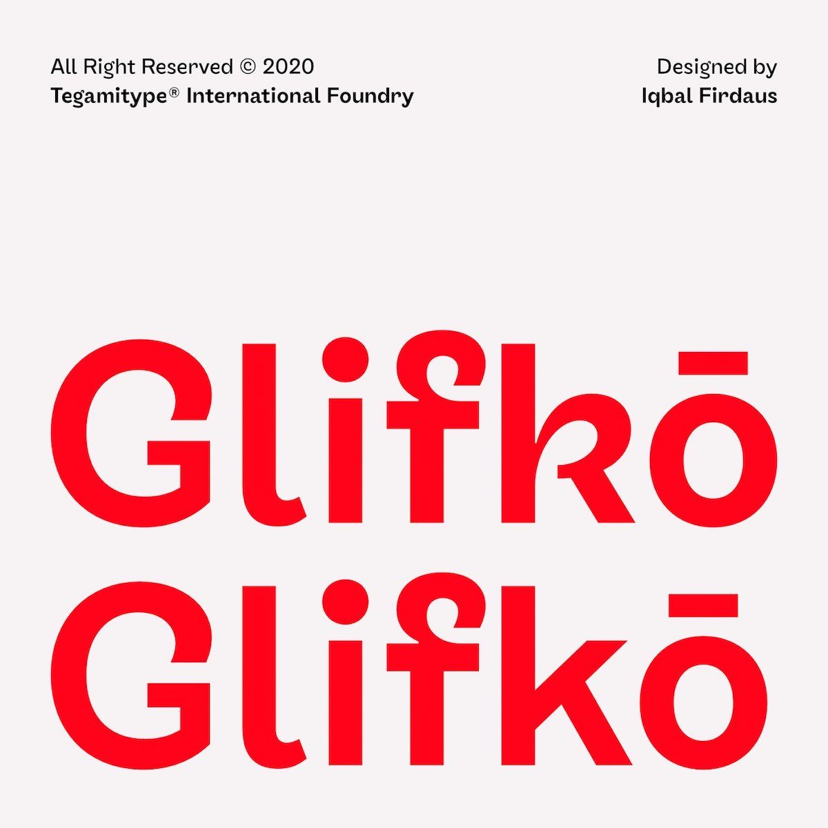
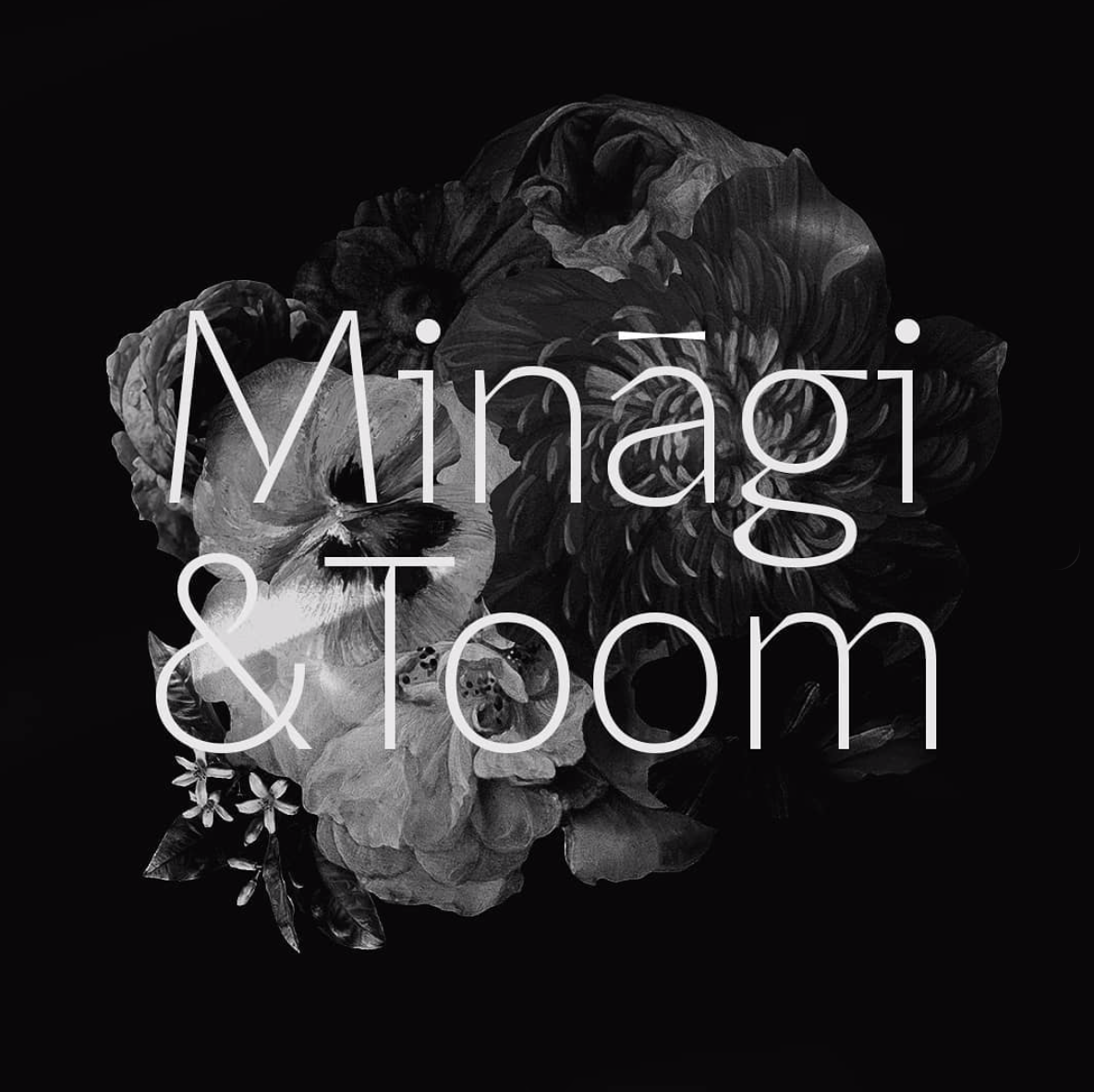
Indonesia-based independent type foundry Tegamitype create retail and custom high-quality typefaces with extensive language support and various OpenType features. Their typefaces are unique and meticulously constructed, and their incredible TG Glifko, TG Praktikal, TG Haido Grotesk and TG Frekuent Mono are all available on Type Department. Tegmitype have also recently been sharing some glimpses of their upcoming WIP, TG Minagi Sans & Display, which looks super exciting.
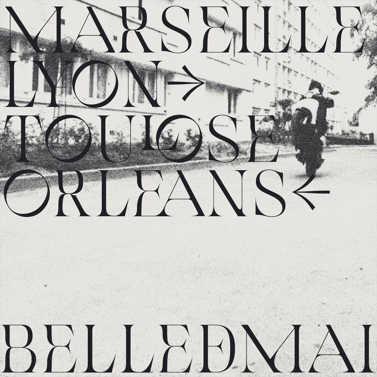
Creator of Belle de Mai, 60KILOS is a designer you 100% need on your radar. Belle de Mai is an elegant, edgy serif display which plays with the cultural shock between high cost, inner-city zones and lower cost suburbs in big metropolitans cities such as Paris. The typeface, available on Type Department, takes its name from the hood of La Belle de Mai and merges classical elements with an unusual, vibrant edge. Be sure to keep up with 60KILOS in 2021.
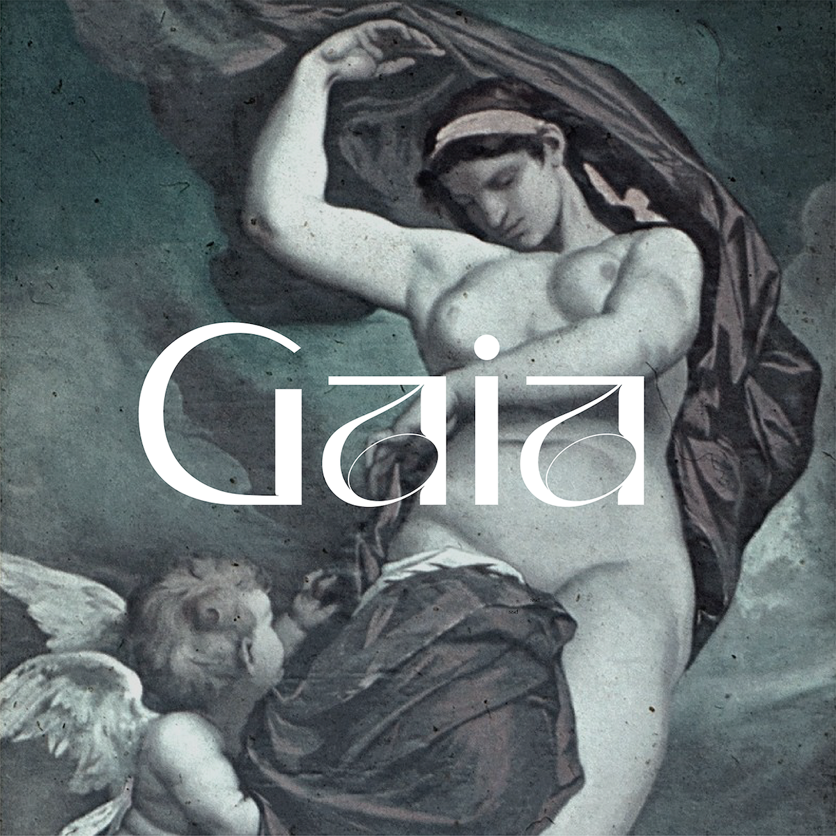
Nora Kaszanyi’s Gaia typeface is one of a kind—a sans serif display with all the experimental, expressive flourishes of a serif. In her own words, Nora says, “Gaia is the personification of the Earth and one of the Greek primordial deities. She is the ancestral mother of all life: the primal Mother Earth goddess.” We’re obsessed. You can find more about Gaia on Type Department.
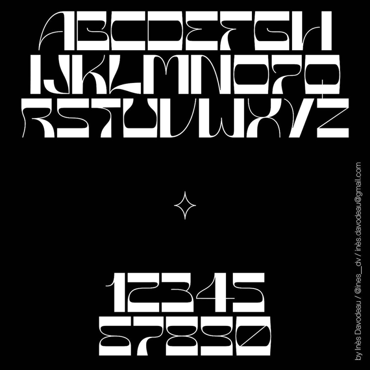
Ines Davodeau’s Asfen display typeface has recently been given a shiny new update, and now comes with a variable font to allow users to play around and hone a tailored aesthetic. The typeface, which explores the tension between humans and machines in its cyborg glyphs, has to be one of the best experiential sans typefaces we’ve seen for a while. Ines is such an exciting designer—definitely not one to be missed. Asfen is available on Type Department.
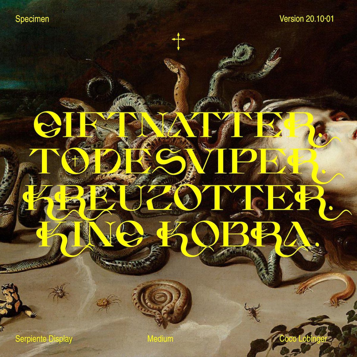
Based in Germany, Coco Lobinger is the designer of Serpiente Display Medium, display font with a morphology based on snakes. Graphically evolving into a life of its own, the organic forms quote the beauty and unpredictability of snakes as creatures whilst maintaining strong structural integrity. We adore this typeface, it’s super daring and easily places Coco as one of the most exciting designers around right now. Serpiente Display is available on Type Department.
Minjoo Ham, cofounder of type foundry Hypertype, is an independent type designer, typographer and graphic designer from South Korea. Having focussed on researching and designing a Latin and Hangul double-script during her TypeMedia Masters course at the Royal Academy of Art (KABK) in The Hague, Netherlands, she is now based in Berlin and produces multi-script font families for corporate clients and various foundries.
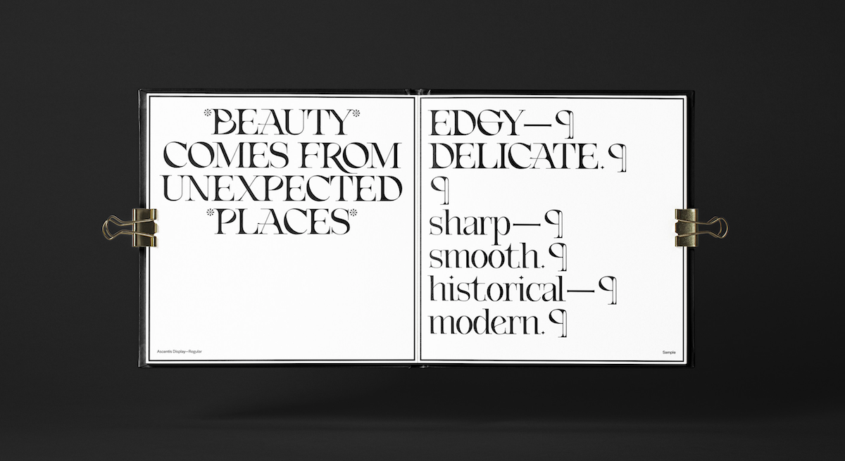
Designer of the gorgeous Ascentis typeface, Emily Jing Sum Chan is currently studying for her degree at Parsons School of Design alongside working at &Walsh. Her current typefaces do a stunning job of bringing to together classic influences with a contemporary touch; Ascentis is inspired by Neoclassical typography with a contemporary twist, while her display typeface Orna draws from Art Nouveau merged with Blackletter Calligraphy.
Alex Slobzheninov is the creator of a collection of stunning typefaces. Relaate is an extensive font family featuring an elegant Serif, a brutal Slab and quirky tall Grotesque. A constant work in progress, Relaate now supports Cyrillic and Latin Extended, and transitions stunningly between styles. Alex has also been sharing some experiments with variable fonts and coding recently, which is also super exciting.
Alexandre Bassi is a type designer currently working in research and type design at Atelier National de Recherche Typographique in Nancy, France. Specialised in art direction, visual identities and type design, his visual work is informed by rigorous research and a deep understanding of typographic forms, meaning his output is rich and always deeply compelling.
And finally, we have Mark Bloom. Also known as MashCreative, Mark is a graphic designer, author and type designer with around 20 years’ experience working in the field. His type foundry, CoType, distributes contemporary fonts of the highest quality for both print and digital. CoType’s recent release Orbikular comes with a gorgeous printed specimen, while their latest release, Altform, is beautiful marriage between a geometric sans and a grotesque.


